
fantastische
Petricor Is Today's Word
27 - lifelong lurkerExpect Sherlock Holmes, BC, MF and X files shit. Funny stuff also applies and aesthetic sillines
24975 posts
Don't wanna be here? Send us removal request.
Last Seen Blogs

mickeyswhore
Mickey Altieri’s Wife

murdawolf
mustard-gas perfume™︎

syztemerrxr
Airfryer

roaringtiger100-blog
Untitled

tazngg
taz
Video
2M notes
·
View notes
Video
Temperature anomalies by country and continent
This video was prepared and shared by Antti Lipponen (https://twitter.com/anttilip) using the compiled temperature measurements across the Earth’s countries and regions in the NASA Goddard Institute for Space Studies database, which extends back to the 19th century. Each bar shows the temperature for a given country compared to the baseline used by NASA Goddard – the average global temperature from 1951-1980. Using this projection you get both the global impression of everything getting warmer, particularly over the last 40 years, as well as a view of local and regional heat waves. How big a heat wave was the one that hit your country in some year? How does that compare to the global changes that have hit since? Scroll through this clip and find out.
-JBB
Video credit (CC licensed):
https://flic.kr/p/W3wPeE
2K notes
·
View notes
Video
youtube
"REDNECK AVENGERS: TULSA NIGHTS" — A Bad Lip Reading of Marvel's The Ave...
Dunno what I expected from this but...
It was not it. IT WAS BETTER
#Avengers#RDJ#robert downey jr#chris evans#chris hemsworth#Captain America#Thor#black widow#scarlett johansson#mark ruffalo#Hulk
57 notes
·
View notes


Text


“(Y/n), what the hell; I said hand it to me, it was glass!”
“Oops, sorry not sorry; why don’t you go complain to one of those suits of yours that you seem to like more than me?”
341 notes
·
View notes


Photo
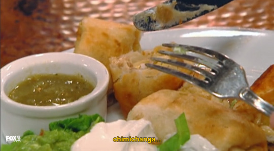
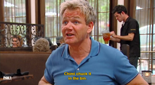
this will forever be my favorite line from kitchen nightmares
#Chimi chuck it in the bin#chimichanga#just to be clear#that is not mexican food#Not that mexican food is much better#actually there are much worst things in our deep fried side of the cuisine
98K notes
·
View notes
Text
Avengers 4: Tony’s dead, Steve’s dead; what do we do now.
“Marvel has not revealed the title of Avengers 4 yet because the title itself is a spoiler.”

6K notes
·
View notes
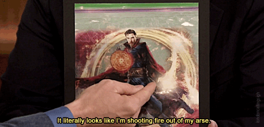
Photo
fast forward it to min 45:30


“He’s always like this.” (x)
5K notes
·
View notes
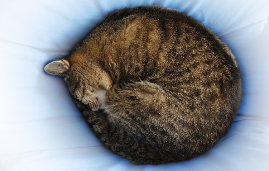
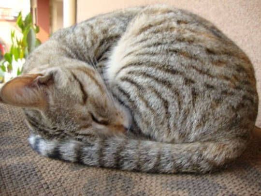
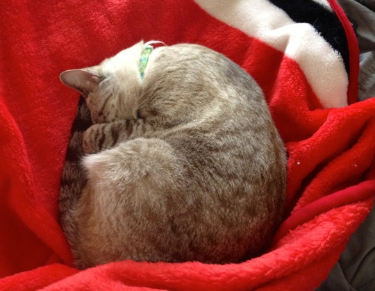
Text
Are they sniffing their own asses?
cats doing the


60K notes
·
View notes