#3dcg
Text

Pressure.
#Sheva Alomar#Panam Palmer#Resident Evil#Cyberpunk 2077#blender#3dcg#pinup#art#my art#my artwork#vex's 3d
29 notes
·
View notes
Text


Freakin out, man
See the making-of here: youtu.be/h9jKc6L16y0
#Pomni#the amazing digital circus#digital circus#fanart#art#artists on tumblr#b3d#blender#3dcg#animation#animated#clown#jester#poole
2K notes
·
View notes
Text


Revy from anime "Black Lagoon"
As a reference, I used the cover of the manga "Black Lagoon: The Book of Venom" by Rei Hiroe.
Cheers
513 notes
·
View notes
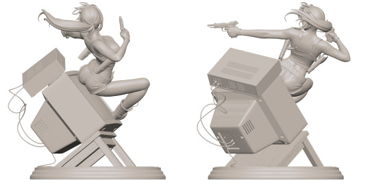
Photo


brandon gobey - debt collectors (2020)
a regional hub for government activity, one of the first buildings to experiment with anti-gravity manipulation.
process stages:

#brandon gobey#debt collectors#concept art#digital painting#art#illustration#painting#digital art#3dcg#process#3d model#paintover#sci-fi#cityscape#sprawl#cyberpunk#architecture#superstructures#sci fi#artstation#artists on artstation#2020#blender#photoshop#3d render
335 notes
·
View notes
Text

807 notes
·
View notes
Photo

(SLASH_Art(@slash_soft)さんのメディアポスト / Xから)
87 notes
·
View notes
Text
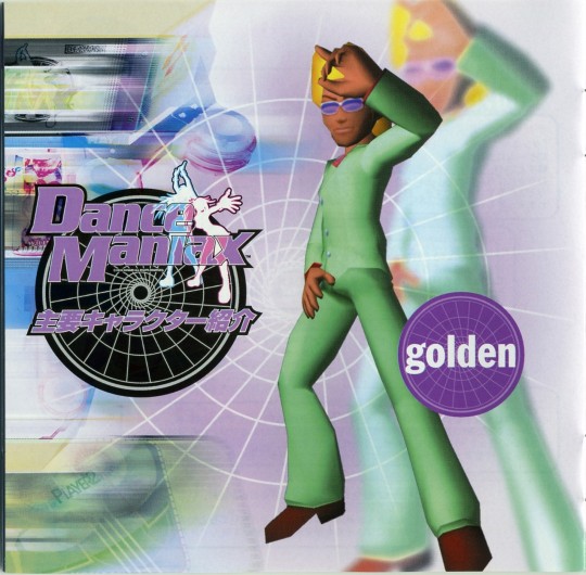
DanceManiax OST (2000)
270 notes
·
View notes
Text

571 notes
·
View notes
Text

Ice spikes in a frosty landscape ❄️
#natsumi pocket#natsumipocket#my art#low poly#b3d#blender 3d#3d art#3dcg#playstation#ps1#ps1 graphics#ps1 aesthetic#psx#playstation 1#psone#psx aesthetic#indie game dev#indie games#game dev#n64#nintendo#nintendo 64#blender#artists on tumblr#ice spike#dreamcore#old game graphics#2000s#early 2000s#90s
109 notes
·
View notes
Text
I made unkown fishes :3 This design is from my old sketches
58 notes
·
View notes
Text

Airing out.
#ada wong#resident evil#resident evil 4 remake#biohazard#blender#3dcg#pinup#muscular woman#art#my art#my artwork#vex's 3d
140 notes
·
View notes
Text

[ 3D ]emems natural habitat
#my art#splatoon#inkling girl#splatoon 3#splatoon oc#octoling boy#splatoon 2#splatsona#nintendo#splatoon art#inkling boy#blender#mikumikudance#anime#2000s#3dcg#animecore#octoling girl
76 notes
·
View notes
Text
canmom's notes on fixing the colours
ok so if you've been following along on this blog for the last week or two i've been banging on about colour calibration. and i feel like it would be good to sum up what i've learned in a poast!
quick rundown on colour spaces
So. When you represent colour on a computer, you just have some numbers. Those numbers are passed to the monitor to tell it to turn some tiny lights up and down. The human visual system is capable of seeing a lot of colours, but your monitor can only display some of them. That's determined by its primaries, basically the exact colour* of its red, green and blue lights.
(*if you're wondering, the primaries are specified in terms of something called the CIELAB colour space, which is a model of all the different colours that humans can possibly see, devised by experiments in the early-mid 20th century where the subjects would turn lights at different frequencies up and down until they appeared visually the same. Through this, we mapped out how eyes respond to light, enabling basically everything that follows. Most human eyes tend to respond in pretty close to identical ways - of course, some people are colourblind, which adds an extra complication!)
Now, the problem we face is that every display is different. In particular, different displays have different primaries. The space in between the primaries is the gamut - the set of all colours that a display can represent. You can learn more about this concept on this excellent interactive page by Bartosz Ciechanowski.
The gamut is combined with other things like a white point and a gamma function to map numbers nonlinearly to amounts of light. All these bits of info in combination declare exactly what colour your computer should display for any given triplet of numbers. We call this a colour space.
There are various standard sets of primaries, the most famous being the ITU-R Rec.709 primaries used in sRGB, first defined in 1993, often just called the sRGB primaries - this is a fairly restricted colour space, intended to be an easy target for monitor manufacturers and to achieve some degree of colour consistency on the web (lol).
Since then, a much wider gamut called Rec.2020 has recently been defined for 'HDR' video. This is a very wide gamut, and no existing displays can actually show it in full. Besides that, there are various other colour spaces such as AdobeRGB and P3, which are used in art and design and video editing.
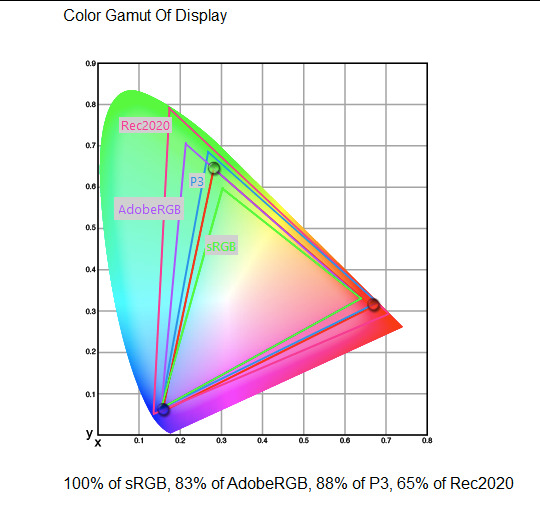
What you see above is something called a 'chromaticity diagram'. the coordinate system is CIE xyY with fixed Y. The curved upper edge to the shape is the line of monochromatic colours (colours created by a single frequency of light); everything other colour must be created by combining multiple frequencies of light. (Note that the colours inside the shape are not the actual colours of those points in CIE XY, they're mapped into sRGB.)
In this case, the red, green and blue dots are the primaries of my display. Since they are outside the green triangle marked sRGB, it qualifies as a 'wide gamut' display which can display more vivid colours.
Sidebar: you might ask why we didn't define the widest possible gamut we could think of at the start of all this. Well, besides consistency, the problem is that you only have so many bits per channel. For a given bit depth (e.g. 8 bits per channel per pixel), you have a finite number of possible colours you can display. Any colours in between get snapped to the nearest rung of the ladder. The upshot is that if you use a higher gamut, you need to increase the bit depth in order to avoid ugly colour banding, which means your images take up more space and take more time to process. But this is why HDR videos in Rec.2020 should always be using at least 10 bits per colour channel.
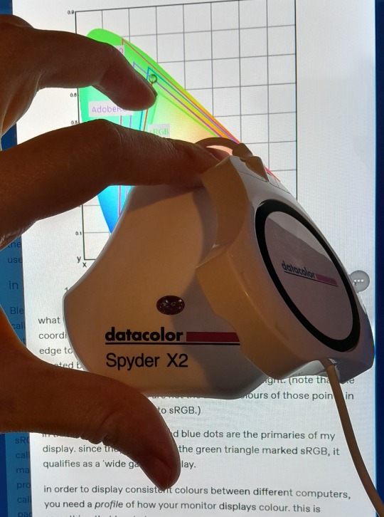
in order to display consistent colours between different computers, you need a profile of how your monitor displays colour. Yhis is something that has to be measured empirically, because even two monitors of the same model will be slightly different. You get this information by essentially taking a little gadget which has a lens and a sensitive, factory-calibrated colour meter, and holding it against your screen, then making the screen display various colours to measure what light actually comes out of it. This information is packed into a file called an ICC profile.
(Above is the one I got, the Spyder X2. I didn't put a lot of thought into this, and unfortunately it turns out that the Spyder X2 is not yet supported by programs like DisplayCal. The Spyder software did a pretty good job though.)
Wonderfully, if you have two different ICC profiles, and you want to display the same colour in each space, you can do some maths to map one into the other. So, to make sure that a picture created on one computer looks the same on another computer, you need two things: the colour space (ICC profile) of the image and the colour space (ICC profile) of the screen.

Now different operating systems handle colour differently, but basically for all three major operating systems there is somewhere you can set 'here is the icc profile for this screen'. You might think that's the whole battle: calibrate screen, get ICC profile, you're done! Welcome to the world of consistent colour.
Unfortunately we're not done.
the devil in the details
The problem is the way applications tell the operating system about colour is... spotty, inconsistent, unreliable. Applications can either present their colours in a standard space called sRGB, and let the OS handle the rest - or they can bypass that entirely and just send their numbers straight to the monitor without regard for what space it's in.
Then we have some applications that are 'colour managed', meaning you can tell the application about an ICC profile (or some other colour space representation), and it will handle converting colours into that space. This allows applications to deal with wider colour gamuts than sRGB/Rec.709, which is very restricted, without sacrificing consistency between different screens.
So to sum up, we have three types of program:
programs which only speak sRGB and let the OS correct the colours
programs which aren't colour aware and talk straight to the monitor without any correction (usually games)
programs which do colour correction themselves and talk straight to the monitor.
That last category is the fiddly one. It's a domain that typically includes art programs, video editors and web browsers. Some of them will read your ICC profile from the operating system, some have to be explicitly told which one to use.
Historically, most monitors besides the very high end were designed to support sRGB colours and not much more. However, recently it's become easier to get your hands on a wide gamut screen. This is theoretically great because it means we can use more vivid colours, but... as always the devil is in the details. What we want is that sRGB colours stay the same, but we have the option to reach for the wider gamut deliberately.
Conversely, when converting between colour spaces, you have to make a decision of what to do with colours that are 'out of gamut' - colours that one space can represent and another space can't. There's no 'correct' way to do this, but there are four standard approaches, which make different tradeoffs of what is preserved and what is sacrificed. So if you look at an image defined in a wide colour space such as Rec.2020, you need to use one of these to put it into your screen's colour space. This is handled automatically in colour managed applications, but it's good to understand what's going on!
(*You may notice a difference in games even if they're not colour managed. This is because one of the things the calibration does is update the 'gamma table' on your graphics card, which maps from numeric colour values to brightness. Since the human eye is more sensitive to differences between dark colours, this uses a nonlinear function - a power law whose exponent is called gamma. That nonlinear function also differs between screens, and your graphics card can be adjusted to compensate and make sure everyone stays on the standard gamma 2.2. Many games offer you a slider to adjust the gamma, as a stopgap measure to deal with the fact that your computer's screen probably isn't calibrated.)
For what follows, any time you need the ICC profile, Windows users should look in C:\Windows\System32\spool\drivers\color. MacOS and Linux users, see this page for places it might be. Some applications can automatically detect the OS's ICC profile, but if not, that's where you should look.
on the web
Theoretically, on the web, colours are supposed to be specified in sRGB if not specified otherwise. But when you put an image on the web, you can include an ICC profile along with it to say exactly what colours to use. Both Firefox and Chrome are colour-managed browsers, and able to read your ICC profile right from the operating system. So an image with a profile should be handled correctly in both (with certain caveats in Chrome).
However, Firefox by default for some reason doesn't do any correction on any colours that don't have a profile, instead passing them through without correction. This can be fixed by changing a setting in about:config: gfx.color_management.mode. If you set this to 1 instead of the default 2, Firefox will assume colours are in sRGB unless it's told otherwise, and correct them.
Here is a great test page to see if your browser is handling colour correctly.
Chrome has fewer options to configure. by default it's almost correctly colour-managed but not quite. So just set the ICC on your OS and you're as good as it's gonna get. The same applies to Electron apps, such as Discord.
To embed a colour profile in an image, hopefully your art program has the ability to do this when saving, but if not, you can use ImageMagick on the command line (see below). Some websites will strip metadata including ICC profile - Tumblr, fortunately, does not.
For the rest of this post I'm going to talk about how to set up colour management in certain programs I use regularly (Krita, Blender, mpv, and games).
in Krita
Krita makes it pretty easy: you go into the settings and give it the ICC profile of your monitor. You can create images in a huge variety of spaces and bit depths and gamma profiles. When copying and pasting between images inside Krita, it will convert it for you.
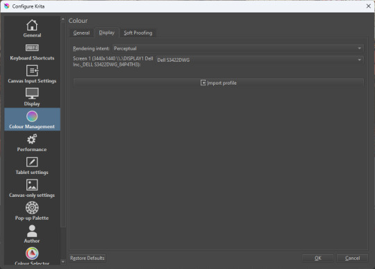
The tricky thing to consider is pasting into Krita from outside. By default, your copy-paste buffer does not have colour space metadata. Krita gives you the option to interpret it with your monitor's profile, or as sRGB. I believe the correct use is: if you're copying and pasting an image from the web, then sRGB is right; if you're pasting a screenshot, it has already been colour corrected, you should use 'as on monitor' so Krita will convert it back into the image's colour space.
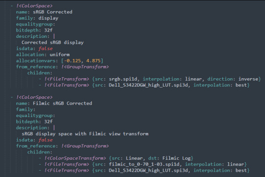
in Blender
Blender does not use ICC profiles, but a more complicated system called OpenColorIO. Blender supports various models of mapping between colour spaces, including Filmic and ACES, to go from its internal scene-referred HDR floating-point working space (basically, a space that measures how much light there is in absolute terms) to other spaces such as sRGB. By default, Blender assumes it can output to sRGB, P3, etc. without any further correction.
So. What we need to do is add another layer after that which takes the sRGB data and corrects it for our screen. This requires something called a Lookup Table (LUT), which is basically just a 3D texture that maps colours to other colours. You can generate a LUT using a program called DisplayCal, which can also be used for display calibration - note that you don't use the main DisplayCal program for this, but instead a tool called 3DLUT Maker that's packaged along with it. see this Stack Overflow thread for details.
Then, you describe in the OpenColorIO file how to use that LUT, defining a colour space.

The procedure described in the thread recommends you set up colour calibration as an additional view transform targeting sRGB. This works, but strictly speaking it's not a correct use of the OpenColorIO model. We should also set up our calibrated screen as an additional display definition, and attach our new colour spaces to that display. Also, if you want to use the 'Filmic' View Transform with corrected colours (or indeed any other), you need to define that in the OpenColorIO file too. Basically, copy whatever transform you want, and insert an extra line with the 3D LUT.
Here's how it looks for me:
in games (using ReShade)
So I mentioned above that games do not generally speaking do any colour correction beyond the option to manually adjust a gamma slider. However, by using a post-processing injection framework such as ReShade, you can correct colours in games.
If you want to get the game looking as close to the original artistic intent as possible, you can use the LUT generator to generate a PNG lookup table, save it in the Reshade textures folder, then you load it into the LUT shader that comes packaged with Reshade. Make sure to set the width, height and number of tiles correctly or you'll get janked up results.
However... that might not be what you want. Especially with older games, there is often a heavy green filter or some other weird choice in the colour design. Or maybe you don't want to follow the 'original artistic intent' and would rather enjoy the full vividness your screen is capable of displaying. (I certainly like FFXIV a lot better with a colour grade applied to it using the full monitor gamut.)
A 3D Lookup Table can actually be used for more than simply calibrating colour to match a monitor - it is in general a very powerful tool for colour correction. A good workflow is to open a screenshot in an image editor along with a base lookup table, adjust the colours in certain ways, and save the edited lookup table as an image texture; you can then use it to apply colour correction throughout the game. This procedure is described here.
Whatever approach you take, when you save screenshots with Reshade, it will not include any colour information. If you want screenshots to look like they do in-game when displayed in a properly colour managed application, you need to attach your monitor's ICC profile to the image. You can do this with an ImageMagick command:
magick convert "{path to screenshot}" -strip -profile "{path to ICC profile}" "{output file name}.webp"
This also works with TIFF and JPEG; for some reason I couldn't get it to work with PNG (you generate a PNG but no colour profile is attached.)
It's possible to write a post-save command in ReShade which could be used to attach this colour space info. If I get round to doing that, I'll edit into this post.
video
In MPV, you can get a colour-corrected video player by setting an appropriate line in mpv.conf, assuming you're using vo=gpu or vo=gpu-next (recommended). icc-profile-auto=yes should automatically load the monitor ICC profile from the operating system, or you can specify a specific one with icc-profile={path to ICC profile}.
For watching online videos, it seems that neither Firefox nor Chrome applies colour correction, even though the rest of the browser is colour-managed. If you don't want to put up with this, you can open Youtube videos in MPV, which internally downloads them using Youtube-DL or yt-dlp. This is inconvenient! Still haven't found a way to make it colour-corrected in-browser.
For other players like VLC or MPC-HC, I'm not so familiar with the procedure, you'll need to research this on your own.
what about HDR?
HDR is a marketing term, and a set of standards for monitor features (the VESA DisplayHDR series), but it does also refer to a new set of protocols around displaying colour, known as Rec. 2100. This defines the use of a 'perceptual quantiser' function in lieu of the old gamma function. HDR screens are able to support extreme ranges of brightness using techniques like local dimming and typically have a wider colour gamut.
If your screen supports it, Windows has a HDR mode which (I believe) switches the output to use Rec.2100. The problem is deciding what to do with SDR content on your screen (which is to say most things) - you have very little control over anything besides brightness, and for some reason Windows screws up the gamma. Turning on HDR introduced truly severe colour banding all over the shop for me.
My colorimeter claims to be able to profile high brightness/hdr screens, but I haven't tested the effect of profiling in HDR mode yet. There is also a Windows HDR calibration tool, but this is only available on the Microsoft store, which makes it a real pain to set up if you've deleted that from your operating system in a fit of pique. (Ameliorated Edition is great until it isn't.)
Anyway, if I get around to profiling my monitor in HDR mode, I will report back. However, for accurate SDR colour, the general recommendation seems to be to simply turn it off. Only turn it on if you want to watch content specifically authored for HDR (some recent games, and HDR videos are available on some platforms like Youtube). It's a pain.
is this all really worth the effort?
Obviously I've really nerded out about all this, and I know the likely feeling you get looking at this wall of text is 'fuck this, I'll just put up with it'. But my monitor's gamma was pretty severely off, and when I was trying to make a video recently I had no idea that my screen was making the red way more saturated and deep than I would see on most monitors.
If you're a digital artist or photographer, I think it's pretty essential to get accurate colour. Of course the pros will spend thousands on a high end screen which may have built in colour correction, but even with a screen at the level I'm looking at (costing a few hundred quid), you can do a lot to improve how it looks 'out of the box'.
So that's the long and short of it. I hope this is useful to someone to have all of this in one place!
I don't know if we'll ever reach a stage where most monitors in use are calibrated, so on some level it's a bit of a fool's errand, but at least with calibration I have some more hope that what I put in is at least on average close to what comes out the other end.
94 notes
·
View notes
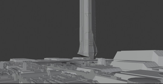
Text

『Cyberpunk city TOKYO』by Masayuki Koyama
211 notes
·
View notes
Photo

(SLASH_Art(@slash_soft)さんのメディアポスト / Xから)
49 notes
·
View notes
Text

Dance Dance Revolution 3rdMIX OST (1999)
160 notes
·
View notes
Last Seen Blogs
angelasrtn
A N G E L A S R T N

colourcraft
Consider the Caves

h-fangtm
H-FANG

sumthinpumpkinplease
All Things Fall & Coffee

capcliffcabanlit
Untitled