#charts and graphs
Text

In before: The dash, which is how I personally use tumblr, is in chronological order from exclusively people I follow.
5K notes
·
View notes
Photo
341 notes
·
View notes
Photo

Those drapes. Those lamps!?
#Bob Jones University#Financial Crisis#Charts and Graphs#Revenue#Expenses#990s#501c3#IPEDS#Office#Bob Jones Jr
2 notes
·
View notes
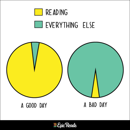
Text
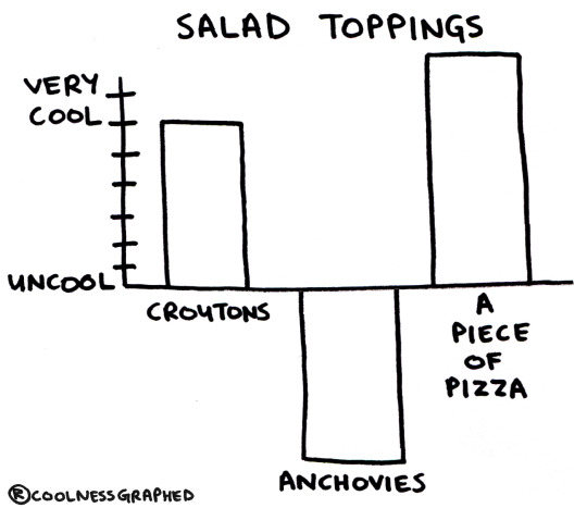
#salad#salad toppings#pizza#anchovies#food#croutons#bar charts#graphs#lol#charts and graphs#coolness graphed#cool
46 notes
·
View notes
Photo

Sissel Tolaas
13 notes
·
View notes
Text
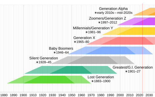
Those born between 2010 and 2024 make up the group called Generation Alpha. They’re likely to grow to more than two billion people, which could make them the biggest generational cohort so far.
0 notes
Text
Help I can't find that one post that goes like beep boop boop bop and it has a lady with like charts and graphs and it's the SpongeBob remix
#spongebpb#spongebob#remox#remix#music#help#find#help me find#also for you#beep bee boo bop#beep boop bop#bee be boop be be boo bop#charts and graphs#a lady did it
0 notes
Text
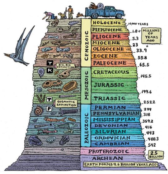
Guide For The Geological Time Periods In Order
#geology#geologists#charts#graphs#infographics#infographic#time periods#educational#earth#science#interesting
9K notes
·
View notes
Text
Tier Ranking the Ranking Tiers:
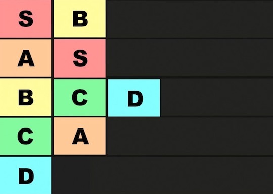
B is so Amazing!
A is okay but even in last it's not bad, it's just not as good as S.
2K notes
·
View notes
Text
Gonna spend some time cleaning up the Secret Life Spreadsheet for the final post but I just need everyone to see this absolutely WILD graph that was so insane I had to triple fact check to make sure I wasn't losing my mind.
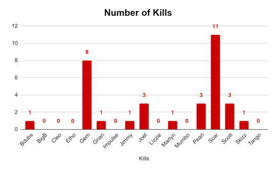
Are. Are you kidding me.
I swear I'm about to make one of these for every other season because I simply MUST know if this has always been the case, that one or two people get most of the kills. There's no way right??? Scar was simply on something this finale (Gem is always Like That I was expecting her to look this way)
Also fun tidbit: all three of Etho's deaths were because of Scar. He killed that man three times. Etho is the only person who died the same way every time.
#as i was making the chart i was thinking to myself#'huh scar sure did get a lot of kills this ep wonder how that's gonna affect the graph'#AND THEN I MADE THE GRAPH#scar you legend these fools are not immune to the good times#also sidenote: the etho's wither and grian's warden aren't credited to them they're credited as '1 stick wither' and 'ethos dishwasher'#might change that later idk#secret life spoilers#goodtimeswithscar#geminitay#secret life smp#secret life#life series#trafficblr#saf does stats
1K notes
·
View notes
Photo

Top 10 Bell Curve PPT Templates for Depicting a Normal Distribution
Do you often find yourself lost among numbers? Do statistics and data overwhelm you? Are you worried about how to comprehend and explain your research findings? Well, dealing with different variables and massive numbers can be a cumbersome task.
But let’s not forget that understanding data is the key to unlocking its potential.
And that’s where the bell curve comes to your rescue! It enables you to showcase facts and figures in a simplified manner for better conception and interpretation.
0 notes
Text

Image I.D. — A Venn Diagram. One circle is labeled “Call the Midwife.” The other circle is labeled “Fairly Oddparents.” The overlapping portion is labeled “Timmy Turner.” — End I.D.
46 notes
·
View notes
Photo

440 notes
·
View notes
Photo

Who remembers the wig years?
#Bob Jones University#Financial Crisis#Charts and Graphs#Revenue#Expenses#990s#501c3#IPEDS#BJUChapel#Pulpit#toupee#BOb Jones Jr#Wig#FMA
3 notes
·
View notes
Text

646 notes
·
View notes
Text
the linguistics of hyperbolic tumblr tags
a graph of hyperbolic reactions in the tags across the axes of Totally Normal to Feral and level of violence. the red italics indicate horny reactions. this isn’t particularly scientific im just going off of vibes. consultation for Horny™️ vibes from @playing-for-keeps
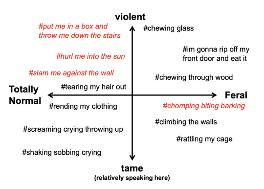
#internet linguistics#tumblr linguistics#tumblr dialect#hyperbole#graph meme#alignment chart#linguistics#tumblr#my edits#just some thoughts based on what ive been observing in my corner of the internet these days#the chaos linguist speaks
2K notes
·
View notes
Last Seen Blogs

whiskeyyouth
Whiskey Youth

ilustrarea-com-blog
Ilustrarea

bud-4-you
Untitled

bigbootylovee
LOVE OF BIG BOOTY

lorehead
WRITING BLOG!!