#edition neue texte
Text

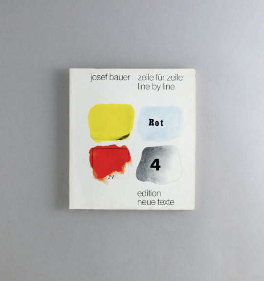
Josef Bauer: Zeile Für Zeile / Line by Line, Edition Neue Texte, Linz, 1977 [Ecart-Books]
12 notes
·
View notes
Text

ask and you shall receive @sinnsenke <3

inspired by this
#own post#spatort#wusste nicht ob ich da ein neues post raus machen sollte. here we are. sah komisch aus als reblog#aber so mit credit und allem ist doch ok in neuem post. oder? pls tell me if not#edit: jetzt mit alt text
35 notes
·
View notes
Note
is there any possibility of keeping the legacy editor as an option? for content creators, the new editor completely ruins the quality of our gifs/edits/art and it's really frustrated to be forced into using an editor that's going to kill the quality of the creations that we spend time perfecting.
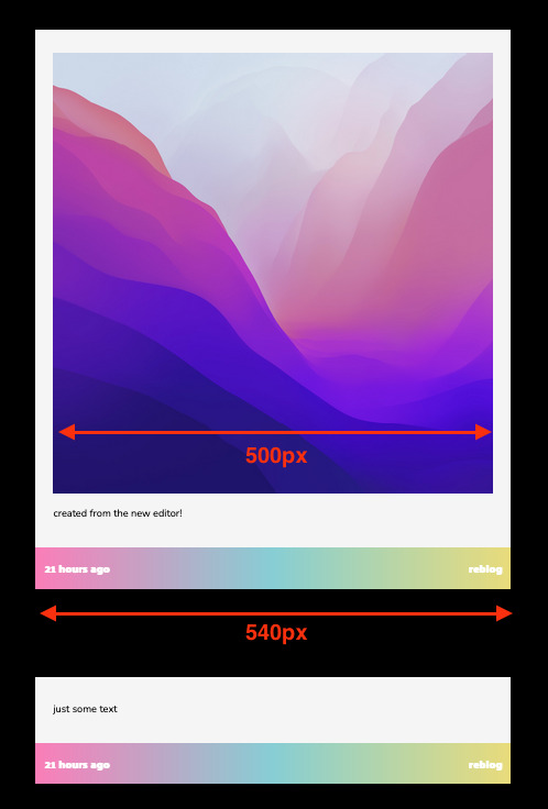
Answer: Hello, @junghaesin!
Thanks for writing in. And thank you to everyone else who has shared similar feedback.
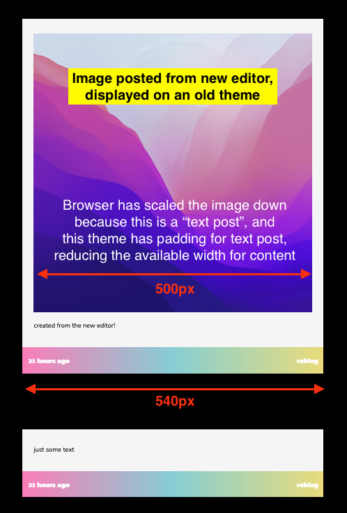
So, tl;dr—this is actually a blog theme issue. Your theme is not showing images in posts created by the new editor as you expect.
GIFs uploaded via the legacy editor or the new editor are actually processed the same way. There is no difference in bit depth or in resolution. You can see this by looking at your posts inside the Tumblr dashboard instead (e.g. instead of yourblog.tumblr.com/post/id, go to tumblr.com/yourblog/id).
The reason why you see a quality difference is because posts created by the new editor are treated as text posts by older blog themes. Themes often add padding around all the content of a text post—including any images that appear in it. If your theme presents posts as 540px wide, then in a text post, with that additional padding, the available space for your images is actually less than 540px. As a result, the browser will scale your images down to fit, and when this happens, image quality takes a hit.
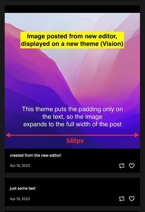
The solution—update to a more modern, up-to-date theme, like Vision or Stereo. Theme developer @eggdesign also built a theme template that works with new posts, that you can build on top of! These modern themes apply padding only to text blocks rather than the whole post, so image blocks receive no padding and are served at their full 540px width, just like the Dashboard. From what we’ve seen, this fixes all of the issues about perceived GIF quality on blogs.
We know. Changing your theme is a lot of work. In the near future, we’re looking into ways to make this transition easier—for example, helping you identify themes that work well with new posts in the Theme Garden. But working with new posts is the way forward—the new posts use a format that opens up a lot of opportunities in the future.
Why can’t you add post types to posts from the new editor? Why not serve new posts as photo posts instead of text posts?
The new editor uses a new post format, called Neue Post Format (NPF). NPF has given us a huge boost in flexibility when it comes to what content can be in posts—remember the time when you couldn’t even upload images to reblogs? Or how old chat and quote posts magically change authors? NPF helped us fix both of these things. It removed constraints—including post types, which limit each post to one specific type of content.
But existing blog themes still need to be able to display these posts. Because NPF posts can include media anywhere (while most of the old post types have a rigid structure for media), it was safest for us to categorize NPF posts as the least constrained post type—text posts. It’s the best we can do to make these posts backward-compatible with existing blog themes.
In lieu of post types, we’ve added an {NPF} theme variable per post that custom themes can leverage. Theme developers must update their themes to take advantage of this new data to retain full control of the HTML output of posts.
You can read more about these decisions, and the Neue Post Format specification, here and here.
Thanks for your feedback, and keep it coming!
With love,
—The Tumblr WIP Team
1K notes
·
View notes
Text
BOOMERANG — group edit PSD template
A group edit template designed to look like a metal band poster to fulfill all of your punk rock dreams! This is great for a fun alternate universe or to bring a convincing visual to a fictional band.
All photos and text are fully customizable. This template is recommended for those with intermediate experience with Photoshop.
DETAILS
Fonts used: Bebas Neue and Geizer
Sample images are credited to their rightful owners
Do not copy, steal credit, or monetize this graphic template (see full guidelines)
Customization, including removing elements of this template to add to another, is permitted so long as the other template owner(s) allow it as well
This is a premium template; please do not share with others
Please like/reblog and credit me by linking back to my blog if you use this template
Optionally, please tag me or send me a link so I can see how you've used this!
* download on payhip
#psd#psd template#character psd#photoshop psd#roleplay psd#template psd#dailyresources#template resources#rp resources#rp template#chara psd#psd character#character template#group psd#psd roleplay#roleplay resources#* mine#* chara#* psd
30 notes
·
View notes
Note
Hi! Can I ask how you did the text in this post? It's beautiful! 64(.)media(.)tumblr(.)com/5e5d23e7809c6ee181ad52142050aa15/ac1a9f9dc72b17a7-9e/s540x810/262cc36a82324d0652af8e28f14e307cf465c756(.)gifv
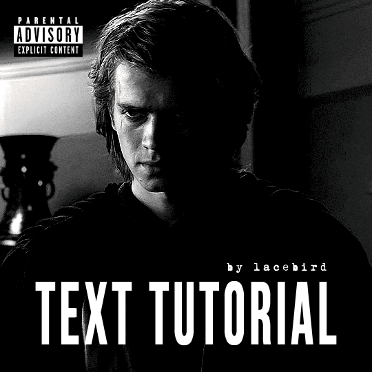
ULTRAVIOLENCE GIF TUTORIAL
Here's a little tutorial on how I made the first gif in this set. It's pretty easy to make, but let me know if you need more help! Also apologies for the delay, i had computer issues!
Just a heads up before we start — the dimensions for this gif are 540x540px
FONT
There are two ways you can go about this:
Download the Ultraviolence font. After you've downloaded it, open it up in Photopea like you would with any file and it will show up in the list of fonts.
Use a pre-installed font in Photopea called Bebas Neue. This is the font I used when making this set. In order for it to resemble the original album font, though, I had to edit it.
The following is my process for making this gif using the second option. If you downloaded the Ultraviolence font, the steps below won't be necessary.
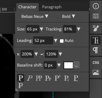
For the font you need to do some adjustments in the Character panel. Below is a screenshot of all the edits made to the text layer.
Essentially what you want to do is:
Set the font to bold. After you've selected Bebas Neue, do to the dropdown right next to it and select Bold.
Increase the tracking so that there is some space between the letters.
Make the text bolder by clicking on the first P at the bottom of the window (see screenshot). We've already selected the bold version of the font, but I personally want it even thicker, so I select this option.
Stretch out the text to make it taller. I set this to 200%
Stretch out the text to make it wider. I set this to 120%
I recommend putting the original album cover below the text layer so you can stretch the text as you go until it matches. The reason I'm not giving you exact numbers is that it will all depend on your text. Play around until you're happy!
BASE COLORING
I won't go too in depth here about how I color my gifs, but here is the gist of it:
Curves (auto, check the box that makes the scene brighter)
Gradient map (blend mode: saturation)
Gradient map (blend mode: soft light, lower opacity if too dark)
Selective color (adjust the whites, blacks and neutrals).
FINISHING TOUCHES
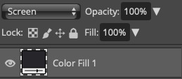
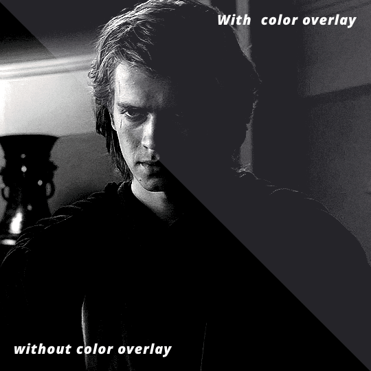
After you've done your base coloring, you can decide if you wanna add a color overlay to match it to the album cover. Make a new color overlay layer, type in #26252a in the popup window and then change the layer blend mode to screen.

Here's the difference between the two. In the original set I made, I didn't use a color overlay. Do whatever floats your speeder!
Lastly, you can't forget the explicit sticker! I like to use this one from Wikipedia
I hope this helps anyone out! Feel free to ask if anything is unclear <3 Sending lots of giffy love to you all!! 💜💜💜💜
#photopea#photopea tutorial#photopeablr#photoshop resources#usergif#usermaguire#gif tutorial#giffing tutorial#resources#gif resources#tutorial#this tutorial is v text heavy so there isn't a lot of examples#hope it's not too difficult to understand#it's v late so make sure to ask if you don't get anything and i'll try to explain better!
18 notes
·
View notes
Text
> junghaesin hat gefragt:
> Gibt es irgendeine Möglichkeit, den alten Editor als Option beizubehalten? Der neue Editor ruiniert die Qualität unserer Gifs/Edits/Kunstwerke völlig, und es ist frustrierend, einen Editor verwenden zu müssen, der die Qualität unserer Kreationen, für die wir viel Zeit aufwenden, ruiniert.
Hi und danke für deine Frage. Und danke auch an alle anderen, die uns Feedback hinterlassen haben.
tl;dr: Hierbei handelt sich um ein Problem mit dem Blog-Template. Dein Template zeigt Bilder in Einträgen, die mit dem neuen Editor erstellt wurden, nicht wie erwartet an.
GIFs werden im Legacy-Editor und im neuen Editor gleich verarbeitet. Es gibt keine Unterschiede in der Bittiefe oder in der Auflösung. Das wird deutlich, wenn du dir deine Einträge im Tumblr-Dashboard ansiehst (also statt deinblog.tumblr.com/post/id auf tumblr.com/deinblog/id). Der Grund für diese Qualitätsunterschiede besteht darin, dass Einträge, die mit dem neuen Editor erstellt wurden, in älteren Blog-Templates als Texteinträge interpretiert werden. Durch Templates wird häufig der gesamte Inhalt eines Texteintrags – einschließlich der darin enthaltenen Bilder – mit einem Padding versehen. Wenn dein Template Einträge mit einer Breite von 540 px darstellt, dann ist der verfügbare Platz für deine Bilder in einem Texteintrag mit diesem zusätzlichen Padding tatsächlich weniger als 540 px. Dies hat zur Folge, dass der Browser deine Bilder verkleinert, um sie anzupassen, und wenn dies geschieht, verschlechtert sich die Bildqualität.
Bild, das mit dem neuen Editor erstellt wurde, in einem alten Template. Der Browser hat das Bild verkleinert, weil es sich um einen "Texteintrag" handelt, und dieses Template verwendet Padding für Texteinträge, wodurch die verfügbare Breite für den Inhalt reduziert wird.
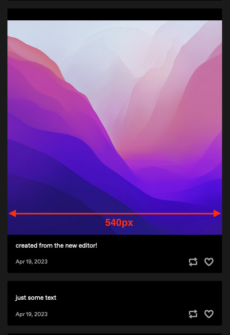
Bild, das mit dem neuen Editor erstellt wurde, in einem neuen Template (Vision). Bei diesem Template wird das Padding nur für den Text verwendet, sodass das Bild die gesamte Breite des Eintrags einnimmt.
Die Lösung: Nutze ein neueres, aktuelles Template wie Vision oder Stereo. Template-Designer @eggdesign hat eine Template-Vorlage für neue Einträge erstellt (EN), die du als Grundlage nutzen kannst. Bei diesen modernen Templates wird das Padding nur auf Textblöcke und nicht auf den gesamten Eintrag angewendet, sodass Bildblöcke kein Padding erhalten und in ihrer vollen Breite von 540 px angezeigt werden, genau wie im Dashboard. Soweit wir gesehen haben, werden damit alle Probleme mit der wahrgenommenen GIF-Qualität in Blogs behoben.
Uns ist klar, dass es viel Arbeit ist, das Template zu wechseln. In Zukunft werden wir nach Möglichkeiten suchen, diesen Übergang zu erleichtern – zum Beispiel, indem wir dich dabei unterstützen, Templates im Template-Garten zu finden, die mit neuen Einträgen gut funktionieren. Aber der neue Eintragseditor ist der Weg in die Zukunft. In den neuen Einträgen kommt ein Format zum Einsatz, das viele neue Möglichkeiten eröffnet.
Warum kann man mit dem neuen Editor keine Eintragstypen zu Einträgen hinzufügen? Warum werden neue Einträge nicht als Fotoeinträge anstelle von Texteinträgen angezeigt?
Der neue Editor verwendet das Neue Post Format (NPF). Durch das NPF lassen sich die Inhalte in den Einträgen viel flexibler gestalten. Kann sich noch jemand daran erinnern, dass man früher nicht einmal Bilder in Reblogs hochladen konnte? Oder wie bei alten Chat- und Zitateinträgen wie von Zauberhand der:die Autor:in verändert wurde (EN)? Mit dem NPF konnten wir diese Probleme lösen. Einschränkungen wurden entfernt – einschließlich der Eintragstypen, die jeden Eintrag auf eine bestimmte Art von Inhalt beschränken.
Die vorhandenen Blog-Templates müssen jedoch weiterhin in der Lage sein, diese Einträge anzuzeigen. Da NPF-Einträge überall Medien enthalten können (während die meisten der alten Eintragstypen eine starre Struktur für Medien haben), war es für uns am sichersten, NPF-Einträge als den am wenigsten eingeschränkten Eintragstyp zu kategorisieren – Texteinträge. Das ist die beste Lösung, um diese Einträge mit bestehenden Blog-Templates rückwärtskompatibel zu machen.
Anstelle von Einstragstypen haben wir eine {NPF}-Templatevariable pro Eintrag hinzugefügt, die in benutzerdefinierten Templates verwendet werden kann. Template-Entwickler:innen müssen ihre Templates aktualisieren, um diese neuen Daten zu nutzen und die volle Kontrolle über die Darstellung der HTML-Ausgabe von Einträgen zu behalten.
Mehr zu diesen Entscheidungen und dem Neue Post Format findest du hier (EN) und hier (EN).
34 notes
·
View notes
Text
junghaesin a demandé :
serait-il possible de maintenir l'usage de l'éditeur original via une option ? pour les créateurs de contenu, le nouvel éditeur détériore totalement la qualité de nos GIF/edits/créations artistiques et c'est vraiment frustrant d'être contraint d'utiliser un éditeur qui va enlaidir des créations que l'on a mis autant de temps à peaufiner.
Tout d'abord, bonjour 👋 ! Et merci d'avoir pris le temps de nous écrire et de nous faire part de vos remarques - partagées également par d'autres utilisateurs.
Alors, pour aller droit au but : le fautif, c'est le thème du blog ! Le thème que vous utilisez n'affiche pas convenablement les images au sein des billets créés avec le nouvel éditeur.
Qu'ils soient importés avec l'éditeur original ou le nouvel éditeur, les GIF sont traités selon le même processus. Il n'y a aucune différence, qu'elle soit qualitative ou en termes de résolution. Vous pourrez vous en assurer en consultant vos billets directement via le tableau de bord : au lieu d'utiliser l'URL votreblog.tumblr.com/post/id, essayez de passer par tumblr.com/votreblog/id.
La différence qualité que vous percevez s'explique par le fait que les billets créés avec le nouvel éditeur sont interprétés comme des billets Texte par d'anciens thèmes de blog. Les thèmes ajoutent souvent une marge tout autour du contenu des billets textuels, et cela s'applique inévitablement aux images qui s'y trouvent. Si le thème utilisé affiche les billets avec une largeur de 540 px, lorsque l'on déduit la marge appliquée à un billet Texte, l'espace restant pour afficher l'image sera inférieur à 540 px. Le navigateur va donc redimensionner l'image pour qu'elle puisse s'afficher dans l'espace restant, ce qui va conduire malheureusement à une perte de qualité.

Ci-dessus, voilà à quoi ressemble une image publiée avec le nouvel éditeur lorsqu'elle est affichée via un ancien thème. L'interprétant comme un billet Texte, le navigateur a réduit la qualité de l'image. De plus, comme le thème ajoute des marges pour ce type de billets, la zone d'affichage de l'image s'en trouve diminuée.

Même image, publiée avec le nouvel éditeur, mais affichée via un nouveau thème (Vision). Ce thème n'ajoutant des marges que pour les billets Texte, l'image dispose de toute la place possible pour exprimer son plein potentiel.
La solution ? Privilégier l'utilisation d'un thème actualisé et/ou plus moderne, comme Vision ou Stereo. Le concepteur de thème @eggdesign a par ailleurs élaboré un modèle type de thème qui fonctionne avec les billets du nouvel éditeur (en anglais). Vous pouvez l'utiliser comme point de départ ! Ces thèmes dans l'ère du temps n'appliquent des marges qu'aux blocs textuels et plus à l'intégralité du billet. Ainsi, un bloc Image ne sera impacté par aucune marge et proposera sans contrainte son contenu sur une largeur de 540 px, de la même manière que le tableau de bord. D'après nos constatations, cela résout l'ensemble des problèmes de qualité d'affichage des GIF qui nous ont été signalés.
Mais vous avez raison : changer de thème de blog représente beaucoup de travail. C'est pourquoi nos équipes réfléchissent à des moyens permettant de faciliter ce genre de migration. Par exemple, les thèmes qui fonctionnent à merveille avec les nouveaux billets sont clairement identifiés dans le Jardin des Thèmes. Mais il nous paraît évident que la compatibilité avec les nouveaux formats de billets est la seule solution tournée vers l'avenir, offrant par la suite de nombreuses perspectives.
Pourquoi n'est-il pas possible d'ajouter le choix du type de billet dans le nouvel éditeur ? Et pourquoi ne pas interpréter les nouveaux billets en tant que billet Photo plutôt que billet Texte ?
Le nouvel éditeur de billets utilise un format intitulé "Neue Post Format" (NPF). Ce dernier a amélioré grandement la flexibilité qui nous était permise quant au contenu des billets. Vous souvenez-vous quand il n'était même pas possible d'ajouter d'images aux reblogs ? Et lorsque les anciens billets Discussion et Citation changeaient comme par magie d'auteurs (en anglais) ? Le format NPF a été salvateur pour régler ce genre de problème. Il retire par ailleurs cette contrainte archaïque qui impliquait de devoir associer un billet à un seul et unique type de contenu.
Mais les thèmes de blog se devaient d'être capables de pouvoir afficher ce nouveau format de billets. Et comme un billet NPF peut contenir des médias à différents endroits de sa structure (contrairement aux anciens billets qui étaient davantage rigides sur ce point), il était plus sûr pour nous de catégoriser les billets NPF en tant que billets Texte : le type de billet le moins contraignant. C'était pour nous la seule alternative possible pour nous assurer de la rétrocompatibilité de ces billets avec les thèmes de blogs existants.
En lieu et place des types de billet, nous avons ajouté une variable {NPF} sur chaque billet afin qu'elle puisse être exploitée dans les thèmes. Il est de la responsabilité des développeurs de mettre à jour leurs thèmes et ainsi de tirer profit de cette variable pour contrôler avec précision le rendu HTML des billets.
Enfin, pour en apprendre davantage au sujet de ces décisions et des spécifications du Neue Post Format, consultez ce billet et celui-ci (tous deux en anglais).
#nouveautés#réponses à vos remarques au sujet de l'éditeur original#conseils et astuces avec le nouvel éditeur et les thèmes
29 notes
·
View notes
Text
An Honest Guide to Tumblr for Twitter Refugees (Part 2)
Part 0: What the heck is Tumblr and is it right for me?
Part 1: Configuring settings + customizing your Tumblr
Covered in Part 2:
Posting basics (introducing the editor, different post types)
Best practices (stating trigger warnings, adding image IDs, indicating sources, etc)
Post controls (who can reblog and reply to your posts)
Note: Like Part 1, I suggest you follow this guide while on desktop Tumblr. This post also contains lots of images without ID. Such images though are basically just screenshots of what's already described in the post body.
Posting Basics
I was gonna talk about curating your dashboard first, but considering how Tumblr veterans would think you’re a bot and just block you if they see your blog is empty, I think it’s best if we cover posting first.
Tumblr Editor
Before everything else, let’s get to know the editor.
On your desktop dashboard, you get to pick from different post types: Text, Photo, Quote, Link, Chat, Audio, and Video.

It should be pretty self-explanatory what they do, but you know what? THESE DON’T MATTER.
I talked about this briefly in Part 1, so lemme just copy-paste it here:
Although Tumblr is still advocating its different posts types (text, image, audio, video, etc.), they’ve actually been rolling out changes to their editor where only a single post type is used (text) and you just add media to it. This is called NPF (Neue Post Format). On desktop, you can turn off the beta editor and thereby turn off NPF. However, on mobile web and on the app, posts can only be made in NPF.
To put it simply: There is no difference at all between the different post types. The only difference is that when you click on a post type (for example, photo), the first block* on your post will be related to that post type (e.g. a photo block).
* If you’ve used WordPress before, then this should be familiar. But if not, then here’s a quick explanation: A block is basically a component used to create a post (text block for text, image block for images, video block for videos, etc.)
More technical info about the block editor and how to use it can be found here.
So my point is, don’t sweat too much over the different post types.
---
You can also write posts in HTML / Markdown!
If the default rich text editor is not enough for you, then get more power by using the HTML editor. It doesn't support all HTML elements, but at least you can do fancy stuff like adding some gradient text:
gradients are cool
To switch editors, click on the gear icon at the top of the editor, and in the Text Editor dropdown, choose between Rich Text, HTML, or Markdown. If you’re curious about Markdown, learn more about it here.
---
Some neat stuff you have to know about posting on Tumblr:
A. YOU CAN EDIT POSTS!!!
We’ve had an edit button here for years, and best of all, it’s free! However, for posts of yours that have been reblogged, even if you do edit the original post, the edits won’t be reflected on the reblogged version. More about reblogging in Part 4 of this guide.
B. You can post loooong articles here
Like Twitter, Tumblr also has a character limit for text. However, this limit is on a per-paragraph basis and not for your entire post. And it’s such a generous limit that I’ve never once hit it. I don’t even have to keep tabs on how many characters I’ve made. You can find a list of all the limits you have to keep in mind when using the NPF/beta editor at the bottom of this article.
C. You can save drafts and schedule posts
If you can’t finish that post right now, no worries. Just save it to your drafts first and finish it later. Or, if you’ve prepared a cool post for New Year even though it’s still November, just schedule that post to publish on a New Year. More about queue/scheduling in Part 4 of this guide.
---
Best Practices
I don’t think I need to do a step-by-step on how to use the editor because it’s pretty intuitive, so let’s talk about best practices when it comes to posting.
On stating trigger/content Warnings
In Twitter, you do this:
// tw: r*pe, g*re, m*utilation
.
.
.
.
[actual triggering content]
Please don’t do this.
First of all, here on Tumblr, we do not censor out those “problematic” words. You have to spell them out so that people who have such words filtered in their settings will actually not see them. Getting content filters to work will be a pain if people have to keep in mind all variations of rape (r*ape, r@pe, r4pe, etc).
Second, those multiple dots don’t do anything. Instead, utilize the “Read More” block. This block will hide everything that comes after it under a “Keep Reading” link.
On desktop, you click on this icon that has a zigzag sandwiched between two horizontal lines:
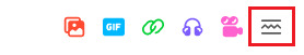
On mobile, you do it by typing :readmore: and then hitting Enter.
(I’ll talk more about triggers/content warnings in Part 3, which will cover Tags)
Just spell everything out actually, not just trigger words
Instead of oomfs or moots, say mutals. Instead of unalive, say murder. No need to shorten or tone anything down here.
Add image ID’s
Image ID’s are basically descriptions of an image. This is important for people using screen readers. I’m guilty for not always following this, but just trust me on this.
On desktop, you hover over the image, click on the three dots that appear, and then click “Update image description.” Keep the description in simple words and state exactly what the image contains. I’m doing it for this particular image below:
On dashboard and on some themes, the image ID will be shown when you click on the ALT button that appears when you hover over the image.
Sometimes, when OP forgets to put an ID, someone will reblog the post and add the ID themselves. If you see someone doing this on one of your posts, then please be an angel and add that ID to the original post. Image descriptions will be more useful/have more impact if they’re actually part of the original post.
---
Link back to source
If you’re sharing someone else’s content from another site, please indicate the source. You can do this by adding a link to the source from within the post body itself, or by using Tumblr’s content source feature in the editor:
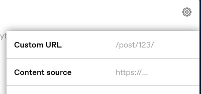
Click on the little gear above the editor, and in the “Content source” field, paste your link.
---
Do not repost other people’s gifs/edits
Sometimes you see a cool gif here on Tumblr that you want to use on your own post. People are generally fine with that, but you have to do it the right way.
DO NOT DO THIS: Downloading the gif and then uploading it to your own post.
Instead, DO THIS: Use Tumblr’s GIF block and search for a gif from there. Doing it this way would link back to the OP and even notify them in their Activity.
Here’s an example of how it looks:

The gif above is from my side blog, and below the image, it says “GIF by fyeahbachisagi.”
Post Controls
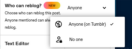
If you don’t want a certain post of yours to get around too much, you can disable reblogs on it. Click the gear icon at the top of the editor, and in the “Who can Reblog?” dropdown, choose from Anyone or No One.
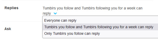
Limits on Replies, however, is on a per-blog setting and not per post. Go to tumblr.com/settings/blog/username, and scroll all the way down until you see the setting for Replies.
---
Okay, that’s all for Part 2! Next up, in Part 3, I will talk about utilizing tags
Update: Part 3 is up! Well, kinda... Not exactly a guide catered to Twitter refugees, but still a guide to tagging:
A Guide to Tagging on Tumblr: Types of Tags
54 notes
·
View notes
Note
what kind of fonts and editing apps do you use to get the 2013 aesthetic!! ps i love your account so much!! 🤍
Hi babe!
Thank you so much for the compliment!! You just made my day 🥹
Anyways, can you please go into more detail, so I can give you the best answer 💖
Butttt, here are some apps and fonts I use for my tumblr posts:
Shoplook: this app is literally my baby. I use this app for my outfit posts
Phonto: used for text and other miscellaneous things
Pinterest: of courseeee! This is where I get inspo and pics to re-post
DaFont (website): where I get fonts for free if Phonto doesn’t have one(s) I’m looking for
Instagram: I use the Instagram filters for the 2013-2016 aesthetic. My faves are ‘fade cool’ ‘valencia’ ‘amaro’ and ‘gingham’
Fave fonts:
Futura
Helvetica
Impact label
Bebas neue
Blackout midnight
Beauty and the beast
Let me know if you want me to get into more detail and/or if I answered your question correctly <3
4 notes
·
View notes
Text
This post was created and written in Emacs as Markdown (with Frontmatter YAML), and then I used my mostly-finished Python code to post it as NPF using the Tumblr API.
The Python packages I'm using are
`pytumblr2` for interacting with the API using Tumblr's "Neue Post Format",
`python-frontmatter` for reading the frontmatter (but not writing; I hate how it disruptively rearranges and reformats existing YAML),
`mistune` for the Markdown parsing, for now with just the strikethrough extension (`marko` seems like it would be a fine alternative if you prefer strict CommonMark compatibility or have other extension wants).
The workflow I now have looks something like this:
Create a new note in Emacs. I use the Denote package, for many reasons which I'll save for another post.
Denote automatically manages some fields in the frontmatter for the information it owns/manages.
Denote has pretty good code for managing tags (Denote calls them "keywords"). The tags go both in the file name and in the frontmatter. There's some smarts to auto-suggest tags based on tags you already use, etc.
The usual composable benefits apply. Denote uses completing-read to get tags from you when used interactively, so you can get nicer narrowing search UX with Vertico, Orderless, and so on.
So when I create a new "note" (post draft in this case) I get prompted for file name, then tags.
I have my own custom code to make tag adding/removing much nicer than the stock Denote experience (saves manual steps, etc).
Edit the post as any other text file in Emacs. I get all the quality-of-life improvements to text editing particular to my tastes.
If I stop and come back later, I can use any search on the file names or contents, or even search the contents of the note folder dired buffer, to find the post draft in a few seconds.
Every time I save this file, Syncthing spreads it to all my devices. If I want, I can trivially use Emac's feature of auto-saving and keeping a configurable number of old copies for these files.
I have a proper undo tree, if basic undo/redo isn't enough, and in the undo tree UI I can even toggle displaying the diff for each change.
My tools such as viewing unsaved changes with `git diff`, or my partial write and partial revert like `git add -p`, are now options I have within easy reach (and this composes with all enhancements to my Git config, such as using Git Delta or Difftastic).
After a successful new post creation, my Python code adds a "tumblr" field with post ID and blog name to the frontmatter YAML. If I tell it to publish a post that already has that information, it edits the existing post. I can also tell it to delete the post mentioned in that field, and if that succeeds it removes the field from the file too.
The giant leap of me being able to draft/edit/manage my posts outside of Tumblr is... more than halfway complete. The last step to an MVP is exposing the Python functions in a CLI and wrapping it with some Emacs keybinds/UX. Longer-term TODOs:
Links! MVP is to just add links to my Markdown-to-NPF code. Ideal is to use Denote links and have my code translate that to Tumblr links.
Would be nice to use the local "title" of the file as the Tumblr URL slug.
Pictures/videos! I basically never make posts with media, but sometimes I want to, and it would be nice to have this available.
6 notes
·
View notes
Photo

Gino De Dominicis,in Arte Povera. 13 italienisch Künstler – Dokumentation und neue Werke, [Anselmo, Boetti, De Dominicis, Fabro, Kounellis, Merz, Paolini, Penone, Pisani, Pistoletto, Prini, Salvo, Zorio], Edited by Armin W. Boerne, Eva Madelung and Peter Nemetschek, Texts by Germano Celant, Luciano Fabro, Mario Merz, Giulio Paolini, Giuseppe Penone, Michelangelo Pistoletto, and Gilberto Zorio, Kunstverein München, München, 1971 [Exhibition: May 26 – June 27, 1971]
#graphic design#art#exhibition#catalogue#catalog#gino de dominicis#giovanni anselmo#alighiero boetti#luciano fabro#jannis kounellis#mario merz#giulio paolini#giuseppe penone#vettor pisani#michelangelo pistoletto#emilio prini#salvo#salvatore mangione#gilberto zorio#armin w. boerne#eva madelung#peter nemetschek#germano celant#kunstverein münchen#1970s
79 notes
·
View notes
Note
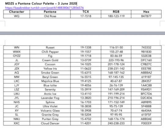
hey would you possibly be willing to share how you did the pantone gifset? or would you like to a tutorual?
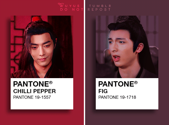
hi anon! I’m gonna assume you’re talking about this edit
I actually did this… a really long time ago (posted exactly 2 years ago on 3 june 2020 in the thick of the plague lalskdf) and my giffing style/ procedure has changed a lot since then, so the below will be a mixture of (what I can recall) of what I did back then + how I would’ve done it had I done this set today (by remaking one gif out of the 10)
1. google around for pantone colours and match them to the characters
I specifically googled for pantone colours with names - I don’t actually think pantone colours have official names (at least in my line of work when I’m exposed to pantone colours, they’re referred to only with their number codes), so I have a feeling whatever I found on google then were just random names generated by other people. you’ll probably need to do a bit of searching, especially if you want to find a name that “fits” the character
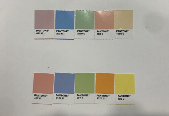
actual pantone chips from my work! they... don’t have names...
this is more of my personal way of planning out my gifsets - map out which character matches to which colour so that you know who you’re missing. save the colours you’ve selected so that you can use that colour later!
2. figure out the layout
create your file first, in my case I used 540x400
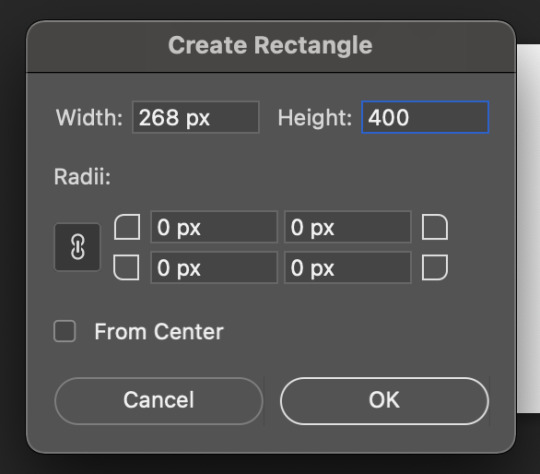
then use rectangle (U) to create a rectangle and fill it with the colour for that particular pantone. back when I was doing this set, I’d used the rectangular marquee (M) and filled it in with the colour, but the rectangle tool is much better since it gives more control over specific dimensions

position and duplicate
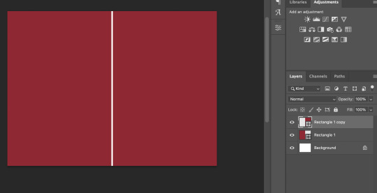
then recolour the duplicated to your next pantone colour
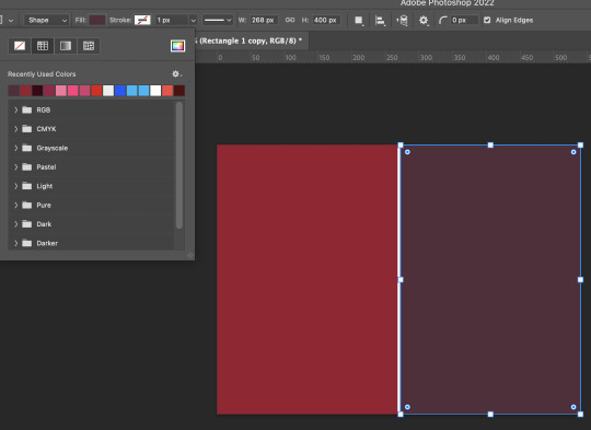
for the “pantone chip” itself, I used the proportions of an actual pantone chip (2x3cm, the colour part being 2x2cm) to create another rectangle (in white this time) of 200x300px

then add in a shadow - I played around with the settings to get a soft yet still visible shadow

then created frames

3. import, sharpen, and colour your gif
do whatever is your typical gifmaking procedure to import your gif, sharpen, and colour - demonstrated only on wwx first, oyzz here is still as imported
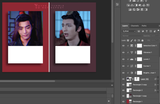
back when I did this set, I hadn’t yet learned how to colour backgrounds and had just started playing around with layer masks which explains why the colours are so dull and not a uniform colour, but you can find a more detailed post on how I now colour backgrounds here
this is where my current style differs from what it had been when I’d made that set:
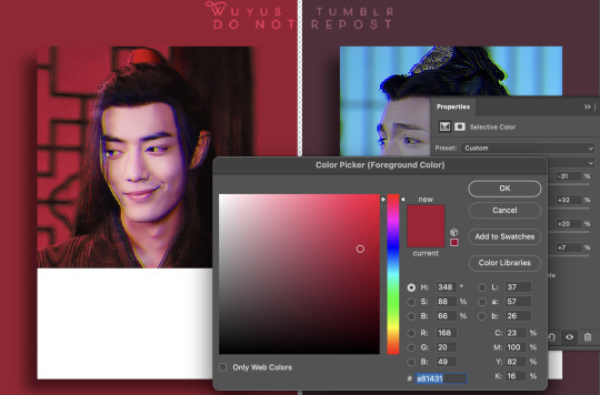
on selective colouring (whites, neutrals, blacks), I played around with the colours till I got something that matches more closely with the pantone colour I’m aiming for
a trick is to use eyedrop (I) to select the pantone colour to see what are the individual %, and then to eyedrop the background colour and then gauge how close you are to the pantone colour
when the pantone colour is eyedropped, the hue, saturation, and brightness (HSB) are 350, 83, and 61 respectively
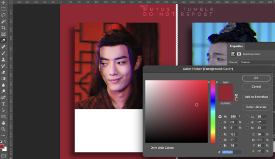
meanwhile, the red part of the gif is 2, 89, and 67. from this comparison (and by looking at the slider), I could tell my background colour was currently still too yellow and not magenta enough
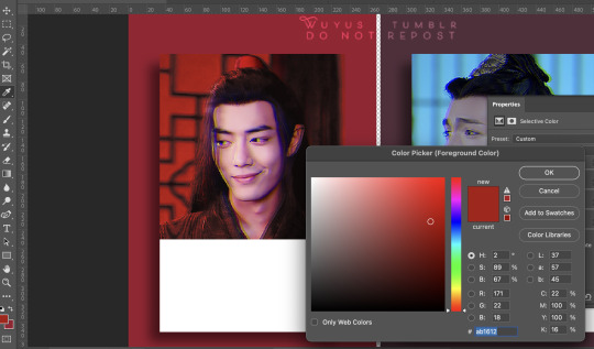
so I went back to selective colouring and pushed the yellow slightly down and increased the amount of magenta
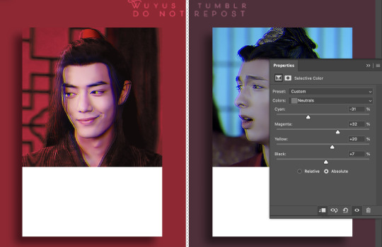
visually it kinda matches more closely to the pantone colour now, but just to check, I went back to eyedrop the background again and now, the HSB values are 348, 88, and 66 (vs. 350, 83, 61) - close enough for me to be happy!
4. the text
I actually googled for the font they used on pantone chips lol and got the answer from a reddit post:

not much typography creativity here, I just went with the recommended helvetica neue and sized down the text with each line

the gif posted in the original set:
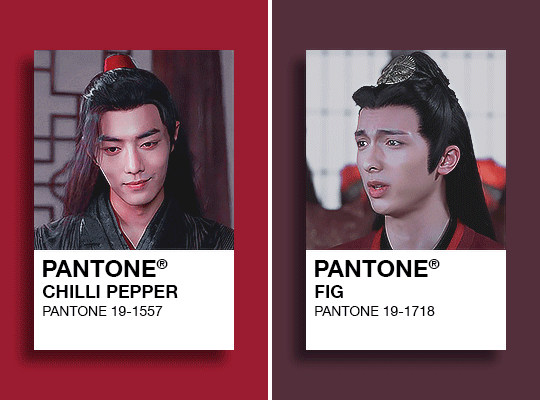
remade:
13 notes
·
View notes
Note
When I make photo posts using the beta editor, the post displays weirdly on blog themes (including the default tumblr theme) with large gaps between images which messes up formatting. Almost like it's getting treated as a text post or something. Specifically for posts with one column of image, the formatting seems to be better it's a multi-column post with side-by-side images.
I get that the beta editor is a work in progress, but is this unintentional and something that will be fixed? Thanks!
Hello there, @kilruas.
Thank you for your question. We will be honest: this might not be everyone’s favorite answer, but it’s the only one we’ve got.
The thing is, the beta editor and the Android and iOS editors don’t work with post types anymore. For them, all the posts are «NPF posts» (AKA., Neue Post Format—regarding which you can find our public docs here and our announcement about this here, which has a note about a theme option for NPF posts) which can have multiple blocks with different content types each. This means themes that haven’t been updated to work with these types may show some issues displaying certain types of posts (because, as you say, the theme considers those posts as ‘text posts’).
We have been moving away from post types for a while, which is why some old posts (or posts made on the web legacy editor) can’t be edited in the apps. But even if we can update some popular themes to solve the problem there, we won’t be able to update every theme ever. That would be on their own developers. We are doing some work to improve a bit some of the problems of “old” themes when rendering NPF posts. But we won’t be able to make it work exactly the same as it used to with ‘legacy posts’ in every case.
We’re sorry this perhaps isn’t a crowd-pleaser, but we hope it explains things, and we hope it helps.
Best,
—Javi @jv (Tumblr Engineering)
74 notes
·
View notes
Note
4, 7, 35, 44, 47 & 49 🌼
Thank you! 🥺😊
4: What do you think makes your style distinctly yours?
I don’t know? I guess the colouring, maybe (it’s doesn’t stand out or anything but it’s uniquely mine, I guess)? The excessive use of Bebas Neue and smart sharpen? Making stuff far too dark? Using Monsta X lyrics whenever possible (I should do that more)?
I want to say it’s the scenes I choose to gif but that’s probably wishful thinking.
Or maybe the way I cut out the background in every. single. edit. holy crap I do it by hand too wtf is wrong w me..
Also the embers, definitely the embers. I just think they’re neat. 🤡
7: What is something you want to develop in your future creations?
I want to get back into playing with text. I used to do that a lot but making textless gifs is more relaxing (plus I never know what text to use lmao)
35: Favourite individual panel from an edit you’ve created!
Recently, I really liked this one from this set:

I kind of wish I’d have used it with the “V” instead of the “S” because the scene is so iconic.
44: Are you most creative during the day or the nighttime?
Definitely the nighttime. It’s just more relaxing and there’s no pressure to finish. Plus, the room I work in is very bright during the day and I never quite trust the colouring until I see it at night lmao
47: What advice would you give to someone who’s just started creating?
Just do what you like and keep at it. Just by being you you already have a unique perspective that will make your gifs/edits stand out.
49: Future creating goals! Maybe a new program you want to learn to use, something to master, something you’re really excited about doing?
Idk I just treat this as a way to relax and engage more with my fave shows so I definitely want to keep at it.
Aaand this is more related to writing but I really want to finish last year’s NaNoWriMo story. 🥺
#ask#about me#these were a lot of fun thank you! 🥺#small unreadable text is making a comeback right now so i'm having high hopes#lorem ipsum for days! no one will ever know!!
4 notes
·
View notes
Text
seltsame formatierung der texte im blog
ich hab mir jetzt mal so die texte hier im blog angeschaut und.. die sind wirklich seltsam formatiert. die absätze sind teilweise unterschiedlich "eingerückt".
ich muss das mal testen.
also: test!
das hier hab ich alles geschrieben und jeden absatz mit einem einfachen "enter" beendet.
jetzt mit "shift + enter". mal sehen wie das jetzt aussieht.
nochmal shift enter
nochmal shift enter
nur einmal enter.
(jetzt hab ich mal ne leerzeile erzeugt, mal sehen was das für nen effekt hat, deshalb: lorem ipsum, text, langer, langer text, mal schauen wie das eingerückt wird)
jetzt hab ich einfach unten im text "reingeklickt" um eine neue zeile zu erzeugen. macht das nen unterschied?
hä. irgendwie konnte man hier noch irgendwo reinklicken und dann kam hier irgendwo so ein "plus-zeichen", so konnte man doch auch nochmal ne neue zeile anfangen..?
das find ich jetzt nicht. komisch.
edit: ok. anscheinend ist der erste absatz in jedem text auf gleicher höhe eingerückt, danach wird aber jeder neue einsatz nur in der ersten zeile wie vorher eingerückt, alles was danach an text im absatz folgt wird am anfang ein wenig versetzt eingerückt.
außerdem: wenn ich nen satz mit enter beende dann startet der satz darunter eingerückt. wenn ich aber "shift + enter" drücke, rückt der das alles nicht ein.
ich mach mal ne leerzeile mit "shift + enter" und schau dann mal, wie das aussieht:
jetzt nochmal zwei:
jetzt noch mal drei:
und jetzt hab ich mit nem "shift+enter" abgeschlossen.
anscheinend ist das template so programmiert, dass der das alles automatisch macht.. mal sehen, ob ich das irgendwie kontrollieren/umgehen kann.. falls nicht, auch gut. hab mich jetzt, nach langem umschauen, für dieses template entschieden (was mit meinem adhs ein absolutes wunder ist, dass ich das überhaupt geschafft hab) und zieh das jetzt so durch.
jetzt schau ich mir diesen text-post nochmal an und guck dann mal weiter..
0 notes
Text
Das neueste Update für Rise of the Triad: Ludicrous Edition, Version 1.1, wurde veröffentlicht und bringt bedeutende Verbesserungen mit sich, einschließlich Cross-Plattform-Multiplayer, neuen Spielmechaniken und verschiedenen Korrekturen, die darauf abzielen, das Spielerlebnis auf allen unterstützten Plattformen (Steam, GOG, Switch, PlayStation und Xbox) zu verbessern.
Wichtige im Update 1.1 hinzugefügte Features
Cross-Plattform-Multiplayer: Ermöglicht Spielern auf unterschiedlichen Plattformen, miteinander zu interagieren und gegeneinander anzutreten.
Die Wachgarde des Blitzes: Führt einen zuvor aus der Beta-Version des Spiels gestrichenen Charakter ein, der jetzt spielbar ist.
Verbessertes Waffenhandling: Spieler können nun das automatische Waffenwechseln beim Aufsammeln neuer Waffen deaktivieren.
Multiplayer-Verbesserungen: Beinhaltet eine Text-Chat-Option und zeigt essentielle Level-Statistiken wie Kill- und Geheimniszähler auf dem Kartenbildschirm an.
Level-Editor-Upgrades: Verfügt über eine neue Jukebox-Funktion, um die Hintergrundmusik zu personalisieren.
Wichtige Änderungen und Korrekturen
Verbesserte Lesbarkeit: Aktualisierte Schriftarten mit durchgestrichenen Nullen, um visuelle Verwirrung zu reduzieren.
Online-Konnektivität: Angepasste Timeout-Einstellungen und verbessertes Netcode für reibungslosere Online-Interaktionen.
Audio- und Visuelle Einstellungen: Verfeinerte Standard-Soundeinstellungen und verbesserte Texturenbearbeitung auf verschiedenen Plattformen für ein besseres visuelles Erlebnis.
Umfassende Fehlerbehebungen: Angegangen wurden Probleme von kleinen grafischen Fehlern bis hin zu spielzerstörenden Bugs, die die Spielkontinuität und Multiplayer-Stabilität beeinflussten.
Dieses Update verfeinert nicht nur die Spielmechanik und verbessert die visuellen und auditiven Einstellungen, sondern erweitert auch den Umfang der Interaktionen, indem es Spielern von verschiedenen Plattformen ermöglicht, nahtlos zusammen zu zocken. Die Aufnahme der Wachgarde des Blitzes und neuer anpassbarer Optionen bringt frischen Wind in diesen klassischen Titel.
Weitere Details zum Update findest du im offiziellen PC Gamer-Artikel. Entdecke außerdem andere dynamische Titel wie das kommende Open-World-Spiel Black Panther von EA, angesiedelt in Wakanda, für weitere packende Gaming-Abenteuer.
Umfassendes Update sorgt für verbesserte Interaktivität und erweiterte Funktionen
Dieses umfangreiche Update bekräftigt das Engagement der Entwickler, das Spielerlebnis zu verbessern und das Feedback der Community zu unterstützen, indem hoch angefragte Features integriert und vorherrschende Probleme behoben werden.
0 notes
Last Seen Blogs
highlyillogical
live long and carry on

imposter-advisory
Bookmark of Demise

furry-lydia
deadly vogue!

superlativelexis
Superlative Lexis

chinalarm0
The Love of Nieves 660