#foundry: sudtipos
Text


1 note
·
View note
Text
Interview to Ale Paul by MyFonts
Interview to Ale Paul by MyFonts
Read the great Ale Paul interview conducted by MyFonts. Ale Paul is co-founder of SudTipos and one of the best typographers in the world.
View On WordPress
0 notes
Photo
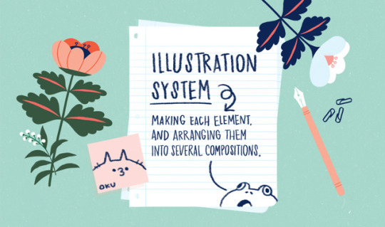
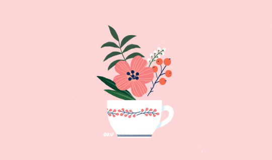

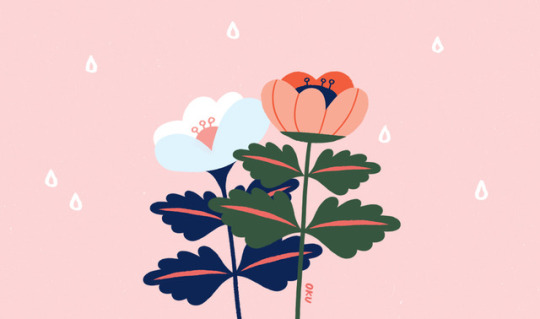
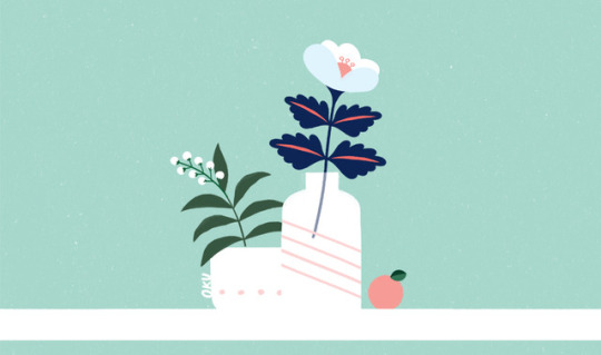
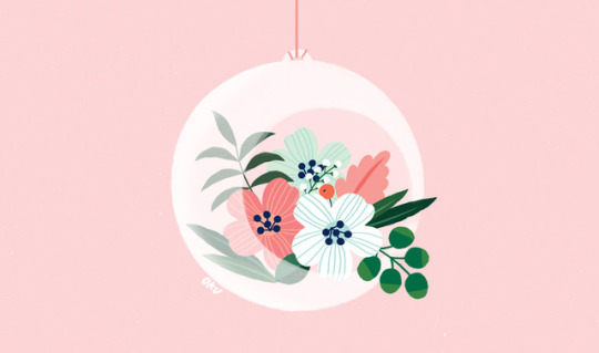
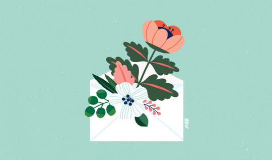
Illustration System
A few weeks ago, I had the pleasure to work with Designer / Calligrapher / Lettering artist Lunol. She needed a set of illustrations for her new font Looking Flowers (which she created with Art Director Ale Paul for Sudtipos Foundry) As there were many compositions, an Illustration System was necessary. To be able to “play” and make several groups, I had to take 5 things into account:
1. The main element and principal object (in this case, the flowers)
2. The complementary objects (leaves and branches)
3. A repetitive element (groups of tiny flowers in branches)
4. The supporting elements (cups, vases, envelope, etc that helped to create contrast with the background and added a different theme even when using the same set of flowers)
5. The color palette (which wraps up everything)
It was a very different and nice experience, which involves illustration, design and planning.
8 notes
·
View notes
Photo

In the week 4 lecture we looked at Blackletter. It was interesting to hear of the implicit connotations I have held for this typeface without even knowing, associating this type with Gothic and Medieval art.
Similarly as discussed in the lecture, blackletter has had many distinctive cultural and religious connotations throughout history and into the present. As noted, Blackletter has been tightly linked to biblical texts, German patriotism and now, linked to more contemporary associations of rebellion and rock/heavy metal music.
The above image is of a typeface named ‘Darka’, by Designer G.M. Meave. It’s interesting to how Blackletter, as distinctive as it is, has continued to be appropriated and used readily through changing cultural, political and religious contexts. I like how this typeface, has a sense of flow despite each sharp letter.
Above typeface & image credit:
Name: Darka, Designer: G.M. Meave, Foundry: Sudtipos, Image sourced from website: https://eyeondesign.aiga.org/
0 notes
Photo


Sudtipos
Argentinian type foundry absolutely slaying the script category for years and years
0 notes
Text
Some Typography Links
I just can’t stop opening excellent typography-related articles, which means I need to subject you to blog posts that round them up so I can clean up my open tabs.
Vistaserve is “a grass-roots web hosting initiative hailing from Thornbury, Australia. Inspired by the quirky web of the 90s, we allow users to create home pages, your own little sandbox on the World Wide Web, as it were.” Caitlin & Paul (I think the no-last-name thing is part of the aesthetic) wanted to get the fonts right, which meant removing anti-aliasing (the thing that makes fonts look good on screens!). CSS was no help. Turned out to be quite a journey involving literally rebuilding the fonts.
Thomas Bohm makes the point that the kerning around punctation may require special attention. For example, a question mark needing a little extra space or moving a superscript number away from butting against a letter.
You could do it manually with stuff like or &hairsp in between characters. But I’m far too lazy for that unless I’m working on a very special piece. Personally, I just cross my fingers that the font I’m using is high quality enough to have thought of and implemented this sort of attention to detail.
I’m sure we’ve all seen, “The quick brown fox jumps over the lazy dog” as a tester string for type, because it uses all the characters in the alphabet. Jonathan Hoefler created some new proofing text that is much more helpful for typographers like him.
That’s deep in the type nerd weeds there. More useful perhaps is another recent post from Jonathan on pairings. I’ve probably read dozens of posts on font pairings in my life, but this one resonates the most.
Some of the most dazzling typographic pairings — and certainly my favorites — are those that use unexpected fonts together. At left, the grey flannel suit that is Tungsten Compressed is paired with crimson silk doublet of the St. Augustin Civilité, a fiery sixteenth century typeface that demands a good foil.
If you’ve got macOS Catalina, you’ve got access to some really nice fonts you might not know about that need to be manually downloaded. Ralf Herrmann has the story on what you get:
Font families:
Canela from Commercial Type in 16 styles
Domaine Display from Klim Type Foundry in 6 styles
Founders Grotesk by Klim Type Foundry in 17 styles
Graphik by Commercial Type in 18 styles
Produkt by Commercial Type in 8 styles
Proxima Nova by Mark Simonson Studio in 12 styles
Publico by Commercial Type in 12 styles
Individual display fonts:
Sauber Script by TypeJockeys
Quotes Caps and Quotes Script by Sudtipos
You can download the fonts right from Font Book
I get Erik Kennedy’s Learn UI Design newsletter, and he mentions using Calena in it…
Overall, Canela walks this balance between the warmth of human handwriting and stately details. It makes me think of something literary, which is why I used it for project in one of the new video lessons in Learn UI Design.
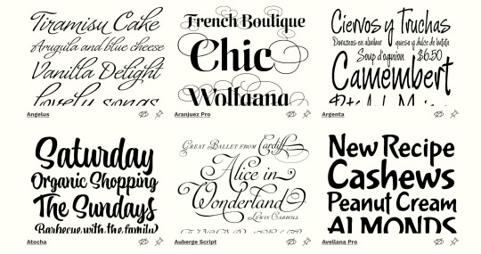
Mark Boulton has a cool new site: TypeSpecimens.
Type specimens are curious objects. They aim to inspire designers. They are tools with which to make design decisions. They are also marketing material for foundries. This project will dig into specimens from these three perspectives: as artefacts made by and for font designers to evolve type culture; as tools for font users to make decisions about choosing and using type; and as effective marketing tools.
The post Some Typography Links appeared first on CSS-Tricks.
Some Typography Links published first on https://deskbysnafu.tumblr.com/
0 notes
Link
Apple has recently licensed fonts from type foundries such as Commercial Type, Klim Type Foundry and Mark Simonson Studio to be used as system fonts on Mac OS Catalina. But since these fonts are an optional download, many users of Mac OS X are not even aware they have access to them for free.
To see and install these optional fonts, open the FontBook application and switch to “All Fonts”. Browse the font list and you will see lots of font families that are greyed out—either because they were deactivated or they weren’t downloaded yet. If you right-click on a font or font family that wasn’t downloaded yet, you see an option to download the individual font or entire family.
Here are some (Latin) highlights of the available fonts:
Font families:
Canela from Commercial Type in 16 styles
Domaine Display from Klim Type Foundry in 6 styles
Founders Grotesk by Klim Type Foundry in 17 styles
Graphik by Commercial Type in 18 styles
Produkt by Commercial Type in 8 styles
Proxima Nova by Mark Simonson Studio in 12 styles
Publico by Commercial Type in 12 styles
Individual display fonts:
Sauber Script by TypeJockeys
Quotes Caps and Quotes Script by Sudtipos
In addition to those Latin fonts, many non-latin fonts are available as well. For a complete list check out this support document.
☞ https://support.apple.com/en-us/HT210192
0 notes
Text
20 Freshest Web Designs, September 2018
Welcome to our roundup of the best websites launched (or relaunched with major updates) in the last four weeks. September marks the beginning of Fall in the northern hemisphere, and reflecting that change, we’re seeing fewer light, airy, minimal designs, and more rich, warm, comforting designs.
There’s been a flood of new design agency sites, and a ton of new season fashion sites launched this month—we’ve included the best. You’ll also find some great photography and lots for lovers of typography. Enjoy!
Critical Mass
Critical Mass is one of those design agencies you’d just love to work for. Their new site is a homage to themselves, telling a success story from their roots in Calgary, to 11 different offices around the world, with some exceptional work along the way.
Genesis
Genesis is a London eatery specializing in organic, healthy food. Their site is ever so slightly bizarre. Entirely black and white, with mystic-inspired illustrations, the site definitely makes me want to eat there, at least once.
Libratone
With bold color blocking, an unconventional grid, and one of the more interesting slideshows you’ll see, Libratone’s site is walking the walk by exuding confidence, sophistication, and a sense of freedom. A great site the perfectly encapsulates its brand identity.
Marc Jacobs
Marc Jacobs is one of the world’s most productive fashion labels, selling a dizzying array of products through this site. Despite the vast range of goods, there’s still time for careful details if you look, check out the animated bag for example.
Tao Tajima
Filmmaker Tao Tajima’s site features fullscreen clips of his work. What makes this site stand out is the liquid-style transition that segues between projects as you scroll. The way the video flexes is a magical effect perfectly in keeping with Tajima’s work.
GT Zirkon
Following the fashion for typefaces to get their own websites, GT Zirkon is a fantastic deep-dive into the design features of this sans-serif typeface. Entirely black and white, the animated noodle details continue to grow, creating a unique sense of time.
Porter & Pals
Feeding our dogs a healthy diet is super important to all owners. Porter & Pals wants you to trust them with your pooch’s diet, they’re different, and they want you to know it. Not convinced? Just keep refreshing the homepage for some hilarious pictures.
Alberta Ferretti
At first glance, Alberta Ferretti’s site looks much the same as any other minimal, grid-based fashion site. Where this site stands out is the playful use of the grid to create unexpected shapes and counter-intuitive alignment.
DAD
Dad is a design agency based in the Netherlands. Scroll through its colorful site and the work scrolls vertically, while the background type scrolls horizontally. Somehow, it works. If they don’t win a D&AD award there really is no poetry in the world.
Hourly App
Hourly is yet another time-tracking app for iOS, so far, so dull. But what sets Hourly apart is the 80s style typography and color palette. The bold choice is reflected in the app’s site, and delivers an impactful, and ultimately individual design.
Studio.Build
Studio.Build is a creative digital and branding agency that believes in big statements made simply. The site features a slideshow of selected work to scroll through, but click-through to the full portfolio for some exceptional design work.
Siri
Apple’s brand new site for its flagship AI product is predictably Apple-like, with a whole ton of mysterious black, gigantic sized type, and some lovely subtle gradients. Rarely does color-coding sections feel so exclusive.
Fred Perry
Fred Perry’s site is a perfect demonstration of how to do parallax right. Used to highlight the size of the product range, and the free shipping options, rather than simply to add interest, it’s an engaging effect on this site.
Sudtipos
Some type foundries focus on black and white to pull us in. Sudtipos have gone in completely the other direction, draping their site in colors inspired by their native Argentina. It’s a fitting approach for a colorful design collective.
The Wing
The Wing is a co-working space with a difference: it’s women-only. With its roots in community activism in the 19th and 20th centuries, The Wing has four spaces in NY and DC, and has plans for six more. It’s a site targeting women, with none of the clichés.
Swallowtail Tea
Swallowtail Tea’s art direction features heavy use of Photoshop’s noise filter, giving the site a nostalgic feel—plus the added benefit of much smaller image files, delivering a faster, more pleasant browsing experience.
Foster Type
Fittingly for a site showcasing type and lettering design, the online portfolio of Dave Foster features some exceptionally well-set type. For lovers of detailed design, it’s a pleasure to browse through and admire.
The Disconnect
The Disconnect is a unique approach to publishing on the web, they want you to disconnect in order to view the content. Just browse over and then turn off your wi-fi. Only on its second issue, it’s great, distraction-free journalism.
The Floral Society
Who doesn’t love flowers? The Floral Society sells high-quality products for amateur florists. From a Christmas wreath workshop, to DIY wedding flowers. It’s a delightful site put together on Squarespace, proving that anyone really can design a website.
The D. E. Shaw Group
A superlative example of an animation that transforms as you scroll, the D. E. Shaw Group’s site is a modern, abstract depiction of investment banking. As a way to illustrate a non-tangible product, it’s difficult to beat.
Add Realistic Chalk and Sketch Lettering Effects with Sketch’it – only $5!
Source p img {display:inline-block; margin-right:10px;} .alignleft {float:left;} p.showcase {clear:both;} body#browserfriendly p, body#podcast p, div#emailbody p{margin:0;}
20 Freshest Web Designs, September 2018 published first on https://medium.com/@koresol
0 notes


Text
SudTipos releases Semilla typeface
SudTipos releases Semilla typeface
SudTipos, the amazing type foundry from Argentina, released Semilla yesterday, a new ornamental display typeface and it looks absolutely gorgeous. You just have to love the marvelous terminations like those in Roses or Zoe above. And what about the ligature of ‘ss’ characters ? I find interesting how the lowercase ‘g’ and ‘y’ saves a lot of vertical space. I am amazed at how each glyph has its…

View On WordPress
0 notes
Text
20 Freshest Web Designs, September 2018
Welcome to our roundup of the best websites launched (or relaunched with major updates) in the last four weeks. September marks the beginning of Fall in the northern hemisphere, and reflecting that change, we’re seeing fewer light, airy, minimal designs, and more rich, warm, comforting designs.
There’s been a flood of new design agency sites, and a ton of new season fashion sites launched this month—we’ve included the best. You’ll also find some great photography and lots for lovers of typography. Enjoy!
Critical Mass
Critical Mass is one of those design agencies you’d just love to work for. Their new site is a homage to themselves, telling a success story from their roots in Calgary, to 11 different offices around the world, with some exceptional work along the way.
Genesis
Genesis is a London eatery specializing in organic, healthy food. Their site is ever so slightly bizarre. Entirely black and white, with mystic-inspired illustrations, the site definitely makes me want to eat there, at least once.
Libratone
With bold color blocking, an unconventional grid, and one of the more interesting slideshows you’ll see, Libratone’s site is walking the walk by exuding confidence, sophistication, and a sense of freedom. A great site the perfectly encapsulates its brand identity.
Marc Jacobs
Marc Jacobs is one of the world’s most productive fashion labels, selling a dizzying array of products through this site. Despite the vast range of goods, there’s still time for careful details if you look, check out the animated bag for example.
Tao Tajima
Filmmaker Tao Tajima’s site features fullscreen clips of his work. What makes this site stand out is the liquid-style transition that segues between projects as you scroll. The way the video flexes is a magical effect perfectly in keeping with Tajima’s work.
GT Zirkon
Following the fashion for typefaces to get their own websites, GT Zirkon is a fantastic deep-dive into the design features of this sans-serif typeface. Entirely black and white, the animated noodle details continue to grow, creating a unique sense of time.
Porter & Pals
Feeding our dogs a healthy diet is super important to all owners. Porter & Pals wants you to trust them with your pooch’s diet, they’re different, and they want you to know it. Not convinced? Just keep refreshing the homepage for some hilarious pictures.
Alberta Ferretti
At first glance, Alberta Ferretti’s site looks much the same as any other minimal, grid-based fashion site. Where this site stands out is the playful use of the grid to create unexpected shapes and counter-intuitive alignment.
DAD
Dad is a design agency based in the Netherlands. Scroll through its colorful site and the work scrolls vertically, while the background type scrolls horizontally. Somehow, it works. If they don’t win a D&AD award there really is no poetry in the world.
Hourly App
Hourly is yet another time-tracking app for iOS, so far, so dull. But what sets Hourly apart is the 80s style typography and color palette. The bold choice is reflected in the app’s site, and delivers an impactful, and ultimately individual design.
Studio.Build
Studio.Build is a creative digital and branding agency that believes in big statements made simply. The site features a slideshow of selected work to scroll through, but click-through to the full portfolio for some exceptional design work.
Siri
Apple’s brand new site for its flagship AI product is predictably Apple-like, with a whole ton of mysterious black, gigantic sized type, and some lovely subtle gradients. Rarely does color-coding sections feel so exclusive.
Fred Perry
Fred Perry’s site is a perfect demonstration of how to do parallax right. Used to highlight the size of the product range, and the free shipping options, rather than simply to add interest, it’s an engaging effect on this site.
Sudtipos
Some type foundries focus on black and white to pull us in. Sudtipos have gone in completely the other direction, draping their site in colors inspired by their native Argentina. It’s a fitting approach for a colorful design collective.
The Wing
The Wing is a co-working space with a difference: it’s women-only. With its roots in community activism in the 19th and 20th centuries, The Wing has four spaces in NY and DC, and has plans for six more. It’s a site targeting women, with none of the clichés.
Swallowtail Tea
Swallowtail Tea’s art direction features heavy use of Photoshop’s noise filter, giving the site a nostalgic feel—plus the added benefit of much smaller image files, delivering a faster, more pleasant browsing experience.
Foster Type
Fittingly for a site showcasing type and lettering design, the online portfolio of Dave Foster features some exceptionally well-set type. For lovers of detailed design, it’s a pleasure to browse through and admire.
The Disconnect
The Disconnect is a unique approach to publishing on the web, they want you to disconnect in order to view the content. Just browse over and then turn off your wi-fi. Only on its second issue, it’s great, distraction-free journalism.
The Floral Society
Who doesn’t love flowers? The Floral Society sells high-quality products for amateur florists. From a Christmas wreath workshop, to DIY wedding flowers. It’s a delightful site put together on Squarespace, proving that anyone really can design a website.
The D. E. Shaw Group
A superlative example of an animation that transforms as you scroll, the D. E. Shaw Group’s site is a modern, abstract depiction of investment banking. As a way to illustrate a non-tangible product, it’s difficult to beat.
Add Realistic Chalk and Sketch Lettering Effects with Sketch’it – only $5!
Source
from Webdesigner Depot https://ift.tt/2OBoxcW
from Blogger https://ift.tt/2NTsL2m
0 notes
Text
20 Freshest Web Designs, September 2018
Welcome to our roundup of the best websites launched (or relaunched with major updates) in the last four weeks. September marks the beginning of Fall in the northern hemisphere, and reflecting that change, we’re seeing fewer light, airy, minimal designs, and more rich, warm, comforting designs.
There’s been a flood of new design agency sites, and a ton of new season fashion sites launched this month—we’ve included the best. You’ll also find some great photography and lots for lovers of typography. Enjoy!
Critical Mass
Critical Mass is one of those design agencies you’d just love to work for. Their new site is a homage to themselves, telling a success story from their roots in Calgary, to 11 different offices around the world, with some exceptional work along the way.
Genesis
Genesis is a London eatery specializing in organic, healthy food. Their site is ever so slightly bizarre. Entirely black and white, with mystic-inspired illustrations, the site definitely makes me want to eat there, at least once.
Libratone
With bold color blocking, an unconventional grid, and one of the more interesting slideshows you’ll see, Libratone’s site is walking the walk by exuding confidence, sophistication, and a sense of freedom. A great site the perfectly encapsulates its brand identity.
Marc Jacobs
Marc Jacobs is one of the world’s most productive fashion labels, selling a dizzying array of products through this site. Despite the vast range of goods, there’s still time for careful details if you look, check out the animated bag for example.
Tao Tajima
Filmmaker Tao Tajima’s site features fullscreen clips of his work. What makes this site stand out is the liquid-style transition that segues between projects as you scroll. The way the video flexes is a magical effect perfectly in keeping with Tajima’s work.
GT Zirkon
Following the fashion for typefaces to get their own websites, GT Zirkon is a fantastic deep-dive into the design features of this sans-serif typeface. Entirely black and white, the animated noodle details continue to grow, creating a unique sense of time.
Porter & Pals
Feeding our dogs a healthy diet is super important to all owners. Porter & Pals wants you to trust them with your pooch’s diet, they’re different, and they want you to know it. Not convinced? Just keep refreshing the homepage for some hilarious pictures.
Alberta Ferretti
At first glance, Alberta Ferretti’s site looks much the same as any other minimal, grid-based fashion site. Where this site stands out is the playful use of the grid to create unexpected shapes and counter-intuitive alignment.
DAD
Dad is a design agency based in the Netherlands. Scroll through its colorful site and the work scrolls vertically, while the background type scrolls horizontally. Somehow, it works. If they don’t win a D&AD award there really is no poetry in the world.
Hourly App
Hourly is yet another time-tracking app for iOS, so far, so dull. But what sets Hourly apart is the 80s style typography and color palette. The bold choice is reflected in the app’s site, and delivers an impactful, and ultimately individual design.
Studio.Build
Studio.Build is a creative digital and branding agency that believes in big statements made simply. The site features a slideshow of selected work to scroll through, but click-through to the full portfolio for some exceptional design work.
Siri
Apple’s brand new site for its flagship AI product is predictably Apple-like, with a whole ton of mysterious black, gigantic sized type, and some lovely subtle gradients. Rarely does color-coding sections feel so exclusive.
Fred Perry
Fred Perry’s site is a perfect demonstration of how to do parallax right. Used to highlight the size of the product range, and the free shipping options, rather than simply to add interest, it’s an engaging effect on this site.
Sudtipos
Some type foundries focus on black and white to pull us in. Sudtipos have gone in completely the other direction, draping their site in colors inspired by their native Argentina. It’s a fitting approach for a colorful design collective.
The Wing
The Wing is a co-working space with a difference: it’s women-only. With its roots in community activism in the 19th and 20th centuries, The Wing has four spaces in NY and DC, and has plans for six more. It’s a site targeting women, with none of the clichés.
Swallowtail Tea
Swallowtail Tea’s art direction features heavy use of Photoshop’s noise filter, giving the site a nostalgic feel—plus the added benefit of much smaller image files, delivering a faster, more pleasant browsing experience.
Foster Type
Fittingly for a site showcasing type and lettering design, the online portfolio of Dave Foster features some exceptionally well-set type. For lovers of detailed design, it’s a pleasure to browse through and admire.
The Disconnect
The Disconnect is a unique approach to publishing on the web, they want you to disconnect in order to view the content. Just browse over and then turn off your wi-fi. Only on its second issue, it’s great, distraction-free journalism.
The Floral Society
Who doesn’t love flowers? The Floral Society sells high-quality products for amateur florists. From a Christmas wreath workshop, to DIY wedding flowers. It’s a delightful site put together on Squarespace, proving that anyone really can design a website.
The D. E. Shaw Group
A superlative example of an animation that transforms as you scroll, the D. E. Shaw Group’s site is a modern, abstract depiction of investment banking. As a way to illustrate a non-tangible product, it’s difficult to beat.
Add Realistic Chalk and Sketch Lettering Effects with Sketch’it – only $5!
Source p img {display:inline-block; margin-right:10px;} .alignleft {float:left;} p.showcase {clear:both;} body#browserfriendly p, body#podcast p, div#emailbody p{margin:0;}
https://www.webdesignerdepot.com
The post 20 Freshest Web Designs, September 2018 appeared first on Unix Commerce.
from WordPress https://ift.tt/2xjJG4E
via IFTTT
0 notes
Text
Well Said Type | 176
BIBLIOPHILE
Bibliophile Script is the latest offering from powerhouse font foundry Sudtipos and is inspired by late 19th century Round Hand calligraphy and Italian capitals. Just look at all those beautiful flourishes! Oh – and it’s 50% off through July 22! Grab your own copy right here.
p.s. For those of you who love script fonts as much as I do, MyFonts is having a HUGE sale on script fonts this week! Some of my go-to script fonts are included in the sale, which runs through Friday, June 16. New styles are being added every day, but here are a few favorites: Blog Script, Quickbrush, Zooja, Freeland, and Saturday Script.
from Oh So Beautiful Paper http://ift.tt/2t1iLqs
via IFTTT
0 notes


Last Seen Blogs

szeretlek-es-hianyzol-blog
Untitled

creaturemichael
Not active

alunasky-blog
Alunasky


globalstudyabroad
Global Study