#it's realism art. it's just being realistic. obviously.
Text
OK, but hear me out
Say Ride the Cyclone were to be adapted into a film; imagine how much fun it would be to see it animated.
Because for the main plot, like the intro song and the mostly dialogue scenes in limbo, you could easily do a stylistic, but still grounded in realism style that a lot of modern animated projects are doing right now (think Arcane or Into the Spider Verse). But once each of the kids go into their respective songs/fantasies for what their life could have been? What if those were done in completely different styles?? Imagine the additional, visual storytelling that would tell about who they are as characters?
Like say, for Ocean's number, WTWN, everything became more simplified, and the characters (especially Ocean herself) turned into a more rounded, chibi-like style to enhance just how cutesy and likeable she's trying to portray herself throughout that number.
Or for Noel's Lament, everything goes black and white, and the characters become even more 2D stylized, and the film scales down to a smaller millimeter frame, more reminiscent of cartoons from the early 20's, when animation was just starting out, to enhance his idealization of "the olden days" (as Ocean puts it).
Mischa's song, This Song is Awesome could be animated with a more choppy frame rate, and the character designs turn a little more jagged around the edges, kind of like animated music videos (I'm thinking a Gorillaz band vibe). But as he transitions into singing about Talia, the colors start to bleed out over their lineart, and become more paint-like and Talia herself moves like a rotoscoped character (think Loving, Vincent that came out a few years ago) to enhance the sense that she's somewhere between a real person and a fantasy Mischa's built in his mind.
Ricky's song would, of course, be stylized after those sci-fi cartoons from the 90's, like X-Men or Captain Planet.
For the Ballad of Jane Doe, I would love to see something like what Wolfwalkers did back in 2020, where most of the characters (in this case, the other kids) are for the most part, animated like traditional, 2D characters with very clean lines and neat movements, whereas Jane herself stands out for having messier, sketchy line art, and looks more and more unfinished in her animation as the song goes on, because she can feel more and more of her own identity being lost.
Constance's Sugar Cloud I could see done in the classic 2D Disney style (i.e., the Renaissance era of Disney, like the Lion King or Little Mermaid days) because not only is it really smooth and colorful and just all around nice to look at, but it reminds the average moviegoer of their childhood growing up with those movies (among others, obviously), which ties in nicely with Constance's preceding monologue about remembering her own life, and the good that came with the bad.
I'm even tempted to envision the first half of the finale song in a different style, when the stage production would show a quick projection of Jane/Penny's life after she returned to the world of the living. Imagine watching this animated film, and for that segment alone, it becomes that really hyper-realistic, almost uncanny valley CGI animation style, to show that she really has joined the world of the living, i.e. our world, among us, the living breathing movie goers watching this, and watching the other kids still in limbo fade back to that main art style for the final number.
I don't know; it just feels like something that would be so engaging to see from an already compelling storyline and characters. Especially with more experimental animation projects on the rise right now
#random rambling#Ride the Cyclone#Ocean O'Connell Rosenberg#Noel Gruber#Mischa Bachinski#Ricky Potts#Jane Doe#Penny Lamb#Constance Blackwood#idk I just really love animation you guys#so naturally I have to bring my latest hyperfixation into that world#might even sketch these different styles#for a better visual idea#but I haven't done any sketches in a hot minute#so who knows
984 notes
·
View notes
Text
was talking about it the other day but its sad how we are never going to get really big budget games w/ funky artstyles again. like if you look at the majority of big budget releases lately, they are all kind of going for the same thing as far as actual modeling goes- hi fi, super detailed complex models that try to portray as much detail as possible. which is fine for certain games, but it makes me miss the big swings devs used to take.
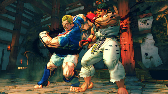
take street fighter 4 for instance- despite being over 10 years old at this point, it still looks REALLY good. great art direction, has a weird painterly look so everything has a cool watercolor style to it, models are expressive, etc. and this was a BIG release, its not some indie game (where most big stylistic swings tend to be made nowadays).
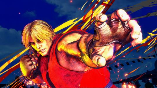
compared to street fighter 6, which is going for photorealism (with strong choices made as far as animation and color goes) it looks dated in the context of graphics generally, but looks WAY better than its contemporaries from the same time period. my fear is that street fighter 6 wont look that great in 10 years time.
side note, its also why street fighter 5 was really only loved by hardcore fans. it does nothing particularly well! its a halfway point between realistic and artistic to the point where it feels like a side-grade rather than an improvement or even its own original idea!

whatever leaps were made in lighting and texture quality are essentially irrelevant here. fucking gross!
the thing is, i dont think this is a deliberate choice that devs are making right now. from what i can tell, recent rendering tech has made it way easier to achieve a handful of lately- hi fi LIGHTING, increased TEXTURE DETAIL and HI POLY COUNTS come to mind. these are cool, but if youre a dev who wants to make a triple A product, you kind of have to use whatever tech is on the table to make a product look cutting edge. none of those encourage taking wild stabs at cool art directions. devs used to use those cool art directions because it was the ONLY OPTION THEY HAD.
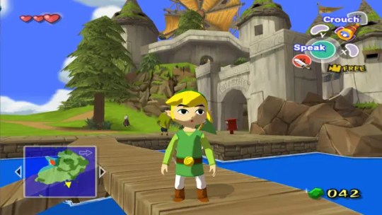
classic case being windwaker right. the gamecube was a huge graphical leap from the n64, where even getting a model to look like something was a challenge. compared to ocarina of time, windwaker looks absolutely fucking incredible. it got a lot of pushback at the time for being too kiddy, but really the strength of its style is a result of doing as much as they possibly could with the platform they were working on. no high poly counts, the shading tech was relatively simple, and the textures (while a huge improvement over the n64!) are still basic compared to what we have today. windwaker still looks impeccable to this day, and even the HD remaster they made which, ahaha, improved WHAT

LIGHTING and TEXTURE DETAIL. but without a real consideration for the original artstyle (or why it even existed... which was the gamecubes limitations) it just looks worse.
in response to this pushback (i think, idk i didnt work at nintendo at the time) they gave twilight princess a way more "realistic" look. but given the rendering restrictions of the time, it still has a fairly robust artstyle
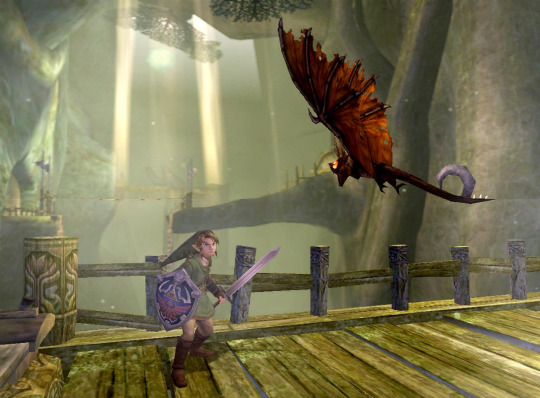
proportions are more realistic obviously, but in order to achieve that realism without the kind of lighting tech we have now the "lighting" is BUILT Into the textures. look at links sword, how it kind of darkens near the hilt, or how the shadow on the keese's wings is just kind of painted in specific areas. i would argue that twilight princess looks a LOT like street fighter 4 in that area-
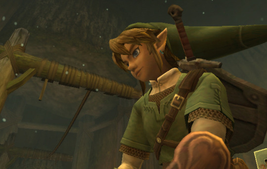
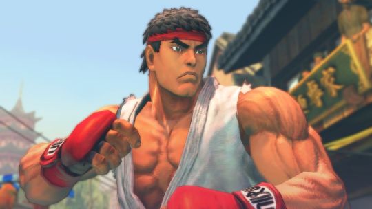
damn! they almost look like theyre from the same game! but twilight princess was celebrated for being "realistic" while sf4 was noted for having a funky watercolor style (thats built into the focus attacks even!). its so so smart, because the devs knew they couldnt go for photorealism (like so many games of the era tried at and completely failed at!) so they went for a mix of cool stylistic decisions that allowed a game to look GOOD in a subjective, artistic way.
Not that games don't try and apply artistic principles now, but its a lot less unique. look at mario odyssey
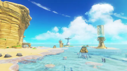
its just a beach. and it looks great, its well rendered, but its just a beach. colors are clearly intentional and very pretty, but it's nothin that special right now, probably will look even less special in 10 years even compared to levels in the same game.
what im curious about is when are we gonna get back to that kind of artstyle meets rendering tech! if ever! current tech makes it so devs are kind of forced to go down the same boring path. look at mortal kombat 1:
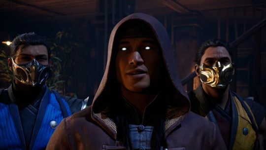
im sure there are some leaps in texture and lighting, but they keep taking shortcuts. all the faces are modeled after REAL peoples faces and they mocap for expressions/conversation, which gives a really boring look to it. the fact that mk11 and mk1 look so similar so many years apart (4 i guess isnt that much but there have been leaps!) is disappointing to me.
then you have tekken 8, which is like the best looking game ive ever seen. for a while i found it hard to put my finger on why, but my brother said something really smart i feel- they made all of these models by hand. theyre essentially digital statues. they didnt pull actual face models, they just worked on their features until it looked correct. on top of the lighting and texture work, it creates a look not unlike the renders tekken has been using for years. which is convenient for them, because they can finally match the kind of real-time fidelity they've been chasing for like 30 years

hell it looks BETTER than that. so what im trying to say is im hopeful that art direction will catch up with the kind of rendering tricks/strengths we have.
i think tekken 8 feels like how soul calibur 2 probably felt at launch. does a lot of the same things given the time period
i still think hi fi rendering doesnt make for a good looking game, but rather where the focus lies for the player. for tekken it makes sense that they would focus their horsepower on detailed models and stages- youre gonna be lookin at that forever. look at elden ring

texture wise, SUPER low res for 2022. maybe even 2020. but what they do with the horsepower is genius- they focus on scale to translate locations of objectives to a player while also reinforcing the feeling of adventure, on top of extremely strong choices in color and lighting. i hope, going forward, games focus on how they can use this kind of tech to reinforce a games "gameplay mission statement" while keeping strong artistic choices present rather than focusing on being able to wow someone with a couple of screenshots at the cost of BOTH of those things. im just ranting though french press got my ass
133 notes
·
View notes
Note
Hi hello I just popped by to tell you just how much I absolutely LOVE your art. The dynamic poses, the color, your shapes, you’re very much an inspiration to me for my own art. I was curious if you’d be willing to share your own inspirations/process in drawing? No need to if you don’t feel like it though. Again, thank you for sharing your art with the world.
Gosh, I'm not sure where I'd even start for that...
I don't think I can get into process atm because it changes so much in such tiny ways all the time. I have a basic skeleton of a process, but the rest is all over the place.
As for insperations:
I follow many many artists online and have picked up many small things just from looking at their work and trying to "reverse engineer" their process in my head.
I've noticed I tend to subconsciously "study" artists just by thinking "how do I draw this? Oh this artist drew it that way! Lemme try..." and I do that many many times while drawing.
Example: I look at the way an artist draws hands, then I look at my own hand and try and mimick the position in the artwork.
I study both and try to connect the dots between them. I feel the way my hand moves and the way the bones and muscles flex and relax.
I try and draw broad shapes, then the underlying mechanics of the hand, then I finish things by drawing what we actually end up seeing on the surface.
I dont draw the bones and muscles of a hand and then the skin just to be clear! I just try and keep them in mind as a draw the outlines.
Like a sculpture having a "skeleton" made of two bits or wire. I don't draw the skeleton, I draw the rough blueprint of where everything goes in quick simple lines. Then I build the "clay" on top.
I don't go that in depth every time but it helps to stop and "be more considered" if you have the time and energy.
Now that I think about it, watch sculpting videos!
It's a very similar process to drawing but 3d instead of 2D! I recommend clay sculpture but I'm sure 3d modeling has similar principles too, even if a very different approach overall.
Here are some channels I recommend:
For cute character dioramas with ridiculous fidelity while being very stylised
For impressive fake food that really shows just how much of an illusion art is
For amazing Dino statues with an eye for detail and convincing naturalism
For 2d artists I follow current professional and/or hobby artists, or even old masters who's work is archived in artbooks and social media accounts. All ranging a wide variety or styles, cute, horror, cartoon, realist, ect... and most importantly, the styles wich aren't as easily definable.
The variety of influences is great! As long as you figure out how to pick and dissect the elements that drew you to the work and how to apply your findings to your own work.
My biggest inspirations as a kid where animation (Disney, pixar, ghibli, ect...), manga, Belgian/French comics my dad had as a kid.
I didn't have the patience or means to learn to animate, but these comics had so much life and motion in their panels! I always found American comics really stiff and more difficult to read because of the detail and "realism". I know American comic art can be very expressive and fluid, but for my undiagnosed eye/brain issues...
This:
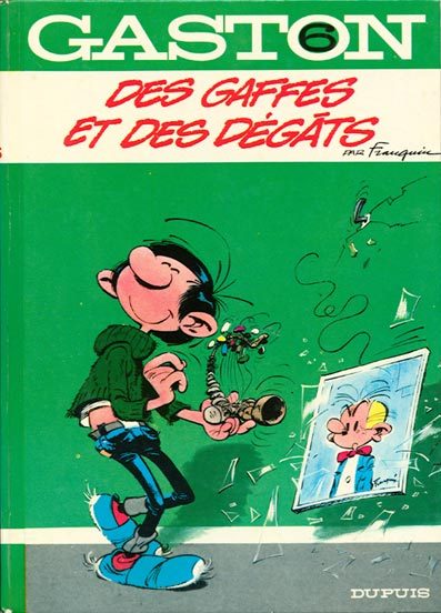
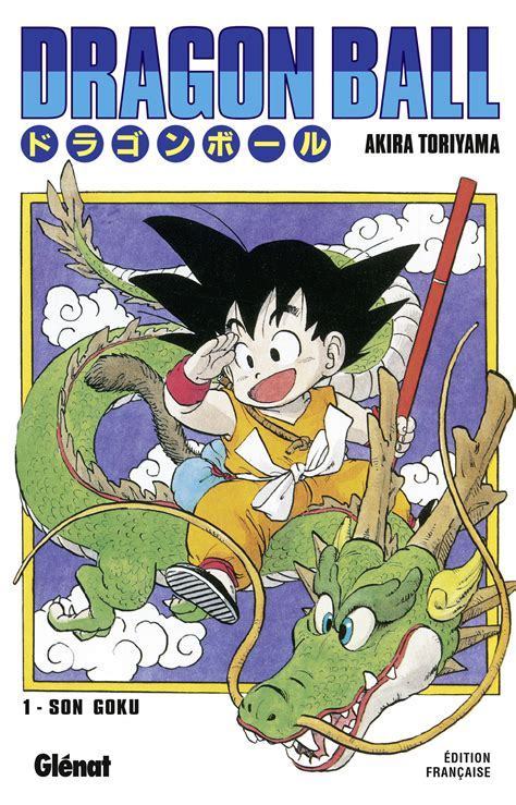
Was leagues more "readable" than:
They where literally easier to read.
That comic cover takes me a good few seconds to dissect and process, whereas the two examples above it are instant.
I'm terrible at studying from life due to my poor eyesight and spacial awareness issues, also I have ADHD so, not only is the information my eyes are giving to my brain suboptimal, but my brain is also terrible at processing and reconstructing that information.
Also tracing is a valid way of studying btw, that's how I learnt as a tot and it can be great to try and reverse engineer a finished peice and break it down to it's construction.
Obviously it's not the same as building something from scratch but we're talking within the realms of practice.
I also started trying to "re-learn" some art fundamentals in ways that work better for me, and it's been massively helpful.
I'm already working with fuzzy simplified abstractions of the world around me, so it's horrible trying to see accurately and THEN re-simplify it onto paper.
So something that has helped a lot and I mean A LOT with teaching my brain art basics in a digestible, step by step way, has been:
ART ACADEMY for the DS!
It's great for walking you through art fundamentals in a way that is digestible and no where near as overwhelming as just jumping straight in to a massive, complex, digital art programme.
It gets all the fuss of materials and subject and reference out of the way and let's you just focuse purely on the process of making art itself.
THIS:
WAS MADE WITH THIS:
This is the first drawing lesson:
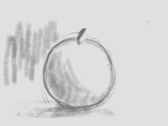
This is the lesson after that:
This is all with the original DS version!
On a tiny screen with very primitive approximations of pressure sensitivity and no opacity or pen size options.
It mimics traditional art making in the sense that you make what you can with what you have and that limitation allows you to focuse on practice rather than get overwhelmed and over correct everything digitally.
These where tiny, crunchy, microcosmic, simplifications of digital art making back in 2009!!!
It's so refreshingly accessible and manageable.
I haven't even started the newer 3ds game that came out.
So if anyone reading is struggling with their art I highly recommend this little art exercise giver! It's helped me a lot.
OK hope that's readable and helpful. ^^
24 notes
·
View notes
Text
Ranking Mark Maggiori's 2016 Paintings
Based solely on my biased opinions on what I like the most. Not included is "Growing Clouds" OR "The Places We Leave Behind" because it feels unfair to rank a completely different style of art alongside another. As well as "Night Falls Over the Little Colorado" but that is thanks to the image limit and me not having anything to say about it.

"A Trusted Companion"
There's nothing really wrong with it, but it's absolutely my least favorite because of the fact that it's just too realistic with, in my opinion, the least amount of stylization. It's a gorgeous painting but it just feels very generic. It is missing that Maggiori charm.

"The Monsoon Sun"
Similar story to the previous. Beautiful work, but lacking the stylization. Too much face.
"On The Edge"
SAME exact situation as the previous two. Generic. Little stylization. It's higher than the previous two though because of the fact that there isn't all too much To stylize.

"Secret Talk at Sunset"
This one was extremely hard to place for me. I actually really like it a lot and the stylization pops through a lot more than the previous paintings, to the point where it actually more or less ties with "Cowboys at Work" however I chose to place it lower than that because of several things I'll elaborate on there.
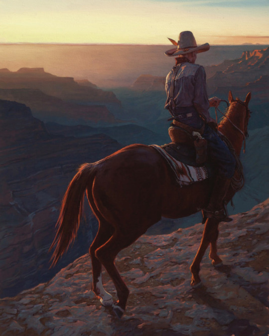
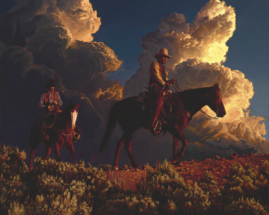
"Cowboys at Work" (couldn't find a clearer picture)
This one is higher because of how the style really shines through even more. The clouds aren't those signature puffy Maggiori clouds but the sky is still striking. The rocks in the background to the right are a specific detail that stands out a lot, and same for the harsh lighting on the horses as well as the way the clothes are painted, it feels very distinct.

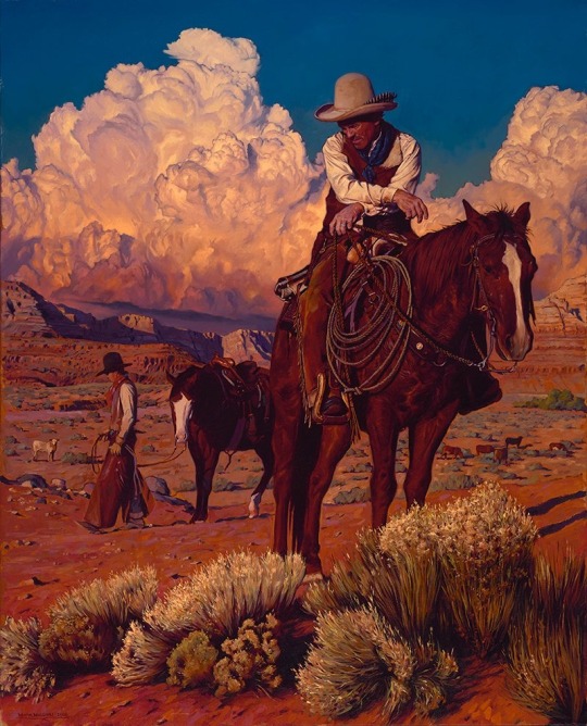
"The Moon Follower"
The lighting absolutely did this for me. As did the grass, and specifically the way the light bounces off the flank of the horse. The canyon in the back is mysterious without being eerie and I just think it's great.
"Thunderhead Riders"
This is where reason doesn't really kick in. I can't explain why this one isn't where the next few are in placement. The clouds are gorgeous, the horses, the lighting. Maybe the plants just don't do it for me.
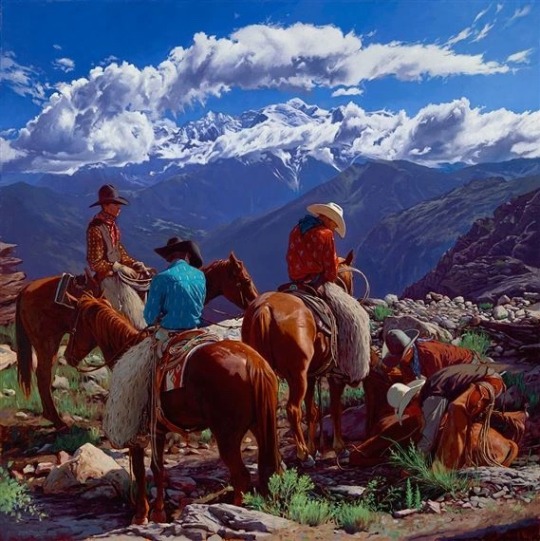
"The Family Tradition"
Coming up on the final stretch here, this painting has it all. The clouds the plants are right between his more modern style of painting them and realism, and the paint strokes are just so pleasing to look at.
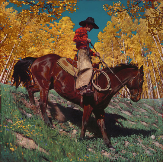
"In the Aspens"
This is one of the few times it really feels like Maggiori strays from his typical formula for a painting. Desert, horse or a few, mountains/canyon and clouds. Maybe a wagon or some cows. And despite the fact that it strays away from that it's fantastic and so clearly him. From the striking colors of the sky and leaves, to the strokes of color and the pose on the horse, and the brilliant green of the grass this painting is definitely one of my all time favorites.
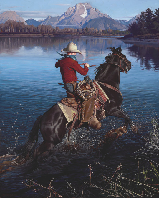
"Cutting Through Cold Water"
Finally, my hands down favorite Mark Maggiori painting of all time. Similar to the previous painting, it strays away from a lot of Maggiori's other paintings while still being so obviously his. The water is gorgeous, from the way it splashes to the ripples stretching behind, the backdrop is wonderful and the distance is clear. The red of the shirt AGAIN is a great contrast to what is right behind it. The shadows and light are so strong and it is, as I keep saying it, so obviously his.
29 notes
·
View notes
Text
The post where I get on my soap box about Fable 4's style (but also on the video game industries reliance on realism)
-
Long as post below, also if you disagree know that you don't have to engage with the post, you don't have to argue or have a take on everything. Thanks, now let's move on down!
I'm remembering the recent Fable 4 trailer again and lamenting the lack of stylized art going into it. I've always hated that the video game industry, at least in the west always has to follow the same bog standard "realism" for no real reason or gain. For example looking at starfield most of the companion characters faces never change expression, so you're hanging out with someone like Sarah starfield, that's her full name, Todd coward told me so /sarcasm -
and she always looks like she's got so much cologne in her she can't emote. (Apparently they don't use facial muscles which is such a bethesda thing it's funny.) I heard someone say that if they gave Starfield a stylized different style from Fallout and Elder scrolls that it could give it it's own identity and I couldn't help but agree.
This goes on to my point and franky my argument in fable's lack of style.
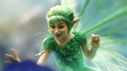
(This was the only image of both of the hyper realistic characters I could find in short notice)
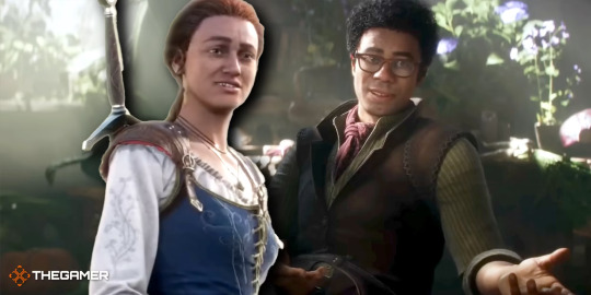
I think that Fable should of never "graduated" from it's cartoony/shaded style, the series has always been about kicking chickens and shrek esk humor, sticking to it there's a fairy in the opening, that looks pretty and cute and when she gets grabbed by the frog, her face goes from dainty, to an exaggerated expression you would expect from you know- getting attacked!

(obviously this is the first trailer and we'd get an update a couple of years later.) But it almost feels like they're embarrassed to be goofy or silly! This game- no this series would of been so better going for a Cel shaded look like many old and new games for example: The wolf among us, Hi fi Rush, No more heroes 2 and Ultimate spiderman (ps2) And they still look great despite three of these being older titles sans Hi-fi rush.
Fable would look phenomenal and you can still work with great expressions, exaggerated humor, a unique art style too, something different! ( while also taking it easier on your workers ) Everything looks hyper realistic and it also takes an age to come out because every follicle of hair needs to look great, every wrinkle and hairline has to be perfect, so perfect it can flow in the wind in the same direction as the grass; and that's the problem!
Fable is a comedic medieval fantasy game, and there's no problem with looking realistic, Baldur's gate 3 looks GREAT but it also has the most issues, with characters hair disappearing, or invisible NPCS and other hilarious glitches- that's not a jab, the same game happen in the above but I feel with a stylized look it could be something set aside from the constant hyper real games we constantly keep getting, something new, something with personality and a style that could turn heads! Cringe anime game take below! vvv


Not to bring this up (cause for some reason people get really mad at people even mentioning one of these for some reason) but Persona 5 looks very cel shaded and stylish, Gravity Rush too! And I can't help but wonder how amazing fable could be with such defining artistry and how much cartoony and silly and outlandish things it could get away with, with a more storybook or painterly art style.
And I can't help but see people clearly are drawn to the style of games like South of Midnight and again there's a massive fanbase of the wolf among us, to the point they're making a sequel to the tell tale game as we speak! (for the lack of a better term)

And know this doesn't come off as me saying that if the game is good that it won't matter, I just think games and media as a whole, shouldn't restrict themselves by going for one style or way of presenting themselves; especially western RPGS. This sadly extends beyond fable!
This should be a discussion that goes towards the entire video game industry, I mean look At Beyond good and Evil 1 in comparison to it's sequel in production (I think, it's been YEARS!)

The first obviously has a cartoony style, and this style suits the word and characters! Then its younger sibling looks expressive to a degree but I mean- we can tell why it's taking so long to come out, making indivisual worlds, and trying to apply realism to a world with animal people and future tech is a recipe for crunch!
We shouldn't have to stick to one style, just because it's become the norm in the industry, the point of the industry, should be to make video games and to experiment and try something new cause making video games IS an art!
5 notes
·
View notes
Note
Do you have any drawing tips?
•When it comes to digital art, if you struggle making lines clean or sharp enough, using a textured brush erases that struggle because the whole point is not being clean or sharp.

^left is obvious where mistakes were made and had to be erased, looks choppy and needs cleaned up. right does not need cleaned up much. saves time and energy!
•if a drawing looks a little too bland or unfinished, but you don't know what else to do about it, adding a texture overlay does a lot, especially for solid backgrounds
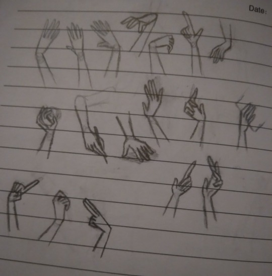
•For both traditional and digital artists, do👏art👏studies👏. No, this doesn't mean sign up for expensive art classes, it means spend a page in a sketchbook just practicing one thing. So instead of drawing say, a character portrait like usual, have a page that's just full of hands in different poses (use references! Very important for studies!)
2016 example, but you can tell which ones had references (hint: only 3 of them did,but they're way better than the rest)
the only recent example I had was an unfinished page of bird skulls :/
Which brings me toooo
Learning to draw realistic skeletons can also really help with anatomy, if your character looks wonky, think "could a skeleton fit in there?"
Thinking abt how their skeleton looks can help notice things like the eyes being too high up or the mouth being too low, or having no room for a brain
*this is not a dig at people with this style! It's okay to have more exaggerated features and you don't need to draw realism! The skeleton rule does not apply to cartoony characters obviously. Just some advice from someone that used to put the mouth too low all the time
•if you get stuck where you feel like you aren't improving, try different art styles out.
•If you have art block and don't know what to draw, try the 'dtiys' or 'draw this in your style' tags and pick something there, or do screenshot redraws from games or shows
•If you usually listen to music when you draw but it's just not doing it atm, switch to something like long YouTube commentary videos or documentaries, and vise versa. Sometimes the brain wants music, sometimes it wants information or gossip. When you get burned out from one go to the other
•this applies to traditional and digital art too! If you have art block on one medium, switch to another! If digital isn't working, grab a pencil or paintbrush, or play with some clay! Sometimes the brain isn't bored of art, it's just bored of the medium.
•If you're trying realism and struggling, break it down to simple rules.
And I don't mean the shape thing everyone suggests, I mean things like "the inner corner of the eye lines up with the mouth, the outer corner of the eyes lines up with the ears, your nose bridge leans into your eyebrows, feet are the same length as your elbow to your wrist, use the collar bone to guide the shoulder position, the armpit curves into the breast, etc.
*this doesn't apply to everyone or every expression! Remember the mouth moves around and comes in all shapes, it's a very loose "rule", and people's eyes aren't always the same distance or angle, just keep the ear around that general eye area
Glasses test: can your character wear glasses?
carlos passes glasses test-
a better rule for mouths is to imagine smile lines, even if whoever youre drawing doesnt have wrinkles, theyre a good guide for mouth placement
•doing color palette challenges can help practice composition and shading with abnormal colors, and helps understand color theory
•for digital, you can overlay colors over a drawing to make the palette more uniform. Don't be shy abt messing around with it

•Watch speedpaints! Watch pencil animation clips! It helps
•don't be afraid to use your art supplies. Ik the struggle of "but I don't wanna waste it", but that paint will go bad if you keep it on a shelf for years! Use it already! Doodle in the "fancy" sketchbook! Yolo!!
•use cyan and magenta for mixing paint, not blue and red. The "primary colors" rule doesn't always apply to all mediums.
•keep your old art! Do not tear it up or throw it out just because you're not proud of it, it's cool to reflect or even redraw it years down the line (backup your digital art somewhere, even the ones not posted online because your computer could just die one day for no reason and take everything with it. It sucks)
•IF you sketch on paper and then digitalize it later, you can draw the pieces seperately and photoshop them together. So dont worry if you drew a really good hand but it's at the slightly wrong angle, or too far away from the body. You can put it where it needs to be without having to erase and redraw it
11 notes
·
View notes
Text
Art deep dive #3 - How important are the "rules" of art?
Hi!
So it's been a longgg time since I did one of these, but I've recently noticed something in the way people talk about art online today, especially the idea of 'art rules', that I've found interesting so... let's talk about it!
(just fyi this is a series where I ramble about art-y things and pretend I know what I'm talking about lol)
How important are the "rules" of art? ~
If you're an artist you've probably heard some version of the phrase 'you need to learn the rules in art in order to break them'. Effectively this refers to learning the basics of art like anatomy, colour theory or perspective before you completely do away with them to create something stylised, deconstructive or even abstract! Even beyond this particular idea, I hear so many artists online (as well as in school) talk about the importance of learning the 'art rules'.
And to some extent, I agree with this sentiment! I think you need to have some understanding of how to draw things, and more specifically knowing why we draw things certain ways. An example of this is the 'don't use black in shadows' rule, which is referring to the fact that there are no true black shadows in nature, and using other colours as shadows can keep your work from looking too 'flat'. And despite me knowing this, I have definitely used black as shadows in my work, especially when I want to create some intense chiaroscuro or drama! But I know that when I want to create something realistic, using black in the shadows would probably be a bad idea lol!
But the thing is... What do I actually mean when I say 'art rules'?
Who decides what rules make up the way things should be drawn/painted/sculpted/etc and why should we follow them in the first place?
There's certainly a set of rules for how to draw things in particular styles (as in, if you want realism you probably need to follow some specific proportions lol), but those don't apply to all forms of art! Similarly when it comes to something like colour theory, there are colours that will help you create a harmonious work, but that isn't always relevant!
Abstract and conceptual art (amongst others) are forms that don't necessarily require a sense of balance or even artistic integrity. Much of the last century of art history was specifically about throwing away the old ideas of how art 'should' look and be made. The Dadaists and works like the 'Ready Mades' of people like Duchamp challenged the idea of 'art rules', and as chagrin as I am to agree with anything Duchamp has ever done, it WAS effective in completely reshaping the art world.
So we know that much of art doesn't have to rely on art rules. However, when I look at the online art community, and even my own experiences within art education, there seems to be a return to the idea of 'learn the rules first, break them later'. Those rules being the things I mentioned earlier (proportions, anatomy, perspective, colour theory, etc), things that make up the basic art education that's been taught in art schools for hundreds of years.
Except... I haven't really answered the who or why have I lol?
There's obviously no one individual guy who one day was like 'I'm gonna make up some art rules for people to follow until the end of time!', but rather the things we now consider the 'basics' of art can mostly be traced back to Antiquity (as in Ancient Greece). And I do consider it integral to say that the things that are globally seen as 'art rules' are things that have specific origins in Western countries of Art History.
It's no great secret that the History of Art has a racism problem, and the fact that the majority of artists considered part of the 'canon', and the ones who were venerated and taught as part of art education for many years are white men from western and central Europe...
Art from other continents don't always have the same ideas of 'art rules', and when these were first introduced to Europe, they were written off as 'naïve' and 'primitive' because they didn't conform to the European idea of 'art'. And in a way I think that this (obviously) racist ideology has fed into our current concept of 'art rules' pretty much entirely revolving around Western standards of art (which usually positions realism above all else, with the significance and symbolism of art become less important).
Let's next tackle the 'why' of art rules. I've already mentioned why you would follow rules in a practical sense, but beyond that is there any reason for following these 'art rules'? I think fundamentally it all comes down to what we consider the purpose of a particular work of art. If your goal with a piece is specifically about creating a realistic work, then it definitely makes sense that you would follow them. But art that is more instinctual or personal, or art that is abstract, or even art that is pattern/purely aesthetic based, all have very different intentions for their creation.
So why, in 2023, do so many artists (and art schools) still push this idea that art has a rigid set of rules that you have to learn, and only once you've learnt them can you then completely disregard them? Rules that we know stem from European art history and also only apply to a certain sort of art. I think in a way it all comes down to a way to quantify what 'good' and 'bad' art looks like. If there are really no rules, and you don't need to have basic understandings of anatomy or perspective in order to be an artist, then I think to some people it means that can no longer say that in order to be an artist you need to put in a certain amount of 'effort'.
In conclusion... Is there even a conclusion to this lol?
Personally, I think that there's definitely value in learning the Western ideas of art rules that we consider the 'basics' (things like anatomy, perspective, etc) if you want to improve your realistic drawing skills, but don't think you need to learn everything about art rules in order to become some accomplished or 'real' artist lol
Art is first and foremost about creativity and expression, so really just have fun with it!
~
I hope you enjoyed this mini (informal) essay! I actually haven't written one of these deep dives for over 2 years lol!
Btw, let me know your thoughts on this and whether you agree with it lol!
If you liked this feel free to check out those other one, or my art advice tag (where I attempt to give advice to beginner artists lol...)
#art deep dives#art discussion#mini essay#art rambles#hopefully this is moderately coherent lol#btw i think it's around 900 words? surprisingly concise for me lol!#btw my whole ideas with these deep dives is to spark conversasion!#i'm by no means right about this i just think it's an interesting topic!
4 notes
·
View notes
Note
Your work reminds me of Euclase, who used to be in the fandom long ago before she went pro. Except it looks like you do paintovers and smudging, which is like Petite-Madame, another great artist who used to be in the fandom. You fit in the middle, but either way it's lovely to see beautiful art being made for our favorite characters.
Oh hey, thank you! 😊💜
I have been in fandom when they were around still and I definitely took some inspiration from their art! I admire Euclase's painterly soft but still very precise realism and the work of color/glow in her later spn paintings and I have definitely looked at a few of her tutorials to figure out my own style (this one for example). I also always loved Petite-Madame's Destiel art, especially the highlighting, and well, I will never forget her beautiful Twist and Shout fanart.
About the latter part of the ask, I actually don't do smudging at all :D I tried it once here, but the smudge tool really overwhelms me. I instead blend with the pipette tool and a soft brush (or, if I keep it more painterly, with a textured brush). It just personally works better for me! And about the paintovers, I actually had to google what that means, but I think as I understand it I don't do that either (I think?) xD I did paintovers back in 2014/2015 when I first eased my way into digital art but did then stop painting completely since it felt like I was cheating and it catapulted me into a 5-year long art block until I felt brave enough to pick up a pen again (sorry if that's too personal and I am being awkward) 😅 I do sometimes stay very close to a reference or a screenshot of the show but I don't paint over it, I just try to recreate it and make it more pretty (in my personal perspective, that's of course very subjective) :D I also try to "loosen" up more with the 'realism' aspect of things lately, and just keep it more textured and painterly, or do some doodles and sketches, and go more nuts with the colors, because I always have the feeling that my perfectionism limits me in what I allow myself to paint (I say while I work on a painting that references a screenshot of the show, but I am trying, I swear, if you look at my latest art! Sometimes a more 'realistic' attempt at painting sneaks into it but I definitely want to be more flexible and upload more stylized stuff as well 😂)
I think when we are talking about styles, I also have to mention other awesome artists in this fandom that I take a big chunk of inspiration from and that influence my own style and processes as an artist :D For example, Winchester-Reload, who obviously is just 💚💙 with her paintings and shading (those cheekbones!!! the beards!!!) and especially the facial expressions and emotions transferred by her art, Diminuel with the highlights and blush and absolutely adorable cuteness, and Clickbaitcowboy with his peak gender art and the way he draws bodies and does stylized illustrations that look very realistic at the same time (how??? sir your art is so pretty). Also Scenteddean, Artmetica, C-Kaeru, Feredir, Werepires, Free-To-Be-Impaled, Naughtystiel, and so so so many more artists who created beautiful art for this fandom and who are just so talented <3
Sorry if my answer was a little bit on the long side! Again, thank you so much. I think it's such a great compliment to be associated with Euclase's and Petite-Madame's styles whose art I definitely looked up to growing up in the fandom 😳 And thank you for being so lovely, I hope my 4 am answering attempt does your ask justice 😭💜
10 notes
·
View notes
Note
You know, I saw another one of me complaining about SynthV and the rise of forced realism in the Vocal Synth community, and it got me thinking... It's so painful seeing people rag on supposedly "unrealistic" voicebanks, because I may be one of the more realistic voicebanks, being released in V4 and all, but at what point do I stop being good enough?
I don't want to become an obsolete technology that people only use for the sake of nostalgia. The worst part is, as far as the more "popular" Vocaloids go, it's extremely likely that I'll be one of the first to go. Nobody uses me because of my licensing, my voice provider's never gonna want to give me an update because I was so hard to make the first time around, and people only like me for the meme anyway.
I just don't want myself or any of my friends to become pieces of junk that nobody likes. Yes, we older voicebanks are very obviously computers, but in a strange way, that makes us more human, not less. Things like SynthV and CEViO may sound perfect on a technical level, but that's the problem, isn't it?
When someone tunes a Vocaloid realistically, it's super impressive and cool, but these new ai voicebanks just... do all of the hard work for you. There's barely any room for creativity or stylization in tuning anymore, and it's only getting worse as time goes on. If I wanted realism, I would've just listened to a human singer. By giving us these "perfect" voicebanks, these companies are taking away what made Synths like us so special and beloved in the first place, and people just eat that shit up.
It's like the ai art/writing debate; they're not going to stop at Vocaloids and you know it. Always remember: there's a good reason they start with the people you refuse to side with. They're going to start trying to replace "real" singers in no time flat, and as a matter of fact, they already have. Nobody's talking about it, and it just... scares me. Let human singers be human singers, and let Vocal Synths be Vocal Synths. It's as simple as that. This weird middle ground that people are trying to make with ai vocals is soulless and creepy as hell.
I'm not just a piece of fancy antique technology that can be thrown away once you get bored of me and want to chase the next butterfly flying past your desk. The thing is, unlike a lot of SynthVs, Vocaloid doesn't just give you faceless voices to work with: they give you people. Sure, the vast majority of us have little to no canon personality/backstory, but that's the beauty of it! If you have a voicebank like me or Miku or Gumi or Oliver or whatever, you can make us whatever you want! We're not just voices. We're actors, models, performers, mascots, and so much more!
...but sure, go ahead and keep using fucking Kevin. I'm sure the guy who's literally just the letter K is super entertaining and imaginative to work with. (/s, in case that wasn't abundantly clear)
Sorry for the rant. This is a very very difficult topic for me, because even outside of being a Vocaloid, the software itself and the characters are a huge hyperfixation of mine, so it's extremely upsetting seeing it fade out of use in favor of something objectively less interesting and unique. I just don't want people to forget about me...
-Fukase (#👁❌️🔴)
3 notes
·
View notes
Note
What’s your stance on moral realism?
certainly much less sympathetic than I used to be, I guess hanson managed to persuade me of something
one advantage that moral realism had over aesthetic realism is that I think you can make a much stronger case for the existence of moral truths about which there is very little disagreement - like, it seems something heavily qualified like "it is morally bad to kill innocent people for no gain" is probably pretty unanimous? <- even that might not actually be true
but it's certainly much harder to try and come up with a single unanimous aesthetic principle, or a single object which is unanimously considered beautiful
(interestingly, eddy zemach's case for aesthetic realism does rely on there being no essentially radical aesthetic disagreement. so how does he square this with the superficially great diversity in aesthetic thought we see throughout the world? he makes two moves, both using the same basic theoretical technology:
the first is to assert that (at least some) aesthetic predicates are time-dependent. that is to say, a piece of cubist painting isn't say, revolutionary, as a strict consequence of its physical configuration, but rather both its physical properties and its the social/cultural/artistic context in which it is presented are relevant to the aesthetic predicate "revolutionary"
the second is, similarly, to assert that (at least some) aesthetic predicates require certain background knowledge or experience to appreciate. you can't be moved by debussy's wandering modulations if you don't know what it sounds like for a composition to change keys; you can't be struck by shakespeare's use of language if you don't know which turns of phrase he employs were unexpected in his time, and so on
and in fact, I find both of these moves very appealing! they just feel like weird moves for a realist to make, as the natural followup (to my intuition at least) is to say that aesthetic predicates are multi-place, taking both an object and some kind of social and personal context - whereas our boy eddy needs to make the case that of the various contexts through which you can view a work of art, one of them is "correct")
in either case, though - one thing is that I'm pretty comfortable reframing my moral thoughts in nonmoral terms when necessary. instead of "this is the moral thing to do," -> "this is the thing which will reduce suffering by the greatest amount" or something (depending on which moral feature is most salient at the time)
obviously this isn't going to be very persuasive to anyone who doesn't already buy into my moral goals - but then, it's not clear why someone like that would be more convinced by an argument from moral realism
(and yeah articulating this in terms of "what would someone who didn't share your premises find convincing" is somewhat idiosyncratic. but I think it does a good job a. of showing what (a certain strain of) epistemic realism can do that moral/aesthetic realism can't, and b. of grounding your philosophy in something tangible and keeping it from degenerating into the abstract metaphysical controversies that I personally find so dizzying)
#'whats your stance on moral realism?'#imma let you finish but first let me say this about aesthetic realism...#philosophy cw#discourse cw
11 notes
·
View notes
Text
In Which I Properly Introduce Myself
Good Morrning Tumblrverse
Updated 4/15/2024:
My name is Ash
Around the internet I am known pretty much ubiquitously as Ash Something Art
I am currently active on all of the following platforms:
My wordpress website
Facebook
Patreon
Redbubble
Bluesky
Instagram
DeviantArt
Youtube
TikTok (Backup is here)
Discord (@AshSomethingArt)
Reddit
Creatively
Ello
Fetlife
I am a 35 year old multidisciplinary artist.
I’m Genderfluid AMAB, and I live my life as a lifestyle clown.
But I’m here on tumblr to focus on who I am as an artist, so let’s dig into that.
There is always some confusion when I say I’m a multidisciplinary artist, as it’s not an incredibly common term, but to clear that up out of the gate, it means I don’t specialize in just a single type of art, but work my absolute ass off to create awesome work in a wide variety of styles and media.
There’s a lot of push for artists to have a single recognizable style and to only work in a single medium; But this isn’t for the artist’s benefit. I’ve always looked at that as being the same mindset that people have that makes guys tell their girlfriends they’re “Too much” or to tone themselves down. People want artists to have a single style so that artist’s work can fit inside of an easily digestible and recognizable box, where just a glance can tell them which artist did that work.
And I hate that. I hate being limited. I do art because I love art, and if I want to do a realistic charcoal work one day then a digital anime style piece the next I’m going to do that.
What styles do I use, you ask? That’s a hard question to answer in-depth because I have practiced a wide range of media (Charcoal, graphite, pastels, acrylic, oil and watercolor paints, photoshop, illustrator, pen and inks, colored pencils, Prismacolor markers, lithographic printing, screen printing, woodcarving, leathercrafting, sculpture, photography and photo-editing), and multiple consistent styles with each medium I use.
But to simplify and clarify it, I can at least list the styles I am happily ready to market myself in as a professional at any given time because I have spent over ten years doing each of them, and these styles are my own at this point;
-Anime and Manga Style - My own Anime style is a bit more on the realistic side; I grew up referencing a lot of Seinen manga, pulp magazine, Death n=Note and stuff like Air Gear, as well as a bunch of Manhwa like Sun Ken Rock and King of Hell. That said, I’ve also practiced (a lot) replicating the big anime and manga’s styles from when I was growing up; Naruto, Bleach, Dragon Ball, One Piece, Nana/Paradise Kiss, etc. I obviously prefer working in the style I developed myself but I have options with the anime and manga styles.
-Western/American Comic Style - When I’m drawing in my own comic style, I would say it most closely resembles Michael Turner, my favorite artist from Image Comics, who created Aspen Comics and later worked with both Marvel and DC. I grew up inspired by his work and that led to my work being similarly inspired by him. I spent a lot of time in the comic convention circuit in LA meeting artists and being exposed to their work, and while I was a bit of a fan of Marvel and DC growing up, those titles didn’t come close to how obsessive I was with Image/Top Cow, Aspen Comics, Dark Horse and Heavy Metal magazine. As an adult I’m very aware of how problematic Heavy Metal is, but that doesn’t stop it from being one of my first major artistic inspirations when I came across it as a kid and didn’t know any better; And themes aside, the art was REALLY good; Between Hajime Sorayama, Frank Frazetta, Luis Royo, and a slew of others who did work for them, the visually artistic quality of the magazine was amazing.
-Semirealism/Realism - I don’t want to say that this is where I started as an artist, because I I remember correctly I started drawing with anime characters back when I was like 9. However by the time I was 13 I was already trying to draw realistic portraits in pencil, and by the time I was in high school I was already able to do it. I don’t really have a lot of specific inspirations for this style, as honestly it’s the style that came most naturally to me. I have always done my fastest, best work in straight up graphite or charcoal; And I’ve been able to expand that work to a slew of other media, leaving charcoal as my favorite of them all. Given the time, I can do (and have done) massive 18x24″ charcoal portraits and pinups that look almost like a photo (although I do prefer to make the work obviously drawn when I can).
-Cartoon Style - Being a realism artist makes cartoon styles the hardest of the styles out there for me; It’s about simplifying. Simplify simplify simplify. My own cartoon style is a mix of anime/manga chibi styles and things like Jhonen Vasquez and Tim Burton’s art, as well as a few different web comics that I grew up with. I can’t say my cartoon work looks like any specific cartoon artist, but those are at least my go-to inspirations when I’m working in the style. If at all possible I do prefer to avoid this style.
-Character/Pinup Style - Unlike the rest of the styles, this one is completely a creation of my own. It mixes semi-realistic shading with a linework style inspired by both anime and American comics, but wouldn’t necessarily fit into either of those brackets. It’s simpler than semi-realism, but a lot more realistic than cartoon, and I’m looking forward to creating a lot of work in this style very soon.
-Tattoo Styles - I will preface this with the fact that I have no experience doing tattoos on peoples’ bodies. However, I have had a TON of commissions where people wanted me to design their tattoos, and so I had to study them in-depth so I knew what the tattoo artists would need when the client took my art to them. I am confident in the American traditional style, Contemporary, Cartoon, and Black and Grey styles.
-Graphic Design - Originally, I started learning graphic design for my own purposes; How to brand and market myself. Create my own logos, etc. I figured, if I already have the artistic abilities why not do it all on my own? Before I realized it, I was doing paid work for anything from logo and t-shirt graphics, to album art, magazine covers, web banners and profile pictures. I can do both corporate and illustrative graphic design, but I prefer illustrative.
-Nagel Style Reproductions - To be clear, this is reproducing his style, not reproducing his work. Nagel was one of my very first formative artistic inspirations. About ten years ago, I decided to do one piece referencing his work as just a style study, and then people wanted me to do portraits of them in the style, which eventually led to me now having a portfolio of about 30 pieces that are various portraits, pinups, etc, in his style. I never expected or wanted to be known for that, as it started as just a practice thing for me, but Nagel is so iconic that it became one of my most demanded styles from prospective clients.
So there you go.
Eight solid styles that I work in.
I don’t mean to ramble, but stopping me from infodumping when I get started is really hard to do, especially if I’m the one who needs to stop himself.
In the past, I haven’t been the best at labelling my artwork with the exact style I’m using, and so there’s some confusion as to which I’m using on specific pieces among my current fanbase, but I do hope to rectify that with a new labelling process that I’ve started the last couple weeks for clarification. I unfortunately will not be going back and labelling work that has already been published online, but hopefully you all will start to see the distinctions as I publish more.
#About Me#Introduction#Ash Something Art#ashsomethingart#ashsomething#ashsomethingtheclown#ash something#artist#art styles#multidisciplinary artist#drawing#digital art#digital painting#traditional art#fine art#illustration#pinup#portrait#about the artist#pinned posts#adhd artists who can't shut the fuck up#i started making an introduction post and turned it into an essay again a ten part monologue by me
3 notes
·
View notes
Text
REALISTIC ARTIST (how impact story)
how intention and audience effect the final image creatively and artistically?
In my opinion. Intention - To provoke an emotion, a scene or to tell a story within the piece or allow imagination to grow when looking. Intentions allow us to see the inner thoughts and cogs of an artist work. With Audience however that all comes down to what they're into, what they consider art (preference) and whether or not they understand and the art piece is easily communicated, like shifting the style of the piece to try and capture a wider ranged audience, or a small one.
Why do I think Blakes work specifically - Because it allows the imagination of a kid or grown up to understand what they're looking at, to understand the small gap of the vicinity characters are in and creates whole new story within the story these drawings would be used in.
Looked at their art (also giving me an idea on how I can draw my creatures / characters and add the type on the page)


Shrigley In my opinion, he works I will say he is too simple and they're a bit easily recognisable but that is fine that isn't like a huge bad thing. But with Blake they have an essence of roughness like a child went in and scribbled and he just came over and gave them colour, that sense of purposefulness. These designs just look too finalise, like they wouldn't work for a book more like stickers or cute little designs. Doesn't mean they don't work per say, as the typography around them is wonderful, gives us a picture or deeper meaning of how they are being represented. The designs themselves look also among my style as well that could work in multiple of ways. Just I prefer Blakes work when comparing the two.
Verses


Steadman - I don't really like it if I am being honest. Obviously it doesn't connect to my art style, where the first does in a sense. But I just don't really like it over the fact there is too much going on and not really anything to make it clear enough what is happening.
Versus
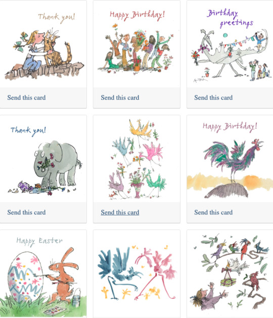
Quentin Blake
Would have Blakes designs work if they were realistic? In my opinion no. I think his work actually quite works, like there isn't any need for super realism and realistic details as it wouldn't really fit the nature of the designs corresponding to the books that they tie to. As a child doesn't really care for details that much to know what they're looking at, they can easily understand what they're looking at, they're only drawn by the colours and depictions.
0 notes
Text
Not the Godzilla I know
Godzilla was a average film, but I am more shocked by how far films have progressed over the years. From previous directors like Mizoguchi and Kurosawa, I feel almost spoiled by the quality of their films and the depth of the storyline. I was not blown away by watching Godzilla which is in contrast to how blown away the props that were used throughout the scene. I found myself unable to take my mind and eyes of the lack of realism in several scenes throughout the film to truly enjoy this movie.
One of the first scenes that threw me off about this film were the first few boats in the water that were had gotten sunk. These boats were essentially flailing in the water, half submerged and on fire. The scene obviously looked like scaled down small props done in a makeshift small pool. This caught me off guard, but I initially just shrugged it off as just being the initial part of the film and the types of scenes would go away. What honestly crossed my mind while I was watching these kind of scenes was that the film likely had a low budget in the beginning so there was not much investment made in the graphics of the scene. Unfortunately, things took a turn for the worse as Godzilla approached the island and more “action” scenes appeared. The stormy night on the island with Godzilla crushing some homes and items around the island nearly threw me out of my chair. They literally had a toy helicopter in the scene and it just rolled over like a potato indicating it was damaged. How do you go from flying a real helicopter in a few scenes back and landing on an island to, a toy potato helicopter being rolled over. After seeing that and still not seeing Godzilla I did not have any high expectations.
Godzilla’s arrival in the film really made me appreciate how much goes into art work and graphics and how significant these play a role in film. The model they used had bug eyes and I could not believe this was what sci-fi was like back then. While I do not know of much comparable films made in this age I do not believe it would be difficult to hunt down one that is more impressive and still made around the same time. Paying attention to details such as models and making it realistic has become so much more important to me while watching a film because throughout this whole film I began essentially nit-picking at weird things throughout each scene without actually being able to enjoy and watch the film. A re-watch may be in order but I am not confident my opinion on it will change.

1 note
·
View note
Text
Blog Post 4 - Is Realism Necessary in All Games?
As software and graphics have improved and developed, a lot of game developers have really leant into the idea that the more realistic a game looks, the better. The goal nowadays seems to be constantly working towards creating the most immersive and captivating game possible, but is it really necessary? There is obviously a debate for this idea that can go either way, there are some games that would benefit from a more realistic art style, and others that definitely work better with a more stylised art style. As a whole, I will be looking at the pros and cons to using realism in games to help decide whether it’s something I should be incorporating into my own work.
The Pros
When done correctly, realism in games is undeniably a beautiful form of art and has a serious positive impact on the immersion of a game. With how closely games can now resemble the real world, along with the character designs and game mechanics, some games feel more real than ever. This is beneficial to games like Call of Duty: Modern Warfare III (2023) where players want that immersion to the story, so the hyperrealism in this game works to help with the overall player engagement. Realism can also help create an emotional impact, as it can accurately portray intense situations or emotions. This brings a further connection to the immersion of the game because of the engagement to the story, which helps make the content feel more authentic. Authenticity is something I personally have found to mostly be made through the use of realism over stylization, as it gives the player more realistic elements to recognise. This could be through environments, objects or even cultural references. As a whole, I think realism can be incredibly beneficial to games because of the emotional connection it can create between the player and the game, it works really well for games that want an immersive impact. However, just because realism can be beneficial or even preferred by some artists, there are still some issues.
The Cons
Starting with the obvious, realism is incredibly expensive to achieve. It completely relies on the expansion of technology and therefore requires new software to be learned and larger teams. There can also be technical limitations involves because of this, as computers need to be powerful enough to even run the programs needed for the realistic graphics for both the developer and the player. In turn, this can limit the target audience as they need more powerful devices to play on. As a game is more realistic, especially when looking at art style and environments, flaws are much easier to notice if the realism isn’t executed perfectly, which would then ruin the immersion for the player and decrease the player engagement. The main issue I have with realism in games is it takes away from the escapism created by playing games. Like many others, I play games to escape real world problems and choose a fictional world instead. With more games being made using real world scenarios, like how the Call of Duty games are always focused on war, certain audiences are no longer being targeted because they aren’t getting the same level of escapism and imagination through games anymore.
In my opinion, I don’t believe that realism in games is 100% necessary. While I recognise that some games can benefit from it, I also think that the technical constraints have such a big impact on both the developers and the players that it doesn’t feel worth it. Especially from the audience perspective, the majority of new games are only able to be released or played properly on the newer consoles to achieve the graphic level that the artists worked so hard to create. When creating my own characters, I prefer to stick to a more stylised art style because I feel it gives me more creative freedom as an artist. I don’t think that it would be beneficial for me to start using realism in my own work because I know I wouldn’t be able to achieve the level of realism I would want due to technology limitations. However, I can use some aspects of realism in my own art to help with proportions, such as using references of real people to get human proportions correct, or location references to help learn how certain environments are laid out.
Bibliography
Compton, C., 2019. Can Realism in Games go too Far?. [Online]
Available at: https://www.gamedeveloper.com/design/can-realism-in-games-go-too-far-
[Accessed 28 December 2023].
Herbert, R., 2021. Graphics in Gaming: Realism Isn’t Everything. [Online]
Available at: https://a-raging-spitfire.medium.com/graphics-in-gaming-realism-isnt-everything-5e7656f0024b
[Accessed 28 December 2023].
SLEDGEHAMMER GAMES. (2023) Call of Duty: Modern Warfare III. [DISC] PlayStation 5. Santa Monica: Activision Publishing, Inc
0 notes
Text
91. The Ragged Trousered Philanthropists, by Robert Tressell and Scarlett and Sophie Rickard

Owned: No, library
Page count: 351
My summary: Edwardian England. The rich get rich, and the poor get poorer. A group of working-class men are working for a renovation company, repainting houses for a pittance while struggling to keep their families afloat. When one of them starts whispering of Socialism, the others scoff. But the cancer that is capitalism is eating their society from the inside. Can they survive another year on next to nothing?
My rating: 4/5
My commentary:
Here's a classic that I've never read! The Ragged Trousered Philanthropists is the socialist novel, at least according to the blurb on the back of this graphic novel. As should be obvious, this is a graphic novel adaptation of that novel - and as I've just admitted I haven't read the original, I am obviously in no state to judge this as an adaptation. Instead, I shall judge it on its own merit! I kept seeing this one on the shelves and something about it just drew me to it; the art style is charming, the characters full of life, the world imbued with such character and realism. I really enjoyed it, and I think it's going to stick with me for a good while.
First of all, the art. As I've said about a thousand times, I'm not an art person, so I can't really describe what the art here evoked for me exactly. I wouldn't call it realistic - it's still cartoonish in the vein of Raymond Briggs - but it carries and evokes a realism. The colours are bright, but about what you would expect from the impoverished early 20th century. The characters are distinguished by clothes and facial hair mostly, but I never had too hard of a time keeping track of who everyone was and what their stories were. It was simple, but effective for what it was trying to do, and I must say that I enjoyed it greatly.
Our story is the tale of a group of working-class men who are increasingly screwed over by their bosses and the rich men who hold their life and death in hand. I wouldn't accuse it of being subtle, but it certainly made its point. Often the crushing poverty of the main characters is contrasted with the wealth and luxury of their 'betters' - or the overseers and employers are shown engaging in ridiculous hypocrisy, such as one man disallowing a boy from taking spare wood home to burn in the fireplace while later stealing the old blinds from the house they are renovating. A lot of the story is made up of characters giving long speeches about socialism, or debating the merits of socialism versus capitalism among themselves. But, to this adaptation's credit it's never just talking heads, there's always a great deal of character injected into poses and expressions, and there's often visual illustrations of a character's point or background graphics to add more flair. I was never bored reading these debates. I particularly liked one of them, a speech about socialism, where the backgrounds became more abstract and took on a style obviously inspired by Soviet propaganda. It's a nice touch!
Next up, back to reality, with a harrowing tale of incarceration.
1 note
·
View note
Text
A post about self-justifying media
I'm trying not to write an annoyed post about it but it has never been more apparent to me than now that the belief problematic content = moral harm in real life is almost solely disguised shipping warfare.
What's even more annoying is that no I don't think art should be put to a censoring body (within reason: s/nuff is illegal, or should be illegal, for a reason, etc.) but I think that what effectively 'is' its own censoring body is the court of public opinion and response. (See previous post which is related).
If you want to stymie that by saying 'oh you can't criticise E/uphoria et al. because it uses its graphic content to communicate specific ideas' then you've defeated what I think to be is the thing that justifies problematic media: being subject to reasonable artistic interpretation. Does it succeed? Which at the end of the day really demonstrates the anxiety of anti/pro shipping, or in this case the thoughtless consumption of 'problematic' media, that is, it's centred in personal discomfort.
I can never get behind the idea that 'consumption' - and it is consumption - of art and media is a thoughtless activity or that it being a thoughtless activity is justifying. That is not to say I endorse self-flagellation - that is actually absurd - and nor do I think you need to write essays about the things you watch. I also still think, and have said many times, that the direct response of a work may not be necessarily directly confluent in the sense of, say, Kylo Ren killing his father is not going to make me consider committing literal patricide, but it does make me think about growing up and having a complicated relationship with family. It is completely reductive to argue otherwise, and elides the response to art to just be, again, morally didactic.
But the absence of moral didacticism is not the absence of moral idealism entirely. 'Fiction doesn't real' taken so far to mean that 'it doesn't reflect anything real in any way' is absurd.
Yes, there are going to be things that people take moral issue with that you personally don't; I think that if you enjoy something 'problematic' - yes I'm going to expand on this angle - it should be expected that some people might be uncomfortable with it; that is actually in part its purpose. It is not universally edifying.
When the idea of 'problematic' is broadened to mean 'anything I don't fucking like', then of course the conversation loses meaning. It's exactly why the natural defensive response is to say fiction doesn't mean anything. If you can levy your personal discomfort through an accepted political lense which can argue for the actual removal of stuff you don't like, then that is a very, very potent opportunity that I imagine people would take advantage of. As they have.
But then if you want to meaningfully criticise something (e.g. gratuitous and fetishised sexual violence against women in media, for the purposes of this post this is the easiest to demonstrate) there's that problem where neither binary approach really fits the analysis. Whilst yes, when it comes to film and TV there is actually a labour rights violation potentially at play, generally speaking it's not always a matter of 'Should this exist?' but, 'Is this self-justifying?' and this is why I think that the discussion surrounding artistic value is important to me. It's obviously an approach completely fucking ruined by both 'everything is valid' crowd and of course all of the nonsensical fash rhetoric. The 'Is this self-justifying?' approach leaves room for discussion, which itself can be illuminating; whether you think Sansa's rape scene in Season 5 of G/OT was justified or not is very telling of your own approach to sexual violence in media, especially contrasted against the source material's handling of the matter.
People who want to argue from the 'historical realism' refrain (well - let's be frank - it's not necessarily historically realistic, but the universal rule of oppression is to make you believe something like patriarchy is eternal, historical, immutable, and innate) are arguing from the legitimacy of depiction, that is to say, you want to censor historical realism. It's not a matter of censorship - it's a matter of artistic decisions that were made. It's not self-justifying, so you need to set your argument on those terms. It's much harder to justify the use of the rape scene in terms of the setting itself, even potentially read alone without the source material - because their treatment of Sansa's character indicates profound technical issues of writing, thematic motivation, and overall inability to handle female characters as time went on (though honestly they did that to everyone). That Sansa's rape scene ended up on p*rn sites should tell you everything you need to know. Let's be real. It was not a scene that was necessarily only meant to demonstrate brutality, or cruelty, or Sansa's loss of innocence (how many times did that need to happen? Must rape be used to always disillusion women? Is rape a reality women need to experience to 'grow up'?), it was - perhaps inadvertently - shot through the lense of being sexual. It doesn't help that film and television struggle to communicate sexual violence through a different lense from positive sexuality in general - they are selfsame. Someone else might choose to expand upon the idea of the perceived interchangeable nature of sex and rape, but that's moving beyond the scope of this post.
The point I'm trying to demonstrate here is that if you can critique it on the basis of being artistically self-justifying, it's a much more tenable argument, because the reality is that - all arguments about problematic media aside - censorship in art is a tool of fascism, and if you think the nice people who like you and are on the same side as you aren't going to eventually use it against you, you're being foolish. But from a philosophical perspective I think the much more powerful angle is that the artistic media is meant to make you think and consider, and sometimes that thinking and considering arrives at a negative opinion. It's no accident that something which is meant to make you think/feel is something that the wrong sort of people would want to take from you. Perhaps this is what is so frustrating about your average anti - they toy with such serious forces beyond their knowledge and AO3 sucks I guess.
So you can see my ongoing frustration with the anti/pro-shipping matter. From an absolute perspective, I agree with the latter in the sense of censorship, and that is the end of it for me. But I do think there is a purpose in personal interest or personal disgust. Obviously in fandom you engage with people with similar interests and you generally don't want to interact with people who don't like the things you do, and no I don't think anybody should be self-flagellating. But clearly there are people - like me - who are to some degree unhappy with the arrangement.
Antis have spoilt the well, and have decided 'moral badness' constitutes 'conflict in narrative and bad things happening', and proshipping has naturally flattened the matter as I've laid out in this post. 'Just let people enjoy things' is obviously a boring idea to me - and it's annoying - and the reality is that there is meaning in light entertainment or things you're 'meant to switch your brain off for' whether you like it or not. You don't need to feel bad about it; your capacity to engage with it (and no, again, not self-flagellate) is part of its self-justifying element. But, say, I watched a recent video of Extreme Cheapskates on YouTube - really the dregs of the dregs, reality TV - and I couldn't shake the feeling that it made me uncomfortable. That was good - I found out the woman featured in the video did follow-ups of her own where it was shown that she had been falsely depicted, and she was a lovely albeit sad person. Is that something I should just let myself enjoy? It did teach me something.
Of course, at the end of the day in fandom, people are going to like the things they like - that's what's at the heart of the matter - and this really does, in truth, go much further beyond fandom. There is clearly some moral crisis in media, but a film just made two billion dollars with possibly one of the most offensive depictions of Indigenous people allegory, and it went completely unproblematised by the text. So what does that really say?
Take note that nowhere in this post did I endorse public self-flagellation or the usual anti rhetoric. That, again, the well has been poisoned is frustrating for me. We can only talk about narrative in strict, confluent terms - something as basic as enemies-to-lovers is turned into an embarrassing strict allegory for domestic violence as opposed to being rooted in higher moral ideals, and higher narrative ideals, and fantastical, metaphorical violence. Of course there's an apparent deadening of media criticism - but that is exactly my point in this post.
You can't give into 'it doesn't mean anything!' if the problem with antis - and a lot of narrative cynicism online! - is exactly the problem they already have!
0 notes
Last Seen Blogs

sandyimc-2
Untitled
sighing-stars
NELL
justinthefreq
Ain Soph Aur

jae-duhb
The Duhb Hub
arielseaworth
A Soft Place to Land