#shaders
Text
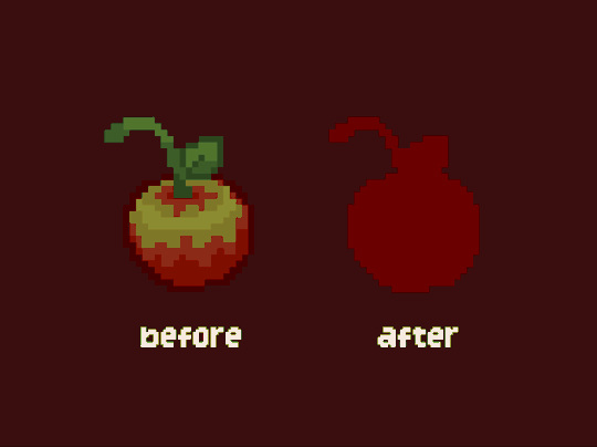
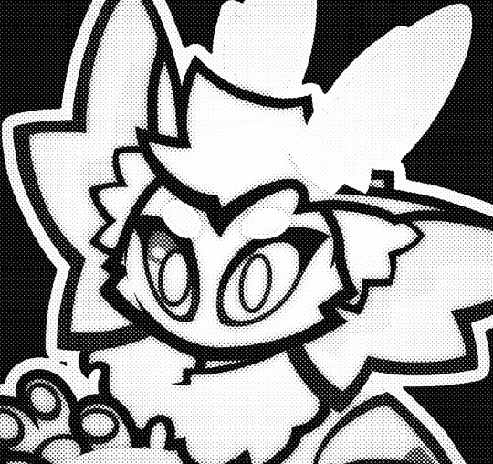
I've been working on a godot plugin for controlling how pixel art behaves with lighting, and I'm almost done with a really basic version! (more info under the cut)
this plugin is based on some techniques I have been developing over the years, featured most prominently in silt spawn.
it's a huge step forward though, since it requires no setup whatsoever, and it works with any normal light sources in the engine. the way it works is by generating an encoded sprite and a bespoke shader that can really quickly pick the exact color to show for each pixel based on how well-lit it is. as this gif shows, the plugin works with existing light sources and sprites, so you can really use these pixel-picky sprites as much or as little as you need!
now that the main feature is done, all I need to do is finish the UI in the editor, and then I'll feel comfortable releasing a bare-bones version of this plugin. I'm really proud of how it's coming along, and this quick little gif is just the beginning! :D
#auroras originals#game dev#indie dev#indiedev#game development#gamedev#pixel art#pixelart#godot engine#shaders#devlog
2K notes
·
View notes
Text

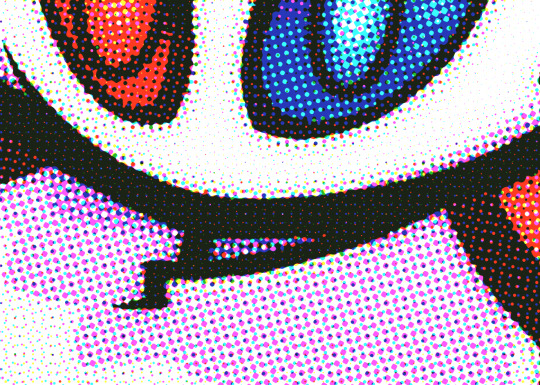
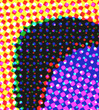
Was experimenting with halftone effects after watching this video and it almost has spiderverse vibes honestly. I actually learned some neat things about why printers use CMYK instead of just CMY so I thought I'd share !!
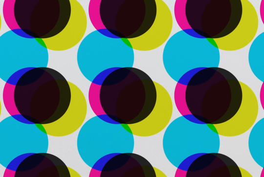
So in our optimal little computer space, Cyan (0,255,255), Magenta (255,0,255) and Yellow (255,255,0) all multiplied together gives us a perfect black (0,0,0) Awesome! The issue is that ink colors irl arent exactly perfect like this, and color is a bit more complicated irl compared to how computers represent it, so they aren't the greatest at combining into black if they aren't those perfect CMY values:
Left: CMY
Right: CMYK

(thats not even black, its a dark blue in the original image but dark colors just look so much richer)
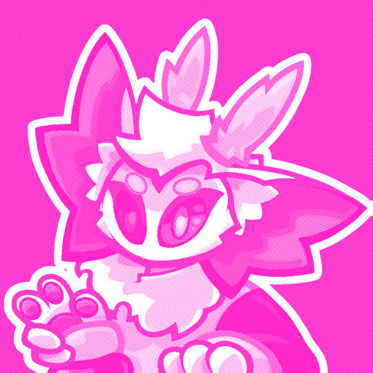
An important step to make sure you arent doubling up on the black values though is to divide the image by it's own "value" (the max of all 3 color channels) that way the value is equal to 1 everywhere, and you're letting the black ink take care of the value on its own.
Left: CMY (normalized value)
Middle: K (black)
Right: Combined


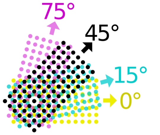
Now obviously the grids of dots cant be aligned perfectly with each other because you'd just get a bunch of black dots in unwanted areas, but if the grids are misaligned, then some dots become more prominent than others which tints the whole image. This was an issue because older printing methods didn't have great accuracy and these grids were often misaligned.
The solution was to rotate these grids such that they can move around freely while getting rid of that tint effect if they aren't perfectly aligned :D
(I have no idea how they came up with these angles but that might be something to look into in the future who knows)
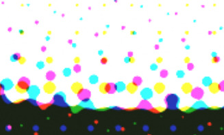
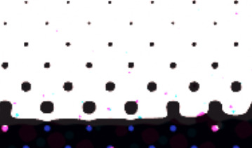
SPEAKING OF MISALIGNMENT
I wanted to implement that in my own filter to get some cool effects, and I discovered another reason CMYK is better than CMY for lots of stuff !!
With CMY, you're relying on the combination of 3 color channels to make the color black. This means if you have thin lines or just details in general, misalignment can make those details very fuzzy. Since CMYK uses a single color of ink to handle value, it reduces color fringing and improves clarity a lot even if you have the exact same misalignment as CMY!
Left: CMY
Right: You guessed it! CMYK


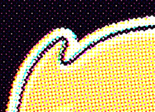

(yes these comparisons have the exact same color misalignment, the only difference is using a fourth ink color for black)
ANYWAY I just thought there was a lot of cool information in this tiny little day project, I also just think it looks really neat and wanted to share what I learned :3c


EDITING BECAUSE THERE'S ONE MORE THING I WANTED TO ADD
So, I talked about how to get K in addition to CMY instead of just CMY, but how exactly do you separate CMY from an image in the first place?
Well, CMY is a subtractive color space, meaning the "absence of color" is white, compared to RGB where it's black. This makes sense because ofc ink is printed on white paper. You can use dot product to get the "similarity" between two vectors, and this can be used to separate RGB actually! Using the dot product of a color and red (255,0,0) will give you just the red values of the image. This is cool though because if we get the dot product of our image and the color cyan (0,255,255), we can get the cyan values from our image too! If we first divide our colors by their value to separate the value from them, then separate CMY using those dot product values, and using K for our final black color value, our individual color passes end up looking like this:


While it's called a "subtractive" color space, I find it more intuitive to treat white as the absence of color here, and then multiply all these passes together. It makes it much easier to understand how the colors are combined imo.
Notice how cyan is the opposite of red: (255,0,0) vs (0,255,255) and magenta and yellow are the opposites of green and blue respectively! This means you can actually kinda get away with separating the RGB values and just inverting some stuff to optimize this, but this example is much more intuitive and readable so I won't go too deep into that.
THANKS FOR READING
I know it's a very long post but I hope people find it interesting! I try my best to explain things in a clear and concise way :3

oh thank you I realized I should probably add an eyestrain tag
1K notes
·
View notes
Text
style experiment
719 notes
·
View notes
Text

I wanted to try my hand at a build using only a few kinds of blocks, and this is what I came up with! I was largely inspired by M.C. Escher's work and love how the light and shadows worked out in this piece.
2K notes
·
View notes
Text
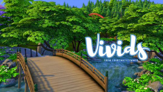
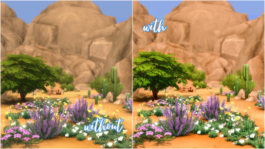
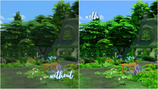
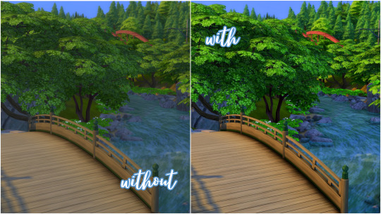
[cs] Vivids GSHADE Preset V1
Dull no more! Vivids enhances the look of your game by making everything clearer, cleaner and brighter! Shadows are more defined, colours pop more, and the overall vibe of the game just feels so much cheerier.
-
DL BELOW
Super happy to share my sims 4 reshade with you! This preset is PERFECT for those of you who want a subtle yet beautiful pop of colour that brightens up your game.
This preset is useable for both CAS and in game!
-
Intended for use with GSHADE install gshade here ♡
╔.★. .════════════╗
DOWNLOAD HERE
╚════════════. .★.╝
Thank you for supporting me!
#sims 4 cc#my sims#sims 4#simblr#the sims#the sims 4#ts4#sims 4 reshade#sims 4 gshade#gshade#sims 4 shader#shaders#thesims4#ts4 cc#reshade#ts4 reshade#sims
193 notes
·
View notes
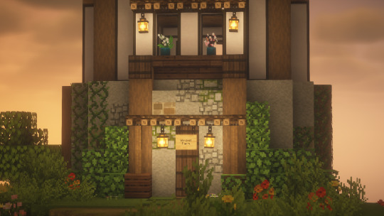
Photo
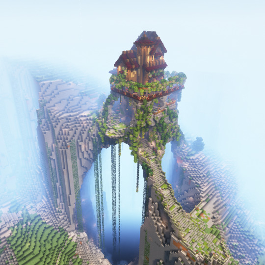
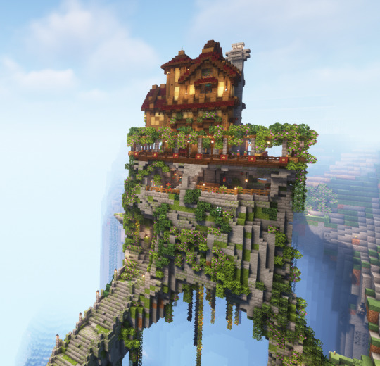


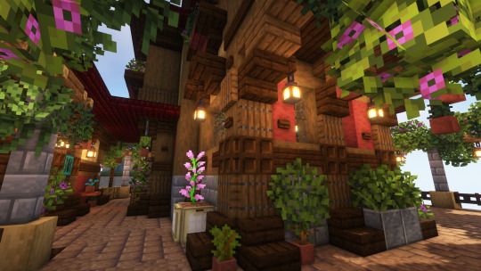

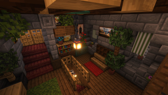

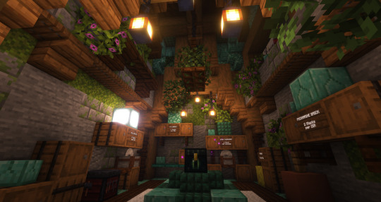
My starter base on the Reloaded OG SMP! It started as a slim land bridge that I turn into massive stone arch ruins supporting a house! It also homes my prismarine shop in the lower portion of the stone base, and likely a moss shop in the other half, along with my storage room in the middle! Still relatively new with terraforming, and it’s not quite natural, but was still fun to do!
The house portion also has a full interior, but it’s harder to get shots in the smaller rooms, so I just took images of the bigger areas, and the smaller attached building is a greenhouse. :D Loads of entrances and exits all over the place and people have gotten lost while visiting me on the server lol.
It’d be easier to show the build as a walkthrough, but I’m not sure if there’s any interest. Let me know! (I made one and you can find it here: https://youtu.be/ay1USYiYRlY )
Textures: Winthor Medieval stained glass, VanillaTweaks leaves
Shaders: Complimentary
#minecraft#medieval minecraft#minecraft smp#original build#minecraft original build#mineblr#my builds#reloaded og smp#fantasy minecraft builds#gaming#minecraft terraforming#mc builds#minecraft design#fantasy#fantasy house#shaders#terraforming
2K notes
·
View notes
Text
@gadgetpatch has my new character shader nearly finished... Look at her... Look at my baby daughter Vesna she's so pretty now....
And go hire Dana for your projects she's the best tech artist you could wish for
162 notes
·
View notes
Text
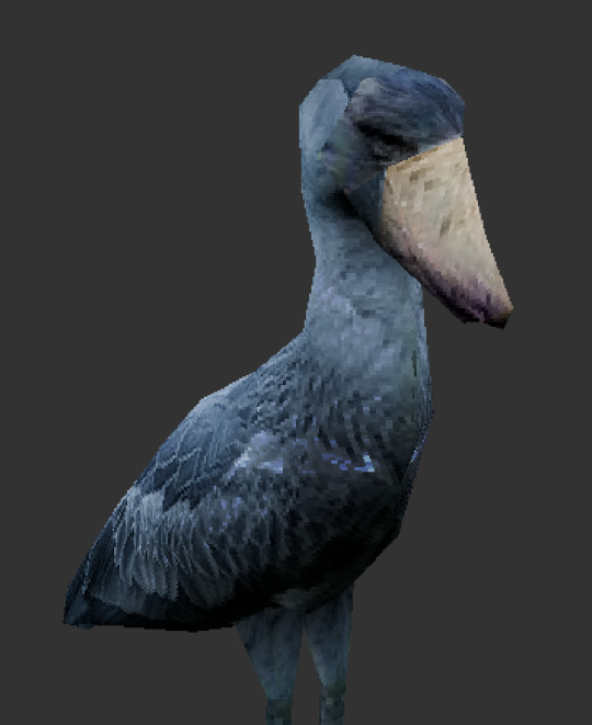
shoebill
#3d#3d art#blender#3d render#shoebill#birds#geometry nodes#shaders#ps1 aesthetic#ps1#ps1 graphics#ps1 style#low poly
172 notes
·
View notes
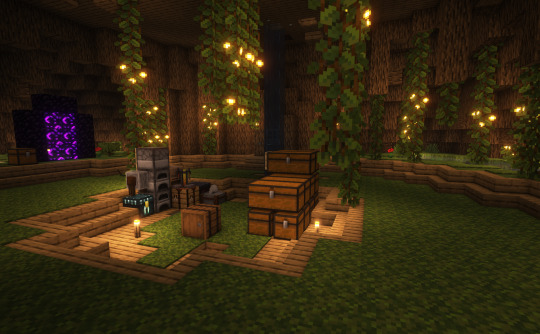
Text
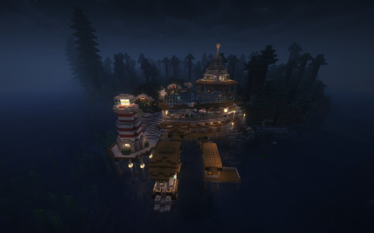

Port Froggy (1/2)
#dilly.txt#mineblr#minecraft#mc#minecraft screenshots#minecraft shaders#shaders#dilly.png#modded minecraft#minecraft build
75 notes
·
View notes
Text

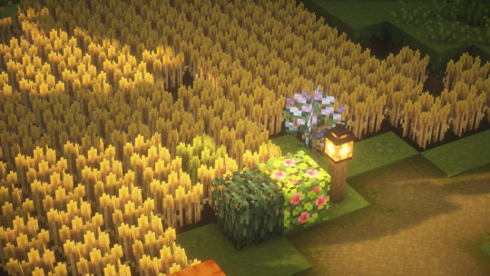


Been playing on a new Minecraft realm with @flumptea and @honbeafairy 🌾🐈
206 notes
·
View notes
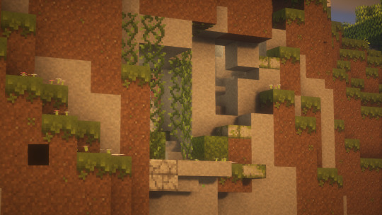
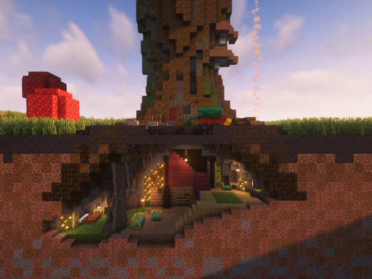
Photo

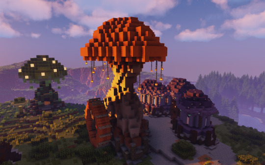
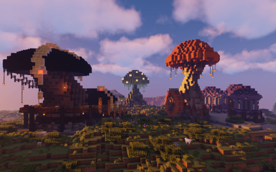
Mushburg
#oli speaks#minecraft#mc#mineblr#shaders#minecraft shaders#modded minecraft#1.19.2#forge#mushroom#mushroom house#screenshot#minecraft scenery#minecraft screenshot
458 notes
·
View notes
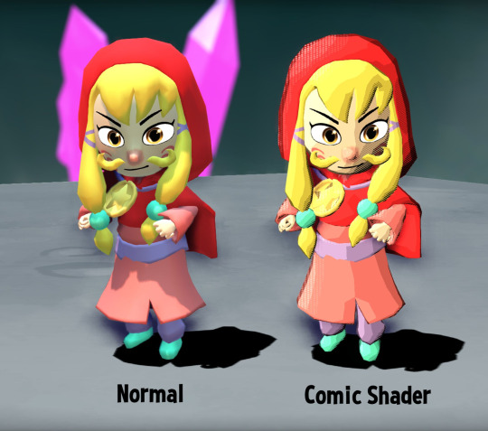
Text
Comic book shader test

84 notes
·
View notes
Text
lighting engine yippee !!
The fact that this is pixel-perfect lighting means I can just throw in any arbitrary sprites and the lighting 'just works™'
I also didn't have palette quantization/dithering in the last post because I was trying to show how little noise there was, but here's what it looks like with those enabled
983 notes
·
View notes
Text
GUESS WHO LEARNED HOW TO USE SHADERS


@karinsnightmareparty @doublebubblr @raineyraven @insomniwillow @pusheen-loves-food @dazewashere @garlic-sauc3 @straymongrel @winter-evenings @winter-mornings
#LETS FUCKIN GOOO#NOW I CAN BE DRAMATIC AND SHIT#mcyt#minecraft#gpsmp#gay park#gay park smp#minecraft shaders#shaders#kit talks
406 notes
·
View notes
Text
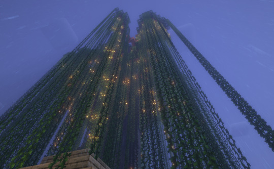
Day 30 of 30 for @clovercrafted's Summer Fun Event: Treehouse
Is it still a treehouse if it's built in the roots instead of the branches?
#minecraft#creative#cloverssummerfun23#art#treehouse#shaders#complementary shaders#mineblr#minecraft build#my build
498 notes
·
View notes
Text
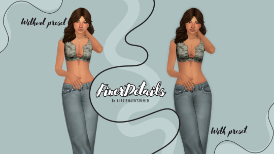
[cs] FinerDetails GSHADE Preset
With a very subtle yet impactful change, FinerDetails enhances the look of your game and makes everything clearer and cleaner.
-
Super happy to share my sims 4 reshade with you! This preset is literally a must and I can't seem to play without it anymore!
-
Intended for use with GSHADE install gshade here ♡
╔.★. .════════════╗
DOWNLOAD HERE
╚════════════. .★.╝
Thank you for supporting my first release!
#sims 4#sims 4 cc#my sims#simblr#the sims#the sims 4#ts4#sims 4 reshade#reshade#sims 4 gshade#gshade#ts4 cc#ts4 reshade#shaders#shader#sims 4 custom content#sims 4 shader
59 notes
·
View notes
Last Seen Blogs

shinanai-kz-blog
CanIDo?

hotanddistraught
game quinning goal!

sashajmes
here's how archivist sasha can still win

nganway
hope i fine

deathwarned
DEATH / SIGHT