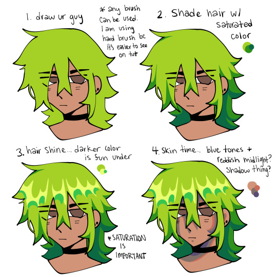
#shading tutorial
Text
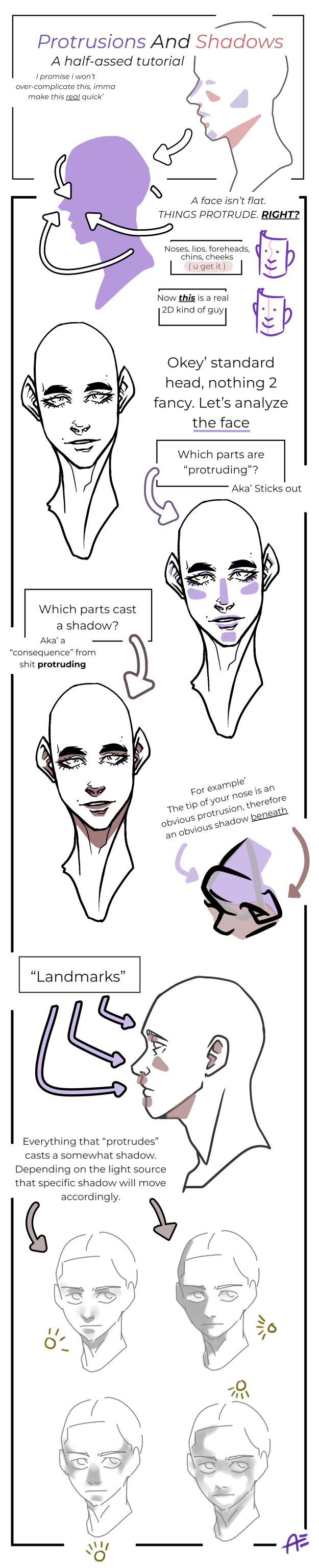
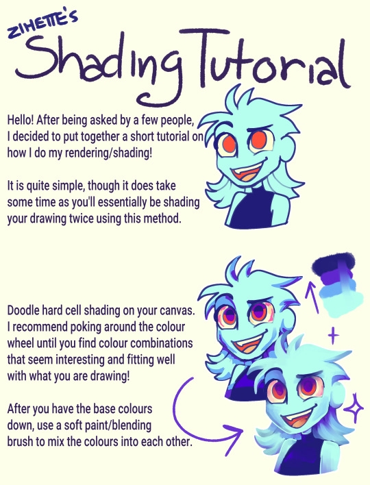
Hell yeah' more shitpost drawing studies'
I mostly to these scribbles/notes for myself, but sharing is caring and my brain simple won't acknowledge and comprehend how light works.
It's actually so simple doing shadows ( in theory ), still' i wanna rip and tear at my hair whenever i actaully have draw dynamic ones.
13K notes
·
View notes
Text

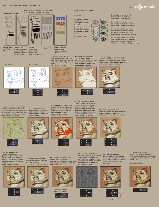
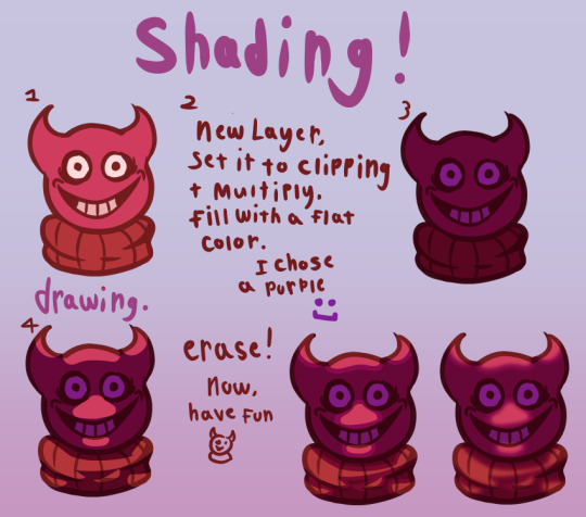
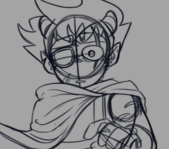
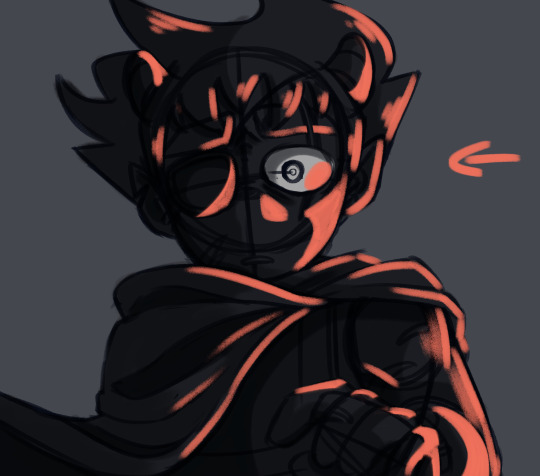
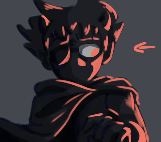
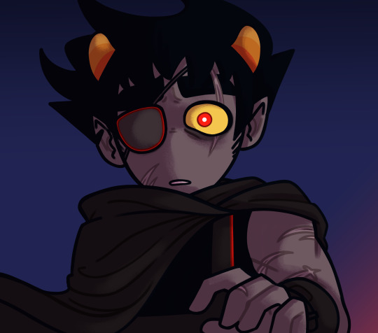
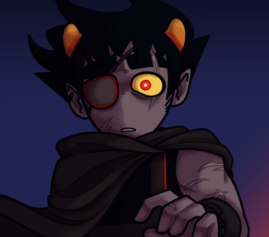
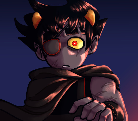
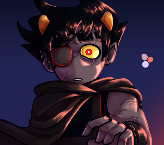
SSSERIEMA SHADING! hi @kikikakapo :3 hey :333 pls ask me specific stuff if you want this is just a little run down of my process with one of the examples i hope its legible :333
#noticing this is more about coloring actually LOL#art tutorial#shading tutorial#clip studio paint#art process#seri's art process
226 notes
·
View notes
Note
do you perhaps……….. have a shading tut………. please yoyr art is stunning
it ended up evolving into a whole portrait tutorial hope thats ok
168 notes
·
View notes
Text

Hey here’s another mini tutorial on how I draw and shade eyes
#art ref#art reference#art tutorial#eye tutorial#shading tutorial#drawing tutorial#drawing#anime#anime art#smkittykat art tips and tricks
231 notes
·
View notes
Note
Hello! I've been following your Creekclan videos and watching you draw is really inspiring for me! I was wondering, if you're comfortable with sharing, if you could make a tutorial of sorts on how you shade your drawings in those videos? It's a very pretty way to shade and I'm curious about what your process is. No worries if you wouldn't like to share that, and thank you for your time :3
Hi ! Thank you so much for following my series !!! :) I will try to post the tutorial here :
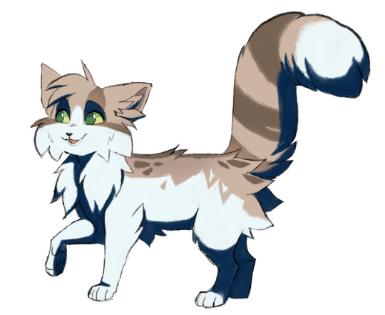
STEP 1 : Paint your character ! Here we will take Toadjump as our test subject !

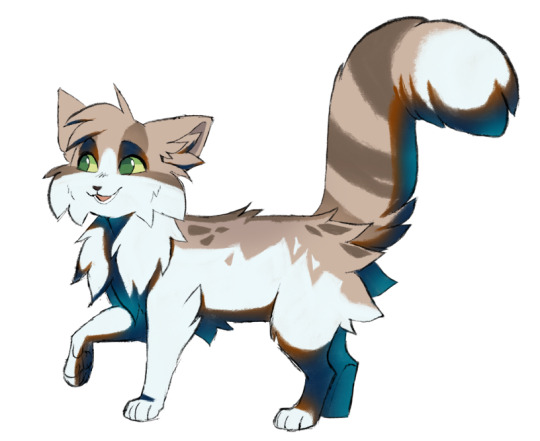
STEP 2 : Add the shadows based on your light source ! (I generally use a high sun) For the colors of the shadow, if your character is directly under the sky, I would use blue, and if under trees or vegetation, a more green shadow, but it's really up to you and the colors you wish to have ! I would also recommend using a textured brush for this step !
STEP 3 : Now, lock your shadow on its layer so you can paint only within it ! With an "airbrush" brush, add some orangy/brown ! The orange should be lighter than the blue, but don't make it too light !

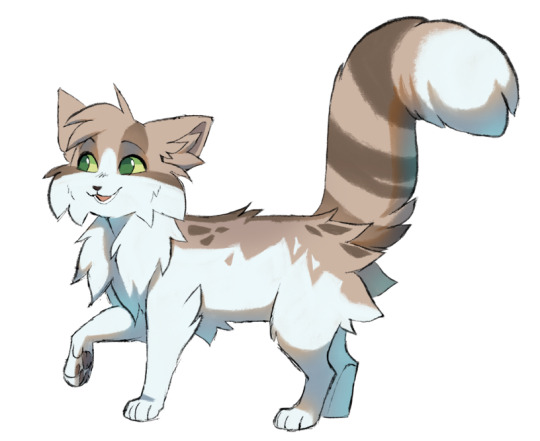
STEP 4 : This one is optional ! Add lighter and more vibrant / satured blue opposed to the orange ! This blue is mainly on the exterior of the body or on the limbs that are "behind" the body ! This color is used as a reflexion from the environment's colors. If you use a white background, this lighter blue is alright ! If your character is in a forest, maybe use a more greenish blue, and etc depending of the colors of the environment (I hope this is understandable !)
STEP 5 : Simply reduce the shadow layer's opacity ! I usually put it around 45% so the shadow isn't too harsh, but depending on your environment, ambiance and lighting, you can vary this setting !
I mainly use this shading technique for my sketches as it is really quick and easy to do ! I hope this tutorial is clear enough, I hope it helps you !! :)
270 notes
·
View notes
Text
how I shade :] I find it easier to draw where the light is coming from rather than drawing the shadows !
the last 2 "now have fun" images are what I typically will do after I've done the basic shading, which is outlining it in a slightly lighter shade of the flat color used for the shading, and sometimes some blurring, if you want a softer look :D
#bob velseb#spooky month#spooky month 5#shading#tutorial#art tutorial#shading tutorial#art tips#digital art#my art :]#just recently watched spooky month#so bob gets to be the test subject#I know. I know.#surprising. it's not springtrap#enjoy the tutorial!
75 notes
·
View notes
Note
uh hi can you give some shading tips? pls?
Sure! :DD
I think the easier way to give some tips is by showing my own process.
(I won't explain here the basics of shading, but if you want I linked a tutorial down at the end of this.)
First off, the program I use is Krita (but any program is ok 👍✨)
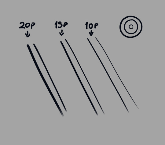
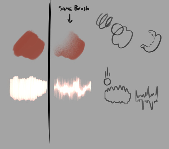
And here's the brushes I use:

I'd say use at least two brushes. A soft one and a harder one.
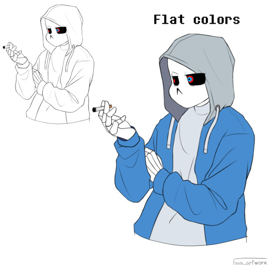
To show you I'll use this doodle I did of Murder!Sans (by @/ask-dusttale)
First, flat colors.
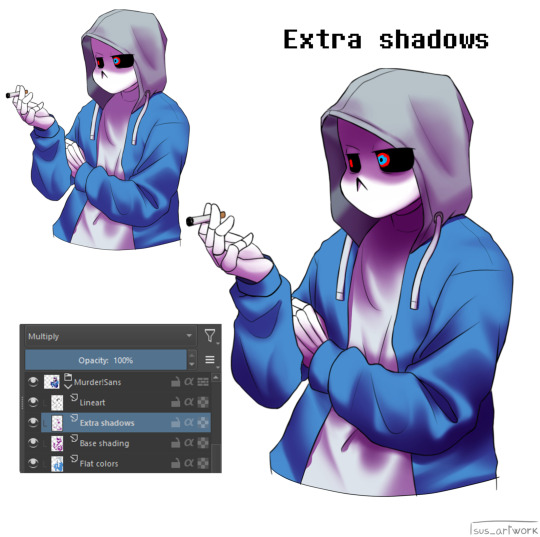
Then start shading on a new layer and put it in Multiply mode, then change the opacity at your liking.
Don't use black for the shadows! Use a dark color.
I usually use a purple or a brown.

Now with the same color, go on a new layer (Multiply mode), and add extra shadows where light has trouble reaching.
This gives more depth to the drawing.
(To make this process easier I use the Select Opaque option, by right clicking on the Base Shading layer, down in the menu, and then paint on the new layer)
Now fill the canvas with the light's color (or do like me and duplicate the Flat Colors layer, and recolor it if you want the light to be only on the subject).
I'm using yellow since it makes a nice contrast with the purple.
Put it in Pin Light mode and change the opacity at your liking.

Aaaand
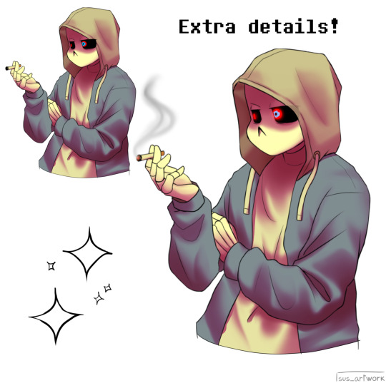
You could say finished!
We could stop here, but if you want some extras, go under the cut:
-EXTRA-
Now I-
I can't explain what "Bouncing Lights" and "Sub-Surface Scattering" are, so... go see on internet :''D
Basically slap some red and blue over the shadows layer in Overlay mode and voilà
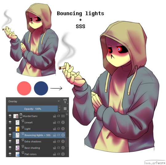
It'd be more noticeable with less light but trust me, it's good
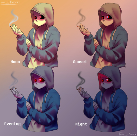
Now let's talk about ambience.
We can create many different scenes just by playing with the light and shadow layers!
Change their colors, change the blending mode, play with 'em and see what you get:

Also I suggest studying how color schemes work (I'll link you a video down below).
I uhh actually kinda suck at color schemes XD but having at least a basic understanding of them it's useful.
And, here's some tutorials that personally helped me a lot:
Shadows and lights tutorial/tips <- great for learning the basics of shading
Time saving shading solutions
This great rendering tutorial by @/licollisa
Different color schemes
For any questions don't hesitate to ask me (^w^)
#ask answered#miramoonli#undertale#undertale au#dusttale#sans#murder!sans#dust!sans#art tutorial#drawing tutorial#art tips#drawing tips#shading tutorial#coloring tutorial#rendering tutorial#This was oddly fun to do :D#maybe cause I LOVE shading. It's my fav part of drawing#Also Murder is fun to draw-#You know whose fault it is XD#This doodle was to practice drawing hoods tbh.
118 notes
·
View notes
Text
How i make my drawings
Hello! Since @wolfsune09 asked how i make my shading and all that i decided to make a little tutorial on my shading style! (I draw in Clip Studio Paint)
Also english is not my fist language so i'm sorry if i make any mistakes or say weird sentences!
So let's start with brushes:
The brushes i mainly use are The Calliflakes brush, Soft square brush, and the regular Turnip pen and Design pencil from Clip studio
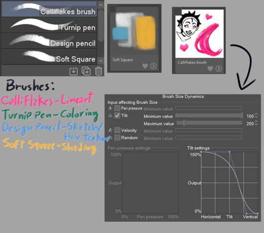
These brushes are like, MY LIFE i love them so much dfjsdbfhbsdb
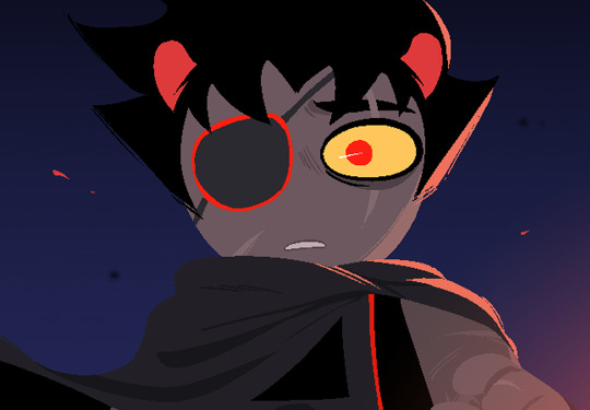
Anyway, the drawing i'm making is a screenshot redraw of a homestuck panel because i can
Get homestucked lol
Anyway after the sketch i make the shading plans, they are really important and will basically dictate if the drawing will be good or not

always make sure the light direction is the same throughout or else it will look lackluster, think about the character in they're primary forms(head is a square, torso is also a square, nose is a piramid etc.)
Now is the real kicker, plan the reflective light (i can't explain it really well so researching it is a better option)


I like to see the light sources with their correct blending modes before drawing to check if the colors look ok
In the end, the objective is to make it so the drawing still holds up without the sketch, if the light makes the pose readable, it's all good to go
Finally, it's time for the lineart, i made the Calliflakes's brush change in size depending on the tilt, this is great for a dynamic lineart and a crunchy look
I usually use three sizes in the lineart, the main size, a medium size to make more detailed parts, and a smaller one for when i need even smaller details, tho it's good to use it sparingly since it might make the drawing look unbalanced
Also, i usually don't use black in my drawings, mostly because of the shading process
Looking good!
Now it's time for the flats! This part is pretty simple, this ios also the part where i paint the lineart, i ONLY paint parts that are INSIDE the silhouette, mostly to make everything blend more and also becuase i like it :)
What a handsome fellow!
Alright now for the part you came here for, the shading! Alright, remember the shading plan? Use that as a base for the actual shading.
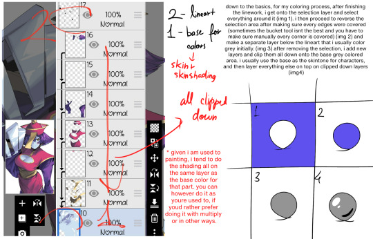
First, since this drawing is in a dark place, i grouped the whole drawing in a folder, then made a multiply layer with the color closest to the original image, then i clipped it to the folder(this is a very common thing here)

(I didn't shade the eye since it is the main point of focus of the drawing)
Now let's see it with the lighting plan
nice
Now let's talk soft squares and design pencils
The way i shade with the soft square is that i make it mostly cell shaded, then i come with the same brush but transparent, and i VERY CAREFULLY make circular motions to erase part where i want the shading to make a gradient effect, the key to a good shading job is balancing the sharp shadows with the soft ones
Now with hair, i use the design pencil, i basically just make a bunch of close streaks, almost like painting with a paint brush, after that i make streaks with the same pencil but transparent, making variations in lenght so it looks natural and organic
Alright time for the first shade pass, this one is for the more general shadows, so it won't look that dynamic
Now you can see where the shadows are lacking and make the second pass to deepen the shapes
(P.S: all these layers are the same color, they are in multiply mode)
Alright time for the star of the show! The lights!!!
Using the shading plan i refined the shapes and put it on the add(glow) mode, a good tip i have for this stage is to make shapes shapes shapes! Also remembering that the farther the thing is, the least bright it will be.

Oh my! That changes the whole vibe!
Now i saw the hair was a little boring looking, so i added an extra layer of airbrush to make it more dynamic

Actually fuck it, time for some finger tip smudge
Now we're talking.
Alright, now it's time for the reflected light, make sure it's not too bright unless it looks like a second light source, also this layer is in glow dodge mode!
We could say it's done as it is...
BUT NOT BEFORE THE COLOR DODGE
It looks so muck better now! But that's not all!
Now that we have this beautiful boi, it's time for the finishing touches! These make ALL the difference in the drawing
There we go!
Well now it's my favorite part... the FUCK AROUND AND FIND OUT part!
This is where you add all the textures and special effects! I like mostly using a noise filter (so AI can't steal my stuff) and achromatic aberration, also adding some ashes and a nice metal texture in the background to make it nicer looking

Now, this is technically finished, but if you want to go the extra mile, you can do some color correction, i like doing it to give more contrast, also to make the piece more balanced, i also added some extra details on the eye and a blur last minute

And it's done!
As you can see my process is a little all over the place, but that's the fun part of drawing for me! It's always an adventure where you never know how it's going to end!
Anyway hope this helped at least a little!
#art tutorial#art advice#? kinda#homestuck#homestuck 2#commander karkat#shading tutorial#rendering#long post
82 notes
·
View notes
Text

A good few people asked me how I do my shading so I whipped this up :]
Feel free to experiment with things of course, but this is just to show how I've been doing things! <3
307 notes
·
View notes
Note
sumi i love the coloring in your art so ive been wanting to know how you do it!!
thank u bestie ✋
i tried my best to be as descriptive as i can and include many screenshots of stuff so i hope this is as helpful as can be to understand my art !
this is a tutorial on how I DO THINGS and MY ART PROCESS, you do not have to follow it to a T and its not things set in stone. you can experiment as much as you want with everything mentioned, and i hope it can or will help as many as possible in any way
also talked more in depth about my brushes in this post!

152 notes
·
View notes
Text
@just-a-douglas-simp-existing wanted a tutorial on how I shade eyes so here ya go 👇✨

1) Once you have your eye shape, make another layer underneath your lineart and add your base colour
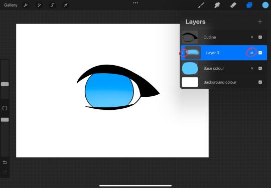
2) Then add another layer above the base colour, hit clipping mask, and set the blending mode to Multiply. With the same colour and with Soft Brush, draw a lil arch shape at the top of the iris, and change the opacity to how much you want it to be
3) Another layer, Clipping Mask, this time the blending mode is Add. Do the same thing as step 2 only this time, on the bottom of the iris
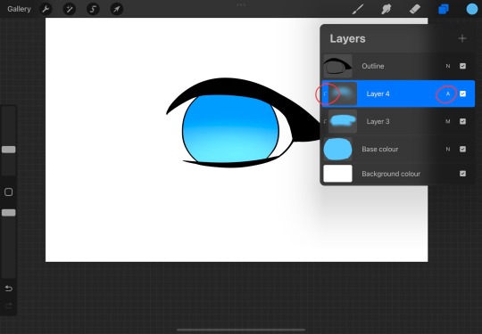
4) Another layer, Clipping Mask, Multiply, change the brush to any inking brush (I used Studio Pen but you can use any one you want) and choose a slightly darker shade of the base colour for the pupil
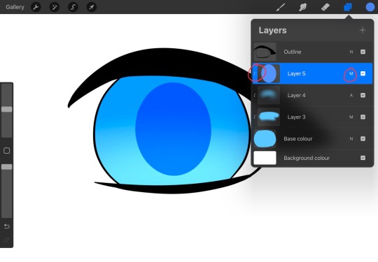
5) Another layer, Clipping Mask, Add, this is for the highlights. Choose a lighter shade of the base colour and make an arch at the bottom, then choose a darker shade and make a smaller blob shape at the top. (Adjust the opacity if you want)
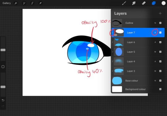
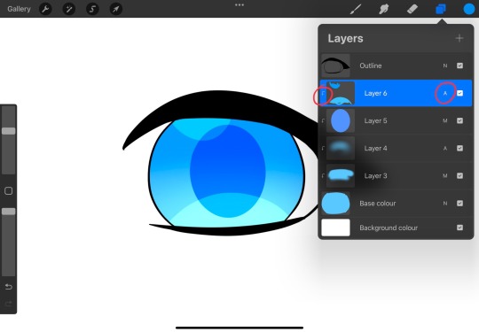
6) Another layer, Clipping Mask, Add, now these are on only one layer (mostly to save time lol). Change the colour to white and make these little blobs like so. The pen opacities are shown in the picture
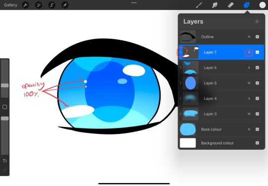
7) Continue to make tiny dots and blobs like so, until you're happy with the highlights

8) Optional bonus highlight: I like to add a little heart in the highlights layer, just use the base colour to draw a tiny heart like this. But you can skip this step if you want ofc
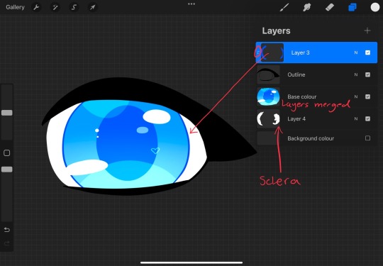
9) Now this and the next step are both completely optional, after you're happy with the iris, merge all the layers into one. And add another layer above the lineart and chose a slightly darker shade of the pupil colour to colour the outline of the iris
10) Similar process to step 9, except make the colour a lot darker to colour the outline of the eye. And donee✨
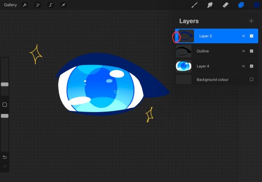
Hopefully this was easy to understand and lemme know if you want anymore tutorials ✨✨✨
21 notes
·
View notes
Text
due to popular request (my brain randomly deciding hey what if we did this) i made an edge shading tutorial but with the goal of making it as bad as possible . ft my addisona laggy . enjoy
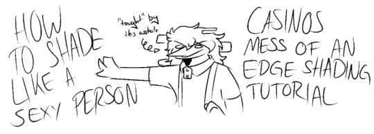

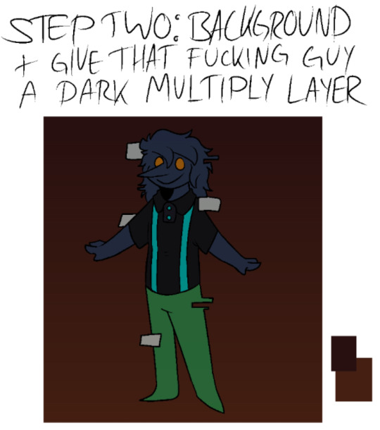
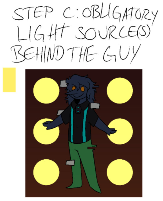
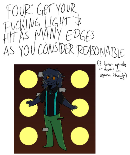


+ full drawing under the cut :}
#long post#<- just in case#addison oc#addisona#oc#sona#art#art tutorial#shading tutorial#<- sighs. i guess#casinos art :]#casinos sonas: laggy
16 notes
·
View notes
Photo

Updated version of this Understanding Shadow and Light Transitions tutorial sheet I made that includes the hue cube examples I went over in my Youtube video version of this. : 3
pateron: https://www.patreon.com/JaeHaruArt?fan_landing=true
link tree: https://linktr.ee/jaeharuart
83 notes
·
View notes
Note
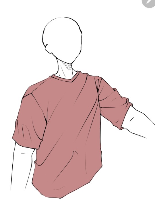
How do you sketch & render your clothing folds, if i may ask? They look very pretty!
I am the least qualified person to give a tutorial but sure let's do this.
No I'm a self taught artist so a lot of this is just me using the good ol' "Fuck around and Find out" technique. So the example I'll might not be the best but it will give a general idea.
First you get your sketch/lineart + flat color. As you can see I've already drawn the fold lines. It's best to know where the shirt is getting pulled more from because that's the general direction that the folds start from and where fore folds are.
Next, on a clipping layer, I just draw with a darker color the places that will be shaded with a watercolor brush or pencil brush, just a brush that kind of fades works. This doesn't have to be accurate coloring it can be just messy blobs. But always keep in mind were the light is hitting the shirt so you'll know which direction to draw the shadows bigger and darker at
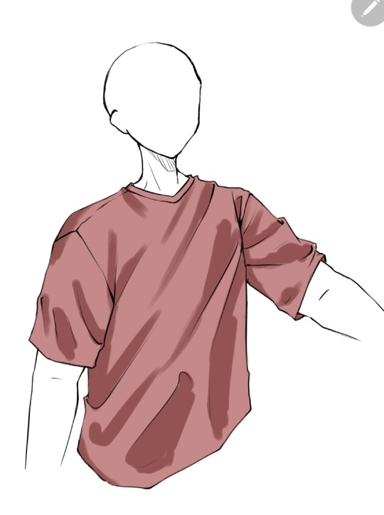
Than with a soft eraser I start erasing the shading and fixing it by going back with the brush. This is a lot of back and forth between the eraser and brush until you get to a point where it looks good in your eyes (i lowered the opacity a bit here because I thought the shade color was too dark)
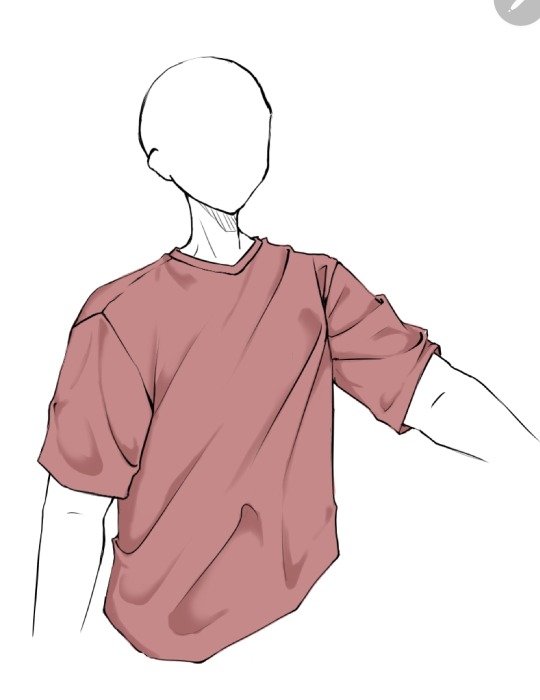
(Note: during more detailed drawings I like to go in with a darker shade color at the deepest corners for more depth and detail)
On a new clipping layer, by using an airbrush or the gradient tool, with the same colour I used for the shading, I darken the top and bottom. Why? Because it looks cool idk.

And usually that's where I leave it but sometimes I might add a lighter color for some lighting on the cloth by using the same steps as for the shading, this may depend on the fabric you imagine the clothes have. Or I've seen some people airbrush the parts of the outfit near the skin and that gives off a cool effect too
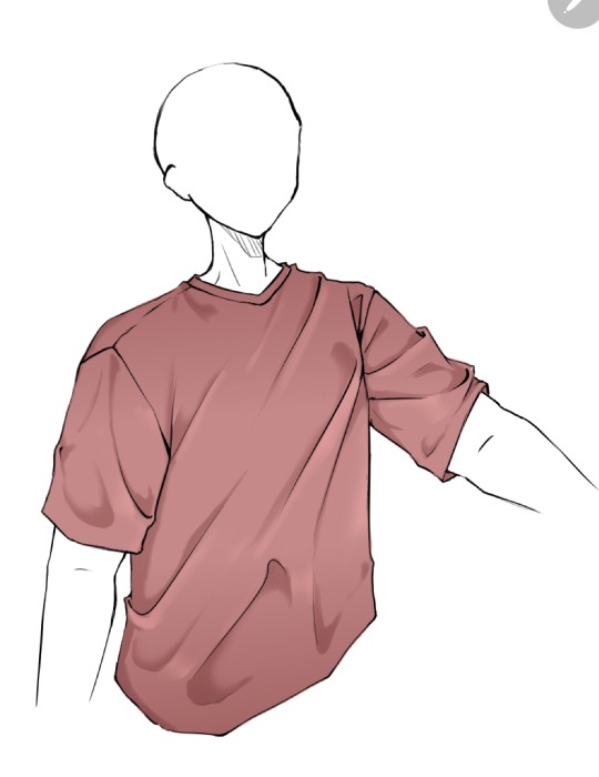
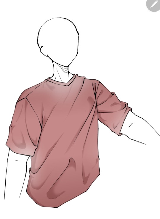
Now as you might have noticed this is the ugliest shirt ever. And that's because I did this in 10 minutes from my ✨️imagination✨️. Usually I have reference pics when drawing which give me a general idea of how the folds should look like and that is a life saver. This was just to give a general idea of how it works. Here are some examples of actual good shading I've done
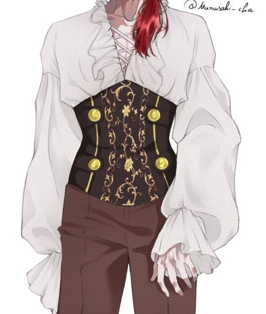
Hope this helps👋✨️
#mura answers asks#shading#shading tutorial#art tutorial#digital art tutorial#digital art tips#digital artist#digital drawing#digital art#artist#artist on tumblr
15 notes
·
View notes
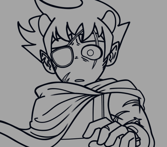
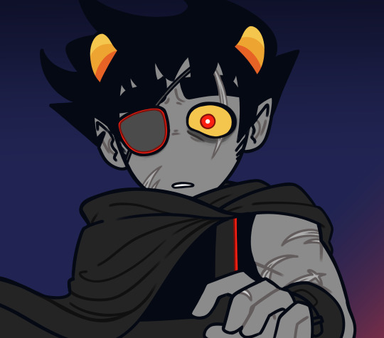
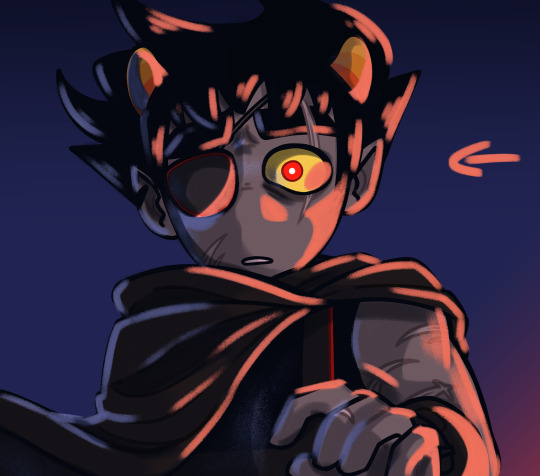
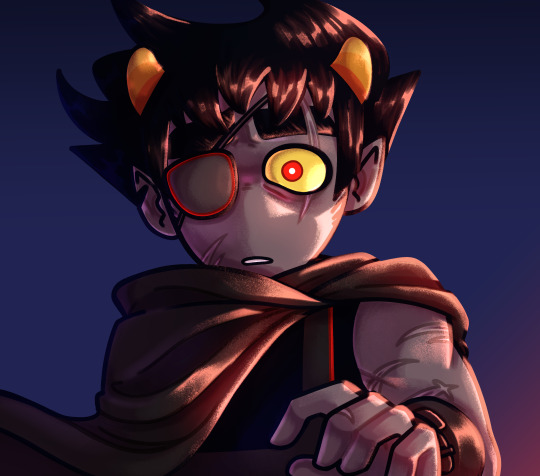
Text
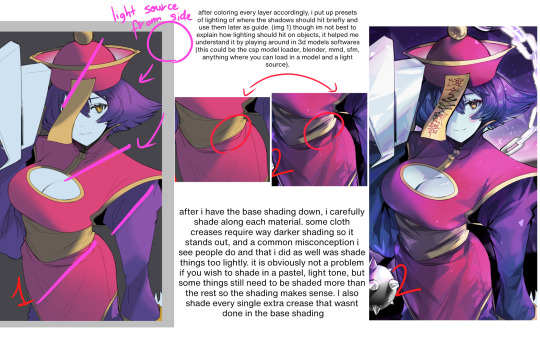
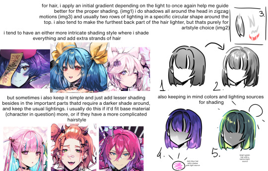
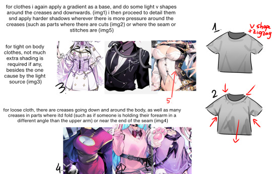
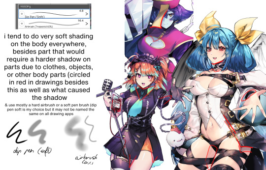
a shading tut i made for my server so.. might as well share it here! it's not very In Depth but i shade differently every single time so. maybe this will help someone

40 notes
·
View notes
Photo

I’ve started to realize i’ve been using my own tutorials whenever i forget how to draw,
Too bad i can’t just ask myself how to draw shit :(
Still happy pride month <3
338 notes
·
View notes
Last Seen Blogs