#somebody else aesthetic
Text
I love Tumblr because nothing matters here truly. There are no influencers. Having followers doesn’t mean anything. It’s just a site where people post their sporadic thoughts and rb pretty pictures. Anyone who thinks any of this matters is woefully missing the point
#I joined tumblr for the aesthetics and now I’m here bc it’s the most low pressure social media to be on#Instagram is ppl’s highlight reel but Tumblr is where u see their pure thoughts unobstructed and I adore that#It’s very nice to have people to relate to and is def the main appeal to me but I don’t think there’s much more to it than that genuinely#Monetization on tumblr isn’t a thing and probably won’t be so it feels stupid to put more stake than necessary in it. Like you’re in the#Trenches over tumblr of all things. Embarrassing#I know chronically online people exist bc I have seen them in my or somebody else’s inbox but imagine waking up at 70 one day and the#Realization hitting u like a freight time that u wasted all ur time thinking tumblr. TUMBLR. This dying website. Has enough weight for u to#be sending anon hate or reviewing ppl’s blogs like they’re some kind of product. Brother this is licherally tumblr#I choose to laugh at this behavior than take it seriously bc absolutely no one is driving me crazy on my OWN blog. On tumblr dot com.#I refuse#I will do whatever I want forever etc
2K notes
·
View notes
Text
#the 1975#music#spotify#somebody else#the 1975 lyrics#2014 indie#2014 aesthetic#2014 grunge#2014 nostalgia#2014 tumblr#aesthetic
294 notes
·
View notes
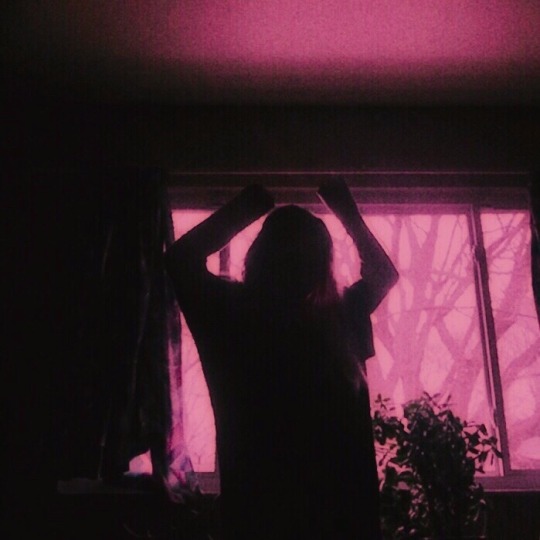
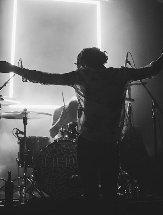
Text


changed lives.
happy iliwys day 🤍
#the 1975#matty the 1975#matty healy#ross macdonald#george daniel#adam hann#i like it when you sleep for you are so beautiful yet so unaware of it#2016 tumblr#2016 aesthetic#2013 tumblr#pink aesthetic#somebody else#era: iliwys#iliwysfyasbysuoi
23 notes
·
View notes
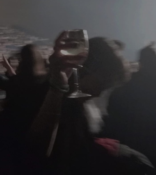
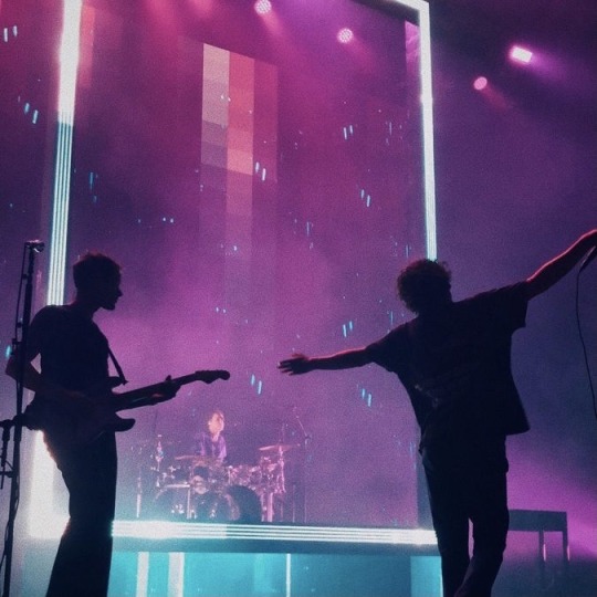
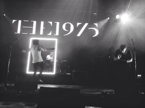
Text
Don’t you mind?
#alternative#tumblr girl#music#aesthetic#the 1975#still at their very best#matty healy#adam hann#ross macdonald#george daniel#somebody else#robbers#drunk#white wine#2014 tumblr#2014 grunge#concert
17 notes
·
View notes
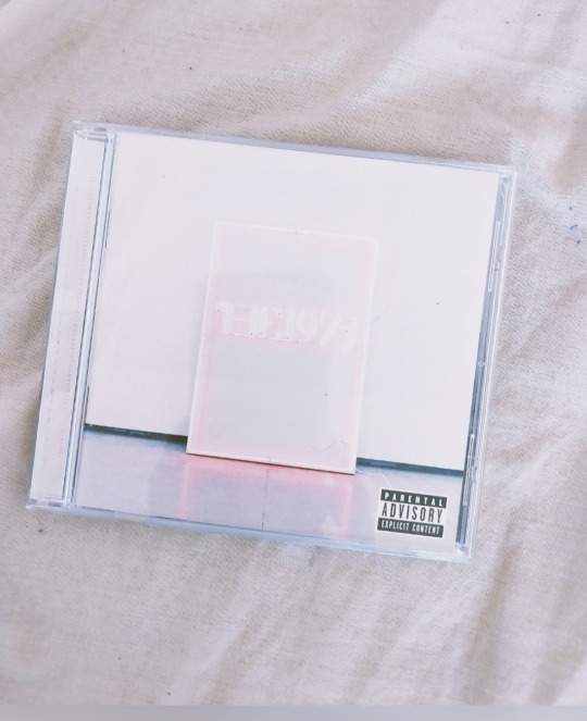
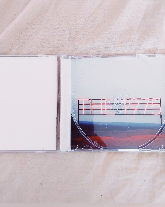
Text


the 1975 album aesthetics: 2/?
I like it when you sleep, for you are so beautiful yet so unaware of it (2016)
I don't want your body / But I hate to think about you with somebody else / Our love has gone cold / You're intertwining your soul with somebody else / I'm looking through you / While you're looking through your phone / And then leaving with somebody else / No, I don't want your body / But I'm picturing your body with somebody else
- “Somebody Else”
#the 1975#i like it when you sleep for you are so beautiful yet so unaware of it#iliwysfyasbysuoi#iliwys#the 1975 i like it when you sleep#the 1975 album aesthetic#somebody else#the 1975 somebody else#matty healy#matthew healy#album aesthetic#album#music#aesthetic#alternative#pop#pink#pink aesthetic#80s#80s aesthetic#neon#neon pink#soft pink#neon aesthetic#soft aesthetic
180 notes
·
View notes
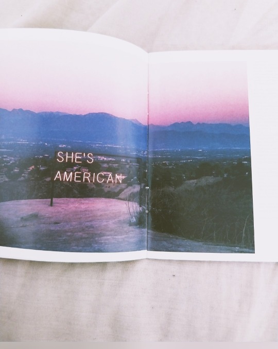
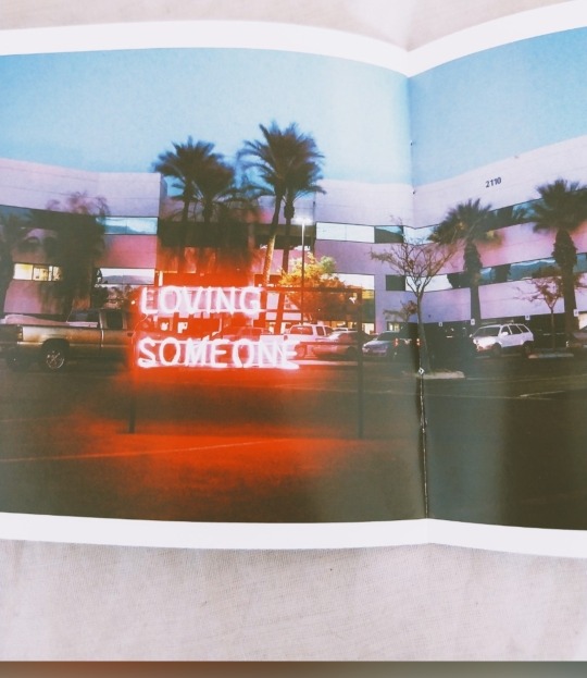
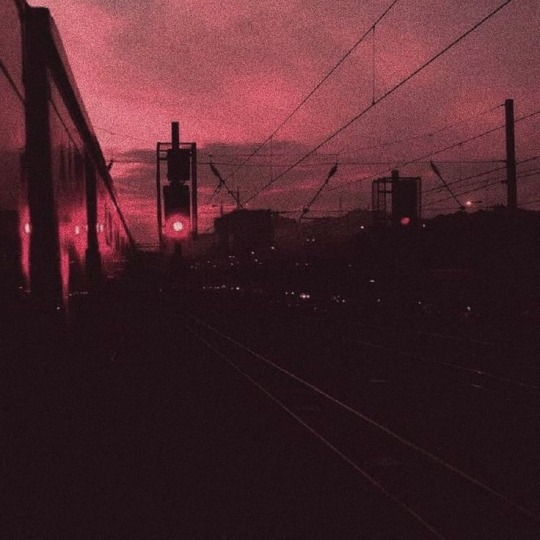
Text

#photography#tumblog#2k14 tumblr#sky#love#the 1975#2k14 aesthetic#pinterest#sunset#somebody else#2k14 revival#Spotify
9 notes
·
View notes
Photo

finally seeing The 1975 in November and i hope it’s everything i have come to expect
#matty healy#the 1975#2014 nostalgia#2014 revival#soft grunge#concert#black and white#robbers#iliwysfyasbysuoi#notes on a conditional form#a brief inquiry into online relationships#lana del rey#lana del ray aesthetic#somebody else#arabella#r u mine#505 arctic monkeys#arctic monkeys#alex turner#marina#electra heart#am#i'm going back to 505#the neighbourhood#cigarrete#say yes to heaven#alexa chung#matt hitt#drowners#miles kane
155 notes
·
View notes
Text

day 107
thinking about putting this guy on my body permanently. as a treat.
#day 107#year 4#maybe not this guy specifically.#i think ideally i would like to hand this guy over to a person who designs art specifically for tattoos#and have them redraw it in their own style#because i can Not have my own actual art on my body forever#no matter how good i think it is at the time i am afraid i will progress past it in skill#and then forever hate the iteration that i chose to put in literal permanent ink on my one and only human body#but if its somebody elses art i will be less judgmental#this is the idea tho i got a bunch of little temporary tattoos with these little cartoon ghosts and i was like hey wait#this is a motif relevant to my life art and personality. and also an aesthetically timeless shorthand for what it depicts. hell yeah
49 notes
·
View notes
Text
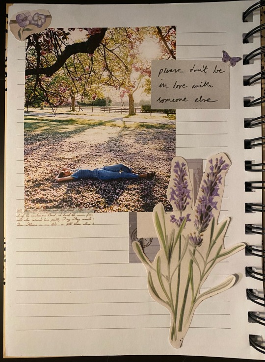
please don’t be in love with someone else, please don’t have somebody waiting on you🪻
@taylorswift @taylornation
#speak now taylor’s version#taylorswift#please don’t be in love with someone else#please don’t have somebody waiting on you#enchanted#speak now#speak now taylor swift#enchanted taylor’s version#taylornation#taylor swift#taylurking#loverjournalartwork#swiftie#journal art#taylor swift lyrics#journal page#journal#purple#aesthetic#flowers#butterfly#enchanted speak now
16 notes
·
View notes
Text
why are typing quirks normalized as a thing to do for fun around strangers and in public posts. can we please recognize how horribly inaccessible this shit is.
psa do not segregate screen reader users to one channel in your inclusive neurodivergent queer server what the hell.
ps putting a translation at the bottom only partially solves the issue. some typing quirks can crash and break screen readers. and its also agonizingly painful to sit through, as we've heard.
#this is especially on discord people are so fucking horrible to visually impaired people holy shit#we were comod alongside somebody else and someone requested aesthetic changes since the way the channels were formatted made#it screen reader inaccessible#comod threw a fit and didn't do it so we had to silently remove everything that was causing issues despite not being a channel manager#embarrassing#why do aesthetics matter to people THAT much
10 notes
·
View notes
Text
I’m not trying to be annoying, but as someone with severe ADHD/brain damage I just want to make everyone aware that making longer text posts using no capitalizations is EXTREMELY inaccessible to me and probably many others. Thanks.
#i Cant explain why but yeah things sort of blend together#adhd#does anyone else feel this way?#It’s frustrating#Because there’s so much content that I want to consume but I can’t#Because somebody along the way somewhere decided that using proper capitalization and punctuation isn’t aesthetically pleasing#fucking annoying I’m sorry but like ugh#vent
5 notes
·
View notes
Text
that post I promised about villain visuals
So I’m working my way (slowly) through Stranger Things season 4, and one of the things that came up as an issue, for me, early on, was the...aesthetically kitchen-sink nature of the season’s main Upside Down-related baddie. The further I get into the season (currently I’m between episodes 4 and 5), the more it’s looking like all of the disparate visual elements that the show is relating to the villain they’ve nicknamed Vecna are supposed to be connected because of Lore(TM) which is being dribbled out throughout the season. On the one hand, I can respect that as a storytelling move. But on the other hand, aesthetically, it’s still not working for me in this specific case, and I’ve devoted entirely too much brain power to trying to figure out why that might be.
After making a case study of two of the Big Name Iconic Horror Movie Villains that the season namedropped, and a number of other Visually Iconic Horror Villains I have loved, I’ve come up with a handful of theories of why, say, Freddy Krueger feels instantly recognisable and memorable and aesthetically distinct, while Stranger Things’ take on ‘Vecna’, despite drawing heavily on Freddy Krueger for inspiration, doesn’t.
First off, I don’t think having a large number of visual/symbolic elements linked to your villain is necessarily always a problem. Or even that using various apparently unrelated visual elements to create a visual shorthand for your villain is a problem! But if you’re going to have a bunch of different, apparently unrelated symbolic visual elements associated with/representing your villain, you’re gonna want them to a) immediately and unmistakably cause the audience to draw an association with your villain, which means you’re probably going to want to b) use relatively few of them, so that that impact isn’t diluted.
One of the easiest and most effective ways to make sure you don’t end up with all your visuals confusing your audience and failing to convey that immediate association is to establish a hierarchy of symbols/motifs/visual elements linked to your villain. So you have one or two elements that draw up a strong association with your villain from your audience, and then in concentric circles radiating outwards, you have more and more tangentially-associated symbols/motifs/visual elements.
And a good way to establish a primary visual element, and link it strongly and directly to your villain in your audience’s mind, is to make it either a part of or directly connected to the villain’s physical presence/distinctive silhouette. If your primary visual element is something that, especially in a visual medium like television or film, can be repeatedly seen onscreen with the villain, it’s much, much easier for it to become linked to the villain in your audience’s imagination.
Like. Let’s take a closer look at the Big Names the Duffers are dropping in season four. What’s the most immediately recognisable element of Michael Myers’ iconography? It’s the inside-out Bill Shatner mask. The most recent Halloween trilogy even used the image of it on its own as marketing material, since it’s such an immediate, obvious symbol of Michael, and pulls up the association at a glance. You see the mask, you know that’s a Michael Myers.
Then you go down a level in the visual hierarchy, and there’s the coveralls and the big bloody knife. If you take away the mask, this is less immediately obviously a Michael, but it’s still recognisable once you link it to the mask again. The mask is the primary visual element to which some of these secondary visual elements are linked. The mask is the single element at the top of the hierarchy.
Go down one more level, and you get into stuff that’s less related to that primary visual element of the mask, less related to the villain’s physicality and distinctive silhouette, and more related to the Lore(TM). I’m talking like the clown suit from the murder of Judith Myers (which they did use again for visual association with Michael, at least in Halloween 4), the jack-o’-lantern, the abandoned Myers house, even Judith’s tombstone. These elements, that orbit Michael’s hashtag aesthetic deal at a slightly greater distance, can be used to conjure up a sense of unease or building dread. But if you want instant recognisability and that sudden sharp jolt of fear, you go directly to the mask. If you ask somebody on the street to picture Michael Myers, they’re gonna think about the mask.
I’m not as familiar with the Nightmare on Elm Street franchise as I am with Halloween, but it seems to me that Freddy Krueger, the more obvious aesthetic influence on Imitation Vecna Flavour, has a similar deal to Michael Myers going on. Freddy gets two primary visual elements - the knife-glove and the burn scars. Then you go down a level and get into costuming stuff like the terrible sweater and the jaunty little hat, and then down another level for stuff like the nursery-rhyme-singing creepy children and the horrible boiler-room nightmare realm (which, again, connect back to him less through immediate visual identification/actually seeing them onscreen with him, and more through Lore(TM)).
Because Freddy has those few main visual elements established as his aesthetic calling card, he can pull whatever nightmare bullshit he wants, and we the audience can see and understand that we’re not meant to be remembering and associating every Bed That Eats or whatever with him as a Distinct Visual Element Of His Whole Deal. If you as a creator throw the entire kitchen sink of ‘nightmares’ at him, and every visual element that gets associated with him (or a pale imitation of him trying to do the same shtick) is introduced on the same ‘level’ or at the same time, the audience isn’t going to form a strong mental link between him and any of those visual elements. And then he won’t have any memorable signature visuals at all. And that makes a villain more forgettable.
This is, actually, probably one of the main reasons why the slasher genre fell into a pattern of ‘distinctive mask + signature weapon’. It’s an easy formula for creating a visual shorthand for your villain, and relates those visual elements that you want to be primary directly to the villain’s physicality. To bring up the third Big Name of slasher horror, there’s nothing inherent to, say, a hockey mask that links it to Jason Voorhees. Except for the fact that we almost never see him without it. The why of it being a hockey mask is not as important as the fact that it’s a fundamental aspect of his whole Look(TM).
“But Mary,” I hear you say, “you’re talking about slashers. Stranger Things’ ‘Vecna’ isn’t technically a slasher. And what about villains who are more inhuman than slashers? Villains whose physical presence isn’t fixed or doesn’t even exist? Villains who are outright monstrous?” Well, you have a point, rhetorical strawman! I was specifically talking about slashers since the show was so obvious about drawing on Freddy, but I think these theories can also be more broadly applied.
In terms of visually distinct, recognisable, memorable monsters, what comes to my mind first and foremost is the lineup of Universal movie monsters. And I’d say they’re actually incredible examples of the theories above in action. They tend not to have such a kitchen-sink assortment of visual elements associated to them, but rather, to stick to one or two primary visual elements, directly related to their physicality and silhouette. I’m thinking the flat-topped head and huge feet of Frankenstein, the hunched hairy figure of the Wolfman, Dracula’s widow’s peak and high cape collar, the Bride’s beehive, the Creature from the Black Lagoon’s armoured fish-face, the Mummy’s wrap...
These images became so famous, so memorable and recognisable, that they have visually defined entire genres of monsters. They get echoed and parodied across pop culture (Grandpa and Hermann Munster! Lurch! Abe Sapien and the Shape of Water fishman! Dave Vanian and Gerard Way in the Bela Lugosi evening dress and facepaint! etc etc etc!) to the point where people don’t even know where the originals come from (vampires in cartoons from the 70s-90s frequently had blue skin, because actors playing vampires in black and white films from the 30s-50s would be painted with pale blue facepaint to make them appear more deathly pale onscreen, because blue read pale and red read dark. This is the same principle behind the set of the 60s Addams Family sitcom being mostly pink!).
(As an aside, the whole ‘one or two primary visual elements related to the villain/monster’s physical presence’ thing might have contributed to why I feel like the Invisible Man doesn’t get nearly as much play in lineups of classic monsters. Gonna have to percolate on that thought.)
In terms of a villain or monster without a set physical form, I believe it’s even more important to establish a primary visual element associated with them. For something like a shapeshifter or a nebulous eldritch idea, they’re by necessity going to have a broader range of visual elements associated to them/involved in the storytelling around them. Having a primary visual element as a visual shorthand for that villain/monster means it can carry through the various scenes of that villain/monster exerting their influence on the world/the story, so that the audience can then identify it as that villain/monster’s calling card - and it can be used to create dread and terror easily and effectively without having to invoke the villain/monster by name or in person every time and breach the Law of Conservation of Shark (which is also the major storytelling problem I’m having with Stranger Things’ ‘Vecna’, but that’s a related but separate post).
In terms of examples, I’m thinking of Mirrors, or Oculus, both of which had some nebulous, unembodied concept of evil reflections as their villain. Mirrors specifically linked its villain to any reflective surface. Oculus kept returning to the image of the ornate mirror where the evil made its home. I’m also thinking of Grave Encounters, which had a similar setup - the villain is an entire haunted mental hospital - and which did an okay job up until it abruptly fell into a trap at the end that I’ve seen at least one other villain fall into. (But I’ll get to that later.)
“But Mary,” you cry, “these examples you’re examining are all on film! Surely you cannot apply these theories of yours to a villain or monster with no set appearance, such as those featured in such media as books or podcasts? Surely it must be different when the eye of the audience’s imagination is responsible for all the visuals?”
To which I say: you make another point, rhetorical strawman! There’s a reason I believe Shirley Jackson’s The Haunting of Hill House to be (rightfully) unfilmable. Her haunting is so deeply psychological, so wrapped up in what is unseen, unspoken, indescribable, that to try to put it to film - or even put it into images - is to do it a massive disservice. The idea of boiling it down to a couple of pieces of iconography is downright laughable.
But not every literary villain or monster is a Hill House. And I believe that there are a great number of cases in which these theories still apply. Stephen Graham Jones’ My Heart Is A Chainsaw - which, you may be unsurprised to learn, I loved - came up with two possible slashers right out the gate and immediately gave them each a set of primary visual elements. Stacey Graves and her Sadako hair and broken jaw, Ezekiel with his huge hands (and, a level lower, his creepy church). You don’t even see the slasher until the very end of the book, but you already know what you’re looking for, so the reveal Works. There’s Coraline’s Beldam, with her button eyes, spider hands, black keys, and world of putty. There’s Long John Silver and his peg leg. I keep seeing people say that, no matter what she looks like, they always know fanart of Ianthe Tridentarius on their dashboards by her golden skeleton arm.
Hell, even returning to Frankenstein’s monster: in Mary Shelley’s text, he’s immediately distinctive. He’s Huge, and looks like someone who should have been beautiful based on his disparate parts but, as a whole, is instead corpse-like and repulsive. And this imagery is so thematically linked to his whole deal, so the imagery feeds the story and the story feeds the imagery, and the resulting creation is so visually distinct that even Frankenstein’s monster designs based on the book rather than the Universal movie are instantly recognisable to me when they cross my dash (which happens not infrequently). Frankenstein’s monster is so immediately visually recognisable and so memorable that he’s lasted more than two hundred years in popular culture. I think that’s a point in favour of primary identifying visual elements, even in text.
And here, now that I’ve talked about these principles in relation to non-embodied villains and villains in text, is where I’m going to take a brief detour and talk about book!Pennywise the Dancing Clown.
In a lot of ways (a lot of ways), Stephen King did this right. Pennywise is a shapeshifter, without a set physical form (so no distinctive silhouette) and takes the forms of people’s worst fears. There is a whole kitchen sink of visual elements connected to this - literally a kitchen sink, since in one scene King has Pennywise taunt parents with the voice of their dead child from their kitchen sink drain.
But King did a very clever thing in establishing two primary visual elements related to Pennywise from the outset. He gave Pennywise a favourite form - Clown - and a favourite haunt - sewers - and, from there, tied every other nightmare thing in some way back to those two elements. All of Pennywise’s monster forms have some kind of aesthetic element from his clown costume included - orange puffballs are the ones I remember most strongly. Almost all of the big setpieces that directly involve Pennywise and not someone under his influence, the fights and the near-misses and escapes, happen in or around plumbing. Which isn’t incidental, it’s very deliberately brought to the foreground. And these threads carry through the whole book - right up until the end.
Right at the end of IT is where Stephen King makes the same mistake that Grave Encounters makes right at its end, a mistake that sits at the opposite end of the spectrum of You Fucked Up A Perfectly Good Aesthetically Coherent And Memorable Villain Is What You Did from what the Duffers are doing with Imitation Vecna Flavour. King tries to bait-and-switch the audience from the primary visual elements we’ve come to associate, strongly and immediately, with Pennywise, for some hitherto completely unrelated visual element that has nothing whatsoever to do with the extremely aesthetically compelling villain he’d built up until that point. There are a whole host of reasons the climactic fight of IT felt flat and anticlimactic to me, but the aesthetic betrayal is definitely a contributing factor.
Anyway. Up until the end of the book, I’d say Pennywise is a beautiful example of how you can have a whole sideshow of creepy bullshit associated with your villain, and still make them visually distinct, memorable, and compelling. You just need to make sure you understand what you want the primary visual elements to be for your villain, establish them well, and thread them through the constellation of images and motifs you collect around that villain.
And the problem I have with the Duffers’ ‘Vecna’ is that they simply haven’t done that. They haven’t identified any primary visual elements, they haven’t established a hierarchy of visual elements underneath those one or two primary ones, and they haven’t established a clear aesthetic link between any of the visual elements they’ve tried to associate with their villain.
Part of the problem, I think, is that they tried to show too much, too soon. They really threw everything but the kitchen sink at the guy right in episode one. Is his main motif supposed to be spiders, or clocks, or the vines, or the rotting corpse thing, or the eye thing, or the flying demo-creatures, or the haunted house, or or or? I don’t know, and so I haven’t formed a strong association between him and any of them. And that’s before you even pull in the nightmare murder sequences, which I know now are tailored to the victim experiencing them and not meant to be recurring motifs, but I didn’t know that in episode one, when they should have been establishing their hierarchy of imagery! So I was trying to throw all of that spaghetti, mentally, at their Big Bad, and none of it stuck.
It’s actually even worse for Imitation Vecna Flavour, too, because of the comparison that’s invited by his nickname. I’ve never played D&D and my familiarity with it comes primarily from The Adventure Zone, but the Duffers very kindly went out of their way to have their characters establish in dialogue that D&D’s Vecna does have an immediately recognisable primary visual element! Vecna’s missing (iirc) his left arm and his left eye! The characters all know immediately by that description that that’s a Vecna! The show itself told me this! So, by inviting the comparison, the Duffers just made their own shit look worse. (Which is exactly the problem they’re having with all of their previous-season callbacks, also, but that, again, is a separate post.)
“But Mary,” the voice of the rhetorical strawman whispers, in the back of my mind, with vicious satisfaction, “you love Dracula, which is an enduring classic and the source of a major recognisable, memorable pop culture monster. And isn’t this exactly like what Dracula would have been like for Victorian audiences? Bram Stoker basically invented the modern vampire mythos singlehandedly. And the Bela Lugosi evening dress, widow’s peak, high-collared-cape image didn’t exist until at least thirty years after it was published. Wouldn’t Victorian audiences, who would only maybe have heard of vampires through Slavic folklore, also have seen it as like throwing too much spaghetti at a villain and seeing what stuck?”
Unfortunately, as usual, the rhetorical strawman has a point. Dracula does have a whole lot of Apparently Unrelated Creepy Bullshit associated with him, aesthetically and visually. You could argue that the blood-drinking becomes his primary visual element, but in the whole novel, I think we only actually see him do it once, and it doesn’t exactly tie in to all the other bullshit he’s got going on. And he doesn’t even have the flimsy excuse of Tragic Backstory(TM) to tie it all together. He’s old and gets younger? St. George’s Eve? Lack of reflection? Wolves? Decaying castles? Coffins and grave-dirt? Lizard Fashion? Blood-drinking? Renfield? The brides? Burning eyes? Shapeshifting? The straw hat that suit neither him nor the time? Holy symbols? Garlic?? Victorians would absolutely have been justified in being like ‘hey Bram you’re sorta throwing the kitchen sink at this one’. And yet, for whatever reason, Dracula has endured long enough to get a visual shorthand so iconic it’s become a meme and a joke.
The only theories I have to offer are:
1) The ways in which the various visual elements related to Dracula were introduced was gradual and mysterious enough that they weren’t all introduced at the same time and with the same level of apparent importance, and the mystery made them memorable.
2) The construction of Dracula as a villain was unfamiliar enough to Victorian audiences that they didn’t have an existing frame of reference to compare him against and find him a pale imitation of, and instead, they had to create an entirely new ‘kind of (horror) guy’ box to put him in, mentally.
and/or 3) I just like Dracula better. Sue me.
Anyway. This post has gotten more than long enough, and has wandered somewhat from its initial purpose, so I will simply say that even with the red thread of Lore(TM) starting to string together the visual elements of Stranger Things’ ‘Vecna’, I still find him unmemorable, not at all visually interesting or compelling or coherent, and basically the aesthetic equivalent of CRT TV snow. Visual white noise.
(Also, to cap this rant off, since I mentioned the Law of Conservation of Shark a few times - is there any more iconic, recognisable, or memorable villain image than that great white shark fin, slicing silently up out of the water?)
#gonna stick this one in my#writing#tag for future reference bc I have absolutely no idea where else to put it#and also because I'm using allllll of this to try to make the big bad in circus luna effective#anyway. is it obvious why i loved my heart is a chainsaw / jade daniels lmao#want a masterclass on what makes a memorable aesthetically compelling villain/monster? ask a goth#i had something to say about inhuman monsters and like. the alien + the eggs + the chestburster + giger's set design#and also about silhouettes and the classic demogorgon mouth#but they never cohered into intelligent thoughts so I'm dropping them in the tags here in case somebody else can make sense of them.
20 notes
·
View notes
Text
aesthetic bullet journal tour this, aesthetic artbook flipthrough that, but can i have at least one non aesthetic journal tour please? like with no washi tape and stickers and highlighters on pages, with messy handwriting that even its owner struggles to read what they written there, and with funny notes like 'was kinda pissed so never finished this one' please?
#bc that's the way i do my journals#i'm incapable of aesthetic journals so i'm trying to have fun with them instead and i wanna see somebody else who does the same!
3 notes
·
View notes
Text

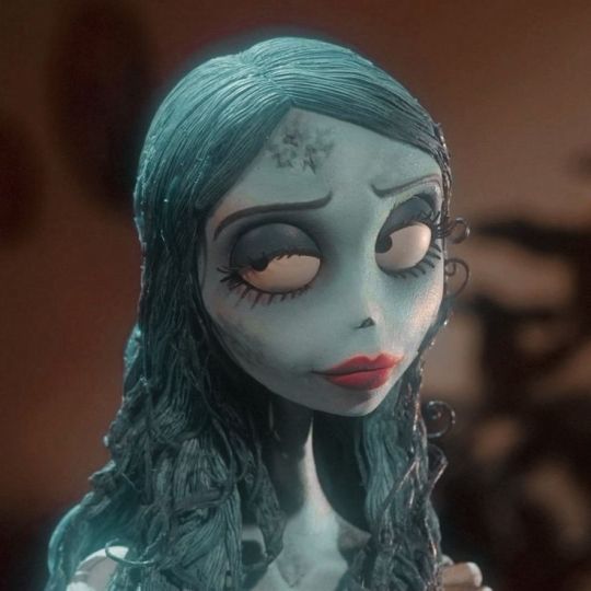
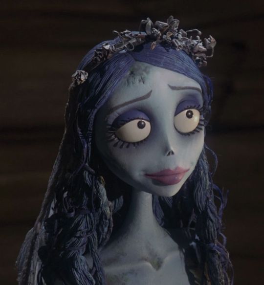
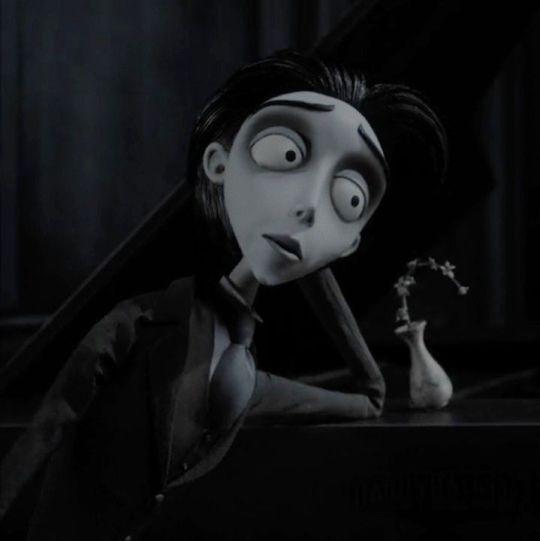

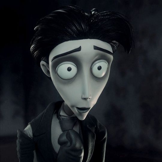
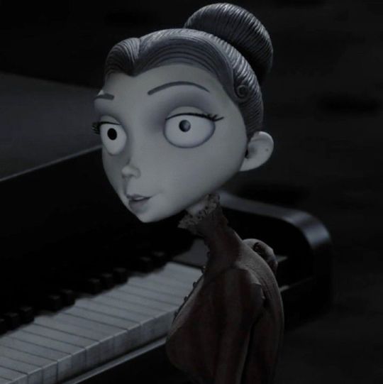


#moodboard#moodboard aesthetic#corpse bride#corpse bride tim Burton#johnny depp#emily#victor#victoria#I love you Victor but you are not mine#corpse bride aesthetic#corpse bride mood board#emily mood board#victor mood board#victoria mood board#I Was a bride and my dreams were taken from me now I'm taking them from somebody else#no you married me she's the other woman#it was a mistake I would never marry you#emily aesthetic#victoria aesthetic#victor aesthetic#emily victor victoria#always the bridesmaid never the bride#you set me free#Ily <333#i'm proud of you <333#💙#Tim Burton#♡#i spent so long in the darkness#I've almost forgotten how beautiful the moonlight is
54 notes
·
View notes
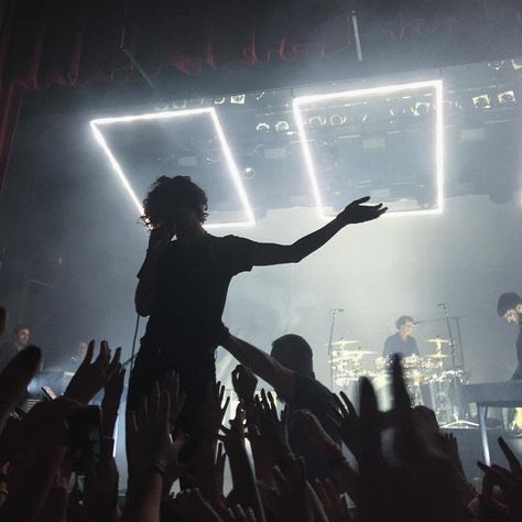
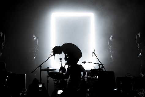
Text
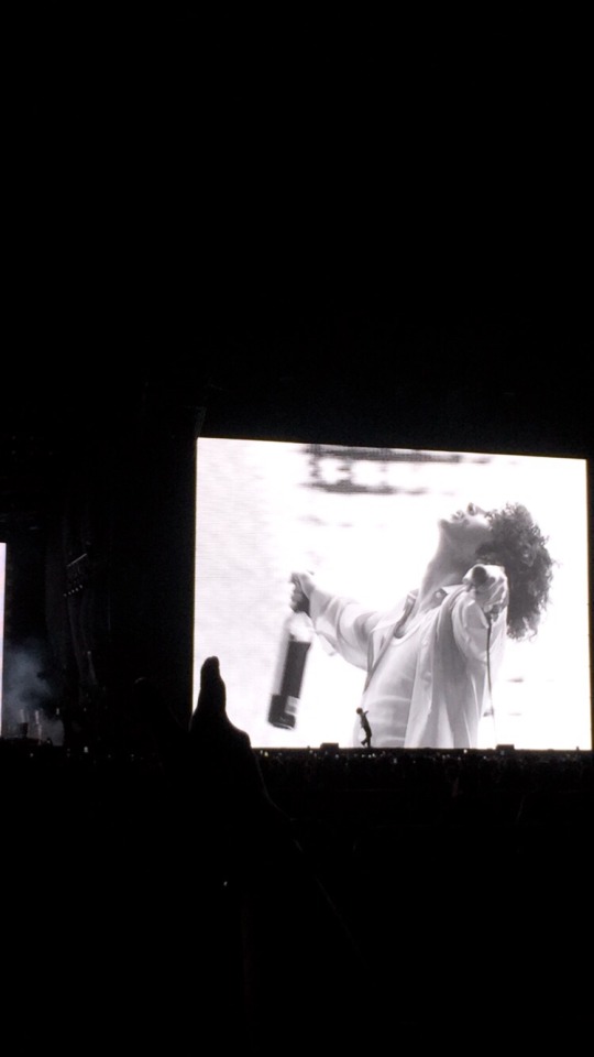
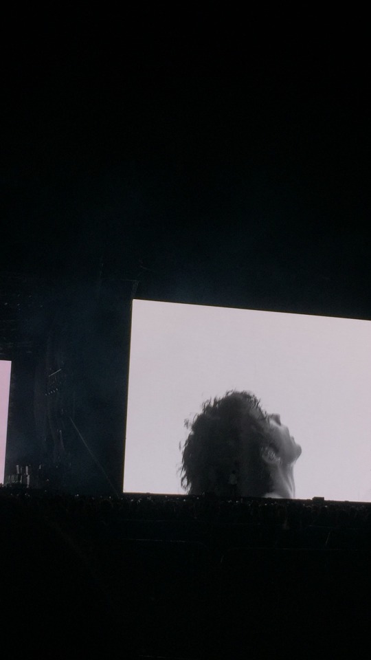
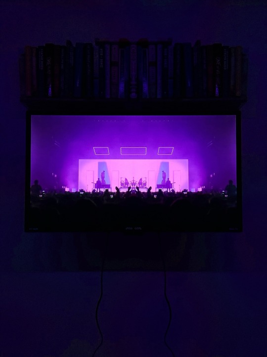
Matty Healy of The 1975 on Lollapalooza Argentina.
March 18th, 2023.
#aesthetic#the 1975#grunge#aestheticpeople#graphic design#photografy#robbers the 1975#somebody else#matty healy#lollapalooza#love it if we made it
11 notes
·
View notes
Last Seen Blogs
groovetrill
groove.trill
meowdarame
the diontori residence

sibabes
SIBABES
wckrs-blakes
Quentin Coldwater owns my heart

chuyengiathammytuvan
Chuyên Gia Thẩm Mỹ Tư Vấn