#traditional animation
Text
Hidden in the Sand, a shadow puppet animation!
#i made this years ago but ive never posted it on here#art#small artists on tumblr#artists on tumblr#shadow box#shadow puppets#traditional art#animation#traditional animation#tally hall#music video#hidden in the sand
21 notes
·
View notes
Text

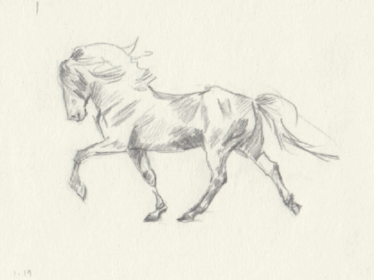
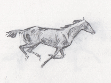
This year has been quite trying, but I'm happy that I discovered a love of making these horse animations in 2023.
#art#artist#artists on tumblr#animal art#horse#horses#horseart#animation#horse animation#traditional animation#hand drawn animation#2d animation#pencil#ink#run cycle#trot#gallop#tölt
24K notes
·
View notes
Text
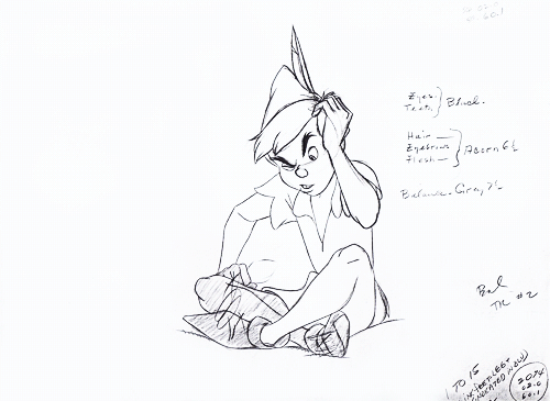
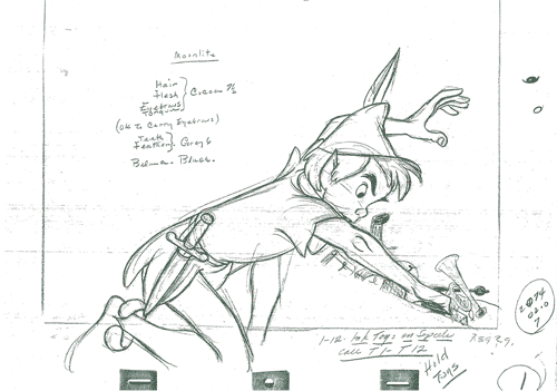
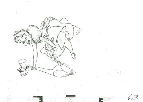
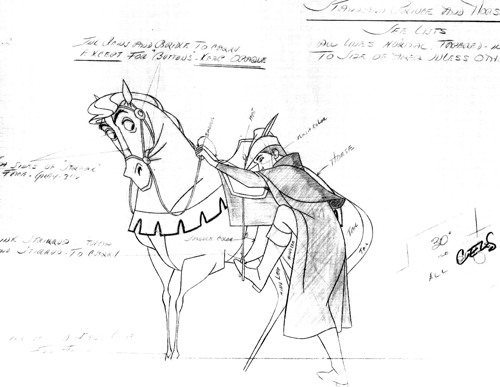
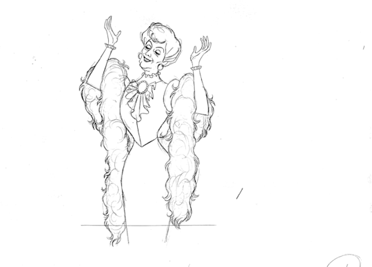


ᴛʜᴇ ᴀʀᴛ ᴏꜰ ᴍɪʟᴛ ᴋᴀʜʟ - ᴘᴇɴᴄɪʟ ᴛᴇꜱᴛꜱ
#disney#milt kahl#the master#disney animation#2d animation#traditional animation#pencil tests#pencil test#appreciation post#peter pan#alice in wonderland#101 dalmatians#the aristocats#animation art#animation#art
7K notes
·
View notes
Text
2K notes
·
View notes
Text

#communism#anti capitalism#leftism#socialism#anarchy#marxism#karl marx#boycott disney#disney#disney movies#disney animation#disney 100#walt disney#netflix#netflix series#netflix geeked week#animation#hand drawn animation#traditional animation#stop motion#2d animation#animated
3K notes
·
View notes
Text
Flipbook animation I made for an assignment last semester
It was a pad of sticky notes so, not the best for flipping through, actually
#original art#schoolwork#animation#monster#creature design#monster design#traditional animation#flipbook#hand drawn#snake's art
938 notes
·
View notes
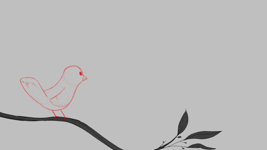
Video
A small Applin animation because I love him and his puny pathetic existence. He’s a precious sweet boy you must protect at all costs.
#pokemon#applin#2d#animation#pokemon scarlet and violet#pokemon sword and shield#apple#2d animation#animated#flapple#appletun#animate#fxs#pokémon#pokemonart#pokemongo#fanart#toonboom#traditional animation
16K notes
·
View notes
Video
youtube
LACKADAISY - countdown to premiere has started!
It’ll go live tomorrow (Wednesday) at 11am Pacific / 2pm Eastern.
#lackadaisy#lackadaisycats#lackadaisyfilm#cats#1920s#animation#gangsters#2danimation#indie animation#2d animation#traditional animation#prohibition#jazz#charleston#electroswing#animated film#comic#webcomic
4K notes
·
View notes
Photo
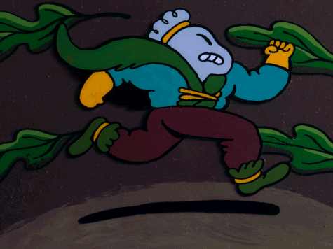
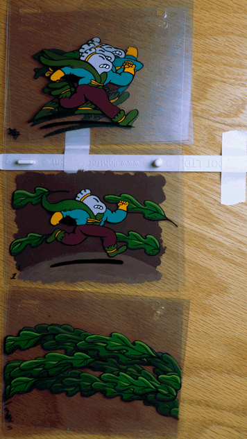
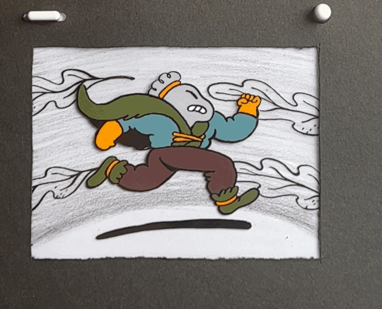
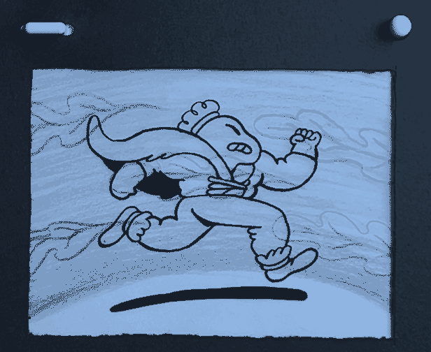
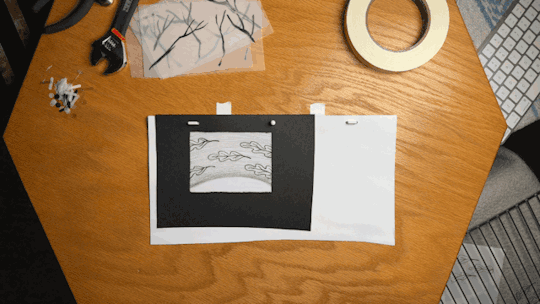
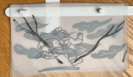


Traditional animation on paper and acetate with ink and acrylic.
#animation#Cartoons#cell animation#traditional animation#2d animation#forest#nature#drawing#ink#acetate#acrylic#Retro
6K notes
·
View notes
Text

Two deep-set eyes look at you, followed by a mischievous grin
#traditional sketch#traditional art#traditional animation#animation#slay the princess art#slay the princess#slayyyyy#it looks like shit but i dont care im proud of myself
2K notes
·
View notes
Text
WAIT A MINUTE!!! WHY DOES THAT LOOK GOOD?
I finally decided to try out making a simple paper animation, but I never thought I would be able to do it from the first time on paper, even in digital it wasn't very easy for me.
And to be honest I like the aesthetic of paper animation more, I don't know why, it's special in some way.
565 notes
·
View notes
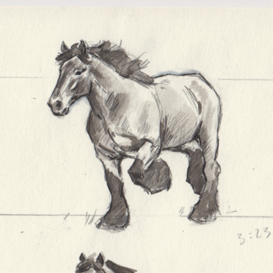
Text
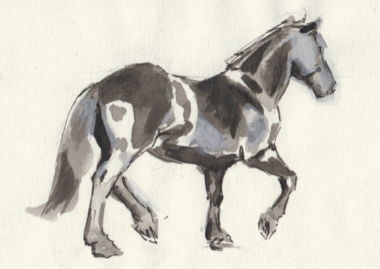
A horse trotting
My attempt at animating trot using pencil, black calligraphy ink, and a bit of white gouache. The horse is moving away from the viewer at a bit of an angle so it was more difficult than my other attempts. I'm still very new to this so please don't judge it too harshly.
#art#artist#artists on tumblr#animal art#horse#horses#horse art#2d animation#animation#traditional animation#horse animation#trot#run cycle
24K notes
·
View notes
Text

You may spank it, once.
Then make peace with your god
416 notes
·
View notes
Text

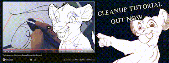
'ello folks, my Cleanup tutorial is finally done and out!
hope you find it useful
#Animation#Tutorial#Advice#Lesson#The Lion King#simba#animation#Disney#character design#how to#2D#traditional animation#frame by frame#Adobe#Photoshop#Animate#Flash#After Effects#Premiere#Video#Film#Drawing#Tips#Gestures#cleanup#lines#krita#toon boom#procreate#tvpaint
1K notes
·
View notes
Text


I had some fun with photoshop tonight fixing up this animation cell of Adam/the Beast after his transformation. If you look at the original cell, the 2nd image, you can see that the lighting and shadowing is incorrect to what animator Glen Keane intended, if you look at the third image; the light is intended to be from the bottom right and he’s meant to be viewed from below— you’re looking up at him. His right eye was also drifting away a bit, so I centered that and pushed up his mouth more to empathize the bottom of his chin.
You can really see the difference here
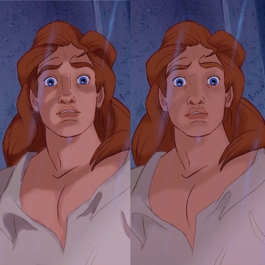
Does it work? That’s up to y’all. I always thought he was hot 🤷♀️
@bookishdruid
I would appreciate a reblog perhaps
EDIT: after some deranged nut operating on moon logic accused me of somehow contributing to corporate injustice against artists and spitting in the face of the animators who worked on this scene, I am forced to state that THIS WAS JUST FOF FUN. I’m not saying this edit is better than the original or that the movie gets bad marks on craftsmanship, I just wanted to share a silly photoshop edit. Dear god.
#disney#artists on tumblr#graphic design#fan art#beauty and the beast#belle x adam#adobe photoshop#2d animation#traditional animation
984 notes
·
View notes
Last Seen Blogs
melanie-adia-of-the-multiverse
Welcome To My World
gattiethaking
Untitled
sierice
Explosion? I don’t know her

girl-in-loves-posts
✨Girl in Love✨

bees-in-disguise
Bees