Text
Scene Notes - Direct comparison
(Most of these notes were taken as I wrote the essay as a way to gather my thoughts. There’s not as many of them as the individual scenes because a lot of the time I could just write the essay directly)
Mix of drama/comedy, OTGW is drama, GF is comedy. Bill has lost and wants revenge, Beast has lost for good and is trying to stay alive.
Both Bill and the Beast shot from below. Shows they’re large and powerful, even when being beaten. Gravity Falls uses flat wide shots because comedy and OTGW has more varied shots and a lot of close ups to show emotions.
Subjective shots both from pov of villain. Villain and Heroes typically not shown in the same shot
More camera movement in OTGW because more drama. Antagonists use (or mimic) camera movement
GF empty, OTGW busy. Opposite feelings but both unnatural. Bill attacks directly and so humans look defenceless with nothing around. Beast wants wirt and greg to stay in the woods and lose hope. Scene makes them feel trapped/lost
Villain makes screen all black/white. Beast controls light whereas bill controls reality. Characters also control light which takes power away from the beast
The Gravity Falls clip is the second last episode of season 1. The Over The Garden Wall clip is the last episode. OTGW had a lot more to wrap up and finalise, while GF could leave questions unanswered and the villain undefeated. OTGW was aired over the course of a week, and Gravity Falls aired over the course of four years, and encouraged viewers to take the time to solve the mysteries outside of the show. That’s why so much attention was given to the zodiac.
0 notes
Text
After Effects Practice 2
vimeo
This practice had a lot more highs and lows than the last one. I like how the square movement looks like a stomp, but that kinda just makes the other shapes look nonsensical. The wiggly line moves horribly but it’s an easy enough fix. The Santa looks fine until he moves, which is a shame. The text functions are very good and I like them, but I’m still not convinced on the wiggle. I probably just need to make it more subtle though. It just looks messy right now
0 notes
Text
Individual Scene Analysis - GF
Editing and pace
Pacing of the fight is interrupted for comedy. Dialogue and fights are interrupted unnaturally to let people quip
Shoot sizes and positions
Bill is filmed from below to give him a sense of power. He’s never shown from above, even when he’s being beaten
Subjectivity/objectivity of shots
Entirely objective shots, apart from one over-the-shoulder shot that comes when the power switches from bill to the humans
Camera movement
Camera follows Dipper’s entrance. A lot of pans are used to follow attacks. Very dramatic zoom with Zyler and Crash. Camera shake when they enter the void. But otherwise the camera is still because the focus is still mostly on comedy
Composition
Bill kept mostly apart from the humans in shots
Mise en scene
Almost entirely empty aside from the characters, which puts more focus on the characters because comedy, but also contributes to the unreality and also shows that the characters are mostly powerless until they figure out dream logic. When Bill shows that he can’t be beat, the entire scene disappears
Semiotics
The space setting blurs the line between real place and unreal place. Bill looks like the eye of providence, which makes him feel knowledgeable, and the zodiac connects him in a meta way with the show’s credits. He also breaks the fourth wall and looks directly at the audience. Dipper uses red attacks, like Bill, but Soos and Mable don’t, which shows how different they are from him. Mable and Soos’s attacks are also cutesy, Soos has a reference to Care Bears, which shows that it’s silliness that eventually overpowers Bill Crash & Zyler are very stereotypically 80s and “cool”
Use of colour and light
Bill is glowing red to make him look threatening and angry. The inverted eye colours also make him look threatening. The scene is set in “space” but is brightly lit because it has a mostly comedic tone. Purposefully dramatic neon lighting
Use of diagetic and non-diagetic sound and music
Dramatic music interrupted with jokes. Lots of sound effects because its unreality. Ambiance in the void. Forboding music at Bill’s threats. Acoustic music at the end to take them back to reality.
Animation technique and style
Flat colours for characters, textures and paintings in the background. Dream-stuff always slightly different. Crash and Zyler are in a different style and have very bright colours. Magic is glowing. Bill’s proportions constantly fluctuate (eg very small hand in the “but know this” shot)
0 notes
Text
Individual Scene Analysis - OTGW
Editing and pace
Just audio over black screen shows they’re lost. Interspersed serious moments and funny moments and funny played serious (mainly with Greg’s dialog) Until greg dies, then it’s all serious and scary, until Wirt outsmarts the beast and there’s the voice joke. The woodsman and Beatrice are serious until she makes up with Wirt properly. 3 seconds per shot. Long shots used to show drama
Shot sizes and positions
Super close up on the rock facts, showing Greg cares a lot about it. Super close up shots when the Beast is demanding. Shows only the beast's eyes sometimes, emphasis on darkness? Shot of Wirt picking up the axe doesn’t show his head, shows how the person with the axe is no longer themself?. Greg is looked down on to show he’s dying. Wirt looked down on when talking to the beast, and the beast is never looked down on. The woodsman is looked up on in the very last shot to show that he’s finally won.
Subjectivity/objectivity of shots
Conversation between wirt and greg had in over-the-shoulder shots, wider shots used to show scene/action. Beast and Wirt conversation only shows one of them, presumably subjective shots. Pan near the start from pov of lantern.
Camera movement
Slow pan to show searching. Slow zooms and pans used to show importance. Zoom at the revelation. Beast almost replicates zooms by moving closer/further away from the camera.
Composition
Amount of people in a shot show priorities and care. Wirt, Greg, and Beatrice care about each other and want to help each other, and Wirt wants to help the woodsman. The beast doesn’t care about anyone but himself and so is shown alone most of the time. When Wirt almost gives in, Greg and Beatrice are put in shadow and The Beast and Wirt are in the same shot, but when Wirt realises and steps back, light is put back on Greg and Beatrice
Mise en scene
Empty clearing in the middle of the wood makes space to see everything clearly but still gives the feeling of being lost/trapped. Greg’s tree in the middle of the clearing connects him with the other trees.
Semiotics
Snow shows coldness, woods shows they’re lost, darkness shows danger, the lamp is normally a hopeful thing but is turned into a threat, tree is normally a neutral thing but is again turned into a threat
Use of colour and light
Scene starts out pitch black, then is lit by the lantern throughout it all. Background colours are high contrast and almost black and white. Vignette. Beast almost supernaturally covered in shadows. Threat takes away all light except for the lantern, then puts it back when threatened. Light exposes Beast. Scene diegetically fades to black, completing the circle
Use of diegetic and nondiegetic sound and music
Ambient noises turn to music, a sombre italien? cover of Potatoes And Molasses, showing how the tone has changed from the start of the scene. Greg’s singing stops when Greg “dies”. Song stops when the tone changes and Wirt questions the beast. Bell noise to show revelation? Probably a callback to an earlier episode (Lorna?) Ambient noise picks up when the Beast threatens him and stops when Wirt fights back. Music box cover of main theme.
Animation technique and style
Solid characters, painted backgrounds, give it a storybook feeling. The Beast’s eyes and the lantern light has a gradient that makes it stand out. Beast painted like the background to emphasise horror and show that it is part of the forest.
1 note
·
View note
Text
Briefing - Motion Graphics
Ideas (Sources under readmore):
Diversity
Feminism needs to be intersectional
Stimming psa
Sustainability
Cats are indoor animals
Planned obsolescence
Biodiverse lawns
Learn to darn/patch clothes
All pollinators are important
Well-Being
Make to-do lists
Split tasks into smaller sections
Wear a mask psa
Warnings about ice on roads
Don’t give pets vegan diets
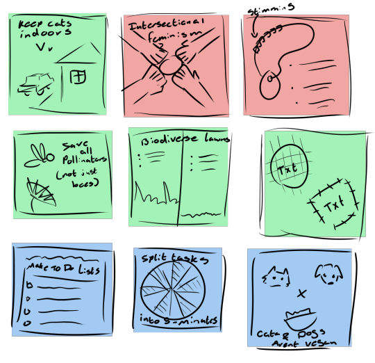
I can’t decide whether I think these ideas are too simple or too complex. There’s definitely too much text on some of them though. I admittedly didn’t put as much though into how some of them would animate, and it shows particularly the stimming one and the dogs and cats one, and even less thought into how they would loop. Some of them seem promising though, particularly the Pollinators one, which I thought could be the flower idly waving and the wasp landing on it and then flying offscreen. It’s also good for being a small part of a larger issue, and I could make others along the same theme of animal conservation only focusing on “cute” animals
Intersectional feminism
(not really something that needs a source? it’s mostly just opinion that you should care about other people)
Stimming psa
https://www.spectrumnews.org/opinion/viewpoint/stimming-therapeutic-autistic-people-deserves-acceptance/
Cats are indoor animals
https://www.petcoach.co/article/outdoor-cats-face-many-hazards/
Planned obsolescence
https://www.activesustainability.com/sustainable-development/battle-against-planned-obsolescence/
Biodiverse lawns
https://www.weforum.org/agenda/2019/07/a-biodiversity-scientist-explains-the-problem-with-our-neat-lawns/
Learn to darn/patch clothes
https://thefloramodiste.com/blogs/tfm/5-reasons-why-you-need-to-repair-your-own-clothes
All pollinators are important
https://www.dailymail.co.uk/sciencetech/article-6183081/Dont-kill-wasps-ruin-picnic-theyre-just-important-bees-scientists-warn.html
Make to-do lists
Split tasks into smaller sections
Both gotten from various posts at https://actuallyadhd.tumblr.com/tagged/studying
Wear a mask
https://www.ucsf.edu/news/2020/06/417906/still-confused-about-masks-heres-science-behind-how-face-masks-prevent
Warnings about ice on roads
I’m gonna be real, my girlfriend said this one and then didn’t elaborate so I have no clue where to go vis a vis research
Don’t give pets vegan diets
https://www.wired.co.uk/article/vegan-diet-dog-cat-pet-food
0 notes
Text
After Effects
vimeo
A lot of this was re-hashing of things I already knew, but it’s always good to strengthen your skills, and it was rather fun. I couldn’t get the skull pictures to work in the slightest, probably because I missed that part of the teams call due to broken internet. I liked the text functions and I got a better grasp of how to use the graph editor, which is good because it makes everything look so much more dynamic.
0 notes
Text
Scene Selection
The scenes I have chosen to write about are:
The Scene from 4:18 - 8:24 In episode 10 of Over The Garden Wall

The Scene from 18:42 - 21:17 in season 1, episode 19 of Gravity Falls
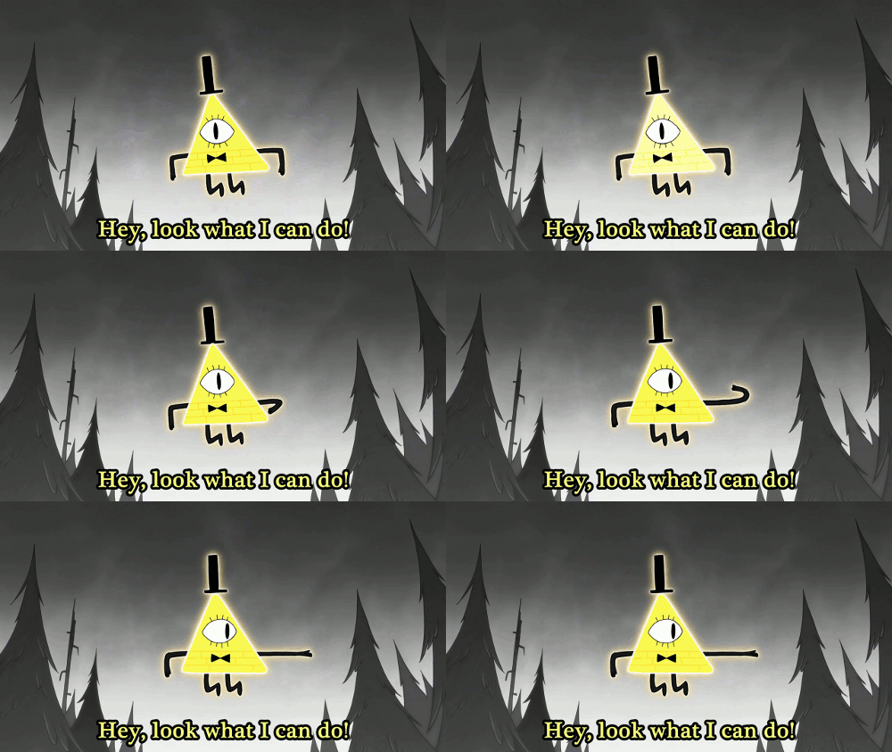
I chose these shows because they are both of a similar genre, containing both fantasy, mystery, and horror aspects, and both being suitable for pre-teens, but Over The Garden Wall takes itself a lot more seriously than Gravity Falls, and I want to see how that translates to film.
These scenes in particular deal with a conflict against the primary antagonist, which is a supernatural being. In Over The Garden Wall, this is the final conflict and the highest point of tension in the show, whilst in Gravity Falls, it’s not the final conflict with Bill, or the final conflict in the season, which decreases the tension. I also want to see how this impacts how the scenes are shown.
0 notes
Text
Sketch Pass
vimeo
This version fixes a few problems but introduces a few more. The cups no longer magically spring to life, they move into view. The cup is meant to be hidden behind the books at the start but that isn’t quite as obvious as I’d hoped it’d be. The sequence of the mug walking at the start seemed too fast when I went to edit it, so I made it longer, but now it seems too long. If I put more focus on the cup, which has a more varied range of movement, it could work, but for now it just seems to drag out. I could fix this by making it the title sequence, though. Because the intro sequence is so long, the jump seems anticlimactic. I want to hold that for a little longer.
I changed around the shots, adding a middle shot where the mug actively looks for the cup, and combining second and third shot into one, which gives it a more dynamic camera angle and gets it back to a wide/close/medium shot set-up. I also added camera movement, which helps it look a lot more lively, and increases tension by making the audience feel like they’re following the cups instead of just happening to glance over at them.
0 notes
Text
Reference Footage
vimeo
This probably doesn’t need it’s own post, but I figured that enough of this animatic is going to be cups walking that I might as well figure out how to do it well. I think the walk I settled on is as good as I’m going to get. It has up-down movement and rotation, and keeps gravity in mind by always having some part of the cup on the ground at all times.

0 notes
Text
Inanimate Objects Workshop

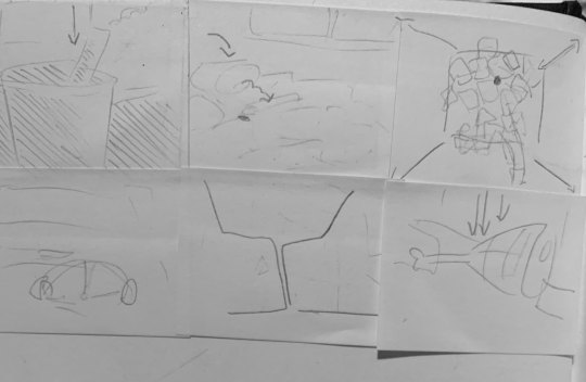
These storyboards are the same as last time, nothing to see here, but unfortunately, my partner entered the lesson too late and we didn’t have the opportunity to swap for the second part of this activity. Instead, I got one of my friends (who isn’t, I may add, artistically inclined) to do her take on it, with the mindset of maybe I was overthinking this. I was wrong. this was a bad idea. I do, however, like the overhead shot she used, which does a better job at conveying the distance between the two objects, but doesn’t show the gap between the shelf and the floor, and also would be fairly difficult to animate well, and I’m lazy.
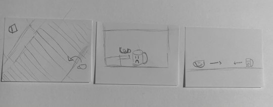
The six panels are just a shorter form of the animatic, but with a camera move in the second shot, which adds something to the tension, and an actual medium shot

0 notes
Text
Inanimate Objects Animatic
vimeo
There are problems with this animatic. Many of them, and I’m very frustrated with it. The objects kinda just magically come to life at the beginning, and then there’s no reason for the cup to jump and you don’t know where it’s going because the mug doesn’t move so you don’t know it’s alive. The second shot is confusing and it’s not clear where the mug is or what it’s looking at until the cup pops up behind it. The turn of what I hoped would communicate losing hope looks more like a shrug, and the final shot is flat, which doesn’t particularly convey the emotions it needs to, and is a second wide shot instead of a medium, which goes against the brief.
0 notes
Text
Inanimate Objects Research
Task One: Research shot types
Wide shot
Used to put emphasis on location, or to make characters look small. Normally used at the start of a scene to make the audience familiar with the setting.
Medium shot
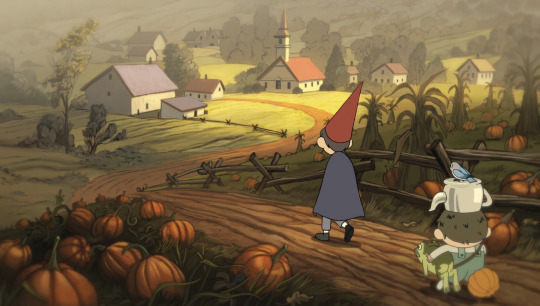
Used to show character through movement. Allows characters to talk without having to cut so often.
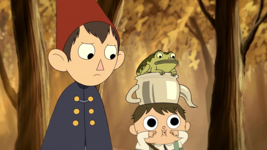
Close-up
Used to show character through emotion. Also very dramatic and makes the character fill the screen so they seem more important

Task Two: Art direction analysis
Kitbull
Flat characters and objects, painted background. Minimal outlines, with texture. Muted colour pallet, a lot of monochrome grey with only a few accent colours. Round shapes to show friendliness

Late Afternoon
Flat characters, textured backgrounds. Lines disjointed and not quite black. Colours pastel and mostly warm with vibrant accents eg. the coat

Blank
text
0 notes
Text
Inanimate Objects Workshop
I had a vague idea of what I would do for this project. I liked the idea of a coffee cup and a mug being friends. It’s easy enough for people to imagine that two objects with a similar purpose would be friends, and I didn’t want to use the animation time setting it up.
For the three first passes, I wanted to slightly change the narrative as well as the shot type. From the cup helping the mug, to the ending being a tragedy, to there being a fun twist in the middle. I wasn’t really thinking for the first one, and I don’t think the close-up works as well as the last shot. If I switched it to the middle one it would give a better feel of the stakes of the situation. Aside from that I like the flat wide shot of the second one. The first two are very dramatic and it just flips the tone and makes it funny, reminding the audience that it’s still just a mug. I ended up choosing the last one because it put the emotional close-up in the middle, which makes the twist that the cup did make it hit more.
I wanted to keep the theme of friendship going so I had the phone give the cup a hug when it gets scared by a plane in the second one, and I liked the visual of mist, so I played around with that in the next one. It changed a bit in the horror one, which I had the fun idea of using a random number generator to pick a random episode of tma, and it picked the monster pig episode. I like the idea of a porcelain pig figure just being a bastard, and the close-up of a completely still pig face with dramatic lighting in the background is just so funny to me for reasons I can’t articulate.

The prompt for this one was noir, and I wanted to really lean in to the trope-y edgy dramatic-ness of it all. This one is a lot weaker in terms of animation because the objects don’t move on their own as much as they are reacting to outside forces, but I do like the framing and set-up of it. Very dramatic.
0 notes
Text
Household Robot Finished
I added a lot more movement to this thing than I thought I was going to, and it turned out better for it. I like how the jumping and the sound lines combine to emphasise the loudness of the sound coming out of the device, and I like the new design of the microphone, which I had to change because in the previous design, it was moving in 3d space and I do not know how to do that yet.
I wanted to microphone’s movements to be the main focus, but as they are, they’re just too slow and boring almost. I wanted it to look like it was actively seeking out the sound so it could be closer to looking like a robot, but right now it just looks like someone knocked it over. I had to take the shadow out as well, which I regret a lot.
vimeo
For next time: Put more focus on movement and have a clear idea of what you’re going to do before you do it. Be aware of the limitations of your medium. Remember the shadows!
0 notes
Text
Household Robot Workshop
Cleaning up the artwork made it look a lot cleaner, which I’m glad of, but I only really had time to animate the waveform in the lesson. Looping it was a little tricky to figure out but I got there with the help of masks. Not much really to say about this right now, but there will be when I am finished
vimeo
0 notes
Text
Film Language - Colour
Odd colours can be used to show unreality or fantasy. The shot on the left is on earth, and the colours are more muted, and are in natural tones of blue, green, and brown. The shot on the left is on the gem homeworld, and the colours are a lot more vibrant, and have a lot of purples and pinks, which aren’t colours typically found in nature.

Different times and places can be colour coded, so can characters, events, and themes. Magical girl anime tends to follow a pattern when colour-coding their characters to let the audience know what roles everyone plays. The pink one is the leader, the blue one is snobby, the yellow one is fun and energetic and the purple one is cool and mysterious

When individual colours are highlighted, it draws attention to them
Red - Anger, danger, blood, fire, but also love and passion
Yellow/Orange - Nature, sunlight, but also memory and the past, sepia
Geen - Poison/toxin, money, greed, but also nature and plants
Blue - Loneliness, the sky, water, coldness
Black - Mystery, space, forboding, danger, night
White - Sterile, drab, boring, regulated
0 notes
Text
Finalise Storyboard Section

This is my first rough pass of an animatic, but I don’t think I like it. It’s a bad part of the scene to chose and its rather limited in terms of layout and composition. I also feel like I either made too many frames for a shot, or not enough. I will try another section and see if that fixes these problems
0 notes