Photo
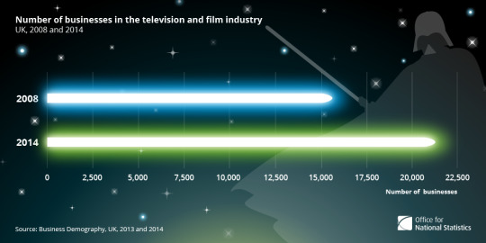
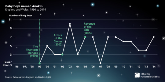
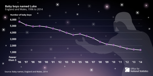
Here are samples of data visualisation work completed for the Office for National Statistics, providing visual reference for a statistical bulletins published to Visual.ONS and through a number of their social media platforms, celebrating the release of Star Wars Episode VII by taking a look at the influence of the Star Wars saga on modern society.
This project can be viewed in their entirety online by clicking here.
0 notes
Photo
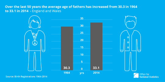
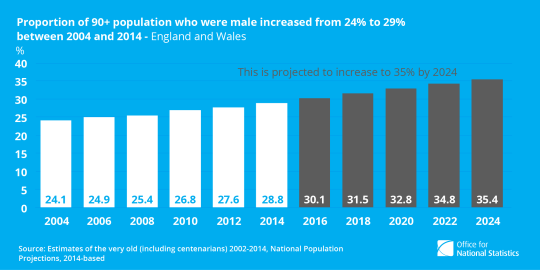
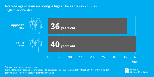
Here are samples of data visualisation work completed for the Office for National Statistics, providing visual reference for a statistical bulletins published to Visual.ONS and through a number of their social media platforms, celebrating International Men’s Day, and the role men play in modern society.
This project can be viewed in their entirety online by clicking here.
0 notes
Photo
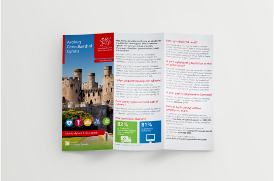
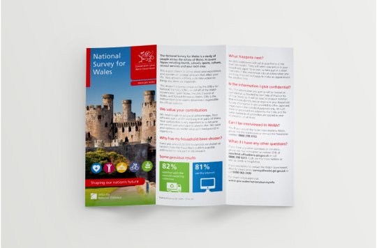
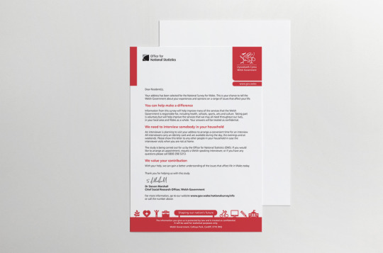
Shown here is a bilingual trifold leaflet design for both the National Survey for Wales and the Office for National Statistics, and a coherent letter design, simultaneously adhering to both organisations branding guidelines.
#graphic design#leaflet design#ons#national survey for wales#welsh government#statistcs#print design
0 notes
Photo
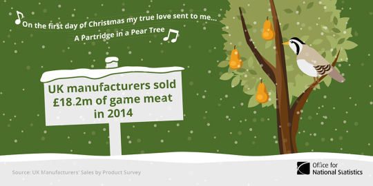


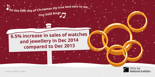


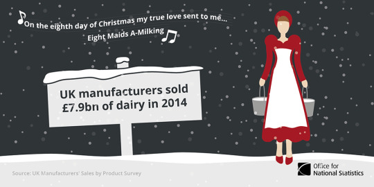


The Twelve Tweets of Christmas was a project I developed during my time at the Office for National Statistics, using the festive season to bring attention to a number of varied figures from statistical bulletins published throughout 2015, and published through a number of their social media platforms.
#graphic design#digital content#ons#statistics#data visualization#animation#gif#christmas#12 days of christmas#illustration
0 notes
Photo


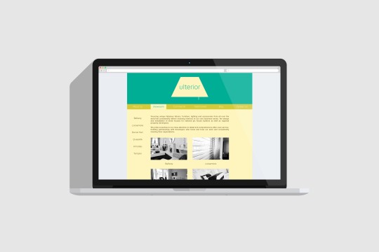
Ulterior are a brand that offer "Ultimate Interior Design". Using a neutral colour palette coupled with greyscale imagery, soft text and structured layouts, I've been able to develop a well-rounded corporate identity and coherent website to satisfy their needs.
0 notes
Photo


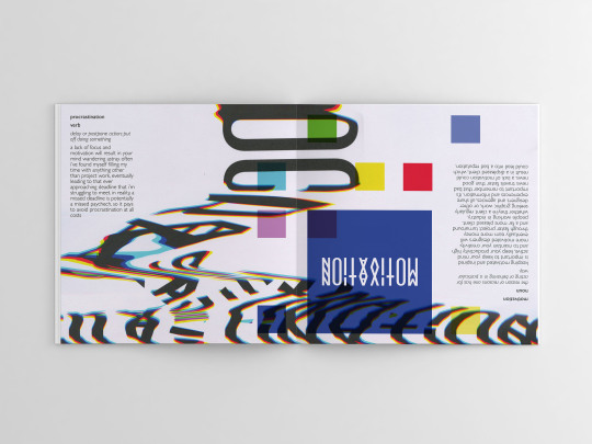
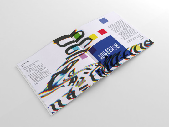
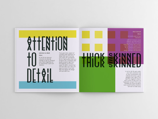
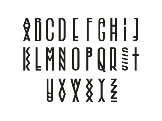
As part of a University brief, I was required to create a book illustrating what I consider to the 7 Deadly Sins and 7 Heavenly Virtues of Graphic Design.
Taking a typographic approach to this square format book, I used both postmodern abstractions and modernist type settings of a bespoke typeface I had developed to represent each half of the book. With the Sins and Virtues both starting at opposite ends of the book, it culminates in a double page spread of both styles in the centrefold.
#graphic design#sins and virtues#seven deadly sins#7 deadly sins#seven heavenly virtues#7 heavenly virtues#print design#book design
0 notes
Photo
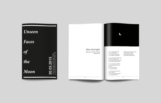
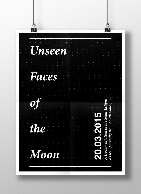
Around the time of the 2015 Solar Eclipse, I was inspired to create a visual documentation of the event so that a moment that lasts only a few minutes could be enjoyed time and time again.
What resulted was "Unseen Faces of the Moon"; essentially a collection of still images taken of the Solar Eclipse as seen partially from the summit of The Bwlch, a mountain in South Wales, UK. The collection of still frames has allowed me to produce a short timelapse video of the occurrence, and translate that into a physical flip book where the images are accompanied by cohesive poetry. A large format poster also displays the books cover, and from a distance what seems to be very fine polka dots is actually each frame of the timelapse when viewed up close.
1 note
·
View note
Photo
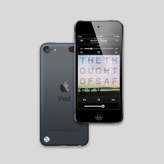
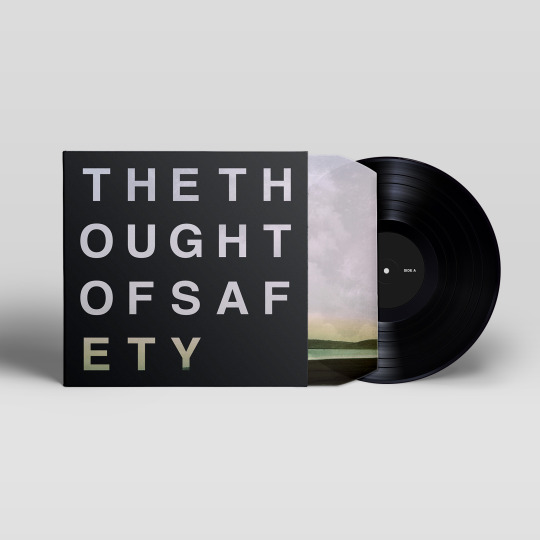

Cover art was commissioned from me for an upcoming release by the band "This Distance".
Although the original brief only demanded a simple thumbnail as its release was only planned to be digital, an alternative format was later needed for a limited edition physical release on vinyl record, and the cover image was also used to create a coherent tour poster to promote the bands live performances in support of the upcoming release.
0 notes
Photo


Assigned the task of re-designing a product range, this packaging refresh of the Halfords own-brand service parts incorporates modernist type, iconography and bold colour to overhaul its visual aesthetic.
0 notes
Photo
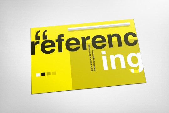
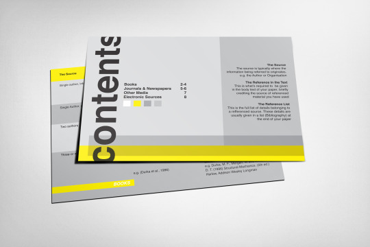
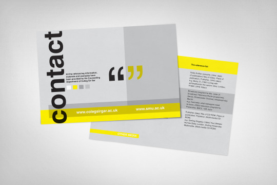
A series of 6 x 4 postcards intended for use by students as an easily understandable guide to the Harvard Refrencing System.
0 notes
Photo
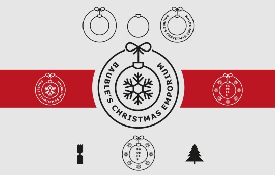
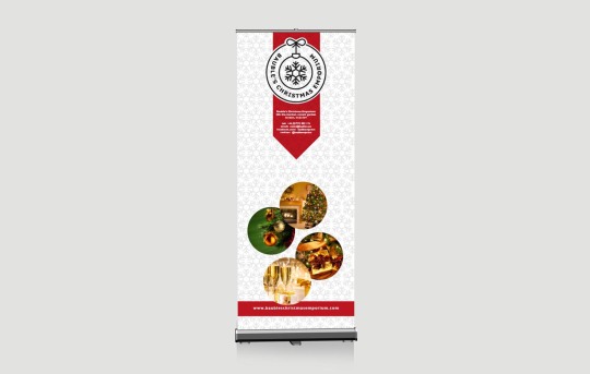
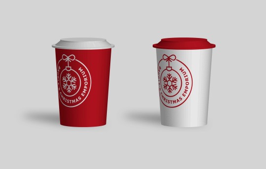
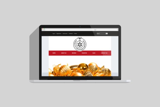

During a short work placement at the Waters Creative studio in Swansea, I was presented with an identity and branding project for Baubles Christmas Emporium, a seasonal and festive retailer based at Covent Garden, London.
A simple, line illustrated identity presents a touch of class as an alternative to more common festive visuals, and a well rounded brand was developed including stationary, promotional takeaway cups, roll-up banner and a website.
0 notes
Photo


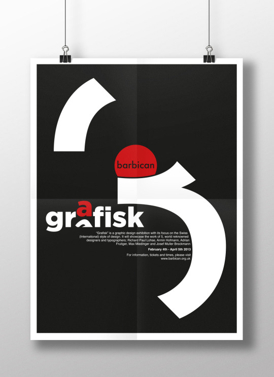
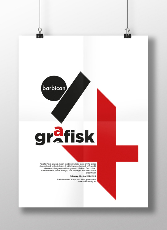
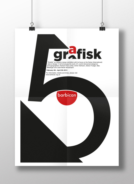
A series of modernist posters designed to promote an exhibition of Swiss Modernism at the Barbican Centre, London.
#graphic design#poster design#swiss modernism#armin hofmann#josef muller brockmann#richard paul lohse#max miedinger#adrian frutiger
1 note
·
View note
Photo

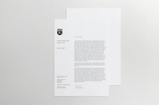

A new logo and stationary set designed as part of the rebranding of an independent Karate club.
0 notes
Photo
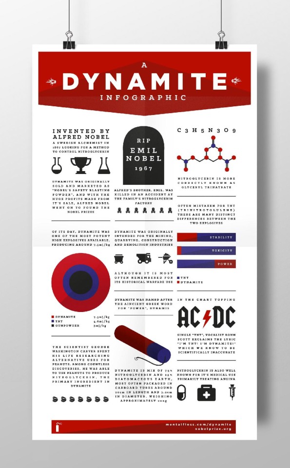
Tasked with creating an infographic on an assigned subject matter, and with the restriction of not being able to incorporate photographic images; I created this bold and bright design by embracing typography and illustrative icons to educate and inform the viewer of various facts and trivia of one of the most notorious explosives of all time.
0 notes