abbeyhindmarchdesign
abbeyhindmarchdesign
DESN 1011
17 posts
Don't wanna be here? Send us removal request.
Last Seen Blogs
please-just-let-me-have-a-name
oc & writing things

sehtas
Erotica
macabre-demise
Macabre Demise
funkylittlefruit
This Bus Kills Transphobes
mlady-bug-a-boo
Miraculous Crack House
Text
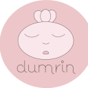
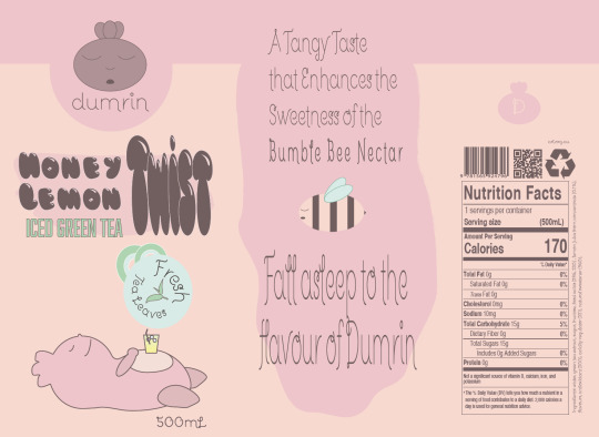
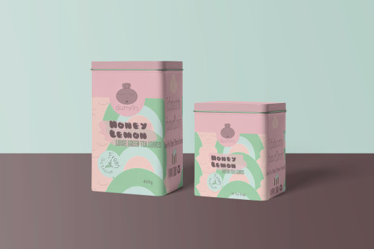
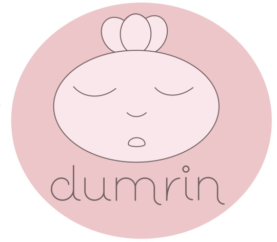
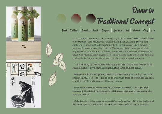
The Composition
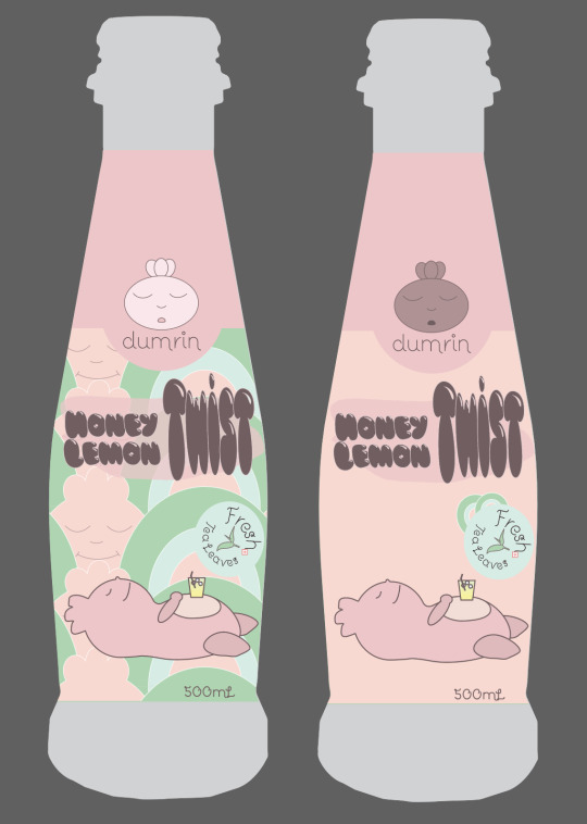
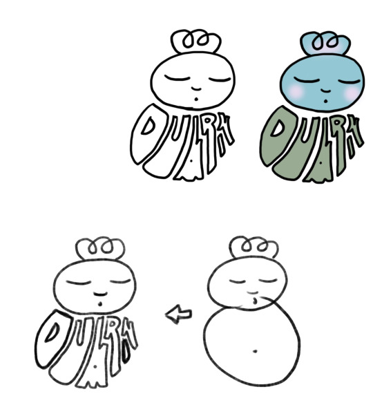
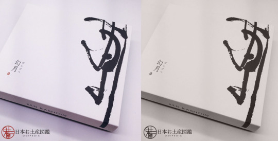
Completed Case Study
I have resolved my concept and have achieved my desired design. This is not where I thought it was going, but I am so proud of the result! Enough dilly dallying haha, here is the Honey Lemon Collection:
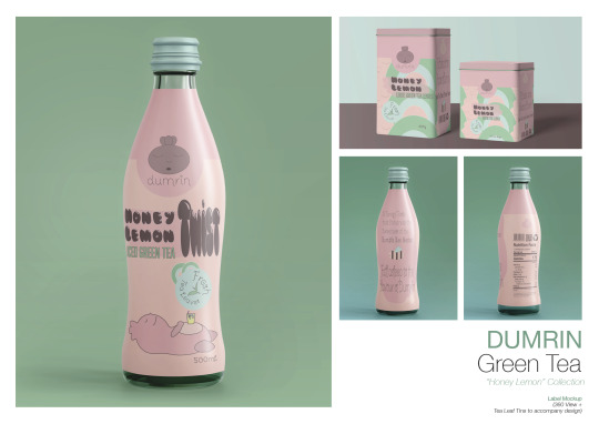
The design reflects the mood boards amazingly, I am so pleased with the balance of Eastern and Western culture and the creation of my own Mascot from scratch!
This journey was turbulent and challenging, but all worthwhile when I sit back and look at the results. So without further ado, I present to you, Dumrin.
0 notes
Text
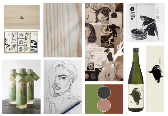
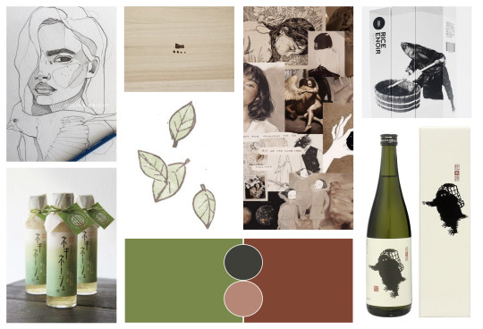
Self Directed // Compositing my Concept
Revisiting the Repeat Pattern
Looking with fresh eyes, I much prefer a lighter colour especially if I am going to use it as my background. It was additionally small in scale, meaning there were a lot of small elements that when on such a small surface, are hard to make out. It also increased the amount of linework that would clash with the rest of the simplistic bold design.
In short, my pattern was getting too detailed, taking all the attention off the text.
The following alterations were made:

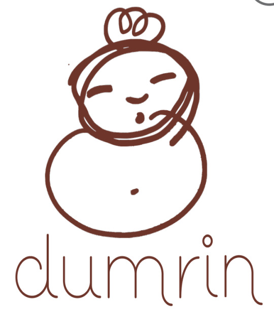
From here, after looking at it with other people’s opinions, with the logo, and mascot I additionally made, an overload of ‘Dumrin’ waas forming. So, to add more reference, I took out the mascot (no tears should be shed- he shall return!)
The Bottle
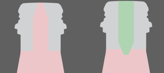
Oh boy this was a challenge. I started with a flat strip- the dieline. And soon discovered this made it impossible to visualise the end product. So, while still working on the initial composition, I created a silhouette of the bottle and worked to that. I made eighteen different compositions and got external eyes to vote and come up with a hybridised version I would further refine.
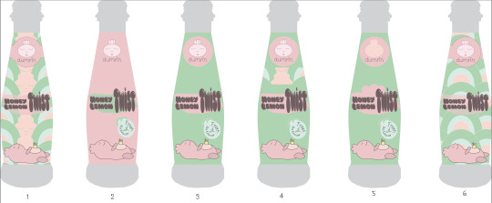
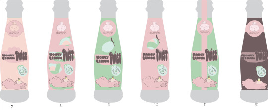
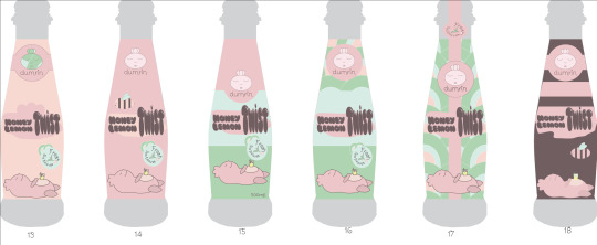
Although some had very minute differences, it was a very difficult decision. The following numbers were favoured
Anon A: 7 and 15
simplicity and refinement
Anon B: 7, 14 and 15
cute, not overwhelming
nice colours, aesthetic
“bee”
Anon C: 7, 14 and 11
clearest in the flavour of the beveridge
the simpler, the better and more appealing
Anon D: 11 and 17
he strip down the middle is appealing and adds a sense of a neat package
Anon E: 4, 16, 17 and 18
loves the repeat pattern
Overall, many different designs were favoured. After a few minutes of being even more confused, I chose the most popular designs and hybridised them.
The following is my refinement of such:
The left was the repeat pattern’s final attempt at being cohesive, unfortunately, the right won. The pattern will be left to the tea bag packaging.
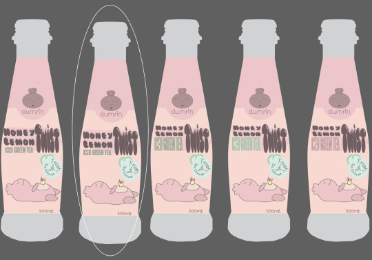
I then added in the ‘Iced Green tea’ which I was clever enough to forget *facepalms*, now with this added text, I had to find a balance. Anon D came back to assist in the final decision of the positioning.

I decided to have one final play with the typography, quickly deciding no, the way it was, was much more appealing to the eye.
Stickers! This is compensation for Anon D’s favour toward the containment of the drink- adding the security of a seal at the top. The green seal is another way to bring in more of the aesthetic of colour Anon B liked so much.

Dark Browns will replace any black on the bottle including the nutrition labelling. This softens the design to fit the ‘comfort’ of the aesthetic.
0 notes
Text
Week Eleven // Self Directed Development
The Right Shape...
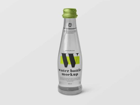
Mock-Up hunting sure is difficult. I don’t want to commit to paying for anything if it isn’t going to be ‘perfect’. Therefore I want to experiment with my label and the best options will arise from that.
The key discovery I have struggled with is finding the shape that will work the best for my bottle, as well as other niches I wanted to apply. Below are a few I have downloaded to have a play with.

This might be too ‘juice’ and not ‘tea’ enough. However the sticker at the top of the bottle is something I wanted to explore. The fact that the sticker isn’t a full wrap is something I would want to change.
I love the shape of this bottle and is similar to past sketches I had made, so that is the main reason I downloaded this one. However this is water, this is a full wrap, even up the neck which is a desirable design choice I was looking into. the full may hide the translucent bottle and water within, however I will experiment with the layers and potentially create a more ‘tea’ colour within.
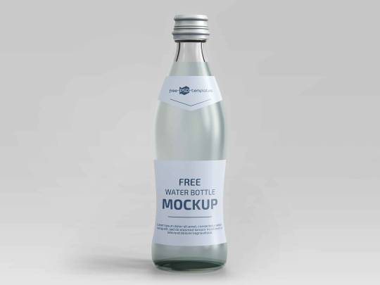
This is another shape I like, as it would stand out, however this is definitely more ‘water’ than ‘tea’. The entire bottle however is editable, therefore like the previous bottle, I can create a full wrap up to halfway around the neck.
As I have explained previously, I expressed interest in producing tea bags to be sold as a novelty with the brand, so when exploring the world of mockups I stumbled across a few to play with in addition.

The tin design is definitely what I was interested in so I will definitely use these.
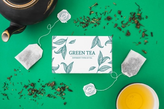
The individual tea bag may be getting a little too cliche but it is there to experiment with nonetheless. Credit to creator:
https://www.freepik.com/free-photos-vectors/mockup
I look forward to the outcomes of all of these!
0 notes
Text
Week Eleven // Design Brief
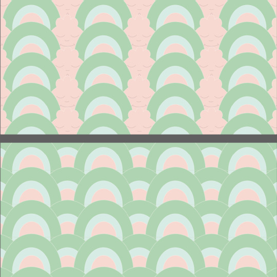
Repeat Patterns
This week’s tutorial was an exciting one for me because I can see it really assisting with my brand development! Repeat Patterns are very useful at manipulating design to fill empty space, like backgrounds, or lonely white spaces begging for a makeover.
Beginning with a touch of research, I began looking into the Japanese wave pattern, as it also has resemblance with the patterns Chinese Takeaway use for their noodle packaging:
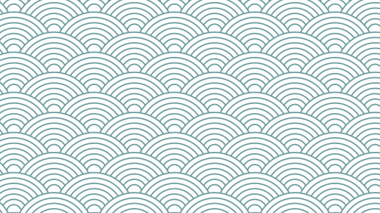

Knowing I couldn’t just replicate this, I began to brainstorm how I could fit this motif into my brand, whilst making it my own. Eventually I came up with this:
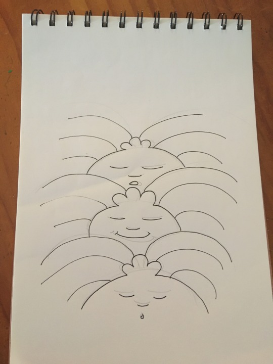
Albeit a very rough sketch, what I wanted began evolving into something that excited me.
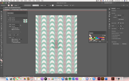
Jumping into Illustrator was the next step so I began making my pattern, fiddling around a LOT and eventually coming up with the following tile- mathematically and strategically so it would seamlessly line up.
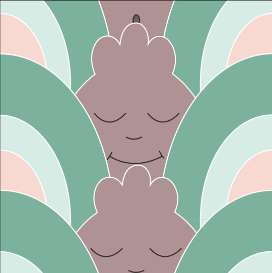
Difficult to understand on its own, however when joined by neighbouring, identical tiles the pattern comes together...

Dumrin has successfully been situated into a totem-pole style pattern with his face alternating between happy and yawning, two key motifs of the brand, amongst the traditional pattern with a twist.
Standing back and looking at the design, the only thing I would change is the colours, making them a little lighter and more pastel would probably assist, especially if I end up making it the background that is very subtle.
I really enjoyed the creation of this pattern, as it was exactly how I wanted it to turn out!
1 note
·
View note
Text
Week Ten // Self Directed Brief
The Anatomy of a Tea Label Feat. Tazo
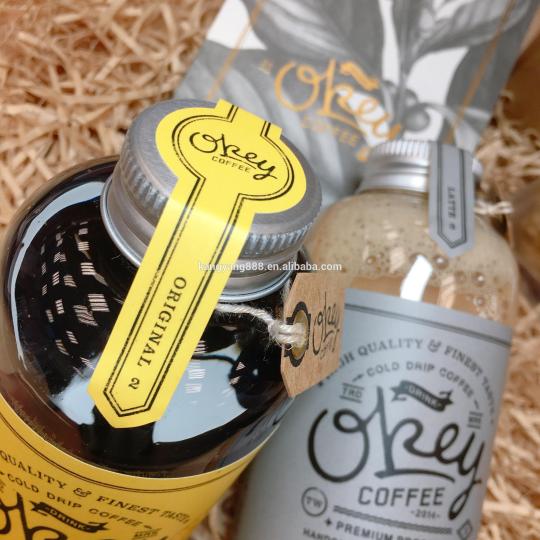
It is very important to get all the correct information on a beverage label, for legalities and convenience. The best way to identify what you may need for your selected concoction is to investigate a similar, existing label and break it down. I chose Tazo as it also has a similar shape for what I intend to present my iced tea in.
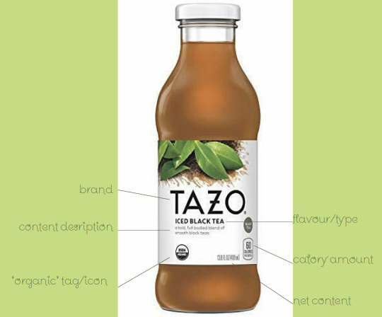
I was lucky enough to find a multi-view online through eBay of all places. The traditional front view is much more minimalist than I may approach, however that is their message- clean, clear, organic.

The side view once again is minimalist and is well set out with the size of each font, and cleverly displaying the barcode clearly- the retailers will be happy that it will be easy to scan!

The most intensive side has all the nutrition packed into it- a sacrifice to the design to ensure they covered everything. However they manage for the label to remain cohesive due to the consistent font use.
Tazo is a great foundation for me to set out my label to ensure I cover all the key labelling aspects- especially the nutritional section.
0 notes
Text
Week Ten // Case Study
Beverage Packaging Design
For this week to help inspire ourselves we were directed to look at existing case studies of beverages and what we like about them. I discovered Molocow, a cute version of a milk bottle aimed for children to encourage their dairy consumption:
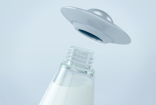

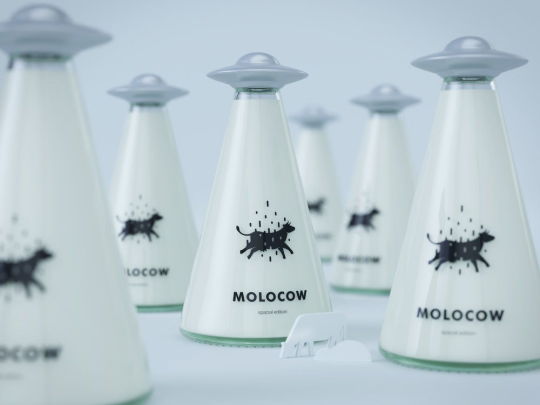
They manipulated the transparency of the glass to act as the beam lifting the cow (linked to milk) upward into the UFO shaped lid. The strong use of word association is evident here and would be very popular if produced beyond a mockup version.
The decisions they made on their brand development are very thorough and well thought out- such as the choice of a glass bottle for eco-friendliness.
I was interested in manipulating my design to the unique shape of a bottle and this resurfaced it. I was initially inspired by Little Sumo’s Gin bottle design:

They manipulated the design to suite the glass bottle, making the whole glass shape the body of the sumo.
These two bottles have resurrected my interest in uniquely shaped bottles, however I think I’ll stick to a more generic shape for this project. i will keep these ideas for future projects however!
1 note
·
View note
Text
Week Nine // Brand Identity: Logo Design
The Real Practice Begins
I have officially began designing for my cute concept beverage Dumrin. I didn’t get to experiment with fonts as much as I would have liked to- so I will treat this logo as a draft idea. I have narrowed down my font to a simplistic design for the logo, and then a more intricate or fancy design for the ‘flavour’.
I opened an Illustrator file and just began sketching out my ideas;

I then decided to have an icon or badge-like design that could perhaps be a sticker on the bottle as my logo...

As much as I like the darker colour in the mouth, I wanted and alternative to compare to:
I like this design but it now feels too seperate to the previous logo. I also decided I missed my more loose sketch of my mascot so I thought I would add that into the design just to see whether it may fit:
It is hard to choose which I prefer so I will come back to it with fresh eyes after my next self directed brief and choose when I have more of the bottle design planned out.
I certainly like the idea of a sticker sealing the beverage with the logo on it; such as the example below:
I will gather feedback and attempt to make a more educated and backed up decision.
1 note
·
View note
Text
Week Eight //Voting and Self Directed Briefs
Back into It!
This week, although a challenge to get back into the swing of things, was great progress toward my brand identity. First of all, my progress was halted until a final design path was elected, I can now announce my main focus is now working toward a resolved brand for the CUTE CONCEPT
Straight away I started brain storming logo ideas prior to our next tutorial, I did this in Photoshop which meant my speed was slower than sketching on paper:
I thought a clever way to incorporate the mascot in the logo would be shaping the text to his body, however after coming back and looking at other branding ideas, I soon realised it isn’t common, nor effective to have the mascot as the main body of the ‘logo’. The mascot should remain the symbol.
So back to the drawing board it was and this time i decided to look at other tea logo designs, especially more niche market styles rather beyond my previous case study during recess:

I was able to look closely at what is most effective and develop my idea from there. If I were to use the mascot it should be a simplified/stylistic linework version, similar to where I started in its development, and type would surround it.
Typography would then be key to the brand, I want something bold and energetic whilst remaining cute and original. I developed a small list of my favourite ones I found:
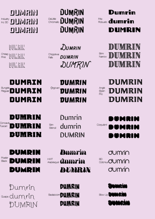
I will edit each font, soften and harden each and play with the outlines across the next week and come up with my logo for the overarching brand.
0 notes
Text
Recess Wk Two // Pitch Presentation
Exploring Loom and Making a Video to be Submitted
This week I worked on making a high quality elevator pitch to be submitted as the conclusion to the first assessment (A1).
What I tried that was successful:
Making all the slides in InDesign, and exporting them to a PDF document. From there I screen-shotted each slide and put them into a PowerPoint.
This ensured I was able to use the PDF document as the submission rather than having to do that at the end- it was there ready for me to add to the submission.
This also meant each slide was high quality and well presented
Below are all my slides:


Something that didn’t work:
I created dot points for each slide that I would then follow off to create a sense of natural speech for a pitch.
This didn’t work as I relied too heavily on the words written down that I would stutter and panic as soon as the dot point ended and I had to continue without something premeditated on
It was odd, as I know my product through and through, however the intimidation of the recording and time restraint ended up consuming the presentation.
Needless to say, my dot points evolved after each take until I couldn’t fill the page anymore without it becoming unintelligible
Below is my page of dot points
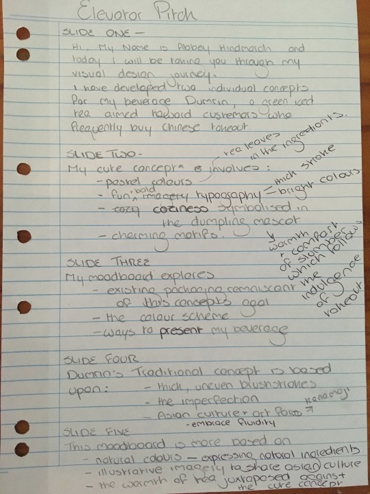
The advice I would give someone who is tasked with having to record a formal yet natural presentation is to make the dot points as you make a ‘draft’ version, so you have the natural language, whilst finding the key points and what is clear rambling and unnecessary.
The remote delivery of my concept proved challenging yet the use of loom was definitely handy. It allowed me to cancel a recording (which I think I ended up doing a lot) without having to go through the whole upload process just to delete it.
1 note
·
View note
Text
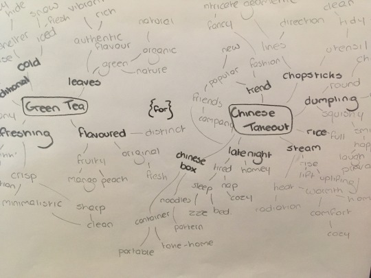
Recess // Self Directed Development
A Little Bit of Research...
To get a better understanding about what my competitors produce for Green Tea branding. After looking at labels I went into more detail on what I could take away from their design for my own. I then put it in a visual manner- like an organised mindmap:

After thinking about packaging tea leaves as an extra, I then looked into the ways in which I could present the leaves:

Kusmi tea presents their tea in tins that can be stacked, the metallic embellishments present a prestige element to their design.
Pukka tea leaves are in a basic box, with colour expressing the flavour, in the case above, it indicates that there are an assortment
TWG tea has many layers of their packaging. This is another prestige, gift-like presentation of tea leaves
Zen uses the traditional packaging of tea in large amounts. In sachets \/ large bags to present their matcha powder
Higher Living uses the reoccurring image of a bird to show the natural ingredients, while changing the shape and colour of its wing to symbolise the flavour. This is a cute and clever way to present a range of flavours.
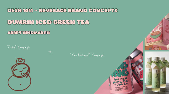
Pitch Slides Updated
To enhance my rationale, I revisited the layout and typography of the slides. This was to better match my concept for each and make the main idea clearer by having it bold and seperate from the rest of the body of text. Below are the new slides:

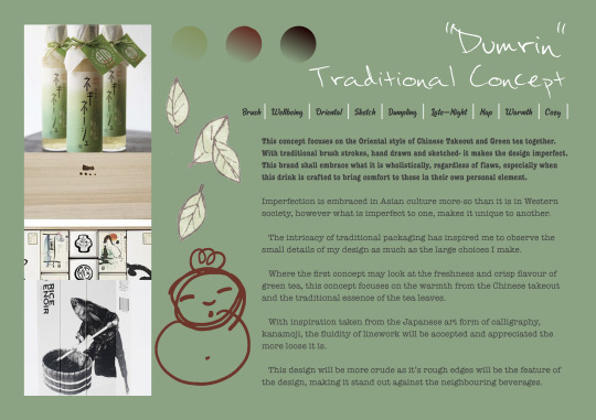
In the “traditional” concept I inserted my illustration of the Dumrin mascot so when I voiceover I can indicate the direction I intend to take each concept in, with a more personal approach as it is hand drawn.
I am happy with my progress and I looked forward to next week when I will record my slides ready to be handed in the following week. Being this proactive will allow me to extend the brief effectively and without drowning myself in work.
0 notes
Text
Week Seven // Public Holiday vs Tutorial // Self Directed Development
Receiving Feedback
Our feedback has been released and what I received was really helpful! The best part was looking from an outsider’s perspective that made this all the more valuable.
Highlights:
My blog is very easy to follow and well set out
The themes I have used match the label design ideas
My moodboards are well explained and well presented
The cute design is favoured and is reflective on what I am selling
Suggestions:
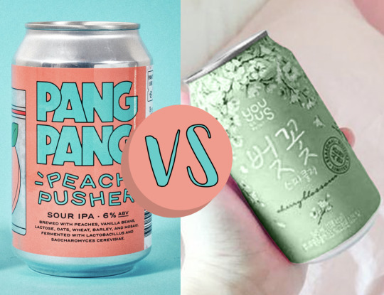
Make sure whatever I chose as the writing on the cans is clear
The green can’s white writing doesn’t stand out as much as the ‘Pang Pang’ cans
Therefore it would be smart of me to stick with the fun typography in thick bold lettering and unique colours and shapes
Additionally, we had a lecture which has encouraged me to revisit the layout of my rationale slides, which I shall do next week, along with some more research into what similar products are doing to promote their designs.
0 notes
Text
Week Six // Online Tutorial
Pitching Our Ideas Online
This week was all about exploring the ways in which we present our ideas. Initially this was going to be in the form of a physical ‘Elevator Pitch Presentation’ in our tutorials. However due to the difficulties that now arise from that, we have shifted to creating an online version.
We must create 4 slides, two for each concept, with our moodboards as one of the contributing slides to each. The other two slides must have our rationale and key words. Whilst exhibiting each slide we will record ourselves using the online tool Loom.
I decided to begin with the layout of my rationale slides as my moodboards are already complete. The searching of fonts proved to be the most challenging aspect as many of the ‘ideal’ fonts were not for commercial use or weren’t compatible with the adobe software when exporting. I ended up with the following:

I am still awaiting my feedback from last week, as this may influence my ideas as to whether I should alter the layout. I am proud of the progress I have made and I am keen to begin designing my label.
0 notes
Text
Week Five // Online Tutorial
An Introduction to Online Learning
This week was about familiarising ourselves with new methods to contact one another and learn with each other behind the screen due to the rising importance of quarantine.
Due to this, little progress was made in each class for me and this week I focused on the compulsory goals and was limited in personal progress.
The main activity was a ‘touch-base’ Tumblr review done anonymously and will be distributed next week. It was challenging to find a medium between constructive and ‘too nice’ as I know no-one’s Tumblr pages are fully rendered yet.
I look forward to my feedback next week as it is sometimes hard to know if it is enough. However all feedback I’ve gotten thus far has been very positive and encouraging.
Afterward, we were advised to create a quote of some form that summarises our creative process and how we’ve felt during this artistic journey, you can find mine below:

1 note
·
View note
Text
Week Four // Tutorial Four
Mood Boarding and Feedback
This week was heavily based upon our personal development in regards to conceptualising our beverage design. As the class was quite small in this week’s tutorial, we were able to get more feedback and I had optimum advice given to me this week.
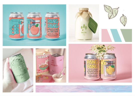
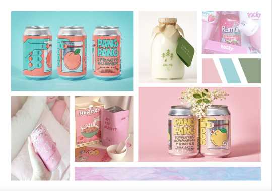
Concept One // Pastel & Cute

Main Points From Feedback:
Add more green into the image to create an even spread across the page
Potentially photoshop bottom left can green
I don’t need the top right image- makes it too busy
‘pang pang’ cans are really modern and convey the concept really clearly
Overall, this design would open a lot of opportunity to have fun with creating my label. The way I have set this moodpboard up is well designed in the sense it is not too much or little, empty space has been manipulated well and the colours are fluent.
I went back and edited this board further with my new feedback and reviewed them 30 minutes later.

I photoshopped the can green, removed the ‘Ramune’ image and replaced it with some sketch of green leaves. By adding more green in, it smoothened the image and made it more pleasing and clear.
Main Points Feedback x2:
Even spread, well set up
The framing/borders are consistent
Leaves added a new element of authenticity to the design (ingredients)
The can works much nicer into the image
To push the photoshop further, I can bring in the whites of the can back in to make it more realistic
Consider key words / text to add in and where
After this I continued to play around with the can and ended up much more pleased with the outcome

Although a slight difference, its subtlety was what was necessary to create a crisp outcome to the image. The difference between the pink and green is depicted below;

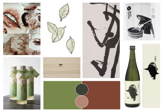
Concept Two // Oriental & Traditional

Main Points from Feedback:
It needs to be stripped back
The timber is nice and suits the aesthetic
Less images
The sketch and the red painting style clash, I need to find an image that is in-between those two
Keep one of he sketches, I don’t need two
There is too much going on underneath the time image
The bottom left image indicates a modern version of traditional and is a nice addition to the board
The idea of a traditional concept is clear and the refined aspect would work well with it
I could see exactly where to implement the feedback and did so across the 30 minutes and revisited afterwards.
I went along with the timber, cut down on the images and added in the in-between image.
Main Points from Feedback x2:
It is still rather busy
I don’t need two timber pieces, one works fine
I should enlarge the top left image
Bring back the reds, as they are now lost in the board except for the swatches
Clean the frames as they are not as crisp as concept one
Consider text / where to put it
Despite all the constructive feedback, I was reassured that my concept is still as clear and refined, I just need to continue to tweak it.
I removed the timber and lessened the amount of images further. I was unable to enlarge the image suggested so I moved it o smaller gap in the board, and shuffled some images around. I also placed in the leaves from the other concept’s board to create a cohesion between the two as they suit both concepts.
My ain issue is still the lack of reds, and whether to include them at all if not. So I went back once more and fiddled with my images to try to create a more fluent presentation.

I brought back the original ‘red’ image and discarded the plain style sketch and the in-between image, settling for the aesthetic of the red image. I replaced the in-between with an expressive image of an ink brush stroke. I am torn between the last two mood boards I created as they both work well.
Additionally I had to change the hue of the calligraphy/brush image to assist in it sitting better in the mood board.
By neutralising the colour in photoshop, it now sits better in the board.
I am pleased with my progress and I am satisfied with my two refined mood boards!
#mood board#feedback#cold beverage#iced tea#green tea#ink#drink#leaf#herbal#traditional#cute#pastel#organic
0 notes
Text
Week Three // Tutorial Design Brief Three
Mood Boards and Rationale
This week we continued focusing on what inspired our two seperate concepts and created the first drafts for each concept: rationale, key words, mood boards. Specifically we investigated InDesign from the Adobe creative cloud as this will be the format we will be using to present our slides, pin ups, and project- and is also a necessary tool when it does to commercial practice.
Concept One // Pastel & Cute
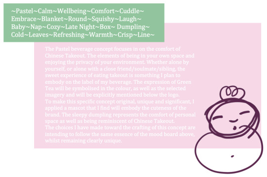
As specified in the rationale, this concept is looking at the comfortable side of Chinese takeout. The idealistic image of being in your own home, watching a movie and needing a suited drink for the occasion: Dumrin would be the perfect selection.
Concept Two // Oriental & Traditional

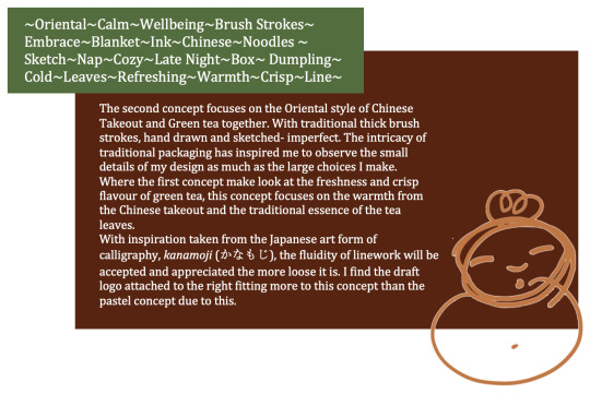
I am more pleased with the rationale for this concept as I learned more of what to leave out and what is important information to keep after completing concept one. I also am finding myself more excited to explore this packaging idea as I have more ideas for how to experiment with techniques I am fluent in and also find could make Dumrin stand out. This colour scheme I also find more suiting to green tea, however both could really work.
0 notes
Text
Week Two // Tutorial Design Brief Two // Individual Development
My Visual Development
This week was heavily based upon our progression toward creating our own design label for a beverage. I personally have developed my concept dramatically to the point of now having a target market, a beverage and my own little character- like the Booth Brewing Co.

Above is the little character named ‘Dumrin’, a pseudonym for ‘Dumpling’. Through mind mapping I came to the conclusion of branding a Green Tea targeted at Chinese Takeout customers. To further the idea of Chinese takeout, there’ll be (similar to fortune cookies) messages on the underside of the lid.
By narrowing down my mindmap to create a clearer goal, I developed my character ‘Dumrin’, which will create a unique face for my brand. The character will appear on the lid, the logo, the label and will also appear in the advertising as the face of the drink- like a mascot.

I created lists of all the key words that I chose, and to add visual aids, I sketched correlating images to assist in the brainstorming of the character/mascot.
Pinterest
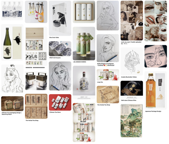
I love the concept of ink / sketches on the label, or even an oriental painting to emphasise the target market. To explore my limitations and push my creative inspiration we went to Pinterest to create initial mood boards. I can see my label concept emerging from this board mores than my second board, below, however I can see both being effective in my approach to the design brief.

Focusing more on he “cute” aspect of ‘Dumrin’, this concept has more pastel colours and more crisp minimalist line-work. My main inspiration for this aspect is from the Japanese food packaging of ‘Pocki’ (below). The pastel colours of the strawberry flavour would align well as the perfect snack to go along with the meal.

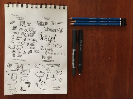
Lecture SketchNotes
Additionally in our lecture, we explored the use of visually taking notes to create a more aesthetic and memorable study session. This would allow us to apply our creativity to the theoretical side of design. I applied this above to the word list, however I explored further as homework other ways and parts of sketch notes that could work to enhance my notes.
0 notes
Text
Week One // Tutorial Design Brief One
Branding Success and Failure
To assist in reflecting on our potential designs for our own theoretical beverage brand, we were to research and observe existing packaging and determine what we find successful and what isn’t as effective.
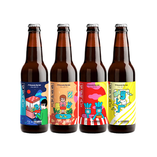
The Booth Brewing Co.
The Booth Brewing Co. is successfully fluent in their branding. They have a consistent character that is even reflected in their logo. Their quirky and eccentric designs for their labels stand out on the shelf and immediately attract customer attention. Additionally, the customer immediately can recognise the brand from the design and purchase with confidence of knowing the fluent design is likely reflected in the quality of the brew.
The character can be found indicating novelty events and symbolic of the flavours or origins of the brews. the booth Brewing Co. interestingly is inclusive in their designs, appealing to additional communities, such as their LGBTQ+ design, indicative of their research into current events.
What I can take from their design:
The modern, youthful and fun designs on this Korean company’s beer bottles/cans are the attention seeking designs I want to apply to my future logo and packaging choices. The bright hues and exciting colour combinations draw attention to the labels, and are something that would push me out of my comfort zone when designing.
The picture I’ve included is a pilot design collaborated between the booth brewing co and 72 Seconds Rye IPA. The bold linework and colour choices are what lead me to endeavour further into the booth’s designs for their existing packaging, which clearly was reflective of the collaborated design, just in a smoother, more crisp design. Both variations have inspired me to create a character for my beverage and to experiment with colours and develop my brand from the character.
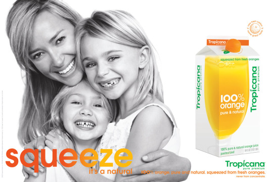
Tropicana
The redesign of Tropicana’s 2009 juice range was considered a failure to the packaging/graphic design community. Tropicana had a dramatic shift from their traditional designs and logo to a completely new design, rendering it unrecognisable to consumers. They had a 20% decrease in sales after their massive decision.
However I can visualise and hypothesise their thought process when creating such a new design. As branding becomes more modern and minimalist, Tropicana made their attempt to create a minimalist package for their juice. The failure comes in when it becomes no longer fluent in their design, losing customers interest and it no longer has its original brand integrity.
Yet, had Tropicana been a new company, I find this design had the opportunity to be successful, especially due to their original flair- such as the orange shaped lid that was simultaneously creative and original. The manipulation of shape to develop a unique aspect of packaging could potentially become part of my design for packaging (potentially the character as the lid).

Soon after the evident decline in sales, Tropicana went back to their original design in the hopes to regain their profits.
Additional research and information was sourced by the Branding journal’s blog post:
https://www.thebrandingjournal.com/2015/05/what-to-learn-from-tropicanas-packaging-redesign-failure/
1 note
·
View note