
Last Seen Blogs

zkjjjj
Aliis inserviendo consumor.

adamhidana
mind's storage

urbankarls
*gay longing intensifies*
wolfettesofcali-blog
Wolfettes of Cali
Photo
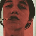
hello and welcome! this is my spin on a comprehensive giffing tutorial that not only covers the basic mechanics of how to gif, but also goes into the tips, tricks, and general photoshop information i’ve learned since i started giffing and now wish i could beam into my past self’s brain. this tutorial will walk you through everything from start to finish, help explain what not to do and why, and hopefully give even experienced gifmakers some new information!
note: this tutorial is very long and image heavy, and is best viewed on dash
WHAT YOU’LL FIND IN THIS GUIDE
software needed
sourcing + storing footage
giffing: methods + step by step process
actions
coloring
text: subtitles, fonts, etc.
saving: timing, settings, exporting
posting: captions, tags, scheduling
resources
Keep reading
2K notes
·
View notes
Text
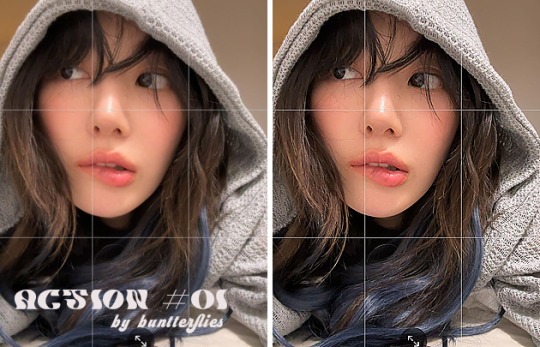
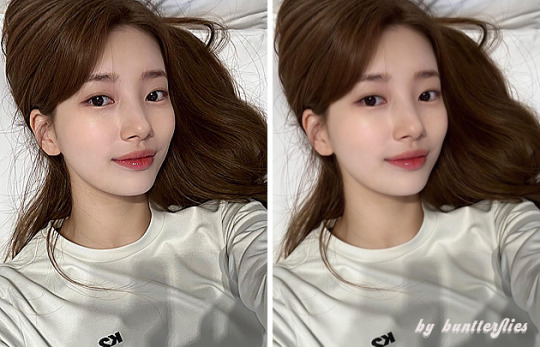
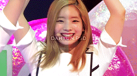
#01 ACTION BY BUNTTERFLIES ♡
don’t repost, reupload or put on pack/google drive.
don’t claim as your own.
for personal/non-commercial use only.
download: follow me + like or reblog + ask (logged) for the link.
80 notes
·
View notes
Photo

tumblr polls — custom colors ⋆
Tumblr rolled out polls as of January 2023. Whilst anyone can vote, only a small portion of users were granted the feature to make polls. Polls are slowly being released to more users. Unfortunately, they can be hard to read and don’t match with the rest of your desktop theme. I wrote a quick fix you can add to your theme, allowing you to choose your poll colors and font sizes.
This fix only lets you alter the appearance. If you want bonus functionality, take that up with @staff.
☆ How to use:
Locate and jump to </head> in your theme’s code.
Paste this chunk of code before that:
<!--✻✻✻✻✻✻ UN-BLUE POLLS by @glenthemes ✻✻✻✻✻✻--> <link href="//static.tumblr.com/gtjt4bo/mXBrpdj0n/unblue-polls.css" rel="stylesheet"> <style> .poll-post { --Poll-Question-Font-Size: 16px; --Poll-Option-Background-Color: #fcfcfc; --Poll-Option-Corner-Rounding: 18px; --Poll-Option-Border-Size: 2px; --Poll-Option-Border-Color: #efefef; --Poll-Option-Padding: 15px; --Poll-Option-Font-Size: 13px; --Poll-Option-Spacing: 10px; --Poll-Option-Text-Color: #666666; --Poll-Option-HOVER-Border-Color: #cfdae4; --Poll-Option-HOVER-Background-Color: #ebf0f4; --Poll-Option-HOVER-Text-Color: #1a1b1d; --Poll-Option-HOVER-Speed: 0.4s; } </style>
☆ A few things to note:
polls are still under development, so things will likely change.
clicking the poll options takes you to vote on the dashboard post view; I can’t control this.
if a poll has ended, the “See Results” link may not appear; I can’t control this.
🕒 Last updated: Jan 31, 2023
605 notes
·
View notes
Text
Disable Right Click
NOTE: Choose EITHER of them - with or without alert.
Disable right click (silent)
Go here and copy the codes. Paste before <head>.
Disable right click (with alert)
1. Go here and copy the codes. Paste before <head>.
2. Replace “Function Disabled!” with a message of your choice.

465 notes
·
View notes
Text
Using Neural Filters to colour correct
i’ve had a couple of people ask about how i’ve coloured the pocket dimension scenes so i thought i’d just do a run-through tutorial kind of thing to show it, rather than going through it with everyone separately.
so this is a tutorial for how i made this:
from this:
follow along under the cut:
Keep reading
2K notes
·
View notes
Note
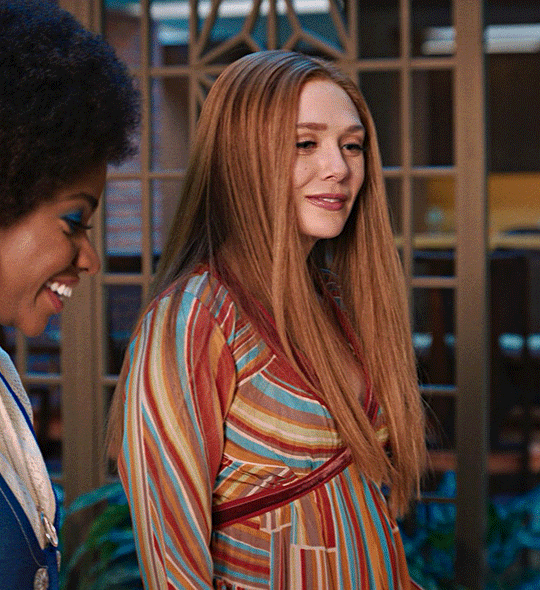
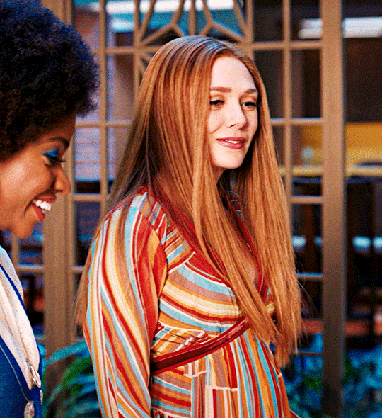
Hi Nia! You're gifs are so pretty! Is it possible for you to show how you get your WandaVision gifs too look so clear and hd? And how do you do your colorings too? (specifically the wanda maximoff in episode 3 gifset ITS GORGEOUS) I'm new to giffing and all the tutorials are kind of old. It's okay if you don't want to though! I understand it may be time consuming.
omg no! never feel intimidated to ask!! i don’t mind at all!
so, i’m going to show you how i made and coloured this gif
mostly bc it’s the only gif in that set w text and i’m going to share my text settings too!
tutorial is below :)
WHAT KIND OF VIDEOS ARE BEST?
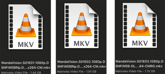
.mkv files (the bigger the better BUT i usually think anything above 5 gb is excessive and unnecessary for an episode of television BUT for a movie worth it)
itunes downloads (logolesspro on twitter, hd-source on tumblr, live-action-raws on tumblr have some DEPENDING on what you’re looking for) (also, there’s a chance that if you search "show/movie hd download tumblr” you’ll find a tumblr with its itunes download available)
THAT IS IT NO OTHER TYPE OF FILES MAKE YOUR GIFS LOOK GOOD
- my suggestion is always if its new (like just came out the past month) t*rrent it! it’ll be downloaded quickly and .mkv files look the best! BUT if not check the sources above see who has the BIGGEST file if they even have what you’re looking for and then if not then you look to t*rrenting!!
here are the wandavision files i use so you can see!!
SCREENCAPPING
-if you have windows use potplayer! i have a mac so i can’t show you how to use it and it’s not available for me :( HOWEVER back when i had a windows potplayer was the best method in screencapping!!
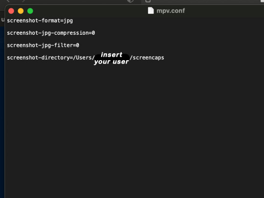
-I HAVE A MAC! so i use mpv!! (go to mpv.io and follow the directions) BUT DON’T DOWNLOAD THE LATEST ONE (it has a bug that skips frames) try each before the latest one bc from what i heard different ones work differently for everyone!! and i don’t know which one i use (yikes!) THERE ISN’T THAT MANY I PROMISE AND IT’S WORTH IT BC MPV IS THE BEST (i used to use adapter but they didn’t take impressive screencaps in my opinion and it was evident in my gifs you can see it too! )
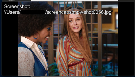
create a folder for your screencaps! and make sure to rmb the directory order! now we want to create a text file on our built in textedit app on mac! type up all this down below (i like jpg but you can replace jpg w png if you want) AND SAVE THE FILE AS mpv.conf THIS IS IMPORTANT SO DON’T FORGET IT! save it somewhere you’ll find easily and NEVER delete it until you don’t use mpv anymore
just in case you don’t know what to insert after, go to your screencaps folder
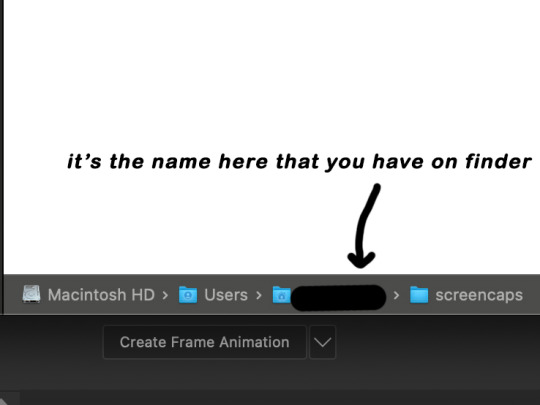
now you want to open mpv and go to the corner towards mpv -> preferences and they’ll tell you that there is no .conf file SO GO LOOK FOR THE TEXT FILE WE JUST MADE AND DRAG IT TO THE FOLDER THEY OPENED FOR US AFTER SAYING THERE IS NO .CONF FILE
(i learned all this from @kylos tutorial!! so if any of what i just said about setting up mpv makes NO SENSE to you check out their tutorial at kylos(.)tumblr(.)com/post/178497909311)
now we can screencap!
so let’s find the scene we want RIGHT BEFORE and MAKE SURE SUBTITLES ARE OFF
i pause and then press (option/alt + s) and then SCREENCAPS ARE BEING TAKEN!! and to end the screencaps being taken you once again press (option/alt + s)!!
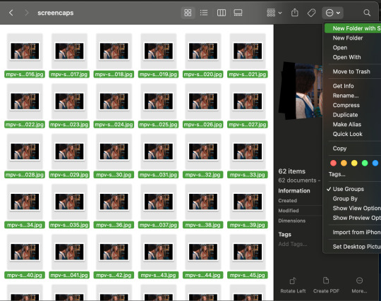
now we want to delete the excess frames! and put it all into one folder!! DO NOT DELETE FRAMES IN THE MIDDLE OF WHAT YOU WANT TO GIF!! WHEN YOU SKIP FRAMES IT WILL BE NOTICEABLE!!

MAKING THE GIF
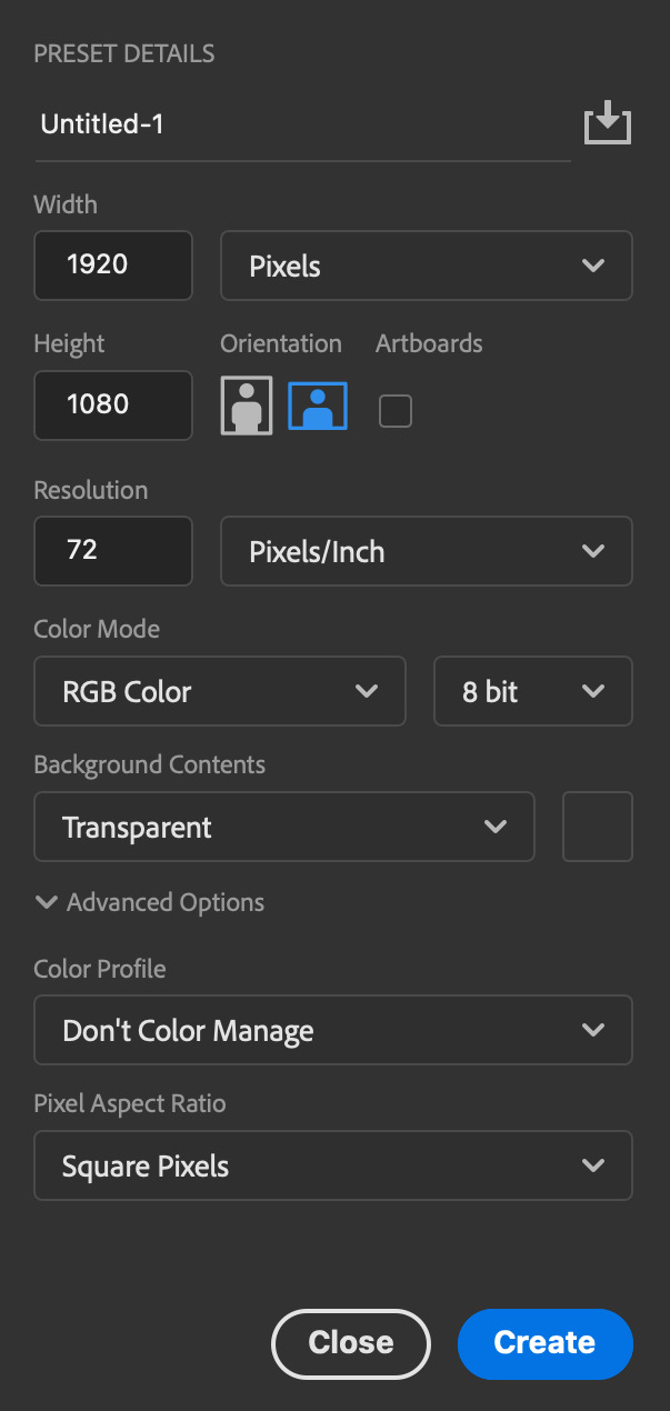
this method isn’t used that much BUT I LOVE IT so this is how i put my frames in! first i check to see the size of my frames: 1920 x 1080

so i create a NEW file on photoshop with those dimensions w these settings
now i set my tool on photoshop to path selection tool bc if you have it set on smth like move tool or crop tool at the end you might end up moving or cropping frames you don’t want to!

ok so now we select ALL our frames and drag it on top of our new file on photoshop and the MOMENT we see our first frame in photoshop JUST KEEP CLICKING ENTER until all the frames are loaded!!

you can do file -> scripts -> load files into stack but it is WAYYY slower in my opinion!
now i crop out the excess BUT i don’t resize the gif yet! the dimensions wandavision is filmed in is 4:3 so i go to crop and set the settings to this:

MAKE SURE IT’S ON RATIO SO WE’RE PRESERVING THE ORIGINAL SIZE JUST CUTTING OFF THE BLACK EDGES!! We are going from 1920 x 1080 to 1440 x 1080 this is the dimensions after i cropped

WE ARE KEEPING THE QUALITY BY NOT CHANGING THE DIMENSIONS OF ANYTHING INSIDE !!
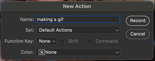
now we want to go to actions and create an action!! open up actions w one of these two depending on what your dash looks like!!


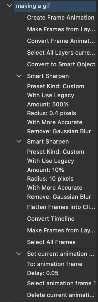
so we create an action with this button on the bottom of actions and we’re gonna title it making a gif and hit record!!

NOW LET’S GOOOOO!!
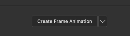
1. make sure you have timeline on your dash!

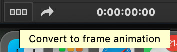
2. create frame animation (if you see create video timeline just click the arrow next to the button to see your other option which is frame animation!!)
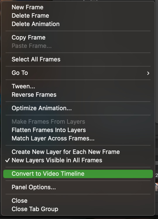
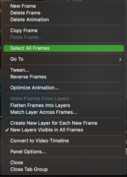
3. now let’s meet our best friend!! the little bar in the top right corner that has all the commands for making our gifs and MAKE FRAMES FROM LAYERS
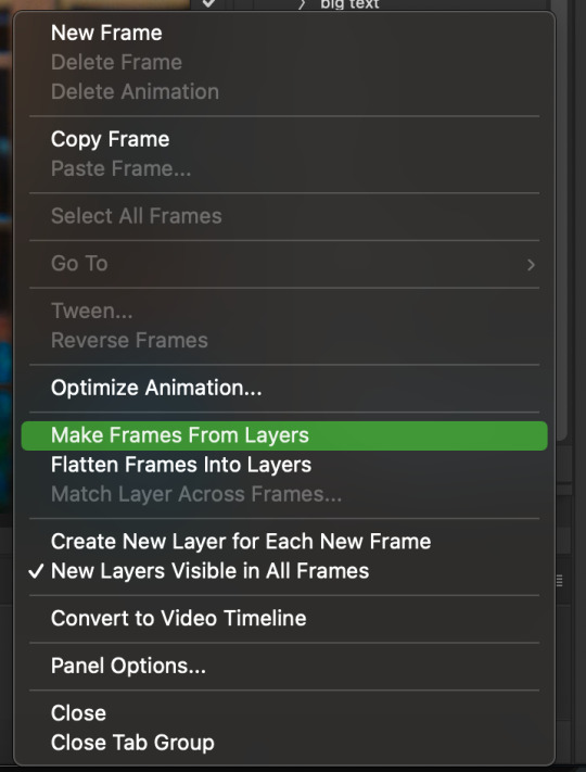
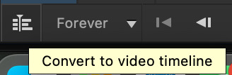
4. WE HAVE TO SHARPEN OUR GIFS NOW BUT TO DO THAT WE NEED TO CONVERT TO A SMART OBJECT SO NOW WE ARE GOING TO CONVERT TO VIDEO TIMELINE there are two ways: the button in the bottom left corner or the button in the top right corner w all the other commands!
5. select -> all layers DON’T MANUALLY SELECT THEM ALL BC THE ACTION WILL ONLY SELECT THAT SAME NUMBER OF FRAMES SO IF THERE ARE MORE FRAMES YOU WON’T GET THEM IN THE SMART OBJECT!!

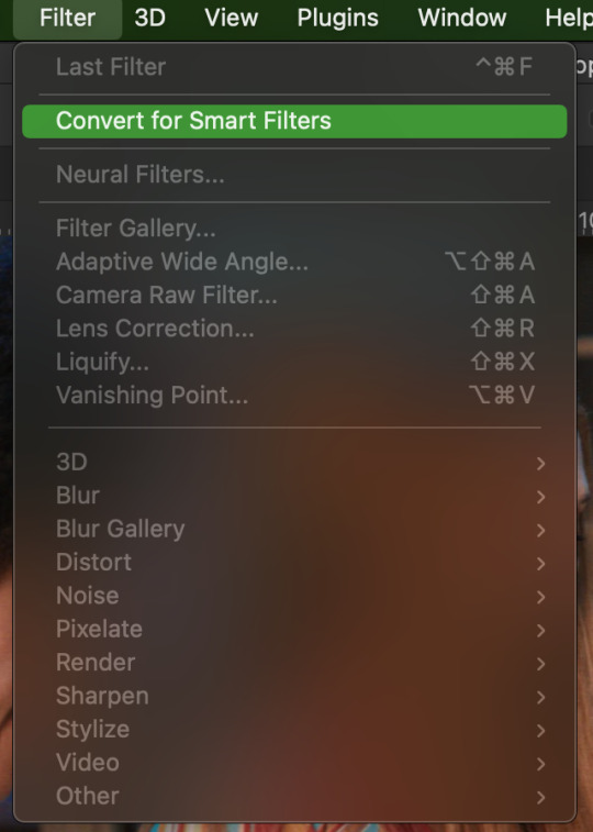
6. filter -> convert for smart filters
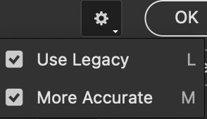
7. NOW WE SHARPEN!! (filter -> sharpen -> smart sharpen) i sharpen twice!! first, make sure we are on legacy w more accurate and remove gaussian blue! the first sharpening will be 500% with 0.4 px radius. NOW SHARPEN AGAIN (filter -> sharpen -> smart sharpen) also w legacy, more accurate and remove gaussian blur BUT this time 10% with a 10.0 px radius!


8. it’s hd now!! so let’s flatten frames into clips!! go to the top right magic button again!! and you should see a pop up saying layers are being made
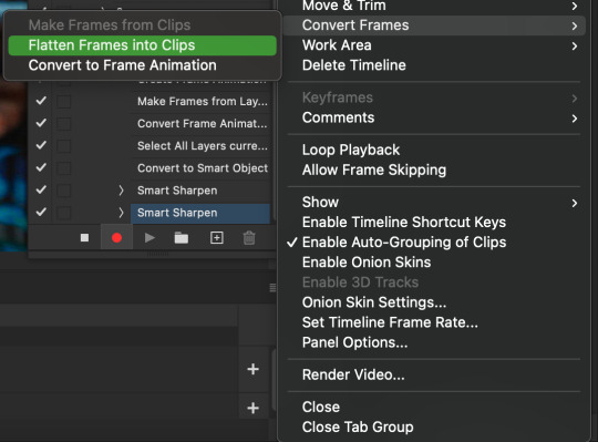

9. now we convert back to frame animation w either the bottom left button or our magic top right command center!

10. make frames from layers

11. select all frames w our magic command button
12. set the animation delay to 0.05 THAT IS THE BEST ONE ALWAYS ALWAYS ALWAYS only use 0.06 when the character is moving really fast in the video itself and it makes the gif itself look awkward BUT NEVER GO ABOVE 0.06 it’ll look slow and laggy and we don’t want that and don’t go below 0.05 bc then it’ll be tooo fast and we don’t want that either!


13. now delete the very first frame on the timeline bc it is an oversharpened duplicate of the second frame! end the recording w this button!

this is what your action should look like expanded! if you made mistakes on the way and it shows up you can just click the specific step and press the trash can on the action tab to delete in from the order!!
NOW AFTER LOADING YOUR FRAMES AND CROPPING THE EDGES OF YOUR FRAMES IF YOU NEED TO JUST PLAY THE ACTION AND THEN YOUR GIF WILL BE MADE FOR YOU!!!!
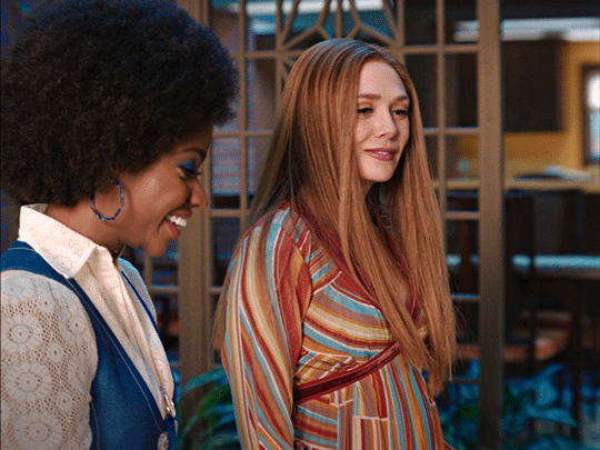
now i delete some unnecessary frames in the beginning and end and this is what my gif looks like (the size was 46 mb and the limit is 10 mb so the dimensions of the gif are 540 x 405 to get it to 5 mb BUT I HAVEN’T CROPPED IT YET SO THIS IS ME CROPPING JUST TO SHOW YOU WHAT IT LOOKS LIKE)
CROPPING THE GIF
in my opinion if you want your gif to look hd you shouldn’t crop before you sharpen!! i believe that if you crop before you sharpen you don’t allow photoshop to sharpen all the pixels whereas if you crop beforehand there is less to work with!!
dimensions is all up to you!! just make sure to go by tumblr rules!! 540 is the max width and if you want to make two gifs per row then my suggested width is 268 and for three gifs per row my suggested is 177 px! Just have the right width and the length can be whatever you want!!
now i’m going to crop my gif to 540 by 590!!

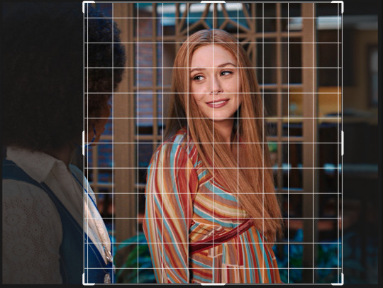
NOW THIS IS WHAT MY GIF LOOKS LIKE!
COLOURING BASICS
let me show you the best adjustment tools in my opinion and a brief explanation for what they do!!
brightness/contrast: pretty simple increase/decrease the brightness/contrast BUT one of my techniques for when i first start colouring a gif is i select all my frames and do nothing to the settings of the adjustment but i set the layer to screen LIKE THIS

curves: ik others use curves to change brightness/contrast w the squiggly thing BUT i like it to set a white point and black point, this is also a technique i use when i first start colouring a gif when screen doesn’t look good for me SO you use white point to select a pixel on the gif to set as the lightest color on the gif (setting the white point) and you use black point to select a pixel on the gif to set as the darkest colour on the gif (setting the black point) usually the white point makes it TOO bright and that’s why we use the black point to counter it and same goes for when i use screen with brightness/contrast, it gets too bright so i use black point to counter it below is the button for white point and the button for black point, respectively they are shaped as color picker tools


vibrance: generally, i never use this except for color p*rn sets but they work really well in making colors seem more strong
hue/saturation: like vibrance, i never use this except for color p*rn sets but this adjustment is to help change the colors or hue of a color for example: turn blue into purple or turn a blue into a little lighter shade of blue
color balance: I ALWAYS USE THIS!! except for in black and white gifs BUT THIS IS MY GO TO AND IF I DON’T USE IT MY GIFS ARE JUST BLAND i feel like color balance is what essentially balances the colors on your gif and adds dimension to it, it makes your gif go from looking way too yellow to a more golden neutral look and it is an essential adjustment in my opinion
channel mixer: i rarely use channel mixer BUT it is so so useful when you are working w a dark scene just play w the settings and all of a sudden all the blue in a dark scene will be a little more yellow and red and your scene will kind of just look brighter and more visible
selective color: THIS IS ALSO AN ESSENTIAL this helps SPECIFIC colors pop you’re working on a scene where there is too much red on someones face you use this tool to remove the magentaness from the yellow section OR when you feel someones face is TOO yellow and needs more blush you add more magenta in the yellow section of selective color
gradiant map: gradiant map is perfect when you’re lazy if you feel like your gif looks more neutral and you want some red in it but you don’t want to mess with any other adjustments just set a red to black gradiant on soft overlay with a very low opacity and BOOM slightly red but not too much red added!
NOW TO COLOR THE GIF!
today i have decided to start with a brightness layer set on screen
and this is what we got!

now that’s a little to bright and washed out in my opinion SOOOO to counteract it, i’m going to use my black point tool in curves and i’m going to select this point on the gif (it’s better to choose smth in the background and not smth that’s paid attention to such as monica’s hair or either of their eyelashes)

now my gif looks like this! the base color is complete!

now i think i need to balance all this yellow and red! SOOOO WE GONNA USE COLOR BALANCE!!
i think the best way to use color balance is to keep swinging the balancer until you see what you like and then keep going midtones i think i want more red and i don’t want a cyan midtone and then for shadows i think i want more cyan to counter the redness of the gif but highlights i don’t touch that much NOW HERE ARE MY SETTINGS SO YOU CAN SEE

and this is what my gif looks like

now you can stop here if you want but in my opinion i think the gif looks a lil too dead still SO IMMA USE SELECTIVE COLOR
i think there needs to be a lot lot more RED so i amp up the yellow magenta and black in the red! but i also think the yellows need to be LESS RED so i remove magenta from the yellow! and bc there’s some cyan and blue bc of monica and the flowers in the background im going to make the cyans more cyan and the blues a lil more black! i’m going to remove some yellows from the magenta!! and i add more black to the neutrals and black!! i think it’s always important to add more black to neutral and black bc it adds more depth to the gif by not just making it a bunch of bright colors and having dark colors to contrast to!! my settings are below!

and the result!
now let’s see everything together!

and the before and after!

I HOPE MY COLOURING EXPLANATION MADE SENSE!! if not you can always ask me more questions i don’t mind!!
ADDING SUBTITLES
we want to grab the text tool!
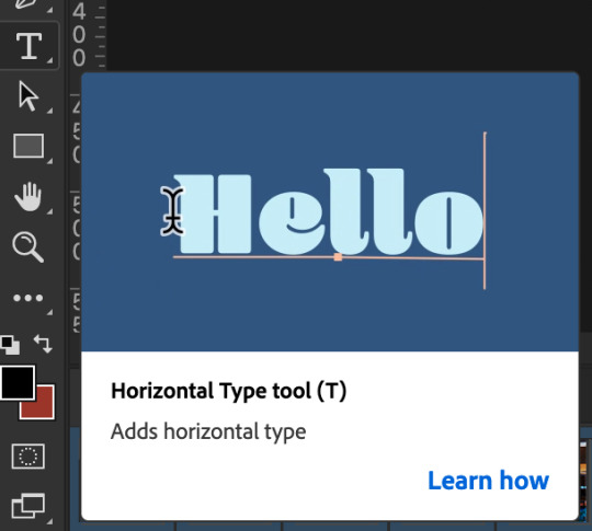
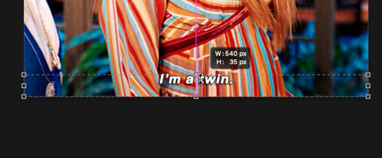
make a text box from anywhere in the middle from the left to right edge. this is so we can make sure our text is centered and will be in the same place for when we have sets w more than one gif w text!

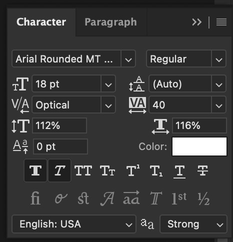
type your text out and make sure you highlight the whole text so that all the settings apply to EACH character! you can find the alignments (for center) in the paragraph tab!

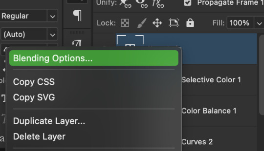
now lets right click on the text layer and go to blending options! add stroke and drop shadow!


now drag it to the desired height you would like and make sure to keep it in mind for when you have more than one subtitled gif in a set!
NOW TO MAKE SURE THE TEXT STAYS IN PLACE AND THE BLENDING STAYS YOU HAVE TO CONVERT TO SMART OBJECT!!

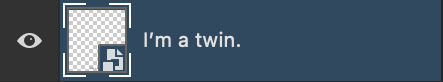
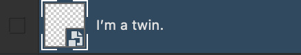
if you want to only have the text applied to certain frames instead of all frames, select the frames you don’t want by clicking the first frame in ur don’t want section ON THE TIMELINE and WHILST HOLDING SHIFT click the last frame of ur don’t want section and then toggle the eye switch next to the text layer
now you see the text
now you don’t
tip: use opacity to fade the text in and out!
the text is going to be on all my frames so i don’t need to toggle the eye but i just wanted to show you just in case!!
now here’s my FINAL RESULT

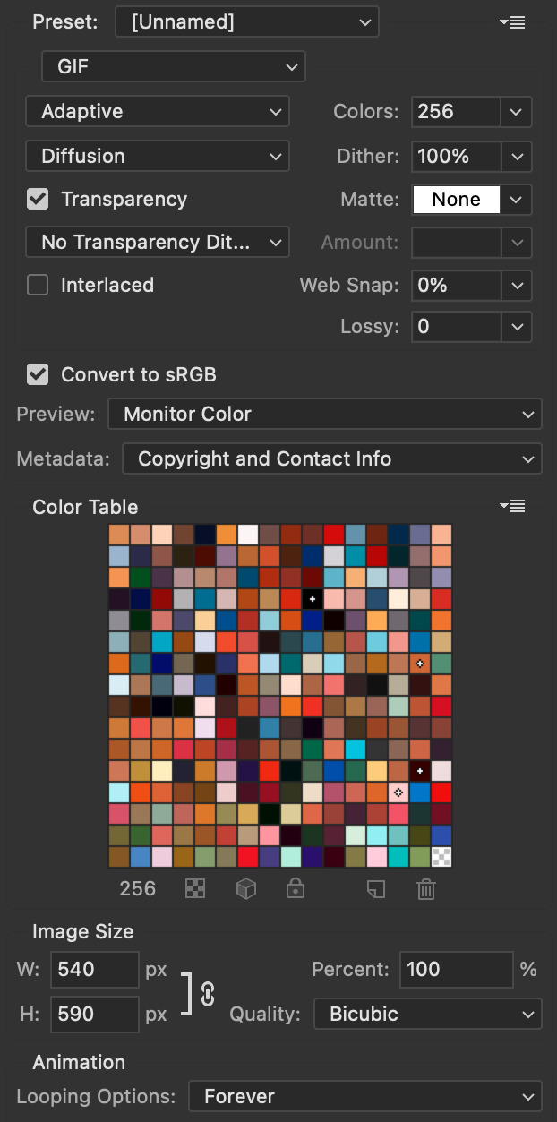
save for web (file -> export -> save for web)
your gifs have to always be under 10 mb! so, if your WAYYY overboard YOU HAVE TO DELETE FRAMES! or you can divide the gif in two and have two gifs instead of one! however, if you plan on going the deleting frames route MAKE SURE YOU DELETE FROM THE BEGINNING OR END OF YOUR SELECTION i promise you that most of us won’t notice that your characters dialogue is being cut off BUT WE WILL NOTICE IF FRAMES ARE BEING SKIPPED so, don’t delete frames in the middle of ur gif!! idc how little you do it IT WILL RUIN YOUR GIF AND I SAY THIS FROM EXPERIENCE i would delete every fifth frame to cut down my gifs and that may seem like not that big of a deal BUT IT IS my gif looked choppy and poor so it is way better to cut from the end/beginning of the gif
ANOTHER LAST PIECE OF ADVICE in the bottom left of when the save for web menu shows up THERE’S A PREVIEW BUTTON click on it! it’ll show you your gif on your default browser and show you what it’ll look like once uploaded! this is perfect to check the speed of ur gif and the colouring and to notice if there’s a problem with your subtitles or maybe there’s an obvious jump in frames you never noticed before!! i always use preview bc the built-in photoshop viewer of ur gif shows the colors differently and the speed is NEVER ACURRATE!
I USED THESE SAVE SETTINGS!! many say to use selective pattern but i DISAGREE and i think these save settings are the ✨ best ✨
OK NOW THAT IS THE END OF THIS VERY LONG GIF TUTORIAL!! I HOPE THIS IS WHAT YOU WANTED!! IF YOU HAVE ANY QUESTIONS DON’T BE AFRAID TO ASK I SINCERELY DON’T MIND!! JUST DON’T BE RUDE OR ANYTHING BC PPL HAVE BEEN RECENTLY :(
I WISH YOU ALL THE LUCK AND FUN IN YOUR GIFFING ADVENTURES !!
383 notes
·
View notes
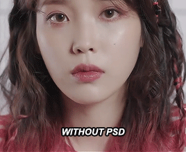
Photo

I recently received a request to show how I recolor photos from black and white (mainly from the photos featured here and here), so here is a quick summary of how I colorized another photo from TIFF from black and white in Photoshop!
Tutorial including some photos under the cut:
Keep reading
211 notes
·
View notes
Note
Hi can I ask what your sharpening settings are? Ofc of its not a bother for you , your gifs look so crisp and hd , it’s amazing
ahhh thank you so much!! here's a little mini tutorial of how i do my sharpening:
(disclaimer: i always gif in 1080p or higher, and i always download the largest file i can find! that goes a long way when it comes to making gifs look as sharp as possible)
1. start out with smart sharpen:

2. hit it with smart sharpen again with the following settings:
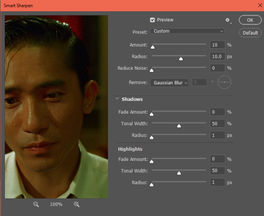
these are pretty standard sharpening settings that most gifmakers use. they'll get you to this:

perfectly fine, and depending on the quality of the footage you have you can probably stop there! BUT i like to add in a little extra *~*pizzazz*~* with a round of high pass:
3. go to filter > other > high pass
you can set it to anywhere between 2.5 and 5 depending on your personal preference. 4 is my standard setting:

4. right click "high pass" on your layers tab and select "edit smart filter blending options." then change "normal" to "soft light" and hit ok.

and voila!

you certainly don't have to use high pass if you don't want to, and i know some people prefer a smoother looking gif. but i've been using it for a while and i love the dimension and added sharpness it gives to the gif!
i also recommend recording an action for this process as it can be really time consuming without one! feel free to dm me if you have any questions :)
1K notes
·
View notes
Text
Your Guide to Gif Subtitles
At times, subtitles can be overlooked. So I've decided to create this comprehensive guide for beginner and experienced gifmakers to styling gif subtitles.
By no means does this post intend to limit the way you do your subtitles.
Please like/reblog if this has helped you and feel free to hit me up for any questions and concerns! ♥︎
↓ SEE SUBTITLE GUIDE UNDER THE CUT ↓
NOTE: I've used only screencaps for most examples due to the 10 pics per post limit, so let's just pretend they're animated 😂 My apologies for the very bad quality!
Gif Subtitles Style Guide
[1] Spelling
Look up words and names you don't recognize (fictional or not) to know how they're spelled.
Look up the proper capitalization and hyphenation of terms, even if you're already familiar with it (e.g. macOS, Professor McGonagall, Spider-Man).
[2] Words
Long Paragraphs
Subtitles are added to be read, so to ensure readability, avoid putting long paragraphs in a single gif.
Try to have only 1–2 rows of text in one gif, 3 rows at most. To do this, make sure there are only 1–2 sentences per gif then move the rest in the next gifs.
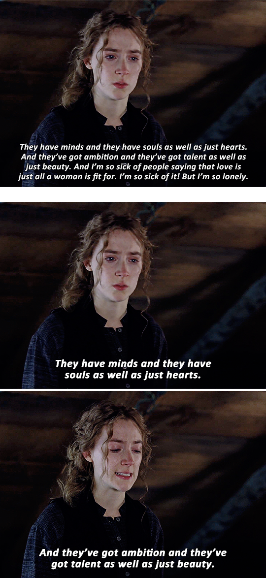
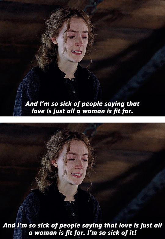
The first gif below is an example of a long paragraph cramped into one gif.
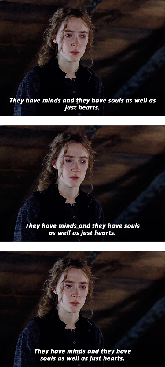
The example above splits the paragraph across several gifs, making it easier on the eyes and giving each sentence more impact.
Widows
Widows are lone words on new rows of lines.
Widows leave too much white space at the bottom of a gif. It interrupts the reader’s eye and diminishes readability.
In the first gif below, "just hearts" is an example of a widow.
To fix a widow, split your subtitles before an article, conjunction, preposition or punctuation then continue it in the next row. To do this:
Split your subtitles before a point in conversation (i.e. articles, auxiliary verbs, conjunctions, prepositions or punctuations). Doing this would also depend on the flow of the conversation OR the overall look of the subtitles.
Continue the conversation in the next row
In the second example above, the focus is on the flow of the conversation: the widow was fixed by breaking the line before "as well as" (which kind of functions like a conjunction), making the flow of reading much better.
In the third example, the focus is on how the subtitle looks: the sentence was split before "souls" (which follows the auxiliary verb "have") to make the width of the overall subtitle more even.
NOTE: The second and third example show there's no definite way in splitting subtitles. Just be mindful of widows and do whatever looks good to you :)
Widowers
(To be honest I'm not quite sure what the term is so I've decided to just call this one a widower 😂 #equality #girlbossing)
A widower is the first word of a sentence left behind.
A widower follows a punctuation in the same row.
Fixing a widower is similar to fixing a widow except we're keeping an eye on lone words that follow punctuations.
In the first example below, the widower is "But" which follows an exclamation point (a punctuation).
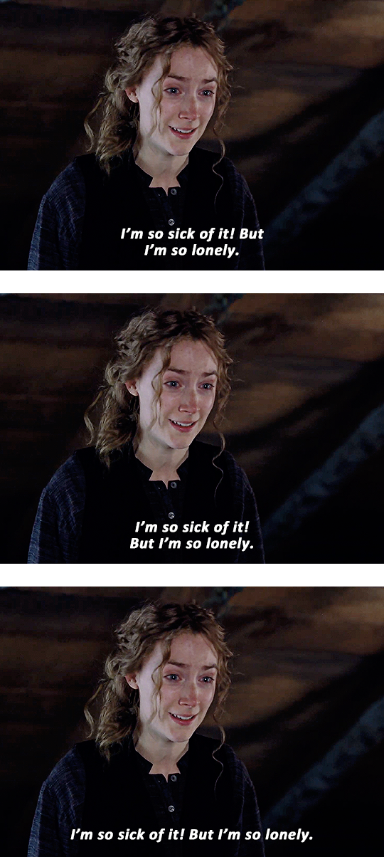
In the second example above, the widower was fixed by moving it in the next row with the rest of the sentence, which is less awkward to read unlike the first one.
In the third example, it has moved the second row ("But I'm so lonely") back up with the first since there's ample space. Not so lonely anymore, is it? 😂
[3] Text
Font vs. Typeface
To this day, I still get confused. Hopefully, writing all this will finally make the distinction stick.
Typefaces are also known as font families. It's a specific collection of fonts varying from Thin to Black, Narrow to Wide, Roman and Italic.
For example: Bebas, Baskerville and Futura are all typefaces
Fonts are part of a typeface. Each variation of a typeface is a font.
For example: Montserrat Thin, Arial Italic and Georgia Bold are all fonts
Serif vs. Sans Serif
Serifs have serifs.
A serif is a small stroke attached to the end of a larger stroke in a letter or symbol. Think Times New Roman, Baskerville, and Didot.
'Sans' is old French for 'without', so Sans Serifs are literally without serifs. Think Arial, Century Gothic and Comic Sans.
Content creators most often use sans serifs such as Arial Bold Italic, Calibri Bold Italic and Helvetica Bold Italic. These fonts aren't flashy and don't distract the viewer from the main visual, the animated pictures.
TIP: Avoid (ultra) Black and Heavy fonts especially with paragraphs because it will make the sentences look bulky and hard to read.
Some gifmakers apply Faux Bold and Faux Italic to their text (the ones highlighted pink in the examples below). Apply whatever looks good to you.
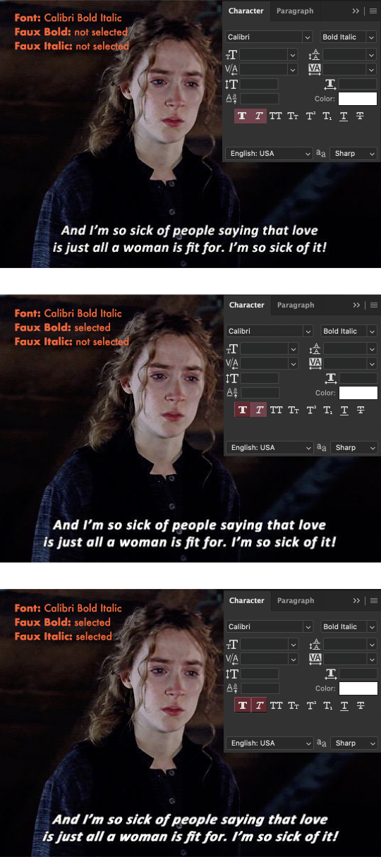
The first example above looks good, but my personal preference is the second where faux bold is selected. The third one looks much too italicized, since the font itself is already italic.
Alignment
There are four ways to align text:
Left
Center
Right
Justified
As you may have noticed, gif subtitles are center-aligned and then centered in the gif.
TIP: Avoid justifying especially long lines of text. Doing so will create awkward spaces, making it difficult to read.
Tracking and Leading
Tracking adjusts letter spacing.
Leading is the amount of space between two rows.
In 'textbook' typography, increasing the leading does improve readability since it helps guide the reader's eye to the start of the next row (especially for multiple rows of text). However, I think this one doesn't apply to Tumblr subtitles. Compare examples 1 and 2 with 3 below.
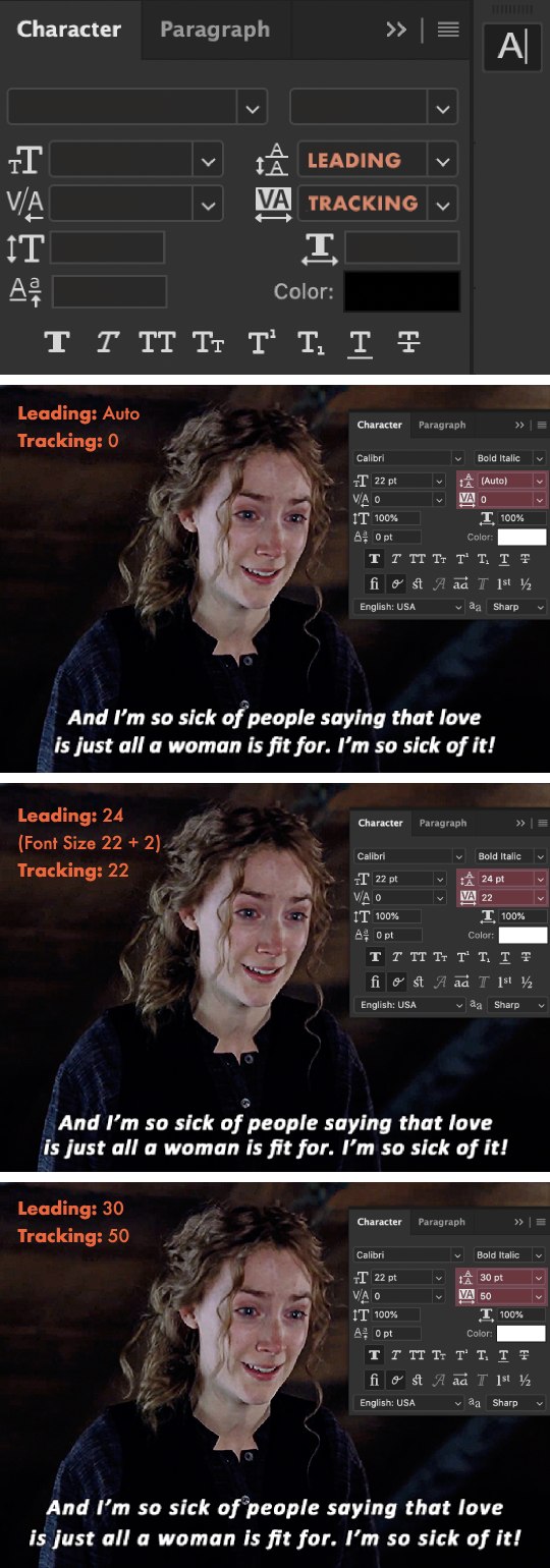
The first example above has leading and tracking set to default. Most typefaces already have a set tracking and leading amount, so if it already looks good, then leave it as is.
The second example has the leading decreased which I found is what most gifmakers do, and it looks great! I've added 22 tracking to add some breathing space for the letters since faux bold is applied.
The third example has the leading increased, making the two rows of text look separated. The tracking further increased, making this one harder to read compared to the first and second example.
TIPS: The leading/tracking amount would also depend on what font you're using so feel free to lessen it, add more or leave it be! :)
Spacing
Please be mindful of the space between the subtitles and the edges of the gif (lined with pink). @kylos notes that Tumblr cuts off the bottom of gifs by 2px on the desktop version.
There is no definite amount, so just make sure to avoid placing your subtitles too close to the edges like in the examples below:
The first example above has the subtitles too close to the bottom edge and the second has the subtitles too close to the sides.
TIPS:
To avoid example 1: Nudge your text higher by selecting the text layer and pressing: shift + [up arrow key] once, and if you want to make slight adjustments, press only the up/down arrow key.
To avoid example 2: Since there's still enough space in the second row, move some words from the first row in the next line to add some space at the sides, keeping in mind what we've learned in the [2] Words 'chapter'.
NOTE: Sometimes, example 2 (or every example in this whole guide really) cannot be avoided, and that's ok. I've only included it as an example for when it can be avoided :)
Font Colors
A color is used to indicate the speaker and is assigned to a certain speaker.
For one speaker / a first speaker: the standard color is white.
For a second speaker: gifmakers commonly use shades ranging from yellow to orange, some use other colors such as blue or purple.
For a third, fourth, fifth speaker: the colors are up to you.
TIP: Avoid using black or dark shades.
Font Sizes
For 540px gifs: 18 to 23 pt
For 268px gifs: 14 pt or higher
TIP: For 268px gifs, it's best to start at 16 pt if you're catering to mobile users or if you yourself frequently use the mobile app.
Nowadays, gifmakers are leaning towards bigger font sizes (i.e. 18+ pt), making subtitles readable on mobile.
NOTE:
The font sizes I've mentioned above would also depend on the font.
So depending on the font, going lower than 16 pt will make the subtitles difficult to read and strain the reader's eyes.
Feel free to do some experimenting of your own! Just keep in mind the readability, paragraphs, widows and widowers :)
Below, I've demonstrated the relation between the font size and the gif size (540px and 268px).
As seen in the first and second 540px examples (and also maybe the third for those with bad eyesight), smaller text sizes don't really work with 540px gifs.
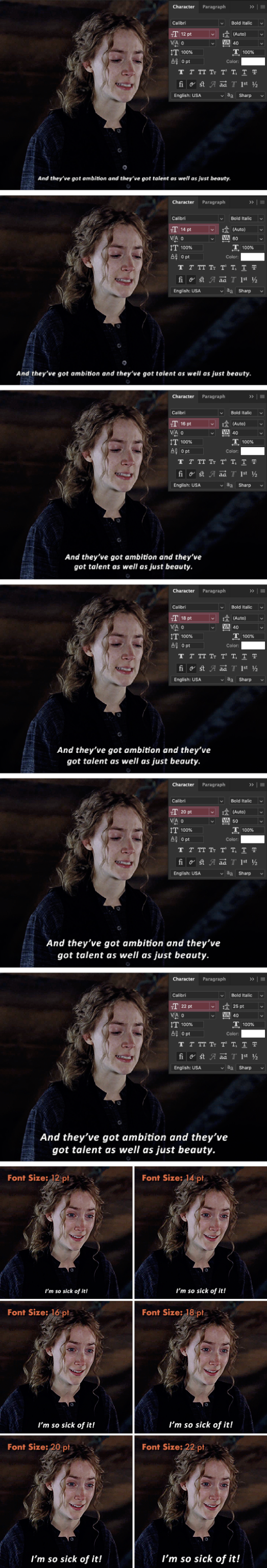
To be honest, I thought 12 and 14 pt would read better on 268px gifs but as you can see, you can't see it. 😂 It would ultimately depend on the font and the length of the text but for this Calibri Bold Italic font, 16+ pt reads better.
[4] Finishing Touches
Stroke
Adding Stroke will make subtitles even more legible, especially if the background is as bright as the text color.
TIPS:
Make sure your stroke color is black (or any color as long as it's in a shade much darker than the text) with an opacity greater than 80%.
The stroke thickness would also depend on your font so if 1px looks like nothing on the font you're using then try upping it to 2px or 3px. Different strokes for different fo(lks)nts 😂
The first example below shows what a subtitle looks without a stroke. Incomplete, right? And without the added drop shadow, "sit" would blend in with the background.
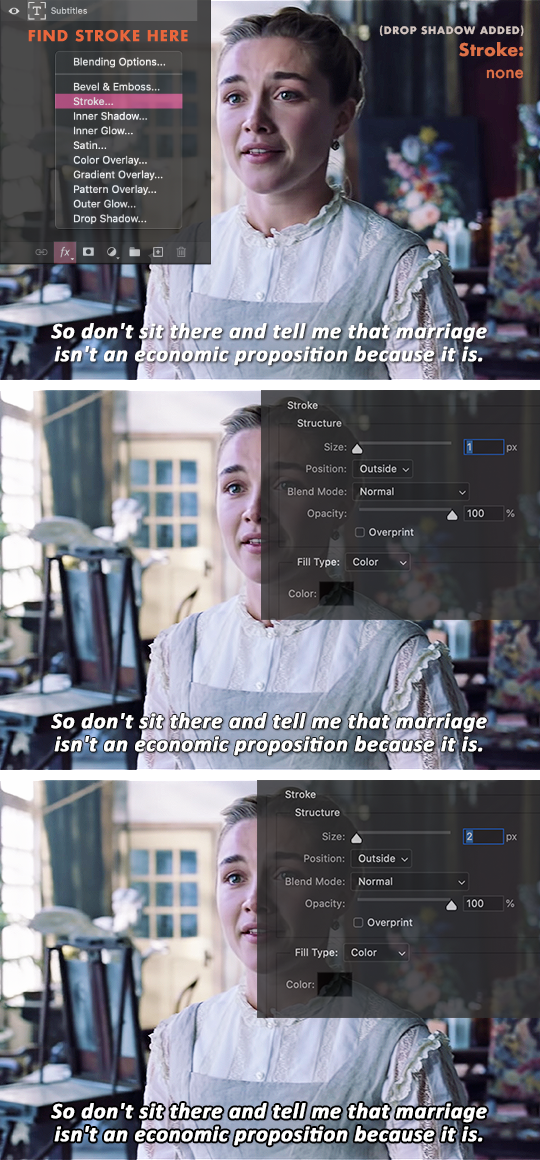
The 1px stroke in second example already looks good and readable to me.
The 2px stroke in the third example is readable, but it looks too dark and bulky.
Drop Shadow
Drop Shadow makes subtitles even more legible, especially if the background is as bright as the text color, just like Stroke.
Drop Shadow gives more depth to subtitles.
For this topic, each gifmaker most likely has their own drop shadow settings, such as the ones I've listed below: (Click to view their settings)
itsphotoshop's
maziekeen's
kylos's
favreaus's
dingyuxi's
What unites all their settings is using the color black #000000.
TIPS:
For dark backgrounds, adding drop shadow isn't necessary since it won't be seen anymore.
Since it's a shadow, make sure your stroke color is black or grey. If it's too dark, lower the opacity.
Making the shadow's distance too far away from the text tends to look distracting and hard to read. A distance between 2–4 is the best way to go.
A large drop shadow size sometimes gives the illusion of blurry text, so try sticking to sizes below 5px.
These tips would also depend on your font and font size. Do what looks good to you and remember to keep in mind the overall readability.
Set the Anti-Aliasing Method
Anti-aliasing produces smooth-edged type by partially filling the edge pixels. As a result, the edges of the type blend into the background.

None: Applies no anti-aliasing, looks very jagged. Avoid this.
Sharp: Makes subtitles look its sharpest, which is the goal.
Crisp: Makes subtitles look somewhat sharp, which is also the goal.
Strong: Makes subtitles look bolder. Avoid this since we already use bold fonts / apply faux bold.
Smooth: Type appears smoother, but personally it just looks blurry to me, so for Tumblr gif subtitles let's avoid this.
TIP: Most gifmakers use the Crisp anti-aliasing method.
〰️
Aaaand that's the end of this comprehensive guide! I hope you learned as much as I did when making this tutorial :) Again, by no means does this post intend to limit the way you do your subtitles.
Please like/reblog if this has helped you and feel free to hit me up for any questions and concerns! ♥︎
〰️
REFERENCES:
99designs
Rev
fonts.com
itsphotoshop
Adobe one, two
Documentary Film Cameras
1K notes
·
View notes
Photo

dice
premium theme
a responsive, single-column sidebar theme. features drop-down links, optional custom scrollbar, left or right sidebar. custom colours & sizes on everything.
preview / code
642 notes
·
View notes
Text

Orbital Texture Set
Includes sub-folders for each categories and some psds for some of the textures. Like or reblog if using! If you enjoy my work, consider supporting me on ko-fi :)
Download
(downloads are always ad-free!)
247 notes
·
View notes
Photo
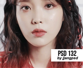
GIF PSD #132 BY JJANGPSD (download)
do not copy/repost
like or reblog if you use
message if there’s a problem
137 notes
·
View notes
Photo
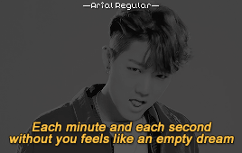
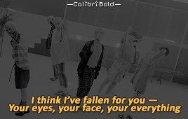

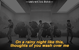
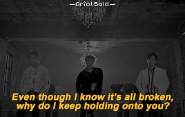


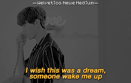
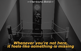
Classic Subtitle Fonts
Arial Regular / Calibri Bold / Myriad Pro Semibold / Helvetica Bold / Arial Bold / Tahoma Bold / Myriad Pro Regular / Arial Rounded MT Bold / Helvetica Neue Medium / Verdana Bold
* click on the gifs for the artist and song title *
189 notes
·
View notes
Text
A compilation of resources needed to make gifs in Photoshop
Vapoursynth --> a program to make cleaner gifs + resize more efficiently. I have linked the tutorial gif book. The steps may look daunting at first, but it is actually super easy to use, and makes the gif making process so much easier. You will also notice a huge difference in the quality of your gifs. The denoiser and sharpening plugins that come with it is one of the most powerful I’ve seen.
Here is a tutorial that does a wonderful job at explaining the process
PSDs/coloring: @kcolourings have some wonderful PSDs that you can use for coloring if you are struggling or are a beginning gif maker. Other places you can look at are @itsphotoshop @chaoticresources @completeresources @quirkyresources
On another note, it’s always best to come up with your own psd so that you’ll have more consistency and develop your own unique style. However, that takes practice and a lot of trial and error.
Sharpening: photoshop has it’s own powerful built in sharpener, but if you do use vapoursynth, you will not need to take this additional step. Here’s a tutorial on how to shapen on Photoshop. The above resource blogs I have mentioned also has additional tutorials and actions that will help you with sharpening.
Where to download HQ videos (asian drama’s,donghua, anime)
pianku: a t***ent**ng site –> korean, japanese, thai, chinese, taiwanese drama’s. You can also download anime and donghua here (please use a vpn if you choose to t***e*t from any site. The one i use is Nordvpn)
dramaday: exclusively korean drama’s. This site provides HQ download links to the latest korean drama, and also provides subs you can download separately.
viki: download korean, japanese, taiwanese drama’s + movies. You will need to use an external resource such as downloadhelper or this site to download the video. For the second link I have provided, please use a vpn and ensure that you have protection/adblock on your computer.
youtube: using 4K video downloader, you can download several chinese and thai drama’s. This downloader is completely free and safe to use.
mkvdrama: download korean, chinese, thai, japanese, taiwanese drama’s in high quality
anime: both this and this site has an extensive list of anime’s you can download in HQ quality. Some files come in dual audio + subtitles (the subtiles are not embedded, so it will not affect your gif making process)
895 notes
·
View notes
Photo
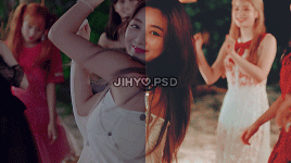


☆.。.:* twice psd pack .。.:*☆
ten of my favorite recent psds featuring twice!
no need to credit
don’t claim as your own
download here ☆
68 notes
·
View notes
Photo


Pixel Fonts for Watermark
wendy / skinny / e4 2017 / pf tempesta five condensed / littlelego
ernest / silkscreen / 04b03 / uni 05_53 / pixel modex
* click on the images for the best size to use the pixel fonts *
847 notes
·
View notes
Photo


Font Pack 14 by liohnelmessi
Happy belated 2022! Over the past few months, I’ve discovered a handful of versatile fonts while editing. So in light of the new calendar year, I’ve compiled a new collection of high quality fonts that I’ve been using in my editing projects across my blogs. I hope you find this useful! {More fonts}
This pack contains 18 high quality fonts
Please do not repost / redistribute.
Like / Reblog if you’re downloading.
Download Links: {Dropbox} / {Mediafire}
1K notes
·
View notes