
akysi
The Art of Katie MacKenzie
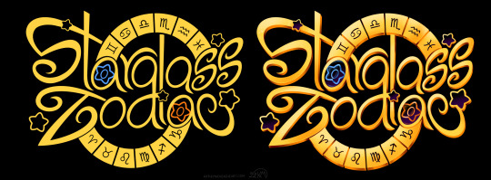
Katie | 28 | She/her | Aroace. A hydra of interests including character design, graphic design, illustration, comics, and a background in animation. Author of Starglass Zodiac🌟💫
570 posts
Don't wanna be here? Send us removal request.
Last Seen Blogs
too-kid-friendly
Rated E for Everyone!
too-kid-friendly
Rated E for Everyone!
lois4719
greeting

synergytop
SynergyTop
xtroor
o v e r c l a s s y
Text

Absolutely HAD to draw something inspired by the eclipse today! :D I wasn’t in a location with totality but I was still lucky enough to see it from my building. It was cloudy at first so I wasn’t sure, but then it cleared right up for the maximum! What a treat :’D
#art#artists on tumblr#Akysi#Art by Akysi#Katie MacKenzie#Katie MacKenzie Art#oc#original character#Cassie#Starglass Zodiac#SGZ#eclipse#sun#moon#totality
15 notes
·
View notes
Text
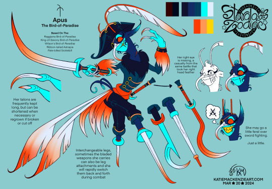
I've had a few ref sheets in the works lately, and I got another one done today. :D Even after I decided to add her to Columba's pirate crew, I'd been stumped for a LONG while on what direction to actually take with the design in general and FINALLY I have one that I really like, especially after giving her a more harpy-ish treatment to add more variety to the many bird constellations. Pretty proud of the symbol integration on this one too, some are easier than others! She's the first I've fully completed of this group so things are bound to get tweaked later on, but this is a good start.
The name Apus means "without feet", as apparently these birds were once thought to not have any, and I thought that would fit perfectly into a double peg-leg to match the pirate theme. A bird-of-paradise could be any number of species under that name though, so I've incorporated attributes from several here, particularly the sicklebills and the various species that have those distinct tail feathers, of both the long and curly varieties. Colour wise, she predominantly resembles the ribbon-tailed astrapia.
Columba's crew isn't exactly evil per se, but they have lost their way a bit after losing their former captain and their ship. Apus loves combat, not for the sake of the outcome, but for the act of combat itself. If you were to lose your weapon during a fight with her, she'd gladly give you one of hers just to continue it! She'll also use her long talons to fight with, but only if she has no other weapons left. Hope you like her. :)
-------
The constellation symbol for Apus was originally designed by Denis Moskowitz and released to the public domain.
#art#artists on tumblr#Akysi#Art by Akysi#Katie MacKenzie#Katie MacKenzie Art#oc#original character#character#design#character design#Apus#constellation#bird of paradise#bird#pirate#sword#sickle#Starglass Zodiac#SGZ
19 notes
·
View notes
Text
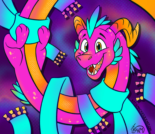
I’m super late to the party, but happy Year of the Dragon everybody! :D I needed something easy and fun to draw to take my mind off things, and came up with this little friend here. Though it has been a while since I’ve drawn a dragon amidst all my commissions and project work, I’m sure this still feels very “Katie Classic” for anyone who has known my work for a long time.
And just as a side note, I’m well aware of and completely against Tumblr’s recent AI bullshit. My blogs will continue like normal for the time being until I’ve had time to think over the best course of action. Thanks <3
#art#artists on tumblr#Akysi#Art by Akysi#Katie MacKenzie#Katie MacKenzie Art#dragon#scarf#illustration#oc#original character#i guess haha#normally i have more tags than this lol
20 notes
·
View notes
Text
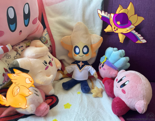
Aaaaaahh my Lumi plush from @starteas arrived today! :'D (after being delivered to the wrong door in my building lol) I couldn't resist taking a picture and drawing a few of my own star friends too :'DDD
They all seem really curious about their new friend, and I bet they're eager to give them a good home here ^_^
Go check out Lumi and the Great Big Galaxy @latgbg, it's a very cool indie animation project!
#they're so cute thank you Evan ;;;v;;;#art#artists on tumblr#Katie MacKenzie#Katie MacKenzie Art#Akysi#Art by Akysi#Lumi#Lumi and the Great Big Galaxy#latgbg#starteas#plush#Kirby#Clefairy#photo#photo drawover#I've actually never attempted one of these before#and while I didn't want to spend too much time on that part I still think it came out well!#oc#(for the drawn characters)#Starlie#Flicker
17 notes
·
View notes
Text
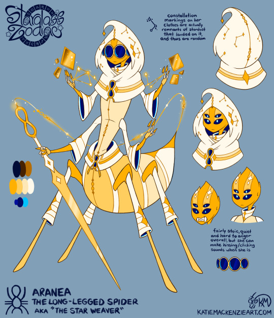
Finally, some more art! This time it’s a complete redesign for Aranea; a new concept, personality, story role, colour scheme, the works! She was originally a minor character, and while that’s still somewhat true here, I’ve specifically tied her role to the main plot via her new concept, and the reason she’s nicknamed “The Star Weaver”. Using her magic needle, she’s able to “weave” remnants of dead constellations and create glass portraits of them, which are then placed in the astral mausoleum to preserve their memory. Conceptually speaking, I wanted to combine the idea of lines connecting stars in a constellation, the connecting lines in a spider’s web, and the lines between pieces of stained glass to create Aranea’s core idea here.
The constellation for Aranea is based on the yellow sac spider, labelled as the “long-legged spider” by its original mapper, though I’ve incorporated a bit of orb weavers to match the theming too. I did leave a few hints at her previous peacock spider inspiration, primarily in her glasses and head stripes. Her glasses are meant to be like large, dark voids that conceal her expression, you never quite know what she’s thinking. This matches with her overall aloof and quiet personality, usually only speaking when absolutely necessary.
The first two months of the year are always odd ones for me, usually a lot of aimless sketching and WIPs until something gets finished (outside of commission work, of course), but I really like how this came out! It took the usual amount of workshopping and I’ve had it as a WIP for a while, but luckily it didn’t fight me as much as I thought it might.
#art#artists on tumblr#Akysi#Art by Akysi#Katie MacKenzie#Katie MacKenzie Art#oc#original character#character#design#character design#redesign#Aranea#spider#arachnid#bug#needle#constellation#defunct constellation#Starglass Zodiac#SGZ
45 notes
·
View notes
Text

Hey, I've got commissions open on my Ko-fi now! I'm inbetween contracts for the next two months, so any little bit helps donation wise, even just boosting helps! Thanks everyone~
Commission listings here!
54 notes
·
View notes
Text
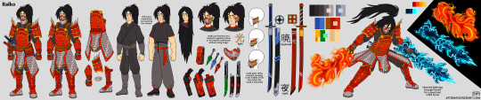
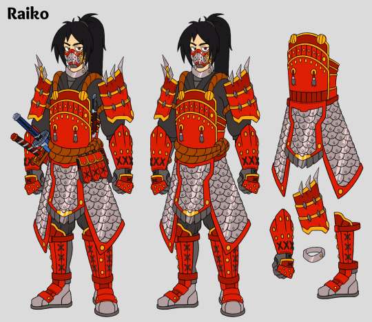


This was a carryover from last year so it’s now my first art of this year, another commission for VioletStrike214 on Twitter of her character Raiko! The devil was in the details on this one but it’s finally complete, and some of my best perspective work in a while. Easily one of the coolest designs I’ve ever been given to make a reference sheet for, thank you for commissioning me! <3
#art#artists on tumblr#Akysi#Art by Akysi#Katie MacKenzie#Katie MacKenzie Art#character#design#character design#reference sheet#commission#VioletStrike214#Raiko#samurai#warrior#swords#gun#tanto
16 notes
·
View notes
Text

Happy New Year, time for my annual art summary! ^_^ I noticed in previous years that it’s hard to show off logo designs in cropped image sections, so I thought I’d add a logo section this time around, and probably will going forward :D
While 2023 itself was a uh… mixed bag to say the least (the bar is very low at this point), I can say that I did make some banger art pieces this year, even if it’s currently not as much or as frequently as I’d like yet. 2024 is the year of the dragon, and while that’s not my actual zodiac year, hopefully my love for them will translate to a better year overall. A girl can dream!
#art#artists on tumblr#Akysi#Art by Akysi#Katie MacKenzie#Katie MacKenzie Art#2023#2023 art summary#art summary
15 notes
·
View notes
Text
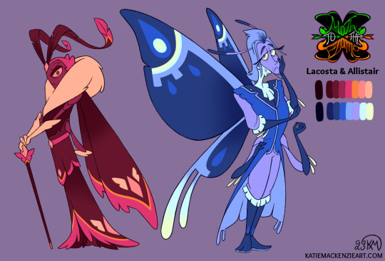
Outside of my ongoing commission work it has been a slow art month, but I still wanted to post something in December for my art summary so I picked one of my WIPs to finish up today :) I’ve been chipping away at the redesigns for Kiida's parents for a while but was close enough to done already so here you go!
Since I have a better grasp of what I want their characters to be, I debated on whether I should give them slightly less monochromatic colour schemes compared to the first iteration, but considering what they represent in the story I think they still work to both match and contrast Kiida. I’ll be posting my art summary soon but for now, Happy New Year everybody!
#art#artists on tumblr#Akysi#Art by Akysi#Katie MacKenzie#Katie MacKenzie Art#oc#original character#character#design#character design#moth#butterfly#insect#bug#Lacosta#Allistair#Moth to the Flame#MttF
20 notes
·
View notes
Note
Hey Do you have any tips on making a logo because ive been looking to make logo for Ask blog and was wondering if you had any tips?
Hey, thanks for asking! :D I can be very wordy about stuff I’m passionate about so my apologies for the length of this answer ^^’ That said though, if you have any further questions feel free to reply or send another ask :) Here’s a few tips, I hope they help!
1. Choose a font (or draw one yourself) that fits what you want the logo to represent
Similar to how specific choices are made to convey the intent in character design, font choice in a logo design can affect the overall “feel” of it, so try to pick ones that fit whatever you’re making the logo for. In other words, logos can have their own “character” too! Many character design principles, such as shape language and colour theory, can apply to logo design as well.
If this is for a fandom/pre-existing media, try looking up those logos first if you want to match their look for your own. Also try studying logos you like in general to figure out how they're constructed, and use anything you like from them in your own design!
There are a ton of styles and combinations out there, but one of the biggest distinctions between fonts is serif versus sans serif.

Though not the case every time, serif fonts tend to look more old-fashioned/traditional, while sans serif usually appears more modern/digital.
While you can use any font for inspiration if you intend to draw your own, if you just want to type one out, then be sure to look up the usage permissions for it first. Not all are free for personal use and may be stolen even if they're listed as free online. If you’re unsure, search the font name and find the license or usage permissions directly from the creator/font foundry if you can!
2. How “fancy” you want your logo to be is up to you, but make sure it still works as a flat image as well
This is less applicable if you’re only using the logo for one thing, but generally speaking you want your logo to be versatile enough to still be readable without all of the fancy gradients and drop shadows added. Those should be extra details, not the main component that's holding up the whole design, so to speak.
I recommend starting with the flat or black & white version and refine the design enough in that stage first before moving on the final clean/fancy version. Here's a comparison between the flat and full version of the logo for my comic project, Starglass Zodiac (original post here):
Even without all of the shiny stuff on top/underneath, the flat colour version still functions as intended.
3. Make sure the width/length/size of the logo works well for what it will be used for
For example, if you want to use the logo on the banner for your ask blog, make sure it'll can be read well in that format. You can do this by either making the logo in a file that's the same dimensions as your banner, or testing the rough design for the logo on the banner first before committing to the final design.
Also make sure that the logo doesn't blend into whatever background you intend to put it on, especially if the logo itself doesn't have a background. Adding a black or white (or both) stroke around the logo can help it appear on more background colours.
4. Make sure the most important words are largest or are the focal point otherwise
Similar to the last point, make sure that a viewer will get the gist of your logo even if they look at it quickly. This is most relevant for logos for things that have long titles or have a subtitle attached to a main name. If your logo will have multiple words, having a hierarchy of importance in size and/or colour can help the viewer see the most important part first.
--------
Now for some general additions/effects to consider for your logo!
Gradients - Your best friend, one of the easiest ways to make even the simplest logo look fancier than the flat version, if the overall style you're going for calls for it. These can allow you to have colour shifts over the whole design, or add highlights in parts of it to tie the whole thing together. You can also add edge highlights/shadows on top of these too.
Textures - Similar to gradients, textures can add a lot of flair to a design very quickly. Even gradients themselves can be textures already, like mimicking shiny metal or the like. They can also be used to represent something about what the logo is for, like adding a rocky texture for a logo involving mountain climbing or ancient ruins.
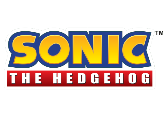
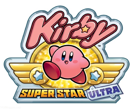
Strokes - These are outlines around your lettering that can help them be seen on multiple background colours, or to make specific letters pop out from the others. You can use multiple strokes on different areas of the same design as needed, but make sure they don't impede the legibility of the lettering itself! Many of the Kirby logos use several strokes at once, like this one below.
Backgrounds - Any colour/shape underneath the text to serve as a base for it. Similar to strokes, they can help the lettering read properly on multiple colours/shades. They can also provide additional information about what the logo is for or represents, like putting a sunset in the background of a logo that has "Sunset" in the name.
Drop Shadows and Outer/Inner Glows - These are often paired together, as they generally serve the same purpose; emphasizing the part of the design they're applied too. Drop shadows can help "lift" some parts of the design off the base, while glows can outline something instead, like a soft version of a stroke. It's very easy to overuse these though, so use them sparingly!
Bevels & Edging - Adding these to the lettering or other parts of the design can make them stand out more, especially if you add shading to it! One of my favourite examples of this is the main Spyro logo, both classic and modern :)
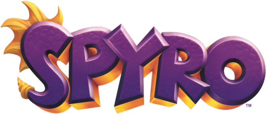
Blocking - Basically a way to make the letters or the whole logo look more 3D by adding "blocks" underneath it, which can also help add another colour to the logo's palette! Spyro's logo above uses shaded blocking.
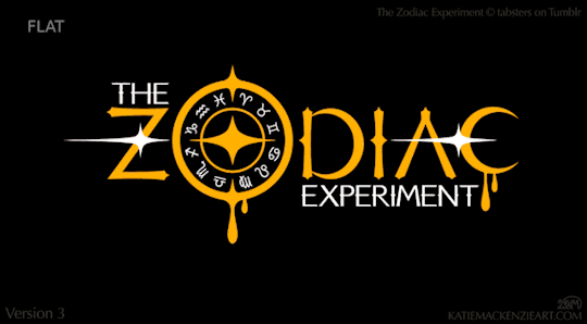
There are a ton of other effects and ways to combine them, so feel free to experiment with a bunch of them! As one final example, here's a breakdown of the logo design I made for The Zodiac Experiment (Original post here) so you can see how these effects can work together on one piece!
Have fun designing! ^_^
8 notes
·
View notes
Text
@professionalwaterbender Thank you very much :'D
To answer your question, I generally don't do requests, as the majority of my time and energy is spent on paid commission work and my own project work instead. Anything that I do for free is usually on an "if I feel like it" basis, which was the case here. Gift art is one of my favourite things to give to others, so even strangers on the internet get it from time to time :)
It's only every so often though, so I can't make any promises here. Still, I appreciate your interest in my work! Does your AU have its own separate title, or is it simply called "ATLAverse"?
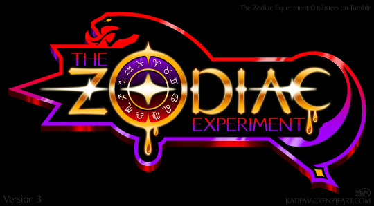
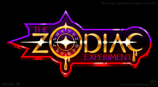
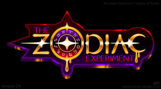
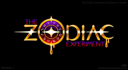
You’ve heard of character fan art, now get ready for logo fan art! :D These are for @tabsters, who also has a zodiac themed story called The Zodiac Experiment.
I made these as thanks for their interest in my comic project Starglass Zodiac, and because I can’t resist doing shiny space themed logos whenever I get the chance. :’D Despite how much work they are (seriously I spent hours just exporting stuff lol) it seems my urge to make logo designs is never too far away haha
I did these mostly based on vibes, but I did try to add elements from the bits of lore that I read too, like Asclepius, Eclipse's scythe, the gold orichalcum, etc. I went a little crazy with all the variants, but I really like how these came out so I hope you like them too! <3
46 notes
·
View notes
Text
You’ve heard of character fan art, now get ready for logo fan art! :D These are for @tabsters, who also has a zodiac themed story called The Zodiac Experiment.
I made these as thanks for their interest in my comic project Starglass Zodiac, and because I can’t resist doing shiny space themed logos whenever I get the chance. :’D Despite how much work they are (seriously I spent hours just exporting stuff lol) it seems my urge to make logo designs is never too far away haha
I did these mostly based on vibes, but I did try to add elements from the bits of lore that I read too, like Asclepius, Eclipse's scythe, the gold orichalcum, etc. I went a little crazy with all the variants, but I really like how these came out so I hope you like them too! <3
#art#artists on tumblr#Akysi#Art by Akysi#Katie MacKenzie#Katie MacKenzie Art#graphic design#logo design#logo#fan art#tabsters#The Zodiac Experiment#TZE
46 notes
·
View notes
Text
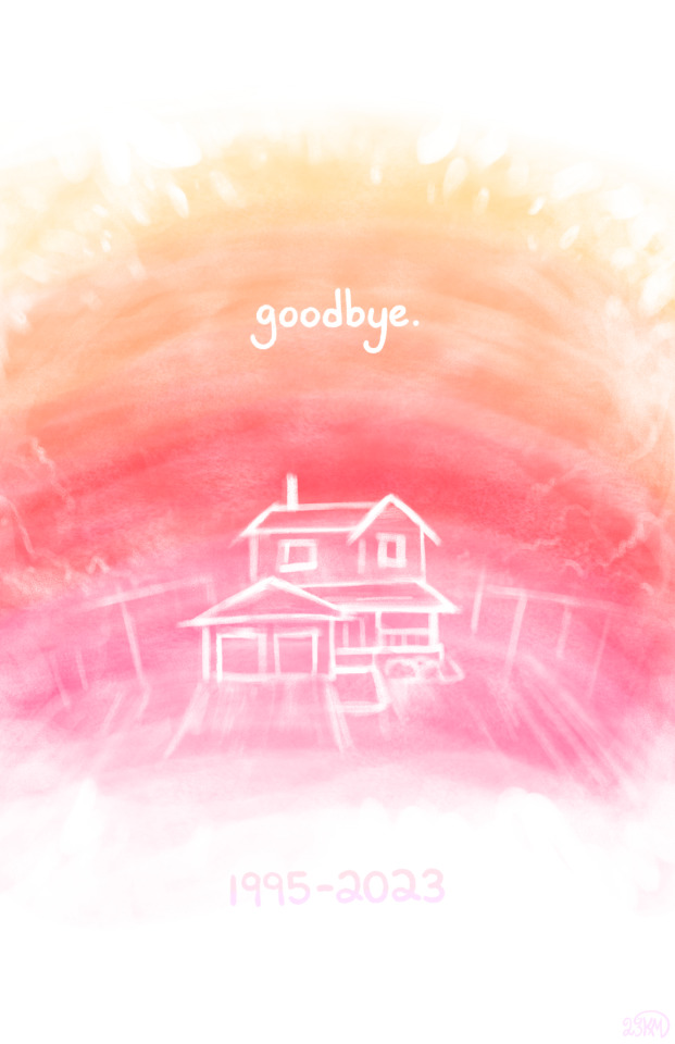
Farewell to Halcyon
------
I had to say goodbye to my childhood home this year. I’ve come to realize that I’ve lost every home that I associate with childhood now, with this being the final one. The last time I was there was on my birthday, of all days.
I started this on that day, and finished it today, the official closing date. It feels a lot more permanent now. No one image can encapsulate such a feeling, but I consider this a tribute nonetheless.
I’m a sentimental creature, it’s true.
#art#artists on tumblr#Akysi#Art by Akysi#Katie MacKenzie#Katie MacKenzie Art#tribute#childhood home
13 notes
·
View notes
Text
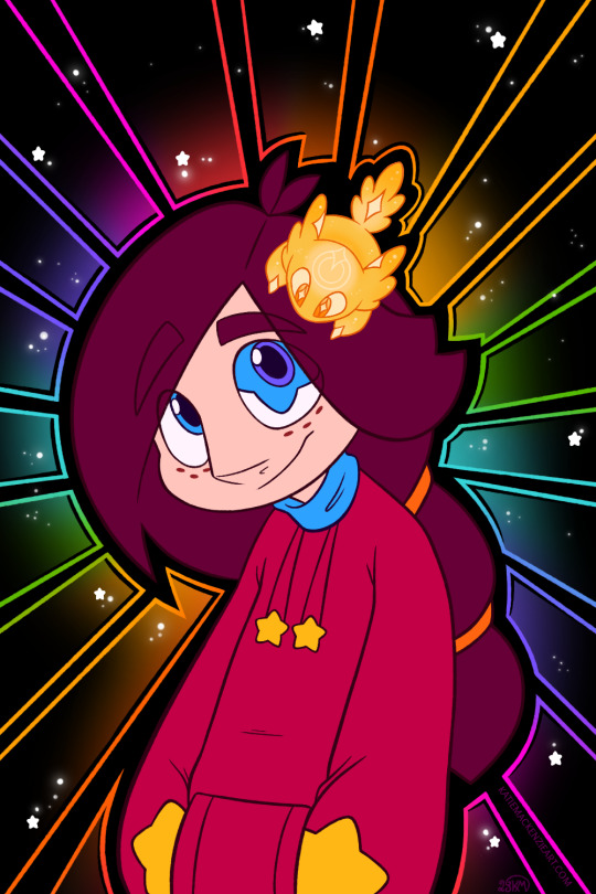
Oops I drew Cassie again, it’s her birthday today so ¯\_(ツ)_/¯
It’s been a while since I drew Flicker though, they’re always fun to draw. Enjoy!
#art#artists on tumblr#Akysi#Art by Akysi#Katie MacKenzie#Katie MacKenzie Art#oc#original character#Cassie#Flicker#Starglass Zodiac#SGZ
24 notes
·
View notes
Note
Yoooo we've been mutuals for ages but I'm somehow just finding your art blog now??? Your stuff is great :DDD
Aww!!! That’s so sweet of you to say, thank you! :'D I do reblog my art on my personal blog but I share a lot of other stuff there too so it’s easy to miss (I really should plug it more in general tbh)
That’s part of the reason why I keep my art blog separate, it’s easier to see it all that way! I keep forgetting to do a pinned post with a link between them though haha
Still, thanks so much for checking out my art! I really appreciate it <3
3 notes
·
View notes
Text
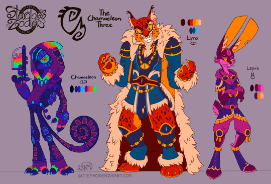
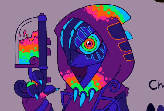
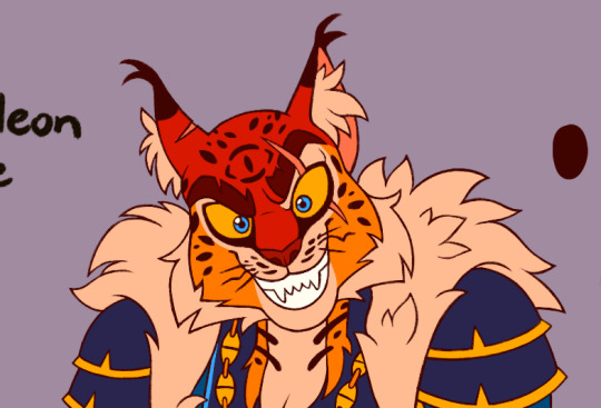
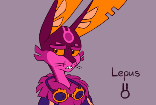
This one was a long time coming, updates to The Chamaeleon Three! It was a difficult and delicate balance to strike with editing each of these, making sure their concepts and symbol integration were strengthened while streamlining a few things as well.
Lepus’s palette and design accents are very similar to Centaurus’s right now, as I plan to overhaul Rus’s colour palette with his own tweaks later. Between the two I think it fits Lepus a bit more.
I was already happy with Lynx’s prior pose so most of that was copied over here, and overall his tweaks are slightly more subtle compared to the others.
It was just a matter of cutting back on a few things to balance the level of detail and colour placement, which was easier said than done! Chamaeleon especially, I didn’t want her to lose her neon flare when trying to simplify parts of her design, so I had to take a long break after looping back on myself too many times. I’m not sure why it didn’t occur to me earlier to combine the concept of the mottled skin of a chameleon with spray paint splatter for her, but better late than never I guess! I wanted it to be more obvious that she’s a tagger without having to rely on her holding her spray gun or paint cans all the time.
I’m not sure who got the biggest glowup between them, but I’m super happy with all three, especially the improvements in the posing and overall anatomy/structure. This was quite a few months in the making, but it’s nice to see it complete now :)
----------
The constellation symbols for Chamaeleon, Lynx, and Lepus were originally designed by Denis Moskowitz and released to the public domain
#art#artists on tumblr#Akysi#Art by Akysi#Katie MacKenzie#Katie MacKenzie Art#oc#original character#character#design#character design#Lynx#cat#big cat#Lepus#rabbit#bunny#Chamaeleon#Mae#chameleon#lizard#constellation#The Chamaeleon Three#villains#Starglass Zodiac#SGZ
38 notes
·
View notes
Text
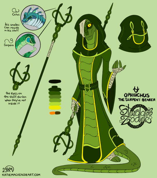
Yay, more design tweaks! Though the primary focus was on giving Ophiuchus an updated lineup pose this time around, like I'm doing for Cassie and the rest of the zodiac. His previous one was a more standard character reference standing pose and I had his expression be more serious/angry, and while that is definitely still an aspect of his personality, I felt this one conveyed more of an accurate summation of his overall character story wise, and thus should be more optimal for the lineup.
Despite having the idea for a while, I realized that I don’t think I ever actually showed how his staff functioned in relation to his snake companions, so I put that here with his updated staff design. There’s more blank space on this than I normally like with my sheet layouts but I already made some of the other reference on his previous sheet so ¯\_(ツ)_/¯
If nothing else, I wanted to nail a very specific expression here, one that’s reeeeeally close to being friendly and kind but something feels off about it to the point of being unsettling. It took a bit of finessing and testing between the line art and colour phases, but I think I got there in the end.
Though I didn’t intend for his raised hand to parallel the one in Scorpio’s pose, the fact they are linked in that way is rather appropriate, ironically! In this case it’s meant to look like he’s beckoning you or is holding out his hand to aid you.
Do you trust him?
#i am incredibly sleep deprived right now so hopefully i don't hate this when i look at it again later lmao#i'll probably end up tweaking more shit once all the lineup art is together and i check the saturation levels and head sizes anyway though#art#artists on tumblr#Akysi#Art by Akysi#Katie MacKenzie#Katie MacKenzie Art#oc#original character#character#design#character design#Ophiuchus#serpent bearer#snake#constellation#Starglass Zodiac#SGZ
13 notes
·
View notes