
allresources
allresources
created to collect and share resources | tracking #allresources
4246 posts
Don't wanna be here? Send us removal request.
Last Seen Blogs

Text

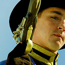
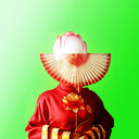
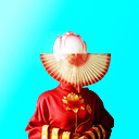
30+ spring themed icons by jojen
requested by anonymous
200x200px
like/reblog if using
find them here
50 notes
·
View notes
Text

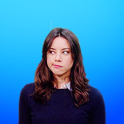
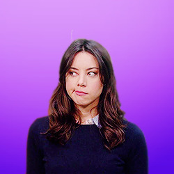
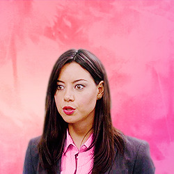
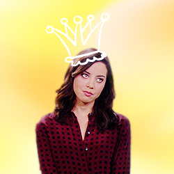
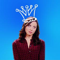
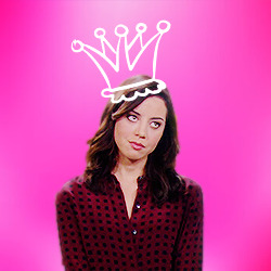
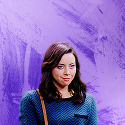
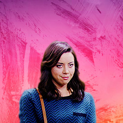
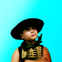
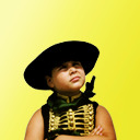
32 icons of april ludgate from parks and recreation
↳ requested by anonymous
250x250
reblog/like if you use
check out more of my icons here.
don’t repost or claim as your own.
request your own icons here.
some icons are under the cut, all icons can be found here thanks to tumblr's 30 image rule.


20 notes
·
View notes
Text
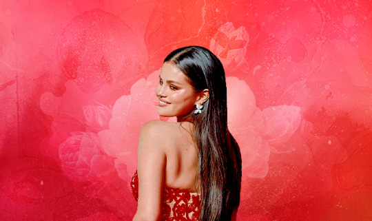
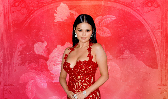
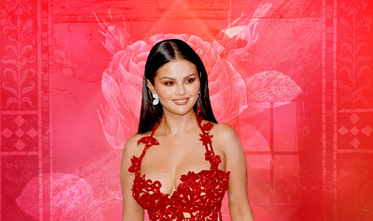

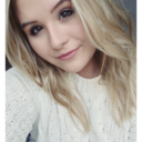
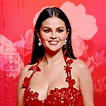
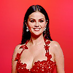
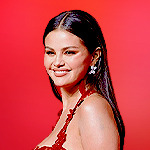
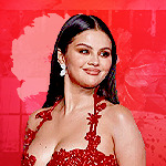
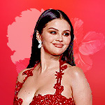
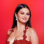
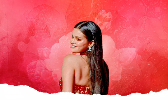
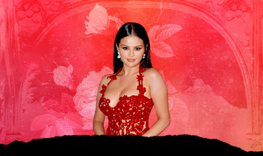
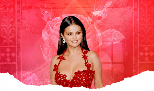
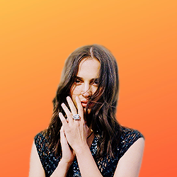
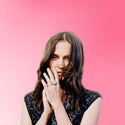
SELENA GOMEZ // MTV MUSIC AWARDS 2023 // (REQUEST)
9 icons // 150x150 // 3 pictures
9 headers // 640x380 // 3 pictures
please do not edit or claim as your own
credit is appreciated, but not required
hope you like them (⊃。•́‿•̀。)⊃


57 notes
·
View notes
Text
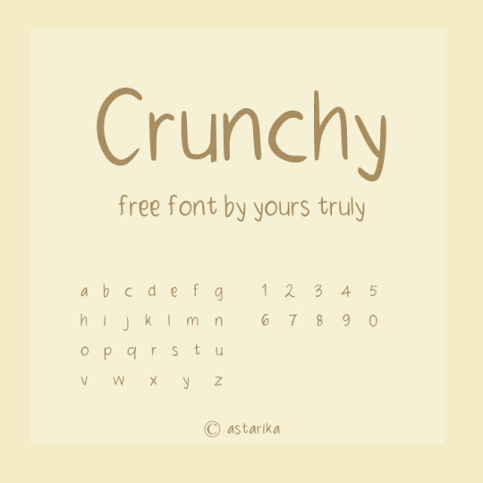
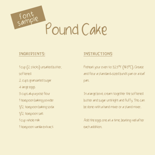
free handwriting font (but not limited to) for digital journaling
get them at my ko-fi shop
do let me know if you encounter any issues!
172 notes
·
View notes
Text
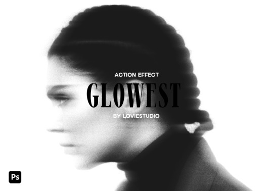
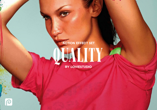
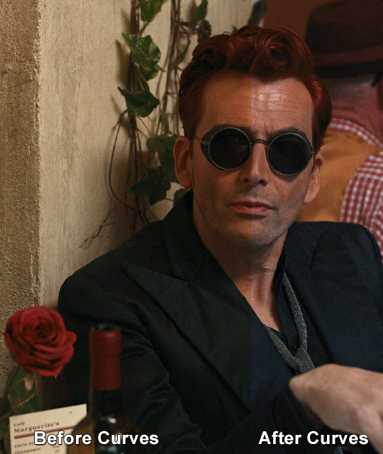
GLOWEST ACTION EFFECT by @loviestudio
This action was made in Photoshop CC, and it will work better on it!
CONTENT
1 Photoshop action file (ATN) with four options of the effect: black and white + coloured - horizontal and vertical.
TERMS
Before/after preview here!
Like and/or reblog to help a creator.
Don’t repost, re-upload or put it on packs and/or google drive. Don’t claim my resources as your own.
Don’t use my resources as a base or copy them.
Credits are not mandatory, although I’d love to see your edits!
My resources are free for personal/non-commercial use only. For commercial use, you must pay for the download. If you paid for the download, you are authorized to use it commercially. Reach out to me for more info or if you have questions about my resources license.
Follow me for more resources! ♡
This is a free resource, but you can buy it with points on DeviantArt to help out a creator or download it for free on Ko-Fi. Thank you!
216 notes
·
View notes
Text

finding footage for aesthetic edits can be really difficult, so here is a gif pack to aid in your edits! if this does well, expect other gif packs of this nature in the future
15 gifs in .psd format
268x170
uncolored & unsharpened
please reblog this post if you download/use
download here
36 notes
·
View notes

Note
As a fellow gifmaker (only not quite as skilled as you are) I've been struggling and your gifs always look so amazing and nice and colourful so I was wondering if you could share some tips on how do you colour tinted scenes like in MoTA? thank you Jess you are amazing 🤗
heey there!!!! First of all sorry for taking so long to reply to this, I was so happy with your nice comments that I wanted to give you a proper insight on how I do it, but unfortunately I'm quite HORRIBLE at explaining things?
I'll put it under the cut because it's gonna be a long post! but if you have any doubts my askbox is always open!!!!

So first of all I already gave some tips on how does my process with coloring gifs work so you can check it on my resources and tips tag
As you said you are also a fellow gifmaker so I'll take it from there as I assume you already know gif 101, but if you are new to this you can again check my tag for some beginners tips
Also want to point out this lovely tutorial by @ajusnice that might be even more helpful, since I learned a lot from it
Disclaimer: i'm colorblind, I can see all the hues, just not all the shades and I tend to struggle with greens, oranges and yellows so apologies for any mistakes or if this turns out looking weird!

HOW TO COLOR TINTED SCENES????
So at this point I hope you already have you gif all cut down to the size that you want and used your fav action/sharpening presets ( I use this or this actions to sharpen my gifs
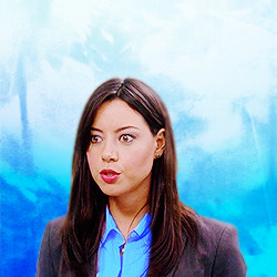
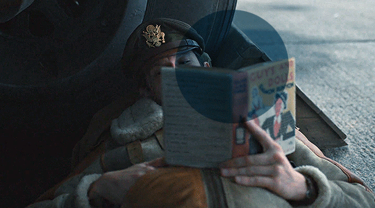
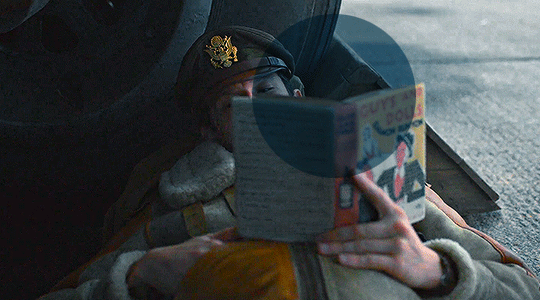
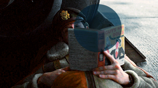
Now I'll use the footage down bellow as it is really blue tinted and I worked with it for this gifset (MoTA SPOILERS AHEAD!!!!!!!!!) so it looks like this
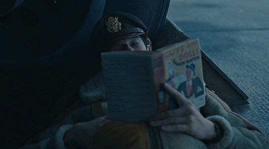
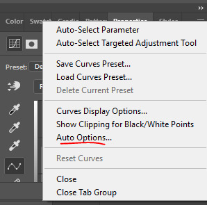
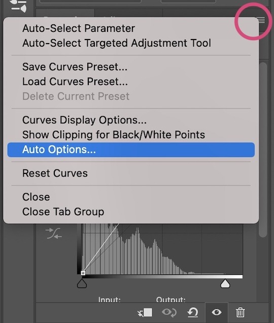
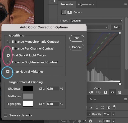
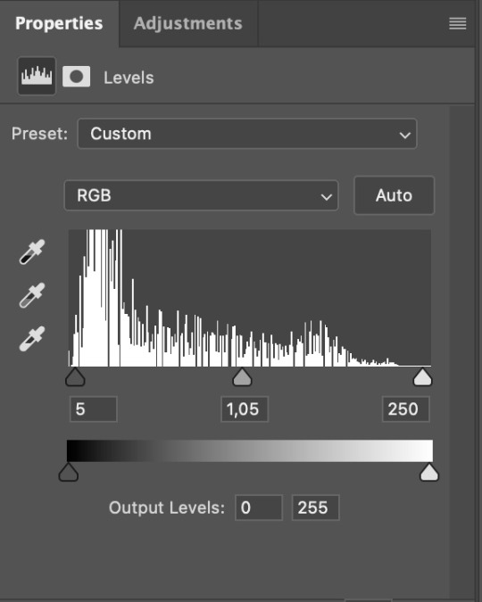
3. So the first thing I do is work with curse as it gives me a better grasp of what I have and how do I want to go with it. I have been using this method where you go to Curves >> Click on the top right menu >> Auto Options
4. Now a new window thing will open up and then I click on the option Find Dark and Light Colors, as you can see my gif already looks a lot brighter and now so tinted
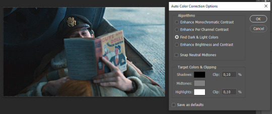
5. this is how my gif looks like I selected that option
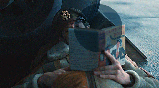
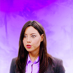
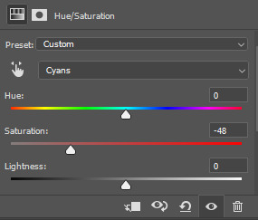
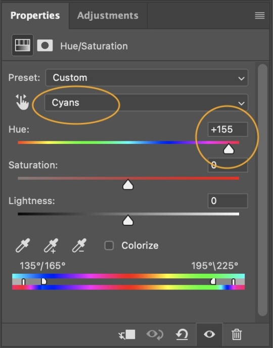
6. still does look a little blue-ish doesn't it? Okay so now I'll go to some adjustment layers, the first thing I do is work with hue/saturation. I'll go to the cyans and blues first and I want to remove some of the blue tint of my scene. I prefer to decrease the saturation of those colors so it looks a bit like this
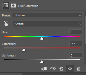
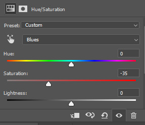
and my gif looks like this
7. So here is our first problem, while I took away the blues my gif now looks a little dull as the scene was delivered to us in such a different color scheme, It wasn't supposed to look like this so now we need to color correct!! For this I work my way around vibrance/saturation so my menu looks like this
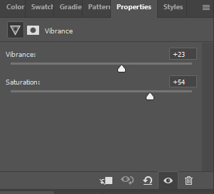
And my gif looks like this
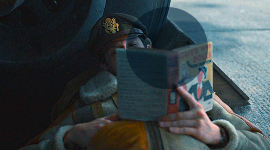
8. Problem #2 because now it looks too blue tinted AGAIN! so I just repeat step 6 again so my menus look like this
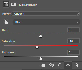
and my gif looks like this
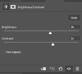
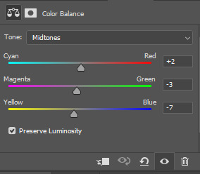
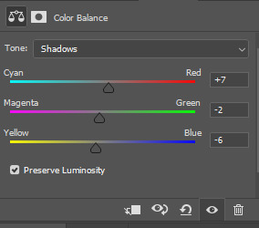
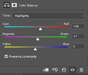
9. from now on it's only about some details such as correct the brightness/contrast of the scene and I personally like to use the color balance adjustment layer, I'll leave it all here
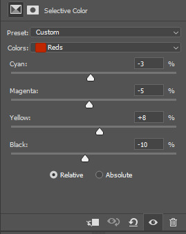
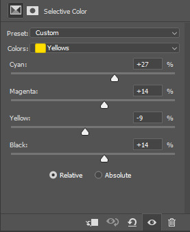
10. finally one of my fav adjustment layers -> SELECTIVE COLOR i just mess around until it looks nice to me, I'll leave the configs I used down bellow
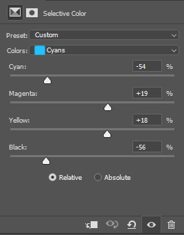
Finally after all those steps my gif looks like this
138 notes
·
View notes
Text
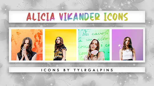
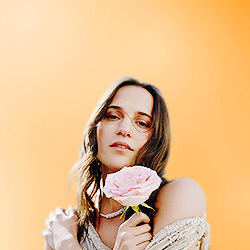
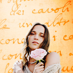
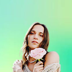
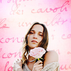
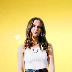
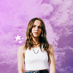
24 icons of alicia vikander
↳ requested by @eikha
250x250
reblog/like if you use
check out more of my icons here.
don’t repost or claim as your own.
request your own icons here.
all icons are under the cut


11 notes
·
View notes


Text
PHOTOPEA QUALITY ACTION SET by @loviestudio
This action set was made in Photopea, and it will work better on it. (The set works on Photoshop as well, but with tiny differences!)
CONTENT
1 Action file (ATN) with the set, containing four actions: 3 variations of the effect (light, medium and strong), and 1 sharpen action.
TERMS
Before/after preview here!
Like and/or reblog to help a creator.
Don’t repost, re-upload or put it on packs and/or google drive. Don’t claim my resources as your own.
Don’t use my resources as a base or copy them.
Credits are not mandatory, although I’d love to see your edits!
My resources are free for personal/non-commercial use only. For commercial use, you must pay for the download. If you paid for the download, you are authorized to use it commercially. Reach out to me for more info or if you have questions about my resources license.
Follow me for more resources! ♡
This is a free resource, but you can buy it with points on DeviantArt to help out a creator or download it for free on Ko-Fi. Thank you!
94 notes
·
View notes
Text
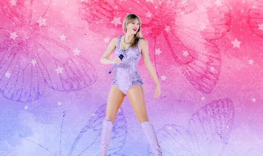
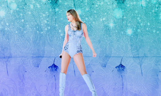
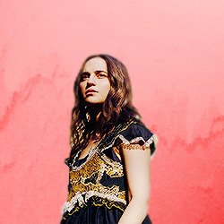
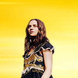
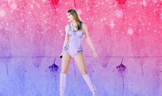
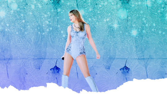
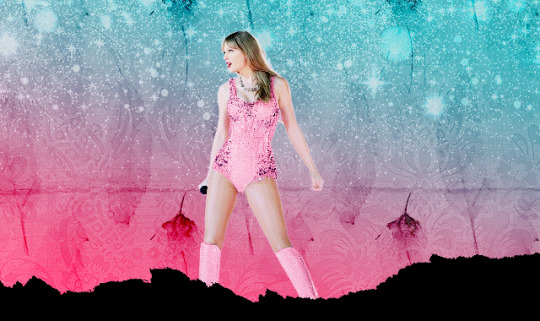
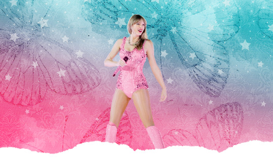
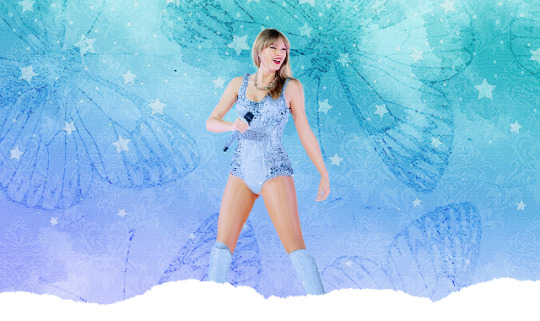
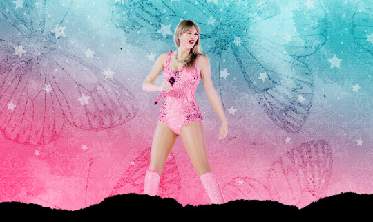
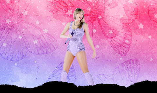
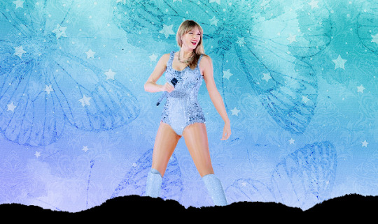
TAYLOR SWIFT // THE ERAS TOUR TOKYO
18 headers // 640x380 // 2 pictures
please do not edit or claim as your own
credit is appreciated, but not required
hope you like them (⊃。•́‿•̀。)⊃


129 notes
·
View notes
Text
━ Please like or reblog if you use
━ Do not repost
━ Feedback is cool
━ Download
239 notes
·
View notes
Text

Anon requested a masterpost for resources and here it is. My favorites have a *.
GENERAL
@allresources *
@completeresources *
@sadresources
@onlyresources
@hisources
@gifmakerresource
PSDS
@dailypsd *
@miniepsds
@wallflowerps
@loviestudio
@harupsds
TEXTURES
@evanbukley *
@jenneferofjengaberg
@natasharomanovf
@evenstarss *
playedtilmyfingersbled
@jaehos
wicked-fate
waretote
behindmylove *
dearestsoul
saharas *
thisslight *
@chaoticroad (by me)
GRADIENTS
@dirrtylady *
wildfireresources
@rossalinesenty *
309 notes
·
View notes
Text

Thank you @cobbbvanth for asking me for this; I’ve never been more flattered! ☺️ I’ve only been making gifs for a little more than 2 years, so I’m really still only figuring Photoshop out, and my colouring owes everything to other people’s tutorials (some of which can be found here). To be honest, I was only asked some tips, but I have no clue what to include and what to leave out; so, here’s my complete (if random) colouring process.
NOTE: This is a colouring tutorial, not a gif-making one. The tutorial that taught me everything I know about that (and to which I am eternally grateful) is this one by @hayaosmiyazaki.
I. SHARPENING
My standard sharpening settings are:
One Smart Sharpen filter set to Amount: 500 | Radius: 0,4
A second Smart Sharpen filter set to Amount: 10 | Radius: 10
One Gaussian Blur filter set to Radius: 1,0 and Opacity: 30%
One Add Noise filter set to Amount 0,5 | Distribution: Gaussian
II. BASIC COLOURING
This is the part where I add most of the adjustment layers available and just play around with them. Obviously different settings work for different scenes, but I do have some standard ones.
Brightness/Contrast
I usually up the Brightness to +10-30, and the Contrast to about +10.
Curves
For the first Curves layer I go to Auto Options > Enhance Brightness and Contrast, and then adjust the opacity until I’m happy.
I might repeat the above step if the gif still looks too dark to me.
I add another Curves layer, I go to Auto Options and this time I pick either Find Dark & Light Colors or Enhance Per Channel Contrast, and check or uncheck the Snap Neutral Midtones option, until I see something I like. I will then adjust the opacity.
Levels
I add a Levels layer that usually looks something like this:
Exposure
I add an Exposure layer, where I usually set the Offset to around -0,0010.
Selective Color
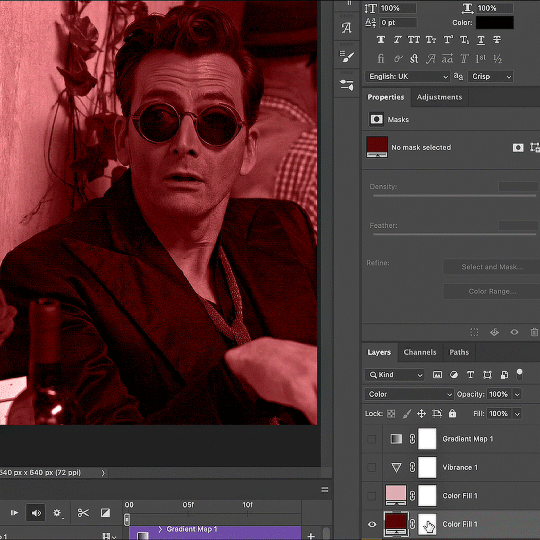
To make the faces look okay, I create a Selective Color layer, select the Reds and usually add some Cyan (+10-20%) and play around a little (±5%) with Magenta and Yellow too. I might also add another layer, select the Yellows and make slight tweaks there too.
III. FUN COLOURING
About colour manipulation: PiXimperfect just uploaded a tutorial that explains everything so much better than I ever could, so I highly recommend you go watch it. It’s made for static images though, and things are more complicated with moving images, so I also recommend @elizascarlets’s tutorial.
The reason I usually go for a softer colouring is that a more vivid one requires a lot of patience and precision, and I honestly can’t be bothered. Instead, I try to tweak the colous only a little, so that the edges can be a little rough without it looking too wrong.
One thing to remember is that each gif is different, and there isn’t one foolproof way to do this, so you will need to use a different technique depending on the gif you’re working with.
Okay, so, after I’ve decided what colour I want my background to be:
1. I create a Hue/Saturation layer and change the greens, cyans, blues and magentas to that colour. That’s easy enough, since it doesn’t mess with the face colour. I then set the blending mode to Color. If your background doesn’t include any yellow or red, you might be done here, like in the case bellow:
2. To change the yellows and reds, I create a new Hue/Saturation layer, select the yellows/reds, move Saturation to 100 (temporarily) and then play around with the sliders until the face colour isn’t affected. I then change it to whatever I’ve chosen and change the blending mode to Color.
3. If for whatever reason step 3 doesn’t work (the background is white or black for example, or just too red), I might create a Solid Color layer set to whatever colour I want, set the blending mode to Color and then select the layer mask and carefully paint with a soft, black brush over the people’s faces/bodies. I will then lower the Opacity, to whatever looks smooth enough. If there’s a lot of movement in your gif, you might have to use keyframes (see elizascarlets’s tutorial linked above). However, my main goal is to avoid using those; that’s why I try my hardest to tweak around as many Hue/Saturation layers as needed and not have to create a solid color layer.
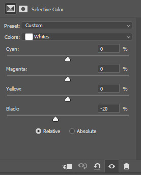
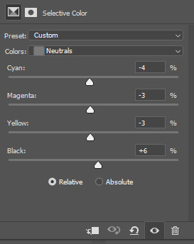
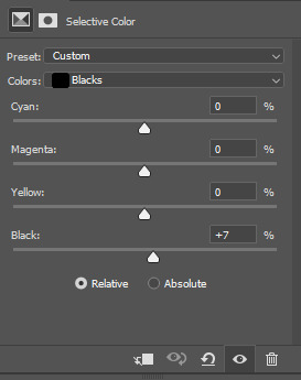
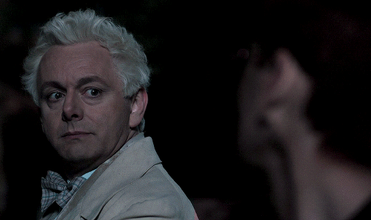
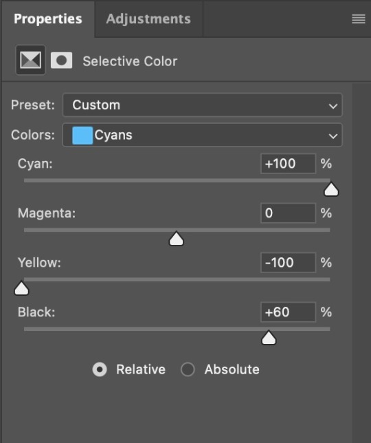
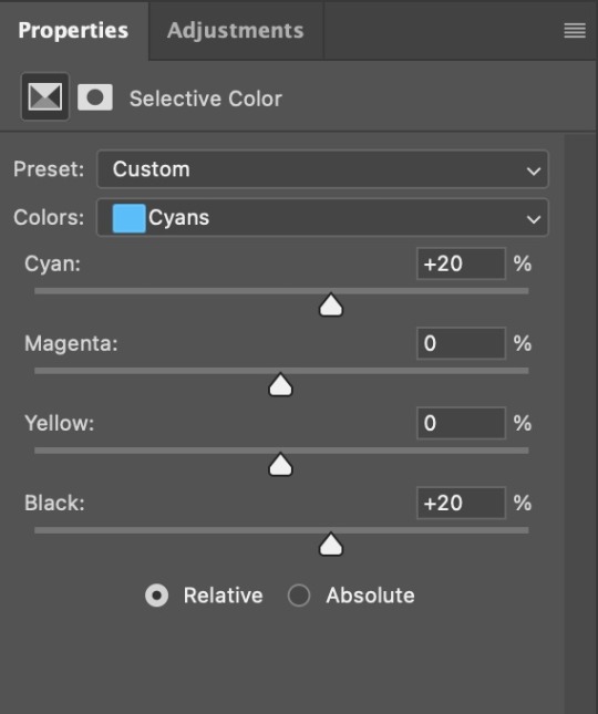
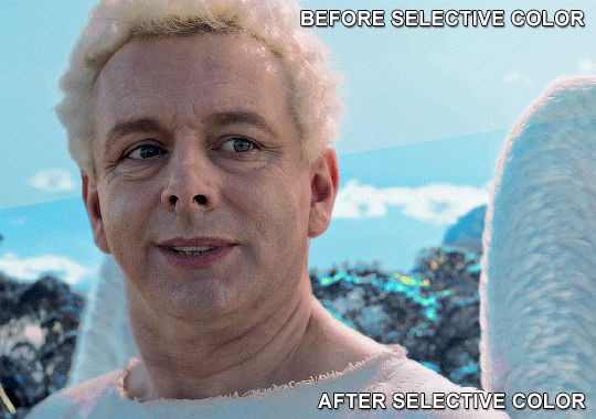
4. Once my background looks the colour I want it, I might add a Selective Color layer that matches my background color and then try to make it look more vibrant. For this Aziraphale gif below for example, I’ve selected the Cyans and then set Cyan to +100%, Yellow to -100% and Black to +60, then created another one, selected the Cyans again and then set Cyan to +20 and Black to +20.
5. If the gif has a white area, I create a Solid Color layer with a colour that matches the rest of the background and then set the Opacity low. I might also create a Selective Color layer, increase the Black and then play around with the colours.
IV. FINISHING TOUCHES
I create a Vibrance layer and set the Vibrance to around +30 and the Saturation to about +5.
I create a black and white Gradient Map layer (with black on the left end of the spectrum and white on the right), set the blending to Luminosity and the Opacity to about 20-30%.
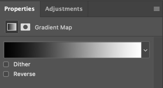
AAAND that’s about it I think! This ended up way too long and perhaps a little incoherent. I tried to make it as general as possible, so you might have to mix and match for best results. Feel free to ask me for further explanations about any one of these steps, and please tell me if you want me to go through the colouring of a specific gifset (although, as I said, I'm by no means an expert). Happy gifmaking!
268 notes
·
View notes
Text

20+ icons by palesources
200x200px
like/reblog if using
find them here
26 notes
·
View notes
Text
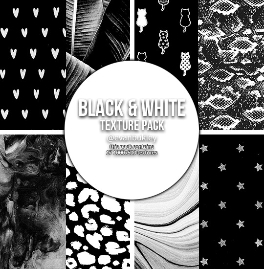
black & white textures
17 large textures // 1000x500
textures in the preview are all from the pack
please do not edit or claim as your own
credit is appreciated, but not required
download // deviant
if you download them please reblog/like!
hope you like them (⊃。•́‿•̀。)⊃
155 notes
·
View notes