
amalas-tutorial-and-inspiration
Some Tutorials and Inspiration no one asked for
Hey Ho, Amalas here ( main: amalasdraws.tumblr.com).
This is a little blog where I will post tutorials, references and things that inspire me. If you would like to know anything just hit me up. Maybe I can help!
IF YOU LIKE WHAT I DO PLEASE CONSIDER SUPPORTING ME ON PATREON OR KO-FI
THANK YOU!
67 posts
Don't wanna be here? Send us removal request.
Last Seen Blogs


madeonearthnyc
MOE NYC

kaiyaru-art
Let's Get Extreme!

lilithmh
Lilith H. School

ratseverywhere
มาร์กซิสต์
Text
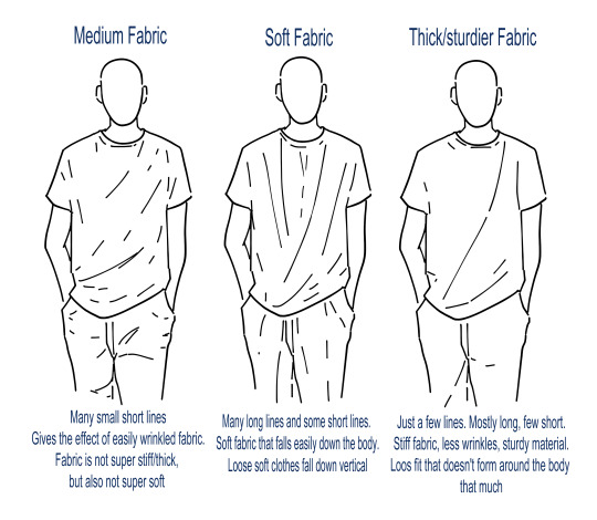

Got asked about difference in folds for different fabrics.
This is a very simplified break down, as a lot depends on the cut of the clothes and the actual material. It really helps to understand the cut and structure of clothing items because it defines how they sit and fall.
But here is a small example with a stiffer cotton t-shirt and a more softer cotton blend shirt.
In short:
Fewer lines = stiffer material
A lot of (vertical) lines = softer fabric.
577 notes
·
View notes
Text
Got asked about difference in folds for different fabrics.
This is a very simplified break down, as a lot depends on the cut of the clothes and the actual material. It really helps to understand the cut and structure of clothing items because it defines how they sit and fall.
But here is a small example with a stiffer cotton t-shirt and a more softer cotton blend shirt.
In short:
Fewer lines = stiffer material
A lot of (vertical) lines = softer fabric.
#fold tutorial#art show and tell#how to draw#drawing folds#how to draw folds#art tutorial#my drawings#my art
577 notes
·
View notes
Note
What tablet or device do you recommend if you're interested in getting into digital art?
To be honest anything you can afford!
Xppen has nice tablets that are def more affordable than wacom for example.
If you are just starting it doesn't have to be anything expensive and fancy. In my opinion it doesn't even have to be a screen tablet. But I think this is more personal taste and I get that some draw better with a screen tablet.
I still use my old wacom intuos which I bought in 2015 as my very first and only tablet.

It was 90€ back then. And I understand that this is not cheap, but def cheaper than a lot of other tablets out there. And I still use it :D
If you really never drawn digitally I also feel buying a used or refurbished tablet will do too. Like try out first if this is something for you. You always can upgrade later. Don't buy anything expensive and fancy if you never tried it and don't know digital is for you!
Yes, sure, there are devices that are better than others, but as with many things I feel in the end it depends on personal taste and what works for you. I know others who would struggle with my old wacom, as much as I would struggle with their expensive and great screen tablet.
It does take some time to figure out what works for you. So just start simple and have fun!
As programs I can really recommend Firealpaca. It's been some time since I used it but all of my art from 2016 to early 2019 was with Firealpaca and back then it was a free software you could just download. Not sure it still is, but I think so!
Medibang is also free or at least cheap and a good way to start.
The first program I started to draw with in 2015 was Paint Tool Sai. It wasn't free but just a $20 one time purchase. It's a good program!
Other than this I can highly recommend Clip Studio Paint, but here you have to pay. So this might be something to upgrade to later when you see that digital art is something for you. I switched to CSP in 2019
12 notes
·
View notes
Text

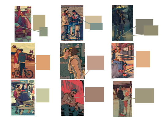
Color picking skin color without considering the surrounding colors and overall tone/mood of the art work is never a good idea!
All those colors here are used as skin tones for the SAME character in various illustrations of mine.
116 notes
·
View notes
Note
https://www.tumblr.com/bigmammallama5/732632789726478336?source=share do you have any tips on how to detect ai and deepfakes?
Good question and I'm gonna be honest, it's not always easy and it will only get harder and harder.
I'm just an artist who has spent their personal time to dive into this topic and study images. I'm still learning and there is a lot I don't know. But let me show what I know.
This will be long, but I will make a summary at the end!
So far, even with ai having become better and better there are still almost always some things wrong with an image, and they all have a very specific look to them.
So let me try to show you some and point out some of them.
As we all know, a biggest struggle ai had were hands. And even though here and there we still see messed up hands, I say "had", because the hands is actual a good example on how ai is improving and will only get better.
Still, looking at pictures that show more hands is always worth it, because somewhere in the back there will be most likely at least one messed up hand.
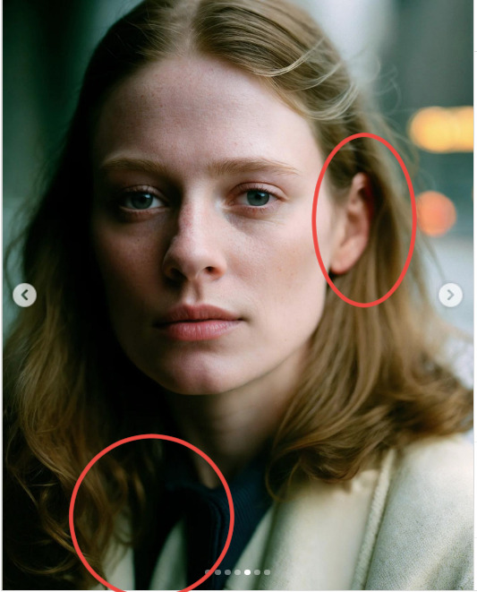
Another issue a lot of ai still has is hair though!
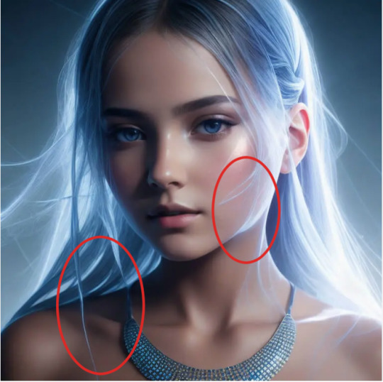
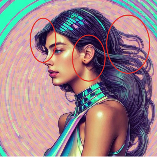

It's very obvious still in many ai "drawings" and in those otherwise well rendered portraits. Hair starts to blend with the ears a lot, or with the clothes.
There is also often this very odd look between something too sharp and way too blurry
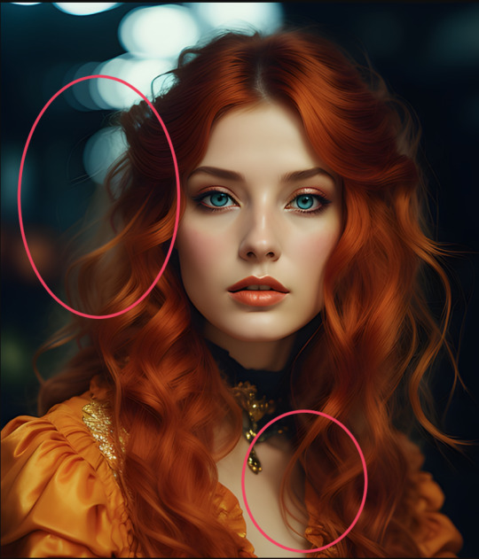
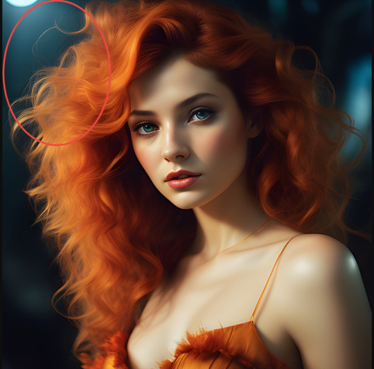

There is often a very specific texture to the hair. I actually do not know the artistic or specific name for it. I can only describe it as this weird sharp feeling that makes it look oddly pixely, and then you have areas where it's very blurry.
And the kind of loops and almost flame like looking hair we see in the last pic out of the three here is also something very common with ai.
As an artist I know we make mistakes too! The way I draw hair is flawed too! But it's not only that it's flawed here, but it's following always the same pattern and falls into the same issues over and over again, no matter who is "creating" the image. Those flame like loops are a common one, next to the odd blends and weird sharp and blurry textures.
But ai is getting better, and we not only have "art" and something that tries to be a drawing/painting, but photos too.

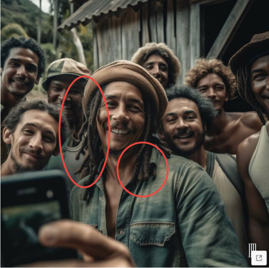
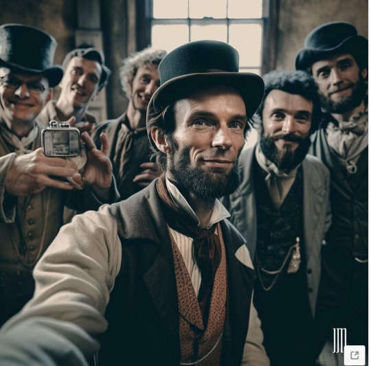

A lot of those "photos" have a very specific texture and look to them! Again, it's not always the mistakes, but the very specific optic too.
A lot of the images are oddly smooth, too rendered, with always blurry backgrounds.
And when you look closer at the background you will see the mistakes! The crowd behind Jesus is a hot mess once you look closer. Bob Marley's hair has the same issue than I described before. Lincoln is surrounded by people with messed up hands and don't even get me started on the faces behind Caesar.
So a lot of ai images look alright on a first and quick glance, but as more time you spend with them, as more mistakes you will notice. The wehre is Waldo of ai horror.
And those "photos" shared here are still very obvious. Not just the mistakes and messed up details but the very specific aesthetic too.
Those images get better and better and as less details you have, as less mistakes you have!
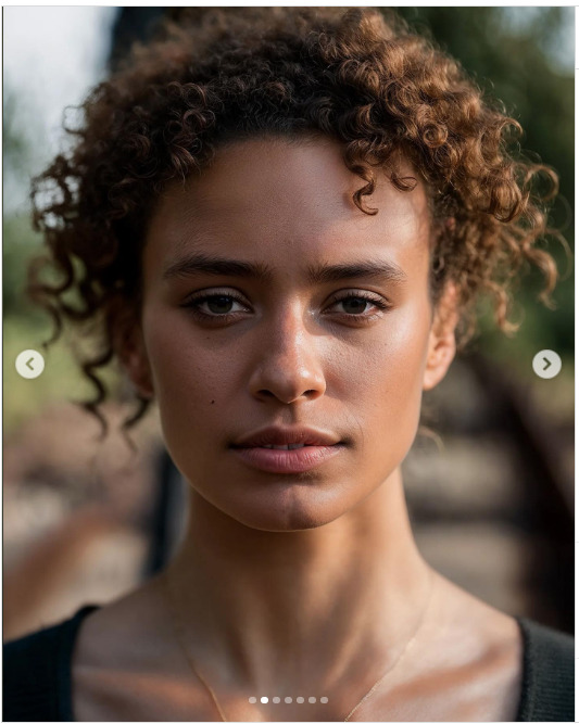

With photos like this it becomes harder and harder. There are not many details and no hands. Not many mistakes can be made. Also the very obvious plastic looking smoothness isn't so much here anymore. It kinda still is...but differently. And always the blurry background!!
Sometimes the hair is still a giveaway.
Collars and clothe straps are also often still a giveaway upon close look. As is jewelry. Earrings will be different and necklaces often don't go all the way around, just end, or blend with the hair or clothes.
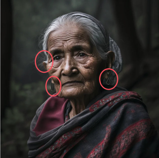

Often details on jewelry is also blurry and not shown properly.
This is a trick with many details. With jewelry, batches, hair, ears, text. So it's often blurred out and not shown properly because ai doesn't know what to really show here.


It's often really just the small details and when we scroll down quickly we will miss them. Like the wedding ring on the middle finger, the pens on top of a closed pocket, the batches that are always blurry, messed up faces that blend with a blurry background.
And sometimes it's so subtle that I could only really tell that right is the ai image in comparison to the real photo on the left.
The real photo shows hands clearly and even when things are blurred out it doesn't feel that it's done to hide things. The ai image on the right hides the hands. There is also a very dead look in the eyes :D
And here I could only tell because the text in the back doesn't make sense. Even blurred out we should be able to make out something here

And after seeing a lot of ai images I recognize the kind of blurred out bg in combination with a very smooth and well rendered foreground/characters.
And here the only giveaway is a closer look at the backgrounds as well

To summarize it:
Ai and fake news rely on a fast living world. We are being bombarded with tons of information and messages daily and we scroll past quickly.
But the best tool, for now, in detecting ai is taking our time! Those images get better and better but so far there are still always some things off!! Especially in the background!
Hair. Often weirdly smoothed out and oddly sharp at the same time
Hair often blends with the ears or the clothes
Details are blurred out.
Jewelry doesn't match (example earrings). Details on metal often blurred out and never shown. Necklaces blend with hair or the clothes, and don't go around the neck.
Background is always blurred out.
In this blurred mess there are often hidden very messed up faces and/or hands.
A very specific smooth and yet too sharp/too rendered aesthetic combines with an always blurry bg.
Text, especialyl in the background, is not legible and doesn't make sense.
Backgrounds are often (so far) the dead giveaway. Somewhere in the back things become muddled and messed up.
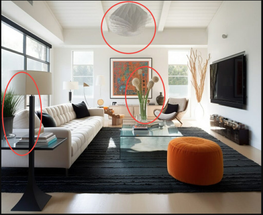
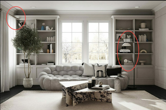
This shows also very well in ai decor/architecture.
There will be odd lines that don't align or align too well. Curtain poles that end in the furniture, a plant that is behind a lamp suddenly having leaves in front of the lamp.
As longer you look as more you will notice.
Conclusion:
Take your time with images! Sit with them! Especially when it's framed as important and political news. Is it ai and propaganda, or did it really happen?
Don't fall for the quick buzz and outrage! Some things are obvious right away but with others you have to take your time. And it's time you have!
If you are still unsure if a pic is real or not, do some research on top. Image reverse search. Can you find it anywhere else? Are other news outlets sharing it? Does the image/message make sense? For example there is now a deepfake of Bella Hadid voicing support for Israel. Ask yourself, does this make sense? If it feels out of line compared to previous behavior, do some research!
Media literacy is not just as being able to recognize a fake or real right away, but being able to do research. To question things! Don't just take every post online for face value. Even when shared by a mutual you trust. They might have been tricked!
There are so many information online and it's great to have access to so information, but it's also difficult to wade through all of it. Media and truth are a weapon and it's being twisted and bend used to manipulate. Always has! But ai and so many people being able to post and share things, it becomes bigger and bigger and more dangerous.
So don't just take everything that is handed to you and share it further no questions asked.
Media literacy and being able to think for ourselves and do the research is important!! And as research becomes harder and harder, as sources are being messed up with ai and other fake news, it's even more important to sit with the images and study them. See the flaws, the mistakes. Compare it to other news and images.
This got long, and I started to ramble at the end.
Sorry
But I hope this helped
6K notes
·
View notes
Photo
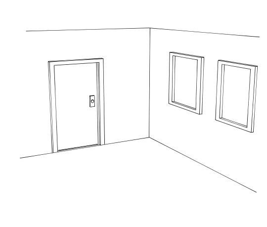
When I started to draw backgrounds and especially inside rooms, one thing that really helped me was to understand that even without furniture a room is not just a straight square room.
There are shapes, niches, corners, edges to a room and each room can have its own note.
#art tutorial#how to draw rooms#background drawing#how to draw backgrounds#art show and tell#amalasdraws
860 notes
·
View notes
Photo
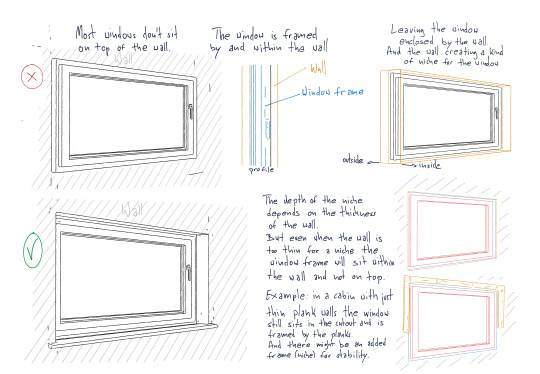


Something I see often missing in drawings is the window niche.
Simplification and stylization in art are a more than valid art form, and things don’t have to be accurate!
But if you want to draw windows more accurate to how they actually are, here is a small breakdown.
(the windows I have drawn in the breakdown are more the german and european windows I know. In the examples on picture 4 you see I’ve drawn US American windows. The structure is a bit different. But there is a window niche and the frame “hugs” the window from the outside)
927 notes
·
View notes
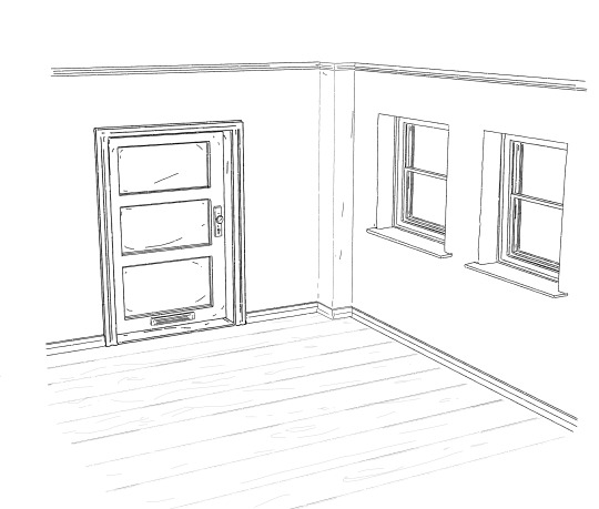
Photo
Something I see often missing in drawings is the window niche.
Simplification and stylization in art are a more than valid art form, and things don't have to be accurate!
But if you want to draw windows more accurate to how they actually are, here is a small breakdown.
(the windows I have drawn in the breakdown are more the german and european windows I know. In the examples on picture 4 you see I've drawn US American windows. The structure is a bit different. But there is a window niche and the frame "hugs" the window from the outside)
#art tutorial#how to draw#art breakdown#show and tell#how to draw windows#windows#how windows work#amalasdraws
927 notes
·
View notes
Note
How did you make a fine liner brush in firealpaca??????
Oh I didn't
I used this Marker brush, which as far as I remember came with Firealpaca. It has no pen pressure and you can even undo the button for "size via pressure" (or whatever it's called in english)
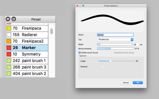
As said, I think this one came with firealpaca. I did use this but I also often used another brush I downloaded for free once (can't remember were), called flat brush. It's not really a fineliner brush but one I also really liked and used often back when I drew with firealpaca.
Tbh since around 2019 or so I'm drawing with Clip Studio Paint and this is also when I really started to use the fineliner pen and monoliner and started to do my lineart like I do now. And it's a default brush that comes with CSP. So not really sure about firealpaca.
3 notes
·
View notes
Note
YOU ARE A GIFT TO THIS WORLD. If you died tomorrow the difference you have made simply by being in this world for as long as you have, simply by being you, would and will continue resonate through people all over the world for years and years and years to come. You make me happy to call myself a human.
OMG!!! ;A; This is the most wonderful message!!

THANK YOU!!! ❤️❤️❤️
I hope you have a wonderful day!
3 notes
·
View notes
Note
Hiya! I’m a production designer working in film and even though I haven’t drawn in years your work constantly inspires me to try again bc your ROOMS AND SCENES ARE JUST SO BEAUTIFUL 😭😭
THANK YOU SO MUCH!!!
❤️❤️
I'm really glad you enjoy them! I feel blessed that they can be inspirational!!
4 notes
·
View notes
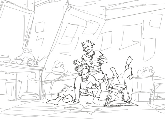
Photo
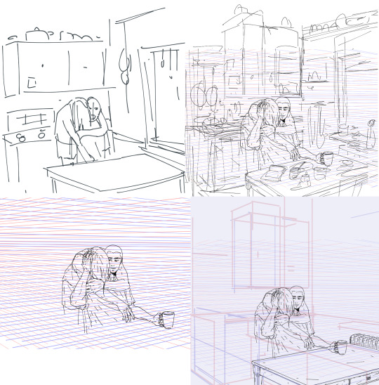


First real rough idea sketch > more clean sketch > clean the characters > add lots of perspective lines to map out the space > draw the surfaces > details > block out charas in one color > color canvas in mood color > coloring > add light > adjustment layers
365 notes
·
View notes
Note
Hello Amalas! I love your artworks coz they're so detailed and you can even make clutter look beautiful. I'd like to ask: what reference do you use for the background? Do you go outside and take pictures or sketch here and there? Do you use photo books? Internet? Coz everytime i look at your artworks in a bigger screen, it makes me feel like i'm transported to the place-- like i'm a passer-by or a fellow diner watching your character a few steps or tables away from where i am.
Awww thank you!!
Okay
This is gonna be a bit longer
It’s a mix of a lot of things and a lot of the things around me. I not only love to draw cluttered places, but I also always kinda lived in lovely cluttered places. So a lot of inspiration is just taken from the things around me, my own memories, and the things I like.
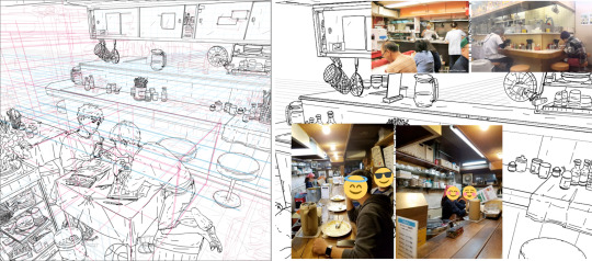
My latest pic for example is something that is created by just an idea I have of a kitchen, based on things I know and things I’ve seen. I didn’t have a specific reference here.
I mostly always start with my characters and then very roughly sketch the room I have in mind around them.
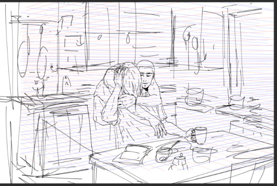
And based on this I create my perspective lines and map out the space a bit clearer. Measure my distance with the perspective lines and create my surfaces.

And then I go into lineart. First for the surface only.

And when I have all my surfaces I only then go into my detailed clutter and add it all over time.
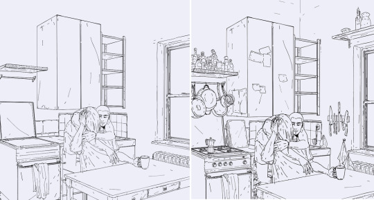
As said, this kitchen was fully made up and only really got shaped into form on my canvas.But I for example have a gas stove and one of those espresso cans at home, so just a quick walk into my kitchen allows me to look up certain items if I’m unsure how they look.
But there are also a couple of items by now that I have stored in my own personal mental library. When you look at my pieces closely there are a bunch of items that I have in several of them. Poles, electric cables, a certain type of window, stacked bowls and cups, soda cans, etc
And those are all items that I can draw by now without any reference.
And then there are some new items that I have to look up, so I mostly just do a quick google search to get an idea on how they look.
For example this bedroom piece was created like the kitchen above and just based on an idea I had in mind, rooms I knew or saw somewhere and then just created out of my head.
I started with a rough sketch
And then continued the same way as with the kitchen piece.
But here I had some very typical late 90s items in mind, and as I could draw the bed, room, window, and some small details just out of my head, there were a couple of items I looked up on google to get the right look for them!

So I created a small library from pics I found on google and just put them on the side of my pic to have them as a ref.It doesn’t have to be a perfect ref. Just a good enough pic to give me an idea of how an item looks like.
Sometimes I have an idea of a room but want something specific and it should look more or less authentic so I go on a google search for similar places.I still like to create my own version but I look at certain structures and items that those places have and try to incorporate them into my piece
Like with this one for example. I just used some photos from google that gave me a good idea of a place like this.
Many of those items are still chosen from my mental library, but I also have some things I look up and some loose references.
Keep in mind that I’m doing this for some time now! And I build up my mental library and how I want to draw things over time! This is not something that comes over night. It takes time! And it comes by repeating things and drawing them over and over.
I also love to take photos and when I visit new places or see something I like I take photos. One because I love to take photos, but also as a future ref. And some of those photos I use as loose refs as in the examples above. And sometimes I even pretty much just redraw them. Because I really like the structure, or want that specific look or even specific place!
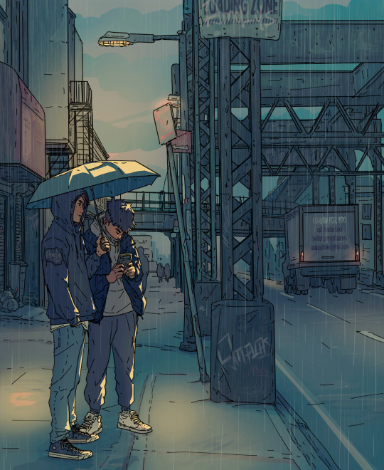
For example I took this photo when I was in New York and as the Aran and Tao story takes place in New York I really wanted to create a place like this! A structure and street similar to the photo.
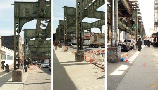
And as you can see especially the train structure and street look is something I used for this drawing here
So long answer short
It’s a mix of things!I have a good mental library by now, I like to draw the things I know and the things around me, and when I go for a certain city, or street look I like to work based on photos I took by myself and use them as refs.
And taking photos also helped me a lot with my background drawings. It gave me an idea of how my irl 3d street view looks on a 2d photo, an idea for lines and angles, what works and what not, and what to look for in backgrounds, what I like in city scenes, and what I want to create.
Google photos can be helpful refs, but I like to use them more loosely to only give my brain a reminder again on how a certain item or space looks like.
When I really redraw something or stay close to my ref I like to take my own ref photo, so all is my work.
323 notes
·
View notes
Photo

I updated an old shoe tutorial I did and changed it a bit for the better.
This is just a basic break down, but it still helps me a lot when drawing shoes.
338 notes
·
View notes
Photo
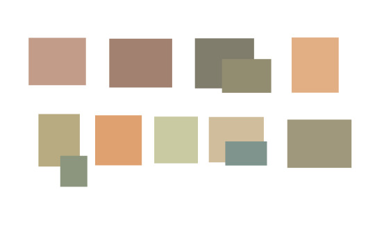
All these colors are used as variations of white in different drawings of mine.
And this is why color picking won’t work if you don’t understand colors and how they work in relation to each other.
Even though non of those colors are white when they stand alone, within my artwork we register them as white because they work in their surrounding.
1K notes
·
View notes
Photo
All these colors are used as variations of white in different drawings of mine.
And this is why color picking won't work if you don't understand colors and how they work in relation to each other.
Even though non of those colors are white when they stand alone, within my artwork we register them as white because they work in their surrounding.
1K notes
·
View notes
Photo
I updated an old shoe tutorial I did and changed it a bit for the better.
This is just a basic break down, but it still helps me a lot when drawing shoes.
338 notes
·
View notes