amandajespersenholm
I'm posting stuff
Amanda J. Holm - freelance animatoramandaholm.strikingly.com
98 posts
Don't wanna be here? Send us removal request.
Last Seen Blogs

v-a-p-o-r-s-m-u-t
V A P O R S M U T

bussnisblog-blog
Untitled

popeyerus
PopEyeRus

cullen-isms
l i o n h e a r t .
bettsfic
great writers on the same dreadful typewriter
Text
What?! Is that a new post? :O
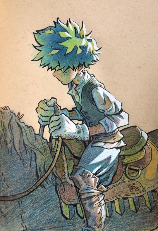
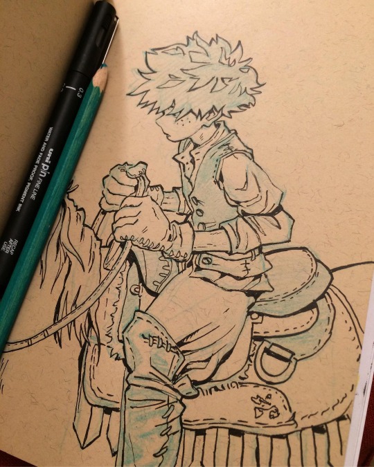
Well, I keep forgetting to simply just post stuff, but thought I would put this up (with the new upcoming season in mind and everything)
I miss horseback riding so much
#deku#izuku midoriya#bnha#mha#fanart#bnha fantasy au#colorpencil#sketcbook#traditional art#pencil drawing#my hero academia#i’ve been binging this series the last month an a half#haven’t seen that kind of anime for years#art#drawing#horseback riding
1K notes
·
View notes
Text

Not sure why but drew her again
#the legend of korra#korra#art#drawing#character design#procreate#bending#tlok#tlok fanart#im still amazed how quick it is to change and experiment with digital colouring#atleast compared to traditional art#pencil sketches takes FOREVER while this is a flick of the wrist#artists on tumblr#sketch#digital art
4K notes
·
View notes
Text

Just korra being korra.
Check my Insta for some wip pictures 🌸👍
#korra#the legend of korra#tlok#avatar: tlok#drawing#art#procreate#digital art#character design#i know it looks like she has been electrocuted with that hair#perhaps she has been#badass#girl#fanart#the animation in this show is purr magic#at least with studio mir#<3#artists on tumblr#character#a#amanda jespersen holm
271 notes
·
View notes
Text

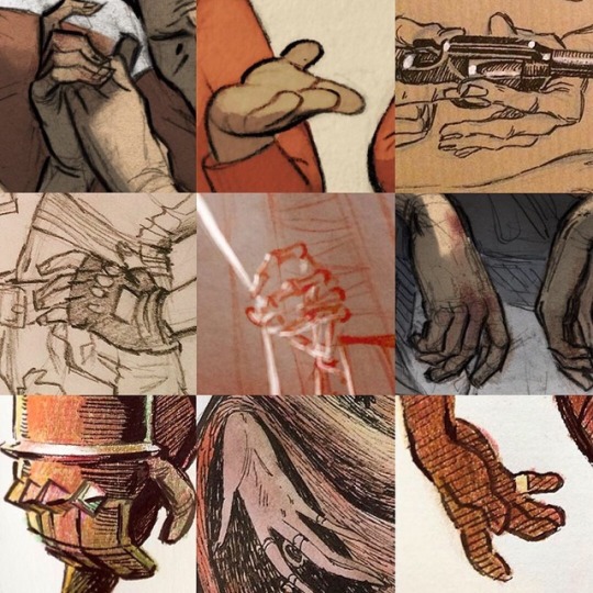
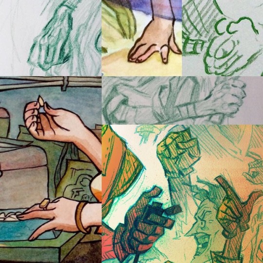
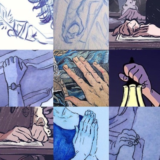
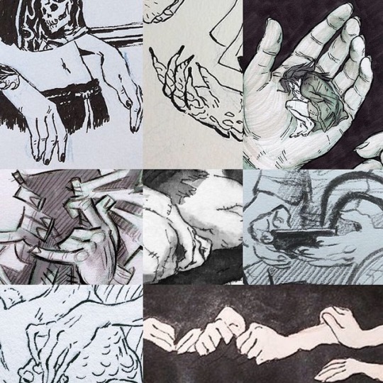
I like drawing hands... like... a lot. So made a compilation of some! why make new art when you can post old stuff
#hands#hand#art#drawing#compilation#traditional art#digital art#anatomy#fingers#look I even separated them in colors#because gradients#amandajespersenholm#amanda jespersen holm#hand drawings#i really like gradients#and hands
2K notes
·
View notes
Text

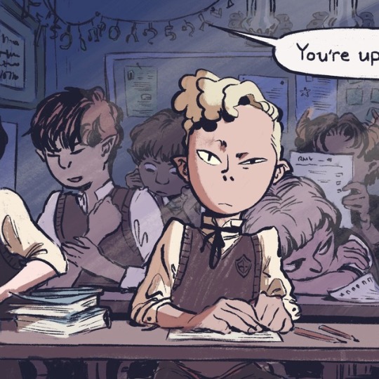

Trying to mix my Instagram and tumblr work, so I can post a bit more on both! Here’s a tryout of another fake comic panel, exploring the powers of digital technology with procreate. The light (and colors) are inspired of the work of @paticmak <3
I ended up finding the background characters much more interesting haha.. hope you like this one!
#drawing#art#character design#comic#procreate#comic panel#light#background#i’m trying#digital art#digital coloring#character#tryout#school#student#classroom#yes that guy in the bg has horns
154 notes
·
View notes
Text
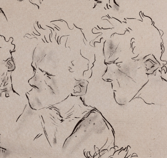


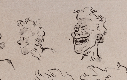
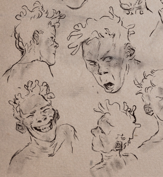
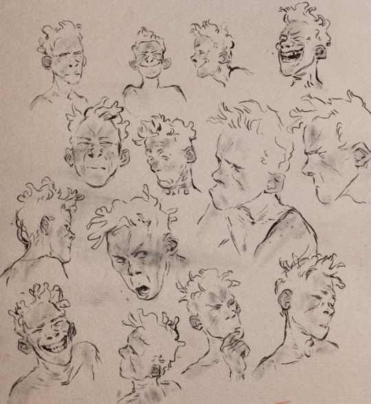
Boy sketches ~
#sketch#art#artwork#ginger boy#emotions#emotions everywhere#character design#drawing#procreate#digital art#yes it’s just pretend paper texture#sry#character sheet#amanda jespersen holm
678 notes
·
View notes
Text
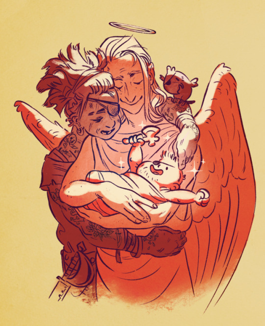
Mmm I just watched the avengers: infinity war, and I can only think of this pair..
#thor#avengers#avengers: infinity war#thors actual parents#it’s canon#art#procreate#digital art#artists on tumblr#character design#pirate mom#angel dad#BEAUTY BOY#baby#pirate#angel#drawing#cute#i never loved how odin turned out either way so this is fine by me#parenting#parents#family#he was kidnapped by odin as a kid you know#amandajespersenholm#amanda jespersen holm#and yes I know I’m the last person on earth to have seen this film
187 notes
·
View notes
Text

I happened to get an urge of drawing Norwegian sweaters
#If Johnny Depp and my dad had a depressed love child this would be the guy.#procreate#art#digital art#sweater#norwegian sweater#look at that pained expression#buhu it’s so tough to be a pretty model#character design#character#fashion#knit#knitwear#drawing#artists on tumblr#sketch#amandajespersenholm
354 notes
·
View notes
Text
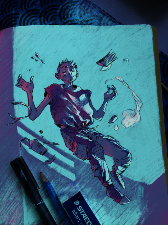
Eiffel sketch colored in Procreate...
Check out the Instagram link below to see a playback of the coloring:
#procreate#art#wolf 359#doug eiffel#sketchbook#digital coloring#colorful#space#floating#bliss#light#artwork#character design#look at that stupid smile#fanart#digital art
134 notes
·
View notes
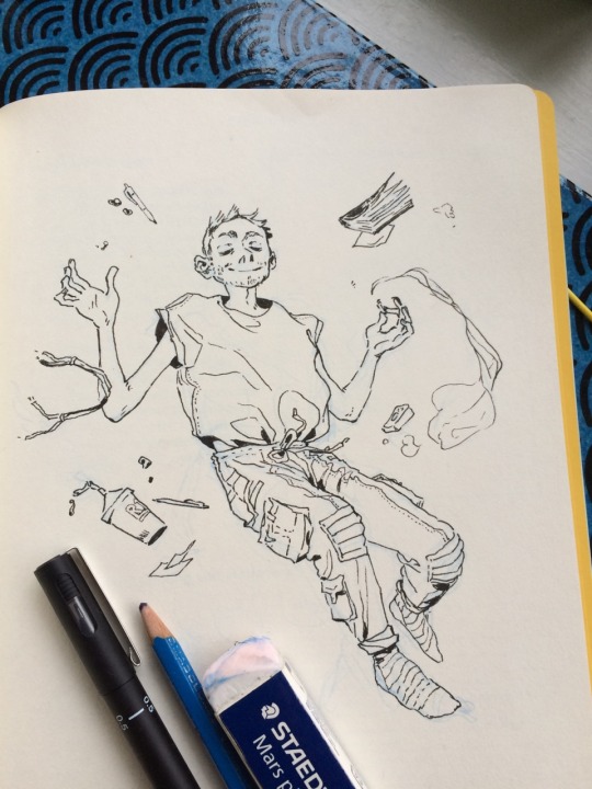
Text


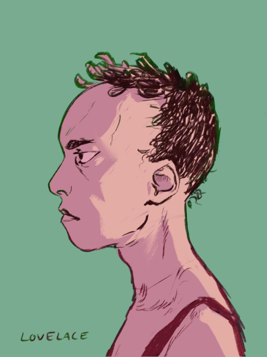
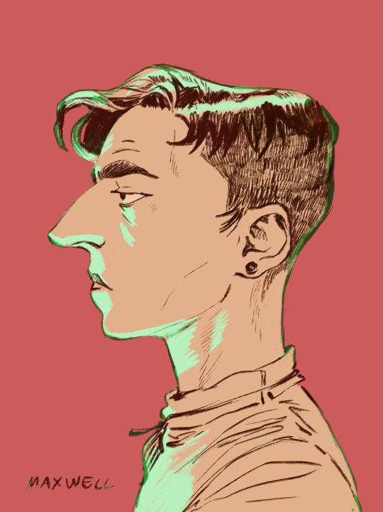

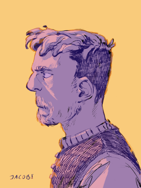
My first post with procreate <3 I love this program... And this podcast... a bit more realistic take on the main cast from Wolf 359. I have a bunch of more stylized sketches I hope to post soon, but these will do for now
#wolf 359#procreate#digital art#doug eiffel#alexander hilbert#warren kepler#daniel jacobi#isabel lovelace#renee minkowski#alana maxwell#art#drawing#artists on tumblr#amandajespersenholm#character design#sketch#character#fanart#profile picture#colorful#realistic#artwork#also they are not wearing space-suits here so lets say these are earth outfits#also I know hilbert is bald but I SEE HIM WITH HAIR
602 notes
·
View notes
Video
vimeo
Me and my roomies did this silly little thing for something called Loopdeloop... (people can submit anything animated as long as: 1) it loops 2) follows the selected theme, this time being “shoes”!)
We even won at the screening in London yay
@louiebonbon did the storyboard, sound and edit, Ditte Wad did design, backgrounds and compositing while I did the animation ;)
#animation#2d animation#silly#loopdeloop#shoes#kinda blonde#yep that’s our “studio” name haha..#tvpaint#fashion#trendy#funny#sweet#priorities in the right place#shine#spinning shoes in 3D are sooo much fun to animate#especially really detailed shoes#super fun#sparkle#anime style#stylized animation#simplified animation#simple animation#film#loop#shortfilm
207 notes
·
View notes
Note
Hey, your timing and spacing is insanely good; would you have any pointers about time charts? I seem to always fumble on those.
Thanks for the compliment! Warms my tiny heart...
I actually rarely use charts while I’m animating, as I always retime the whole thing back and fourth until the end. (As an example my Joker animation are closer to having 400-500 frames compared to the 300 in the rough not-very-updated charts)
The charts are often added later to help a cleanup artist and/or inbetweener figuring out the intended spacing for the moment.
However, they can be super handy to have as a tool on the side, and a good practice as to figure out the spacing between keys, so definitely try to use them. Just don’t worry about the numbers too much..
Tbh I often add them mainly because it looks nice... hehe... eeh. Though also for practical reasons.. of course.. ehm
My general advise is to overall keep your inbetweens and breakdowns CLOSE to the key. If you want to keep it snappy, favour the ease ins/outs close to the key drawing. A lot of new animators (me included) tend to have everything too smooth and floaty as they overanalize/explain the moment inbetween.. just keep it simple and snappy. That’s one advise at least ^^
Step though the animations you feel look nice and see how it works..
44 notes
·
View notes
Text

I didn’t feel like drawing legs this time.
Done with watercolor and black ink
#watercolor art#drawing#art#artists on tumblr#amandajespersenholm#character design#sketch#character#traditional art#girl#accesories#omnious#black flower#cool#cool look#fashion#sketchbook#woman#asian#original character#the flower thing looks like something from stranger things#kinda creepy
117 notes
·
View notes
Text
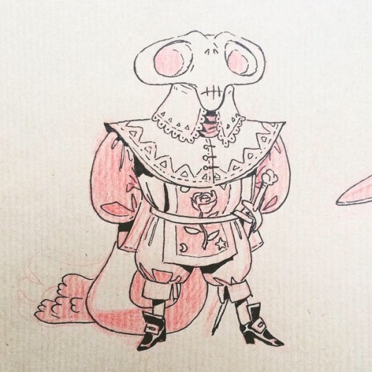
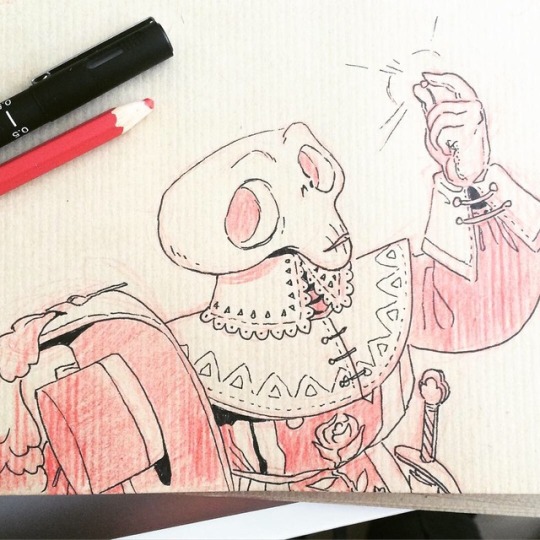

Tiny skeleton musketeer
#art#drawing#artists on tumblr#character design#sketch#pencil#character#sketchbook#traditional art#skeleton#musketeer#amandajespersenholm#cute#skull#skull head#gentleman#oldfashioned#artwork#ink#brown paper
1K notes
·
View notes
Text


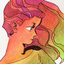
Here are some colorful pencil drawings.
Drawn so many gals recently.. might upload some more later
#art#drawing#artists on tumblr#character design#sketch#pencil#character#sketchbook#traditional art#amandajespersenholm#colored pencil#stylized#women#woman#gradient#colorful#profile picture#amanda jespersen holm#artwork#hair gradient#I’m so bad at updating my tumblr as usual#check out my instagram instead things are actually happening there
191 notes
·
View notes
Text
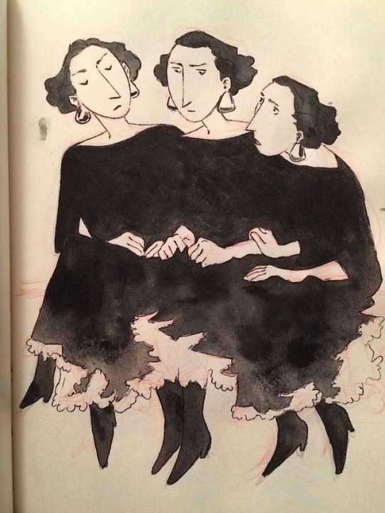
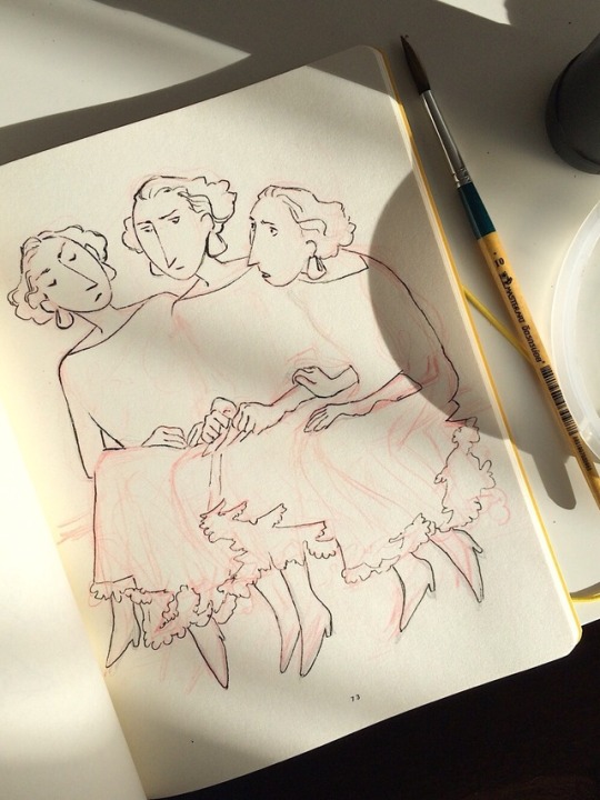
Still trying to figure out how this inking thing works
(Aaaand if you have a keen eye you might recognize this character from a previous post...)
#art#drawing#ink#black#sketchbook#artists on tumblr#character design#sketch#pencil#character#traditional art#inking#amandajespersenholm#girls#sisters#victorian fashion#old fashioned#worry#there is THREE of them somehow#triplets#amanda jespersen holm#I’m basically just posting things from my insta
1K notes
·
View notes
Text
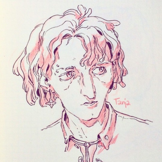
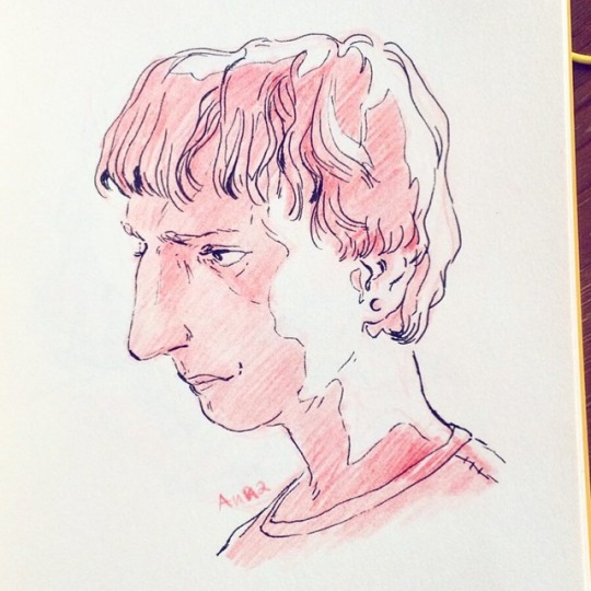
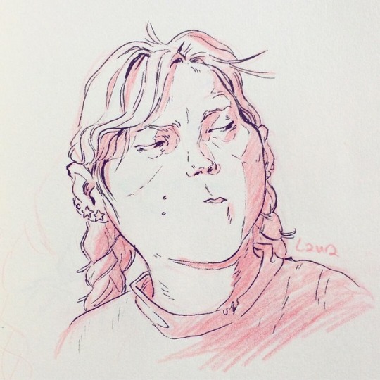
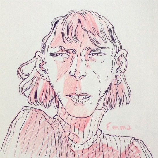
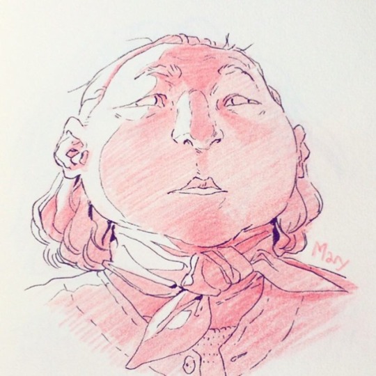
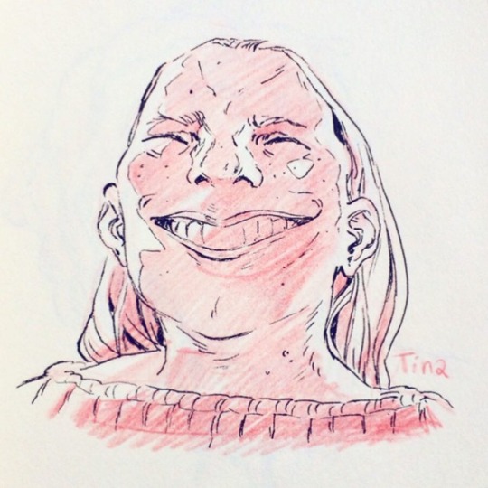
Some character sketches.. of ladies
Let’s see if I can hashtag correctly this time
#drawing#character#character design#art#sketchbook#sketch#red pencil sketch#ink#artists on tumblr#woman#women#girl#head#design#amanda jespersen holm#which one is your favorite?#comic book style#traditional art#pencil art#pencil#artwork
3K notes
·
View notes