
Last Seen Blogs

svetmaste-blog
Najlepse se smeju tuzni
ontheduckside
너에게 날아갈래

magicpony45
Magic

aoiabyss
Aoi Abyss🌼

karakara-atmosphere
KaraKara's Atmosphere
Text
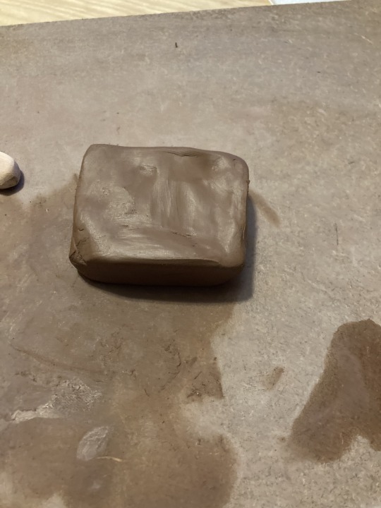
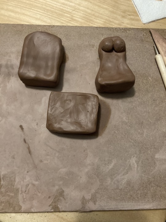
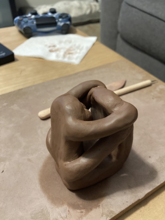
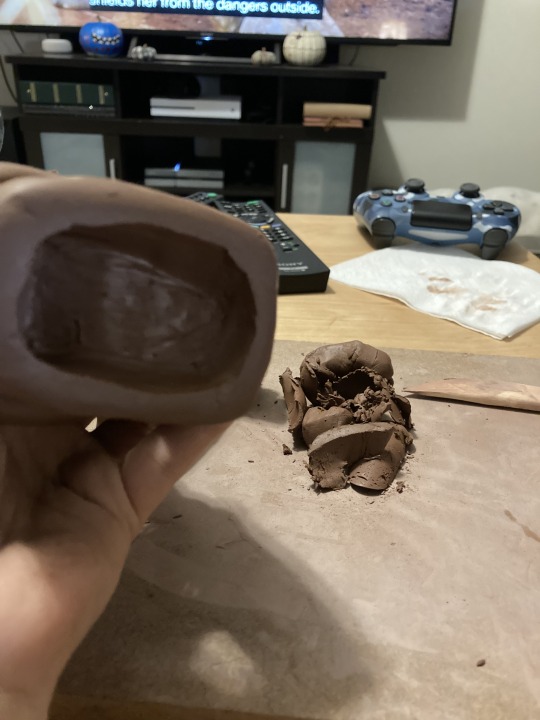
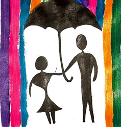
Final Project
Title- Intertwined Couple
Medium- Terracotta Clay
Step 1- wedge clay to work out any bubbles

Step 2- make the base
step 3- make simple busts of a man and woman
Step 4- score and slip the busts onto the base
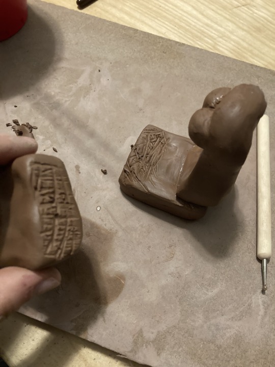
step 5- smooth over the seams to make a unified sculpture
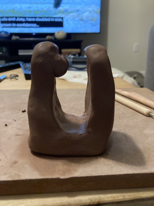
step 6- make coils for the arms, add the males arms first and attach
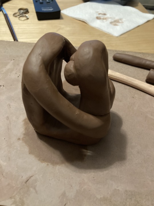
step 7- attach females arms
step 8- make round balls for their heads and attach them and have them touching

step 9- hallow out the bottom to ensure there are no bubbles so the piece can be fired with low probability of exploding
This piece is of two people in love holding each other so close that they look as if they are one. They resemble the affection that is between them and the close and honest relationship they have. Viewers should be able to look at this and either see their own relationship in it or think about the future relationship to be had.
0 notes
Text
Virtual Sketchbook #3

Artist- Joseph Wright of Derby
Title- Moonlight Landscape
Date- 1785
Medium- oil on canvas
Dimension- the painting: 24 5/8in x 39 3/4in the frame: 32 7/8in. x 37 5/8in. x 1 15/16in.
This piece, created by Joseph Wright of Derby, playfully uses light coming from the moon that is hidden behind the bridge. As viewers, we know that the moon would only be behind the bridge for a brief moment in time which gives specific ambiance, contrast, and shadows that are cast on the trees and people around the bridge. The graduation of light from the center helps show the distance of each aspect of the painting from the emphasized bridge in the left middle of the painting, parts that are farther away have a darker shadow and are almost unrecognizable because of the shade, closer parts are lighter and are easier recognized. The painting is made with cool colors of blues, greens, and light browns. The people are wearing brighter colors to be more easily detected and drawn to by the viewers. In the distance, under the bridge, there is a building that the viewer is drawn to because of an implied line from the point of view of the person below the bride. The painting itself is balanced with the huge tree in the right foreground balancing out the focus on the bridge, the person on the bridge is balanced by the light post behind them, and the building in the distance is balanced by the person and his small boat or basket under the bridge. This artwork makes me feel safe and like I need to go for a late-night walk by a stream because places like this allow me to think and truly be myself. It makes me feel as if I am right there in the painting, feeling the cool air and listening to the rustling leaves and the moving water, in a relaxing and calm state of mind.
Wright often played with the different characteristics of light in his pieces; artificial light, natural light, and shadows became major aspects of his works. The industrial revolution was in full effect when Wright had painted this piece, with poorly lit factories being the main source of employment at the time. Since he lived during that time he often painted work environments involving industrial laborers; his collection of "men at work" were favored by the nobles of the time, including Lord Melbourne, Prime minister of the U.K., and Catherine the Great of Russia.
In the piece, Moonlight Landscape, Wright uses contrast from the light of the moon and the dark of the night to create an eerie atmosphere. In person, you can see the texture of the water and how the light hits the higher points of the water, giving it a life-like quality of how light falls onto everyday objects. The lines are soft and blur between different parts and there are implied lines that force viewers to see the whole piece. Wright painted this in search of truthful observation of the natural world and the differences it holds in its natural events. Using his knowledge of light and night he created a sophisticated landscape with great contrast that draws in the attention of viewers with the work of light and realistic qualities.
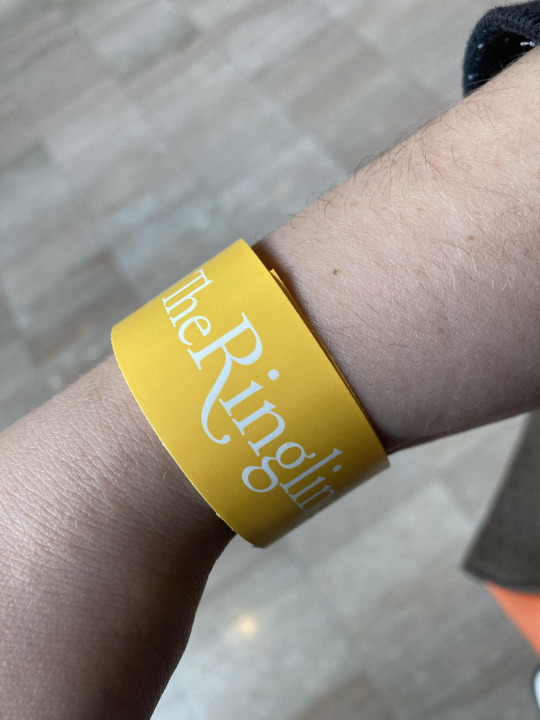
I went to the Ringling Museum on November 5th and this is the wrist band they gave me.
0 notes
Text
Virtual Sketchbook #2
1. Principles of Design
Unity- similarities throughout, not entirely the same elements but similar
there is a wall in my house that only has family pictures on it, none of the frames are the same sizes but all of them have family in them
Variety- having different elements throughout, not many similarities
Balance- the way elements are laid out which creates a sense of evenness throughout, can by completely symmetrical with both side identical or asymmetrical with different elements balancing each other
I keep a balance in my life between school work and me time, if there is more school work that is down than time I make for myself my life is unbalanced and stress overloads me and makes it difficult to get my schoolwork done
Emphasis- when something draws the attention away from everything it is emphasized, it is different from everything around it and stands out
Subordination- when something has a lesser importance then something immediately around it, can be shown by shown size, color, or placement
Directional forces- aspects of an artwork that guides the viewers attention to different elements of the piece

Repetition- when a certain element is shown over and over again throughout, can be multiple different elements with repeat making a pattern
I am a person of repetition, every week I drink out of the same coffee cups, everyday I start my homework when I wake up take small break in between to tend to my daughter, I eat lunch around 1pm everyday and then dinner around 6pm, I put my daughter to bed around 8:30pm and then do my work until my significant other comes home and then spend time with him, then wake up and do it over again
Rhythm- the repetition of the same elements throughout a piece, whether it is dominant elements or background elements
Scale- the size of a piece compared to something next to it
Proportion- the sizes of different elements within a piece itself
2. Charles Demuth, “I Saw the Figure 5 in Gold”
In this piece there are several different principles of design in the composition. He unifies the piece with the large number 5. There are a variety of different colors that is also repeated different times throughout and the number 5 is also repeated in the piece which gives it rhythm. The large size of the biggest 5 is being emphasized the most. The piece is asymmetrical yet each aspect is balanced. Also, the diagonal lines provide a strong directional force in the piece, drawing the viewers eyes all around the piece.
3. Colors of life
One day that I will never forget is the service that was held for my mom. My mom hated black. There was not one thing in her life that was dominated by black. When we held her service we had asked everyone attending to not wear the normal black clothing that you would wear to a funeral because that is not what my mom would have liked. Everyone that day came in beautifully colored clothing which perfectly portrayed my mom as a person. Even though it was one of the worst days of my life, I am glad that I do not have the memory of it associated with black.
If I was to choose a color scheme for my life it would be blue. Blue has always been one of my favorite colors and it is a big part of everyone’s life because it is the color of the sky. I also love the water and going to the beach or pool and blues dominate those scenes.
4. Art Project
5. Design Layouts
Bad Design Layout

Good Design Layout

A good design has a message that is easily understood. It it not overcomplicated that a viewer has to stare at it in order to receive the intended message. The good design layout example above is intended to show that the production shown has been hand produced. They present this by having two block hands that come together like producers and photographers will do when looking for a perfect scene and they also form a piece of film. This design fulfills its purpose of telling the audience that the production was “handmade” with a logo that is easily understood and does not have an overabundance of things in it that would overcrowd the viewers perception.
0 notes
Text
Virtual Sketchbook #1
1. #28. Shahzia Sikander 1997 Hood’s Red Rider #2. Vegetable color, dry pigment, watercolor, tea on hand-prepared Wasli paper, 10 1/8” x 7 1/8”
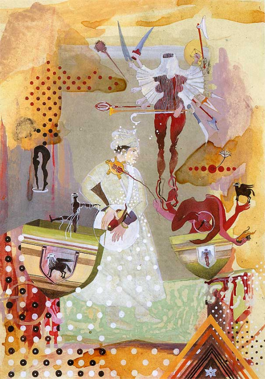
A. The first things I noticed about this piece of art are the number of things happening in the piece, it made me feel a little overwhelmed at first glance. I also noticed the use of muted colors along with some bright red. It seems as if the woman in the middle has taken on the many duties shown around her, some of which are not typically a woman's job.
B. Five facts about Shahzia Sikander or Hood’s Red Rider II
Shahzia Sikander has done 25 solo exhibitions with the first being in 1992 and the most recent in 2020 having almost 1 every year.
Three of her artworks have been publically displayed; Gopi Contagion in Times Square 2015, Disruptions as Rapture in a museum in Toronto, Canada in 2016, and Mary-Am in a park in Houston, Texas.
Being born in Pakistan, her first works were of traditional miniature paintings with her award-winning piece The Scroll having launched her career as an artist.
This piece was one of her early works that represents the human cross-cultural experience. The different aspects throughout the piece are different representations of Sikander's culture such as the turtle on cinderella's shoulder symbolizing heaven.
In the very middle of the piece is prince charming holding cinderella's slipper as a powerful reimagined red riding hood above takes control, this is Sikander's reimagined storybooks with female protagonists
C. Did the way you think about the art change from the first time you looked at it? Do you see anything different in the art now?
After doing some research on the artist and the piece itself, my thoughts about the piece have changed. I now see that the abundance of different aspects of the artwork is all playing a part to tell a bigger story. That story being the reimagined roles in storybooks as protagonistic women. In an attempt to represent these women as confident and intelligent, unlike the original and typical stories in fairytales told to little kids.
2.

This is a piece of aboriginal artwork that I had purchased from a native Aboriginal at the Sunday market while I lived in Alice Springs, Australia. The artist while unknown, used traditional painting techniques and symbolism to the Aboriginal culture making this a piece of folk art, typically on canvas. They use of different colored dots around the snake in the middle gives balance to the piece as well contrast. The snake often represents strength and continuity in Aboriginal art and story telling making this piece a symbol of strength for the unknown artist. I really enjoy looking at this small piece because it tells a story as well as having great balance and unity.
3. I am a 20 year old female who has moved a total of 7 different times and lived in 5 different places throughout my life. I am a little white and a little Hispanic. Right now I enjoy making things out of ceramics and painting in my little free time. I am not a member of any organized group and I do not have a job as I am a full-time student and raising my 3 month old daughter. I am a very caring and supportive person who can be outgoing at times but mainly introverted who loves being outside with nature and admiring the worlds beauty.
4.

2 notes
·
View notes