ben-sinclair-ia
- BEN SINCLAIR - Illustration Animation
53 posts
Don't wanna be here? Send us removal request.
Last Seen Blogs

happysanztech-blog
Digital marketing
celebrity-meme
Celebrity AU'S/IMAGINES
cutechan555
Your average blog

fr8war
Untitled
drjosefinamonasterio
Developing And Perfecting
Link
The Progression of my Animated Documentary
After months of work, my animated documentary is very nearly complete! The main bulk of animation is now finished and after some feedback I just need to iron some things out. This project has been hugely beneficial to me, as whilst this first year in Illustration Animation has been very beneficial, I was really hoping to fully finish an idea. I think the main two main practices I have improved on with this piece is sound design and pacing. Although the pacing of the film is still not completely fluent, I have certainly improved my ability in this aspect. I’ve realised that sound design heavily influences this pacing, as even if you had very little animation in one scene, the sounds that accompany it can drastically alter its meaning and intensity. Resultantly, I have realised that the the last few scenes need to intensify in order to create a climax for the piece - at the moment it feels quite flat and anticlimatic. Moreover, with more time, I would also iron out some of the animation and improve the illustrations of some scenes. However, the greatest lesson this project has taught me is the importance of storyboarding. In hindsight, I believe that if I had planned this video further ahead and storyboarded the whole piece from the start, it would be a much greater video. At the moment, it might seem that some parts are disconnected, due to the fact that I storyboarded one section after another, rather than all at once. This way, the rise and fall of tension across the piece is quite erratic, and the overall arc of the piece is slightly lost, hence why the final few scenes might seem quite flat at the moment.
Nevertheless, this project has also taught me the power of fluent, loose animation to create tension and drama. For example, within the fox chase scenes and the rotoscoping of real footage, drawing each frame quickly and with energy created a much more impactful scene - projects such as Hold the Eye helped me with this.
I have also learnt some smaller, but equally impactful techniques, such as piecemealing text for the viewer, so that they don’t have to read lots of text all at once. This simple idea seems obvious, but creates a great difference to the flow of the animation. Additionally, more technical aspects of my practice have improved, such as using Adobe Premier, adding effects to the sound design and even choosing the correct sounds to use. Overall, this project has been hugely beneficial.
0 notes
Link
A reflection on the first ever project of the year
The very first project of this year involved recording a narrative of a character, which then became a 5 minute presentation in the form of a blog post. I decided to base my character on a busker that hangs out in the streets of my home town, Ashford - a mysterious looking man, always wearing a sombrero, even in winter. I created a short fictional narrative of his backstory and made a few illustrations and a gif to picture the story. Looking back, I’m still quite pleased with the end result of the gif - the animation itself is quite solid and reflects the ‘Ideas in Motion brief’. I am also still quite pleased with the character design, although the main improvement I can see would be to use a different medium. A stronger light source, rendered in perhaps pastels and with a background would enhance the drama of this character. The story is also very basic and limited and could use a few techniques from Jane Hankin’s story writing project.
0 notes
Photo
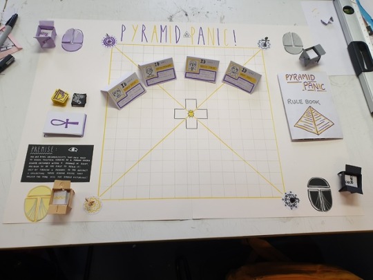

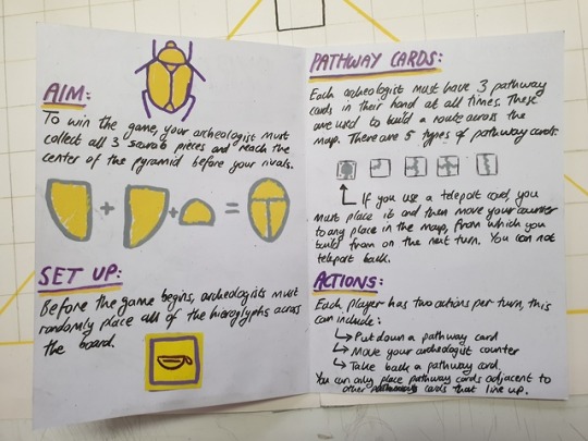
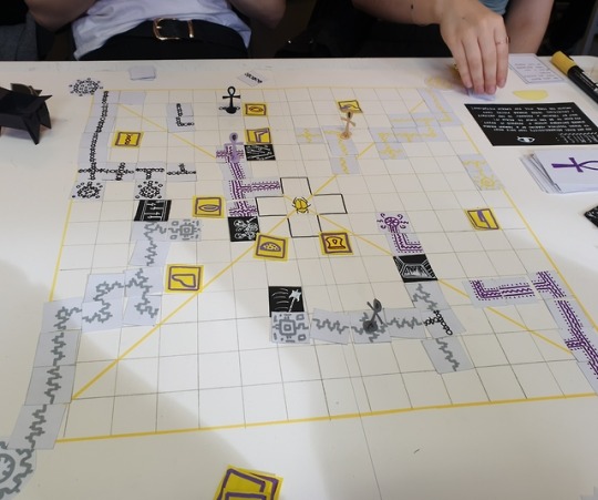
Board Game Design
The final studio project of this year involved creating a board game, which I found hugely satisfying. Viv Schwartz gave us a great deal of knowledge on the process and mechanics of making a board game, although I believe the most important advice she gave us was to be fast and spontaneous with your ideas at the beginning. Even if you believe you have a strong idea to start, it is always best to leave it to the side and create something new first.
In the end, our group came up with Pyramid Panic - a board game in which four archeologists compete to build a pathway to the centre of the pyramid in order to collect the golden scarab. The strategy of the game comes in with the pathway you create, and also the placement of trap cards to block opponents. I believe the game had real promise to it, and during testing it felt both fun and not random - there was a genuine sense of strategy and planning. To improve, I believe the ID cards (which determine your acheologist character) needed to have a greater influence on the gameplay - at the moment they only serve as part of the story. With more time, the visuals could be more fully developed, and I think extending this yellow and purple colour scheme would work very well. The visuals of ‘God Save the Queens’ by another group is a huge inspiration, as the whole board was beautifully rendered and involved 3d hand made models, which added a lot more immersion for the game.
0 notes
Link
Sound design Practise
This ten second animation was an exercise in telling a story within a small amount of time, and with one fixed viewpoint. However, it was also an exercise in using sound design, which I am beginning to develop further with my documentary animation. My documentary involves a much broader range of sounds and audio, although this one panel narrative was important to introducing me to the practise. I decided to not involve music in my documentary however, as whilst it works well here to increase tension, I have already increased tension enough with the layers of sound I have added. Adding music then made it feel forced and overwhelming. I also wanted to convey the reality of fox hunting, and thus the raw, brutal sounds that come with it needed to be as prominent as possible. This 10 second animation was also important for practising timing, not only within the animation and the action, but also with the sound - forming a rhythm that fits with the narrative.
0 notes
Photo
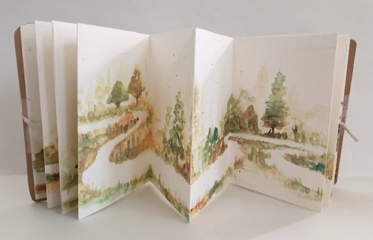
Development for Crystal Ball
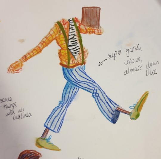
After creating a new design for this character that I am happy with, I then started to research how it could be rendered. I really enjoy the way these characters are coloured by an unknown artist on pinterest. Thus I decided to experiment with the same sort of mediums, using watercolour as a base tone for the character, then adding form and detail with pastel pencils. I went with a very garish and overly saturated colour palette in order to convey the intense personality of this character. Upon reflection, I think I over render a lot of these drawings, whereas the simplicity and empty space of the pinterest illustrations work a lot nicer. Perhaps some thinner and lighter linework could work better too, and leave the watercolour to take a bigger part of the design.
0 notes
Photo
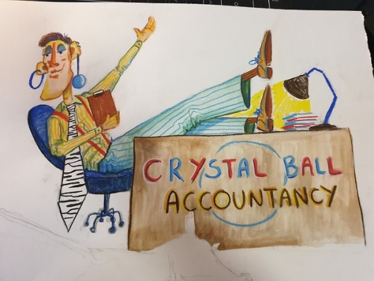
Some preliminary sketches for ‘Crystal Ball’
The guidelines for my character:
Name: Crystal Ball
Job: Accountant
Trait: Eccentric
Pet: Zebra
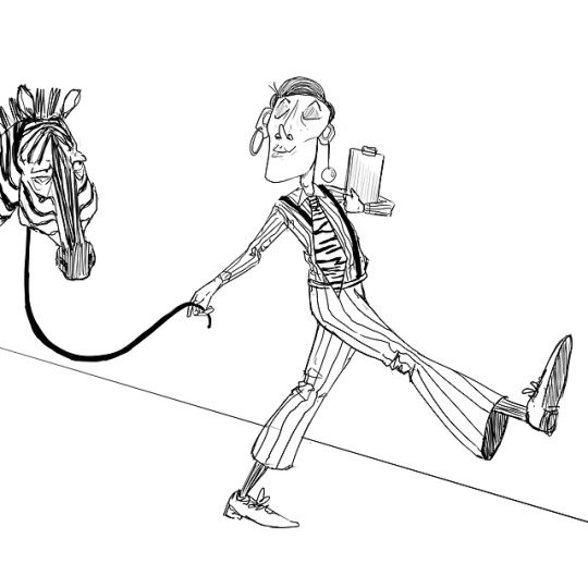
My original design had a good concept, although lacked an interesting design in the final outcome. I had the idea of making him a transgender accountant with an explosive fashion taste and bubbly behaviour. However, to add an interesting dynamic, I decide to make the zebra a completely opposite type of character - negative and fed up with the intense personality of his owner. Taking inspiration from Juliaon Roels, I have already started to create a more interesting design compared to before, although there are still more iterations to come.
1 note
·
View note
Photo
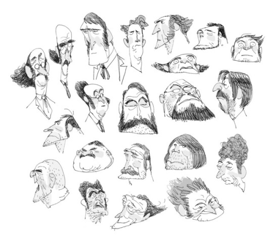
Inspiration from Juliaon Roels
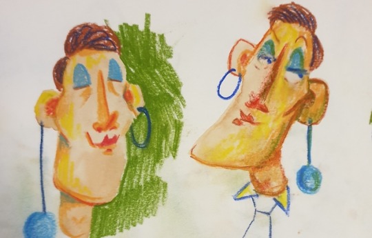
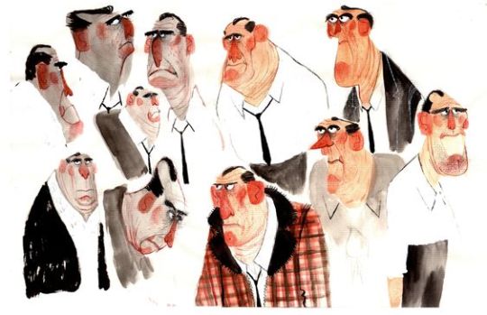
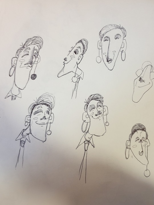
A few months ago I completed a project called ‘Out of Character’, in which I was assigned a random name, character trait and pet to illustrate. After a few months I realised how poor the final execution was and so decided to revisit the project with a fresh mind. As character design is not one of my strongest practises, I decided to take inspiration from illustrators such as Juliaon Roels, who’s characters I find extremely pleasing. His shape language and expressions have such an energy and charisma that I want to feed into my own design. Every character has a vastly different head shape, allowing for a completely unique personality. I decided to experiment with his style of shape language in my own work.
1 note
·
View note
Photo

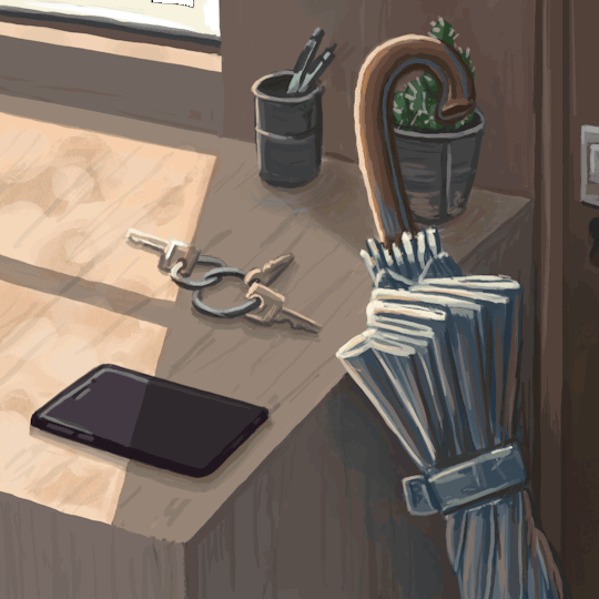
Editiorial Gifs
I found this to be an extremely satisfying project, as the outcome can be so simple yet so effective. Rebecca Mock was a great inspiration for this gif, due to her ability to convey a scene that is so still and silent, and yet holding so much information. For example, I found her animation of the phone in the top gif very powerful - with this being pretty much the only animated part of the gif, the rest of the scene then feels even more still and void of life than just a still image would show. Thus, I tried to bring this technique into my own gif for an article on pessimism. I wanted to create that same feeling of stillness in order to draw attention to the 2% chance of rain forecast on the phone.
0 notes

Video
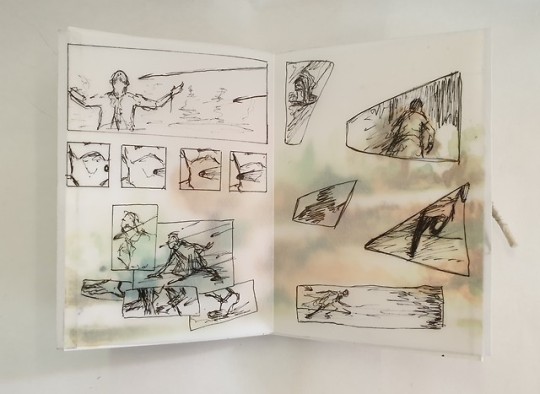
Impressionist Animations for my Documentary
The second part of the project “Hold the eye” saw us do a multitude of 1 minute life drawing poses, that eventually made up a small and rough animation. This exercise taught me that having very quick and fluid poses can often be more powerful than longer, more precise drawings. As shown in this video, the gestures are quite inaccurate, although they portray the movement effectively and suggest a very expressive animation. Thus, I implemented this technique into my documentary, whereby I animated the fox chase scene in a very similar fashion - using a reference video, but drawing each frame very quickly and with energy. This left for a much more effective animation that portrays the panic and intensity of the chase.
0 notes
Photo
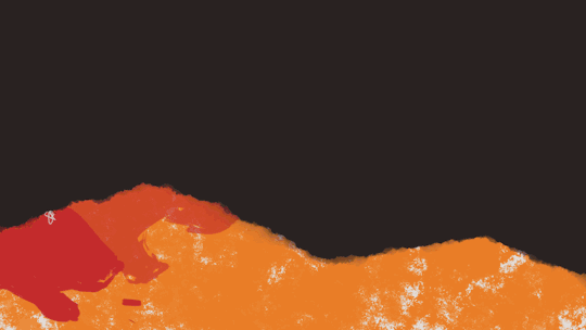

Abstract animations for my documentary
The ‘Hold the Eye’ project was very useful and informative for my documentary, as it showed me how abstract and loose animation can become, whilst still maintaining the effects that are needed. The bottom gif is the rough animation I created for this project, aimed at portraying the word ‘dense’. During my animation, I then encountered a similar challenge, whereby I needed to convey the panic and distress that a fox endures during a dig out - an emotion that needed to be shown during the transitions. Thus, I took inspiration from this ‘Hold the Eye’ project and decided to make my transitions between scenes very abstract and messy, as shown by the gif at the top. Although perhaps not as abstract, these two projects show a similarity in that animation sometimes needs to be undefined and surreal in order to be effective.
0 notes
Link
Inspiration for my Animated Documentary - Rabbit Punch
The raw, amost cringe worthy aspects of Rabbit Punch have been a great inspiration for me when creating my documentary on fox hunting. Its sketchy hand drawn animation with rough boiling is key to presenting the visceral harshness of teenage life and behaviour. It creates a real sense of unease that I believe I can translate into my own animation.
0 notes
Link
Progress on my Animated Documentary
After interviewing a fox hunting saboteur about the issues surrounding fox hunting and the actions of protesters like himself, I have begun to create an animation that encapsulates his message. This small clip is part of a section in which Ian describes the torture that a fox endures during a dig out. The main challenge of this scene is effectively presenting the fear and intensity of such a moment. After working on this section for a while, I’ve realised that quick transitions and fast paced animation is key to creating this intensity. However, I’m hoping that with the addition of sounds I can make this scene much more powerful.
0 notes
Photo
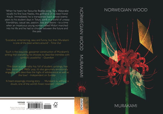
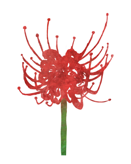
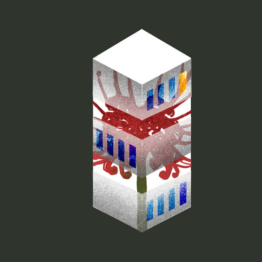
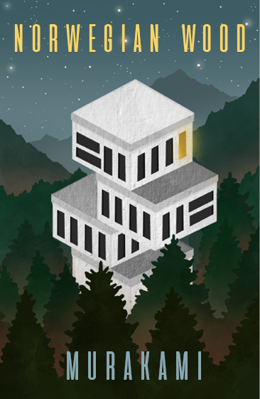
Final Design for Murakami’s “Norwegian Wood”
After lots of iterations, I finally came up with a design that combined the red spider lily and the Ami Hostel. I decided to simplify the hostel by only incorporating its windows, which not only allowed for an interesting connection with the flower, but also felt more like a piece from 1960s Japanese graphic design. Resultantly, I believe this piece managed to encapsulate the mystery and intimacy of the novel, and also show the relationship between the three main characters.
1 note
·
View note
Photo
Taking inspiration from 60s Japanese Graphic design
To align the design more to the essence of the novel, I decided to take inspiration from 1960′s Japanese Graphics Design, such as Ikko Tanaka and Kaszumasa Nagai. Moreover, I also brought in the japanese flower of death, the red spider lily. Being such a powerful japanese symbol, I believed I could combine this with the Ami Hostel to create a similarly surreal idea, but with a greater connection to the feeling of the book. Along with the aesthetics of these 60s designs, I was getting closer to a design that fitted the narrative.
0 notes
Photo
Preliminary Idea for the Penguin Design Awards Cover
My preliminary ideas for the cover of Murakami’s Norwegian Wood were centered around the Ami Hostel and its function as a juxtaposing location in the book. Its abstract descriptions and isolation from the rest of the world felt like quite a poignant idea to me, thus I decided to illustrate this idea by depicting the building in a surrealist way. However, after further reflection, this design didn’t seem to catch the essence of the novel, feeling too much like a sci-fi story rather than one of teenage romance and death.
1 note
·
View note
Photo
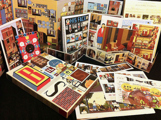
More Inspiration from Chris Ware
Another important aspect of my adaptation of “An Occurrence at Owl Creek Bridge” is its interactivity. This took inspiration from Chris Ware’s “Building Stories”, which allowed the reader to build the story themselves from the vast array of separated stories that are provided. I believed this idea could translate into the format of Bierce’s story, which is cyclical and could be read in a different time order. Thus, I decided to make the background piece and the comic strip separate, which the reader could then remove and see the two stories in isolation. This worked in theory, although in practice it felt quite clunky and awkward to have to untie both ends of the book in order to remove the comic. Thus, with more time and resources, I would create a more easily accessible mechanic for this idea. I would also use a more transparent tracing paper if possible, as at the moment it is difficult to see the background through the comic strip.
0 notes