cburridge4
Chloe Burridge
Artist and Designer from Somerset
159 posts
Don't wanna be here? Send us removal request.
Last Seen Blogs
bloodrediscream
WELCOME EVERYONE
lucietope
LUCIE TOPE
jrjeremy
JR. Fraudulent

steensepstrupdeltablues
Untitled
Photo
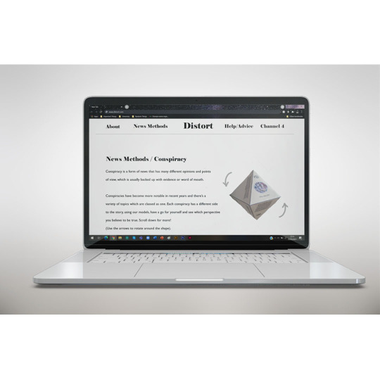
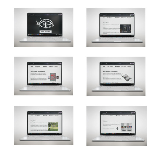
Third Year - Final Major Project - 2021
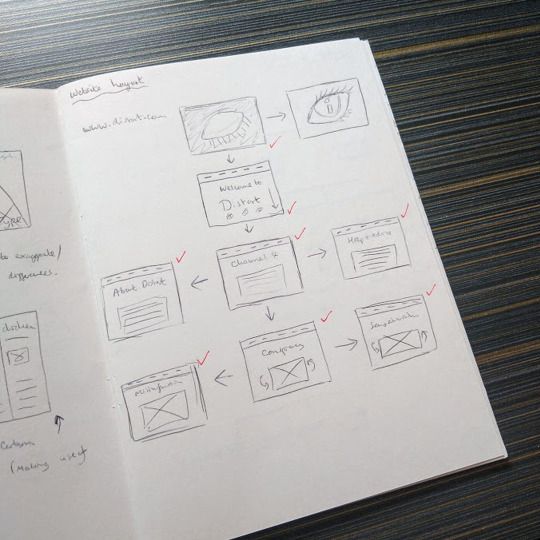
The final aspect of my campaign was to have a website that would act as the centre hub of my work.
Using a mock-up, I created eight screens which each represented a different thing. There would be a launchpad to the website where you would click to enter, followed by a homepage which would feature images from the campaign and a bit of information.
There would be a section for each of the sections: Misinformation, Conspiracy and Sensationalism, which would go into more depth about why each piece of campaign work was created and why.
Followed by a help/advice page, an about page and a page about Channel 4 who I envisioned would be the ideal partner for this campaign due to their unique media channel.
The concept of the 3D work being able to be rotated and viewed from different perspectives would also be a feature on the website to further emphasise the campaign goals.
Overall, I’m incredibly proud of all the work created for my Final Major Project, it was an odd mindset to get into to work during the pandemic but once I started sketching and researching I was able to get into the swing of things. The Distort campaign is something that would be really good to have in the real world and help people see it’s ok to look at other sources to get a better side to a story and to consider other perspectives.
#brief#project#final major project#website#mockup#webpage#campaign#concept#idea#3D#information#insight#image#layout#art#design#student#university#graphic design
4 notes
·
View notes
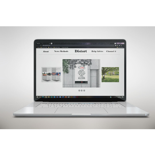
Photo
Third Year - Final Major Project - 2021
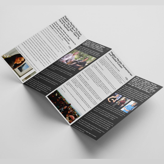
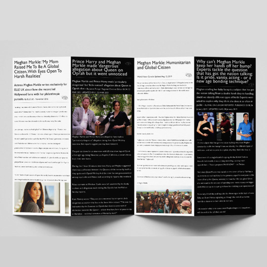
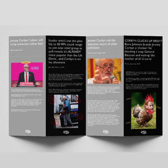
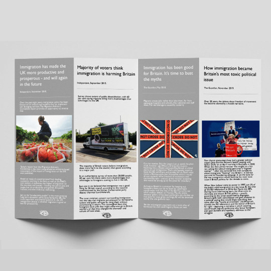
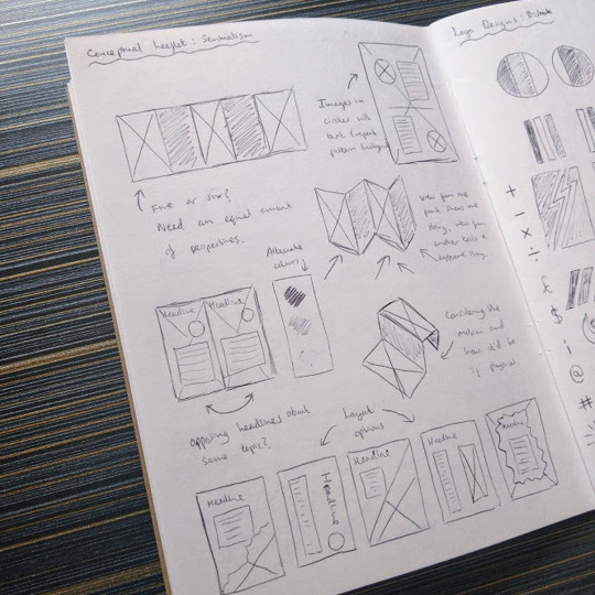
The third aspect of my campaign was leaflets looking at the idea of Sensationalism and how the media portrays things/people in different lights.
My starting point was Meghan Markle and how prior to her marriage with Prince Harry, was shown as a caring, down-to-earth woman. Since, the media have portrayed her very differently, notably when compared to her sister-in-law.
I wanted to create a conceptual concertina leaflet that, viewed from one way, showcases positive press and the other side, negative. Highlighting how news sources interact with the portrayal of things and how much of an impact it has. I also created leaflets for Jeremy Corbyn and Immigration, both exploring positive and negative articles as well.
Showcasing these concepts this well highlight how the media tries to influence our beliefs by using key words to make us want to read the article to find out more.
#brief#project#final major project#leaflet#concept#conceptual#concertina#mockup#visual#opposing#perspective#view#angles#colour scheme#type#font#art#design#student#university#graphic design
1 note
·
View note
Photo
Third Year - Final Major Project - 2021
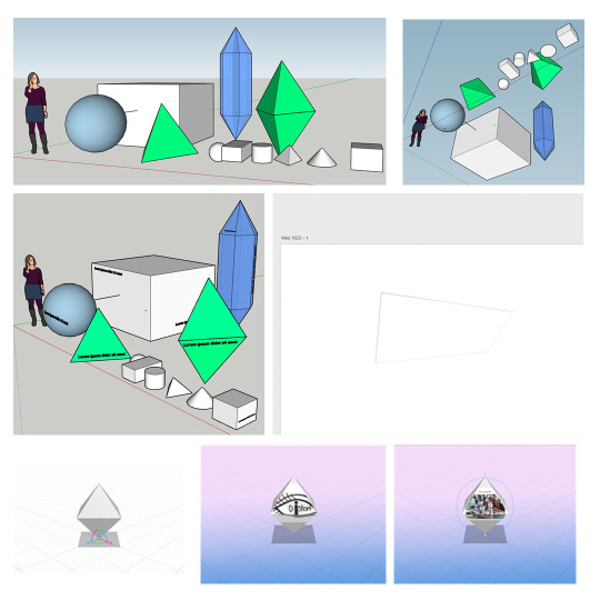
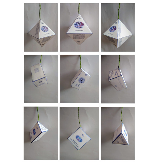
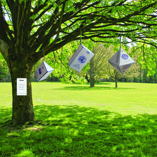
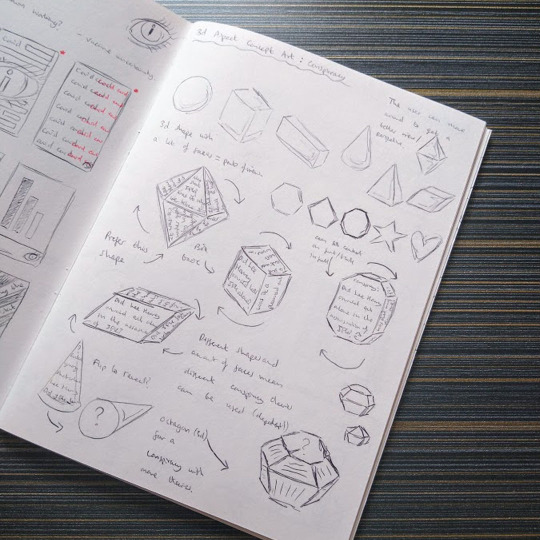
The next element of my campaign looked at installation style work, originally I had envisioned a physical piece but due to the pandemic I had to work around this and thus created a hybrid concept.
I was really inspired by SketchUp and how you’re able to move around a shape. The second part of my campaign focused on Conspiracy, something that has many points of view, which meant this concept linked well. I attempted some digital work but it didn’t turn out how I envisioned so I made paper mock-ups and added on information from a Conspiracy book I own. Being able to hold the shape and look around really reinforced my theme of perspective and I created three of these in total (JFK, Loch Ness and Millennium Bug).
My main goal with these were to have them on a digital platform and have the audience navigate their way around the shape and figure out what they believe to be true. However after a tutorial, I made mock-ups of the shapes in situation as I felt they could also work as physical aspects (on a bigger scale).
There would be a sign next to the installation, referencing the campaign and goals, as well as stickers.
#brief#project#final major project#sketch up#mock-up#digital#shape#paper#paper model#model#conspiracy#installation#interactive#perspective#point of view#3D#art#design#student#university#graphic design
0 notes
Photo
Third Year - Final Major Project - 2021
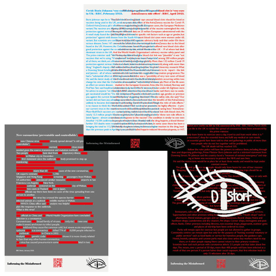
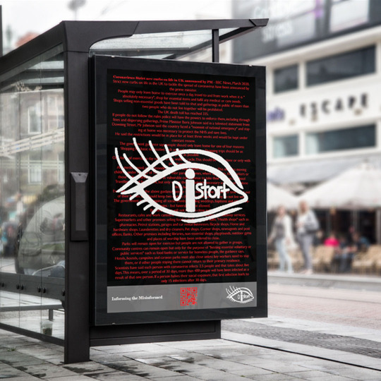
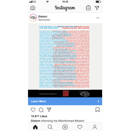
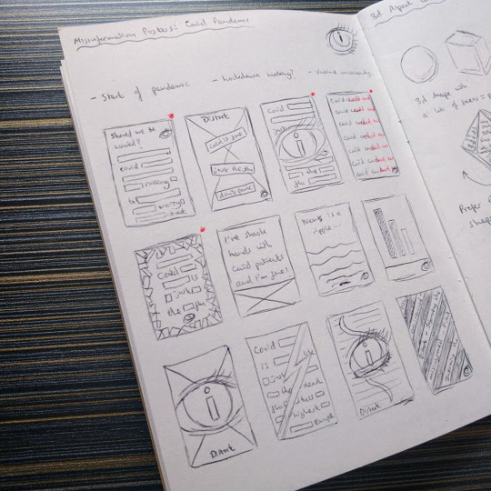
The first part of my campaign focused on promotional posters that focused on two different aspects. Looking at Misinformation as a theme and how things are presented.
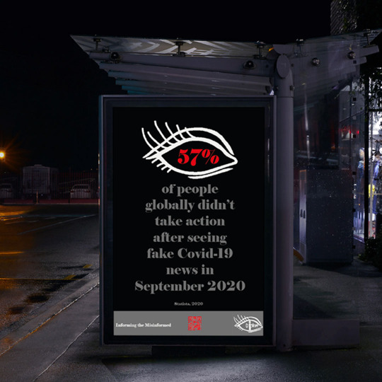
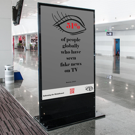
The first set focused on the Covid-19 pandemic and how the news presented itself. Poster 1 looks at the start of the pandemic, where Covid-19 was new and people scanned articles for key information (hence the red lines blanking out information). Poster 2 highlights the start of the UK lockdown and the strict watch over the public to enforce this restriction (including the eye logo to further this point). Poster 3 focuses on the vaccine debate and with inspiration from 3D imagery, shows the for and against of the vaccine (with the opinions clashing in the middle and getting muddled).
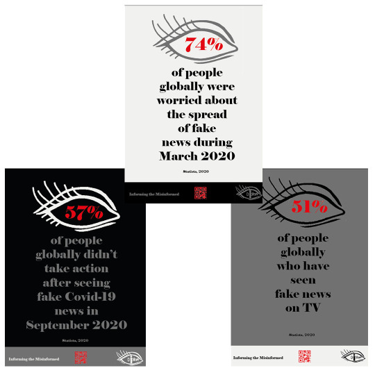
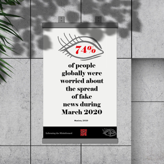
The second poster set focuses more on data misinformation and showcasing this as a wake up call for the public. With data from Statista, I allowed this to be the central point and be something that sticks with the audience. Maintaining the colour scheme as well.
I feel like the posters work well and all aspects work well as one set or two. They’re eye-catching and help to highlight to the public what my campaign concept wants to achieve. Also including a QR code to allow access to the campaign website.
#brief#project#final major project#poster#poster set#news#perspective#pandemic#data#viewpoint#colour scheme#mockup#promo#audience#message#information#blank#eye#bold#3D#misinformation#art#design#student#university#graphic design
0 notes
Photo
Third Year - Final Major Project - 2021
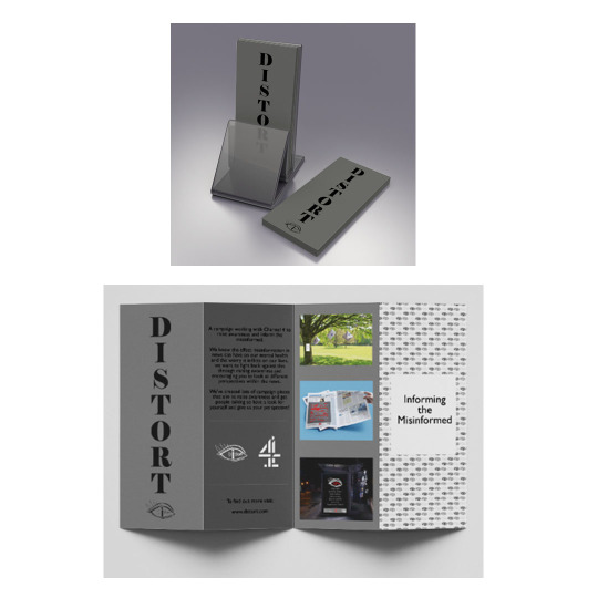
I decided the best route to go would be to create a campaign that could raise awareness of misinformation and perspective.
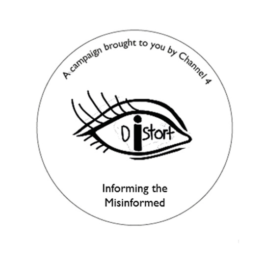
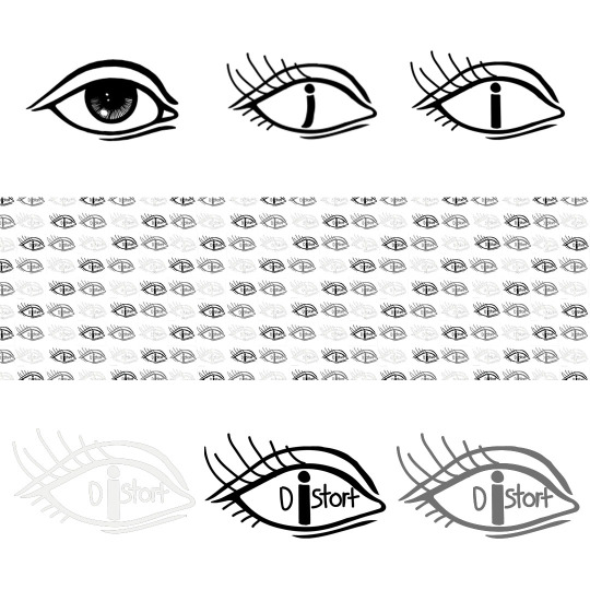
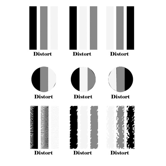
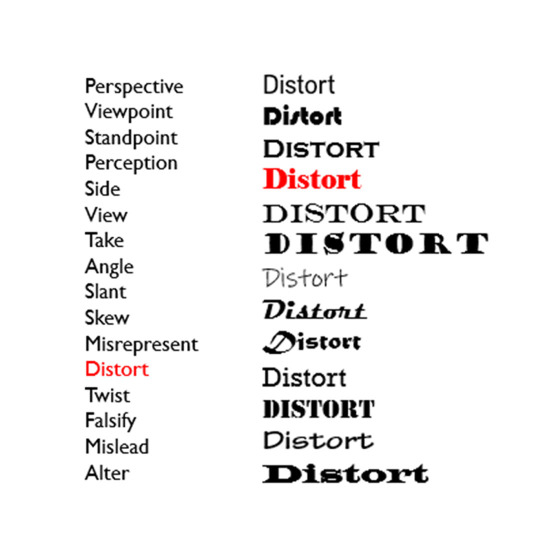
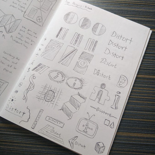
I used the name ‘Distort’ for the campaign, as the name related well to my FMP theme. I looked at what fonts would work best with the style of work I wanted to create and chose ‘Elephant’ as it comes across as professional but hard hitting due to its boldness.
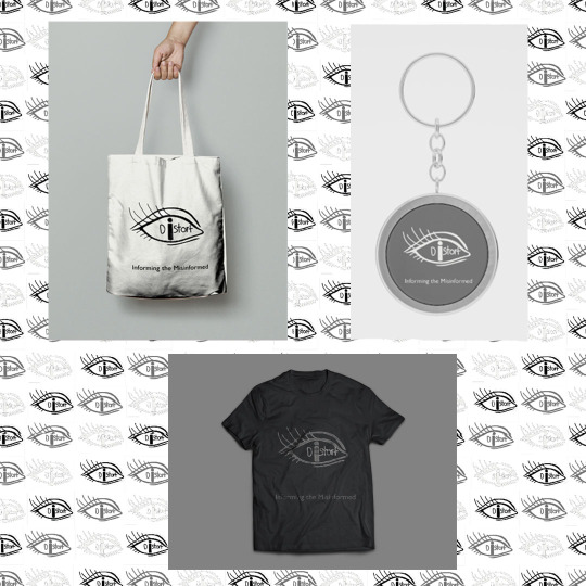
I worked on logo designs that focused on sections, emphasising different perspectives. However, I really liked the eye logo design shown previously in my sketches, using a template from Google Images, I reworked the eye to be more realistic and to have the campaign name within the pupil (with the i being the focus). I stuck to a colour scheme of: white, grey and black (highlighting how the news can be seen in black and white).
I also worked on some rough promotional items but decided that these wouldn’t work with my campaign.
#brief#project#final major project#logo#logo design#eye#angle#perspective#news#colour scheme#minimal#name#type#font#style#promotional aspect#bag#shirt#keyring#campaign#art#design#student#university#graphic design
0 notes
Photo
Third Year - Final Major Project - 2021
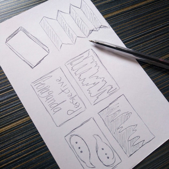
For my self initiated FMP, I wanted to look into the idea of news and perspective and how there’s more than one side to a story.
I researched into installation/art pieces that could create a behaviour change in audiences, notably Michael Pinsky’s ‘Pollution Pods’.
I was really drawn to the idea of perspective because everyone sees things differently and especially within the news, things are distorted depending on what bias is used. I wanted my FMP to look at and highlight how things are shown and that there’s always an alternative angle to look at something.
The sketches show key aspects of my project journey and the aspects that helped to shape my campaign concept. I also conducted a survey to get better insight into how people interact with the news and their opinions about the way in which things are displayed.
#brief#project#final major project#sketches#sketch#idea#concept#initial#journey#research#inspiration#news#perspective#art#design#student#university#graphic design
0 notes
Photo
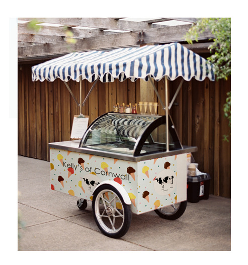


JDO Raw Brief - 2021
The final part of this brief was to envision it in the real world.
My first mock-up is of an ice cream cart, going back to the company’s starting point of selling ice cream on the beach, I felt like this would be a nice, traditional marketing aspect to have.
With the rise of social media, I also did an Instagram advert which would reach a younger target audience as well. I also did a bus stop poster which would attract a wider audience from all age groups. All the adverts are bright, colourful and eye-catching and help encourage audience interaction.
#idea#concept#rebrand#reimagine#supermarket#product#ice cream#pattern#logo#cow#colours#font#type#colour palette#packaging#ice cream cart#ice cream stall#mock-up#poster#art#design#student#university#graphic design
0 notes
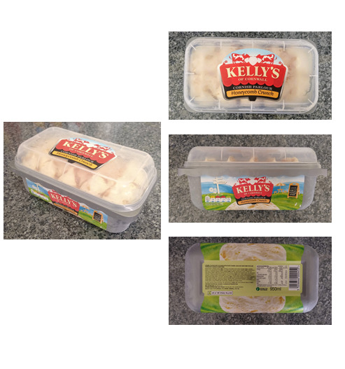
Photo
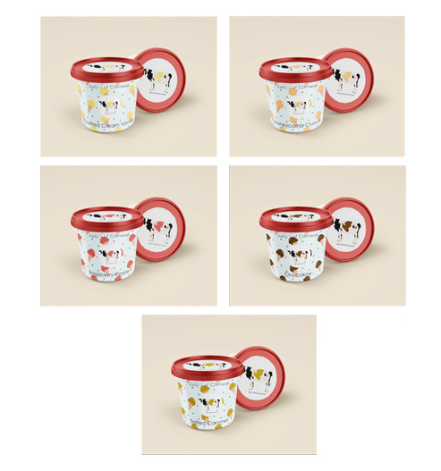
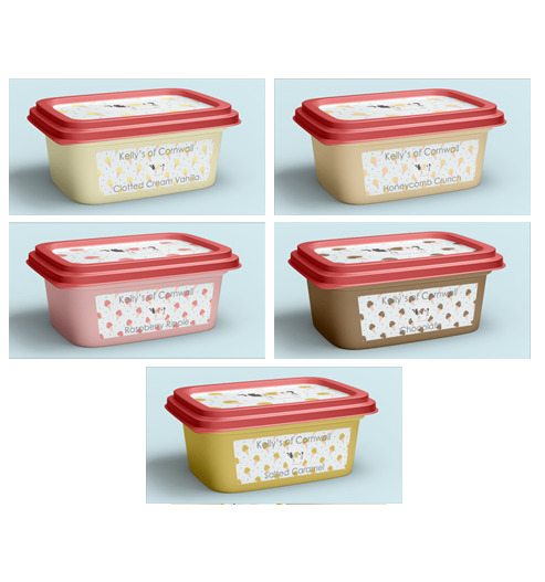
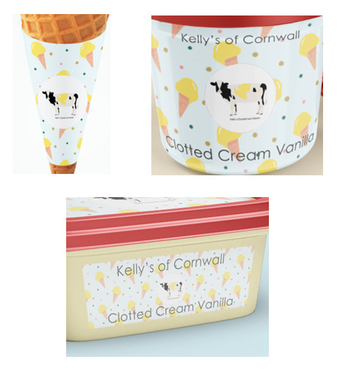
JDO Raw Brief - 2021
I did mock-ups of how the rebrand could potentially look. Each aspect includes the ice cream cone repeat pattern with the updated logo, with each being recoloured depending on the ice cream flavour.
With the popularity of individual tubs, I introduced this and felt this could encourage sales either for individuals or for families who want to buy more than one flavour.
Going back to the brand’s beginning of selling ice creams on the beach, I also included some ice cream cone wraps which could be used in parlours, allowing the customer to keep their hands clean whilst also promoting Kelly’s further.
And finally, the standard ice cream tub which follows the same design as the smaller tub, but more aimed towards families.
I think this rebrand works well and brings Kelly’s more to the forefront of the ice cream brand competition and celebrates the company’s family history more.
#idea#concept#rebrand#reimagine#supermarket#product#ice cream#pattern#cow#logo#small tub#large tub#packaging#mock-up#ice cream cone#colour#font#type#colour palette#art#design#student#university#graphic design
0 notes
Photo
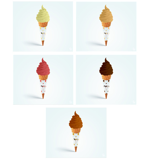
JDO Raw Brief - 2021
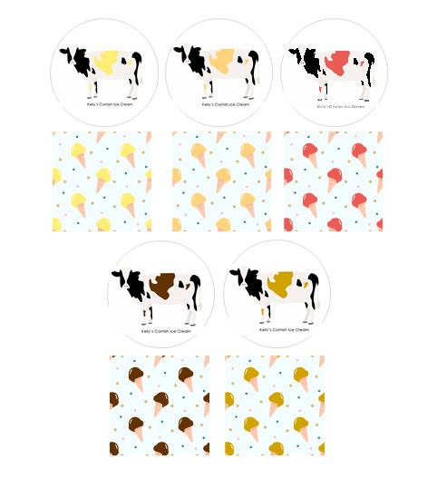
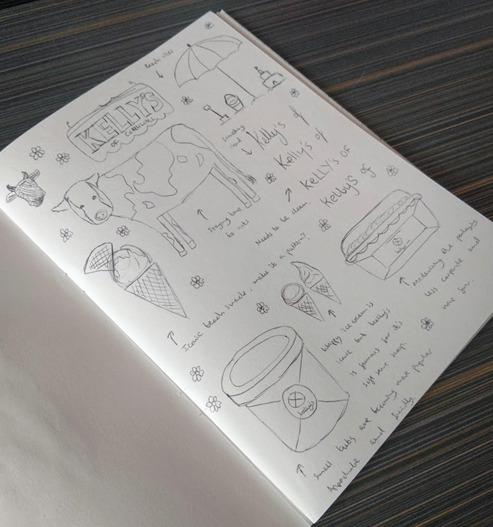
This brief set by JDO challenged us to reimagine/rebrand a supermarket product and create a new identity for it. I chose to rebrand Kelly’s of Cornwall, an ice cream brand as I wanted to showcase it as more of a family brand and make it less corporate.
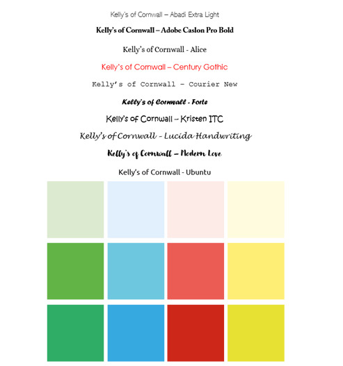
After doing sketches and packaging analysis I began to work on creating a rough colour palette (ensuring to keep the iconic red) and choosing a more rounded font (Ubuntu). As well as considering what is popular among ice cream products as well as the brand’s history.
Using illustrations from Google, I reworked the Kelly’s logo and made it so that for each flavour, the cow’s patches would be recoloured to emphasise what it was. I also worked on an ice cream repeat pattern (following the same colour style as the logo) which I felt would make the product appear more fun.
#idea#concept#rebrand#reimagine#supermarket#product#ice cream#pattern#logo#sketches#cow#colours#font#type#colour palette#packaging#analysis#food#art#design#student#university#graphic design
1 note
·
View note
Photo

D&AD New Bloods Disney Brief - 2021
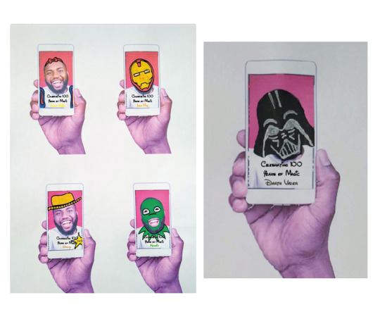
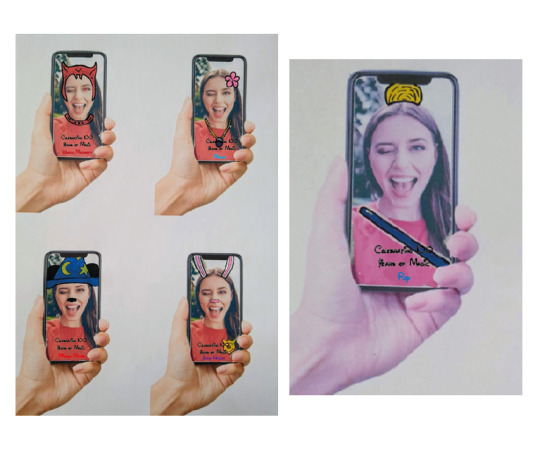
The ‘new’ part of the campaign would feature digital social media filters and outdoor versions of these. The main target market (18-25) are on social media a lot, this is where Instagram filters come in. The 100 Year Anniversary character filter would allow social media users to use the filter and determine which character they are (with character relevant details appearing over the users face). The filter would go through character symbols above the users head before deciding a character, then adding character costume details to the user.
As well as this, this target market are often at university or working so would be using buses and trains frequently. Interactive poster adverts would feature here which follow the same concept as the social media filters just on a bigger scale. The user would step in front of the screen and an animated filter would appear (surrounded by pixie dust clouds and text referencing Disney). This allows people to get into the spirit of the anniversary and share this amongst friends, reigniting their nostalgia and creating a talking point.
I was so happy I was able to work on this D&AD New Blood brief, Disney is a company I’ve admired and I grew up with all the classic films so being able to do concept work on a brief set by them was a really amazing thing to happen!
#disney#campaign#concept#celebrate#characters#symbol#movie#classic#modern#nostaliga#colour#filter#intereractive#costume#poster#mockup#art#design#student#university#graphic design
0 notes
Photo


D&AD New Bloods Disney Brief - 2021
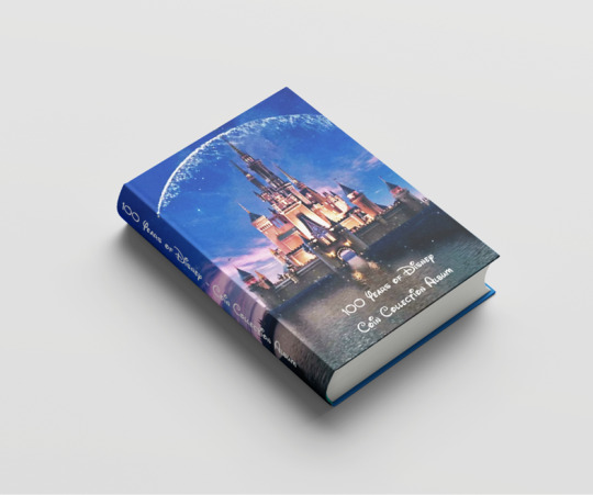
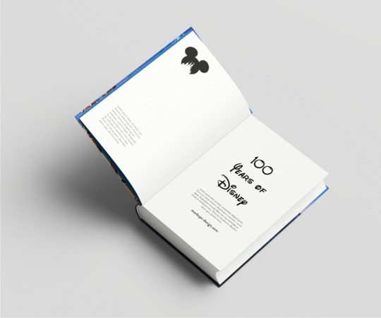
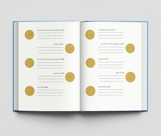
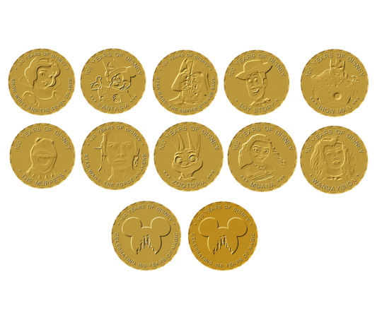
The main aspect of my campaign concept for the Disney brief was a commemorative coin collection book. Going back to the brief wanting to combine the old and new, I felt like a coin collection would work well as physical currency is on the decline.
Disney fans love collection pieces and through the use of commemorative coins this would allow fans to build an album of their favourites or completing the whole collection (of the 100 characters previously shown). The coins would also reflect currency of where the tale is set as well to allow further inclusivity. This is the old part of the campaign as coin currency isn’t so widely used these days.
These would be available in ‘blind bag’ form or specific ones can be bought individually. The album features brass style coins and there would be a gold plated limited edition framed version.
(Disney photos from Google Images, coins made on CoinsForAnything).
#disney#campaign#concept#celebrate#characters#symbol#movie#classic#modern#nostalgia#coin#collection#book#coin collecting#frame#brief#mockup#art#design#student#university#graphic design
1 note
·
View note
Photo


D&AD New Bloods Disney Brief - 2021
This brief set by Disney invited us to create a campaign concept to celebrate their 100th anniversary. The key aspects of focus were to include nostalgia, diversity, creating bonds between generations and the idea of giving back.
I started this by looking at 100 things that could be the focal point of this campaign, settling on celebrating 100 characters from Disney movies and shows. I made a list that showcased popular characters as well as some of the more obscure ones (also making a list of the character, film and iconic symbol).
For the purpose of the presentation, I selected 10 characters and began to work on merchandise samples to show how Disney could market the campaign. Known for their hand drawn style, I illustrated the characters before adding a colour paint splatter background (in character related colours). I felt like going back to Disney’s routes would be a perfect way to celebrate 100 years.
This merchandise I mocked up (t-shirts, mugs and tote bags) would be available in all 100 characters, which would allow everyone from any generation to find their favourite character.
(Disney character photos from Google Images).
#disney#campaign#concept#celebrate#characters#symbol#movie#classic#modern#nostaliga#colour#paint#paint splatter#illustration#merchandise#shirt#mug#tote bag#brief#mockup#art#design#student#university#graphic design
1 note
·
View note
Photo


D&AD New Bloods Audible Brief - 2021
To help visualise my book cover design better, I mocked it up onto billboard posters and social media adverts (to help promote the book).
I also did some mock-ups of how it could look like on Audible’s website as well as Amazon.
#brief#audible#book#cover#bookcover#ideas#mockup#visual#visualisation#poster#advert#promo#nature#shed#type#digital drawing#art#design#student#university#graphic design
0 notes
Photo


D&AD New Bloods Audible Brief - 2021
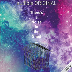
I really liked this design I did which used a reference photo of a garden shed within a somewhat vortex hole. I felt like this added to the mystery and depth of what the book was about (also adding stars around the corners to emphasise the fantasy element).
I then decided to illustrate the focal piece and whilst I liked the outcome, as I felt like it could be a sketch of the shed the protagonist could’ve done whilst analysing the shed, I felt like it could be improved further.
Using my graphics tablet, I recreated the whole concept but digitally. This was really fun to experiment with as I’ve never used a graphics tablet before and I really enjoyed the process of layering the elements to create a piece of work.
I added on Audible banners to help visualise the covers better and decided that the digital drawing route was the best as it felt warm and inviting but still allows the reader to gather there is a sense of mystery/fantasy to this.
#brief#audible#book#bookcover#ideas#concepts#digital#hand drawn#digital drawing#paint#watercolour#graphics tablet#nature#shed#style#variation#type#font#visuals#art#design#student#university#graphic design
1 note
·
View note
Photo


D&AD New Bloods Audible Brief - 2021
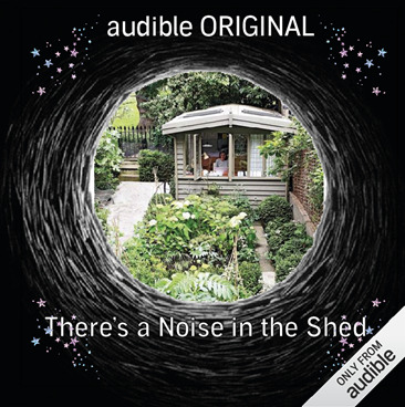
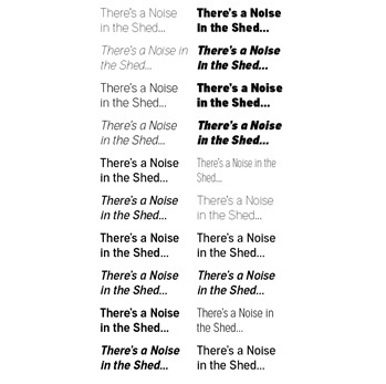
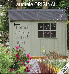
This brief set by Audible challenged us to create a book cover design for one of four fictional books. I chose ‘There’s A Noise In The Shed’, a fairy tale/animal book revolving around a mystery noise in the shed.
I began by creating sketches of potential designs, keeping the shed the focal point of these and incorporating nature into it. I also narrowed down a rough colour palette of natural tones which worked well together. Using the Audible font provided, I chose which font would work best with the the book itself (settling on a light font).
I worked on some initial digital designs revolving around quite fantasy like designs which incorporated both the shed and the garden aspect, using imagery such as stars to highlight a mystical element.
#brief#audible#book#cover#bookcover#sketches#shed#nature#ideas#initial#colours#colour#colour palette#type#typography#font#art#design#student#university#graphic design
0 notes
Photo


Third Year - Conceptual Characters
The digital mock ups for my final book cover!
This was one of my favourite projects to work on, this was a huge change for me as a designer as I’m not used to doing something so conceptual and minimal. However, all the elements come together really nicely to create a unique typographic book.
#idea#concept#conceptual#book#layout#spread#character#personality#type#font#journey#alice in wonderland#lewis carroll#mock up#visual#illustrations#art#design#student#university#graphic design
4 notes
·
View notes
Photo


Third Year - Conceptual Characters
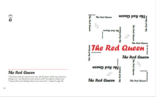
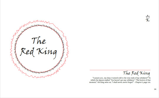
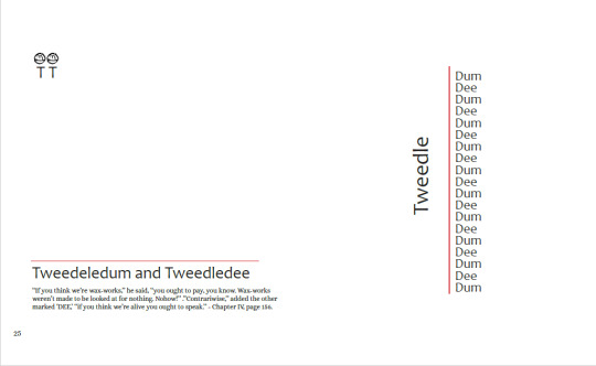
I gave each characters a double page spread, type design, an iconic quote and a matching font symbol.
The Queen of Hearts - Foreboding and in your face character, displaying her name in an illustration of her face.
The King of Hearts - Living in his wife’s shadow, cracks are starting to show from not being heard.
The Red Queen - Showing the control she has, with Alice trying to figure her way through the Queen’s maze.
The Red King - Wanting to give everyone his seal of approval, made into a King’s stamp.
Tweedledum and Tweedledee - Showcasing the rhythmic qualities of the Tweedle twins’ names.
Alice - The roses are in full bloom, with her name becoming larger, highlighting her growth and development as a character.
#idea#concept#conceptual#book#layout#spread#character#personality#type#font#journey#alice in wonderland#lewis carroll#illustrations#art#design#student#university#graphic design
4 notes
·
View notes