cgrahamvisualculture
Visual Culture
Catherine's visual culture blog for uwe
13 posts
Don't wanna be here? Send us removal request.
Last Seen Blogs

superbdonutpoetry
Untitled

saccharinerose
the queercoder
imaginal-ai
Imaginal-AI

nowandthengalleria
Now and Then Galleria LLC

honey-from-hell
Howdy Y'all
Text
Visual Artefacts
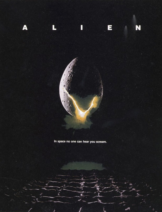
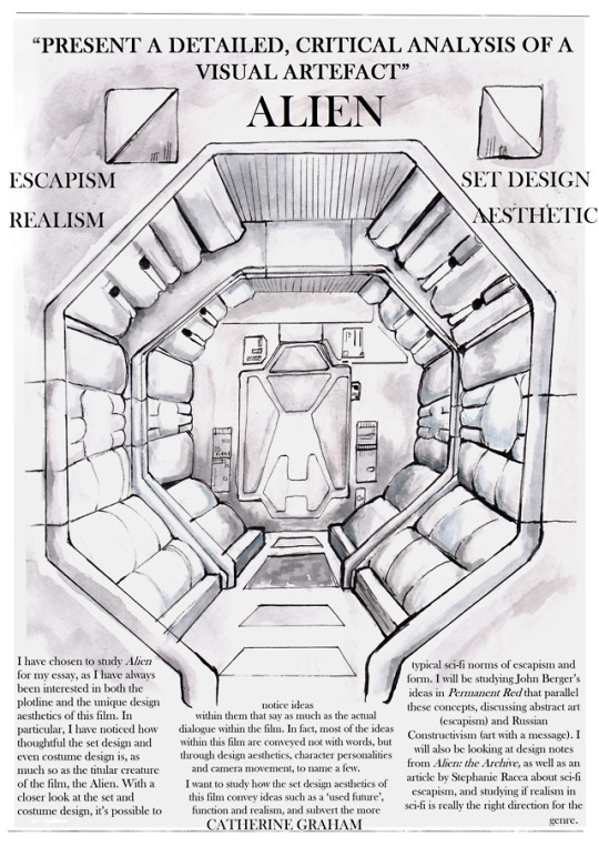
First Artefact: Alien
Possible Ideas to discuss: themes of alien versus human, through set design/ alien v human; set design and how it reflects society of the time; costume design.
Produced by 20th Century Fox; Audience - sci-fi, film fans, possibly fine artists due to Giger’s work on the film.
Messages: dystopia, changing society, commercialization, distrust and dishonesty between companies and individuals.
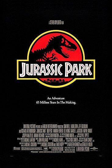
Second Artefact: Jurassic Park
Possible Ideas to discuss: taking the once sacred and unchangeable and commercializing it; evolution and how humans cannot stop it even if they try; computer generated imagery versus puppetry and animatronics and the effects of each of these on the viewer.
Produced by Universal; Audience - science and dinosaur enthusiasts, possibly young children due to the dinosaurs, films fans, special effects fans.
Messages: Humanity’s place in the world - we are not God; bringing something once untouchable into our modern day commercialized world.
0 notes
Text
Angela McRobbie
1. JACKIE magazine.
The magazine and its unpicking by McRobbie is interesting because on the surface it appears to look like something to help girls in their social life, i.e look nice, get a good boyfriend, etc. But I found it interesting that McRobbie thinks it is designed to get young girls to fall into the trap of consumerism and being like everyone else. The more people think the same, the more people they can sell the magazine to. I found it especially scary that femininity was only a construct for pop culture, and that the magazine promotes bad things such as competitiveness and individualism, not things like friendship and female solidarity,
2. Second-hand style and subculture
This was mostly about shopping and the underlying psychology and reasons why people shop. It highlighted that shopping in flea markets was more beneficial and had more society than shopping in supermarkets. What I found especially interesting about this piece was "post-modern condition", and that after WWII there was a loss of faith in the future, resulting in obsession with retro and vintage objects, a reminder of the world before.
3. McRobbie as a defender of pop culture
I find this notion quite interesting as in the Jackie Magazine project, McRobbie unpicks a pop culture object (the magazine) and shows it as what she reckons to be tool to make girls part of society, under the same set of ideas. Surely this is a blow to pop culture. However, it's worth noting this was a project she did whilst in education, and her later work does defend pop culture, for example defending shoppers and saying shopping is "skilful", not brainless.
0 notes
Text
John Berger texts
Of all the abstracts I would probably read the first one "A song for politics", as it seems to be the most supportive of Berger and his ideas and actually has him in it. Whereas the third text seems to condemn him, I like Berger's ideas and would want to read more about them, not someone condemning them. Also, the description of the first text is the simplest to read and understand. The summary of a text is important if people are going to read it, and I found the other summaries either hypocritical of themselves or too difficult to understand.
0 notes


Text
Edward Said
IN WHAT WAY HAVE IMAGES AND OBJECTS BEEN USED TO EXAGGERATE THE DIFFERENCE BETWEEN US AND THEM, NATIVE AND FOREIGN?
In traditional Western art, such as that created in the 1600-1800s, the detailed and accurate subject matter is very different from art produced at the same time in the East, such as that by Hokusai. In the West, paintings were about material things, and what people had, such as animals, houses, land, fine clothes. Eastern art more typically celebrates the natural world, things within it that are bigger than ourselves, for example mountains and waves. The technical methods used in production of art in both cultures (e.g extreme detail in Western art, simplicity and stylisation in Eastern art) highlight the differences between the two cultures in not just one way (physical differences in how the artwork looks) but also let us see what matters most to both these cultures. In the West material things were key to who you were- if you had a horse, or dogs, fine clothes and lots of land, you were worthy. The fine detail highlights the exquisteness and exaggerates how good these things are percieved to be. Even art of poor people, such as beggars, dressed in rags, is still in fine detail to highlight the simpleness and dullness of these people and their belongings. However the East kept its spirituality and different philosophy of life much longer, and so the artwork is different. Most Chinese artwork depicts people only as very small figures, in an overarching, magnificent world. It highlights how small and unimportant we are in a world that contains so much more than just us.These two very different ways of thinking are used in artwork from both cultures, to highlight and state the different philosophies and what we think of ourselves.
0 notes
Text
Current phase of participatory culture
In today's world, smartphones are an extremely common occurence. There is a pressing need to document almost everything you see and do (vlogging, instagram, facebook) seemingly in order to impress peers. Advertising is similar, pressurising people into getting the latest thing, such as the "apple watch", or "amazon echo". Having these things is not a statement of ignorance, or weak will, as some might believe because you have been persuaded by adverts to buy these gadgets, but a statement of wealth, up-to-dateness and being part of the world today. If someone has one of these things, a friend etc is likely to be jealous, because the adverts tell everyone that unless you have this thing, you aren't really part of society. Therefore, one of the key features of the current phase of participatory culture is competiveness.
Another interesting variation on this is the increasing popularity of retro and vintage items,such as cars, records and clothes. On the surface this seems to be a rebellion against the newest gadgets. However, as the obsession with retro objects has grown, the market has capitalized on this. It is now an ironic extension of the aforementioned subject, an attempt at rebellion absorbed by the system.
0 notes
Text
My top ten artists
NATALIE HALL
Natalie Hall is a tattoo artist from California. Her fluid, powerful way of drawing has very much influenced me in my work in recent months. For example, where I used to draw in quite an angular style, I am now incorporating a more fluid linework in my drawings, especially in life drawing.
ERIKA WORTHYLAKE
This is a character designer and formerly an animator, from Canada. Like Natalie, she has a fluid way of drawing lines, but she focuses on line a lot more than Natalie, the latter of which incorporates tone often in her drawings. I am especially drawn to line as an element of drawing, which is why I like Erika’s work so much.
DAVE MCKEAN
I first encountered this artist’s work as illustrations inside the book VARJAK PAW, and THE OUTLAW VARJAK PAW, many years ago. I loved the atmospheric darkness and edgy, powerful shapes they had. It really lent the world of the two books a smoky darkness and you could feel the stench of the city in which it is set through the illustrations.
FREDERIC REMINGTON
Remington was an artist of the West, back when America was not yet fully colonised. He often drew and painted the horses on which so many people rode, which is one of my favourite things about his artwork. The horses are always painted so anatomically accurate, and they have a lot of power about them. The landscapes he paints around the subject also have a wonderful soft pastel quality to them.
CHARLES RUSSEL
Charles Russel was another artist of the West, like Remington, although where Remington chose to focus on the colonising Americans and migrants from the East, Russel looked more at the natives, the American Indians, their way of life, and the beautiful landscape surrounding him. His work is more atmospheric than Remington’s, I think, and though not as detailed, has more of a charm to it.
DIETER BRAUN
Dieter Braun is a German artist who is best known for his two books, WILD ANIMALS OF THE NORTH and WILD ANIMALS OF THE SOUTH. I knew of the first book from various bookshops but only properly discovered this artist’s work in the second, when I bought it from a bookshop in Berlin. Braun works digitally with shapes and textures, something I would really like to try out, as I mostly focus on line. His illustrations are vibrant and colourful, like the animals themselves.
ERIK ABEL
Erik Abel is an artist from Oregon who uses paint to create incredible stylized images of the sea, waves and surrounding plants and rocks. I love this artist’s use of colour and shape, and his unique inspiration of Mayan art. His art has always felt fresh and new to me, much like Dieter Braun’s illustrations.
CH’NG KIAH KIAN
An artist from Malaysia, Ch’ng Kiah Kian works almost exclusively with stick and ink. He uses sharpened sticks from trees, to create unique, varied lines which are scratchy and have many different weights within a single line. I love his atmospheric sketches because they look at the same time an observational study of a place but also a way of seeing the place.
J.A.W COOPER
I always saw this artist’s work as similar to Natalie Hall’s and Erika Worthylake’s, because of the qualities of the lines - they are fluid, curved and liquid. However, this artist’s work is different because it is almost entirely composed of just lines (sometimes with tone). Unlike Natalie’s or even Erika’s, Cooper’s work is very simple, providing just the bare basics of which to see the subject, but somehow looking beautiful at the same time.
BETH CAVENER
Beth Cavener is a Montana artist who works with sculpture, mostly producing sculptures of animals. Although this list is mostly comprised of 2D artists, I felt I had to include a 3D artist because I do have an interent in sculpture, and I think that sculpture is more related to drawing than we think. For example, Beth’s work is very fluid, liquid and reminds me of water, like some other artists on this list. I love the simultaneous smoothness and textural quality of the apparance of the surface of the sculptures.
0 notes
Text
What is the difference between a historical fact and something that happened in the past? Why are some facts about the past recorded and remembered (eg. in exhibitions, archives and books) and others not considered worthy of committing to memory?
Because I grew up watching science fiction programmes such as Doctor Who, the words "history" and "past" mean the same thing to me, because they were used interchangeably when talking about travelling backwards in time. However, the dictionary definition of "history" is "the study of past events". What they mean is the study of past events which seem to be important to how a country/person etc developed into what they are remembered as. For example, someone might decide to go into abstract painting because they saw an abstract painting in an exhibition and liked it. So if that person became famous, that would likely be written in their biography as how they became the painter they are today. However, they might not mention that they went to that exhibition because they, for example, wanted a break from their family problems. This might not be regarded as important to someone recounting their history. The "historical fact" is that they became a painter because they went to the exhibition, not because family problems drove them away from their house. So, "historical facts" seem to be the events that stand out as out of the ordinary events, that link directly with the big, important events such as the fact this person became a painter. Smaller events that don't have a direct link to the big event are often, I think, not regarded as important. Perhaps this is to make history simpler, as history is not a complete story of every single thing that ever happened.
0 notes
Text
Over the past 50 years, has there been a social and cultural shift away from the verbal/textual and towards the visual? If so, has this shift accelerated during the past 10 to 20 years?
In today's world, advertising is in our faces more than ever before. It has developed over the past 100 years very rapidly. Advertising mostly relies on visual content - a brand name font, what the product looks like, what colours you associate with it. With digital communication developing over the past 10-20 years, visual content is much easier to show to people. They don't even have to go out of their house - it's on their tv, their computer, their phones.
Although one could say society focuses more on visual elements nowadays than verbal or textual elements, one could also say that is not quite true, as advertising does include text, such as the brand/product name, a description of what it does, etc. However, looking at adverts from e.g the 1940s and adverts today, there are less words in today's static adverts, such as those displayed on billboards. But today's society, with its reliance on digital media, seems to use spoken word much more if an advert wants to say a lot about its product. Spoken word is quicker on average for most people to understand, as everyone has different speed of reading.
0 notes
Text
Richard Sennet
One of the ideas that I found interesting from the fourth text - 'Fractured Skills: Head and Hand Divided' by Richard Sennet - was found in the criticism it directed towards computers in architecture and building design. Advertising would have us believe that new technologies, such as Computer Assisted Design (or CAD), are beneficial for work and are so much better than the old ways of doing things, like drawing the building by hand before building it. However, the opinion presented in this article highlights that this quick computer-assisted way of working, although revolutionary, may not be in a good way. I found the idea that drawing the building means you gain a deeper knowledge of it, in a way that the computer, instantly building the building for you, cannot provide, had relevance to my own experiences. I personally don't like many new technologies, finding that they make people lazier and less connected with the world. The writer's idea that drawing enables you to have a deeper connection with the object you are drawing is the second point that connects with me. I have always found that the best way to understand an object, for me, is to draw it. I know more what a flower looks like if I draw it. An interesting quote Sennet includes in his text is from Victor Weisskopf - “When you show me the result, the computer understands the answer, but I don’t think you understand the answer”. Essentially, the computer seems to have a bigger part in designing more and more of our human creations. The computer isn’t like the pencil, a simple tool which the human mind controls almost totally. The computer has its own ideas, and these ideas are not all human ideas, but instead ideas governed by maths, or science, such as the car park in the Peachtree Center being close to the hotel for convenience, but destroying the human creative idea, of having a nice view from those hotel windows, instead of a view of a car park.
0 notes
Text
Glossary
Words from the John Berger - Ways of Seeing extract.
Moralizing - comment on issues of right or wrong.
Connive - secretly allow something immoral, illegal or harmful to occur.
Banality - lacking in originality.
Subjectivity - quality of being based on or influenced by feelings or opinions.
Voyeur - someone who gains sexual pleasure from watching other people having sex.
0 notes
Text
bell hooks
The introduction to the bell hooks book 'Teaching critical thinking' implies that the author is black, although it isn't clear until later that she is also a woman. This influences the reader to emphasize with the author, as one of the issues of the introduction, that black people deserve an education as much as white people, is something the author has been a victim of themselves, and they are not just an observer. However, the fact that the author is black could lead to bias, as they have emotionally been through the issue mentioned. But when one reads the whole introduction, they find that although it seems to be first about equal rights in education, it leads on to discuss how teaching should work - delivered so students remain passive, or become critical. The fact that the author is black no longer really matters, as they talk about how people should be taught, and how much they wanted to become a teacher who was involved with their students. The author seems to use the fact that they wanted to be this kind of teacher to tell the reader that they defeated their own teachers' attempts to put them down and prevent them from receiving the same education as whites.
During the first chapter, the main point the author wants to say is that critical thinking is how everyone should think. This chapter starts off with the author looking back at herself as a child. She talks about how children think - inquisitively, asking the essential questions such as why, how, who, where etc. She then links this to critical thinking - that this is how children think. In 21st century life, adults look back on the simpler days of childhood, unclouded by the trivia that adults are subject to every day via advertising etc. The reader is subconsciously guilt-trips the reader, because how children think is closer to the natural way of thinking humans should be engaging in, rather than one tainted by societies' views.
0 notes