common-sans
common
-sans
Exploring the eclectic world of all things type and design.
28 posts
Don't wanna be here? Send us removal request.
Last Seen Blogs

coldhandsprofessoreclipse
Sans titre
matcharabbit
bisexual shenanigans
alunasky-blog
Alunasky
w99899871-blog
草莓君🍓

deafblindblast
DeafBlind Blast
Photo
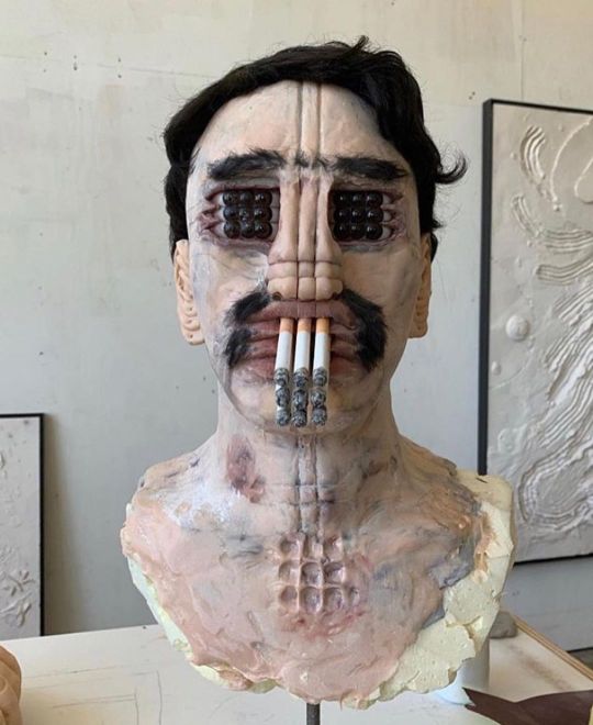
Here is a weird sculpture from daltmejd.
He has a very unique style. I remember stumbling across one of his sculptures on Instagram and thinking I had forgotten to put my glasses on or something. His work is realistic, yet totally bizarre and impossible at the same time! Personally, I have never seen anything like this before. It makes me both uncomfortable yet intrigued...
3 notes
·
View notes
Photo

I found this photo by Philip Mason, 1965, and instantly fell in love with it! I love the woman’s expression, looking in to the camera, almost as if she were looking deeply into our eyes. The square Afro is really pleasing to look at as it fills the photograph with fun geometry that also acts as a natural frame.
0 notes
Photo
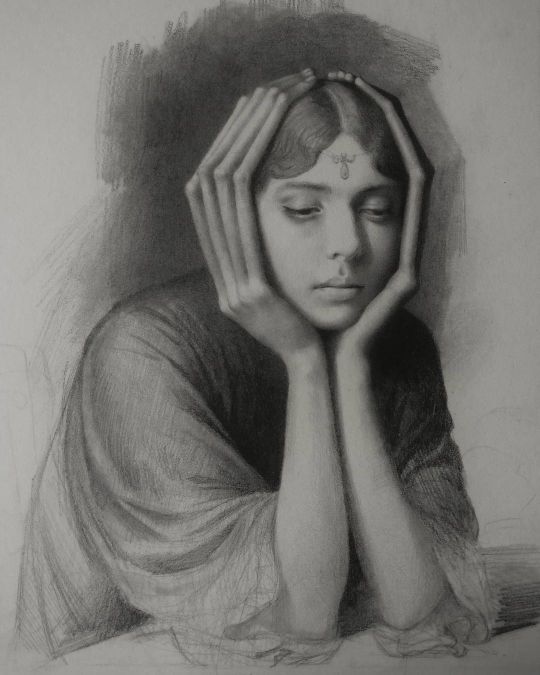
Melancholia by Miles Johnston.
Miles Johnston has a very original and interesting style. His technique is very professional and traditional, yet his subject matter always has a hint of freakishness. For example, this drawing at a quick glance seems to be a normal portrait of a young girl. However, when you look at her hands you notice they’re abnormally larger than they should be! This juxtaposition between real VS unreal possibilities is evident in most, if not all of his art.
4 notes
·
View notes
Photo
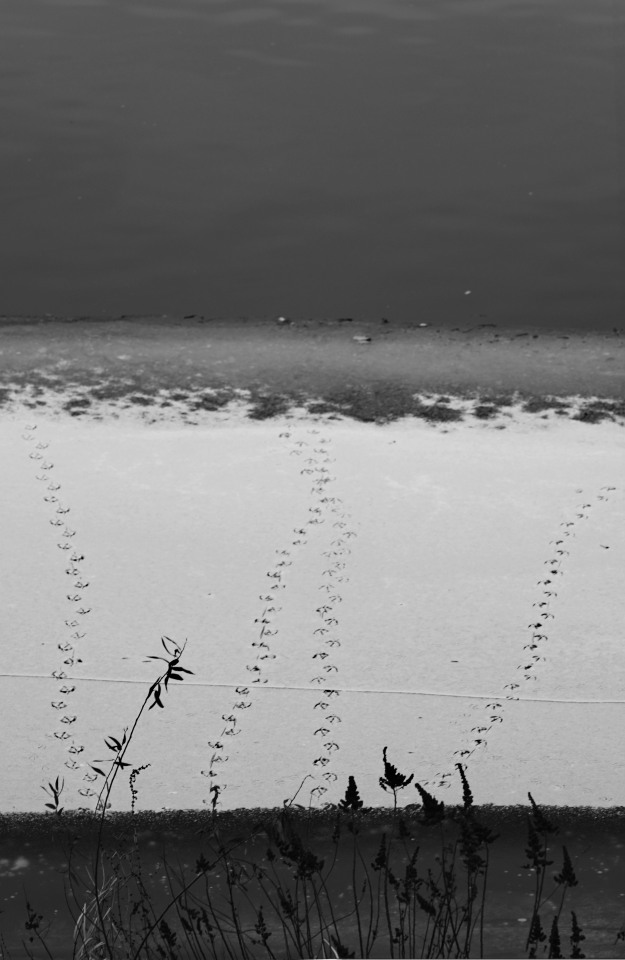
This is one of my own photographs that I took in Prague one Winter afternoon..
I’ve titled it, “Nope”. I like the composition with its different layers of shades of white/black, with the center focus being on the bird’s feet going in and out of the cold water. I chose to make it black and white as i think it makes it look more artistic and interesting, as in the original, the colours served no purpose, it was more for the composition.
2 notes
·
View notes
Photo
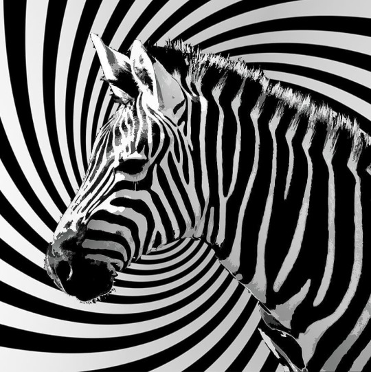
This digital drawing by selftasy is awesome! I love the use of contrasting line movements and how the zebra’s patterns almost camouflage into the background spiral. This work of art is clever and creative, yet simply effective.
0 notes
Photo
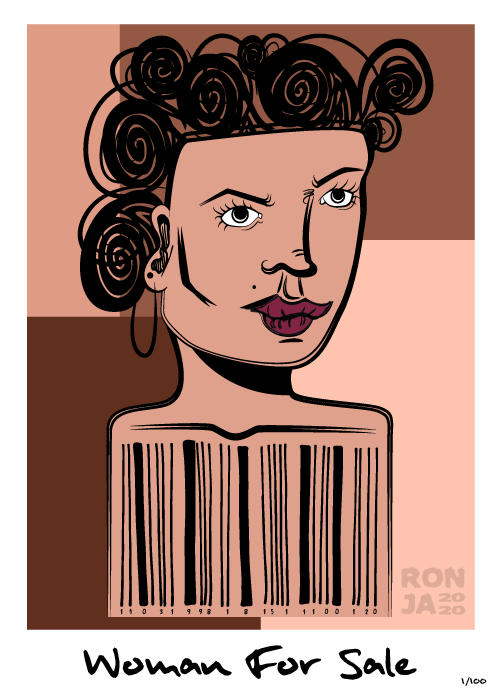
“Woman For Sale” is a digital illustration I did with a slight negative view on how women are often regarded in society. I don’t know about you ladies, but sometimes I feel like some people make me feel like a product, rather than a person..
2 notes
·
View notes
Photo

Dream Caused by the Flight of a Bee around a Pomegranate a Second before Waking, 1944, by Salvador Dali.
Dali was an eclectic and uniquely artistic character. I remember seeing his art for the first time when I was a small kid, and his style and subject matter baffles and intrigues me to this day. His dream-like compositions bring you on a journey of spiritual and metaphorical symbolism. For example in this painting, the pomegranate is meant to be a Christian symbol for fertility, thus implying that perhaps the emerging fish and tigers have some kind of phallic connotation, while the bee and bayonet may imply the sudden wakefulness of the woman.
Dali was determined to bring his dreams to the canvas, so much so that he would apparently deprive himself of sleep and sit on a chair holding a spoon. He would have a bowl on the floor, and once he started dozing off, and begin dreaming, the spoon would fall from his hand and make a loud noise from the bowl that would wake Dali, but not before he enjoyed some flashing images of his dreams that he would then incorporate into telling a story through his paintings. As he famously once said:
“The only difference between me and a madman is that I'm not mad”
0 notes
Photo

This is a political sculpture done by Czech artist, David Černý. His art is original, undoubtedly questionable and elegantly controversial. This one in particular was a big **** you to the parliament that was considering giving a communist party some power, which would have been outlawed for over 20+ years at that time (2013). This sculpture is bold, yet playful with the exaggerated finger and relaxing purple colour, and the fact that it is simply floating on a small boat down the Vltava River is a statement in itself.
0 notes
Photo
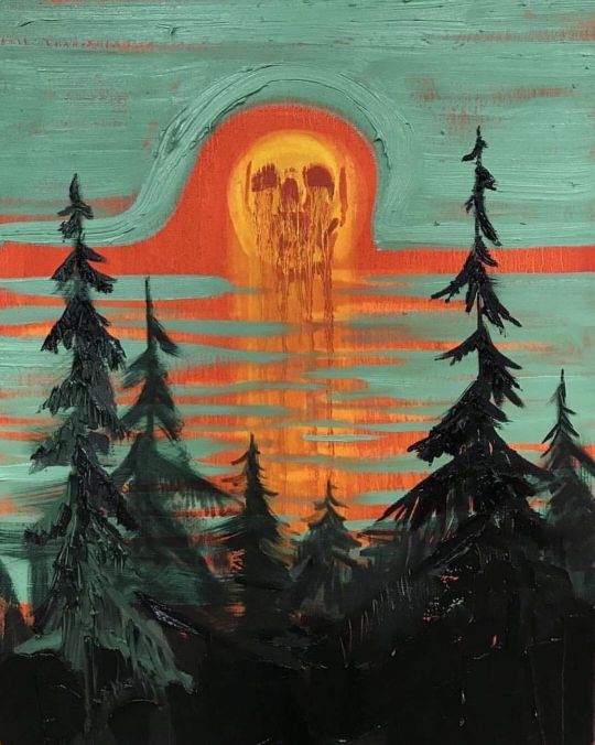
This eerie painting is done by kimdorland. I love his paintings for their natural symbolism and dark subject matter, with often an equally subdued colour palette. This one in particular reminds me of the days when you wake up, and you wish you hadn’t just yet.. 5 more minutes, please! It’s the kind of mornings when it’s so cold but the glaring sun is blinding your eyes through the slits of the curtains, but keeping you warm...
0 notes
Photo
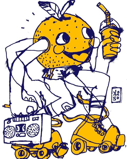
I love this cheerful and cool orange-man having a skate on a warm, summer’s day while he listens to some funky tunes along the way. This one is digital drawing made by jmarshallsmith. His style makes me feel somewhat nostalgic. The hand-drawn effect and child-like lines make me think back to my school days when I would doodle in my copy books. This particular piece is simple in its colour palette, but I think there is no need. The muted mustard yellow/orange is soothing and fun and the use of dark blue outlines, as opposed to black, make the illustration look more light and bouncy.
0 notes
Photo
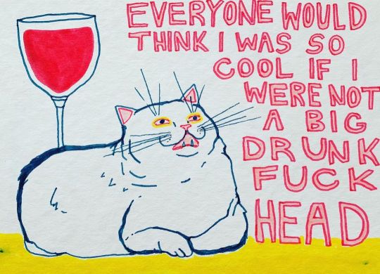
Excuse the French...
I am a big fan of Celeste Mountjoy, also known as filthyratbag, on Instagram. She uses a simple combination of colours, usually red, yellow and blue with some funny or controversial messages. This one in particular is one of my favourite drawings, as we can all relate to some unnecessary binge drinking sessions with the cat during the heavy lock-downs...
2 notes
·
View notes
Photo
I found this tumblr profile, Ori Toor and I have to say, what a gem! Browsing through their archive I didn’t know which one to share. I really like their style and colour pallets in each piece. I’m not entirely sure what is going on, but regardless, my eyes are taken on a delightfully colourful journey of all sorts of content! Very eccentric and original style.

David and the Sphinx
521 notes
·
View notes
Photo
Isn’t that just lovely?
I really like this simple swirly design by chlstll. I love the choice of bright, rainbow-like colours. It reminds me of a sunny day on a beach, with some groovy music playing in the background. The spiraling design definitely makes me want to get up and boogie!

Spiralize - visual design by chlstll (2019)
50 notes
·
View notes
Photo
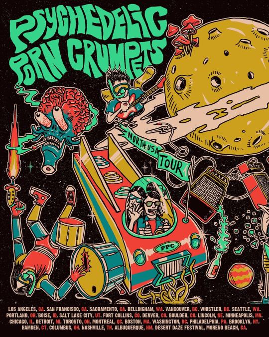
Psychedelic Porn Crumpets - USA/Canada Tour 2019
I chose this band to do my typography poster on, and while I was doing my research, I found this little gem! A trippy poster for an equally trippy band! Psychedelic Porn Crumpets are a psychedelic rock band from Australia. I love this poster for its quirky looking characters and content. They’re a loud band with playful and colourful riffs. I think this poster does well to give you the feeling that their music is going to take you on a wild ride full of surprises! I like the neon colour in the name of the band and tour, as it makes it stand out from the rest of the content. Your eyes are immediately directed there. They are then taken down the rocket ship and flow around the entirety of the poster, finishing at the bottom where you can read everywhere they will be playing.
4 notes
·
View notes
Photo

WoMan is a shout out to all the beautiful women, men, those who classify as both, or neither. I wanted to create a portrait of an androgynous being that did not fall into any “box”, as they say. Who’s to say that this can’t be a portrait of a man with luscious lips and long eyelashes? Or perhaps it’s a woman with short hair, feeling empowered even without her long locks? At the end of the day, it’s a stylised portrait of a person. Whatever society deems feminine and masculine, it really shouldn’t matter because we all deserve to live colourful and happy lives.
YOU DO YOU, BOO!
7 notes
·
View notes
Photo
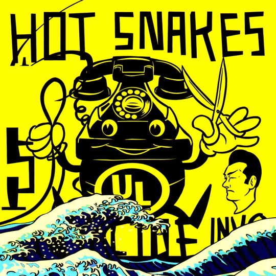
Hot Snakes, “Suicide Invoice”, 2002 album cover
I am quite the fan of Hot Snakes’ music and album/merchandise designs. Being heavily influenced by the 1920′s cartoon style, we can see the bold black outlines, striking monochrome colors and bubbly eyes and gloves for hands. This particular album though, I was not a big fan of. To me, the juxtaposition between the Japanese style of what looks to be the The Great Wave off Kanagawa (by Hokusai) along with the cartoon telephone simply isn’t doing it for me.. It could be that the multiple colours used in the wave, compared to the single use of colour for the background lacks consistency and flow. As well as the fact that the two are of completely different style. Had the wave been cut out altogether, I would have much preferred it, but I guess that’s what it’s all about! Break the norm. Surprise and emphasize!
#post-hardcore#music#Hot Snakes#album#cover#art#Suicide Invoice#graphic design#1920 cartoon#Japanese#influence
0 notes
Photo
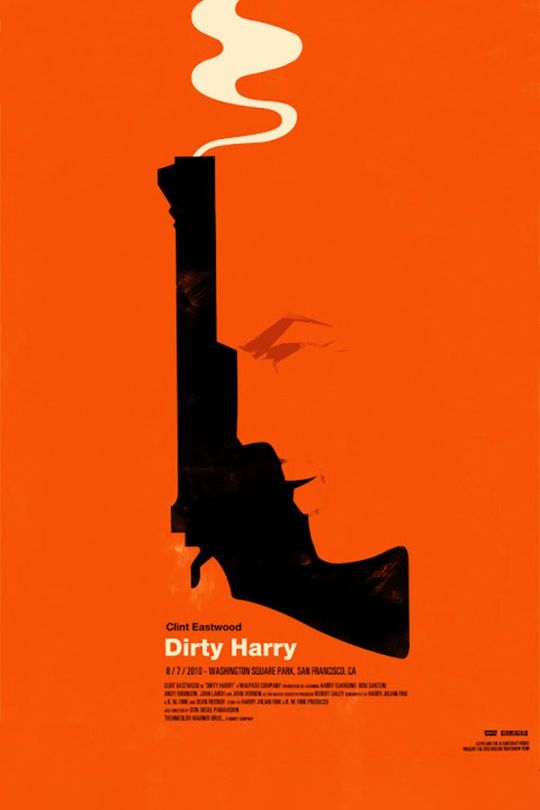
Dirty Harry (film poster) - Olly Moss
I really like this one! The shade of orange is vibrant, eye-catching and exudes a sense of excitement. This is an incredibly creative, yet simple, design. At a quick glance I took it for nothing more than the side profile of the character, but then I noticed the swirling smoke at the top, and realised the clever use of design. The face’s shadow is a gun that has evidently just been fired! The poster definitely leaves it down to the viewer what they think the film will be like. I think the minimalistic approach, with the monochrome orange and lack of text, definitely adds some mystery to the finished product!
4 notes
·
View notes