crabapple96-blog
Sam's Art 124-Journal
"Crab Apple Pickering"
14 posts
Don't wanna be here? Send us removal request.
Last Seen Blogs

doodle-bun-makes
Just a little clown

pinecomb2009
Big Cocks 4 Little Holes

johaun-davy
Johaun Davy
xigbar
city boys

vyaratiles
Vyara Tiles
Text
Week 15- Final Thoughts
I think I see design moving in similar ways to that of the “Citizen Designer” concept. The role of design in activism and approaching complex social issues has developed into a symbiotic relationship. This especially in the sense of advertisements, displays, and documentation. The image of social change groups and statements are the posters and objects behind them. Design can be used as a tool to create accessible knowledge and to communicate with others. One that come to mind is the #metoo movement. Their website is a work of incredible design. The typeface is sans-serif and bold. It is equipped with “tool kits” of organized information and images like articles, that people can download to read and share. The website also has feature built in called that “safety exit”. When clicked, the page is redirected to the google search page. The link is discreet, and allows the viewer to safely navigate the page. It’s a reminder that design is also for user safety. I think design in activism will also be important in future activism movements. Many of these platforms are based on social media. I think design is going to be crucial in social media banner, posts, and logo imagery. Also in digital documentation of museums, protests, and activism groups. The “Black Lives Matter” movement has created an image for themselves using black, white, and yellow to symbol themselves. Its’ symbol is bold and striking. It echos the use of type in Emory Douglas’ works for the Black Panther Party. Creating a single image for activism groups is essential for a seamless transportation of its’ message. This is also apparent in the continuing efforts of the “We the People” campaign that created the triptych poster series questioning the social norm American identity. The campaign uses lithograph prints and stickers that are being used everywhere from women’s marches, school hallways, internet blogs, and other activist community spaces. The designs help facilitate dialogue.
#metoo:
https://metoomvmt.org
Black Lives Matter:
https://blacklivesmatter.com
We the People:
https://amplifier.org/campaigns/we-the-people/
0 notes
Text
Week 14- Your Choice
It amazes me every time thinking about how movements and styles of art and design flow into each other. They play off of each other and influence the subsequent ones. I’ve enjoyed watching how design became more accessible as it neared the digital age. I think it’s important that design keeps following this trend. If design influences every aspect of modern life, it should be able to be manipulated and created by everybody.
Something that interested me was the Neo-gothic architecture style. The design included the original iconic parts of including gargoyles, vertical lines, jointed windows, etc. The Chicago Tribune Tower brings in different businesses into the same space. The buttresses near the top of the tower draw the eye upwards. They are also stated to be easier to see lit up at night. The ornamental pieces add to the facade of the building connect it back to gothic origins. It also collected bricks and stones from historically significant sights from around the world. Some that come to mind is Notre Dame Cathedral, the Great Wall of China, Lincoln’s tomb, and petrified wood from the redwood forest in California. It also connected me back to my own community with St. Casimir’s church in my neighborhood.
Thinking about the impact of current design should be talked about more in our school curriculum. The idea of being a citizen designer was intriguing to me. It makes me think about the idea of, “where did the radical minded design students go? What happened to their driving force and spirit?”. It makes me wonder about the balance of it. Do creatives have a duty to address societal issues? Is that what was in mind of designers and artists of the past? I do think the idea of being a cross-pollinated has merit. The future of design has to be met with some sort of curiosity and optimism.
0 notes
Text
Week 13-New Media
The digital aesthetic describes the change of design away from the trends in the 80’s to the newer “hot topics” of the 90’s such as video games, science fiction, and other technologies. Some techniques are characterized by their bright colors layering over each other. With the introduction of photoshop and other programs that manipulate/create digital media, digital images could have more depth. Layering techniques were broadened further from printmaking and painting layers, playing with transparencies. “Bit-mapped” typefaces were continued to reach gaming-audiences. New medias became more accessible to the public. Programs with “Do-it-yourself” and “Customizer” options allowed for personalization, as well as marketing to the individuality/independency of home technology. Something that interested me was the topic of internet entertainment vs. creator purpose. Music videos,TV show, and movie graphics changed pursuing sleeker, more futuristic, and seamless transitions. 3D design developed to incorporate new techniques of motions and CGI.
Recently with the age of Minecraft and other older games being rereleased for contemporary gaming consoles, fashion has changed with it. Lots of people who enjoy these games are buying merchandise with images of them on them. Lots of “8-bit” accessories were popular for a while. Gaming culture has highly influenced social media and fashion trends. Games like Fortnite spread internationally with its iconic characters, customizability, and of course the dances. What is interesting to think about is the aspect of virtual reality. With games like Pokémon Go, brings digital design into a sense of reality captured by cameras. The digital aesthetic branching over to a hyper-realistic style. It mimics “real life”. Graphics are more photorealistic, and people can connect over the internet in a matter of seconds. Speed in multitasking is the key.
0 notes
Text
Week 12- New Media
I think an incredibly important part of interactive design is how accessible recording technology became in the 70’s to the present. The start up for any new thing doesn’t reach a wide audience right away; especially while all functionality and overall design adapts and changes. It gets prototyped, adjusted, and redistributed. However, when a product hits the market and takes off, I’m interested in the societal impact. Plus, how it effects our documentation of history. Imagine what closer looks into the daily lives of people in the past, if digital documentation existed. Obviously, it would have changed everything in ways we cannot fathom. But the point is, we would have so many different perspectives to learn from. With the progressing VCR cams, flip cams, Apple products, and Go-Pros, anyone can document their lives. Whether we like it or not, “selfie culture” is documenting society, in a much more detailed and numerous way than portrait paintings really ever did. This accessibility to technology changes how people receive information. There is so many outlets and resources with on click. It makes me think about the future of the phrase, “History is written by the winners”. By making recording devices individualized mobile objects, we’ve invited spectators into personal parts our lives. It’s uncharted territory. A person cannot go through their day without having some sort of impact on the future. With the development of more sharing media outlets and devices, how will we distinguish what is reality? The accessibility factor also plays into the target market debate. It’s less who can afford what new thing, but who is going to use it. The newest iPhone or gaming console isn’t necessarily gate-kept or elitist items. Everyone can get them somehow. The design is going to account for who wants them. The varied sizes, colors, and features create options almost as diverse as the public buying them. The individualization of design makes devices reach the interest of larger target markets.
0 notes
Text
Week 11- Graphic Design
The Citizen Designer refers to, “a professional who attempts to address societal issues either through or in addition to his or her own commercial work” (425). The reading describes that artists working with this title are working to use their experience and passion for art and design to help approach complex problems from a multi-disciplinary angle. Some examples are global climate change, human rights, and the treatment/prevention of HIV/AIDS.
Some designers came to this profession from a negative assessment of humanity and a call to arms. They were fed up with artists creating work on a client-artist basis, making things for aesthetic pleasure. Brian Smith wrote, “So what happens to our ideals? How do design students with radical ideas seem to end up a few years later designing hotel interiors…” (425). Others see that collaboration with government, industries, etc. promotes the diverse collection of ideas, perspectives, and points of view to draw from. The way to solve societal issues is to include people from all walks of society, think-tank style meets cross-pollination. The design aspect also includes sustainability with these changes. Designs work with eco-friendly ideas like using digital media. Overall, the Citizen Designer is to take back the name of design from solely marketing, blue-prints, and aesthetics. Design encompasses a broader span of creative outlets that work in all facets of work and activism.
It’s hard to see how the Citizen Designer is not relevant. Bluntly, there are a lot of current issues that need to be addressed further, and many on the horizon. However reflecting on the general feel in my classes, it’s also not hard to see why artists ‘sell out’ and work commercially. Placed in front of every student is the question of survival. Everyone needs an income. It’s hard to keep that initial zeal for art and design when juggling an uncertain future. But the reading shows why it’s important to start thinking beyond that. It’s imperative that people in creative backgrounds continue the collaboration of art and design activism. There doesn’t need to be a “designer as prophet” mentality, just the will to work as a team.
0 notes
Text
Week 10- Graphic Design
As an art student with an emphasis in drawing and painting, without much of a knowledge base in typography, it’s interesting to see how the different process bases and histories line up. I did take a couple printmaking classes with type units/projects, but most of the time we worked more on studio work creation than based in history. Something that stands out is the relation of painting to posters. Many of the artists making posters for advertisements or war efforts had inspiration from neoclassical and romantic era painters like Eugene Delacroix. Both forms used their subjects to emotionally persuade the viewer to action. Delacroix used his paintings like Liberty Leading the People to all the citizens of France to arms and end the reign of the monarchy. About a century after the French Revolution, artists used posters in similar styles to urge citizens to enlist in the military and support their respective governments. It helped me realized that painting and typography are existing in the same or similar art movements, and not necessarily in separate worlds.
I also thought it was interesting how the loyalties and histories of France and Germany kept their type designs separate until the mid-twentieth century. It speaks to the unrest between the countries that built up between several years to the Franco-Prussian war in 1870. The divided roman forms in France and the German blackletter type, in part, divided Europe. Creating a transitional form would definitely have been seen as anti-nationalist. While blackletter font came first, it seems to have been pushed out of style by more modern roman forms “simplicity”. This can also been seen in the short coexistence between the end of the rococo era, neoclassicism, and romanticism. They turn on each other in a flip from using techniques and imagery from antiquity to purely modern techniques.
0 notes
Text
Week 9- Industrial Design
With the wave of immigration into Milwaukee in the late 19th century, the city became a hub for machinery and other working industries/factories. It got its nickname as the “Cream City” from the amount of light colored bricks made from the bed of the Menomonee River Valley. In one way, the city developed as a center for industrial design with its expansion to being the largest city in the state. Reading about it, with the addition of factories and commercial spaces in the city, the art and innovation came with it. Places like MIAD and the Milwaukee Art Museum started showcasing the ideas inventors and designers have been making to reach the ideals of the consumer, and also an artist.
Before anything, Stevens had roots in Milwaukee from the start. From his biography is sounds like he had a support system here. He had connections, not necessarily as a foot in the door, but as having like-minded people to collaborate with. The biography also states that he thought, “Milwaukee was where the business was”. People were moving into and around the city for the jobs. I’m guessing during WWII, the factories already starting to develop were converted for military-grade use. Post-war, all of that needed to be reconstructed for civic use. The text describes how Stevens repurposed military jeeps into stylish touring cars.
Milwaukee is the home of many internationally known companies such as Miller Brewing and Harley-Davidson. When looking at the principles of universal design, or creating advertising that is appealing, there has to be a demand or a spark for such. In this city, there was space to place an individual spin on the blueprints. Working from his proverbial backyard, he knew the city, and in an aspect: what it wanted. While the business was here, he knew it well.
0 notes
Photo
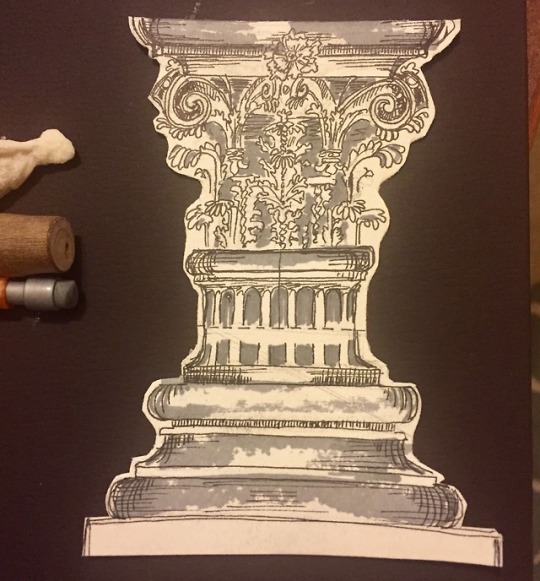
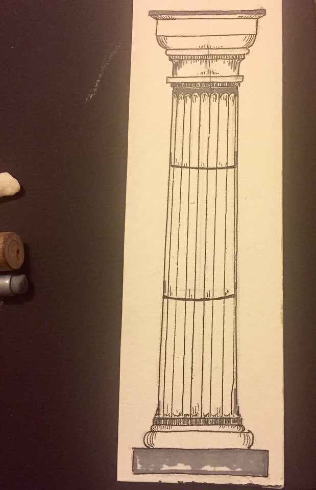

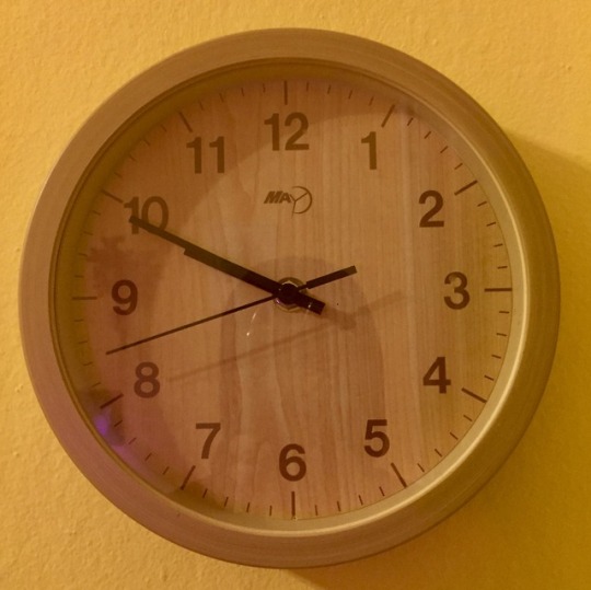


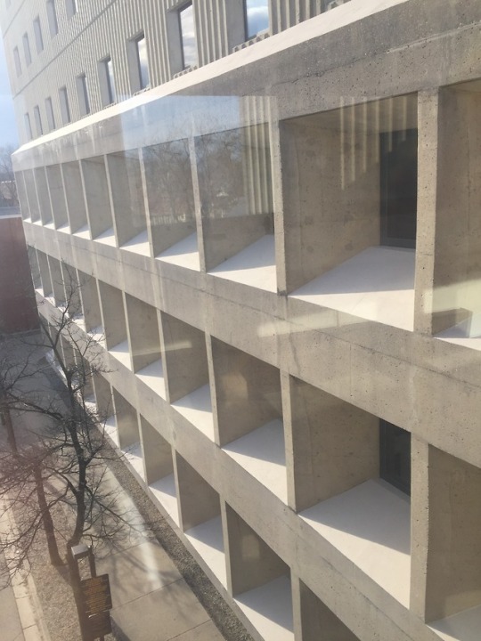
WEEK 8- INDUSTRIAL DESIGN
I’ve been exploring the differing designs of pieces create for similar functions.
The doric column came first, and is know for their strong appearance. The corinthian column came after the first two, known for its’ decorative style based of acanthus leaves. Drawing the two has helped me appreciate their differing impacts on their respective time periods.
The clocks in my house are also fun to compare. My round clock is battery operated, and is minimalist in appearance. The cuckoo clock works by pulling the chains to wind it.
Mitchell Hall is where my art studio space is, and Curtin Hall sits next to it. The somewhat neo-classical appearance inside the building is a major juxtaposition from Curtin’s brutalist structure.
0 notes
Text
Week 7-Architecture
One of the Universal Design principles is it has Perceptible Information. The idea is that the design provides multiple ways to interact with the user, usually by activating different human senses. It has to be accessible for diverse target market. One of the item I use frequently that shows this is my stovetop kettle. The kettle both has holes that whistle and a built in thermometer. This way the user can hear if the water is ready, or watch and wait for the thermometer to reach the right temp. People with visual or auditory impairments can use it to get all the coffee or tea they need. This is also similar with the Cuckoo clock I have, it visually shows the time with hands, and sounds the time with the bird sounds at the half-hour and hour, with the correct about of “cuckoos”.
Another principle is Low Physical Effort, which pretty much speaks for itself. There is no need for repetitive motions, complicated procedures, or added stress. Living in the city, we all know that when it comes to drinking tap water, some sources are better than others. My husband and I got tired of using a filter pitcher that we had to refill and store. It took up room in the fridge. As a replacement we got a filter that screws right into our kitchen faucet. It was a simple installation and has a lever to switch from filtering water, and letting the tap flow. It’s a lightweight design, and it’s straightforward. Whenever we have guests, they seem to figure it out without any questions. This is also similar with all the locks on our doors. their design is a simple deadbolt that you see everywhere. Turn it to the left to unlock, right to lock. The user can hear the bolt lock. I think it’s easier to use than remembering to fasten a chain, sliding locks, or my friend’s jimmy proof that takes a few turns to lock.

...Now, I want coffee.
0 notes
Text
Week 6- Architecture
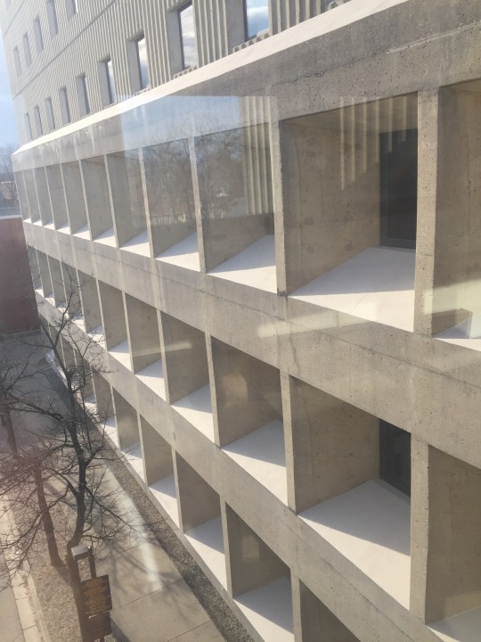

Curtin Hall reminds me of brutalist architecture, it is concrete, utilizes many of the cubic motifs. It looks like a grid. Placing it next to Mitchell Hall, which is more of a classical revival, it’s a contrast. Someone once told me that Curtin Hall was built to be raid proof. Whether or not it’s true, I’m not sure.
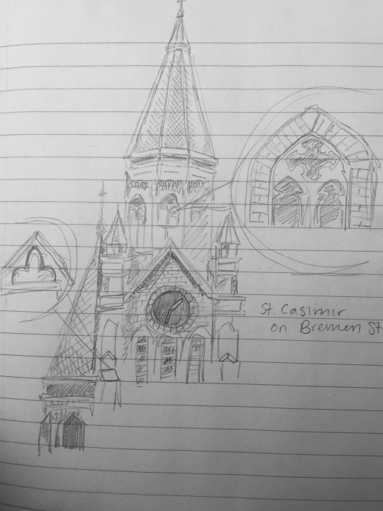
The church I mentioned in an earlier discussion post, St. Casimir Church, is built in the Victorian Gothic style that many churches, schools, and government buildings are built in the late 19th century. It has high arches, stained glass rose windows, spires, gables, columns, and statues in niches. It’s brick-based. It looks a lot like traditional gothic cathedral in Europe.
0 notes
Text
Week 4- Found Object
I live in the Riverwest Neighborhood and walking around I found myself looking at St. Casimir Church. Stamped into the side of the building is the founding date of 1894. It is the tallest building in the area, and it sticks out. It is built in a victorian gothic style, with the bricks starting to turn from cream color to a darker shade. The spires are a pale green color. It functions as part of a parish, a separate school, food pantry, as well as historical architectural design. The stained glass rose window is beautiful. It lets light into the building and functions as part of christian story telling.
I also walked near the Oak leaf Trail. It’s super snowy and icy right now. I took interest in the signs designating the trail. They are brown with tan lettering and have a green oak leaf image. The type used remind me of the sans-serif letter-types. The letters are bold with close together kerning. The colors used are natural, probably blending in with the trail during the warmer season. The other trail signs also have arrows pointing out the direction of the paths. Makes sense because of how the trail runs along the river, lower than street level.
The numerous amount of cones are hard to miss as well. They are an eyesore, but are important. The bright orange color alert drivers and the reflective lights have the same effect at night. I see that a lot of the cones are tipped over and semi-crushed, probably due to cars hitting them or the snow. Different from the giant orange ones, the skinny white poles on the Locust St. bridge were most likely to function the same way. I know they were installed when the street went from being two lanes to one, it created better bike lanes on the bridge and more room for pedestrians. However most of them seem to be broken off by now. I wonder if they were orange or bulkier they would have lasted longer.
0 notes


Text
Week 2-Design Thinking
I would define design as a working system, based on the collaboration between different sources, that strives to give a positive solution to presented problem.
Right away, design thinking is in travel coffee mugs. I drink a lot of coffee and tea, and am constantly on the move. So is the vast majority of people I know. Not all of us have the time of day to sit and drink a cup. One brand in particular that stands out to me is Contigo. They are marketed for busy people, going to work, school, sports, etc. Many of the designs are combinations of materials to keep drinks extra hot, easy to carry, and spill proof. The name also translates to “with you”, they’re like a travel buddy. It plays into the idea of “great design [satisfying] both our needs and our desires” (92). Both an emotional and functional appeal.
Keeping on the coffee track, my pour-over coffee system is made by a Japanese company called Hario. They started making laboratory glassware in 1921 under a different name. After years of research and prototyping, they created a new heat-proof glass (“Hario Glass”) in 1949. Branching out they started making household coffee brewing equipment. They promote using an all electric melting furnace and using recycled materials to have a better ecological impact. According to their website message, they pursue the “truth of nature and well-being of people and fulfill needs which in turn become profit”. This both in a professional and personal sense. It’s an example of “human-centered exploration” (89) that expanded new commercial-use product into individual homes. Their beakers, flasks, etc. are used in labs across the world and I’m making coffee in the morning using the researched glass.
I think the most significant concept from the reading was including empathy into a design thinker’s personality profile. While being in art studio classes does seem to be a lot about the quirky outfits and critique opinions, design incorporates the idea of something more important than self presentation. Bringing “people first” and thinking about taking a moment in someone else’s shoes is thought-provoking. How often do artists, myself included, create things for solely personal use? Art made for the artists’ use by no means is a bad thing. However, thinking about a larger perspective can be world altering. It makes think about my art career beyond the gallery space into design.
0 notes
Text
Week 1-About Me
Hello, my name is Samantha and I am a Studio Art major with a concentration in Painting and Drawing. I have been experimenting with using different mediums and techniques from oil to acrylics, and adding things like tissue paper, hair, teeth models. Some of the topic I’m working with is the perception of fear and false memories.
I took this class to further learn about the history of design and its’ relationship with art. Both are so closely associated, I think it’d be important for me to know how they relate. I think a lot of artists start with a concept/problem that they solve with their completed work. Being a student artist, I understand that art can be used for activism, commercial use, personal explorations etc. I’m inspired by all the different ways creative minds work in different fields of study. Design is everywhere.
My husband is very interested in watches these days. I recently bought him some of the parts he needs to build his own. Apparently the design of each mechanism of a watch has been turned into something of a competition between companies. For example, how smoothly the hands move is one factor, and the appearance of the face another. Something interesting to me is that the Japanese Seiko brand watches is chosen in blind craftsmanship reviews over the Swiss brand Rolex. It ranks higher. However, by name alone people more often than not, pick Rolex over Seiko. It gets me thinking about how design might be secondary to brand.
1 note
·
View note