
daily-rayless
there is much to scan
Hi, I'm Rayless. This is my main blog, where I post art every day. My secondary blog is right here if you'd like to see what I reblog. Either way, enjoy your visit.
1968 posts
Don't wanna be here? Send us removal request.
Last Seen Blogs

drumeveryday
DrumEveryDay
itjustfeels
Zombies Are Gross
drumeveryday
DrumEveryDay

jenabelle13
Like Clockwork

diegoazeta
Azeta 🌐 Azota
Text

Some years back, I had the opportunity to learn some Arabic. I only become comfortable in the most rudimentary things, but it was a lot of fun. Since then, I've unfortunately lost most of what I learned.
Knowing that, I think the text here is wrong? It's supposed to mean "pearl (lulua) of the night (layla)", as in, the moon. According to Google Translate, I left off a key taa marbuta, which is a shame, because the taa marbuta is the cutest not-technically-a-letter in any language I've seen. Anyway, the phrase would be pronounced luluat allayl.
I don't remember specifically why there's a cat, but I've always found them difficult to draw, and I think this one turned out well.
See also this Persephone, because I am nothing if not happy to revisit ideas.
5 notes
·
View notes
Text

More Mitsuru. Of course.
8 notes
·
View notes
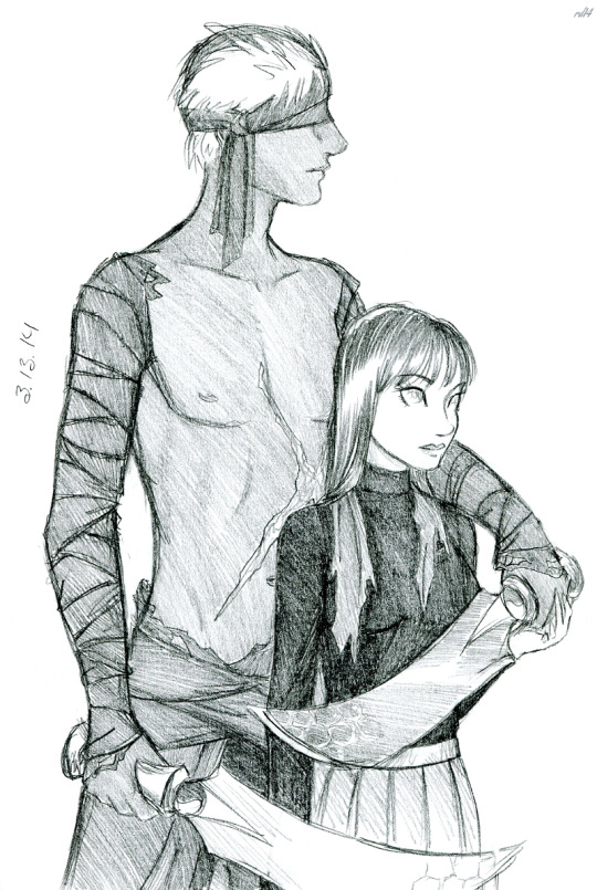
Text
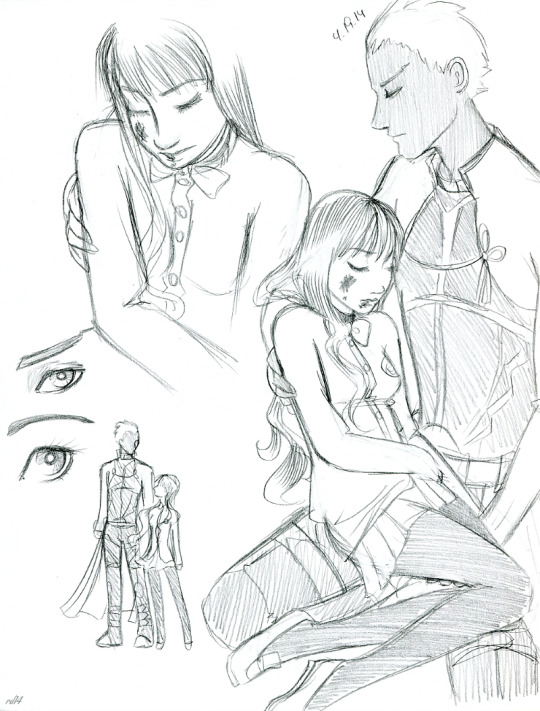
I'm not sure why Hakuno's wrecked in these sketches, whether there was any story behind it. It reminds me of Fate/Extra's Week 7, though, where Hakuno keeps passing through Julius' barriers in the Arena and seems to progressively get more hurt. The visuals are limited, but you can bet that by the end of it, her Servant is probably losing their mind with fear for her.
Excuse me now, got to go sit somewhere and wait patiently for news of the remake.
0 notes
Text
Largo and Rosie from Valkyria Chronicles, in peacetime. Also a cat.
2 notes
·
View notes
Text
At the last moment, disaster was averted. If only Red realized that –- she might have had some hint of who her real enemies were. As it is, as the summer of 67 goes on and her relationship with her bodyguard crosses the point of no return, she can't shake the feeling that not everything is as ideal as it seems in Cloudbank.
Chapter Sixteen: Red finally learns about this mysterious Transistor -- and the people behind it.
Updates Mondays
7 notes
·
View notes
Text
Designing My Book's Cover
I did this with my first book, talked about my thought processes behind its cover -- so let's do it with the second one, The Escape of Lady Aigle. You hear different things about book covers:
1: Traditionally published authors have no control over their covers, so don't complain to them about it.
2: Self-published authors must never, ever do their own covers.
As a self-published author who did her own cover, it's fair game to 1) judge me and 2) complain to me. With that out of the way, let's talk about it, what my process was, and whether I made the right choices.
This book, Eola for short, was developed over a stupidly long period of time. I think I started brainstorming some time in 2008, I started writing in 2013, and then it was published in 2023. For most of it, the book didn't even have a name (that's a different post) and I didn't have much idea what the cover should be. (Eyeball? Eyeball with mysterious magical mark beneath it?) But in late 2018, I started playing around with -- not exactly workable covers, but ideas that maybe some day could inspire a cover.
This is the one I always think of:
Character art by me. As with the first book, I used some borders/ceiling art by Jules-Edmond-Charles Lachaise because they are utterly gorgeous and public domain. Background texture by solstock on deviantArt.
I think I wanted to convey two key things in this and the following images: 1) The heroine is a fancy lady and 2) There is a mysterious magical gateway that's going to bring her no end of trouble.
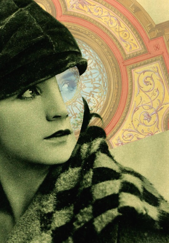
I also played around with using old photos, pressing long-dead silent-era film actors into service.

More Lachaise. Light flare texture by Hexe78 from deviantArt. Charmian played by Greta Nissen, from Photoplay. I like the broodiness of this, also the way the light flare is localized over her left cheek, but altogether it feels unbalanced to me.
This time, the Lachaise magical "gate" is straight up coming out of her cheek. I think there's an interesting idea here, but it's not well executed -- the gate should be shaped to her nose, and it would look much better if it extended all the way behind her. (Again, I say in my defense, these were ideas, not meant to be actual covers.) Charmian here played by Mary Hay from Photoplay.

Some months later, I returned to this idea, this time with Charmian appearing to be lost inside the gate. Background texture from Freestock.com, I believe. I think this looks nicely harmonious, but the concept of the gate being a gate, rather than being a pretty design (which is what it originally was, sorry, Lachaise) is lost.
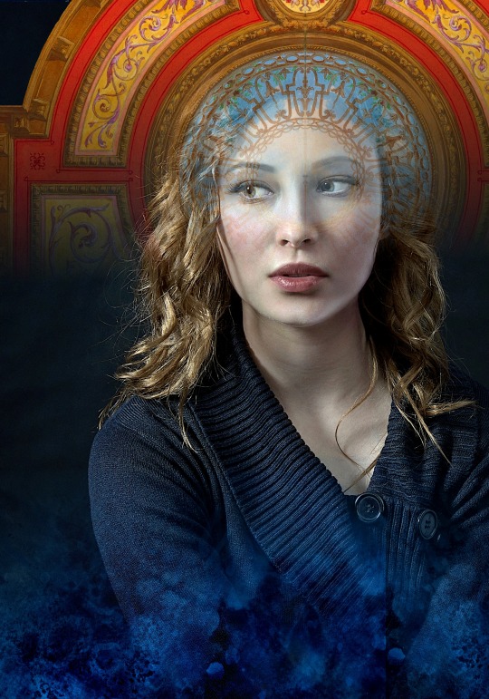
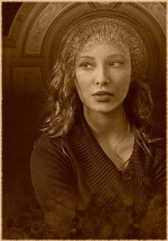

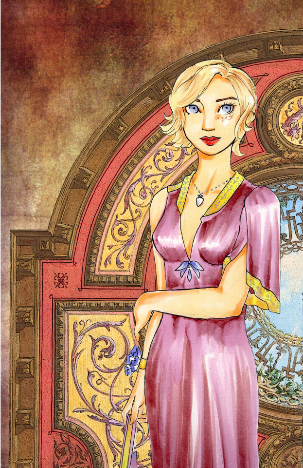
Then I did this series, where the gate is emerging from her mind. I think of these as the kokoshnik ones. They're very pretty, but I wonder if they also would have been baffling. Two Lachaise borders this time, woman's photo from Pixabay, texture (I believe) from Freestock.com. Out of all of these, the last one might have come closest to becoming the basis for the cover.
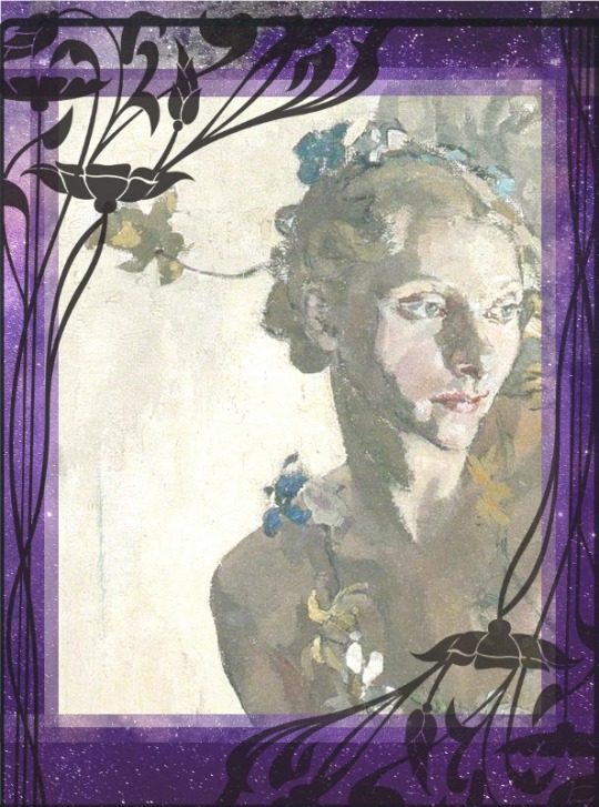
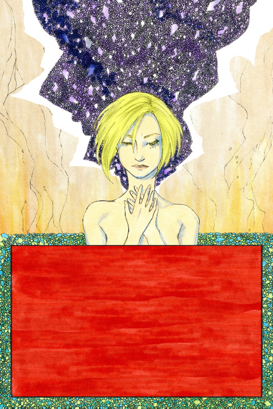
And then there was this one I just threw together, going for a little bit of an art nouveau feel. Artwork by Ethel Gabain, border and background from Pixabay. An amethyst/purple night sky is a key plot visual, and I think it's pretty, but this one would have needed a lot of work.
But in the end, I didn't use any of it. After doing the first book's cover, I think I was pretty committed to doing Eola's art elements myself -- all of them, not even relying on stock images. The cover's dimensions and the placement of images can change a lot as you figure things out, so rather than create a single static image, I decided to create a collage, doing each element in isolation so I could move things around as needed.

If it looks like it took a long time to do all those geode facets and small pebbles, that's because it took a long time. I am an imprudent traditional artist and the detail work just about killed me. But I think it sells the effect, so I don't regret it.
One thing I like about this cover, that the earlier attempts didn't have, is that it's extremely specific. The different elements mean something. This couldn't be the cover of any other book.
One key difference with Eola and the first book is that I also wanted a hand-drawn back cover -- and, hey, while we're at it, why don't we do a portrait of the heroine Charmian on the book's spine? A picture on the spine will help it stand out on the shelf. It can't be that hard.
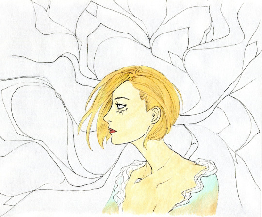
I ended up drawing that spine portrait three times. It's the smallest element of the cover, and it kept thwarting me.
I just wanted Charmian in simple profile, showing off the mysterious marking on her left cheek. I like this first attempt a lot, but the colors were wrong (I can't complain about the publisher getting details wrong; it comes down to me) and overall she felt a bit stiff. Okay, let's go for more movement.
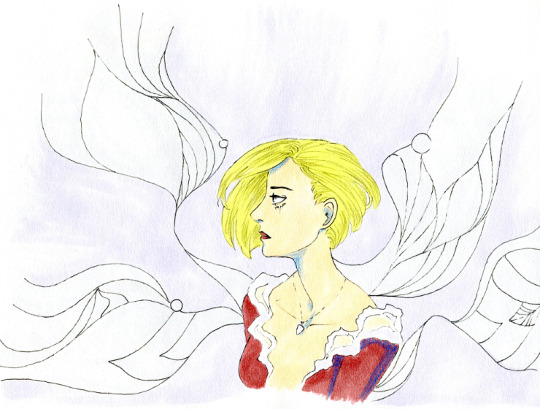
That's quite a lean you've got going on there, Chara sweetie. We got movement, but the colors aren't right at all and in general she's kind of droopy.
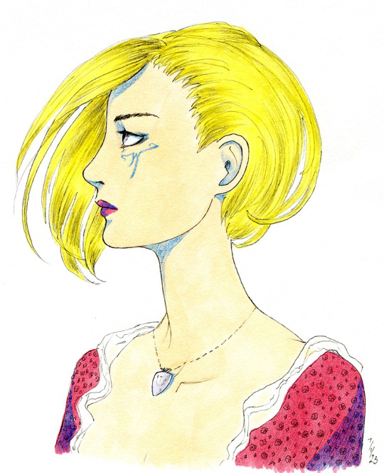
Third time was the proverbial charm.
Pose has some movement, colors are good, mark looks good. I really like the warped lines around her, though in the end result, you don't see too much of them.

The final spine portrait, blown up huge.
So, after all of that, here they are, the front and back covers:

Hand-drawing the entire cover was daunting, but the end result was better than I'd expected. Where's the magical gate? It's still there, it's the erupting tear behind Charmian. What're the geodes about? What's the bracelet skull thingie? Hopefully they're intriguing and they'll inspire browsers to open up the book.
I'm especially pleased with her cheek mark on the front cover. I wanted it to be there, but not immediately obvious.
I hope you enjoyed taking this little journey with me. Did I make the right calls? Am I just abusing poor Lachaise's hard work? It's always possible I'll redo the cover some day way down the road, so you might see some of these ideas resurface.
5 notes
·
View notes
Text
In most of my Evil!Hakuno art, she's clearly having a great time. But here, she has an intriguingly blank demeanor.
Evil!Emiya is gathering her protectively close, not holding her hostage. I know, I know, they're evil, but they're evil and in this together.
1 note
·
View note
Text

Today's second birthday belongs to Renne from the Trails series. Happy Birthday, Angel of Slaughter.
#renne#renne bright#trails#trails in the sky#trails in the sky spoilers#trails of cold steel#trails of cold steel spoilers#eraserless chaos#2023
13 notes
·
View notes
Text
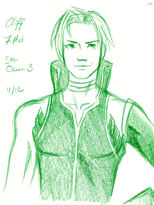
Happy Birthday to Star Ocean 3's Cliff Fittir, your leather-clad rebel pugilist mentor friend.
#cliff fittir#star ocean#star ocean 3#star ocean iii#star ocean 3: till the end of time#eraserless chaos#2023
2 notes
·
View notes
Text
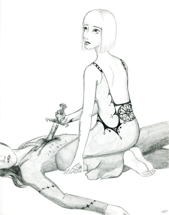
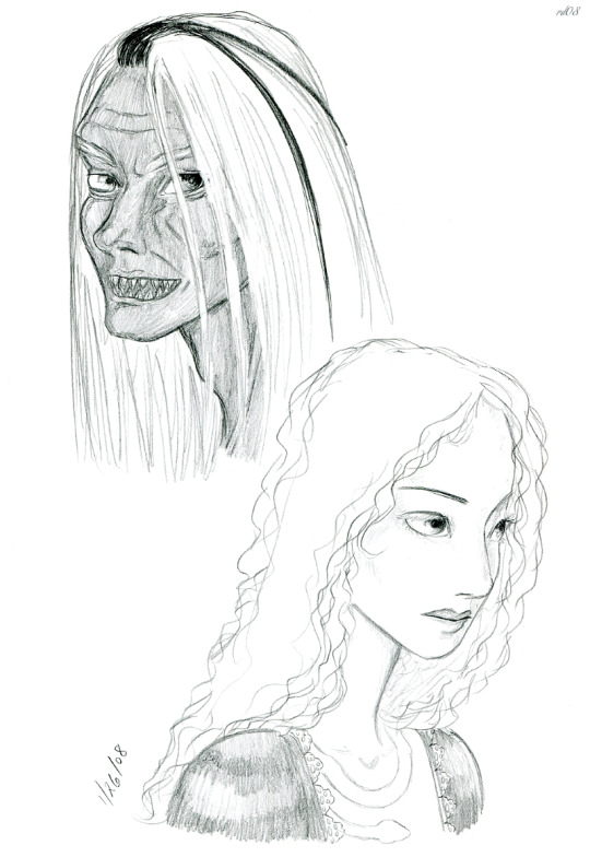
The outcome to this one. The maiden kills the vampire.
#woman#vampire#blood#stab#gore#mythologyhistoryfolklore#2007#let me know if there's additional warning tags that would be useful
1 note
·
View note
Text
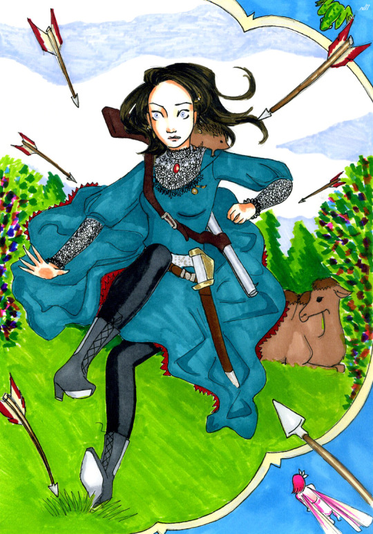
Fan art for "The Princess and the Hedge-pig", one of many original fairy tales by the brilliant early twentieth-century fantasy author E Nesbit. So many of Nesbit's fairy tales are fun and funny and clever, but Hedge-pig (just another name for a hedgehog) has long been my favorite. Our heroine, the Princess Ozyliza, who can fight and shoot as well as any Prince Charming, is ousted from her throne. Her enemies attempt to assassinate her with a barrage of arrows. But her childhood friend, a strapping young baker's apprentice, throws himself in the line of fire, is repeatedly impaled in the back, and, to save his life, a good fairy turns him into a hedgehog. From there, they set out to win back her kingdom.
Nesbit often writes with an eye for humor, so I wanted to capture a bit of silliness in this.
#ozyliza#the princess and the hedge-pig#hedgehog#e nesbit#edith nesbit#fairy tale#benevola#malevola#(the fairy and the toad)#2011
2 notes
·
View notes
Text
Kate and Marak from The Hollow Kingdom. I like this one, especially Kate's serene determination here. Marak's always a challenge, but I think he looks pretty good here.
0 notes
Text

2030s Rin. I like the pointlessly sheer hoodie she wears in that one pic.
2 notes
·
View notes
Text

Happy Birthday to Persona's Yukino Mayuzumi. She'd be 45 today, but I'm sure she's more than capable of kicking all of our asses.
#yukino mayuzumi#persona#persona ii#persona 2#persona i#persona 1#eraserless chaos#2023#her p2 look because i love her armorish jacket
27 notes
·
View notes
Text

Velvet Crowe sketch. I like her outfit.
8 notes
·
View notes
Text
At the last moment, disaster was averted. If only Red realized that –- she might have had some hint of who her real enemies were. As it is, as the summer of 67 goes on and her relationship with her bodyguard crosses the point of no return, she can't shake the feeling that not everything is as ideal as it seems in Cloudbank.
Chapter Fifteen: "If I hadn't done this, you'd be dead."
Updates Mondays
4 notes
·
View notes