Last Seen Blogs

jeanlisas
Untitled
i-am-but-a-fluffy-bunny
Books Are Dreams You Hold In Your Hands.
richrbr
Untitled
wwwlittledemons
little demons
a-sociopath-without-a-watson
Small Bathroom Mirror Ideas
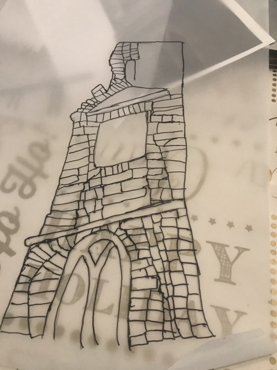
Text

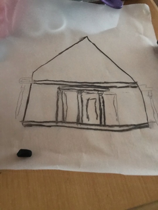
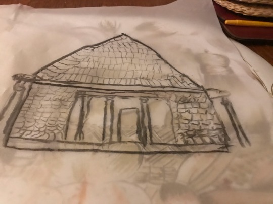
Here is other charcoal drawing/ tracing
The drawing turn out better the expected but still I feel could better in some areas of the drawing.
I wish spray with fixing to stop charcoal from smudging and to the detail rubbed out.
I wish I made all the stones looks the some so it would the drawing look better.
2 notes
·
View notes
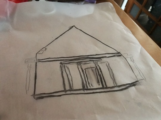
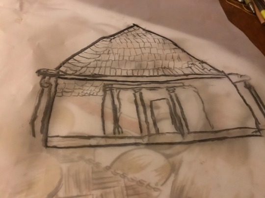
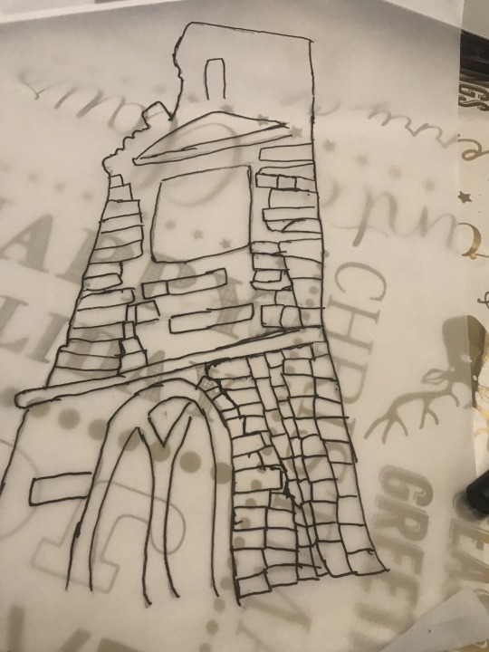
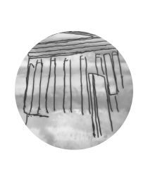
Text


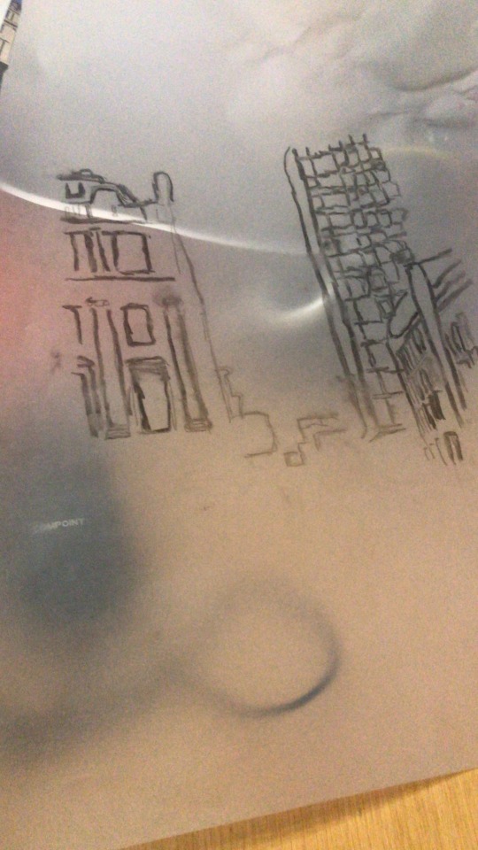
Here is other charcoal drawing/ tracing I of the building next to queen train.
More I drawing in charcoal better the drawing come out. This drawing come out a tidier the first charcoal drawing I did. The drawing get better with more details I added.
The different size building give since of scale to drawing.
I wish go over the details agin to make the details bolder and to stand out more.
I wish I drawing the windows because the windows look more like bricks then window.
2 notes
·
View notes
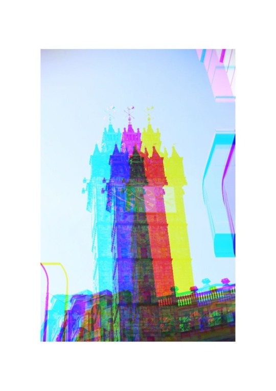
Photo
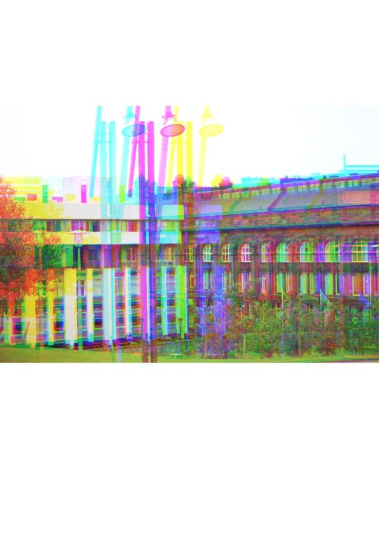

Here so more Canva edits
The effect I used in the first photo works better the photo because make shapes look more interesting to look at. The colour give rainbow effect to the photo. I wish play around with effect more to make the effect in photo more effective.
The effect I used the second added colour to the photo. I wish used different effect on the photo to make the shapes in the building stand out more.
1 note
·
View note
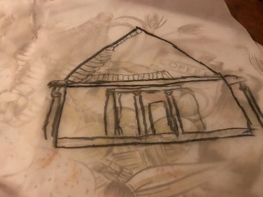
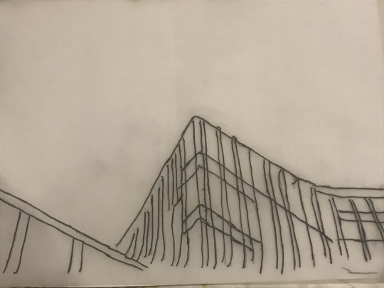
Photo


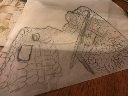

Here is drawing I did in charcoal of part of castle.
I haven’t drawn in charcoal in a long time and I forget how difficult it was because every time I add new detail to the drawing the odd details get rubbed off because when I reach my hand over to add more details to the details other detail get rubbed off.
I should sprayed with setting sprayed to stop the details from rubbing off when I was go along with drawing.
The drawing did not turn out as tied as what it to.
The way I drawn the balcony look almost 3D.
2 notes
·
View notes
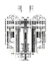
Text
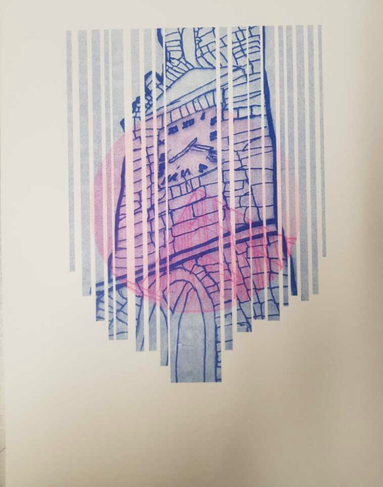
Here riso graph
The colours complement each other well and buildings give a nice composition to the print with two different building sizes.
If I printed it again I would print the college building in a different colour so would stand out more from the other building.
1 note
·
View note
Text


Here so edits I did Canva with my photos of buildings.
Edited make the photos more interesting and more catching eye with all the different colours from the effects.
could experimented more with different effects to what they could do to the photos. Do like how the effects change the photos however the effect could hurt you’er eyes look if look at the photos to long.
2 notes
·
View notes
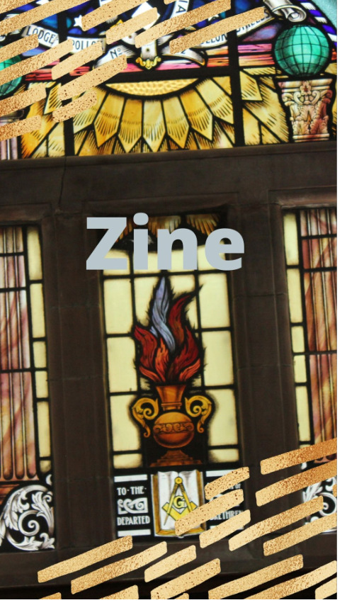
Text

here is my zine for the Beauty and the Mundane.
I created it on canva and using a template. I used radiate , split and glitch effect on my drawing. The effects add colour to the zine and to make the drawing look more intruding.
I think the colours in drawings provides nice contrast with colours in the photos. I wish had layout the second page of drawings and photos better layout because looks little bit of mess.
1 note
·
View note
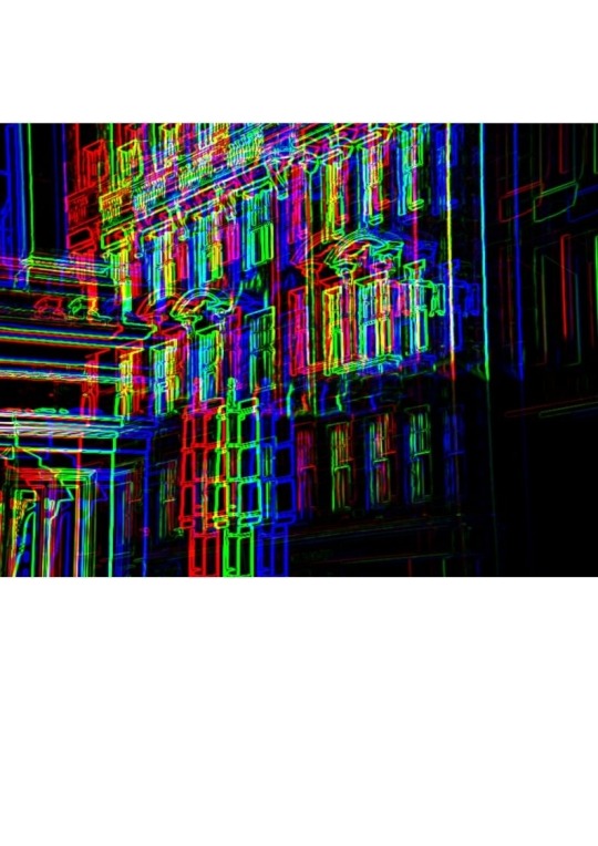
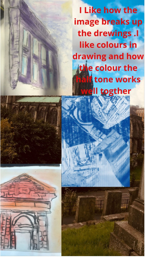
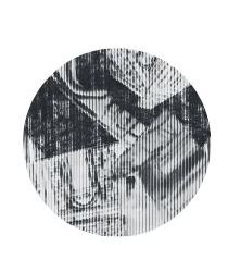
Photo
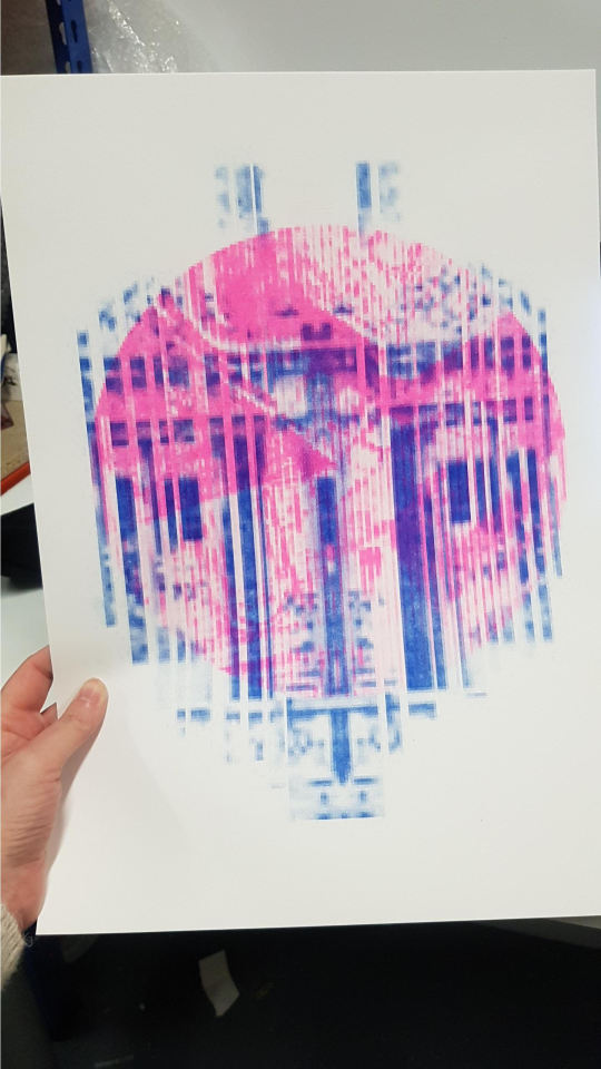
Here the RISO graph I did it come out pixelated but still look nice with colours.
I wish checked the images before editing and using RISO graph. I wish was more careful when cropping and enlarging the photos when edit the photo.
1 note
·
View note
Photo
Here is my zine
Was planning to a digital zine for my hand in and the colours in both pages of the Zine work will together because they contrast each which makes images stand out more.
I wish use the template when was make the Zine so it would look more like booklet then a poster layout and use different photo to show more verity in my work .
2 notes
·
View notes
Text
Evaluation
For my Beauty in Mundane Brief, my ideas are shapes found in buildings. I plan to do a series of two layers for Risograph. For the other idea it will be a series of two-layer screen prints of shapes found at the Seaside. The idea that I have chosen was shapes found in buildings. The first Risograph comes out pixelated because when enlarged and the crop the image becomes pixelated. For the second Risograph I used drawings of my local church and the other is of the college building. I got that idea from laying the two drawings on top of each other. I could have done more work if my health was better and was able to be in college. When it was during this brief, I was nearly submitted to different hospitals three times with two different infections.
I used a photo of a band stand that got pixelated, when it was edited for the printing, but it turned out good but not as good as I hoped it would turn out. The other photo I used was a half tone of one collage in Laura’s class. It became pixelated, so I cropped it. I also did RISO graphs of drawings that I did of the church and college buildings. These prints come out better than the building and halftone print. I did one with edits of photos and drawings of buildings for Risograph, I also did the edits using Canva. I did tracings of seaside which added colour by painting it and added details to it with a POSCA pen for my second concept broad. Then I did the other concept broad with photos of drawings that I have done. I have also done two collages using brusho as a background and glue, cutting up photos of the drawings to the background. For my second collage I used Risograph print for a background, I cut around it and glued the photos of the buildings. I have used a different app to create halftone on the collage.
The drawings that I did for development turn out well, but I would like the drawings to come out neater, I could have used a mixture of charcoal and POSCA pen to draw my drawings. I could have done a print of the college of the buildings printed out in a brighter colour, so it could stand out more on the Risograph print. I could have tried different shape frames on the photo to make the prints more interesting. I could draw the line in the drawing a lot neater to make the drawings better. When I was drawn with the charcoal, I wished that I had sprayed them with fixer spray before I knew the details of the drawing to stop the old details from rubbing out I traced the photos on to tracing paper then free handed the bricks on the building. I wish I could have been better at free hand drawing so the details will come out finer.
For my final I used the Risograph print with two layers then glued the monoprint on top of the solid black background.
My strengths and Weakness
Strengths
Can be able to do work well in lockdown and when I’m unwell
Still able to make work with materials I have out at home.
Weakness
The work came out great considering working from home and with materials that I had at hand and being unwell.
Can’t get more developmental print and develop due to not being at college.
1 note
·
View note
Photo


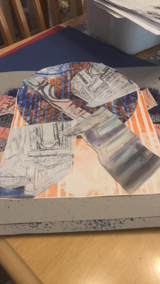
Here the collage I did in Laura’s class .
The firsts two collage i cut up photos of drawings and glue on to a brusho background. The last one I used RISO graph print I did Laura’s class for the background then used last of the cutting for other two collage to glue on to background of the collage.
The colours for the background and the drawing work well together on the first and second collage.
I was used different background on the last collage because the colours in the background is doesn’t work well the colours in the drawing.
1 note
·
View note
Text
Henri Matisse
He was born Henri Emile Baniot Matisse on 31 December 1869.
He was born in La Cateau-Cambresis France.
He died of the 84 on 3 November 1954 in Nice France. He oldest son of a wealthy grain merchant. He grew up in Bohain-en-vermdio France.
He went to Paris in 1887 to study law. After guided he worked as Court administrator in Le Cateau- Cambresis. In 1889 he started to pant after is mother get him art supplies. He discovered “a kind of paradise” as he described it. He decided to become an artist his decision with father to become artist deeply disappointed him. He returned to Paris in 1891 to study art at the Academie Julian where he become a student of William Adolhe Bougereau and Gustave Moreau. He panted still lifes and landscapes in a traditional style , at which he achieved reasonable. His work was influenced by the earlier masters like Jean -Bapitste -Simeon Chardin , Nicolas Possin and Antoine Watteau his work was also influenced by modern artists such like Edouard Monet and he influenced Japanese style of art.

like the contrast in colours and shape in artwork which make you draw into different parts of artwork.
2 notes
·
View notes
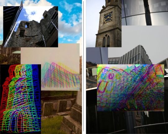
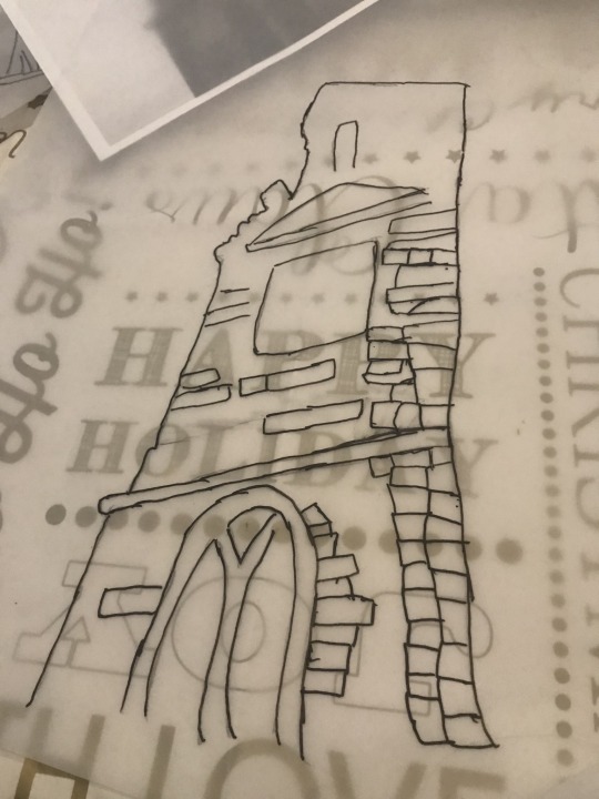
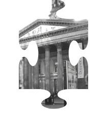
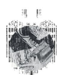
Photo


Here idea for RISO print for the beauty in the mund. I like drawings because the contrast in the shapes and style of the building. I would printing the smaller building on top the bigger building for contrast effect. I chose the two building because the church is my local church in where live in my whole life where I start my education and the college where I would end my education.
The different stage of print show my though process for the creating the print.
I wish made the greyscale on the college building light so the print would come lighter.
The stage of the print
Stage 1 : Drawings/tracings the buildings
Stage 2 : Add outlining and detail to the drawings
Stage 3 : Place two drawing on top another to see what the print would look like
Stage 4: Grayscale and add frame to the photos of the drawing
Stage 5: Print the images
0 notes
Photo
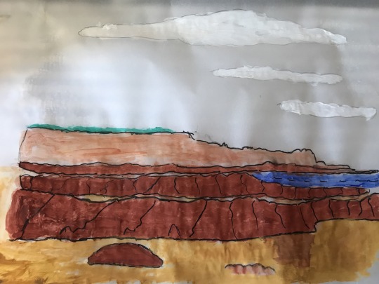


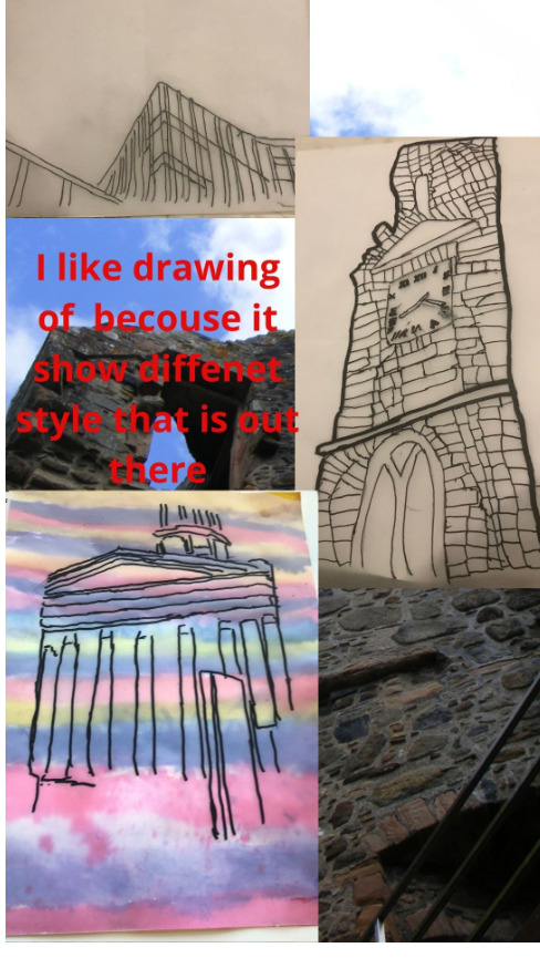
Here there the drawing / tracing I did for second concept board for Beauty in the Mund brief.
I trace the photo with pencil and then add colour by using paints . I used posca pints to add the details . Outland to rocks to make the rocks stand out and added wave to the sea to get moment of the waves. I put lines on the rock to get texture of the rocks. I put a shadow one the drawing to show which way the sun was pointing when I take photo that the drawing is based on.
Like the first and third one best because there is different colour though of the drawing whereas the third is only really one solid colour though out the drawing.
I would like the lines between sand and the sea where more tidier an the last photo drawings. Think the colour will together because devoid a concerts with each other.
0 notes
Text


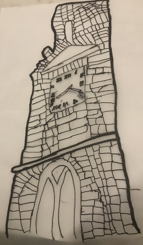
Here different stages of my drawing/tracing of part of my local church.
More details i added to the drawing more started to like the drawing .
I wish the numbers on clack face come out bitter then it did it come out messy and smudging.
The drawing come out will considering I have not drawing in while.
Using POSCA pen helps to bring out details in building.
1 note
·
View note
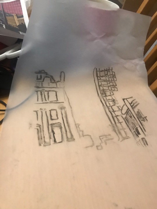
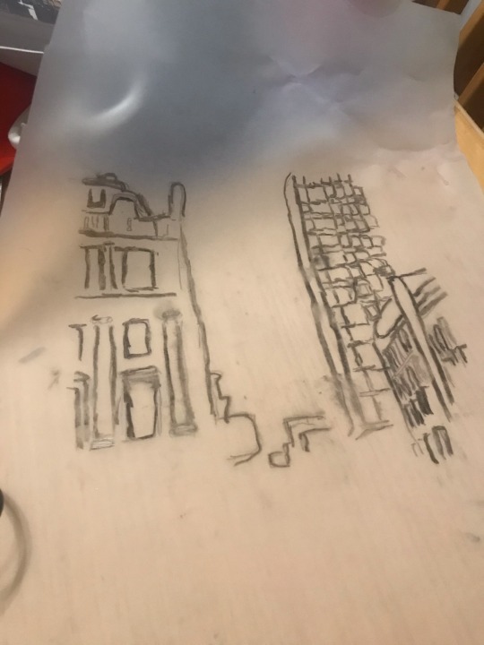
Text

Here drawing/ tracing of part of the college building the first one is in pencil and second of the drawing that I went over with posca pen.
I like second better because the lines stand out more then first one.
I wish I drawn the line neater on the building so make the drawing look better.
1 note
·
View note
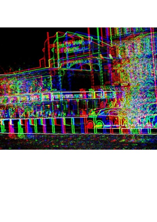
Photo


This some of image that I might use for my RISO graph prints for Beauty in the Mundane.
Wished I experimented more with different shapes of frames and different drawing/photography. When do then agin would be more carefully not pixelate the photo when editing the photo
1 note
·
View note