Last Seen Blogs

naka-cc
企画キャラ一覧

uhhhhmandart
Amanda Sterling Art
palmtreepalmtree
Palm Tree, Palm Tree, Palm Tree

chihiro20
Chihiro

morisenpaisimp
mori likes seashells
Photo


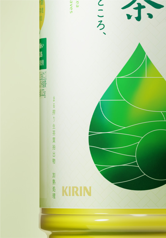
生茶 / NAMACHA 2024
KIRIN beverage
#Artdirection #Graphic #Package #symbolmark
33 notes
·
View notes
Photo

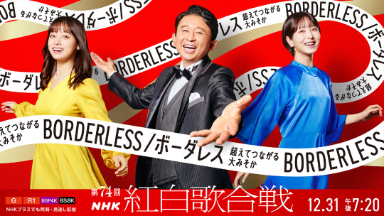


第74回 NHK紅白歌合戦
NHK
Photograph: Shinya Sato
#Artdirection #Graphic #Advertising #Logo
0 notes
Photo
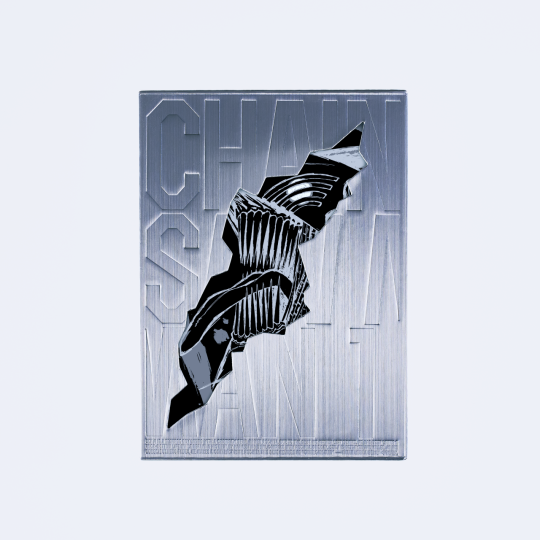


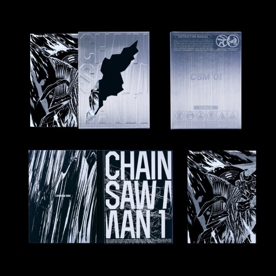

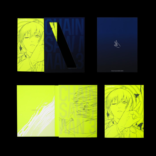
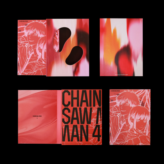
CHAINSAW MAN BD/DVD Vol.1-4
MAPPA
#Artdirection #Graphic #Package
1 note
·
View note

Photo
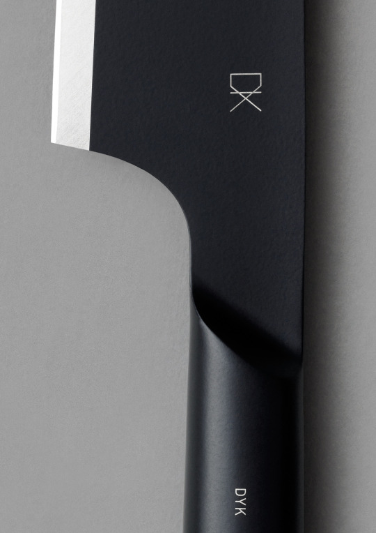
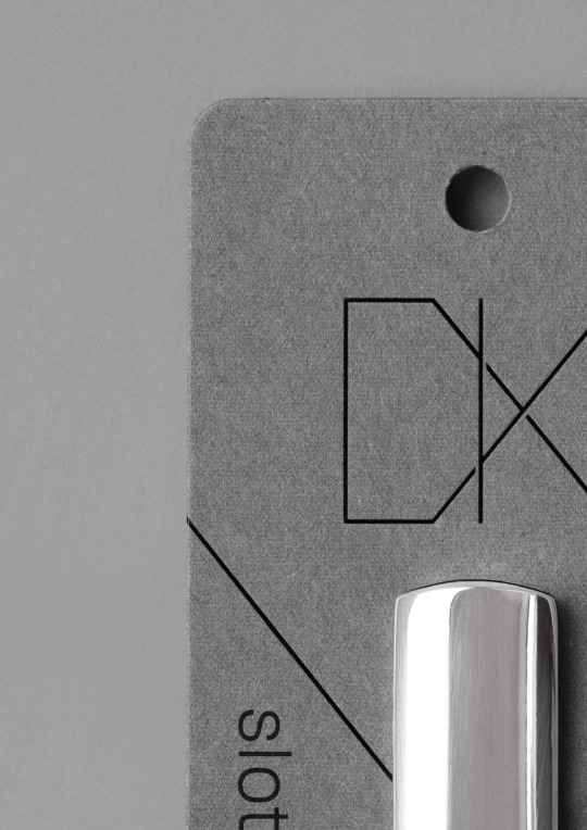
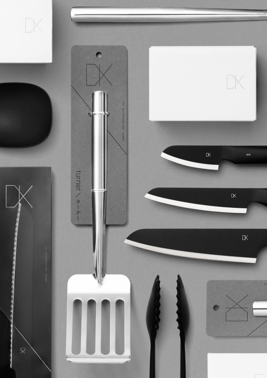

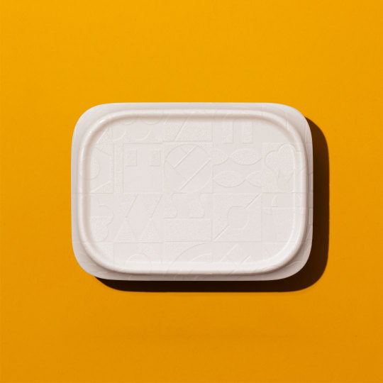
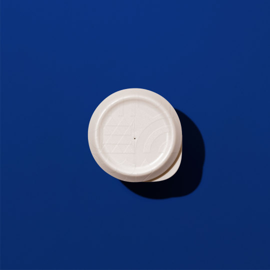
DYK
株式会社 高儀 / TAKAGI CO.,LTD.
Product Design: Keita Suzuki + PRODUCT DESIGN CENTER
#Branding #Logo #Packaging #Graphic
55 notes
·
View notes
Photo
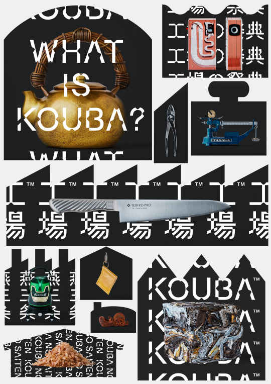
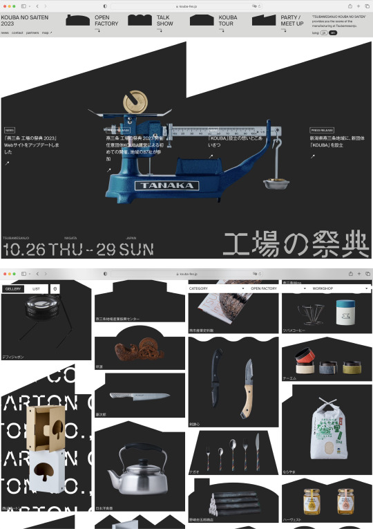
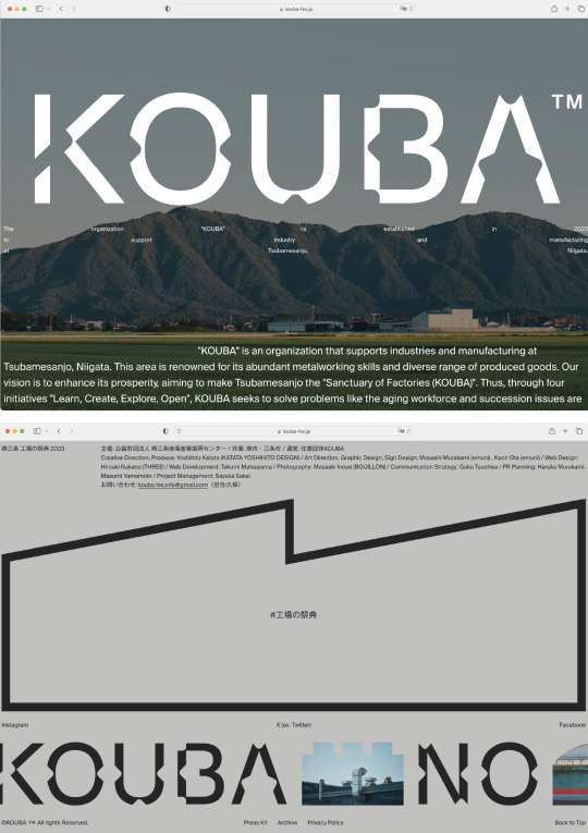
燕三条 工場の祭典 2023
KOUBA
Creative Direction: Yoshihito Katata
Web Design: Hiroaki Nakano
#Rebranding #Artdirection #Graphic #Festival
13 notes
·
View notes
Photo
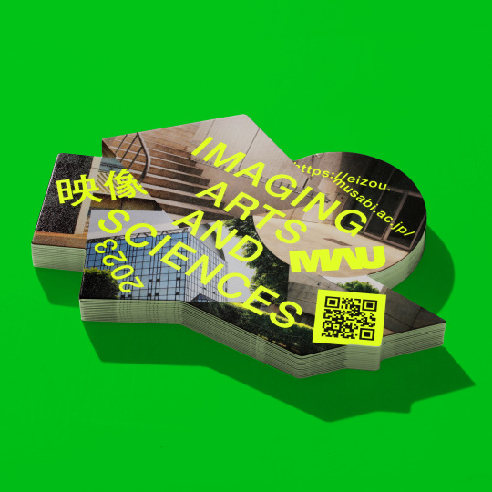
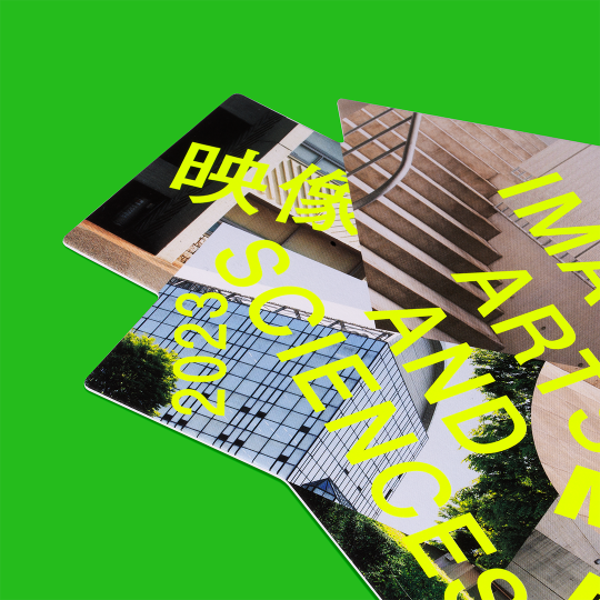
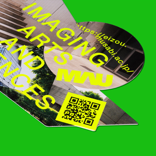

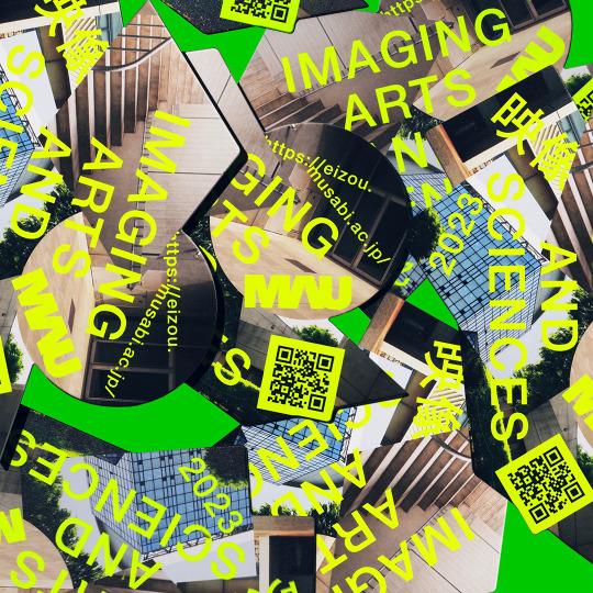
Department Introduction 2023
武蔵野美術大学 映像学科 / Musashino Art University Imaging Arts and Sciences
#graphicdesign
0 notes
Photo


Tokyo Festival 2023
東京芸術祭実行委員会 / Tokyo Festival Executive Committee
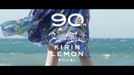
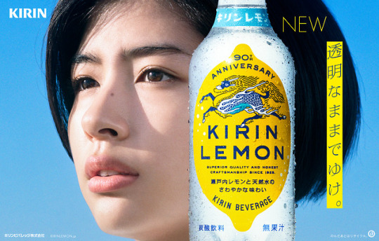
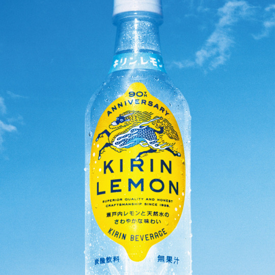
Rebranding design of Kirin Lemon, a carbonated beverage by Kirin Beverage Co., Ltd. 2018 marked the 90th anniversary of the launch of Kirin Lemon, and it was celebrated with a rebranding project. Emuni was in charge of the art direction and graphic design of the whole project, including the logo, packaging, and advertising. With this rebranding, the product went from being targeted to an older age bracket to a younger one, and this required a rethinking of the brand. Rather than creating a new brand image from scratch, we opted to leverage the 90 years of history behind the property, establishing guidelines to revive the commitment and visual identity of the product at the time of launch. We built the project around a renewal of the 1928 beverage's original "clarity" concept. We took inspiration from the brand’s 90 years of history, incorporating the original bottle design into the new one. The alphabet logo was also created by adjusting the typographic style used on the original packaging. In addition, we revived the “kirin” picture used on the 1928 product label using it in product packaging for the first time in decades. The reborn Kirin Lemon was a hit with a wider audience than expected, and, also because of the synergetic effects with the concurrent social network campaigns, as of now, one year after the renewal, the original sales target of 3.5 million cases was greatly surpassed, with 6.16 million cases sold. This successful rebranding contributed to a 200% increase in sales as compared to the previous year.
#Art direction
29 notes
·
View notes
Photo
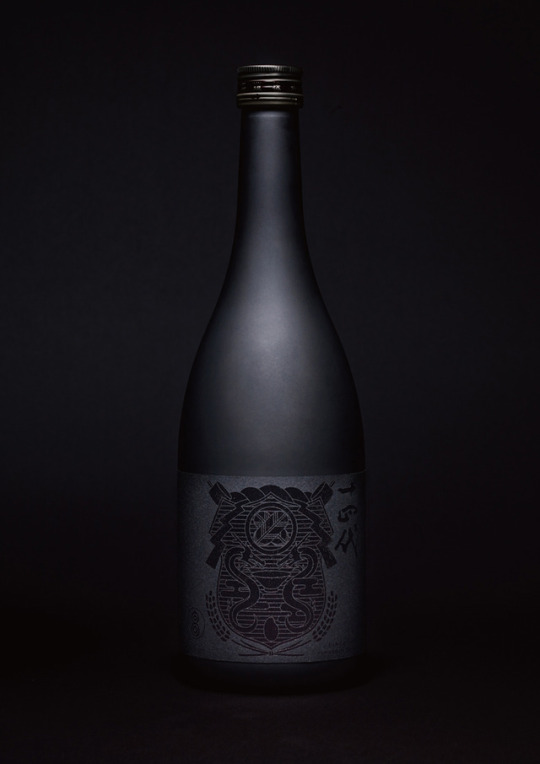
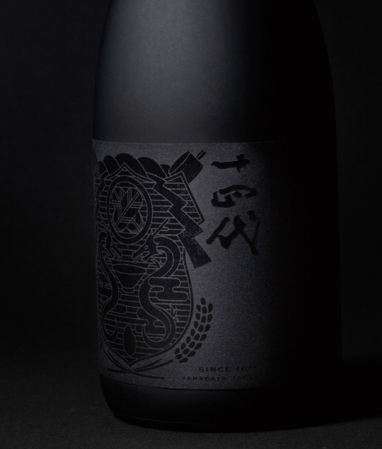
JUYONDAI INTERNATIONAL -BLACK LABEL-
JAPAN CRAFT SAKE COMPANY CO., LTD
Package design for the international release of the “Juyondai” sake made by the Takagi brewery in Yamagata Prefecture. The Takagi brewery has a history of over 400 years brewing sake, and its high-class liquors represent Japan worldwide. We created a new symbol and put it in the center of the label to express Takagi's commitment to sake brewing and the history of how that came to be. The symbol is designed to represent a coat of arms, as in the flag of a herald approaching foreign countries. Forming this coat of arms are the two facing dragons, that are the symbol of the Takagi brewery, rice, sake’s raw material, and other instruments related to sake brewing. The design also incorporates a succession of events, as it is a black bottle with a black label with black printing on it, which at first, from afar, looks like a completely black object, only to show its details as the viewer comes closer and takes it into their hand.
山形県の酒蔵 高木酒造の日本酒「十四代」初の海外販売商品のパッケージデザイン。400年を超える酒蔵としての歴史を持ち、日本を代表する最上級のお酒を作る高木酒造。その酒造りへの拘りやそれが出来るまでの歴史を表現するために新しいシンボルを作成しそれをラベルの中心に据えた。新しいシンボルは海外へのアプローチとして紋章をイメージしてデザイン。高木酒造の象徴である向き合う2体の龍や酒造りにまつわる道具や原料であるお米を構成要素とした。黒い瓶、黒い紙、黒の印刷のため遠目からは黒い塊となり、手に取ることで要素が浮かび上がり見えてくるという時間軸も含めたデザイン設計を行った。
日本パッケージデザイン大賞2019 _ 金賞 /
JAPAN PACKAGE DESIGN AWARDS 2019 _ GOLD
#Packaging
59 notes
·
View notes
Photo
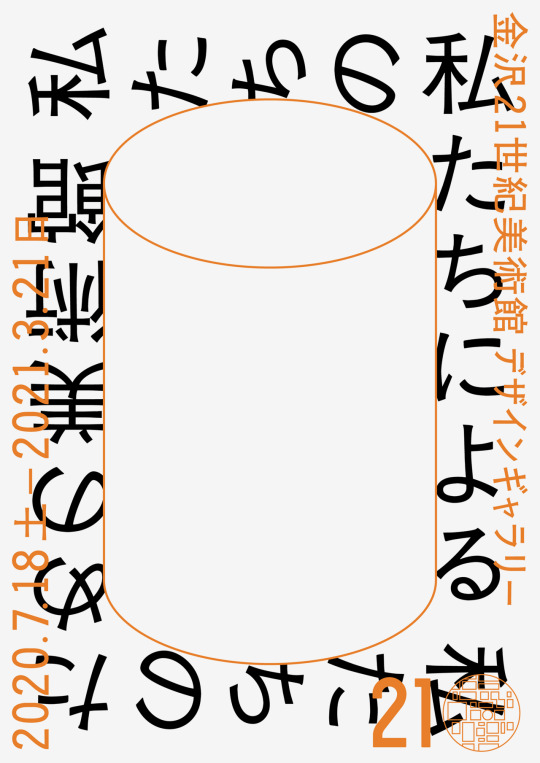

私たちの 私たちによる 私たちのための美術館
金沢21世紀美術館 / 21st Century Museum of Contemporary Art, Kanazawa
金沢21世紀美術館で開催された展覧会「私たちの私たちによる私たちのための美術館」展のメインビジュアル。
本展覧会は開館16周年を迎える金沢21世紀美術館のこれまでを振り返り、これからを考える展覧会で、金沢21世紀美術館のシンボルでもある建物を模した円柱のオブジェクトをメインビジュアルとして据え、ロゴ、ポスターや壁面などのグラフィックデザイン、会場構成、映像のアニメーション、冊子デザインまで全体のデザインをemuniで行なった。
#Graphic #Exhibition Design #Book Design #Editorial
68 notes
·
View notes
Photo
KIRIN beverage Co.,Ltd. / キリンビバレッジ株式会社
KIRIN LEMON 90th / キリンレモン 90周年
Rebranding design [ Advertising, Logo ]
リブランディング[広告、ロゴ]
2018
4 notes
·
View notes
Photo
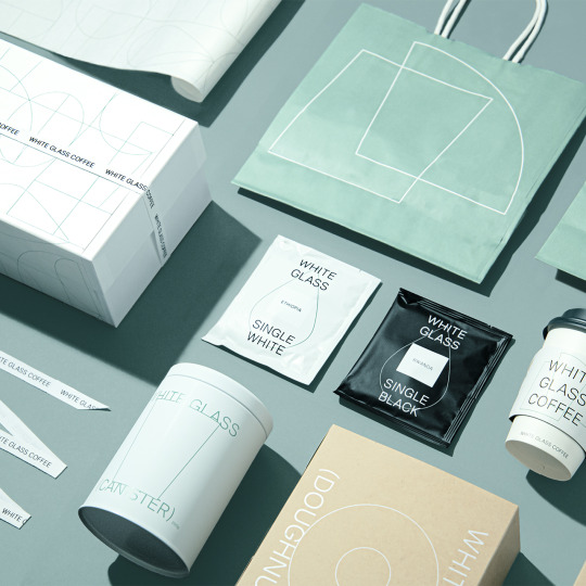
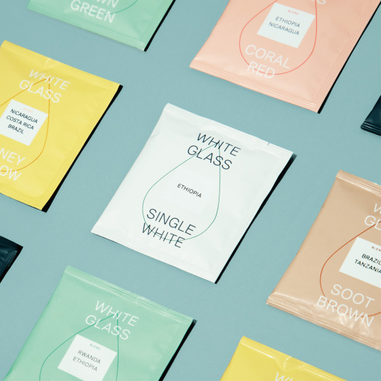

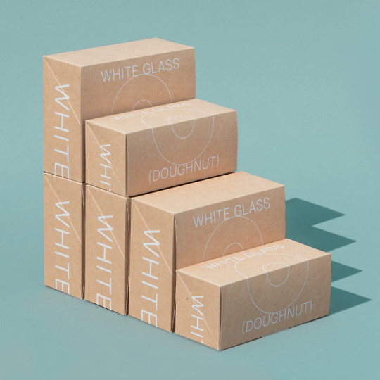


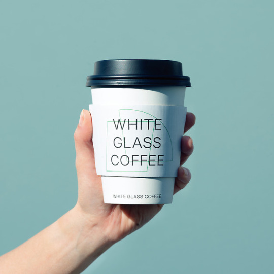
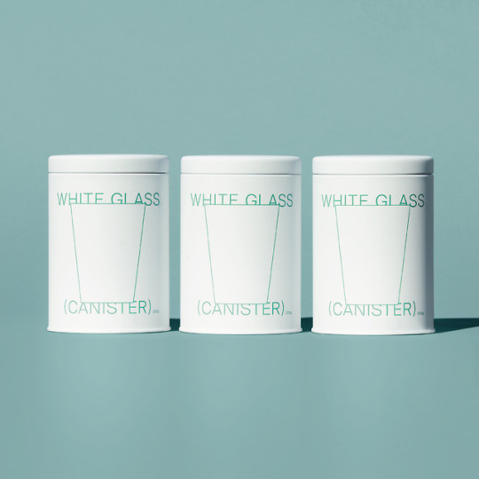
WHITE GLASS COFFEE
株式会社 ロイヤル・アーツ / ROYAL ARTS inc.
Emuni was in charge of the art direction and graphic design for the newly opened “roastery cafes” in Shibuya (Tokyo) and Shibuya. WHITE GLASS COFFEE is a cafe based on the concept of “a roaster in the middle of the woods” built in such locations as Shibuya and Fukuoka. The main color of the café, a relaxing shade of green, is based on this very concept, and the logo is a square shape representing the “space” where the customer is surrounded by green, accompanied by an arc representing the pleasant “time” spent inside the cafe. In this design, the overlap between the two shapes resembles a glass, in reference to the cafe's name. We defined a visual identity for the brand of various line-based motifs, and designed products such as the coffee bean packages and canisters, as well as the paper cups, donut boxes, other packagings used in the stores, and all other items to comprehensively match this concept. We used the line-based graphics as a brand logo of sorts to be used in the design of all items.
東京の渋谷と福岡に新たにオープンしたロースタリーカフェのアートディレクション・グラフィックデザイン。WHITE GLASS COFFEEは渋谷や福岡という立地の中で「森の中のロースター」をコンセプトとしたカフェ。カフェのメインカラーはコンセプトに合わせ落ち着きのある緑を基調に設定、ロゴは緑に包まれる「空間」を表す四角いフォルム、その環境で心地よく過ごせる「時間」を円弧のフォルムとしてそれぞれをシンボル化し重ねた。重なり合うことでその間にカフェの名称であるグラスのフォルムが現れるデザイン。線で描かれた様々なモチーフをヴィジュアルアイデンティティとして定め、商品となるコーヒー豆のパッケージやキャニスター、店頭で使用されるカップやドーナツ箱、包装紙等のアイテム展開など総合的にデザインを行った。ブランドロゴと同様の捉え方で表現されたライングラフィックを各アイテム共に落とし込んでデザイン展開をした。
#Branding #Logo #Packaging #Tool
148 notes
·
View notes
Photo
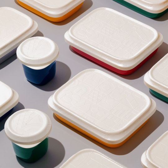

神戸市給食箱
神戸市 / KOBE CITY
Product Design: Keita Suzuki + PRODUCT DESIGN CENTER
#Graphic
28 notes
·
View notes
Photo


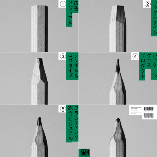

ROUGH SKETCH OF ART DIRECTOR & DESIGNER 188
株式会社エムディエヌコーポレーション / MdN Corporation
#Book design
102 notes
·
View notes
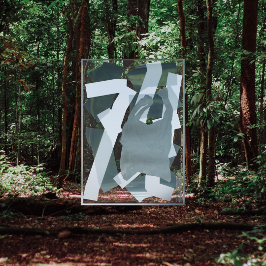
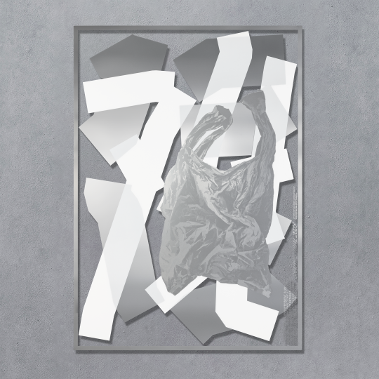
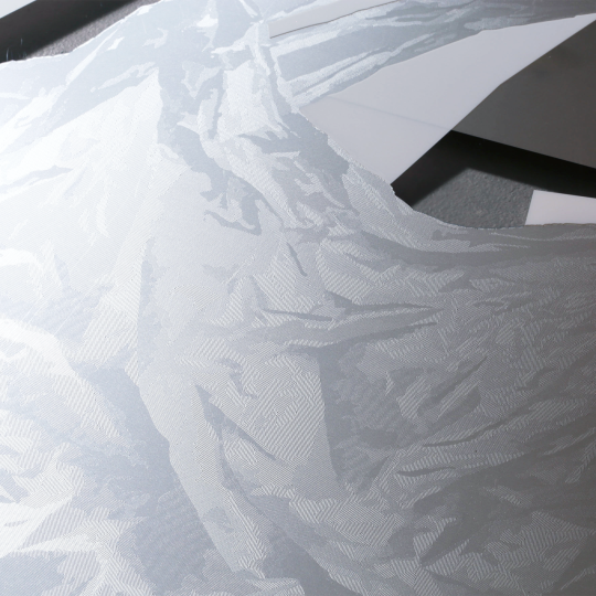
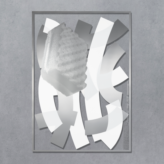
Photo
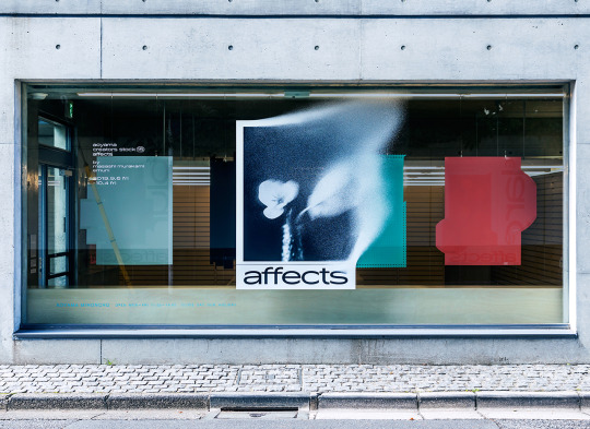
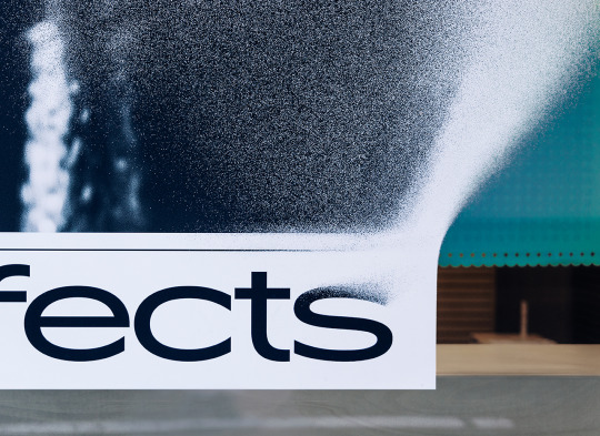
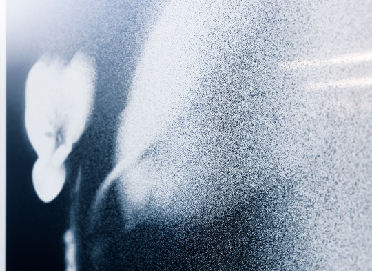


affects
株式会社竹尾 青山見本帖 / TAKEO Co., Ltd. Aoyama MIHONCHO
Photo: Tadahisa Sakurai
第21回CSデザイン賞 凖グランプリ /
21th CS Design Awards _ Second Grand Prix
#Graphic #Exhibition #Art
509 notes
·
View notes
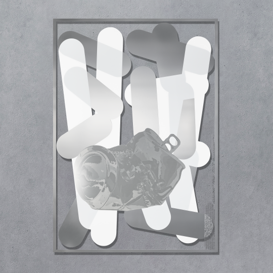
Photo


VENT NOUVEAU DIGITAL
株式会社 竹尾 / TAKEO CO.,LTD.
Photo: Shinya Sato
#Logo #Exhibition #Graphic
43 notes
·
View notes
Photo
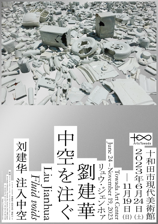
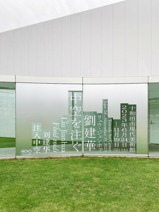
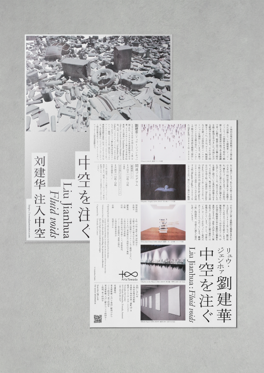
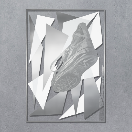
劉建華 中空を注ぐ
十和田市現代美術館 / Towada Art Center
#Art direction
47 notes
·
View notes