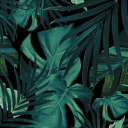
freya-a-smith
"Page To Screen"
(The Jungle Book)
"Artwork that is inspired from books that have turned into films and focusing on target audience"
61 posts
Don't wanna be here? Send us removal request.
Last Seen Blogs
panstilesstilinskirp
StilesStilinskiRP ϟ
ingo-ingoing-ingone
I Missed My Stop For This

usemymancunt
Fuck toy
philososwift
Aude
(taylor’s version)
tplana-hath
at least i'm not brent spiner
Text
Evaluation !
Since September, I have been working on the first project of my year two graphics communications course which was titled PAGE TO SCREEN. This project was about famous books that have been turned into a movie and creating artwork from them. I had to create alternative book covers and film posters for my selected theme, which was The Jungle Book.
I was pleased with my selected book/film as I knew I was going to be focusing on the audience of children. This would mean many different colours were going to be incorporated into my project and also an element of education was going to be brought in my artwork as well.
For a lot of my outcomes, I used Pinterest for inspiration as I wanted to see what had been done before so I could create unique results that would stand out.
When you look at my outcome, there are elements of the jungle throughout all of them as one of my goals was to focus on grabbing my audience's attention. A fair amount of the features were animals. The reason for this was because my target audience being children I wanted my artwork to educate them on animals that would be found in the jungle.
There was a lot of trial and error within the project as I was experimenting with different styles such as thresholding, halftoning, extra. One of the processes that helped me get over mistakes was having the pieces of artwork up on my desktop and then create the same thing again on photoshop but changing the bit that didn't look right. Still, by doing this, it allowed me to have better outcomes than the first and also made me learn a lot more, and by learning, I was able to broaden my skill base. Alongside this, there was a lot of research. Not just artist research I was researching the author of the book Rudyard Kipling and also researching about the jungle, the jungle book originated from. By doing this, it allowed me to look at colours and animals for inspiration, and by doing this, my artwork came out well.
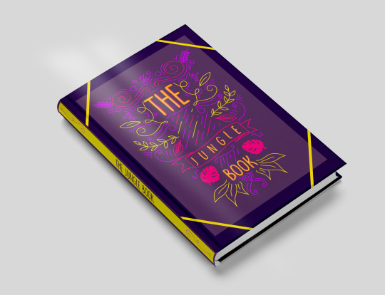
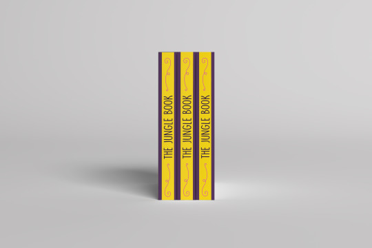
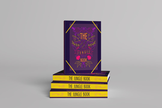
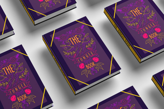
Within my project, I created five book cover designs, and 11 movie poster designs within all these designs I was making illustrations to use on them including digital images drawn on photoshop and procreate and also hand-drawn work using pens, paint and pencils.
When I was given the jungle book, I was excited to start creating artwork. As I got into the project, I began to find it hard as I had problems that I didn't think of such as showing expressions through an animal's face and being able to create cartoon looking animals to represent the 1968 animation film but soon realized it was hard so, during my project, I decided to focus more on the real-life jungle book that was made in 2016. This made it slightly more manageable as I was able to use an image of real animals to work from and not having to create my animal from scratch.
Other issues that I had to approach was the colour pallet at the beginning of my project. I was focusing on the colours of the jungle as I wanted the colours to represent it, but then all my work started merging into one, so I decide to use a website called coolers.Co this was a colour generation site, and by using this, I was able to use unique colour pallets that made my outcomes stand out. First, I started adding different colours in slowly then completely didn't use green, and the results came out well. My final book cover design had no green on it at all, which can show progress has happened, and I have worked on targets.
The journey of the project had a high at the beginning due to my interest and excitement to create but then went downhill but soon lifted again after I had the problem solved and come up with solutions this made it run more smoothly.
With having been doing the concept and topic of page to screen the jungle book I knew it was going to be children based as I said at the beginning, I knew my aim was to make fun, unique, educational pieces of artwork. Nowadays I feel like children are more into movies as technology is overriding the classics such as books that is why I have made many different movie posters as that is what I feel children would be more drawn too now. However, there are still children who love books hence why I always focused on creating book cover but just not as many as the posters, I was still focusing on the educational bit for both of them, But mainly the book as that is something you pick up and really absorb whereas with a movie poster it is something that you look at to get an a fell of the movie and get a feel for what's to come and with my outcome, I think you can see that being portrayed.
This whole project opened my skill base hugely as I was learning new skills every day and not just the skill I was being taught. I also learnt skills about organization preparation but mainly understanding of my target audience. I feel that out of the skills I learnt from college understanding my audience and how important it is to understand and get on the same wavelength as your audience. This will give you the best outcomes as you are putting your self in there shoe's. It works well and makes you want to do more artwork as it gives you a lot of inspiration. But overall, it also helped me with this project.
Page to screen project was a project that consisted mainly of computer-based work. This included the materials of photoshop and illustrator and in my case also procreate there was also the element of practical workshops such as typography, collagraphy, screenprinting and illustrations(continuous line drawings), my favourite media that I used was probable the digital art as I like the effects and texture I was able to create, and how I was able to bring a piece of artwork alive, the only thing that wasn't as enjoyable about the digital art was having to constantly create layers, so you were able to move them around even though it helps a lot when you want to manipulate the outcome, its frustrating when you get to the end and realize its all on one layer but when that has happened, I have always been able to sort it out eventually. My favourite part of the practical workshop was probably the illustration workshop as it was a challenge having to keep the pen on the paper the whole time to create the illustrations were hard but what I drew was terrific illustrations.
With each book cover and movie poster design I had to select the right size for both of them so throughout the project this became a prosses I had to do every time I wanted to create an outcome. With the book cover, I have to prepare an a4 horizontal white page on photoshop making a 2cm gap in the middle for the spine of the book with the rulers and then with the movie poster I had to create an a3 white page on photoshop.
Another process I had to use throughout the project was looking and planning my design to do this, I went on to Pinterest and had a browsed at different book cover/posters for inspiration.
A technique that appeared in this project was animating. I had done this technique in another project before last year; this benefited me as I was able to crack on with it. The only thing that was different was the animation have a different topic/concept. Animating was an old skill to me, but I managed to learn a new skill within it which was another way of animation I learnt that you were able to create an animation without having to do the process of moving and saving this helped as it was an easier but effective way of animating.
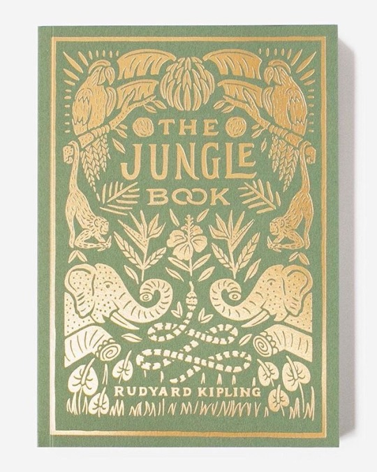
With the current situation of COVID19, we were asked to create a blog on Tumblr this was to ensure us that our lecturers were able to see our work in case of other national lockdown and also minimizing cross-contamination of passing our journals back and forth. I really have enjoyed having tumbler as our alternative sketchbook and journal as to me look a lot nearer than my previous projects, and with my specialism being graphics communication, I can present my work in a high-quality way compared to last year, and with Tumblr, I was able to look at my blog as a whole project. I was also learning about aesthetic as you could transform your blog to link to your topic. My blog contains a lot of work, including research. The research was a big part of this project as I needed to learn about The jungle book but not just the storyline, but about the background of the jungle book, this helped me a lot as I was able to plan colour pallets layouts and general inspiration and overall enjoyable to me. It helped me with my target audience a lot. As I am on the topic of research there was research on my blog about the artist that inspired me the main artist that inspired me to do my final book cover design was Coralie Bickford smith she is an amazing illustrator for book cover designs, and I just fell in love with her work and I was able to create outcomes using inspiration from another artist that help me more with digital illustration, his name is Roy Lichtenstein he inspired me with my halftone work, and I can happily say it some of the favourite work I have created.
One of my the pieces of primary research I did was creating my own mood board using objects to help me understand the topic of the jungle book, and I used Jordan Bolton as my artist inspiration for this as I wanted to link to back to an artist.
I have really enjoyed this project of the page to screen and can happily say I am pleased with my outcome.
My outcomes are very strong and show planning, and the main thing is catered to my target audience I feel like they could be a genuine poster and book cover, but there are also some weaknesses, but the weaknesses were not with my outcome because I am happy with them it more about my blog side to the project if I was to work on something it would be delving into more artist research and even though it was hard to find an artist that inspired me I still feel like I could have done some more but still happy with what I have achieved.
With this project, I feel like was to be harsh on myself, and I did this as it made me work harder what I mean by this is when I looked at my work I reviewed it as two people one of them was saying the good thing and the other picking up on things I wanted to change, and this helped me and was an effective way of self reviewing and help me at the end with outcomes.
To me my outcome show progress as from the start of the project from the 16th of September to now you can see my work has grown and this is down to workshops such as halftone, typography workshops and these were only in the first couple of weeks on the project, and there were many more, but you can see it has helped me grown as a designer and learn, I feel the workshop that has to help me the most was the typography because it made me understand how much can be conveyed through typeface and also helped me understand how important it is.
Overall my outcome has worked well there have been displayed on my blog along with my research, other outcomes and problem-solving. The way my work has been displayed is in a unique way I have placed my book cover design onto a book, so it looks more realistic as with my poster I have made sure I have a high quilty picture and has been put onto a mock-up on to different billboards in different areas.
My whole project shows the progress of my skill and how my outcomes have been created and that is what I wanted for my blog to portray and I am excited to use the skills that I have learnt in my future project as they are very useful and I know I have a lot more knowledge on the audience and that will help me plan and create better and significant outcomes in the future.
0 notes


Text
Spider digram that helped me with my target audience.

This was a spider diagram I made at the beginning of the project to hep me think about my target audience and it helped me with ideas and focus on what is important in my target audience.
0 notes
Text
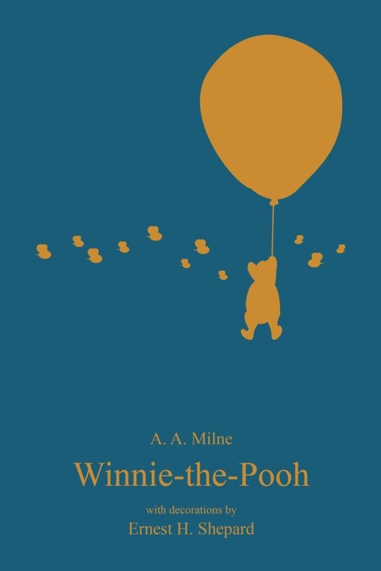
Inspiration for book cover design !


INSPIRATION !
INSPIRATION !
Theses cover design was focusing on symmetry and layout and that is why I used these alternative book cover designs for inspiration the first one I used for the layout as I really like the way that the symmetry looked and I feel like it works well and that’s why I used it in my own book cover and with the second design that inspired me I liked the layout as well with the animals popping out either side as it creating the illusion of everything being overgrown and with my book me in the jungle book I wanted to keep the element of the storyline within it another reason why are use these but covers inspiration is because of the colour pallets within them are used the greens and the whites that were used as it is a connotation to the jungle.
0 notes
Text
Inspiration for book cover !

INSPIRATION !
INSPIRATION !
INSPIRATION !
The reason I have used these alternative book cover designs as inspiration is because of the layout and colour palette as one of my target was to use different colours I thought using warm sunset colours would work well with my book as I could still add the element of the jungle as green goes well with oranges and reds another reason why are used orange and green in the book cover is because of a tiger I wanted the book cover to focus on the character of sherr Khan with the first inspirational book cover I liked the layout of it where it had the Sun/moon in the middle of the book cover and the title was within that shape and then around it was the leaves which gave off a good bushy effect I feel like I have incorporated these designs together to create my outcome with using the shapes the colour palette and the layout of the book covers that I looked at.
2 notes
·
View notes
Text
Inspiration for book cover!

INSPIRATION !

INSPIRATION !

INSPIRATION !
I focused on these designs for inspiration for this book cover due to the Minimal imagery used. The aim of this book cover was to betray the storyline by only using one or two images, and that's why with these book covers for inspiration it helped as they were able to capture a small amount of the storyline but also not be too overpowering. With this book cover, I focused on the 40s and 50s books as a lot of their books only contain one image in the centre or off the centre of their book covers. I think by having these but covers as inspiration it helps me come out with this outcome even know these, but cover inspirations don't have the same colour palette they still show an element of where I've got the layout and idea from.
1 note
·
View note
Text
Inspiration for Book cover !
INSPIRATION !
INSPIRATION !

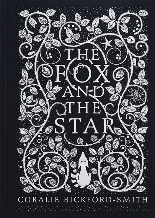
These designs inspired me to create my jungle book cover the reason they inspired me is due to the colour palette used I wanted to use a more bold and brighter colour palette rather than sticking to the obvious of using green. In the book the Fox and the star I really liked the way that they had to use the pattern on the front cover, so I tried to create my own element of this by still using the element of the jungle With the other book cover design I took the aspect of the symmetry look as I thought it was effective and look visually pleasing. The reason I use these colours and these colours stood out for me is because they all compliment each other. It was different compare to other book cover designs and the fact I was still able to get the element of the forest, and the greenery in the jungle worked well.
2 notes
·
View notes
Text
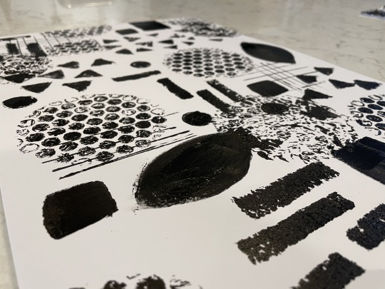
Collography print workshop!⚪️⚫️
This workshop on Friday with Sophie was about creating layers and textures using the technique of collography this means using shapes and different textures to Create outcomes. Below is the outcome I come up with.
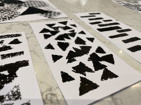
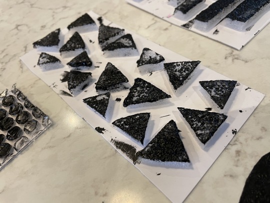
Too Create these long pieces I used foam that I cut out into triangle and small rectangles and stuck them onto a piece of card then used ink over them and transferred them onto the paper. I made sure there was laying in some of them I wanted to exspirment with them too see different outcomes.
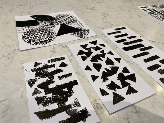
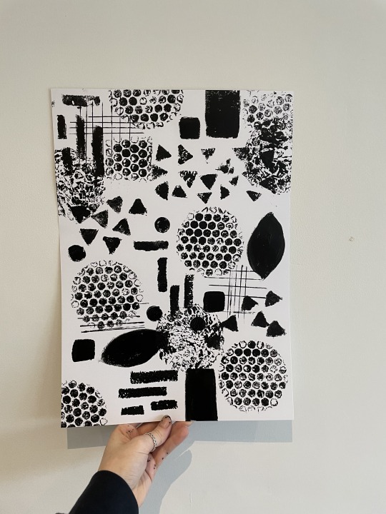
Here is a close up of my main outcome use and see the texture I have created.
Here is a close up of one of the shape/prints I made with foam and card it was very effective.
This is my final piece of work I just the other outcome as inspiration and made other outcome with it I use more materials on this one including bubble rap it was very effective and really put the piece of artwork together will also creating nice layers.

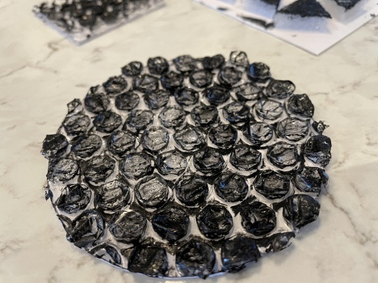
Here are pictures of all the tools I used to Crete my outcome overall I am please wit how there come out I also incorporated my theme of the jungle book into it by adding in a leaf shape.
1 note
·
View note
Text
Mayday Pradesh jungle.🌿

Mayday Pradesh lies in the heart of India there are mountain ranges their rivers and miles and miles of jungle floor with in this they have 25 sanctuaries 10 national parks and 6 tiger reserves.
There are not just only tigers that live in the jungles there are deer, leopards, cheetahs, wild bore and crocodiles.
The reason this jungle inspires me is because Rudyard Kipling used this jungle to help his imagination in book and the book is based on a boy who was Brough up by wolfs in this forest.
Many of the colours that I have used in work was inspired by the jungle and being able to lookout were the book originally come from it help a lot.
1 note
·
View note
Text
How I created by final GIF animation.🌴
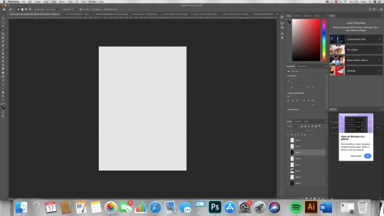
The first thing that I done to Crete this animation was open a a4 document in photoshop that was portrait.
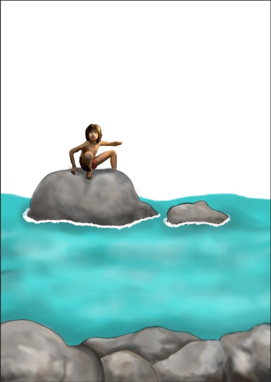
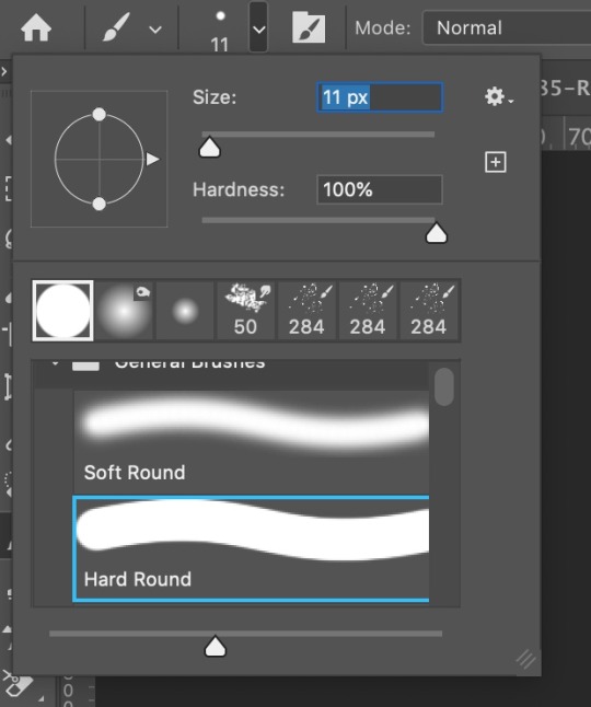
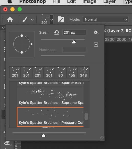
I had planned to draw a river side sense for my gif so I started of drawing the rocks and water to do this I used the brush and smudge tool to create the look to do this I Crete blocks of colour that you would find in a rock then been out after with the smudge tool and as you can see above it worked really well. I also done the same technique with mowgli.

After I had the basics layout I then was able to visuals the back ground better the other drawings you see on the image was created my me on procreate as I wanted to get a more detailed look to them.
All parts of the gif I wanted to move was a layer as to Create an animation you need to make frames and this is how it's done.
With each image I wanted to move you had to go through the steps of moving and saving moving and saving and by going this each save the image is at a different place you have to do this so you can Crete frames each save needs to be save as (frame1…..)
Once I had done the saving it looked like this in finder ones you have done this you need to open a fresh a4 document and drag and drop the frames on to the page.

This should move the frames not the dic after this I when to the taps and the top and selected windows and scrolled down to timeline this is where the frame will be after you convert them.

The time line at the bottom will have a tab saying Create Fram animation you want to click that after I had done this I proceeded into click the three lines that you can see above and clicking make frames from layers and all you layers will suddenly appear at the bottom of the time line.
It should look like this ones I had done this I then experimented with the delay on sections of the gif and finally work around it and got what I wanted.
0 notes
Video
The is my final and best gif animation inspired by the film and book the jungle book it really captures the jungle and the main character in this gif.🍃🏞
0 notes
Video
This is the 2nd animation gif I created inspired by the jungle book I was focusing on the sense of the elephant patrol and have the lyrics on the song around the gif with give it more life and fun too it.🌔🐘
0 notes
Video
One of my 3 outcome of gif animations inspired by the book and film The jungle book.🌞🌙
0 notes
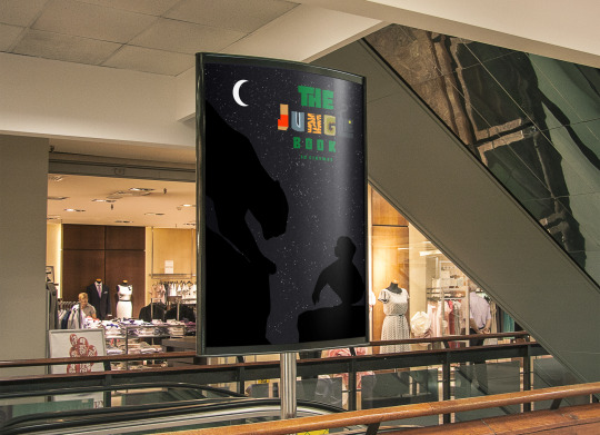
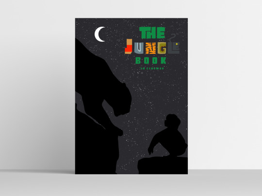
Text
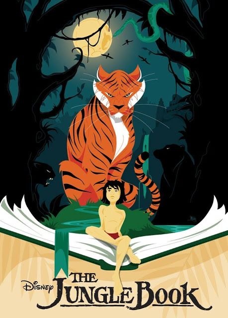
Movie poster design!


The first step into me creating they movie poster was choosing the right colour for the background it was hard to decide, I went though loads of different including reds and yellows but decided to keep with the theme of the night sky at to do this I choose a dark colour of a blue dark grey.
After I choose the statutable colour fo the back ground I then when and used the brush tool and selected and brush that look like it would give the effect of stars.

Once I had done this and found the suitable brush I went over the background colour with the brush set on the opacity of 45% so it wouldn’t be too harsh and then left areas were I new images would be after I had used the brush on the pastry of 45% I then use 75% over the top to highlight some areas but not to much.

The outline you see above I drew on procreate using the brush tool o then transferred it over to photoshop to make sure the sizing was right and to make sure that the images were cute out so there had a crisp edge to be pasted on the background.
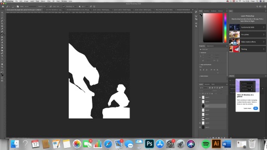
It then looked like this I then made sure it was positioned right and the lay out worked well I also tried to make the proportions right because the panther (Bagheera) is bigger than Mowgli.
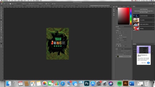
Now that the basic layout is done It was time to incorporate the title I used the type face that I Crete on another on of my movie poster as this was the element that would brig colour to my pieces of art work. I used the lasso toll to cut round the image and copied it sueding (CMD shift C ).

I then proceed on to pasting it on to my current movie poster ones I had done this I then sized it to my liking it tried different size but I was happy with the size I choice and then I selected the wand tool and made sure contiguous was off and selected the black back ground and got rid of it.
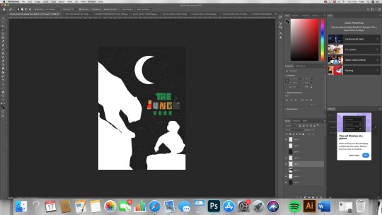
I then used the brush toll again and made the size bigger so I could make a moon shape to do this I click ones on the ayer and then I painted a circle after I had done this I selected the eraser tool choice a smaller brush and created the shape of a crescent moon I done this to make sure the element of the night sky was hi lighted more. I then arranged all of the layers to were I wanted then and I am really pleased with how it came out.
0 notes
Video
another screen record of me creating a movie poster in pro create using different colours.
0 notes
Video
This is a screen record of me creating one of my posters on procreate.
1 note
·
View note