frillyfix
FrillyFix
I'm a huge fan of the lolita fashion and designs.The dresses have the most adorable designs and cuts but once in a while I see a piece that would need just a tiny fix to be perfect in my eyes. I mean no disrespect to these brands nor the fellow fans! I'm not complaining, I'm actually offering a solution.Now also on Instagram: www.instagram.com/frillyfix/
77 posts
Don't wanna be here? Send us removal request.
Last Seen Blogs


Text
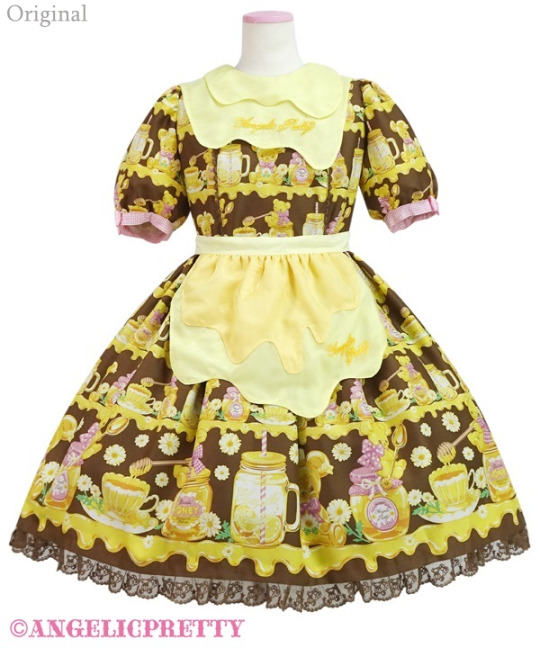
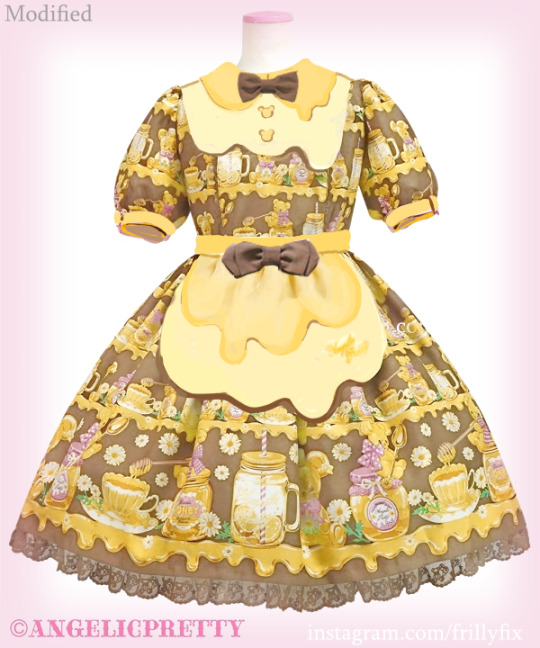
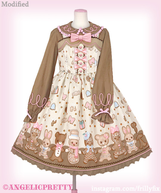
Honey Bear's Cafe OP, Angelic Pretty’s upcoming release. I think the other colorways are fine and probably will sold out but for the brown colorway I think it's off.
How would I fix it? I think the brown should be lighter to be in nice balance with the print. The yellows of the dress seem too green yellow, I would adjust them to be more like golden orange yellow instead just like honey! The shapes of the melty collar, bib and apron could be better. Now they remind me more of an egg instead of honey. For example with the collar it looks better to have the usual collar shape defined more clearly and adjusted just slightly with the melty detail to avoid kind of confusing collar shape. I don't think the gingham pattern works in the sleeve cuffs. The AP text on the bib felt too much, I added bear buttons instead. As usual I also added two bows, these could also work in pink!
(Stock photo source: Angelic Pretty Online Shop)
(NOTE: This is just my personal, humble opinion, though being quite direct with my opinion I mean no disrespect by any means!)
21 notes
·
View notes
Photo


Dreamy Chocolatier Skirt
Angelic Pretty’s upcoming release. It is cute but I felt that it needs that extra something.
How would I fix it?
First thing to change is the flimsy tulle lace that will probably be floppy as it’s not very structured. I’d use some sturdy fabric instead. I also wanted to slightly edit the hem details, the shape of the melty hem and the colors.
(Stock photo source: Angelic Pretty Online Shop)
(NOTE: This is just my personal, humble opinion, though being quite direct with my opinion I mean no disrespect by any means!)
59 notes
·
View notes
Photo


Bitten Biscuit JSK
Angelic Pretty’s latest release. Though I do love prints, I’m happy to see more designs where the print is not the main thing. Angelic Pretty’s different details made with appliques, bows, ribbons and other trimmings makes me think of old school designs but still managing to still often look quite fresh and modern.
How would I fix it?
The fabric looks too thin and shiny, that would be the first thing I’d change. The plump bows are kind of cute but I’d add a bit sharper corners to them to make them more defined. The lace up details seem nice but as it continues on the skirt it’s looking a bit weird that the lace detail is not continuing on the other side of the lace up part so I added that lace there. I felt that the dark brown was too dark in the original dress so I lightened it. The light brown seems to be distributed in a bit unbalanced way in the original design so I added some light brown fabric to the bottom of the hem and the top of the bodice. I thought the scallop shape would work with the theme well. I also added some empty pink area around the shoulder strap buttons so they stand out clearly.
I know the applique is supposed to be a biscuit whit a piece bitten off but I just felt like the cookie would work better with a whole cookie. That would probably mean the name of the release should be changed too. I guess the bitten off detail could be still added but it should be much smaller to not have such a big impact on the design. The original cookie kind of looks like a crescent moon and it adds more complicated shapes to the overall look of the dress. It bothers me that in the original design the bottom of the cookie applique is so close to the Angelic Pretty ribbon of the hem so i added plenty of room there.
(Stock photo source: Angelic Pretty Online Shop)
(NOTE: This is just my personal, humble opinion, though being quite direct with my opinion I mean no disrespect by any means!)
32 notes
·
View notes
Photo

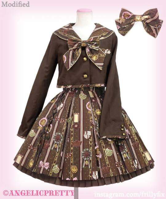
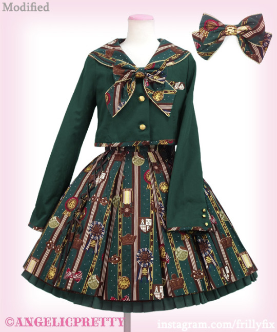
Chocolate Rosette School set
Angelic Pretty’s beloved chocolate rosette print has a new cute uniform style cut which is very lovely! Currently it is only available at the Sendai renewal opening event.
How would I fix it?
For all the other colorways, wine, navy and ivory the blazer color is unified with the print fabric’s color. However with the green colorway the jacket is solid brown fabric. It looks nice but I really like the more unified colorway versions. There is no completely brown version either. So I decided to make versions of an imaginary brown colorway and a fully green colorway. I also made the buttons nice and golden instead of the de-saturated antique gold so they pop out more and match with the rich gold tone of the print.
(Stock photo source: Angelic Pretty)
(NOTE: This is just my personal, humble opinion, though being quite direct with my opinion I mean no disrespect by any means!)
33 notes
·
View notes
Photo

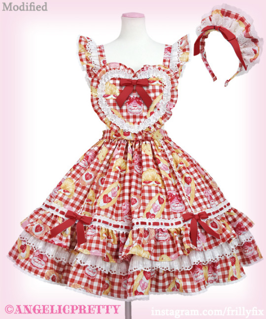
Strawberry Bread Bakery Cafe Skirt set
Angelic Pretty’s latest print. It’s super adorable strawberry bakery themed design but a couple of things just could make it better in my opinion.
How would I fix it?
I understand that it has a French theme but the gingham combined with the three color stripe ribbon is just a lot. In the original version the French flag ribbons are definitely the thing that stands out the most but the print and the gingham background are fighting for attention too. So I just made the ribbons into solid red color to highlight the actual print more. The wide lace with cutlery is nice otherwise but for some reason it’s missing the holes that are an important part of an eyelet type lace. So it looks more like white fabric than lace. So I added the holes. I also removed the crossed ribbon from the heart part and added a traditional detachable bow in the middle instead. I also aligned the print in the middle on the heart so the jam jar is nicely centered.
(Stock photo source: Angelic Pretty Online Shop)
(NOTE: This is just my personal, humble opinion, though being quite direct with my opinion I mean no disrespect by any means!)
53 notes
·
View notes
Photo
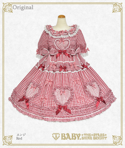

Sweet Gingham Doll jsk
This time I am looking at a dress from Baby, the Stars Shine Bright (their stock photos are tiny!). There is only two one piece cuts available so I wanted to make a jsk version. This heart themed dress is absolutely adorable but I’d like to test something slightly simpler.
How would I fix it?
I like bows. This op has 34 bows but I could manage with fewer bows. I removed the gingham ribbon bows as they blend in to the gingham fabric and create a bit unclear details. I think the hearts should be the preliminary thing in the design and bows would be just a secondary thing. I noticed the hearts in the hem are only in the front side of the skirt and there are none in the back. I would definitely add the hearts all around the skirt so instead of three hearts there would be eight. I lowered the top ruffle on the skirt so that it doesn’t overlap with the big waist side bows. I also think the overall design is more balanced when there is less space on top of the hearts. I added some white lace here and there to lift certain things off of the gingham background. I also added length to the bodice and made the skirt silhouette more cupcake shape instead of A-line. (Stock photo source: Btssb)
(NOTE: This is just my personal, humble opinion, though being quite direct with my opinion I mean no disrespect by any means!)
12 notes
·
View notes
Photo

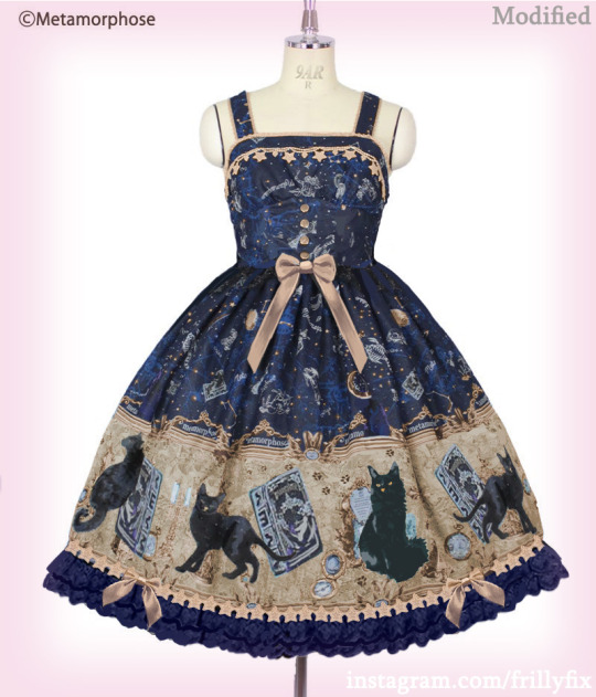
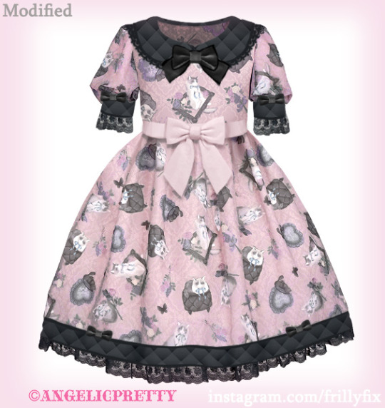
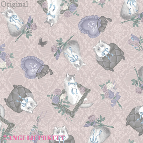
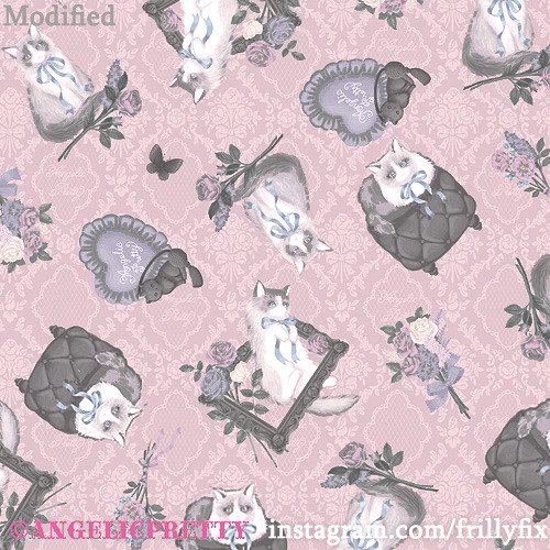
Black Cat and the Magical Map jsk
This time I am looking at a dress from Metamorphose Temps de Fille. The Black Cat and the Magical Map print has cats, magical and astral illustrations in the print. I have been eyeing this dress for a while really hoping to get to fix a couple of things that bothered me.
How would I fix it?
The thing that most bothers me in the original design is the composition of the cats in the border print. Seen from afar you can see one big dark blob in the middle and the rest of the cats kind of disappear on the top area of the border print. Most of the print doesn't have strong contrasts so the print ends up looking empty background missing the cats that should play the main role. So I balanced the print out by scaling up the cats and putting them to the middle of the print in their rightful place. The other thing I really wanted to fix is the turquoise print background color. I thought some golden hues would work great with navy and the magical theme. I also added some proper lace on the hem as I think the tulle in the hem is too thin and delicate for this context. I don’t think the tulle is needed around the waist either. And as a final touch I added some star lace trim on the hem. (Stock photo source: Lolibrary)
(NOTE: This is just my personal, humble opinion, though being quite direct with my opinion I mean no disrespect by any means!)
12 notes
·
View notes
Note
hi, you made me revive my ANCIENT tumblr account. your designs are just too good! the lady cat room, girly sticker and spooky doll are all dresses i wish i liked but just don't. if they looked like your designs i'd buy them in a heartbeat. and bat wings on dream cats? GENIUS. I do have a question though - are you be okay with people recreating your designs irl? I'd love to make the spooky doll, i think it's different enough from ap's dress to not be a replica but still would need your blessing!
I'm glad if people get inspired and want to create the designs for their personal use! I'd also love to see them! It's nice that you appreciate my designs, I also have an instagram with the same name.
3 notes
·
View notes
Note
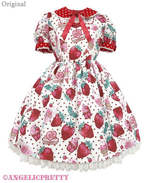
Would it be okay with you if someone sewed a dress based on one of your redesigns? I find myself entranced by Fresh Strawberry Diner, yet confounded that I cannot buy your (superior) take on it.
Sure! Glad to inspire creativity!
2 notes
·
View notes
Photo
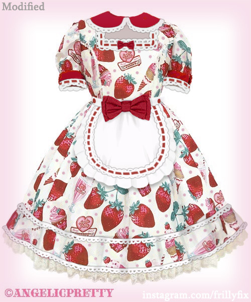
Fresh Strawberry Diner OP
Angelic Pretty’s upcoming berry print. It has a lot of cute details but I feel like it’s quite busy.
How would I fix it?
So many dots, different sized dots everywhere! I think the main thing of this dress is the print and the diner theme so I did my best to bring those out. The print can breath better with less dots that are light pink color instead of the darker red color. I just had to add an apron too. I felt that adding some volume to the bottom of the hem with ruffle would be nice too. I also clarified the neck area to bring out the ladder lace details and lace better. (Stock photo source: Lolibrary)
(NOTE: This is just my personal, humble opinion, though being quite direct with my opinion I mean no disrespect by any means!)
32 notes
·
View notes
Photo

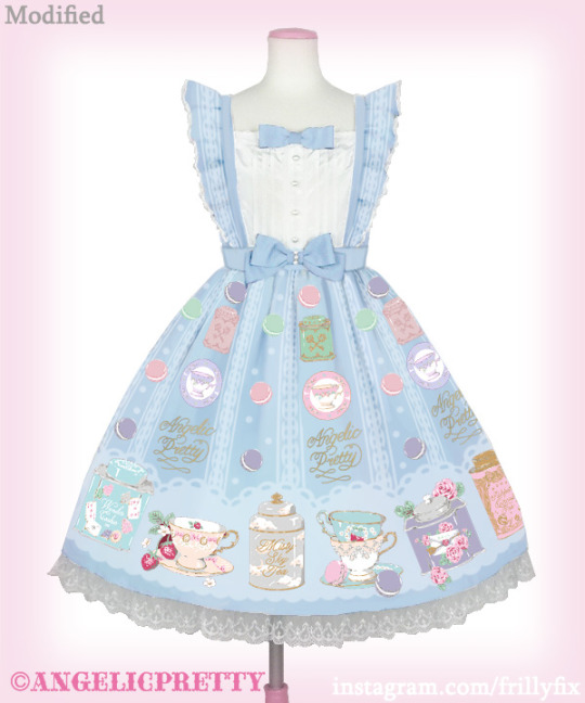
Memorial Tea Museum jsk
Angelic Pretty’s latest release has a really nice tea themed print by Imai Kira. The tea tins have some famous Angelic Pretty print names on them which is a super lovely idea! What lolita wouldn’t want to drink Misty Sky or Puppet Circus tea? The cut is actually also really lovely!
How would I fix it?
Aside from the print being too close to the edge of the hem there isn’t much wrong with this dress. I’m not a fan of this type of shiny polyester fabric that makes the print a bit faded. The blue color is okay but I’d just love to see this print on proper sax blue cotton. My main reason doing this dress is that I wanted to see how it would look like as a border print. In the original all the lovely details seem to get a bit lost, maybe this isn’t the case when seeing the dress in real life though. But still I’d like to have the beautiful illustrations big and clear. (Stock photo source: Angelic Pretty Online Shop)
(NOTE: This is just my personal, humble opinion, though being quite direct with my opinion I mean no disrespect by any means!)
20 notes
·
View notes
Note
not very much of a question, but i just wanted to say i find your fixes very thoughtful and very rarely find myself disagreeing with your choices. looking at the originals i often have a hard time articulating what is bothering me but with your fixes i have these a-ha moments, it's very cool. thank you for sharing :)
Thank you! I'm glad you like my fixes! I love older AP and just edit dresses to kind of be more like the dresses that made me to fall in love with the brand originally.
5 notes
·
View notes
Note
I love your fixes! What program do you use to make the modified dresses?
Thank you! I use photoshop.
0 notes
Photo

Lady Cat Room op
This Angelic Pretty x Risa Nakamura collaboration dress just became available for reservation. It says on the website “The theme of the pattern, the design and the materials are all produced by Risa-chan!” The ragdoll cat print with cute items is really lovely! The color, cut and materials could use some modifying.
How would I fix it?
As usual I’d choose sturdier materials. The fabric is so thin you can see the lace trough the hem. I’d use quilted fabric accents to match with the quilted stool in the print. I would replace the ribbons with sturdier bows. The cut is a bit weird due to the very high waist and quite simple looking collar. The sleeves are okay. A simple classy cut would be better in my opinion. Lastly the color is this weird desaturated hue of pink and the print is quite faded so those could also use some adjusting.
I’d also do a small fix in the otherwise great print as well. The cat loaf on the quilted stool is pretty cute but it doesn’t read too clearly especially from a far. On the first glimpse it looked like a cat sitting inside a pot. I’d have the body of the cat also visible to avoid any confusion. (Stock photo source: Angelic Pretty Online Shop)
(NOTE: This is just my personal, humble opinion, though being quite direct with my opinion I mean no disrespect by any means!)
12 notes
·
View notes
Photo
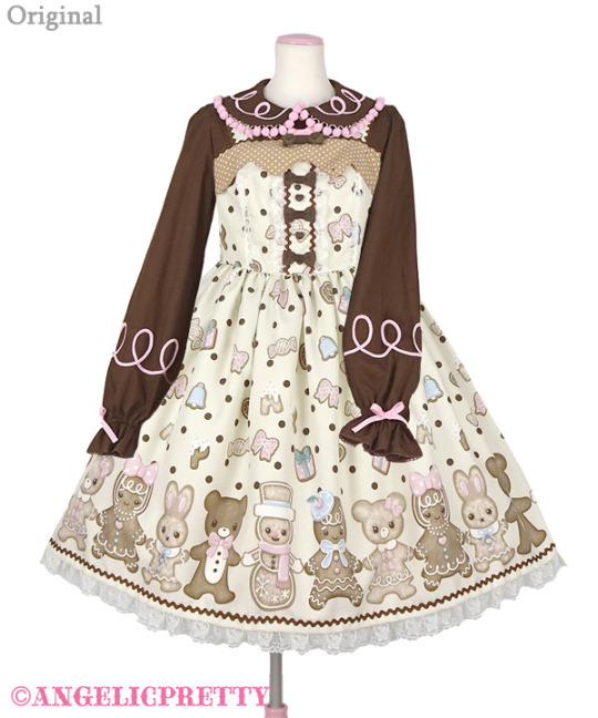
Nakayoshi Ginger Cookie JSK and Blouse
This time we are looking at the upcoming jsk and blouse release by Angelic Pretty. It’s a cute print with gingerbread cookies and the blouse has a lovely piping theme to achieve that perfect gingerbread cookie look! Except for me there are a couple of things I’d like to change to make it appeal to me better personally.
How would I fix it?
I feel that the colors need the most adjusting. Everything looks a bit dull and the print is lacking some contrast. But then there is a very dark brown blouse with very vibrant pink details and also some relatively dark details on the dress but the colors are very de-saturated. So this just needs some balancing. The dress with the blouse manages to lack contrast and have too much contrast at the same time. So I balanced the distribution of the values and added vibrancy to the pinks and sax blues of the print. I also changed the bows into pink bows and added a bigger bow on top. The gingerbread cookies seemed like they are floating around on the hem so I added a brown background that ties them together. I felt the tiny polka dots on the top of the jsk were unnecessary and replaced that with solid light brown. I also modified the shape of that part to rounder forms and added the piping detail there to unify the coord when worn with the blouse. In the blouse I moved the sleeve details lower as they felt a bit weird so high up.
(Stock photo source: Angelic Pretty Online Shop)
(NOTE: This is just my personal, humble opinion, though being quite direct with my opinion I mean no disrespect by any means!)
19 notes
·
View notes
Photo


Flower Basket JSK
Flower Basket jumperskirt is a flower print dress Angelic Pretty released a while ago. The important features here seem to be the apron and the contrast of the wine ribbons and bows against the light printed fabric.
How would I fix it?
I simplified the design a lot and got rid of weird crisscrossing lines. The skirt is tiered but it’s not very clear as there are some things distracting from it. So to show the tiered form better I removed the white ruffle from the middle of the skirt. I thought the cupcake shape would bring out the tiered layers better than the A-line shape. The original has diagonal lines cutting off the top part of the apron. This is a very unique design, but I thought I’d like to use a more traditional approach instead. So I removed the bust ribbons and made the apron top part continue all the way up. Instead of two big bows covering the waistline I used just one in the middle that lefts the waistline visible. I balanced the distribution of wine red details by adding another line of ribbon on the hem and also smaller detail of ladder lace with wine ribbon inside on the apron. The original has eight bows all on the top area, I thought I could reach a more balanced look and using only six bows and distributing them more evenly. Finally the little ruffles on the straps felt too separate from the rest of the dress so I continued the ruffle all the way down highlighting the apron style design.
(Stock photo source: Angelic Pretty Online Shop)
(NOTE: This is just my personal, humble opinion, though being quite direct with my opinion I mean no disrespect by any means!)
24 notes
·
View notes
Photo

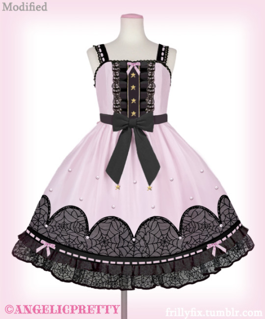
Spooky Night Doll JSK
Everybody has been patiently waiting for the annual Halloween dress from Angelic Pretty and we are yet to see a Halloween print release but instead last week we got this dress.This design is quite unique. I wonder what is that pattern? Diamonds? Coffins with narrow bottoms? It’s difficult to read what the pattern is so there is no clear Halloween connection. I’d like to see some clear Halloween themes on it better.
How would I fix it?
For the materials I would choose use something that has a sturdier structure and isn't shiny. It seems like it would already be a big improvement to remove the diamond pattern but I always try to take the original idea of a dress and execute it better in my design. So just removing the pattern wasn’t an option. I went with more simple and clear bat wing shape there. To add the Halloween feeling I chose spiderweb lace. I’m not usually a fan of lace overlays but for this one I think it works. I’m not a fan of the new hem style of many recent dresses where there is a bit too long and loose ruffle continuing from the hem. So I added a lot of lace, ribbons, ruffle and pearl details.
(Stock photo source: Angelic Pretty Online Shop)
(NOTE: This is just my personal, humble opinion, though being quite direct with my opinion I mean no disrespect by any means!)
27 notes
·
View notes