
gendesigns
gen designs
au shi ying genevieve ; nm3215 w2
i am an nus student taking the module nm3215 and this is my visual blog
13 posts
Don't wanna be here? Send us removal request.
Last Seen Blogs
angelspoiled
☁️✨ newwavedoll☁️✨

starryhunbun
𝒉𝒐𝒏𝒆𝒚
iciel
Iciel
sweetdeathwrites
i picture it soft and i ache

dxccar
DXC Car Consulting
Text
NM3217 Blog
Assignments
Assignment 1
Assignment 2
Assignment 3
In-Lecture Exercises
In-Lecture Exercise A - Lecture 1
In-Lecture Exercise B - Lecture 2
In-Lecture Exercise C - Lecture 4
In-Lecture Exercise D - Lecture 5
In-Lecture Exercise E - Lecture 6
In-Lecture Exercise F - Lecture 7
In-Lecture Exercise G - Lecture 8
Final Project
Final Project
0 notes
Text
Final Project (Group)
LEARNING OBJECTIVES
Understanding effective communication design through the various facets covered in class.
Understand the proper use of design elements and principles in terms of layout and content organization.
Synthesize and apply design process learned in this module properly and appropriately through the creation of a prototype that will fit into students’ portfolio.
Reflect critically on lessons gained in the module through the documentation of work processes in the form of academic writing.
Having worked by myself for the past three assignments, it was a different but equally enlightening experience working in a group now. I learnt how to capitalize on each other’s strengths and weaknesses, and to give and receive better feedback. Previously, I had total creative control over my designs but now that I am in a group with three other people, it was crucial that I learn how to change my style to fit my group members’ without compromising my original style.
It was especially important as we needed our final e-guide to have a consistent look and we tried to attain that by integrating a mascot, same font styles and positioning of repeated elements like our sticky note at the header. Simultaneously, we also ensured that each person’s style shone through by making each spread unique, according to the section, so that they do not all blur into one. For example, our “Acing your Interview” utilized the setting of an interview which is relevant to the section.
It is always difficult to start a design from scratch and this project was doubly difficult as we had to balance the ideas from four people. As our eventual topic was on internships, a rather professional topic, we choose to use solid shapes like rectangles and straight lines to illustrate a sense of seriousness and solemnity. They also aided in directing attention without making the e-guide too crowded. Our fonts were carefully chosen for their ability to emphasize and catch people’s attention.
We also chose to use the colors blue, black and white for their calmness and elegance. The colors orange and yellow were used to spice things up, making our e-guide more dynamic and to draw attention when required. However, as our target audience was millennials, we were careful not to come across as boring and hence, decided to integrate an illustration of a mascot.
For our mascot, we chose a girl who is meant to be a placeholder for the reader and as the reader continues reading our e-guide, they will notice that the girl evolves with each page. Initially dressed in a Communications and New Media shirt, the once confused and nervous girl will grow and change to be more confident and appropriately dressed by the end of the e-guide. This also symbolises the reader’s growing knowledge of how to tackle internships. We figured that the addition of a cute mascot would endear readers and make the e-guide more interesting.
Next, we also recognize that internships are a topic with a lot of information and we did not want our readers to be overwhelmed. Therefore, our layouts were chosen to display information in bite-sized pieces or in creative ways in order to ease readability and allow for greater comprehension and understanding. There is always a careful balance of text and illustrations to keep readers engaged in our e-guide. For example, for my section on resumes, I placed my tips on writing resumes in a resume format, allowing the readers to visualize the placement of the information better and not be bored.
Lastly, the design document helped us tremendously. For me, it aided in my reflection and greater understanding of my choices in layout and content. For the most part, I spent most of my time designing the e-guide but the design document allowed me to internalize my choices and then express them. This was particularly illuminating when it came to tracking my progress, from my first draft to the final piece my group submitted, as I am able to read and see my improvements.
In this project, I took on an equal portion of the creation of the e-guide and designed both the table of contents and “Writing your Resume”. I was fortunate enough that my designs were well received by the class and also devoted my time to aiding my other group mates in their respective sections of the e-guide. I gave feedback and ideas to improve on for their sections. At the same time, I took on the role of submitting the required documents for forums for Weeks 11 and 13. As my group mates were more focused on their sections, I also wrote and edited parts of the design documents especially towards the end in order to ease my group mates’ workload.
In sum, the final project was a truly enlightening learning experience in terms of producing a work that is worthy of being in one’s portfolio. The final project also mimicked our future careers of working in a team to produce one design and I really learn a lot from this experience. While our e-guide may not be the best, I am still proud of it and how much I have improved.
0 notes
Photo
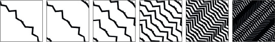
Week 8 In-Lecture Exercise G — Create your own Pattern using Elements of Design
Using what you have learnt today on elements of design, draw/create a pattern.
You should also range it from the lightest (1) to the darkest (6)
Creating a pattern was a tad difficult because I didn’t know where to begin. I chose to use lines instead of curves because I found lines more orderly as compared to the messier curves. I started off by creating a simple jagged line and duplicated it thrice to form a sort of pattern, as seen in the lightest (1) and the following (2). I continued duplicating the lines and shifting it a bit for the next four parts until it became the darkest (6). The lines direct the viewer’s attention and the jaggedness makes it more interesting as the viewer would follow it go up and down, up and down… The final part (6) accumulated to a dark, almost solid pattern with only some white portions peeking through.
0 notes
Photo

Week 7 In-Lecture Exercise F — Create your own Color Scheme
Take a photo with your mobile phone.
Create a color scheme from it:
Pick out five hues from the image and write a VERY SHORT write up on the hues, what mood are they conveying, if they are working well...
[LtR: BB020A, DB6D9A, ECA4B2, F3EDEA, D3A46A]
Right off the bat, you can tell that this color scheme is one that is girly and intended to attract feminine people. The five hues were taken from a picture of a Etude House store, a makeup store from Korea whose target audience are teenaged or young females in their twenties.
The use of pinks in the color scheme is meant to invoke a sense of femininity and youth, of blushing cheeks and rosy lips. Pinks are also used to symbolise romance and this color scheme would be ideal in a romantic comedy poster or date nights. The red is deep and striking, symbolizing passion and complements the romantic, girlish vibes the color scheme is giving off.
The white and brown act as contrast to the pinks and red, allowing more attention to be drawn towards them. Since the pinks and red are so eye-catching, the white and brown are more conservative and take a backseat to support the other three colors.
Overall, the colors work well together in relaying femininity and youth. The brown might be a tad too jarring and ought to be lighter to better match with the other colors.
0 notes
Photo
Week 6 In-Lecture Exercise E — Typography Case Study
Have a look at the image in the next slide and make a commentary on:
What seems to be off about this particular typographic representation?
How would you improve this typographic representation (look into the 8 rules for guiding points for discussion)
There is no need to present a new layout; your commentary in words will suffice.
Firstly, it is obvious that the fonts for the title and body are the same, save for the title font likely being bolded. As such, the fonts do not enhance or compliment each other but instead, makes it look jarring to the viewer. This is in addition to both texts’ fonts being capitalized as if screaming for attention. The body text is also centre aligned when it should really only be the title, befitting its status as the title, which makes it difficult to read.
Admittedly, the kerning of the text appears to be fine, except for the lack of space between the first period and the next letter in the sixth line. There is a decent amount of space between each letter and word in the image which is a boon for its readability.
However, the readability of the image is worsened with the fact that the font itself has very thin strokes and really should not have been used for the body text as it makes up the bulk of the text. While the title font has thin strokes as well, it is larger, maybe even bolded and hence, easier to read. Thus, I would have used a Serif font, perhaps the classic Times New Roman or my personal favourite Quattrocento, for the body text to complement the title font and ensured that it was left aligned. It would have made the text more pleasing to the eye and definitely more readable.
While there is no hint as to what the text is for, the visual personality of the typeface appears to be for a sports event or even a school graduation. When I first saw the image, I was instantly reminded of the blocky font athletes often used on their team jerseys and then my mind immediately went to High School Musical as they seem to use the same font for their basketball jerseys. Therefore, if that is what the image is intended for, I would approve of the title font used but if it was meant for a more elegant or formal occasion then I would demand for a change in font.
0 notes
Text
Week 5 In-Lecture Exercise D — Composing Compositions
Use your phone camera, choose a subject and compose it in various shot sizes and camera angles, while demonstrating your understanding of visual composition.
Take about 4-6 images.
State the purposes of using these techniques and how does it affect your audience who perceive your subject.
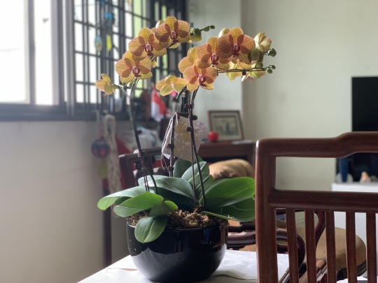
Firstly, we begin with a mid shot with the subject, a vase of flowers, right in the middle. This sets the setting for the audience and allows them to recognize the vase of flowers as our subject.

Next, the high angle shot is meant for the audience to find the vase of flowers meagre and lacking in flowers.
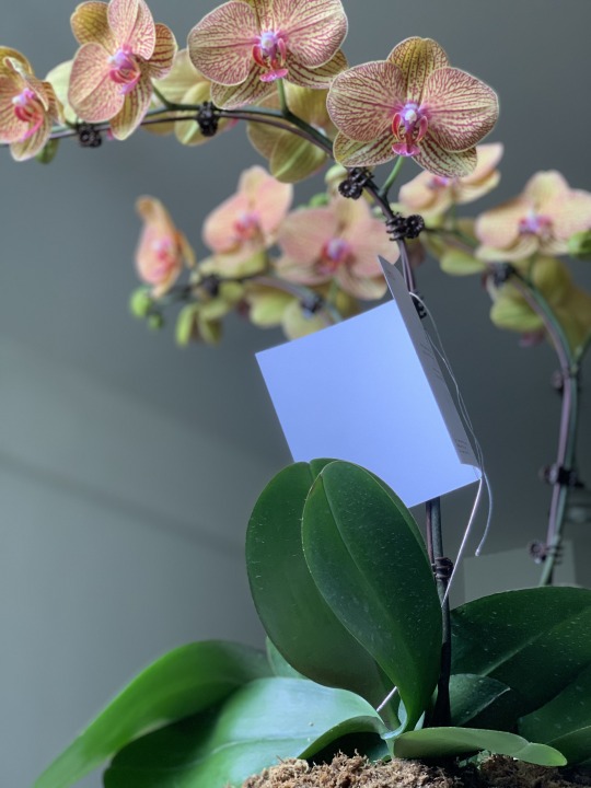
However, the low angle shot subverts this perception by placing the audience beneath the vase. Now, the flowers are arching over the audience which gives the appearance of them being massive and numerous, and demands the audience’s attention

The Dutch angle further pushes this notion of the flowers being plenty and eye-catching as the audience are now positioned in an angle that makes the flowers feel overwhelming and expansive. The tilt of the X axis also adds a sense of unease as the flowers feel out of balance.

Lastly, in the extreme close up shot, a single flower nearly fills up the entire photograph and each pink vein of the petals can be clearly seen. The audience is now forced to focus only on the flower and can only appreciate and acknowledge the flower, down to its thin veins, and nothing else.
0 notes
Photo

Assignment 3 — Information Design
LEARNING OBJECTIVES
Learn the process of abstraction through simplification.
Learn the communicative properties in information graphics applied in abstracting images.
Understand and analyze the various signs/symbols.
Understand the need for abstraction and its purpose of doing so.
Assignment 3 was the most fun and enjoyable assignment to complete. While it was difficult coming up with everything (topic, color, information etc.), I still liked that I had control over everything. I chose the fun topic of bubble tea in Singapore as I wanted my infographic to be pastel and cute, involving something that everyone knew and liked. Hence, I added a portion introducing unique bubble teas in Singapore.
In the beginning, I wanted to include more information about bubble tea such as fun facts and the sugar content but it made my first draft of the infographic too cluttered and disjointed. Eventually, I chose to focus on making the infographic visually appealing with many illustrations of bubble tea.
I chose not to use photographs of the bubble tea as I wanted to control the size and color scheme of the bubble teas, and also because I wanted to make the illustrations cute to fit the theme. I instead used the bubble tea stores’ brands to differentiate each cup and chose different colors and styles (glass jelly for KOI, pink pearls for PlayMade).
For the timeline, I chose to make it a flow of bubble tea since I felt that a normal straight line would be too flat and added droplets to make the flow more dynamic. I tried making the droplets more “reflective” as well.
Throughout the infographic, I stuck to the chosen brown and cream color scheme as they were reminiscent of bubble tea and used a warm pink as titles. After the critique session, TA Zicheng and my classmates advised me to use a huge bubble tea to tie all the information together and to make the information more linked.
For example, I mentioned HEYTEA and Tiger Sugar in my introduction so I added them to the timeline. I also made the conscious choice of putting Gong Cha, despite it not having as many stores as the others, in the timeline along with LiHO and KOI as they are arguably the most well-known bubble tea store brands in Singapore.
Next, I changed from my initial plan to use the different bubble teas as the bars for the table (“Number of stores per brand”) as it was too chaotic with the different designs. I changed to just using one illustration and bars, of typical bubble teas, with the number at the end. I designed the different bubble teas but while some of the stores’ logos were available in PNG format online, some weren’t. I ended up having to free trace the logos in order to make them into PNG formats. It was also difficult to mimic the colors of the Tiger Sugar bubble tea and after my first try was deemed not recognizable by the class, I had to freehand the patches of colors and add a blur to make it better resemble the mixed texture of the Tiger Sugar bubble tea.
Lastly, I chose the font “Better Together” for its bubbliness as the title to draw attention. I also used Abril Fatface and Futura as they were Serif and Sans Serif fonts respectively. I wanted the thickness of Abril Fatface to make an impact as the headers and the straight lines of Futura to enable better readability.
Overall, the infographic is meant to have a cute, pastel aesthetic with accompanying illustrations. The infographic relays information easily and in a creative way, from the unique bubble tea concoctions to the timeline of bubble tea in Singapore.
0 notes
Photo

Assignment 2 — Storytime!
LEARNING OBJECTIVES
To communicate ideas through visual storytelling
To understand the process of production through initial storyboarding to finished product.
Understand and work within constraints set (like that of the number of frames and the medium involved)
Assignment 2 was more difficult to complete as compared to Assignment 1 due to the different stages of it, from storyboarding to photo taking and finally, compiling the photos into a coherent storyline. The storyline I ultimately chose was about a boy finding a relationship from Tinder and I tried to communicate their love story with only nine photos.
Initially, I was careful to ensure that the couple wore different clothing in the photos to show the passing of time as we were not allowed to use text but I neglected to show that the settings were different. When I presented to the class, they advised me to choose more varied settings as the photos all appeared to be taken in the same place, a park, when they were actually taken at different venues. Hence, for the second round of photos, I took extra care to photograph the couple in visibly different places and in different outfits.
Next, I tried to experiment with the angles and positioning of the subjects. I positioned the couple differently in the photos and utilized close-ups (to show the Tinder screen and hands) and mid-shots (the dates). I initially wanted to use a long-shot of the couple where they were just strolling the park but there was little visual impact as the surroundings took the attention away from them instead.
Due to the lack of text and limited photos, I also tried to show the couple’s growing closeness through their facial expressions (from looking away from each other awkwardly to grinning widely at each other). I gave extra attention to their hands inching closer to each other before finally concluding with a back shot of them without barely any space between them. That took up almost half of the nine photos but they were important to show that the couple was finally comfortable with each other, not just as friends but as a couple.
0 notes
Photo
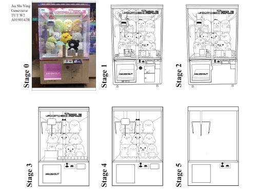
Assignment 1 — Stripping Down!
LEARNING OBJECTIVES
Learn the process of abstraction through simplification.
Learn the communicative properties in information graphic applied in abstracting images.
Understand and analyze the various signs/symbols.
Understand the need for abstraction and its purpose of doing so.
For Assignment 1, I chose to abstract a claw machine filled with large stuffed toys. It seemed like it was a challenging subject because of the many curves and lines of the machine and toys. However, I was certain that it would be easy to abstract due to the straight lines and the fact that it was essentially a box with a claw. That was my focus and main point of abstraction as I figured that the claw was crucial and telling enough that people would still be able to recognize it as a claw machine.
Naturally, Stage 1 took me the longest to complete because there were so much that I had to trace, from the curves of the stuffed toys to the bulky text as well as the transparent claws. Even though I have used Illustrator during tutorials, I was still new and unaware of most of the tools and had to keep retrying and redoing the tracing. The claw machine’s sides were also reflective and I had to make sure that I was tracing the correct things.
The next most difficult stage was Stage 3 because I had to simplify the design of the stuffed toys but still ensure that they were recognizable and most importantly, still adorable enough. I constantly checked with my friends if they found the stuffed toys cute enough or too simplistic. I tried to add some unique design, such as a bow or animal characteristics, to the stuffed toys as well as I did not want them to all look identical.
Despite all my efforts in abstracting them, I ultimately removed the stuffed toys from Stage 5 as I wanted the final design to look like a typical claw machine and not only claw machines that had those stuffed toys as prizes. I continued stripping the design of the nonessential parts until there was no more text or extra lines.
During the presentation, I was given the suggestion to make the claw hanging on the left of the machine to be more abstract and I did so by slimming the hanging bar and removing the oblong in the center. I am satisfied with my final design as I think the design is still recognizable as a claw machine.
0 notes
Photo

Week 4 In-Lecture Exercise C — The Signs and Symbols of Heinz
Review the print ad. Write about the sign - what is the signifier, and the signified. Essentially, analyse and describe what this ad is trying to say.
The signifier is a chopped up Heinz ketchup bottle, made to resemble chopped up tomato slices piled hazardedly on top of one another in the shape of a sauce bottle.
The signifier is that Heinz is trying to imply that their ketchup is made out of the freshest tomatoes, so fresh that it was like the tomato themselves are in the bottle or literally make up the bottle of ketchup. The idea of organicity is reinforced by the text below where Heinz evokes the idea of freshness and cultivation of ketchup, and by extension tomatoes, through the clever use of “grows” instead of more common “make” and positions themselves as the best in the industry.
0 notes
Link
Week 2 In-Lecture Exercise B — Constructive Criticism Model
Apply constructive criticism model in evaluating a design OR artwork.
The artwork I chose is an oil painting of a dark-skinned lady breastfeeding a child of lighter skin, “Maid Breastfeeding Child” by Yom Bo Sung. The lady, presumably a maid or a domestic helper considering the title of the artwork, is wearing a white button-down shirt which is currently unbuttoned to give the child in her arms enough space to latch onto her nipple. She is smiling directly in the audience’s face and does not seem perturbed despite her state of undress.
The background is a blur of greys and blacks, directing the audience’s attention to the domestic helper and the child in the foreground. The juxtaposition between the domestic helper and the child’s skin tones clearly relays to the audience that they are not biologically related even though they are engaging in an act that is incredibly intimate and ought to be performed between a mother and her child.
Instead, the artwork depicts a domestic helper breastfeeding her employer’s child, an act that may be acceptable and commonplace in the past with the existence of wet nurses but for today, modern’s standards, is an act that warrants a second take. The domestic helper is no longer just employed for performing menial labor like cleaning the floor, but also selling her breast milk to her employer.
This artwork is a warning to Singaporeans and their over-dependence on domestic helpers. An increasing number of families, especially those with young children, are turning to domestic helpers to help care for the household. In these households, domestic helpers are expected to raise the children of their employers in order to provide for their children back home.
This painting takes it another step further by showing the domestic helper breastfeeding and essentially acting as the child’s wet nurse, a profession that has been criticized by scholars since wet nurses in the past often had to forgo raising their own children in favor of moving into their employer’s houses and breastfeeding their children. Thus, this artwork cautions society of their over-reliance on their domestic helpers and the possibility that the domestic helpers might one day intrude into the boundaries of mother and child relations.
This artwork successfully catches the audience’s attention with the positioning and more specifically, the almost shocking act of baring one’s breast. The revealing of a breast has long been tied with sexual connotations but the artwork cleverly uses it to first attract the audience’s attention and then prompt the audience to think of the functional and original usage of breasts and the issue related to it.
Admittedly, the artwork could have chosen the background colors to be less striking. The greys and blacks put the two subjects to the forefront but the yellows are nearly identical to the yellow tone used for the domestic helper’s breast which may be confusing at first glance and diminishes the visual impact of the exposed breast. Nonetheless, the visual contrast between the skin tones of the domestic helper and the child again doubles down on how this act is not being performed by a mother and her child but by an outsider.
0 notes
Photo

Week 1 In-Lecture Exercise A — Articulate your Thoughts through a Sketch!
Sketch (design) a machine/device that you think will enhance your creativity.
I’m a visual person and listening to music is one of the best ways to make me creative. I enjoy listening to epic, powerful music — the kind of music that they use in movie trailers because it makes me excited and sends my heart pounding. I would visualize the action in my head, how each act is emphasized with each beat or, how tension or emotions are drawn out with a lingering note. I’m clearly not an artist who draws or designs but I want to be a video editor and pair music with videos together.
As such, my device is simple and I’m afraid, not very innovative. It is just a pair of headphones attached to an iPad or computer which allows me to actively sketch out each scene as I hear the music enhance the action playing out in my head. There is a holograph machine (think of the holoprojector seen in the Star Wars movies) connected to my iPad so that I can see the action play out in the front of me in 3D. It would even enable me to direct the movement or limbs of my characters or the animation of opening titles and special effects.
0 notes
Text
first post placeholder
just in case i need to add something important
0 notes