greenhorn-art
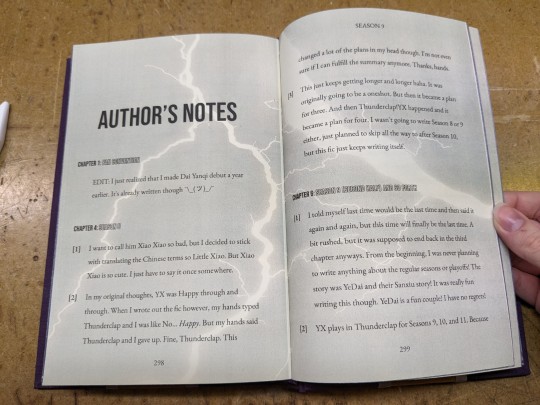
Gotta Start Somewhere
Greenhorn —Noun: an untrained or inexperienced person. My art dump, and reblogs of references and tutorials I want to save in one place. Bookbinding: Mountain Lark Press
157 posts
Don't wanna be here? Send us removal request.
Last Seen Blogs

bikesteelborrow
Bike, Steel & Borrow

ncityrave
noceur

comeunosumille
Come uno su mille

chemicalsmaterialsaltus
Chemicals & Materials
crowclawed
WICKED ONES.
Text


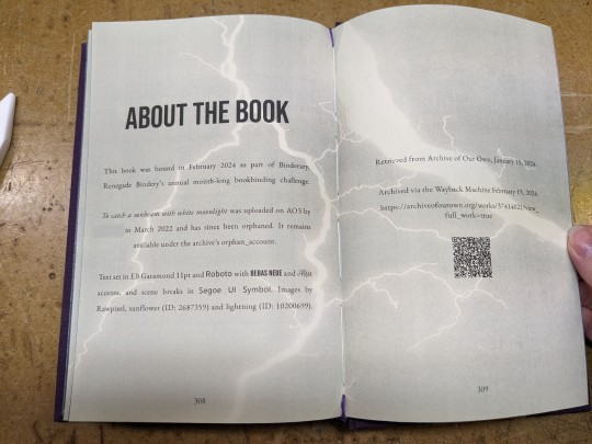
to catch a sunbeam with white moonlight
Author: orphan_account [this work has been orphaned and is no longer associated with it's author]
Fandom: 全职高手 | The King's Avatar
Rating: General Audiences
Category: F/M, Gen, M/M
Words: 55,720
At a Glory convention, Dai Yanqi meets Ye Xiu who is helping Su Mucheng buy her favorite doujinshi. They surprisingly hit it off as they browse through all the doujinshi about their peers and talk about Glory.
About the book
FONTS: EB Garamond (body text, title), Roboto (body text - electronic), Bebas Neue (title, headings), Alfie (title), Segoe UI Symbol (scene breaks - 'gear without hub')
IMAGES: Sunflower (Rawpixel, ID: 2687359), lightning (Rawpixel, ID:10200699)
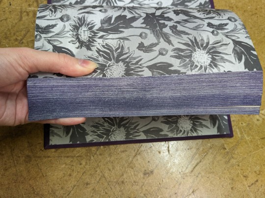
MATERIALS: Domtar Earthchoice (textblock - 20lb, cream, 11x17 cut down to 8.5x11), Recollections paper pad (endpapers - Dark Watercolor Florals), Iris bookcloth (covers - Eggplant), Verona bookcloth (covers - Hot Toffee), Ribbon (covers - 1/4", shell grey), embroidery floss (endbands - 209 Very Dark Lavender), leather cording (endbands - 1.4mm), Ceramcoat acrylic paint (painted edges - metallic silver), Anita's acrylic paint (painted edges - 11038 Purple), Reeves acrylic paint (painted edges - Violet & Crimson & Blue Lake, Payne's Gray), waxed linen thread (sewing textblock - 30/3, white), Books by Hand (glue - pH neutral PVA)
PROGRAMS USED: Affinity Publisher (typesetting), Affinity Designer and Affinity Photo, LibreOffice Writer (QR codes), Bookbinder-JS (PDF imposer)
BINDING STYLE: Split-board binding, French double-core endbands
(Belated) Binderary Book 2024
My first year participating in Binderary and I'm 2/2 with my goals, albeit slightly late (even with the added leap day).
Goal No. 1: Bind a book!
This fic is an orphaned work, with no author available for me to reach out to. Convenient, since it was a last-minute decision.
Goal No. 2: Finish typesetting the fic that got me into this whole bookbinding/fanbinding hobby!
Bad Boys JEDI Style is a 217 chapter, 908k word "comedy of errors: in which our heroes are recruited to film a reality holo-drama". Much to my despair, the fic I loved had been deleted from every site it was uploaded to, and I was left kicking myself for not having downloaded a copy from AO3.
Shout out to Kam and Lofe, whose wonderful Binderary demos were put to use in the making of this book! Kam's French Double-Core endbands demo was super helpful, sizing up the 'textblock' and components made it easy to actually see what's happening with the sewing. Loffe's demo introduced me to the split-board binding technique and, sleep-deprived hiccup notwithstanding, I think I might find it easier then bradel style binding! Need to bind more books to know for sure (such a hardship 😔).
In other new-s, I took my dad's recent workshop baby for a spin. The bookbinding plough works like a dream! I tried a hidden fore-edge painting for the first time (just a solid colour), but the purple is lost under the Payne's Gray basecoat I applied to the silver painted edges. Adding ribbon to the cover was also new (mostly due to the fact that I never remember until the endpapers are already pasted down).
On the Design
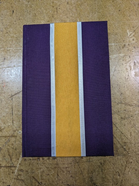
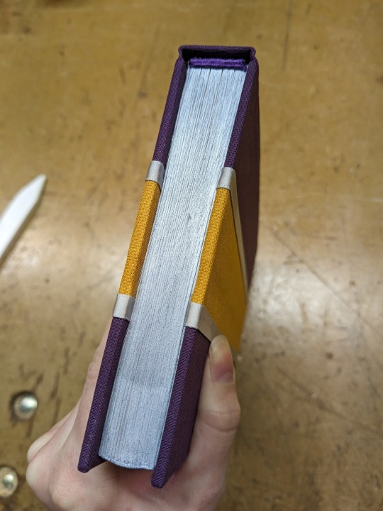
Cover
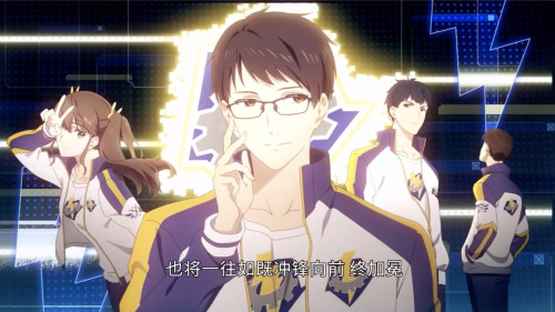
This is a Team Thunderclap!Ye Xiu AU, so the cover was based on Team Thunderclap's uniforms from the donghua (from the one screencap of the team I found, see below): purple across the shoulders and forearms of their jackets with a yellow stripe down the centre. I added silver ribbon as a nod to the white of the jackets as well as the grey gear of the team's logo. Also in reference to the title: yellow=sunlight, silver=moonlight.
Title Page
The title page stumped me for a while. While brainstorming title page design ideas, I thought about what the title means. In English it's poetic but nonsensical, so I wondered if maybe it held some meaning in Chinese?
As it turns out, it does. Kind of. Maybe. (If I stretch and reach for it, it makes sense). According to a quick search of one webpage for each query, "'White Moonlight' usually refers to a person or thing that is elusive in the heart, has always been loved, but cannot be touched" or "an 'unforgettable first love'." The sunbeam itself might be Ye Xiu, the figurative ray of light, the hero, the gaming idol. Or 'catching a sunbeam' could refer to how "sunflowers turn their heads to catch every sunbeam."
The potential meaning I have cobbled together is how Dai Yanqi turns Ye Xiu's head and captures his heart by sharing the (SanXiu-ified) story of Su Muqiu, the aforementioned white moonlight. Is this what the author intended? Who knows. But it does seem plausible enough to inspire me.
I ended up using both the idea of sunflowers and Thunderclap's uniforms (again). Lightning referencing the team's logo, and also the white colour of a flash of lightning which is kind of like moonlight. The logo's background is blue, as is the uniform as seen on the cover of the manhua featuring the captain Xiao Shiqin (see below), so I made the background blue-purple.
Endpapers
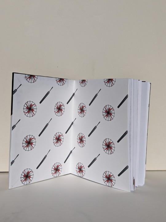
The (not-actually-)sunflowers carried over to the endpapers, as well as the grey colour from the gear in Thunderclap's logo.
Endbands
Kept these simple. A solid purple, as close as I could get to the bookcloth. I didn't want to draw attention away from the stripes on the covers or the silver edges.
Probably could've gone for thicker cores.
The text
For the scene breaks I used a special character of a gear. The cog also looks like a sun. Which is fun because it can reference Thunderclap, the title (sunbeam), and my design choice of sunflowers.
I reused the lightning image at 50% opacity as a background to set apart the backmatter.
Misc.
Recently, I've begun to increase my efforts of preseving fanfiction and safeguarding the stories I love from purges and takedowns. (Sparked by the December 2023 scandal about Sony announcing an upcoming removal of content including the movies and TV shows that people have purchased).
This fic has been archived via the Wayback Machine at https://web.archive.org/web/20240215155152/https://archiveofourown.org/works/37414021?view_full_work=true.
Also, curses be upon Rawpixel. Since the time that I had downloaded the images, they have now be placed behind the premium user paywall (along with a number of other graphics and elements that used to be free).
50 notes
·
View notes
Text


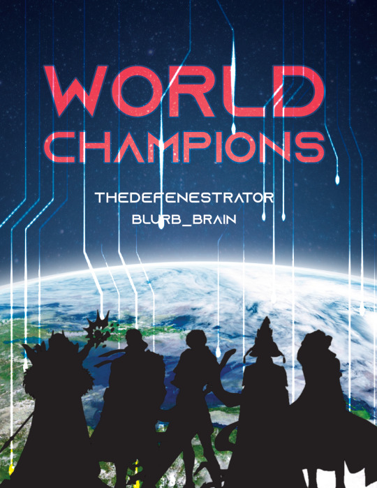
World Champions | Artwork for World Champions by TheDefenestrator by TheDefenestrator, art by Blurb_brain
Fandom: The King's Avatar | 全职高手
Rating: Teen And Up Audiences
Category: Gen
Words: 71 944
At the end of season 4 of the Glory Pro Alliance, the government finally receives the information it has been waiting for: The other players have caught up. Or, In which Glory has been a government recruitment ploy for remote-piloted mecha operators all along.
About the Book
FONTS: Mundo Serif, Azonix [dafont], Segoe UI Symbol
IMAGES: Illustration by Blurb_brain [AO3]; cover image by NASA ID: 440611 [Rawpixel]; Planet Earth background ID: 6331593 [Rawpixel]; Circuit lines background ID: 3117935 [Rawpixel]; endpapers' image by Eric Eastman [Unsplash]; Swoksaar, Desert Dust, Lord Grim, Vaccaria, and Cloud Piercer [The King's Avatar Wikia]
MATERIALS: regular printer paper (8.5"x11", 96 bright, 20lb), 80pt bookboard, Iris Bookcloth (colour: Black Pearl), Neenah cardstock (8.5"x11", bright white, 65lb), waxed linen thread (white, 30/3 size), embroidery floss (shades 3750, 350, 3845, 370), leather cording (1.9mm diameter), Reeves’ acrylic paint (Mars Black, Phthalo Blue, Titanum White), Americana acrylic paint (glow in the dark), ph neutral pva glue (Books by Hand)
PROGRAMS USED: Typeset in Affinity Publisher, cover/title page/endpapers designed in Affinity Designer/Photo, QR codes generated with LibreOffice Writer, PDF arranged for printing with Bookbinder-JS
BINDING STYLE: quarto, case bound (slightly rounded, with oxford hollow, forgot to use tapes)
.
Fenes' "Glory's tech isn't handwaved" AU. This was great! Funny and creative, and I'm both amazed and full of admiration for Fenes' ability to juggle so many characters.
I was feeling excited and ambitious with this one. Tried some new fun things (double core endbands, painted edges) and used some new equipment (a lying press).
The Text
TITLE/HEADINGS FONT: Azonix says 'SciFi' to me, it's a bold, non-serif, sleek font.
BODY FONT: Mundo Serif, it's a decent serif body font I haven't used before. Felt like it worked with Azonix.
SCENE BREAKS: a special character in Segoe UI Symbol of a black & white icon of Earth, the globe showing Asia.
TYPESETTING: Finished typesetting the fic, left document open on my laptop, laptop's battery failed, file now crashes immediately upon reopening, issue persists with copied versions of file (; ̄Д ̄) . Thankfully I had a backup file for the typeset with the barebones of the text, so I didn't have to restart from scratch...
Title Page
My thinking: it takes place in space, the world's at stake, and it's the dawn of a new horizon for Earth. Glory and the titular champions are represented by Swoksaar, Desert Dust, Lord Grim, Vaccaria, and Cloud Piercer – the captains of what I'd call the 'big 5' teams. A circuitry board background element hints at the tech/mecha nature of the story's competition. It may not match Blurb's art, but I hope I was able to convey some of what the story is about.
The circuitry image is used as decoration throughout the book.
I only used the avatars of the top five teams' captains because too many silhouettes would lessen their impact and readability. (Removing the backgrounds was tedious, but worth it.)
Here's what it should have looked like. The test prints for this and the BB art were fine, but I think my inkjet started running out of ink just when I printed the final copies and I didn't reprint them. (Too impatient, really wanted to finish up and read the book)
The Cover
World Champions is another Big Bang fic, and once again I based some of my design choices off of the accompanying artwork. The dominant colours of Blurb_brain's illustration are red and blue-green.
COVER PAPER: For the decorative cover material I used NASA's ASTER image of Poyang Lake. NASA has some really interesting photography some of which remind me of marbled paper, thought it could be interesting. I chose this image of Poyang Lake because 1) it's in China, 2) the colours were similar to Blurb's awesome illustration (fate strikes again, dropping matching images and artwork into my lap!), and 3) NASA is tangentially relevant to the fic, which takes place in space.
BOOKCLOTH: Verona bookcloth in the shade Black Pearl, a lovely dark navy blue colour. Thought it suited the cover paper and title page. (Bought it for this fic specifically, but the colour goes well with almost all of my decorative papers so it should see a lot of use in the future!)
Endpapers
The final decision that held this project at a standstill for two months.
In the end I drew inspiration from the matchups against the final opponent in the story. The image I used is a little chaotic and a little too unrelated to identify why I picked it without an explanation, but this book is for me and I know why, so there. (Note that I played around with the colours and cropped the photo.)
Endpaper inspiration: the maps for the matches against the Infilhites
"a long bridge through an enormous tube-like hall, where light seem to come from every side through stained glass windows. It was visually confusing, limited lateral motion"
"a warehouse, crates stacked on and beside metal racks that went all the way to the ceiling."
"a house of mirrors, fully enclosed to be sure the Infhillte couldn’t fly out of it."
"like a volcano, rivers of lava moving sluggishly down a slope, occasional vents of overheated air nearby."
"a series of overlapping bridges between halls and stairways, level after level layered over an open abyss."
Trimming & Painting the Edges
Going all out, a 2-for1 deal: the opportunity to use my lying press for the first time and learn a new technique!
TRIMMING: Used a paring chisel and lying press.
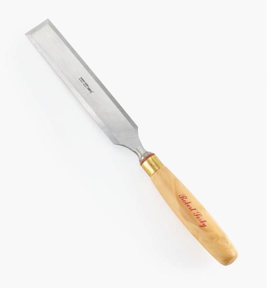
CHISEL: The 1.25" wide paring chisel I used was form a modern manufacturer. (Vintage paring chisels are very thin, enough so that you can bend/flex the blade. But don't do that.) It's long and wide blade made it easier to register against the surface of the press for consistent cuts. Looks like this one below from Lee Valley.
LYING PRESS: My dad's project. Solid black walnut, hand carved screws and internal threads — he even made the tools to make the threads too! The jaws of the press are each 3 7/8" wide. It's big and heavy (though much smaller than full-sized professional ones omg), but there's enough of a flat surface to register the chisel against. A thicc boi, much like this one below from Bookbinding Supplies.

PAINTED EDGES: The idea was to have dark navy edges, speckled with white stars. I used acrylic from a tube to paint the edges — tutorials recommended it over liquid bottled acrylic, and I had an old set hanging around. Had to water it down because otherwise the paint just flaked off.
My test of trimming and painting went well. Then the trimmed book itself came out slightly crooked, the paint required significantly more watering-down than before, and the white paint did not want to be both opaque and speckle-able. Unfortunate, but still book-shaped! And now I have an idea of what to do differently next time.
Also, did not like the glow-in-the-dark paint. Looked too translucent in the light when compared to the white acrylic, and needed a thicker coat to be visible in the dark. (The thickness combined with the translucence and base colour kinda reminded me of boogers... Ended up scrapping most of it off, so there's not much left to glow.)
Endbands
Still in the mood to have fun and go all-out, I attempted double-core endbands for the first time.
TUTORIAL: YouTube @ BookbindersChronicle: Bookbinding 101 Sewing Headbands Session 2. Also watched @ DAS Bookbinding's Double-Core Endband // Adventures in Bookbinding, but I personally found Chronicle's closeup video easier to follow.
I used embroidery floss from a 100pk of assorted colours off Amazon, wrapped around a core of 1.9mm leather cording from Michaels. I drew from Blurb_brain's art for the general colours, choosing a dark base, with red, blue-green, and gold. The specific shades were picked to go with the cover.
#World Champions#TheDefenestrator#Blurb_brain#qzgs#tka#the king's avatar#fanfiction#bookbinding#fanbinding
82 notes
·
View notes
Text
A statement on ficbinding (according to me)
I've joined the book/ficbinding tag on tumblr a couple of weeks ago, and in that time I've seen some confusion and concern about what ficbinding is, so I thought I'd post a statement of how I see ficbinding and why I do it. (If you're an author and I redirected you to this post because I want to bind your fic, hiiii) (Fellow ficbinders, if you find this post a useful ressource, don't hesitate to use it yourselves)
What's ficbinding?
Ficbinding (also called fanbinding) means a reader is going to print your fic and make a book out of it. It goes from the simple single booklet stapled together to leatherbound gold-foiled volumes.
Are you gonna make money off of my writing?!
I wouldn't dream of it. Ficbinding is just another fandom practice: you can't monetize your fic writing because you don't own the universe you're writing about, and I can't monetize your fic because it doesn't belong to me. I believe there are professionals who bind fics for a price (on Etsy, maybe?) but I'm ethically opposed to it.
Why do you do it, then?
Love of the craft. I'm a craftsman, I love choosing the best fabrics, fonts and embellishments for a project and making something with my hands.
Love of your fic. I liked it so much I want it in my house! I'm not fond of reading on a screen, it drastically reduces the chances I'll re-read the fic (even if I want to). Printing your fic ensures I'll enjoy it for years to come. It's the best compliment I can pay you.
As a gift to a friend who doesn't have the skills.
And what, it happens whether I want it or not?
As you can imagine, this is kind of a gray area legally. Nothing forces a ficbinder to reach out and tell you they're binding your fic. But this is fandom, and I personally view it as a community and consider that it's only courteous to let authors know I'm doing this. If I post pictures of my binding here, I want to be able to give credit where it's due, and since most authors are very happy to see their work bound, tagging them means they'll get a nice surprise when they open tumblr. I'll always do my best to find a way to contact you (ao3 comment, tumblr if you've put it on your ao3 profile).
I don't like strangers messaging me, is there a way to let people I agree/don't allow this without talking to someone?
Valid, and there is! The simplest way is to write it in your ao3 bio, it's called a blanket permission or a transformative works statement. For example, mine says that I allow all transformative works (ficbinding is one, like fanart) based on my fics but that I like to be notified so I can gush about it and reblog/link to it, and I put my tumblr there to make it easy to contact me.
You can build a statement with this excellent tool. Answer the questions at the bottom of the page and you'll get a clearly-worded short statement to copy-paste into your bio (you can edit it, of course). The blanket permission is the thing ficbinders look for and as a digitally socially anxious person, let me tell you, it's a life-changer.
(Now, can I bind your fic, pretty please 🥺?)
95 notes
·
View notes
Text
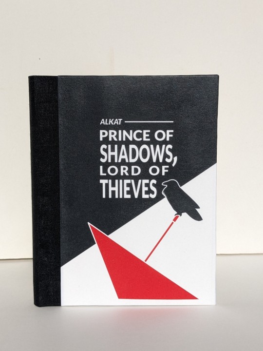
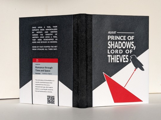
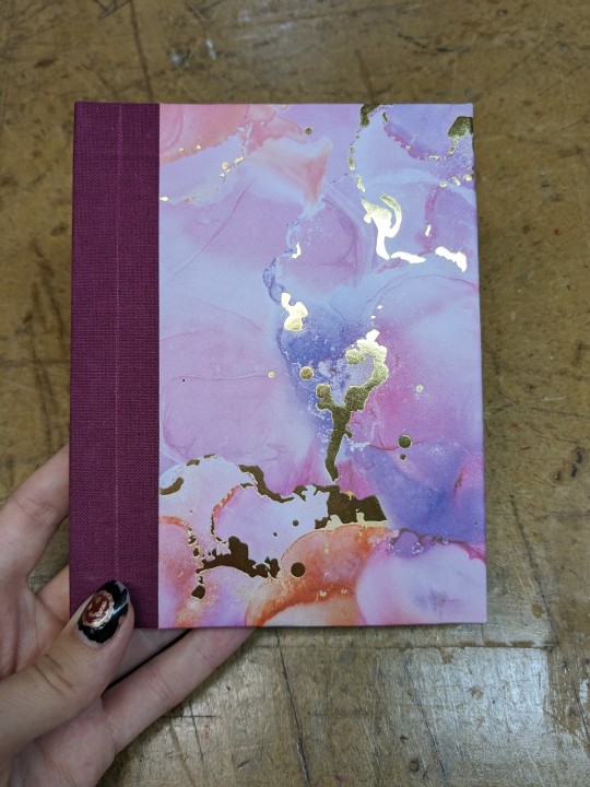
Prince of Shadows, Lord of Thieves by alkat
Fandom: The King's Avatar | 全职高手
Rating: Teen And Up Audiences
Category: Gen
Words: 1 929
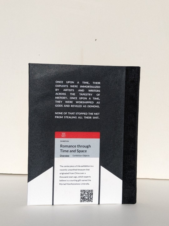
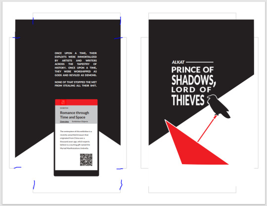
Once upon a time, their exploits were immortalized by artists and writers across the tapestry of history. Once upon a time, they were worshipped as gods and reviled as demons. None of that stopped the Met from stealing all their shit.
About the Book
FONTS: Alegreya [Google Fonts], Lato [Google Fonts]
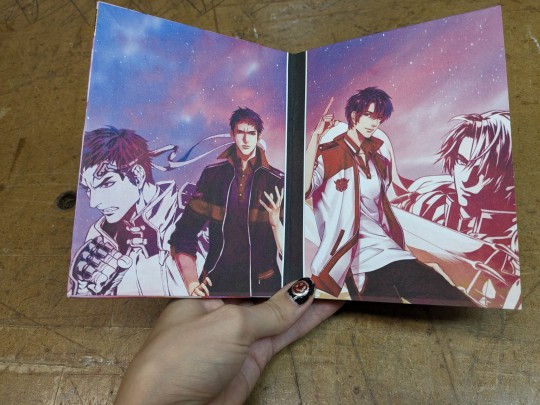
IMAGES: all art made by myself @greenhorn-art for this fic
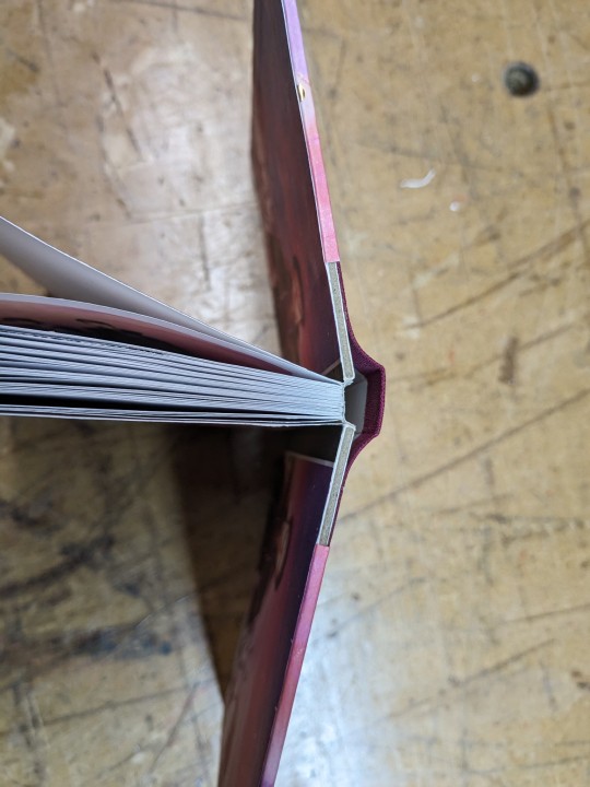
MATERIALS: regular ol' printer paper (8.5"x11", 20lb, 96 bright); ~2-2.5mm binder's board; Neenah cardstock (8.5"x11", 65lb, bright white); Cialux bookcloth (black); waxed linen thread (30/3 size, white); wheat paste (1:4 flour:water); paste wax (from a friend, unknown ingredients&quantities, some kind of wax and turpentine/mineral spirits)
PROGRAMS USED: Affinity Publisher 2; Affinity Designer 2; Bookbinder JS | Renegade's Community Imposer (settings: Quarto, snug against binding edge, custom signatures of 2, 1, 2 sheets).
Text & QR codes printed with colour laser printer (duplex, flip long edge), images printed with inkjet printer. QR codes generated with LibreOffice Writer, snipped, saved, and inserted where needed.
BINDING: quarto (quarter-letter) size, sewn board binding with french link stitch and breakaway spine.
.
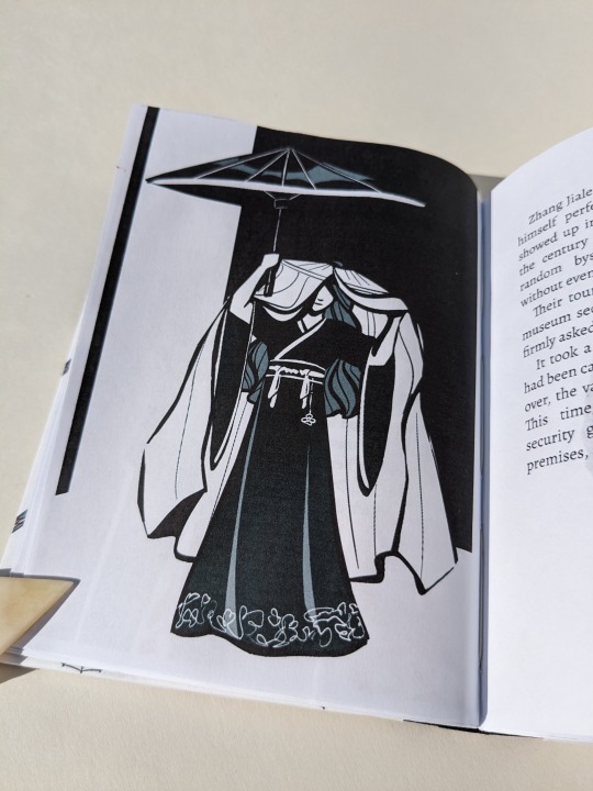
So this one all started because the visual of HST's outfit was so fun that I was possessed by a visceral need to draw it. Inspiration slapped me across my mind's eye, and much like a medieval knight being slapped in the face by a glove (which didn't actually happen, that's a myth that sprung from the throwing down of a gauntlet. but that's beside the point), I felt bound to take up the challenge. Which lead me to draw a few more, and then I ended up binding the whole thing.
(Also, I find it really amusing that the famous Terracotta Warriors were just storage for YXs stuff. And the gang going 'shopping' at various exhibits for gifts for friends/family,, like that sure is SOME window shopping! I can hear it now: 'Oooh I'll take one one those SMASH, and that SHATTER, and throw in some of those CRASH, they're going to love these! 😇'. All in all, it was a fun little read, and fun little project! :D)
About the Art
Because this was initially a one-off drawing I tried a new art style (and struggled to at least not stray too far for the rest). It was fun and helped me think more about shape and visual focus, instead of being caught up in the details.
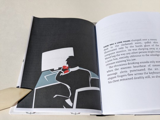
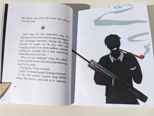
The crow (based off of image ID: 4039963 from Rawpixel) and the red umbrella on the front cover were filled curves made with the pen tool. The illustrations' poses were based off of a combination of images found on Google and photos taken by myself.
Pinterest is awful for sources, but it would have been handy to pin the references I'd googled. Only remembered to save the one of a man sitting at a desk. (I deliberately searched for someone sitting with bad posture because YX is described as being "slumped" over the desk. I figure that since "the laws of physics held no meaning to ["cursed souls eschewed by the natural order"]", they'd also be immune to mundane things like discomfort from sitting hunched over for too long. Back pain images were a gold mine! All I had to do was choose one with lighting that would give me a silhouette.)
The Myriad Manifestations Umbrellas and illustrations were drawn in Procreate.
I opted for a more plain umbrella design because it's not (presumably) a fantastical weapon in this story. Though the initial version did have YX cradling the donghua!MMU.
For the scene breaks I inserted the images, pinned them inline as character, and adjusted height and baseline in the pinning menu to fit.
The author wrote one scene break differently than the others, using multiple empty paragraphs instead of just one. Following suit, I used a different image for that particular break. I wanted to reference vampires somewhere, so for that break I made two bloody spots resembling bite marks. The blood spots were made with a group of shapes in Designer.
On cover design:
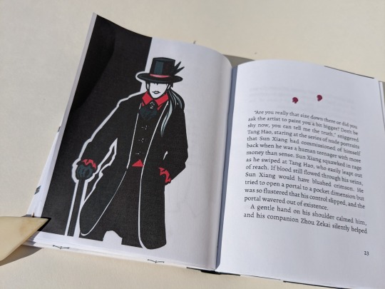
Because the MMU is what sparks the whole heist, I wanted it on the front cover.
Earlier iterations involved a full cover spread with a man's shadow standing before a shattered glass case, with a plaque mounted on the wall to the left providing information. The plaque was formatted like a museum label and had the author, date published, title, event collection, and story description. I'd also added a QR code to it. Ultimately, I abandoned the concept because it was difficult to decipher what is was when only looking a one cover at a time.
My second idea for the cover would have been a bookcloth-only cover with a cut-out of the MMU on the front, acting like a window showing off an image of the MMU on paper below it. (Inspired by the work of a number of folks over on Renegade's Discord. Here's a few examples gleaned from a quick search: szynkaaa's lung cutouts, some of EHyde's books, and the front cover of Spock's massive all-in-one TGCF). As fun as that would have been to try out, I felt it didn't quite suit the style of the art so I nixed that too.
Eventually I landed on the back cover design with the Met exhibition webpage. At last, I felt that the back & white and simple-shapes-background went with the artwork. The webpage viewed on the phone is based off of the Met's actual website. I took a snip/screenshot of the Met's logo from the banner at the top, then looked at their exhibitions' pages and eyeballed it to create my own. (Threw in the QR because I wanted the easy access to the fic online on the back cover). I chose to use a phone screen rather than I computer monitor because it worked better composition-wise. And besides, while YX may be allergic to owning a phone, SMC is not. I imagine that she saw the news while on her phone then messaged him.
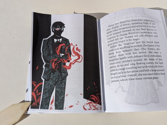
The front cover came together after that. An umbrella for the MMU, and a pop of red. One of YX's messenger crows. A black shape in the background similar to the back cover's, sort of creating a spotlight over the umbrella and placing the rest of the cover in shadow.
Trying New Things: Applying a protective finish to printed covers
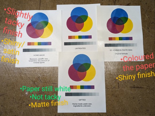
Over on the Renegade Bindery Discord, folks have spoken about using a beeswax & turpentine/mineral spirits 50-50 mix to seal printed covers (thank you Kate). According to my dad that's just a paste wax, so he threw 3 different ones at me and said 'have at it'.
I tested them out using the same paper and inkjet I'll use for the cover. I was looking at 1) whether the paste wax affected the paper colour or print quality, and 2) the finish. After applying one coat each and buffing them out I had my winner. Then I applied & buffed two more coats to it and tested 3) water resistance by dripping tea on it. The liquid beaded up and wiped away without staining -- good, three coats will work nicely.
(Test results: Mystery paste wax from a friend wins.
The commercial SC Johnson Paste Wax Original formula (intended for woodworking) has a nice dry shiny finish, but coloured the paper slightly brown -> disqualified
My dad's homemade stuff has a nice shiny/satin finish and didn't change paper's colour, but it felt slightly tacky even after buffing it -- maybe I didn't buff it enough?
The gifted paste wax has a matte finish, didn't change paper's colour (in the image below this one has 3 coats. The paper is now slightly off-white, but still acceptable), and while not as dry-to-touch as the Johnson it was not as tacky as the other homemade stuff.)
When I print out my quarto covers, I print front and back covers side-by-side on the same page*, with some guides to ensure I'm cutting and gluing in the correct place. (The guides mark the boundaries of the covers and start of the turn-ins, and stop at the edge of where I cut. Before cutting I flip it over to mark the guides [see marks indicated in image below] on the wrong side and connect them so I can see where to glue/place book. Then flip it back over to cut, right side up.)
*I'm being economical here at the cost of possible warping damage. This layout means that I'm only using one sheet of paper, but the grain is running in the wrong direction (across the book instead of preferred head-to-tail/top-bottom). This could cause warping issues, but I'm OK with that. I'm hoping that by just gluing at the edges, instead of pasting down the whole thing, warping will be minimized. (I use wrong-grain endpapers most of the time with larger books anyways).
I applied the paste wax before cutting out the covers, working carefully to avoid accidentally creasing/bending the paper (which happened twice, but it was minimal and I hardly notice it). Doing so before cutting ensured that the cover material was completely covered. Even the turn-ins -- something I later came to regret. After all, wax is used specifically so that things don't stick to it. It made it rather difficult to drum on the endpapers because I was trying to glue something down onto a waxy surface. It all worked out in the end -- perhaps due to the fact that there were multiple layers of wheat paste which could adhere to each other, followed by being squashed in a press.
92 notes
·
View notes
Text

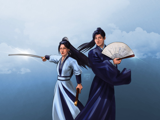
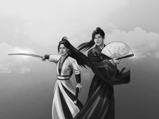
Keep Your Head Up to the Sky (As Your Day Unfolds) by alphera [Twitter]
Illustrated by Shirou_UOHS @shirou-oh-sakura
Fandom: 全职高手 | The King's Avatar
Rating: General Audiences
Category: M/M
Words: 9 270
Time is rarely kind, and impossible to escape. At the ripe old age of 30, Han Wenqing retires from the Glory Professional Alliance and moves forward the only way he knows how: fearlessly and without hesitation.
About the Book
FONTS: Coelacanth, Segoe UI Emoji
IMAGES: Illustrations by Shirou; pastel sky ID: 7007221 from Rawpixel; dark blue sky ID: 7044483 from Rawpixel; Han Wenqing & Desert Dust image from The King's Avatar Wikia; Ye Xiu & Lord Grim image also from TKA Wikia; Glory card png also made by Shirou via Discord
MATERIALS: regular ol' printer paper (8.5"x11", 20lb, 96 bright); ~1.5mm chipboard; Neenah cardstock (8.5"x11", 65lb, bright white); Iris bookcloth (Madeira colour); paper from Gilded Ink paper pad by Recollections; waxed linen thread (30/3 size, white); wheat paste (1:4 flour:water)
PROGRAMS USED: typeset in Affinity Publisher 2; endpapers designed with Affinity Designer 2 and Affinity Photo 2; imposed with Renegade's Community Imposer (settings: Quarto, snug against binding edge, signatures of 2 sheets).
Text & QR codes printed with colour laser printer (duplex, flip long edge), images printed with inkjet printer (HP Envy 5055; one sheet at a time, single sided, place facedown in tray)
BINDING: quarto (quarter-letter) size, sewn board binding with french link stitch and breakaway spine.
.
Absolutely LOVED this story! I've reread this one a number of times, and keep going back for more. Alphera's writing is so good! Ye Xiu is the series protagonist so things usually follow him, which makes it refreshing to see a story through Han Wenqing's eyes. And the author does it SO WELL! AHHH!
It's been a while since my first read-through, but I'm pretty sure this was the first TKA fic that I actually downloaded and started typesetting. Absolutely chuffed to have it finished! (Love me some growth-- the typeset looks a LOT better than my earlier attempts!)
RAMBLES
Another sewn board binding and breakaway spine! Since this isn't my first go at it, the construction of the book was considerably faster and smoother than my last one. It's just as well, because I ran into a speed bump that stretched out how long it took to typeset and print.
The culprit: (very pretty) illustrations. My laser's colour printing capabilities are shot to hell, so I used my inkjet for the artwork. This involved creating 3 copies of my typeset: 1) the completed typeset; 2) just the text, images hidden; 3) just the images, text hidden/white. Then I ran them through the imposer and printed the text version. The real issue was figuring out how to feed the sheets through my inkjet printer to print the images where I want them. Had to go one page at a time, single-sided. (Just need to place sheet facedown in the tray. So flip along vertical axis.) It took a while, but I got there in the end. And the results were SO worth it! 😊
For the scene breaks I left them as written. I had tried inserting images of the Glory Logo and account card, or using crossed swords emojis ⚔️, but nothing I tried worked as well as what the author did. (It's really neat! Different characters were used to indicate the direction of the timeskip: >>>> for a jump forward in time; <<<< for a flash into the past; and ==== for regular scene breaks, a 'next' rather than 'before' or 'later/after'.)
The cover and endpapers were based off of Shirou's fantastic cover illustration of HQW and YX walking hand-in-hand down a beach at sunset. The art itself is phenomenal so I had it stand alone as a frontispiece and didn't do anything fancy with the title page. For the covers, I looked through my decorative paper stash for something red or black to represent HWQ or Team Tyranny. What I found was paper with pinks, oranges, and purples similar to that illustration -- and that was that. I liked how the colours matched the art, and the gold splashed across it. (Gold for victory, gold for wedding rings and a happy golden future together.)
(Sidenote: I love how the beginning of the end of HWQ's career as an e-sports player "starts with a tingle in his ring finger", leading him and YX to taking the next steps in their relationship and eventually getting married 💍🖐)
I went with a red bookcloth for the spine because it's a common team colour for Tyranny, Excellent Era, and Happy. It also represents good fortune, courage, passion, and love -- things that come to mind when I think about YX, HWQ, and HanYe. The particular shade of red I used is Madeira. It's darker than Ruby Red and leans a little cooler, which suits the decorative paper more.
The endpapers use two background images (overlayed, adjusted, using multiple blending modes) and some images of HWQ and YX from The King's Avatar Wikia.
The background images are from Rawpixel -- I was just minding my own business looking for images of clouds and maybe some mountains to represent overcoming challenges/glory/looking up to the sky, when I found some clouds with the same sunset colours of Shirou's art. Figured it was too perfect, and if I'm going to lean into that design-wise, I might as well go whole hog and full-ass it. Then I found a starry night sky to add some darker blues and stars to it to match. After that it was a matter of overlapping them and positioning them to fit. I also grabbed some images of HWQ and YX from the King's Avatar Wikia and added them to it because HanYe. (After removing the backgrounds).
#Keep Your Head Up to the Sky (As Your Day Unfolds)#alphera#fanfiction#bookbinding#the king's avatar#qzgs#tka#sewn board binding
96 notes
·
View notes
Text
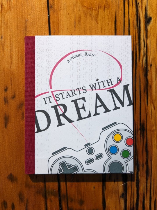
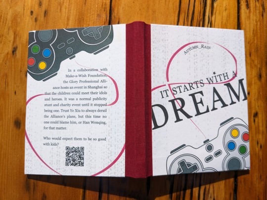
It Starts with a Dream by Autumn_Rain @ciaolongbao
Fandom: 全职高手 | The King's Avatar
Rating: General Audiences
Category: Gen
Words: 6 566
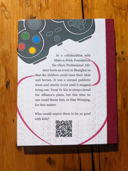
In a collaboration with Make-a-Wish Foundation, the Glory Professional Alliance hosts an event in Shanghai so that the children could meet their idols and heroes. It was a normal publicity stunt and charity event until it stopped being one. Trust Ye Xiu to always derail the Alliance's plans, but this time no one could blame him, or Han Wenqing, for that matter.
Who would expect them to be so good with kids?
About the book:
FONTS: Crimson [Google Fonts], Roboto [Google Fonts], and Georgia
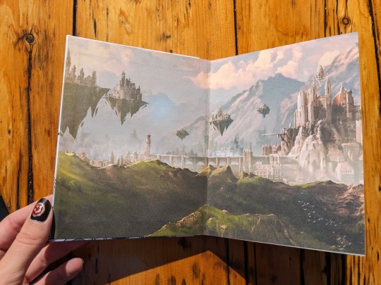
IMAGES: Equalizer background from Rawpixel (ID: 3119862); Gamepad icon (Image# 5358929) by pictranoosa on The Noun Project; Heavenly Domain image from The King’s Avatar Wikia.
MATERIALS: 20lb 96 bright 8½”×11”multiuse paper; 0.057" chipboard; Ruby red Iris Bookcloth; Neenah bright white 8½”×11” 65lb cardstock; 30/3 waxed linen thread; wheat paste (1:4 flour to water).
PROGRAMS USED: typeset in Affinity Publisher 2; cover designed with Affinity Designer 2 and Affinity Photo 2; imposed with Renegade's Community Imposer (settings: Quarto, snug against binding edge, signatures of 2 sheets).
Textblock printed with laser printer, covers printed with inkjet printer.
BINDING: Quarto size (quarter-letter, 4.25"x5.5"), sewn board binding with French-link stitch and breakaway spine.
Trying New Things 2: Electric Bugaloo!
Though it's not my first time making a quarto size book, it's my first sewn board binding and my first breakaway spine. Will not be my last. (I'm fact, as I'm writing this I've already bound another QZGS fic using this method!)
Much like Coptic, the sewn board binding technique bypasses the exact things I dread about making a case bound book: making the cover and casing in. Haven't gotten the hang of spines or hinges yet. Or pasting down the endpapers when casing in. (Art imitating life: my books aren't straight and neither am I lol)
Drumming things on (use of minimal glue, only on edges where necessary) is a lot less stressful and means there is less moisture to worry about. However I have my doubts about the structural integrity and longevity of sewn board binding when compared to case binding. With minimal glueing there's less holding it together, and the particular method of covering the boards means that they're partially exposed, in all their onion-y glory (by which I mean 🧅layers✨).
Onto the design:
The endpapers are an image of Glory's heavenly domain, acquired from The King's Avatar Wikia (I just cropped out the pro teams' logos, then resized and cropped to fit.)
The covers were designed as one image so that the contents will flow and connect from one cover to the other.
A major theme of this story, I felt, was connection: the kids are meeting their heroes; HWQ and YX stun everyone by connecting so well with the kids, playing with them, encouraging them, and inspiring them; YX opens up about his backstory and reveals a similar dream to a kid; that same kid going on to become a pro with New Excellent Era.
To pull some quotes from the story: "Everything started with a dream between friends… but now that dream will end with a legacy", "after all, you're never going to be walking alone. Glory has never been mean to be played alone", YX "[continued] inspiring new generations of gamers long after he had retired."
Following that theme of connection, the controllers on the covers are physically connected with a pinkish-red wire. For that I went with a red string of fate, thinking along the lines of fate and a love of Glory. The wire is also in the shape of a cancer awareness ribbon on the front cover (hence why the red is skewed pink).
The black and white controllers are like Player 1 & 2, and they're connected. To each other, to Glory.
I traced the gamepad icon with the pen tool in Affinity Designer, creating filled in curves of each component, for ease of recolouring and resizing without losing quality.
An equalizer background image, stretched and with low opacity, adds texture to the cover. It also reminded me of pixels from holograms. (The idea of the pros and kids' game playing out on stage with massive holograms really stuck with me).
I also wanted to directly reference Make-a-Wish in the cover design, so I looked up which font they use in the logo/branding. Search results turned up Georgia being used in relation to the brand, so I exclusively used that font on the covers. And added a little star above the 'i' in 'with', like in 'Wish' for the Make-a-Wish logo.
(also first attempt at nail art. Armed with a toothpick, I made Ye Xiu from The King's Avatar themed nails! 😾Sullen Kitten; 🌶️Unrivalled Super Hottie; ☂️Myriad Manifestations Umbrella; 🍁One Autumn Leaf; 😊Happy)
69 notes
·
View notes
Text
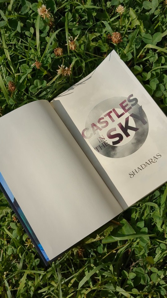
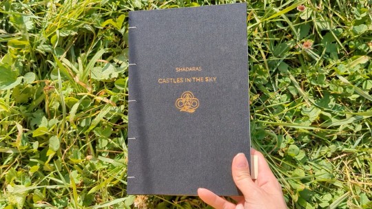
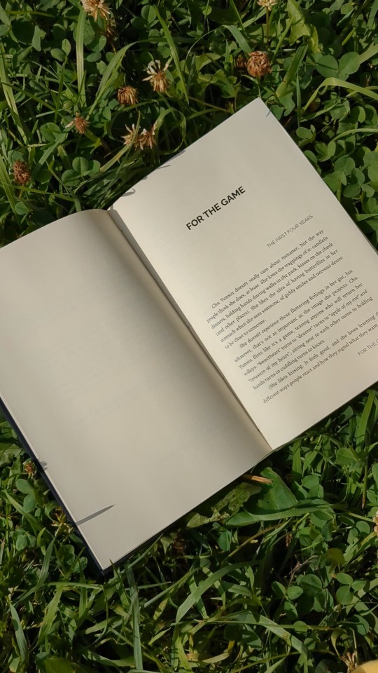
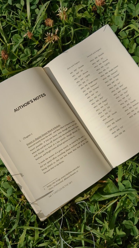
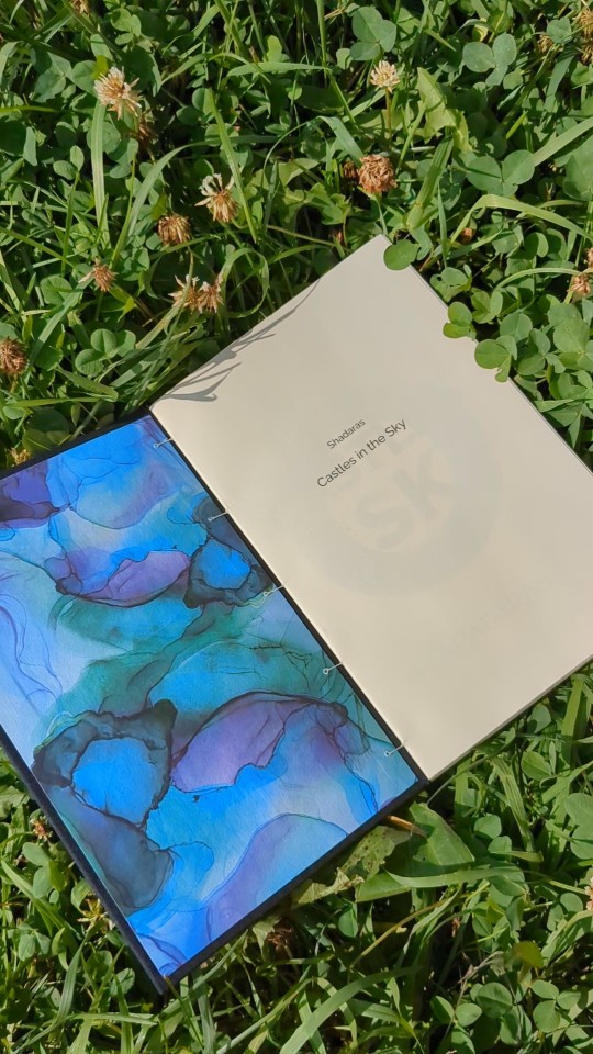
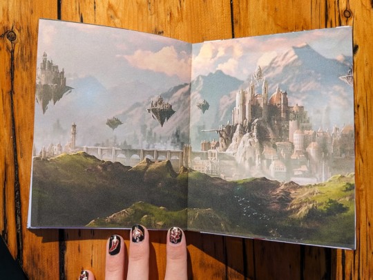
Castles in the Sky by Shadaras @shadaras
Fandom: 全职高手 | The King's Avatar
Rating: General Audiences
Category: Gen
Relationships: Chu Yunxiu/Ye Xiu
Words: 36 613
Here are two truths and a lie:
Chu Yunxiu is Misty Rain’s captain.
Chu Yunxiu is dating Ye Qiu.
Chu Yunxiu is happy to have the Shu twins on her team.
Of course, a lie can become true if you believe in it enough…
(A Chu Yunxiu character study.)
About the book:
FONTS: Alegreya [Google Fonts], Raleway [Google Fonts], Catchy Mager [purchased from MyFonts], Segoe UI Emoji
IMAGES: Clouds from Rawpixel (ID: 9581058); Misty Rain logo from The King's Avatar Wiki (stretched slightly horizontally and traced)
MATERIALS: Domtar Earthchoice multipurpose copy paper, cream, 11"x17" cut in half to form short-grained letter size paper; Recollections' Gilded Ink paper pad; Cialux bookcloth, black; heat transfer foil, gold; 2mm binder board; waxed linen thread, 30/3 size; wheat paste (this time I used 1:4 flour to water ratio, and heated until conditioner-like consistency. An improvement over last attempt.)
PROGRAMS USED: typeset in LibreOffice Writer; title page mocked-up in Procreate then designed in GIMP; imposed with Renegade's Community Imposer.
I spied this fic towards the top of the kudos and kept it in the back of my mind while trawling for more HanYe fics. Thought, well it's gotta be there for a reason so should be good! ooh look aroace queerplatonic relationship 👀👀 Definitely bumping up to top of Read Next!
The amazing thing I've found about The King's Avatar is that the CP possibilities are endless! The characters are both friends and rivals, there's respect and history and it all mixes and clashes creating more possibilities and chemistries than I've ever seen in a fandom before. The fact that AllYe is so popular (and not just in an NSFW way) is testament to it, and also, in part, what drew me to this fic. Asexual representation is scant, aromantic even more so — especially in fandom (in my experience of it at least).
If I were to add a tag to describe Castles in the Sky it would be 'heartwarming'. Shadaras' writing and characterization is wonderful, and I really enjoyed the both the story and the aroace representation. They took a character with relatively little content (in comparison to others in fandom. I have not read the source material) and gave her a voice, dreams, and made me really care about her. I was touched, and after finishing it I jumped to my laptop and set about turning it into a physical book.
So, onto the details.
The thing that stuck out and stayed with me the most about the story was the aroace aspect (Shadaras fed my smol aroace heart so well), so that's what I focused on design-wise.
The title page features a large black ring, referencing the black ring worn usually on the middle finger of the right hand as a symbol of asexuality. The colours of the asexual pride flag are also represented: the text is purple; the clouds colour the page in shades of white and grey; and the ring is black. For the endpapers/cover backing I chose paper that mixes green, purple, and blue: green for the aromantic pride flag; purple for the ace. I also found the green-blue mix of colours to be rather fitting, inspired by the description of Misty Rain's HQ with the "cool blues and greens of Misty Rain's walls" (chapter 5: Transformations). While I personally find CYX's relationship with YX significant, her relationship with her team is just as important.
When choosing which cover each endpaper goes on, I thought about how the story begins with CYX and YX's relationship, and about how after it's established we see her team and it's future at the forefront of her mind. Following that line of thought I put the paper with more purple on the front cover (purple for aroace CYX), and the more green-blue paper on the back (Misty Rain's colours).
The process of foiling the cover took me 3 hours (the length of the movie RRR — good movie actually, would recommend. Which is surprising because I usually find Oscar movies rather boring). The foiling was done with a heat pen. Three hours is not the norm: first, I had the foil backwards and foiled my template instead of the cover; then, my power banks kept dying, so I had to take charging breaks, and I also went over everything again just to make sure that I didn't miss a spot; and of course I was also watching a movie while working, so that ate up some time too.
I had initially planned to bind it as a casebound book, but I didn't have enough time to do it (I was about to go on vacation and wanted to read the book in my downtime). Instead, I did a Coptic binding. The covers were pulled from the press and foiled leaving me 5 hours of sleep to spare.
I went simple on the outer covers to contrast the fun paper on the inside of the covers. I used black Cialux bookcloth instead of my green-blue 'petrol' Iris bookcloth for the contrast, and because it picks up the black from the title page. The text foiled onto the cover is a simple sans serif (Raleway, the same as used inside), and the image is Misty Rain's logo from the donghua. (Image came from The King's Avatar Wiki. It was stretched slightly horizontally because it seemed a bit squished compared to other versions seen on Google, and then traced). Using the colourful paper inside was a practical choice: I couldn't get two covers out of one sheet of paper, but one sheet would do the inner covers with some material leftover.
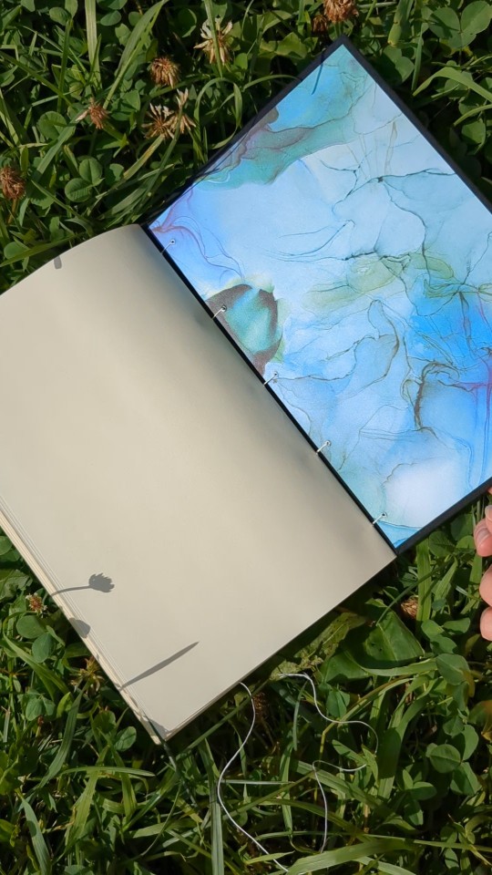
The sewing and construction of the book was done while camping — I'd packed up what I needed and brought it with me: the signatures (folded and punched); the finished covers; thread; a needle; and an awl. As for the actual sewing, it's supposed to be Coptic but don't look too closely. This was the second time I've tried Coptic stitching and I didn't have any instructions with me. (My first Coptic binding was a thin 2-signature notebook I did a few weeks ago. It was for taking notes at the event I was at, Pennsic War 50).
Book is primarily set in Alegreya. It's currently my favourite body font, and has a matching sans serif family. The fonts used in the title page are Raleway and Catchy Mager. Raleway is also used for titles, headings, etc. Segoe UI Emoji was used for any emojis that cropped up throughout the text (Pretty sure they're the same emojis as seen while reading on my phone and laptop). Catchy Mager was purchased from MyFont. (The first and only font I have ever bought, but I saw it used in a fic's title art and fell in love.)
Lastly, onto The Comedy of Errors, or: When-You-Finally-See-All-the-Typos-and-Mistakes-Once-You're-Done-and-Can-Only-Laugh-While-You-Cry-Inside.
Appendix's footer says 'Epilogue', so I must have missed something with the paragraph style for the Appendix heading.
Forgot about using Segoe UI Emoji font and did not include it in the About the Book.
Missed fixing the archive info for gnomen in the Author's Notes — the copy/paste of metadata into Notebook to remove formatting also removed the commas and spaces between tags.
Because I hadn't planned cover materials/design before printing, there isn't a section for that in the About the Book. Also the reason why the artwork on the cover is not credited in it, as I had not planned to use it.
#bookbinding#fanbinding#Castles in the Sky#Shadaras#qzgs#tka#the king's avatar#hopefully the video works.#first my computer cant view videos taken on my phone. then adding the video to the post from my phone removed allll the text in the post#and it's quality also went down :/#almost feels like just trying to POST this should be on my Comedy of Errors section lol#ALSO#so much rambling in this post because i had more downtime than planned and i reread it all and highlighted stuff and was FULL OF FEELS#sidenote: it was a bit windy out when i filmed that so its nice that the pages weren't flipping in the wind! (that wasn't the 1st take lmao
54 notes
·
View notes
Text
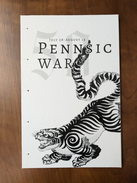
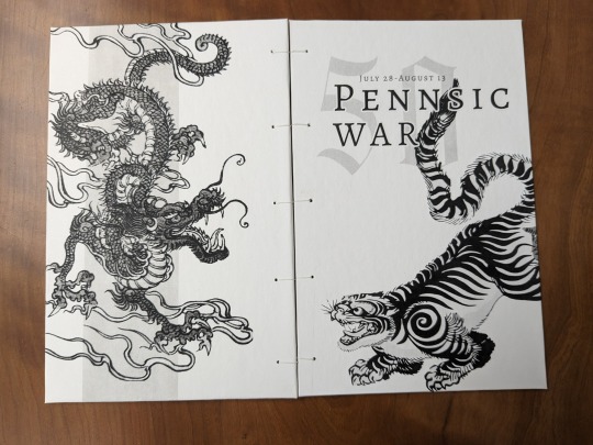
Annual enemies, eternal friends — here's the coptic bound notebook I made for Pennsic this year!
I wanted a notebook to take notes in at Pennsic, and since I've now taken up bookbinding as a hobby, thought why not make one myself? And so I decided to take a stab at coptic bookbinding (which is a period method :D )
FONTS: Alegreya (Google Fonts), The Quality Brave (DaFont)
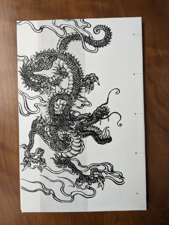
IMAGES: Tiger from Rawpixel (ID: 6258161); Dragon from Rawpixel (ID: 6258161)
MATERIALS: Domtar Earthchoice multipurpose copy paper, cream, 11"x17" cut in half to form short grain letter-sized paper; Neenah 65lb (176gsm) cardstock, bright white; waxed linen thread, 30/3 size; 2mm binder's board; wheat paste, 1:4 flour to water.
PROGRAMS USED: Affinity Photo V2, Affinity Designer V2 (Bought Affinity during the recent summer sale. The background removal brush very useful.)
The book itself is really thin (only 2 signatures of 4 letter-sized sheets, folded folio style), but it's more than enough for what I need it for. (I also ended up making a few quarto-size notebooks for my family too!)
When designing the covers I made sure to include the important information of which Pennsic it's for, and when (in hindsight, including the society date or mundane year as well would have been nice). Then I added a tiger for the East Kingdom and a dragon for the Middle, to represent the two sides of the Pennsic War.
The covers were designed as a spread, with both covers forming the entire image. The Tiger of the East is on the right (front cover) because east is on the right of a compass. The Dragon of the Middle has a stripe behind it to reference the kingdom's arms.
When choosing the images I wanted them to have a similar art style in order to make it all look a bit more cohesive. That being said, the art for Western-style dragons did not look remotely like the tigers'. So I went with a Japanese (-esque?) art style — less accurate to the European-style heraldry (snake vs lizard dragon), but it looks nice.
I especially liked the postures of the two beasts. The tiger is making a playful bow to the dragon, which almost seems to return the gesture. And doesn't that just feel fitting for Pennsic?
15 notes
·
View notes
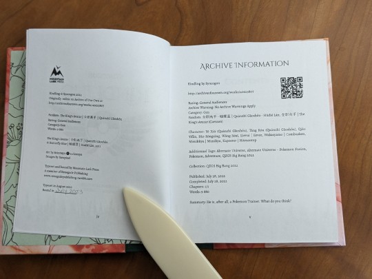
Text
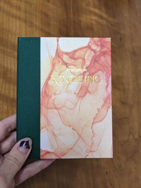
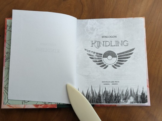
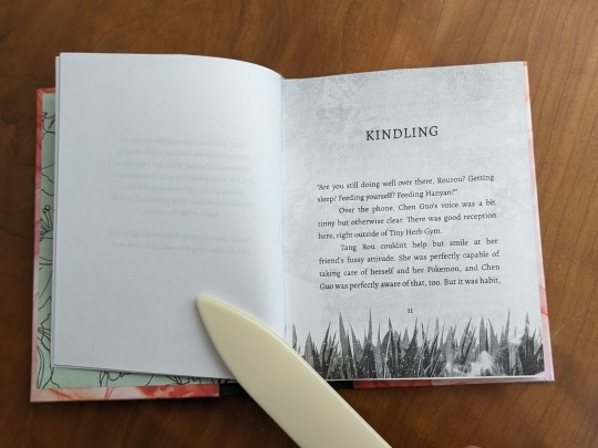
Kindling by @syncogon
He is, after all, a Pokemon Trainer. What do you think?
Fandom: 全职高手 (Quánzhí Gāoshǒu) | The King's Avatar
Alternate Universe - Pokémon Fusion
So this took a lot longer than expected, but it's finally done! 🎉 (Oh to have the energy to Make a Thing!)
August 2022: Typeset the fic.
September 2022: Sewed textblock, endbands, and cut boards for the cover.
July 2023: Made cover, cased in textblock, and added the title -- first time using the hot foil pen I got for my birthday!
Another first: this book was made quarto-style. I used regular copy paper so that it would be short-grained. Trimming was a exercise of patience: 'hmm maybe juuust a little bit more, oh shoot that looked rough maybe a bit more will fix it...' ad infinitum. (My printer has margins, and I wanted the images to go right to the edge.)
Fonts: primarily set in Alegreya, title in Catchy Mager. (Thought I'd changed all instances of Cinzel to Alegreya and updated my Print Details page to reflect that, but alas. Missed the Archive Info and Contents headings. Ah, the things you notice once a piece is done :/ )
For the cover and title page I leaned into the ideas of 'kindling'/fire and 'Tiny Herb'/grass. I chose green bookcloth and green floral endpapers because the story takes place at Tiny Herb Gym and in a forest. I chose flame coloured paper for the covers because of both Jun's quirk, and also the 'kindling' of QYF, TR, YX & Jun's Pokémon journeys. The smoke/flame and grass pics used in the title page are free images from Rawpixel.
The endbands' colours were chosen to match the green endpapers and the yellow of the mimikyu Acinonyx6 drew for the fic.
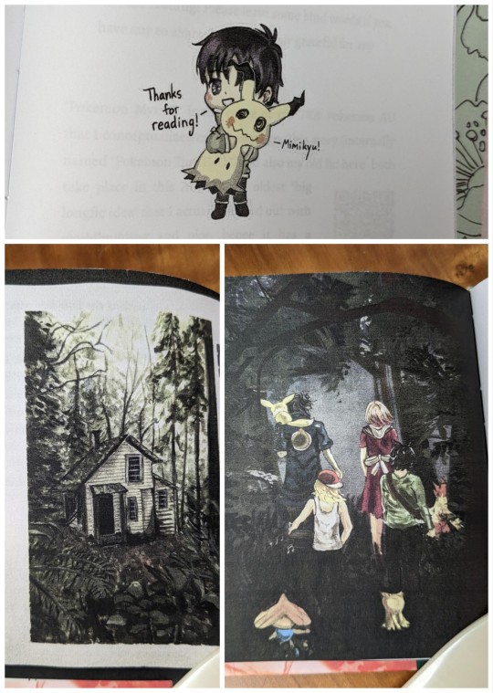
Since "Kindling" was part of QZGS Bang Bang 2022 I also included Acinonyx6's artwork. (My printer really can't do the art justice!)
[a.cinonyx's Instagram]
For the scene breaks I made a pokéball out of shapes, then pasted it in and anchored it as a character.
116 notes
·
View notes
Text
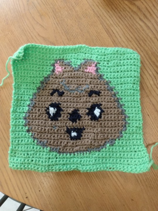
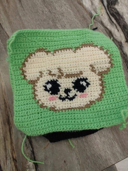
And there's HANQUOKKA!
Though this square was an exercise in frustration, it is done! (7/8 SKZoos, just Felix's is left)
Wrong colour for the outline; had to frog things thrice over every few rows; the tension was different so it's over 1cm larger than the rest length and width; my hands were really sore throughout; and for whatever reason, I had a bear of a time weaving in the ends.
HOWEVER! I've ordered an ergonomic crochet hook, so I'll give my hands a break before starting the Bbokari (...Bokkari? Felix SKZoo.) square. Hopefully the new hook will be easier on the hands!

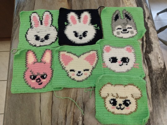
If you can't buy Stray Kids merch, homemade is fine! I'm crocheting a cardigan out of patches with the Kpop group Stray Kids' Skzoo characters.
So all my (many) bookbinding projects have been on hold lately because I've fallen down the rabbit hole that is crocheting...
.
(Ramblings under the cut)
The idea for this project spawned from a Tiktok video of a crocheted skzoo tote bag. (Fyp refreshed before I could save the it 😭). Initially I was going to make one with Leebit on one side and an Oddinary version of Leebit on the other, but the panels ended up smaller than expected. So onto Plan B: a patchwork cardigan!
The main body will be the 8 skzoo patches, one for each Stray Kids member. Then I'll crochet some sleeves, and finish it with trim/cuffs.
I have never crocheted anything, nor made a sweater of any description before in my life. Didn't practice before getting started on the first patch either. I don't know what I'm doing, but I'm doing it anyways and having a lot of fun! (It's nice to have something to do with my hands as I watch TV. Also, a soothing way to start to the day, crocheting while having my morning caffeine-fix!)
The first one(s) are a mess, but they're going into the cardigan. Will it look bad? Yes, but it shows the progress I've made, as my skill slowly but surely improves. It'll be really rewarding to see in the end. (That's my story, and I'm sticking to it)
Here's to hoping I'll actually finish this project, and it doesn't end up joining many other projects indefinitely on hiatus...
39 notes
·
View notes
Text

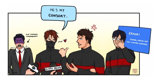

Two roads diverged by vqt, Chapter 5
“What is your relationship with Captain Han Wenqing?”
“He’s my consort,” [Ye Xiu] said dryly. “We’re going to have victory sex after this press conference.”
Everyone present, including those who remained from Tyranny, stood in shocked silence.
.
Loved this scene from chapter 5. Everyone’s shock, HWQ’s rage! (and how later CG is like ‘omg they totally ARE a Thing, how else could that rookie get away with it!’) Tyranny’s management/PR team must be having kittens over it!
😱😏😡😶
Drawn April 14, 2023 | Posted April 16, 2023
#hwq: wtf is wrong with you?!#yx: :3#qzgs#tka#quanzhi gaoshou#the king's avatar#hanye#ye xiu#han wenqing#fanart#my art#fanart of fanfic
45 notes
·
View notes
Text
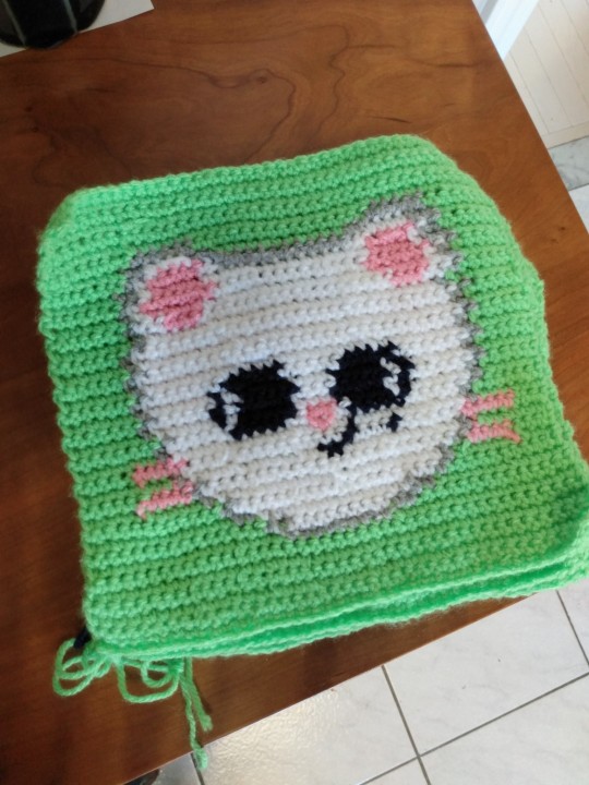
멍멍! [meong-meong, woof]
The PuppyM square is now done! After finishing the crochet part, I went ahead and planned out the colour changes for the last two squares and then prepped my yarn for the next one. Gotta love procrastination-born productivity! (God I hate weaving in the ends, so tedious! T^T)
Also just realized I'm either going to end up with a cropped length cardigan, or I'll have to crochet a back as well as sleeves. Thinking about making it with either Chan's little dino doodle or the SKZ compass from the lightsticks...
Also realized I have no idea where to put pockets. I can't NOT have pockets!
If you can't buy Stray Kids merch, homemade is fine! I'm crocheting a cardigan out of patches with the Kpop group Stray Kids' Skzoo characters.
So all my (many) bookbinding projects have been on hold lately because I've fallen down the rabbit hole that is crocheting...
.
(Ramblings under the cut)
The idea for this project spawned from a Tiktok video of a crocheted skzoo tote bag. (Fyp refreshed before I could save the it 😭). Initially I was going to make one with Leebit on one side and an Oddinary version of Leebit on the other, but the panels ended up smaller than expected. So onto Plan B: a patchwork cardigan!
The main body will be the 8 skzoo patches, one for each Stray Kids member. Then I'll crochet some sleeves, and finish it with trim/cuffs.
I have never crocheted anything, nor made a sweater of any description before in my life. Didn't practice before getting started on the first patch either. I don't know what I'm doing, but I'm doing it anyways and having a lot of fun! (It's nice to have something to do with my hands as I watch TV. Also, a soothing way to start to the day, crocheting while having my morning caffeine-fix!)
The first one(s) are a mess, but they're going into the cardigan. Will it look bad? Yes, but it shows the progress I've made, as my skill slowly but surely improves. It'll be really rewarding to see in the end. (That's my story, and I'm sticking to it)
Here's to hoping I'll actually finish this project, and it doesn't end up joining many other projects indefinitely on hiatus...
39 notes
·
View notes
Text
Update: Jiniret has joined the chat!
The Jiniret square is done, and the ends are now woven in on BOTH sides off all squares!!
(Except for the start and end. Those help me remember which is the right side)
I've printed out the patterns for PuppyM, HANQUOKKA, and BbokAri. PuppyM is next! All the colour changes have been roughly planned out, and the yarn bobbins prepped. (Will definitely need to make some more as I go, but it's enough to start!)
Since I've started crocheting for longer periods of time, I've noticed my hand getting a bit sore. After making some adjustments to how I hold the yarn, it's now both easier on the hands, and easiER to crochet! (Now I'm draping yarn over ring and index fingers, loosely holding yarn and making slack with pinky, instead of curling my index finger around the yarn)
Also getting better at weaving in the ends, looking neater now. Still a pain where there's only 3 stitches of a colour though.
If you can't buy Stray Kids merch, homemade is fine! I'm crocheting a cardigan out of patches with the Kpop group Stray Kids' Skzoo characters.
So all my (many) bookbinding projects have been on hold lately because I've fallen down the rabbit hole that is crocheting...
.
(Ramblings under the cut)
The idea for this project spawned from a Tiktok video of a crocheted skzoo tote bag. (Fyp refreshed before I could save the it 😭). Initially I was going to make one with Leebit on one side and an Oddinary version of Leebit on the other, but the panels ended up smaller than expected. So onto Plan B: a patchwork cardigan!
The main body will be the 8 skzoo patches, one for each Stray Kids member. Then I'll crochet some sleeves, and finish it with trim/cuffs.
I have never crocheted anything, nor made a sweater of any description before in my life. Didn't practice before getting started on the first patch either. I don't know what I'm doing, but I'm doing it anyways and having a lot of fun! (It's nice to have something to do with my hands as I watch TV. Also, a soothing way to start to the day, crocheting while having my morning caffeine-fix!)
The first one(s) are a mess, but they're going into the cardigan. Will it look bad? Yes, but it shows the progress I've made, as my skill slowly but surely improves. It'll be really rewarding to see in the end. (That's my story, and I'm sticking to it)
Here's to hoping I'll actually finish this project, and it doesn't end up joining many other projects indefinitely on hiatus...
39 notes
·
View notes
Photo
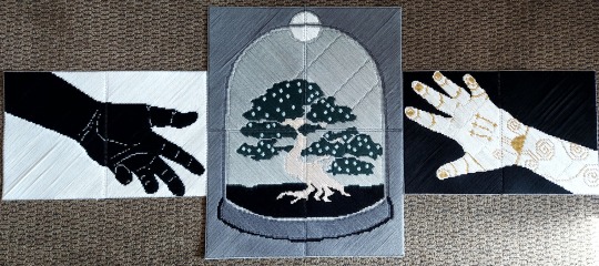

May your Names be spoken as One
“-and may you never feel the pain of separation.”
-How To Win A Bar Fight And Practice Diplomacy While Negotiating A Bounty On Your Head by @jackdaw-kraai
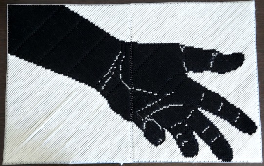
I recently listened to all the available audiobooks for the Guides series (and huge shout out to Sam Gabriel for bringing Jack’s word to such amazing life), and needless to say, I’d gotten hit with a massive wave of inspiration, and now 4 weeks and 8 panels of plastic cross stitch later I have a new wall hanging! Or at least I will, once I get some hooks and figure out how best to attach a hanger.
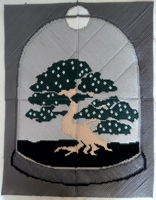
Special thanks to @mxxnfish for creating the definitive Luke prosthetic hand in my brain and @greenhorn-art for the design of the shiranaa tree I based this on.
Now, all I need is to figure out what to do with the large amount of yarn left over from all the colors I needed…
30 notes
·
View notes
Text
If you can't buy Stray Kids merch, homemade is fine! I'm crocheting a cardigan out of patches with the Kpop group Stray Kids' Skzoo characters.
So all my (many) bookbinding projects have been on hold lately because I've fallen down the rabbit hole that is crocheting...
.
(Ramblings under the cut)
The idea for this project spawned from a Tiktok video of a crocheted skzoo tote bag. (Fyp refreshed before I could save the it 😭). Initially I was going to make one with Leebit on one side and an Oddinary version of Leebit on the other, but the panels ended up smaller than expected. So onto Plan B: a patchwork cardigan!
The main body will be the 8 skzoo patches, one for each Stray Kids member. Then I'll crochet some sleeves, and finish it with trim/cuffs.
I have never crocheted anything, nor made a sweater of any description before in my life. Didn't practice before getting started on the first patch either. I don't know what I'm doing, but I'm doing it anyways and having a lot of fun! (It's nice to have something to do with my hands as I watch TV. Also, a soothing way to start to the day, crocheting while having my morning caffeine-fix!)
The first one(s) are a mess, but they're going into the cardigan. Will it look bad? Yes, but it shows the progress I've made, as my skill slowly but surely improves. It'll be really rewarding to see in the end. (That's my story, and I'm sticking to it)
Here's to hoping I'll actually finish this project, and it doesn't end up joining many other projects indefinitely on hiatus...
39 notes
·
View notes
Text
Got the plague. Got better. Got my missing creative motivation back from Santa and drew this on Christmas! :D
I’ve recently been watching Who Rules the World (just finished ep 19) and was struck with the urge to draw Hei-Bai Fengxi.
The greyscale version turned out pretty well, kinda prefer it even. I find it fitting for the 黑 (hēi, black) 白 (bái, white) couple!
Drawn Dec. 25, 2022 | Posted Jan. 22 2023
#heibai fengxi#bai fengxi#hei fengxi#who rules the world#且试天下#fanart#my art#also been learning Mandarin and it’s so fun to actually catch some of what they’re saying!#I don’t know a lot but there ARE a few words and phrases I recognize and it’s always exciting when I do!
23 notes
·
View notes
Text
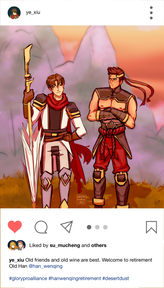
陈酒味醇,老友情深。
(“Old friends and old wine are best”)
On another The King’s Avatar kick. This time with art!
It’s rough, but I’m trying to teach myself to stop spending so much time on tiny details that don’t matter.
Scribbled down the poses, sketched out the characters, went ham with the colourfill selection tool, brushed in a bit of extra details, and filled in/cleaned up major eyesores. Then fiddled with colour overlays, threw it at PS Express for the template and made a fake Instagram post.
“Old friends and old wine are best” is from the Chinese proverb 橙酒味醇,老友情深 (chénjiǔ wèi chún, lǎoyǒu qíng shēn) which I found online. [https://www.digmandarin.com/chinese-proverbs-about-friendship.html]
(Bonus: the whole image because the faux Instagram post cropped out the feet. those are like the best feet I’ve ever drawn lol)

.
I love how shippable a character Ye Xiu is and the variety of ships there are (and all the gen stuff!), but HanYe is definitely my favourite by far!
Lately I’ve been ploughing through ao3’s The King’s Avatar fics like a hungry chickadee at a birdfeeder; I go to ao3, open a fic, read it, and come back for more. Over and over again. I’ve devoured most of the HanYe fics available in English (sidenote: why are so many abandoned?! 😭😭), and gone back for a second (or third) read. At this point I’ve resorted to parsing out my browser’s Google Translated versions of Chinese fics. (Dear god it’s painful and difficult to read! Good motivation for my Chinese lessons though...)
Drawn Jan 11, 2023. Posted Jan 12, 2023.
#the king's avatar#quanzhi gaoshou#qzgs#tka#hanye#ye xiu#han wenqing#lord grim#desert dust#fanart#my art#quan zhi gao shou
29 notes
·
View notes