Last Seen Blogs
quickp
Bez tytułu
mad-maxiee
𝓜𝓪𝓭 𝓜𝓪𝔁𝓲𝓷𝓮
saskolinas
Saskolinas - Sketching, Hand Lettering & Bujo

happyaa2-blog
Без названия
curiousgastyart
🍙Gasty🍙
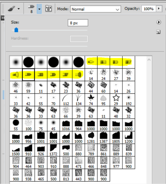
Text

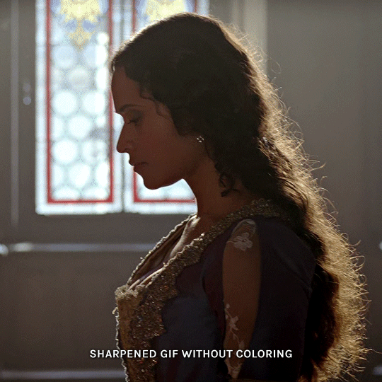
COLORING + SHARPENING TUTORIAL
someone asked for a coloring tutorial and my sharpening settings, so here it is! there are also a few tips to achieve more HQ gifs. :)
tutorial under the cut!
FOR HIGH-QUALITY GIFS
FILE SIZES
it doesn’t matter what your sharpening settings are if the file you’re using to gif is too low quality, so i tend to look for the best that i can get when downloading stuff.
usually, movies (+2h) look better if they’re 5GB or more, while an episode (40 min/1h) can look good with even 1GB. the minimum definition i try to find is 1080p, but i gif with 2160p (4k) when available. unfortunately, not every computer can handle 4k, but don’t worry, you can gif with 1080p files just fine if they are big enough. contrary to popular belief, size does matter! which means sometimes a bigger 1080p file is better than a smaller 2160p one, for example.
SCREENCAPPING METHOD
this can too influence the quality of your gifs. as a gifmaker, i’ve tried it all: video frames to layers, directly opening video clips, loading files into stack, and i’ve finally settled down with opening screencaps as an image sequence. with bigger files, it doesn’t matter much what technique you use, but i’ve noticed with smaller files you can do wonders if you screencap (either by loading files into stack or opening as an image sequence) instead of using video clips. for example, this gif’s original video file was only 4GB (so smaller than i’ve usually go for), if you can believe it!
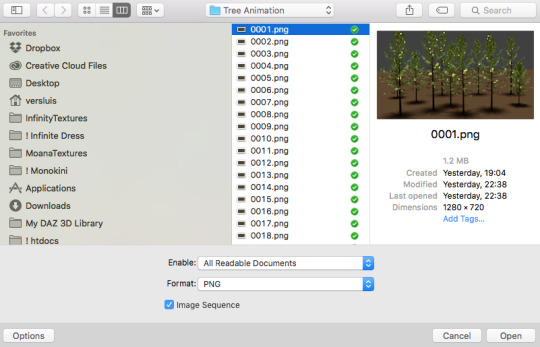
here’s a tutorial for setting up and screencapping with MPV, the media player i use to screencap. again, you can keep using video clips for bigger files, but you’ll find this useful when dealing with dire causes. i don't file loads into stack, though, like the video does. i open as an image sequence (open > screencap folder > select any image > click the image sequence button). just select OK for the speed. this will open your screencaps as a video clip (blue bar) in timeline mode (i'm a timeline gifmaker, i don't know about you). you will need this action pack to convert the clip into frames if you're a frames gifmaker. i suggest you convert them into frames even if you're a timeline gifmaker, just convert them into a timeline again at the end. that way you can delete the screencaps right away, otherwise you will delete the screencaps and get a static image as a "gif".
ATTENTION if you’re a Mac Sonoma user, MPV won’t be an option for you unless you downgrade your system. that is, if you have an Intel chip. if you have M1 Max chip (or even a better one), here’s a fix for MPV you can try while keeping that MacOS, because nowadays MPV is skipping frames in its latest build. or you can use MPlayer instead for less hassle. here are two tutorials for setting and using MPlayer. Windows users are fine, you can use MPV without trouble.
FOR EVEN MORE QUALITY
ADD NOISE
here’s a tutorial for adding noise as a way to achieve more HQ gifs if your original material is too low quality.
REDUCE NOISE WITH CAMERA RAW
instead of adding noise, you can reduce it, especially if your gif is very noisy as it is.
the path is filter > camera raw > detail > nose reduction. i do this before sharpening, but only my video file isn't great to begin with. because it’s a smart filter, you can reduce or increase its opacity by clicking the bars next to its name in the layers panel.
TOPAZ AI
i use Topaz Photo AI to increase the quality of my screencaps when i need to. it’s paid software, but there are… ways to find it for free, usually on t0rrent websites. if someone’s interested, i can make a tutorial solely about it in the future.
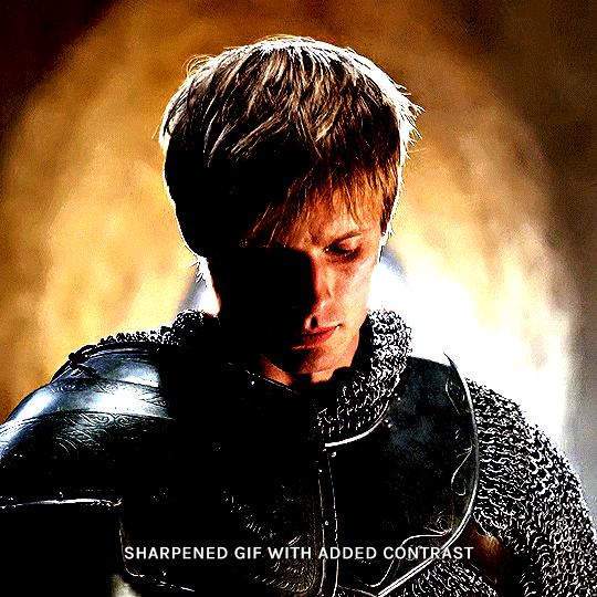
SHARPENING SETTINGS
here are my sharpening settings (filter > sharpen > smart sharpen). i sharpen things twice: 500% 0.4px + 10% 10px. here's an action for it, for more convenience. here's a tutorial on how to use Photoshop actions. for animated stuff, i use this action pack.

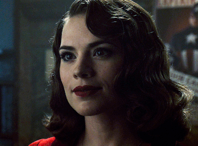
COLORING
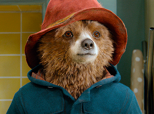
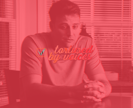
here’s the gif i'm gonna use as a base. it’s already sharpened like the way i always do it.

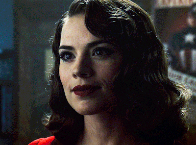
LIGHTNING THE SHOTS
half of the secret of a good coloring is good lightning. i always useCurves (layers > new adjustment layer > curves) and Brightness & Contrast (layers > new adjustment layer > brightness & contrast). the settings depend on the scene you’re giffing, but i always try make my gifs bright and with high contrast to make the colors pop.
CURVES
besides lighting your scene, the Curves adjustment layer has four automatic options that will color-correct it for you. it’s not always perfect and it doesn’t mean you won’t need to do further coloring, but it’s a great start. it’s a lifesaver for most ridiculously yellow scenes. look at the difference! this gif uses the 3rd automatic option (the screenshot below isn't mine btw so that's why the fourth option is the chosen one), from top to bottom. what automatic option you need to choose depends on the gif.

sometimes i like to tweak my Curves layer. not everybody does that, it’s not that necessary and if you’re not careful, it can screw your gif up. to modify your layer by hand, you will need to click and drag points of that straight line in the position you desire. this is the concept behind it:

basically, the lower part of the line handles the shadows, while the upper part handles the highlights of the image. if you pull a highlight point up, the image’s highlights will be brighter. if you pull it down, it will make them darker. same thing for the shadow points. you should play with it to get a grasp of it, that’s what i did when i first started giffing.
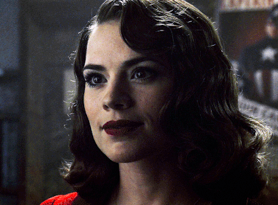
BRIGHTNESS & CONTRAST
then i added a bit of brightness and contrast.

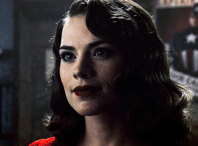
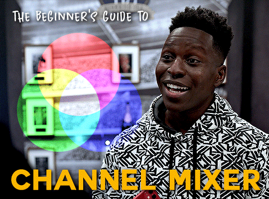
CHANNEL MIXER
the scene looked a bit too yellow, so i used the Channel Mixer (layer > new adjustment layer > channel mixer) adjustment layer. here’s a tutorial of how it works. not every scene needs the Channel Mixer layer though, i mostly use it to remove heavy overall tints. in this particular case, the Curves layer got rid of most of the yellow, but i wanted the gif to be just a bit more blue so the Channel Mixer tweaks are very minimal.

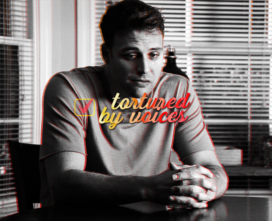
SELECTIVE COLOR
now, this adjustment layer i always use: Selective Color (layer > new adjustment layer > selective color). this is THE adjustment layer to me, alongside the Curves one. this is how it works:

ie, you can separately edit a color this way, giving it tints. for this gif, i wanted to make the colors more vibrant. to achieve that, i edited the selected colors this way:
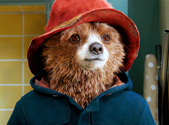
for the reds, i added even more red in them by moving the first slider to the right, making the color more vibrant. for his hat to have a more warm tint, i added yellow to the reds (third slider, moving it to the right). finally, to make the reds stronger, i moved the last slider to the right (more black).
for the yellows, i made them brighter by adding white to them, thus making the tile wall and Paddington more bright as well.
for the cyans and the blues, i just added the maximum (+100) of black that i could.
i wanted for Paddington's nose to be brighter, so i added more white to the whites.
lastly, i added depth to the blacks by increasing their own blackness.
you should always play with the Selective Colors sliders for a bit, before deciding what you want or need. with time, you will automatically know what to change to correct the color grading. it all takes practice!
HUE/SATURATION
i don’t know if you noticed, but there are some green spots on the blue wall behind Paddington. to correct that, i added a Hue/Saturation adjustment layer (layer > new adjustment layer > hue/saturation) and made the saturation of the greens 0%, making that unwanted green disappear from the background.

while the green spots on the wall are specific for this gif, i use hue/saturation a lot to tweak, well, hue and saturation. sometimes someone’s skin is too yellow, i made it redder by tweaking the reds and the yellows, or vice-versa. the hue bar follows the rainbow bar, so the maximum settings (+100 and -100) give the selected color to change its hue to something more red or pink (the rainbow extremities). changing hue can give pretty whacky results, like turning someone’s skin tone to green, so you will need to play with it to get the hang of it. you can also tweak the opacity of your hue/saturation layer to further improve your gif’s coloring. i didn’t do it in this case, the opacity is still 100%. the reds and the blues had their saturation increased to make them pop just a bit more, without affecting the other colors.
COLOR BALANCE
the highlights of the gif still had a green tint to it due to the automatic correction of the Curves layer, so i used Color Balance. this is how it works: instead of giving specific colors some tints, you can give them to the shadows, highlights, and mid-tones. if your shadows are too blue, you counterbalance them with the opposite color, yellow. same thing with the cyan-red and magenta-green pairings. in my case, i added a bit of magenta.


B&W GRADIENT MAP
now, if this gif was a dish, it’s time for the salt and pepper. i always add a Gradient Map (layer > new adjustment layer > gradient map) (black to white gradient) with the Soft Light blending mode, thus giving my shadows more depth without messing with the mid-tones and highlights. it also doesn’t “deep fry” (you know those memes?) the gif too much by adding even more contrast. usually, the opacity of the layer is between 30% to 70%, it all depends on the gif. it always does wonders, though!
COLOR FILTER
finally, i like to add Color Filters (layer > new adjustment layer > color filter) to my gifs. it’s very handy when giving different scenes for the same minimalistic set because it makes them kind of match despite having completely different colors. in this gif’s case, i added a “deep blue” filter, opacity 50% density 25. you can change the density and the opacity of the layer for further editing, again, it all depends on the gif.

VIBRANCE
if i feel like it, i add a vibrance layer (layer > new adjustment layer > vibrance) to make the colors pop. this can ruin your coloring sometimes, especially when regarding skin color, so be careful. i didn't do it in this gif because i felt i didn't need it.
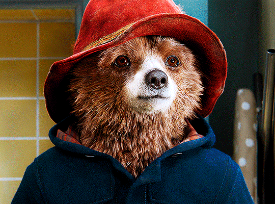
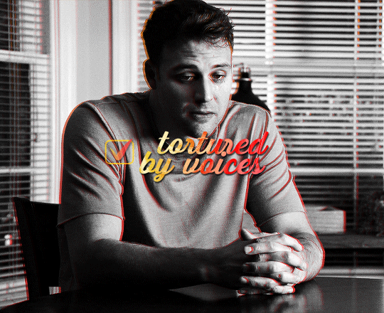
TA-DA! 🥳
AN OTHER EXAMPLE
the color grading of the original scene it’s pretty good as it is, to be honest. let’s see a worse scenario, a VERY yellow one:
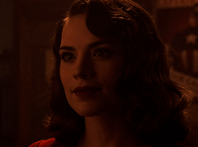
no channel mixer this time because the automatic curves option dealt with the yellowness, but you can see it made the gif too green. i needed to correct that with the following adjustment layers:
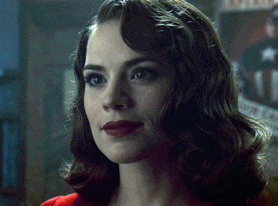
curves (automatic option) (gif 2) >> same curves layer (tweaks) (gif 3) >> brightness & contrast (gif 4) >> hue/saturation (tweaked cyan+blue+green) >> selective color >> color balance (gif 5) >> b&w gradient map >> (sepia) filter >> vibrance (gif 6)
i added a hue/saturation layer to remove the blues & greens before my selective color layer because i thought that was more urgent than tweaking the tint of all colors. color balance (gif 4) was the real hero here, though, by removing the green tint. the selective color layer was meant to make the red pop more than anything else, because the rest looked pretty good, especially her skin tone (despite the green tint). you can notice that tweaking the curves layer (small gif 3) also helped A LOT with the green problem.
tl;dr 😵💫😵💫😵💫
here's a list of my go-to's while coloring and lightning gifs. it's not a rule, just a guide. there are gifs in which i don't use all these adjustment layers, or use them in a different order. it all depends!
1. curves (automatic option + tweaks)
2. brightness & contrast
3. channel mixer
4. selective color
5. hue/saturation
6. color balance
7. b&w gradient map
8. color filter
9. vibrance
i'll suggest that you study each adjustment layer listed for more info, either with other Tumblr tutorials or YouTube ones. the YouTube ones focus on images, but you can translate what they teach to gif making very easily. you can ask me to further explain any adjustment layer, too! i was brief to keep this short (which i kinda failed lol).
feel free to ask me for clarification or something else about gifmaking wise, i always like to help. ❤️
263 notes
·
View notes
Text

GIFMAKERRESOURCE/CRAINTHEODORA's FONT PACK #1
I do not own these fonts, so there is no need to credit me, but please like or reblog if you found this helpful!
DOWNLOAD HERE
212 notes
·
View notes
Text
GIFMAKERRESOURCE/CRAINTHEODORA's FONT PACK #4
I do not own these fonts, so there is no need to credit me, but please like or reblog if you found this helpful!
DOWNLOAD HERE
146 notes
·
View notes
Text

GIFMAKERRESOURCE/CRAINTHEODORA's FONT PACK #2
I do not own these fonts, so there is no need to credit me, but please like or reblog if you found this helpful!
DOWNLOAD HERE
207 notes
·
View notes
Text

GIFMAKERRESOURCE/CRAINTHEODORA's FONT PACK #3
I do not own these fonts, so there is no need to credit me, but please like or reblog if you found this helpful!
DOWNLOAD HERE
161 notes
·
View notes
Text
TRANSITION & OVERLAY PACK by @mikelogan / @gifmakerresource
Pack contains 15 GIF transitions & overlays sourced from YouTube videos
Please like/reblog if downloading
GIFs may be used in any way
I do not claim ownership of any of the effects in this pack
I recommend this tutorial for the transitions
DOWNLOAD HERE
107 notes
·
View notes
Photo
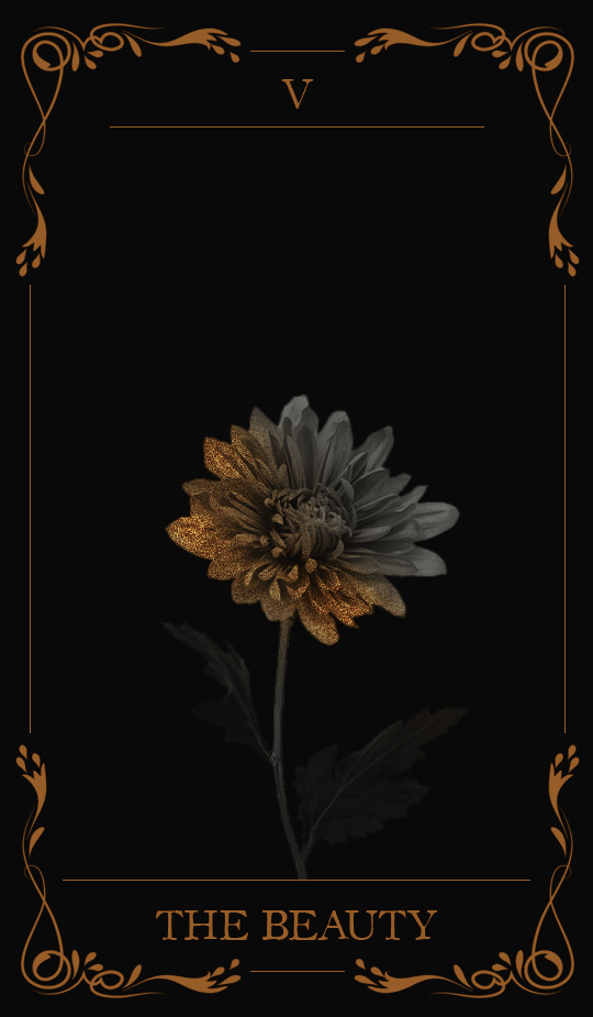
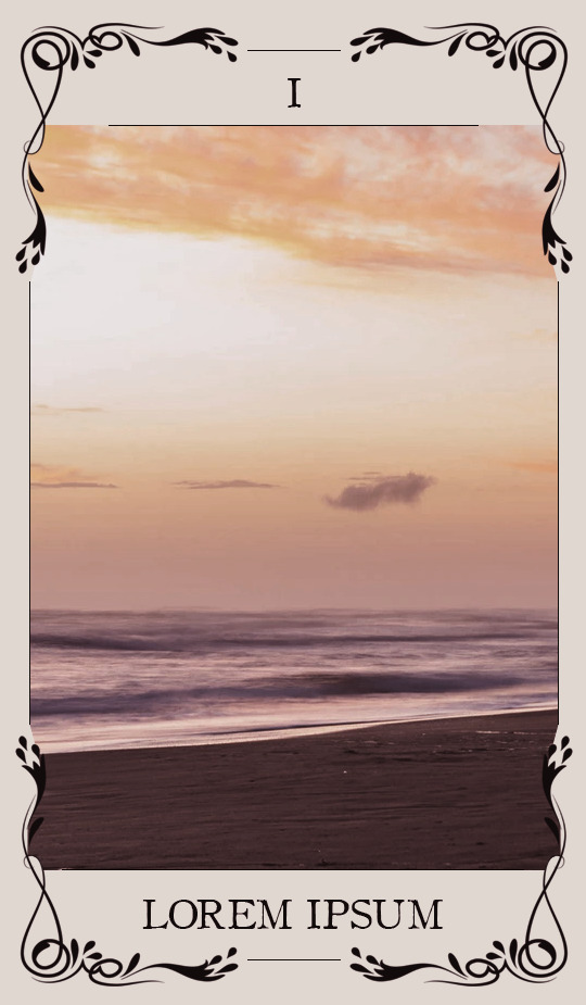
。・ template psd one hundred eleven by templatepsds ゜+.*
-`. info .’-
+ as requested, here is a tarot card template with two different designs, both of which have either a black/gold option, or an off-white/black option.
+ to insert an image, place your picture layer above the layer titled “put image in here*,” right-click on your layer and select “create clipping mask.”
+ you can change the colors, resize it and make it smaller, etc.
+ the font used in the templates ‘OldStyle’, which you can download here.
+ not for commercial use or anything like that! just for personal use/to have fun.
+ adjust as much as you want to suit your liking.
+ please like or reblog if you download.
+ message if you have any questions/difficulties!
-`. download .’-
+ dropbox || mediafire
2K notes
·
View notes
Photo
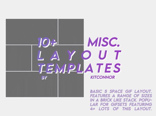
MISC. LAYOUT TEMPLATES
Through the following drive link, you’ll find 12 misc. templates, mainly aimed for gifmakers! There are 5 basic layouts, 3 shape templates and 4 design templates.
I DO NOT CLAIM OWNERSHIP OF ALL THE DESIGNS. However, please credit the design or shape templates where you can!
To fill this folder up a bit more I’m happy to take requests on any layouts you would like a psd for with the dimensions.
Each template in this folder relatively follows the tumblr gif guides (gutter width and gif size) so it takes the hassle out for you. As well as that, design templates each come with the relevant fonts, or similar fonts.
Please rb if you are going to use these! You can find the pack here ꨄ
445 notes
·
View notes
Text

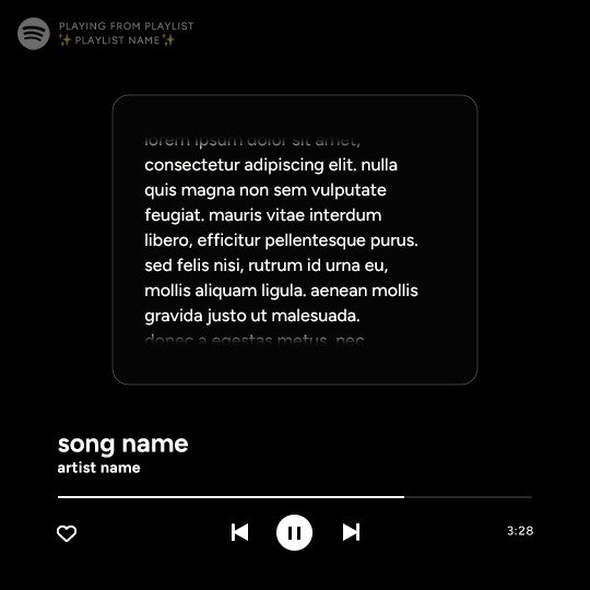
Spotify Template by @seaoftr
Hello! I received a few messages asking me to share the template that i made for my cal kestis playlist set, so I thought it was time to make a post for it!
Below is some basic info + download link.
the font used here is called figtree from google fonts
the layers are all labeled, some with basic info that tells you what to edit/adjust
the play/pause button layer-group uses a layer mask, but the pause button rectangles are included as well in case you run into any issues.
i made this template myself, so all i ask is that you don't claim as your own & you give proper credit if you end up using it!
the link to download the template is here.
feel free to tag me in your edits! i would love to see them <3
1K notes
·
View notes
Text
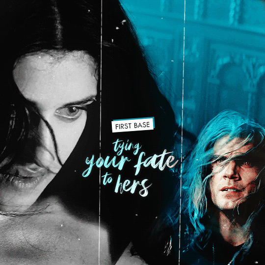
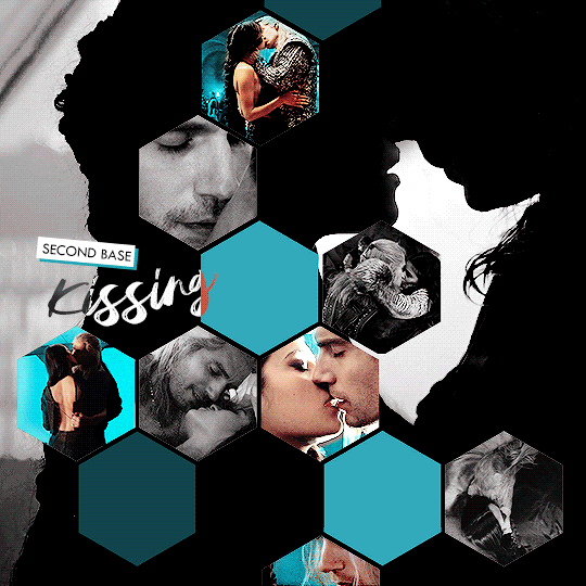


the 4 bases of intimacy according to geralt & yennefer (insp.)
441 notes
·
View notes
Text
Honestly I think a lot of people who have never made a gif for tumblr don't get that it does actually take time and effort, its not just rip it from a video and post it- you have to download the video, in my case I have a video player installed that grabs continuous caps, figure out what parts you need, you have to open those in photoshop or gimp, depending on where you got photoshop you might be paying for it every month and then on top of that is actually sizing, cropping, colouring, sharpening, adding text, etc. etc. like it is something that takes time and effort for which the only real reward is creating something that makes you happy and hopefully people reblog it with a nice or funny tag, so maybe keep that in mind the next time you think gif makers are being mean or unfair for being upset about reposts. It is its own little artform that is fairly unique to this website, and that's a big aspect of why I have always loved tumblr, if all the gifmakers stopped posting things would be a lot more boring around here.
4K notes
·
View notes
Text
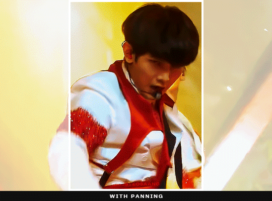
how to pan gifs
were u ever like gahd these camerapeople again making yet another stage ungiffable. yeah me too.
sooo here in this tutorial i'm gonna try to explain how to pan gifs so ur subject can remain centered or at least not be out of frame, sth like this:
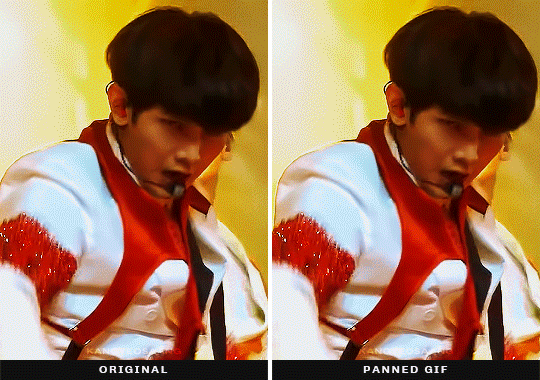
this is a more advanced tutorial, in a sense that i'll assume you know how to make gifs, not in a sense that this is complicated lmao, okay let's gooo:
essentially this is what's happening and what we gonna do:

before we dive into the how tho, it must be said that photoshop's timeline can only do linear movements so no easing. at times it can look unnatural or choppy or... frankly both. (if you want to know more about this look up ease-in-out animation curve, or easing curves)
part 01 · prepping gifs
as i wrote in my gif making process post i usually crop my gifs bigger than they usually will be. e.g. a 268px gif will be cropped to anything between 468-540px. sometimes because i want to have the opportunity to position the gif a bit differently but most of the time because i know 268px is a reeeaaalllyyy tight place and i need to make some movement adjustments especially for weekend music shows where the camerapeople seem to be on crack or just very into experimenting
part 02 · let the keyframe madness begin
whichever way you are making gifs just open up your gif and crop it to the final size, colour it and whatever else you fancy. once you have everything ready just open your video layer on your timeline (if you don't know where you will be able to see it in the video later)
you will see 3 tracks, transform, opacity and style. for this we will use the transform because it contains movements (but also resizing if that's what you fancy).
all we need to do is create keyframes which will define what is the position of the video layer at a certain time. so e.g. here we are moving this box to the right by 50px in 1 second.
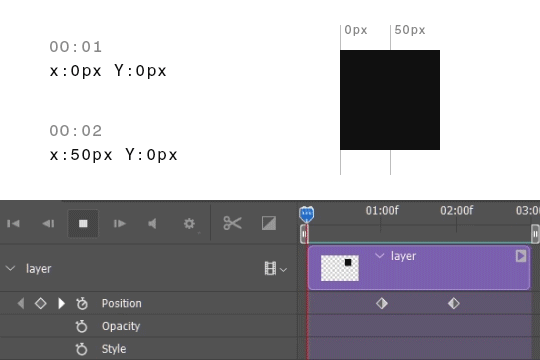
to create keyframes click on the timer icon in front of the position label and photoshop will create you one. the active one will always be yellow. if you move on the timeline with your playhead (that thing that is moving) and you resize/move your layer photoshop will create yet another keyframe for you without you needing to click on it, because it will recognise the change. so all you need to figure out is when the movement starts and which position your layer should be, and the same for the end and ps will take care of the rest.
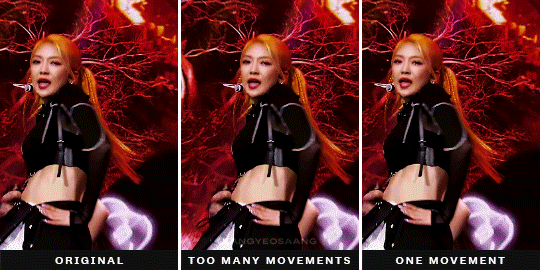
part 03 · some things to consider when panning gifs
now this is the part where it gets subjective and less tutorial like. so all i can provide is some explanation how i go about it and what i pay attention to.
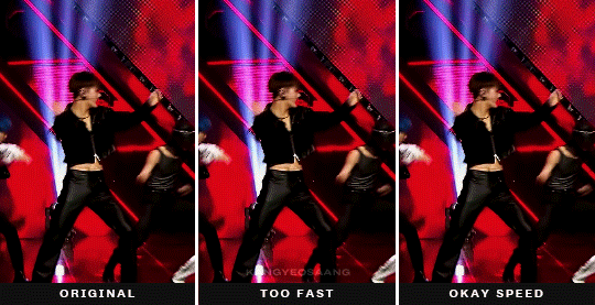
tip #1: match the movement speed to the gif
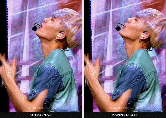
whenever you are panning a gif it may result in the gif being choppy bc the framerate and your movements are not matching up, so it's either too fast and photoshop needs to move your image by too many pixels frame by frame or it's too slow resulting in basically the same thing but kinda reversed, either way it won't look smooth. this mostly happens when the original footage is moving (there is a quick camera pan/movement) and you are trying to keep it in place, less when the original is kinda still and the subject is moving. this is kind of a trial and error process: try moving your keyframes closer to each other or maybe further, add more/less movement between two keyframes and just see which results in a smoother gif.
tip #2: try moving your gif once in one direction
there are times when your subject might go out of frame multiple times and you have the urge to keyframe the whole gif and keep them in center the whole time. however, as we do not have easing curves in photoshop the switch between moving something from one direction to the other one will be very visible. so try placing your subject in a way that you'll only need to make one movement and it's kinda okay all the way thru or pick the most annoying 'placement' you want to correct. here in this example it mostly bugged me that the gif was not centered at the end, but onda kinda remained in frame.
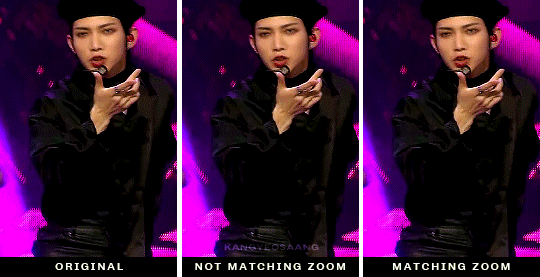
tip #3: pan your gifs when there is a quick zoom/movement
sometimes whatever i do the gif will look choppy regardless one movement or not. in these moments, and these moments ONLY we can be thankful for the sometimes unnecessary zooming that's happening and reposition our gifs while the zooming is happening. since there is already a drastic movement you can get away with basically anything, as long as you time the beginning and the end where the zoom begins and ends. also i must add that you can pan stage gifs way more and more drastically bc there is a lot of things happening in the background, so adding a bit of movement on top of all the other movements is less noticeable than... moving footage where e.g. the background is static.
✨something extra✨ · panning/moving other things
so what we looked at is moving the whole gif to fit into the frame we have, but with this technique obviously you can move all sorts of stuff, text, texture whatever you fancy. you can apply this process to the layer you wanna move and this is when you get these:
a sidenote: the fade effect is literally the same keyframe business but instead of playing with position keyframes you change the opacity keyframes.
aaand that is all, if you have any questions my askbox is always open so hmu <3
tagging @sanhwalynight bc of requesting reasons hehe
1K notes
·
View notes
Photo

I recently received a request to show how I recolor photos from black and white (mainly from the photos featured here and here), so here is a quick summary of how I colorized another photo from TIFF from black and white in Photoshop!
Tutorial including some photos under the cut:
Keep reading
211 notes
·
View notes
Note
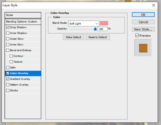
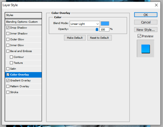
hi alie!!! first of all i love your gifs so much, you are so talented! <3 wondering if i can ask, how you did the colorful text for the names on your 911 2023 wrapped gifset? it looks different (cooler!) than the typical difference/exclusion mode i use, so i am curious! thanks so much :)
hiiiii, thank you so much! 🥺🥰
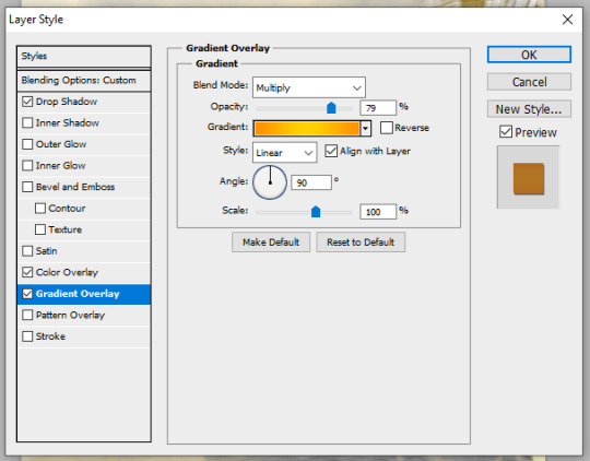
all the name text layers in that gifset had this:
white text, layer blend mode set to difference
gradient overlay, blend monde set to multiply
color overlay, blend mode set to either soft light or linear light. (color dodge also works great for this, but i did not use it this time)
thin, straight, black drop shadow
i've mostly played around with the layer styles blend modes and opacity. since the blend modes give text transparency and i didn't want to numbers to show through the names, i also made sure to mask out the outline number layers with the name layer. to do that: ctrl click the text layer to create a selection of the text, then put the layers you want to mask in a group and hit the layer mask icon. it will create a mask of the selected text, and you just gotta invert by hitting ctrl + i.

here are the settings for 4 of the gifs (the buddie, 9-1-1, ryan, angela ones had the same settings but with different colors and opacity percentages)

and then the oliver one was slightly different:


i have saved a few versions of these settings as layer style presets so i don't have to start from scratch everytime, it's soooo useful!
186 notes
·
View notes
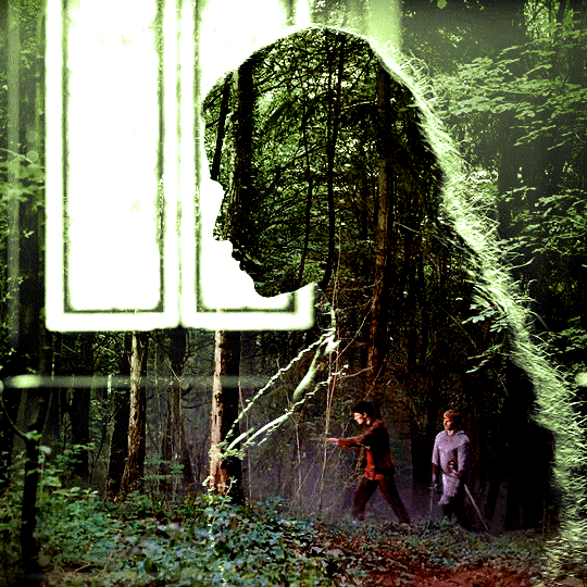
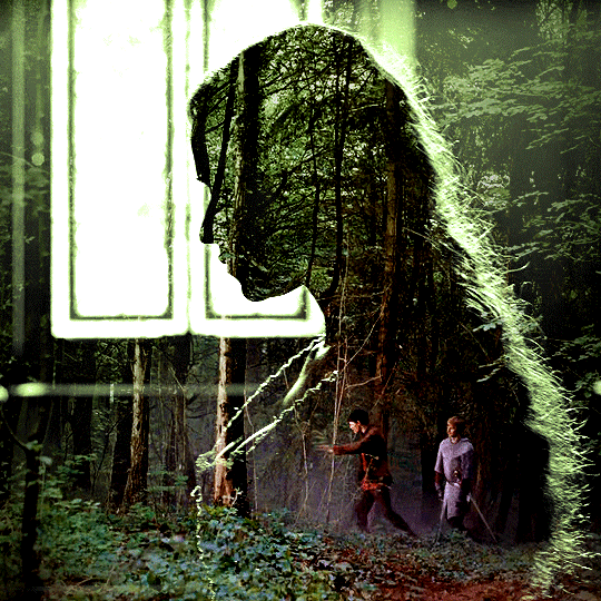
Note
Hi! Can I ask how you did the double exposure gifs for your merlin set? They're beautiful btw!
heyy, thank you!! of course!
it's actually not very hard, the trick is to find the right shots for this. here's how i did it (reference gifset), under the cut.

for this tutorial i will be:
— using photoshop cs5 on windows
— assuming you know how to make gifs using the timeline
— have basic coloring, sharpening, groups, and layer masks knowledge
I. CHOOSING THE RIGHT SHOTS
the ultimate trick to pull this off is to choose the right image. in order to do the double exposure, you need a silhouette shot that has these:
a defined and dark silhouette with a background that is not too busy
enough contrast between the silhouette and the background
the silhouette should take at least 50% of the space
not too much movement
here are a few examples of why they work and why they won't:
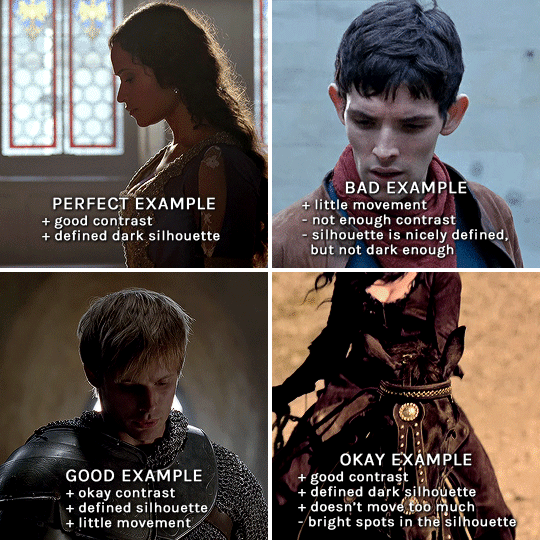
gwen: perfect example since this shot is already quite contrasted with a defined silhouette. there won't be a lot of work needed to make this one work.
merlin: not a great example because even tho there's a somewhat good contrast between him and the background, the silhouette is just too bright, not dark enough.
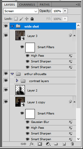
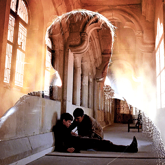
arthur: another good example, even if there are some bright spots on his face and armor. since he's not moving too much, you can definitely brush some black over him to make his silhouette darker (i'll explain/show later)
morgana: this one could work because the contrast is great, but of course her skintone is very bright against the black clothing. that being said, since the movement is not too bad, it could be possible to brush some black over her and move these layers with keyframes (as mentioned for arthur's example). i haven't tried it tho, but i think it would work well enough.
once you have your silhouette shot, you need another gif for the double exposure. what works best, in my opinion, are:
wide, large shots
shots with no to little camera movement (no pan, zoom, etc), but the subjects in the shot can have little movement of course
pretty cinematography/scenery shots
i find these are easier to find and make it work, it's not as "precise" as with silhouette shots. it's mostly just trial and error to see what works best with the silhouettes.
II. PREPPING THE SILHOUETTE
for the effect to work, we want a silhouette that's dark as possible. i'm gonna use the gwen and arthur shots as examples.
for the gwen gif, i started by sharpening, and then upped the contrast by quite a lot so her silhouette is mostly black, while retaining some nice details. i've used only 3 layers here:

selective color layer: in the blacks tab, playing with the black slider (value: +10)
brightness/contrast layer: added a lot of contrast (+61) and a bit of brightness (+10)
black and white layer: on top, its blending mode set to soft light and at 20% opacity. gives a bit more depth and contrast

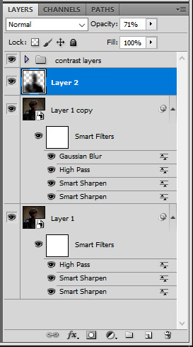
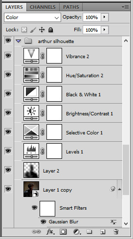
then for the arthur example, i've also sharpened it first, and added contrast layers in this order (the skintone looks horrible, but it won't matter soon lol):
levels layer: black slider at 0, grey slider at 0.76, white slider at 104
selective color layer: in the blacks tab, black slider at +10
brightness/contrast layer: brightness at +1-, contrast at +47
black and white layer: on top, its blending mode set to soft light and at 20% opacity. gives a bit more depth and contrast
as you can see, half of his face is still quite bright. to correct that, create a new empty layer and put it between the gif and the coloring layers.
using a really soft brush and the black color, brush some black over his face and body on that new empty layer. you can edit the layer's opacity if you want, i've set mine to 71%. since arthur doesn't move much here, there's no need to keyframe this layer's position. for the morgana example, this is where you'd need to play with keyframes to make it work. here's where i'm at now after this:
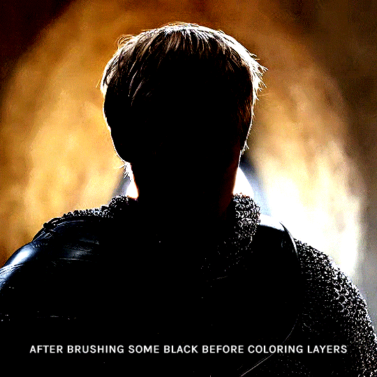
you can always edit this layer later if you need, after doing the double exposure blending.
once the silhouette is all ready, you can put all layers in a group and rename it (i've renamed mine silhouette).
III. BLENDING
now the fun part! import the wide/scenery shot in photoshop, then resize it to the same height of your silhouette gif. make sure the gif is a smart object layer, and sharpen it. finally, bring this gif onto the silhouette canvas (by right clicking the smart object > duplicate layer). once you have both gifs onto your canvas, put the wide shot gif layer in a group, and set this group's blending option to screen.

you can then position the wide/scenery gif the way you like it in the canvas. this is how it looks for both examples after i've done that:

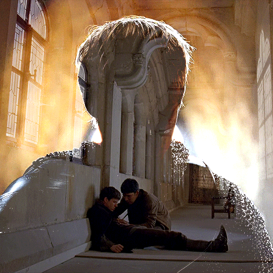
if the blending mode screen doesn't give you the best result, so you can play around with other blending modes (such as lighten and linear dodge in these particular cases), but generally speaking, screen is the real mvp here haha.
IV. COLORING
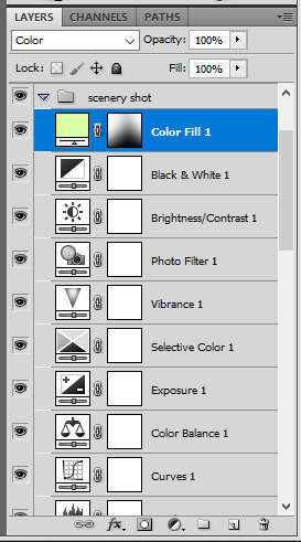
now that the double exposure effect is done, we need to color the gifs to bring them together. i went with simple coloring here, simply enhancing the colors that were already there. just make sure that the coloring layers for each gif are in their respective groups. here's how i've colored both examples:
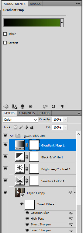
gwen silhouette group: i added a gradient map layer on top of the contrast layers in black to green and set the blending mode to color
scenery shot group: multiple coloring layers, with a green color fill layer (blending mode set to color), with a layer mask so it only affects the top half of the gif
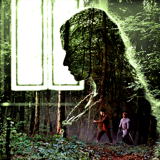
for the arthur gif, i did something very similar but with warmer colors. i didn't use a gradient map for arthur though:
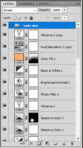
arthur silhouette group: i made the yellow warmer, closer to orange/red, with a hue/saturation layer, and added more vibrance. didn't feel like it needed a gradient map layer here though.
wide shot group: basic coloring layers to enhance colors from the merlin & daegal shot, and an orange color fill layer set to the color blending mode.
at this point you're pretty much done. just need to add some final touches and typography (if you want).
V. FINAL TOUCHES
a small and completely optional detail, but i wanted to soften the edges of the wide gifs. to do so i've duplicated the smart object gif layer and removed the sharpening filters (right click on smart filter > clear smart filters). put this layer on top of the other smart object layers (but still below the coloring).
then with this same layer still selected, go to filter > blur > gaussian blur... > 10px. this will give you a very blurry gif, but we only want the edges of the canvas to be softer. so add a layer mask to this layer. with a very large and soft brush (mine was at 0% hardness and about 800px size), brush some black onto the layer mask to remove the blur in the middle of the gif.

you can play with this layer's opacity or gaussian blur amount if you want (by double clicking on the gaussian blur smart layer filter). here how both examples look with this gaussian blur layer:

you can also mask some of wide/scenery gifs if you'd prefer, so it shows less outside of the silhouette. just put a layer mask on that whole wide shot group and brush some black or grey on the layer mask. it's what i did for the gwen gif, with a very soft brush and i set the mask density to 72% (i kept the arthur one as is tho):

and that's how i did it! hopefully that was clear enough :)
967 notes
·
View notes
Note
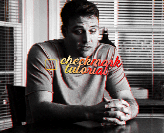
hi alie! how are you? i was wondering if you could explain, or link a tutorial that does, how you did the first gif and the checkmarks on this (/post/713604672591659008/pscentral-event-14-your-url-insp) beautiful gifset please?
hello!! i'm good, thank youuuu ♡ and yeah, sure i can! i didn't follow any tutorial for this gifset, so i'm gonna try to explain my process as best as i can.
the first gif is fairly easy, it's just a bit time consuming. the second one for the animated checkmark uses some keyframes. i use photoshop cs5, which is rather old, so hopefully my directions still work for more recent ps versions!
tutorial for these two gifs under the cut:

gifs in text
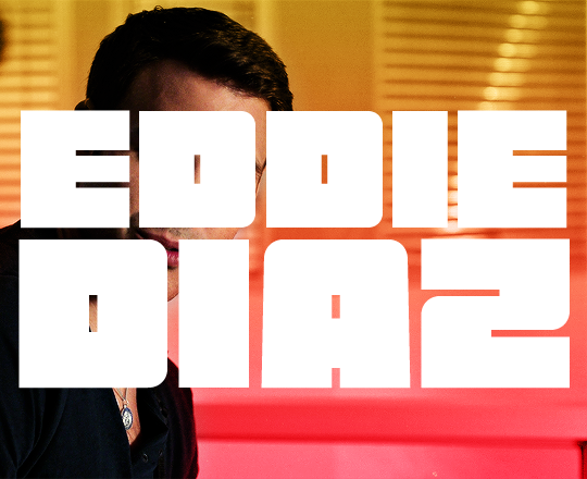
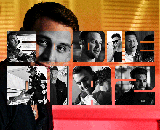
i'm gonna assume you already have basic gifmaking knowledge, so i'm gonna start from this base gif already colored:
i started by finding a big and very thick font that i liked. for this gifset i used a font called barle. i placed my text the way i wanted it, but i used one text layer per letter, because i wanted one different gif per letter. once i had my 9 text layers placed, it looked like this:
then, you need to create a group with a layer mask for each letter. for this, i simply hold the ctrl/command key and click on the letter layer's thumbnail. it will create a selection of the letter.
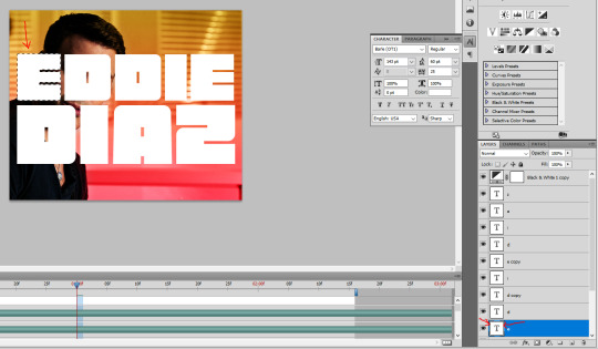
with this selection on, i click on the folder button to create a new group, then on the add layer mask button. it will create a group with your letter where you can put anothet gif in.
then you just need to rinse and repeat for every letter.
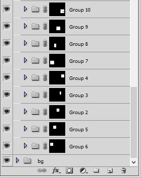
once you have all of your letter groups done, you can select all of the text layers and put them in another group. we'll use these layers again later.
then you just need to bring your second gif onto this canvas and put it in the right group/folder. i usually just bring a smart object gif onto my main canva, slide it in the right folder, then resize, sharpen, and color the second gif in there.
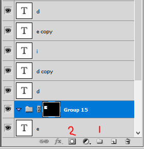
you can just drag this layer once it's inside the group to position it the way you need it. and also use ctrl+T to resize it (drag the corners while holding shift to keep the right propertions). once the gif is positioned, you can go ahead and disable the E text layer you used to create the mask (but don't delete it!). i kept the coloring very minimal since it's a black and white gif, and the layers should look like that:

and this is the gif so far with the first E done:

then you just need to do the same for all other letters, pretty straight forward! for the first D letter, i wanted eddie's face to show instead of using a different gif, so i simply put a black and white layer in that D group. my gif looks like that at this point:
then what's missing is the outline, and it's pretty easy to make. go back to the text layers you created at the beginning. enable them all, and make sure they are on top of everything else. double click on that first text layer to bring in the layer style options, and add a 1px stroke with the color and blending mode you want. I went with yellow and the hard light blending mode. these are my settings:
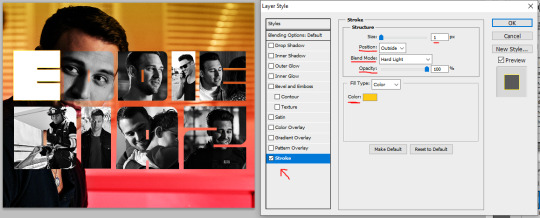
back to the layers panel, keep the text layer's opacity at 100%, but bring the fill to 0%. this will make online the online show up on the gif.
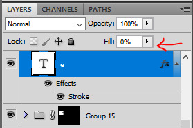
to apply this setting to other text layers, you can right click the first text layer and select "copy layer style". then select all of the other layers and right click one of them and go "paste layer style". once all the text layers have their outline it should look like that:

to move the outline a bit, make sure they are in a group and select this group (i renamed mine "outline"), then just nudge it by a few pixels with the arrows on your keyboard. i transformed the outline group by about 4px left and up on mine. i also duplicated the whole group because i wanted a deeper color for the outline.
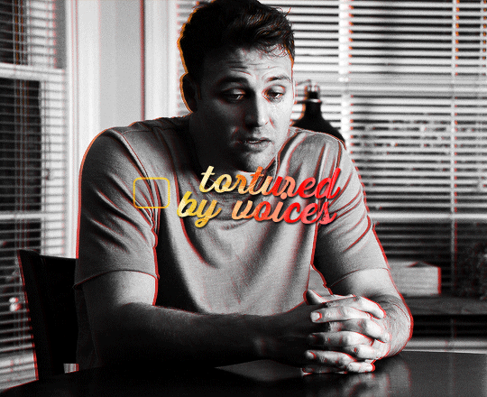
and this is my final result!

animated checkmark
starting with my base gif, i added some animated text and a little box for the checkmark to go in (drew a shape with the rectangle tool and gave it a stroke, the same way i did it for the previous gif):
for the actual checkmark, you can try to find a brush or shapes to download, but i didn't feel like looking it up lol, so i drew the shape myself with a regular brush that comes baked in with photoshop. the best way to draw a custom shape, in my opinion, is to draw the shape as a layer mask on a color fill layer. that way you can always change the color or add layer styles later (like i did).
so on my canvas, on top of everything, i created a color fill layer (layer > new fill layer > solid color) with whatever color i wanted (you can change this later if you need). you will get a new color fill layer, with a layer mask already attached to it. i put this layer at 75% opacity so i can see the gif under it and it's easier to draw the shape in the right spot:

i then selected the layer mask thumbnail and the brush i wanted to use, one of them (not sure i remember which one, sorry haha!):
with the black color selected, just go ahead and draw a checkmark where you want it on the canva. you can always use the brush in white to erase it and start over with the black color if you're not happy with it. but once you have a checkmark you like, it should look like this:
now you just gotta invert the mask so the checkmark is colored, to do this just click on the color fill layer mask you just drew on and hit ctrl/command + i. the mask will get inverted and it will look like this:
then you can add whatever layer style you'd like to the checkmark. i added a gradient and a drop shadow to mine, and changed the blending mode from normal to difference to make it match with the text, so now it looks like that:
animation time! this is where you need to use a bit of keyframes, but i promise it's not complicated.
for this animation i wanted to mimick a checkmark being drawned. when you draw a checkmark, you usually do it in 3 steps right? your startung point, then a line down, and then another line up to the end point. it's what i tried to mimick here.
to animate it that way, you need to draw a shape that will hide the checkmark and then move it around to mimick the drawing animation. to do so, create a new group (i've named mine "checkmark") and add a layer mask to this group. you also need to unlink the mask by clicking on the little chain icon next to the mask thumbnail:

now the next steps are a bit of trial and error until you get what you want, i'm gonna try to explain it as best as i can (bear with me haha):
1- go to where you want the animation to start, aka where you want the checkmark to start appearing. for me it was a few frames after the start of the gif.
2- then, with a black brush that wasn't too big nor too soft, i brushed a bit over the checkmark to erase it for now (you may have to go back and edit this after the animation is done). no need to do a huge shape, just big enough to cover the checkmark. if you go back to the move tool and click on the mask thumbnail you have just created and click and drag in the canva, you should be able to move the mask around. this is what you want for steps 5 and 7. basically, on your mask thumbnail on the checkmark group, what is brushed in black will erase what's in the group, and the white part will reveal what's in the group. for now just make sure the shape you just drew is covering the checkmark.
3- once the checkmark is hidden, click on the stopwatch icon next to layer mask postion to start the animation. this will automatically create a keyframe where your cursor is on the timeline (the yellow diamond)

4- once your starting point is done, you want to go a bit further on the timeline with your cursor.
5- then move the mask shape so it reveals just the smallest part of the checkmark (make sure you click the checkmark group mask thumbnail first before moving the mask). once you move the mask with the move tool, a new keyframe will automatically appear where your cursor is on the timeline (another diamond). make sure you drag the shape down the checkmark to mimick it being drawn.
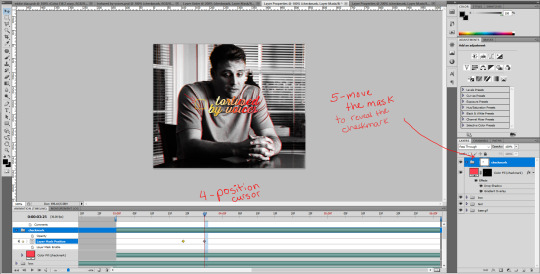
6- go a bit further again on the timeline, where you want the animation to end.
7- and move the shape again to reveal the checkmark (make sure you click the group mask thumbnail first before moving the shape). again, a third keyframe will be automatically created. i dragged the shape up from the bottom of the checkmark to mimick the drawing of the checkmark.
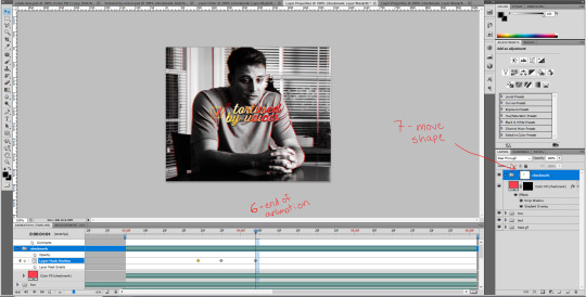
your animation should be done here after these 2 movements, so play it in a loop and see if you are satisfied with the animation you have created. if you don't like it you have options:
you can go back to the group layer mask and edit it with the black or white brush;
you can also go back to each keyframe by positiong your cursor over it and move the mask around in a different way;
and you can select the keyframes (yellow diamonds) and move them around on the timeline. if you push the keyframes closer together, the animation will be faster, and if you space them out more, the animation will take longer. it's up to you!
this animation thing is really just trial and error. you could probably do the same animation with a checkmark you find online, as long as the image file is in a group and the animated mask is applied to the group. and don't forget to unlink the mask before animating a movement or it won't work properly!
and this is what my animation looks like:

that's about it, i hope that was clear enough omg. never realized how hard it is to explain these things in english lol. let me know if you have any questions! ♡
275 notes
·
View notes