jadesartljmu
JADE MILLER
CRITICALITY BLOG LJMU
88 posts
Don't wanna be here? Send us removal request.
Last Seen Blogs
what-r-u-gay
~sexy trash goblin~

emilythedog661
Emily 🙂
what-r-u-gay
~sexy trash goblin~
what-r-u-gay
~sexy trash goblin~
picassobody11
picassobody contouring
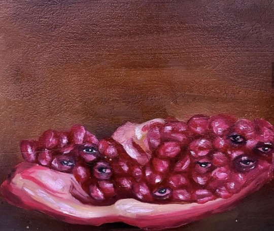
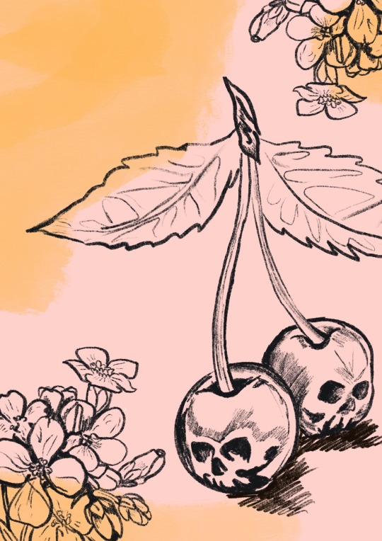
Text
“ Eyes or Pomegranate?”
Oil on wood
#art#art blog#my work#artists on tumblr#my notes#painting#abstract#abstraction#overindulgence#digital art#flowers#harry styles#portrait#clay#skulldrawings#strawberry#tumblr blog
24 notes
·
View notes
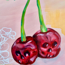
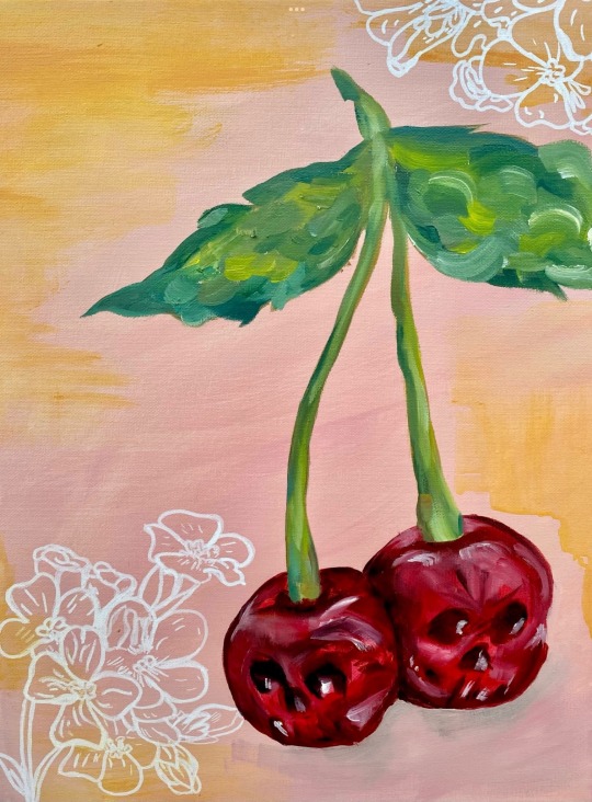
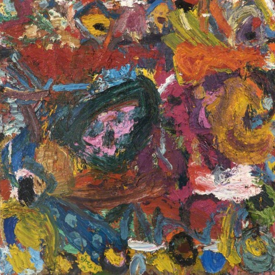
Text
SKULL CHERRIES
Oil Paint on Canvas
A3
#art#art blog#my work#artists on tumblr#my notes#painting#abstract#abstraction#overindulgence#digital art#flowers#harry styles#portrait#clay#skulldrawings#strawberry#tumblr blog
24 notes
·
View notes
Text
INITIAL IDEA VS OUTCOME

#art#art blog#my work#artists on tumblr#my notes#painting#abstract#abstraction#digital art#harry styles
4 notes
·
View notes
Text
EXPLORING MOVEMENT AND COLOUR
pink empty space with swirls in each corner to create distance and flow within the piece
Acrylic paint
A4

3 notes
·
View notes
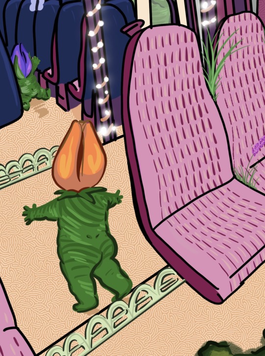
Text


“Mossy Rail”
Digital drawing created on Procreate.
Surrealism drawing inspired by my practice, I aimed to create a considered normal scene and make it crazy with things that aren’t normally alive. Plants have been turned into human forms and taking over the train.

#art#art blog#my work#artists on tumblr#my notes#painting#abstract#abstraction#overindulgence#digital art#flowers#harry styles#portrait#skulldrawings#strawberry#tumblr blog
2 notes
·
View notes
Text
WHITWORTH ART GALLERY
Part Two.
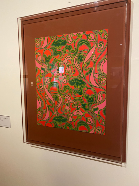
David Bartle (designer)
Arthur Sanderson and Sons Ltd (WPM) est 1860
(manufacturer)
Hecuba 1967
Screen printed wallpaper
A beautiful wall paper piece with a 70s print with fit well within the open house project.

'Love Songs: Multi Story House,' a collaboration between Mary Kelly and Ray Barrie, was extremely inspiring to me. A wooden frame with a plate glass floor lighted by fluorescent light dominates the area, forming the shape of a conventional house, complete with rooftop. Conversations and confessions between women of different generations are imprinted on the house's cast acrylic panel walls and roof - the phrases are humourous yet not to be praised, speaking of affairs, passions, and secrets. Despite the fact that love is a motif across them and the name, love is not conveyed through my eyes. From a read theory standpoint, the audience derives meaning from this by associating it with love, poisonous relationships, and so on.
1 note
·
View note
Text
WHITWORTH ART GALLERY
An Exhibition review.
The Whitworth, which opened in 1889 as the first English gallery in a park, has undergone a £15 million renovation. This is a gallery whose visitor numbers have skyrocketed in the last five years, whose contemporary exhibitions programmes have breathed new life into worldwide collections, and whose daring curatorial staff has garnered international acclaim.
The Whitworth is a gallery that is a place of research and academic collaboration, and whose teaching and learning teams have created novel techniques to dealing with non-traditional arts audiences. It is part of the University of Manchester. Despite its ambition and evolution, the Whitworth maintains a feeling of the personal, intimate, and whimsical. It is a popular tourist destination.
I attended the Whitworth gallery on the 1st of march, There was many art displays but certain ones interested me the most which I will discuss.
The Open House Event.
Open House is a project that connects the lives of people who live in front of wallpaper with the Whitworth's 10,000 wall coverings. We'll be organising a series of events throughout 2022 to help launch the project, hear your experiences, collect photos, and build these bonds.

Daniel Meadows b.1952 and Martin Parr b.1952
June Street 1973
Gelatin Silver Prints
June Street in Salford was filmed by Granada TV to simulate Coronation Street before a set was erected because the houses and cobblestones were regarded so characteristic of a northern working-class terrace. June Street's dwellings and neighbourhood were threatened with demolition in the 1970s as part of a large renovation. Students Daniel Meadows and Martin Parr, who were studying photography in Manchester, were drawn to this. June Street residents and their dogs appear in highly stylized rooms in their series of images, which relate to both individual taste and era trends, such as patterns, textures, shapes, and materials. The overall series of work represented the northern working class with their personal and memorable photos of their houses and places of comfort.
Gillian Ayres 1930-2018
Galatea 1981-1982
Oil on hessian
Gillian Ayres was a pivotal figure in postwar British non-figurative art. Exuberant technique and bright colour were hallmarks of her highly individual work.
Galatea demonstrates her fascination with allusions to Greek mythology. Galatea was a sea nymph whose lover, Acis, son of the deity Pan and a nymph, was crushed by a huge rock thrown by Polyphemus, a jealous cyclops. Galatea gave the deceased Acis the nature of his mother, the nymph, and changed him into a glistening stream. Gillian’s work is truly inspiring, especially to my own painting. The textures and flow of the paint really creates amusement and excitement within the piece. The boldness of the colours and different brush strokes create a sense of child’s play and fits beautifully within todays art even if it was created within the 80s.
1 note
·
View note
Text
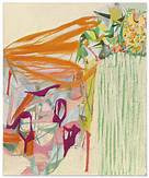
Exploring movement and colour
how psychedelic art makes us feel.
Comparing this to the warmer piece, i wanted to see the difference between the way cold and warm colours makes us feel. This piece was also done using a chalk brush on an A3 Canvas.
#abstraction#art#my work#art blog#artists on tumblr#painting#digital art#abstract#acrylic#art history#artwork#modern art
6 notes
·
View notes
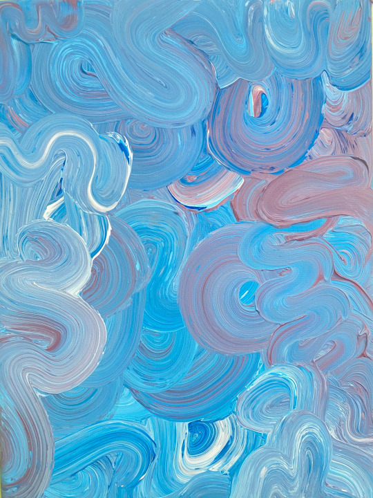
Text
Exploring movement and colour.
how psychedelic art makes us feel.
This piece is approximately A1 size, I experimented and used a chalk brush to create a better flow in the piece, more circular. The chalk brush helped spread the paint across the canvas smoothly. The warm colours provide comfort and relaxation.

1 note
·
View note
Text
Exploring movement and colour.
how psychedelic art makes us feel.
Within this piece, I was exploring poured mess and when the paint is placed on the canvas it creates movement and flows within the piece, I like my work to have a flow and to make the eyes of the audience wander.
Cold colours created a much more harsh tone to my work. this is something I wanted to explore, my pieces normally are all done in warm colours.

1 note
·
View note
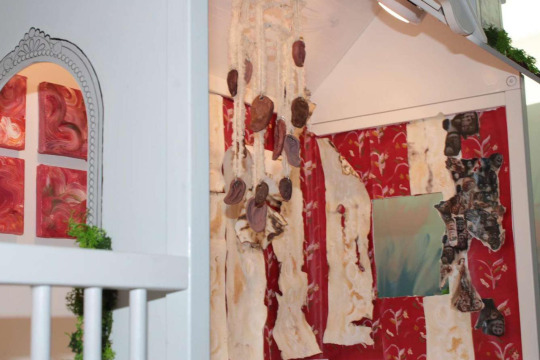
Text
GET TO OURS!
At The Tiny House Gallery.
On the 8th of March, I was featured in the exhibition called 'Get To Ours' which was featured in The Tiny House Gallery.
This exhibition featured works that investigated scale and perspective, as well as themes such as architecture, decor, childhood, and family. All the while questioning what a home or gallery space can and cannot be.
I featured a small series of abstract canvases, all looking at how movement is created within the paint. I did a series of brush strokes all ranging in harmonious colours presenting subtle movements and expressive art.
Below are photos from the exhibition and my work in the installation.


0 notes
Text
Cecilia Vicuña
Guest Lecture
Cecilia Vicuna is a Chilean poet and artist who divides her time between New York and Santiago, Chile.
Her work is known for exploring themes such as language, memory, dissolution, extinction, and exile. Critics also point to her work's relevance to the politics of ecological destruction, cultural homogenization, and economic disparity, specifically how such phenomena disenfranchise the already powerless. Her dedication to feminist forms and methodologies is regarded as a unifying theme in her diverse body of work, with quipus, palabrarmas, and precarious standing out. Her work has been specifically associated with the term eco-feminism.
Vicunas' work is truly expressive and has demonstrated a key role within the art community.
0 notes
Text
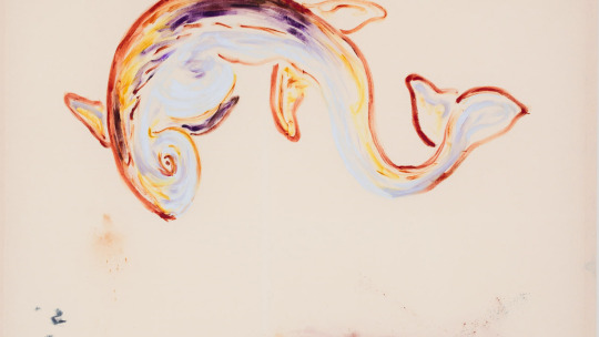
Anna Zacharofff
Guest Lecture
Anna Zacharoff is a Swedish artist based in Brussels whose work primarily focuses on the traditional medium of painting, with an underwater theme revolving around sea creatures. Zacharoff frequently constructs her paintings with oil paints, establishing animals such as crabs, goldfish, sea rays, and turtles.
In terms of composition, Zacharoff isolates the marine animals on the canvas, giving them a sense of Flow, as if they were gliding through the ocean. The isolated composition of the creatures on the canvas gives the piece a sense of emptiness as if the creature has reached a standstill, representing the solitude of the ocean. However, this is offset by the stained background, which was created by priming the back of the canvas, as a result of an irrational fear of a blank canvas This unusual technique fills the piece's void by adding a rippled texture to the painting, which represents the moving ocean. This fear of a white canvas that many artists have may reflect a common fear of the ocean's vastness and emptiness. Despite this, I believe the artist's depiction of the creatures' beauty contrasts with the artist's fear of the ocean, as evidenced by the vivid colours and patterns created by the artist's abrupt, limited brush strokes.
Zacharoff's first exhibition in Oslo was solely dedicated to goldfish. The fascination with this animal stems from the fact that it is a marine animal that is never associated with food; it is man-made but is never to be consumed by man. This fascination with the animal is emphasised by the warmth of the colours, which are exaggerated on the empty canvas, as well as the animal's gaze, which is frequently directed at the viewer. The creatures' direct gaze, created with limited brush strokes, characterises them and adds a comical sense to the piece. Regardless, I believe it creates an intimidating tension between the creature and the viewer. Zacharoff's work is definitely well-crafted in my opinion. I'm also impressed by how little input is required to produce such a fascinating result. The abrupt brushstrokes appear to be carefully placed, and the colours used to characterise the animals, distinguishing them from one another, which is emphasised by the powerful gaze.
0 notes
Text
Mimi Hope
Guest Lecture
Mimi Hope is a young contemporary artist from the United Kingdom. Her first solo show was at Sarabande in 2018, only a year after graduating. This included her new work "Cloud," which consists of lenticular works she created while at the Sarabande Foundation, as well as her solo exhibition at the Supplement Gallery. Now, the artist has a slew of upcoming shows, including collaborations with the Liverpool Biennial and the London Biennial. Mimi Hope was born in London in 1994, where she currently resides and works. The artist received her BA in Fine Art from Chelsea College of Arts in 2017.
The piece that piqued my interest was known as the "Cloud." The artist wanted the audience to connect to the clouds above and with dreams and wishes in this cohesive piece about freedom and serenity. Blue and white skies represent a perfect world or an unattainable achievement or dream. Hope celebrates the natural phenonium that we as humans take for granted on a daily basis. Clouds as a whole drift apart, combine, and then disappear, as whole clouds are not always promised to be this still and calm, and the beauty of the piece is Hope capturing this exact moment of its time.

'Cloud'
0 notes
Text
Amy Sillman
Guest Lecture
Amy Sillman is a painter from the United States. Drawings, cartoons, collage, iPhone video, and zines are apart of her artistic practise. Sillman is a Professor of Fine Arts at the Städelschule and co-chair of Painting at the Milton Avery Graduate School of the Arts at Bard College.
Amy Sillman's paintings combine abstract and figurative elements in whimsical, almost hallucinogenic scenes. The paintings depict primordial experiences of birth, survival, copulation, conquest, and death, occupied by Lilliputian cosmologies of plants and animals, disembodied heads, and preternatural beings. Strokes and blobs, flat expanses, and geometric shapes are infused with signs of life and narrative possibility, drawn from a lexicon of Formalist motifs. Rather than giving shape to the figure with paint, the inhabitants of Sillman's paintings appear to have parthenogenically emerged to take over and manipulate the medium.
Her Expressive mark-making is truly exciting and colourful, truly inspiring to my own practice.

1 note
·
View note
Text
Yesim Akdeniz
Guest Lecture
Yesim Akdeniz is a Turkish artist whose work explores orientalism, gender, cultural appropriation, and patriarchy. 'Radical Selfcare,' one of her most recent series, consists of textile pieces made up of large pieces of fabric, contained with heavy layers of fabric, and containing repetition of patterns and muted colours. Akdeniz's work contains symbolism and is frequently metaphorical. It is clear that these pieces contain clothing forms, such as fake pockets and sleeves, which represent the dysfunctionality of orientalism. In addition to textiles, Akdeniz works with painting, which frequently depicts forms that have been removed from their natural habitat. Her work also depicts politics indirectly, for example, by utilising architectural structures that were destroyed in the late 1950s and have limited documentation.
Yesim Akdeniz Graf creates scenes that are calmly strange, with familiar elements made jarring when combined. She creates fantastical and dreamlike tableaus with modernist architecture, Hollywood icons, safari animals, women in hats, or household items—sometimes all at once. Akdeniz Graf, well-known for her use of symbolism, states that her "paintings are metaphors for stories that interest me." She pays homage to her Surrealist influences by quoting iconic works in her own paintings, such as René Magritte's pipe in The Lovers II (2011) and the recurring appearance of elephants on spindly stilts reminiscent of Salvador Dal's creatures.
Personally, I found this artist difficult to relate to and understand; I believe the large diversity of her work and her complex ideas make it difficult to sum up what she is specifically interested in and where her inspiration comes from. While the forms in her work are recognisable, the message is perplexing.


0 notes
Text
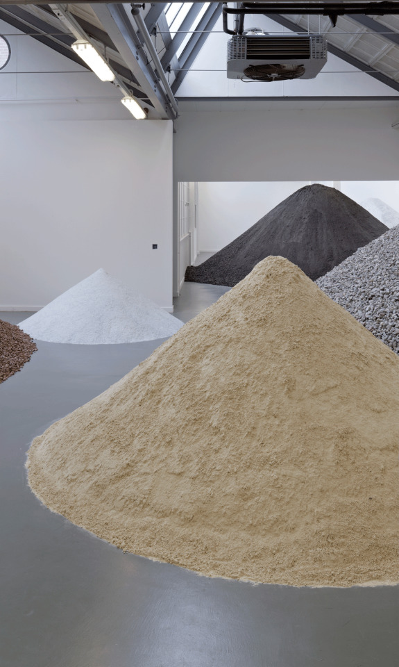
Lara Almarcegui
Guest Lecture
Lara Almarcegui is a conceptual artist from Spain who creates installations that resemble urban landscapes and focuses on urban transformation. Almarcegui creates interior landscapes within exhibitions using materials such as cement, stone, concrete, and brick. She finds empty lands to use as her studio as well as responding to exhibition spaces with materials sourced from wastelands. For example, she discovered Liverpool had many empty landscapes, inviting her to the city to explore the areas and develop her practise. Almarcegui's work questions urban transformation by studying land prior to development and exploring alternative methods of using land other than construction.
This artist, in my opinion, successfully depicts how the landscape is constantly changing on a global scale and calls into question the development of land through human intervention. It is admirable that the artist is so committed to preserving land and using it in creative ways rather than simply building on it. I appreciate her critique of the function of construction materials, which reveals how they can be used for purposes other than building structures. She also demonstrates how an exhibition space can be used as a site by successfully transforming materials from a landfill into a composed space. She is questioning the substantive use of these materials for construction and transforming the exhibition space into an urban environment by transferring these materials used by society to build within a man-made limited space.

0 notes