
jstawowy
JOANNA STAWOWY
Joanna Stawowy PORTFOLIO
166 posts
Don't wanna be here? Send us removal request.
Last Seen Blogs
pisces-amor
Pisces Romantic

tvfreakd
site individual

oac47
oac47
hrlvy
?

silverlinedrival
Silver Lined Rival
Text
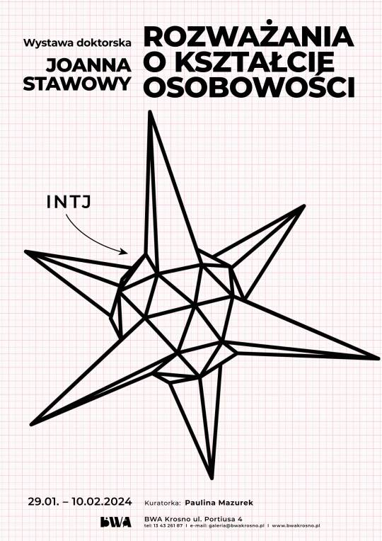
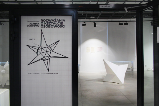


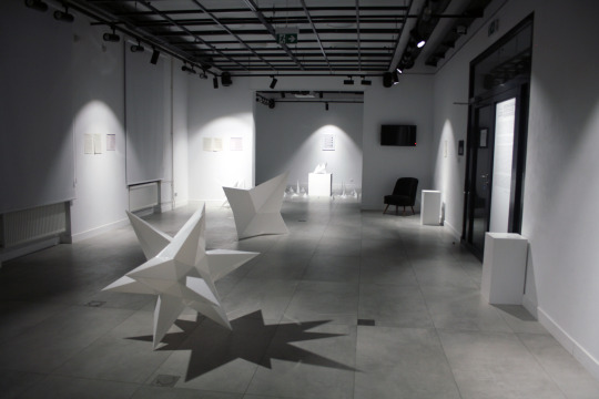


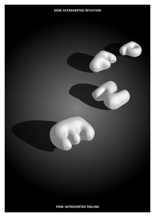
Wystawa: Joanna Stawowy "Rozważania o kształcie osobowości”
Wystawa doktorska
Termin wystawy: 29 stycznia - 10 lutego 2024
Wernisaż wystawy: 2 lutego (piątek) 2024 r., godz. 18:00
Śniadanie/Spotkanie na wystawie: 3 lutego (sobota) 2024 r., godz. 11:00
Kuratorka: Paulina Mazurek
ESTJ, ISTJ, ENTJ, INTJ, ESTP, ISTP, ENTP, INTP, ESFJ, ISFJ, ENFJ, INFJ, ESFP, ISFP, ENFP lub INFP – skróty znane z gabinetów psychologów i doradców zawodowych coraz częściej pojawiają się też w memach i aplikacjach randkowych. Teoria MBTI pozwala wyróżnić 16 typów ludzkiej osobowości. Czteroliterowe kody odnoszą się do funkcji opisujących, jak czerpiemy energię (I – introwertyzm, E – ekstrawertyzm), przetwarzamy i pobieramy informacje o świecie (N – intuicja, S – doznanie, ang. sensing), podejmujemy decyzje (T – myślenie, ang. thinking, F – odczuwanie, ang. feeling), organizujemy otoczenie (J – osądzanie, ang. judging, P – postrzeganie). Kwestionariusz Myers-Briggs rozwijający teorię 8 typów osobowości Junga jest jednym z najbardziej popularnych narzędzi oceny jaźni.
Jolande Jacobi, analizując psychologię Junga, dostrzega, że gdyby wszystkie cztery funkcje mogły być wzniesione do świadomości, (...) wówczas moglibyśmy mówić o «okrągłym», czyli zupełnym, doskonałym człowieku. Osobowość dąży do stanu idealnego balansu, nigdy jednak go nie osiąga. To wbrew pozorom dobra informacja, gdyż taki stan wiąże się z zanikiem ruchu energii psychicznej, czyli de facto zanikiem samej osobowości.
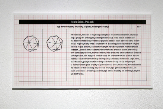
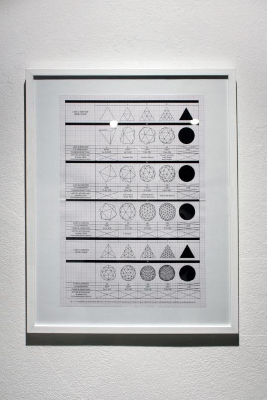
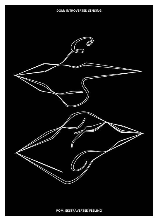
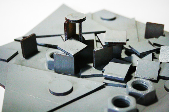
Z tych teorii czerpie Joanna Stawowy, tworząc projekt na granicy sztuki, psychologii i matematyki. Nie traktuje ich jako zupełnie rozłącznych dyscyplin, a raczej jako języki opisu świata, których styk skutkuje pojawieniem się nowych, interesujących jakości. Stawowy przeprowadza analizę psychobiograficzną, na podstawie której określa typy osobowości 11 wybitnych, znanych artystów. Jednocześnie szuka odpowiedzi na pytanie, jaki wpływ reprezentowane przez nich typy mają na ich artystyczną ekspresję oraz radzenie sobie z czynnikami zewnętrznymi. Wyniki swoich badań przekłada na język matematyczny. Koduje je, otrzymując surowe, intrygujące kształtem bryły reprezentujące poszczególne typy. Wychodzi od przypuszczenia, że niezaburzona osobowość w teorii Jung-Myers przyjmuje w trójwymiarze formę sfery. Jest jednak jasne, że taka osobowość nie istnieje – forma kuli nie jest adekwatnym przedstawieniem psychiki realnie żyjących osób. Inspiracją stają się więc dla niej wielościany geodezyjne, które poprzez kolejne podziały swoich ścian „dążą” do kształtu sfery, nigdy go nie osiągając. Najlepiej oddają charakter jaźni jako bytu dążącego do stanu idealnego zbalansowania energii psychicznej. Za poszczególnymi formami kryją się osobistości takie, jak m.in. Marcel Duchamp (INTJ), Piet Mondrian (INTJ), Mark Rothko (INFP), Andy Warhol (INFP), Marina Abramović (INFJ). Geometryczny, poukładany charakter brył oddaje zorganizowane i skomplikowane cechy teorii Jung-Myers. Wielościany, jak zauważa artystka, stanowią intrygujące zetknięcie się ze sobą sztuki oraz najbardziej ścisłej nauki, jaką możemy sobie wyobrazić – matematyki. Połączenie to zdaje się dowodzić, że proces twórczy jest podobny niezależnie od dyscypliny, jaką się zajmujemy.
Stawowy nie pozostawia odbiorcy samego sobie – skrupulatnie przedstawia mu zastosowany kod i uczy stosowanego języka. Zaprasza do samodzielnego szyfrowania i odszyfrowywania. Przyświecają jej założenia wyższości koncepcji nad formą, redukcji formy i dematerializacji autorstwa – dzieło da się wykonać zgodnie z napisaną przez nią instrukcją. Celem jest uzyskanie syntetycznego kształtu, odpowiadającego ludzkiej osobowości poziomem abstrakcji. Instalacja składa się także z różnej wielkości ostrosłupów symbolizujących istnienie innych teorii osobowości, skutkujących ustaleniem innych wzorców osobowych. W surowej, uporządkowanej formie ujawnia się także sama artystka, typ INTJ – introwertyczny, intuicyjny, zorganizowany i podejmujący decyzje na podstawie logiki.
#jstawowy#joanna stawowy#mbti#art#sztuka#psychology#personality#doktorat#phd#doctoral school#maths#doctorate#mathematics#mathblr#geometry#geometrical art#geometric figure#geometricalart#polyhedron#polyhedra#van gogh#rothko#mark rothko#pollock#jackson pollock#vincent van gogh#marina abramovic#salvador dali#dali#andy warhol
0 notes
Text
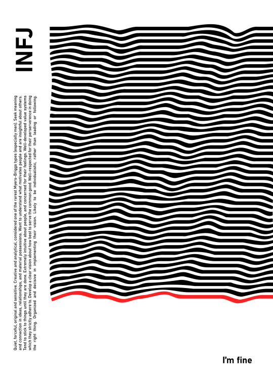


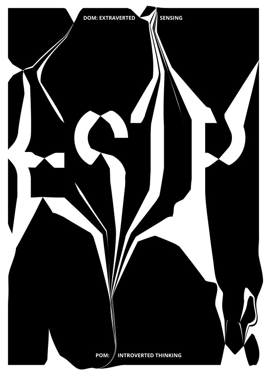
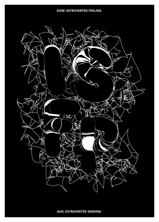
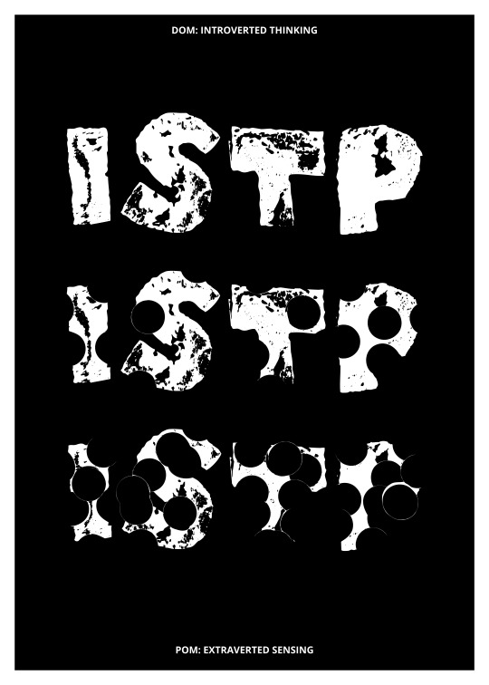
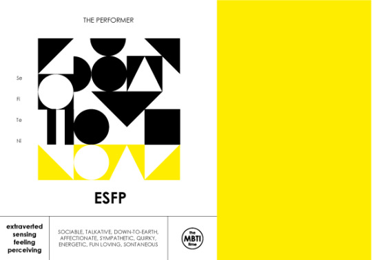
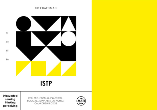
MBTI typography posters
16 typographic posters depicting 16 personality types. Each of them contains a description of a given type and a composition showing its dynamics. The most important part of each of them is the "statement" – a short sentence, word or set of words that the author heard in real life from a given personality type, read as an online comment, and which seemed typical and characteristic of a given personality.
#jstawowy#mbti#art#personality#graphic#psychology#typography#design#intj#myers briggs#entj#posters#poster art#poster design#graphic design#mbti posters#infp#infj#basic colors#typography poster
32 notes
·
View notes
Text

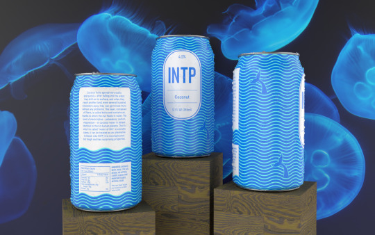
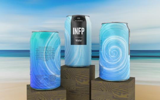

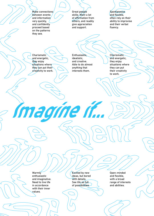
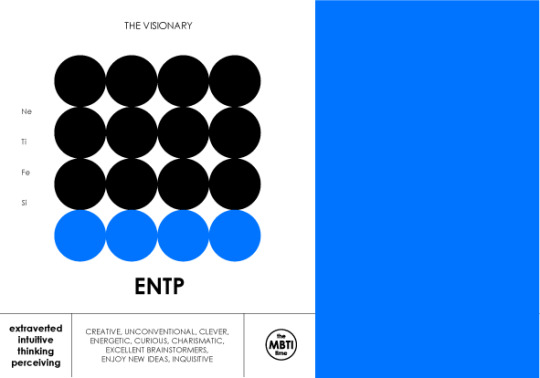
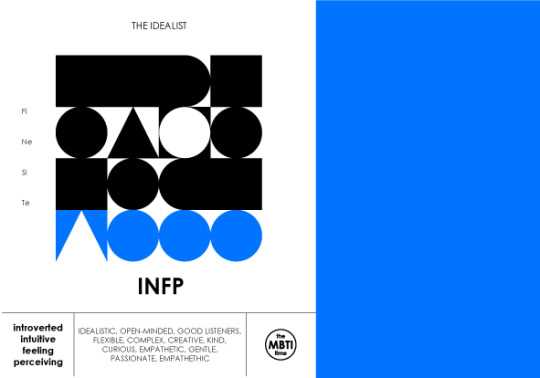
NP types
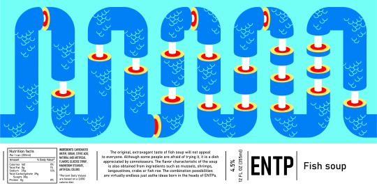
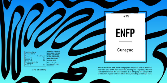
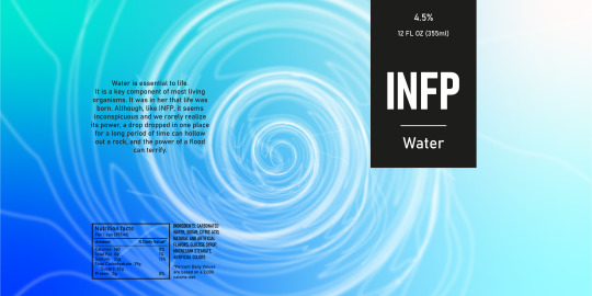
NP types are imaginative and creative, always open to new experiences. Just like water, they are able to take the shape of the vessel in which it is placed, the malleable minds of these types are able to adapt to any situation. Visionary and talkative ENTPs are innovative and spontaneous, taciturn INTPs surprise with their witty humor and unconventional approach to life, imaginative and intense like the dark ocean waters with various species of animals INFPs impress with their courage and playful and enthusiastic ENFPs combine extensive skills with fun.
Deep blues, cyan and white – these are the colors that correspond to the intuitive, spontaneous nature of these types. The cloudless sky and the endless blue of the ocean below, the harsh summer sun, lagoons and atolls, sandy beaches, watery jellyfish, underwater life on coral reefs – these are what I associate with NP types.
Element: water
#jstawowy#mbti#art#design#graphic#graphic design#myers briggs#personality#psychology#infp#intp#entp#enfp#water#ocean#product design#projektowanie graficzne#label design#sea
18 notes
·
View notes
Text
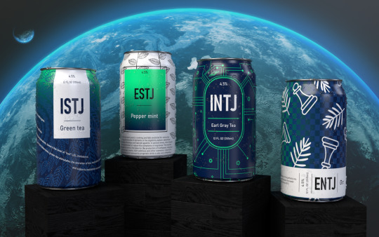


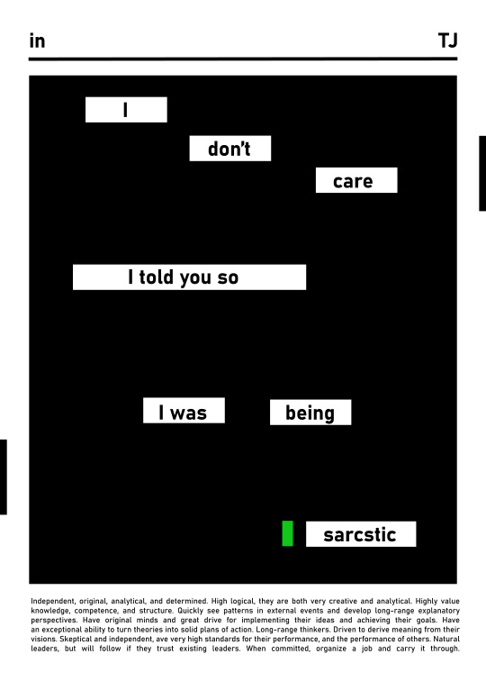
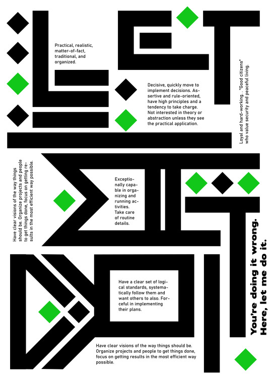
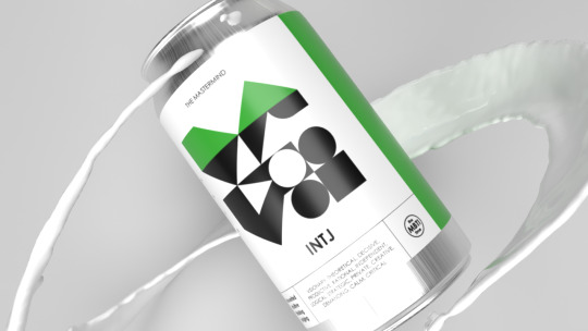
TJ types
TJ types are disciplined and rational, favoring logic and reason above all else. Ambitious ENTJs make great leaders, analytical and ingenious INTJs can improve everything they meet, focused on details and honorable ISTJs excel in activities that require meticulousness and patience and efficient ESTJs can solve any pragmatic or scientific problem. Although they do not always arouse sympathy among other types, they are the main guardians of order – without them the world would plunge into chaos.
Dark, cold colors are heavy and refreshing at the same time. While cool as the crackling polar frost, the TJ types can also be as beautiful as the Northern Lights. The starry night sky and snow-capped mountain peaks beneath it, snow caps on the trees, foggy forests, vegetation covered with drops of water with its characteristic smell right after the rain, the polar night – this is something that reminds me of TJ types.
Element: earth
#jstawowy#mbti#design#art#psychology#personality#graphic#myers briggs#graphic design#intj#estj#entj#istj#entj aesthetic#mbti personalities#label design#packaging#dark#earth
10 notes
·
View notes
Text
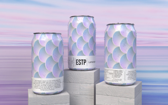
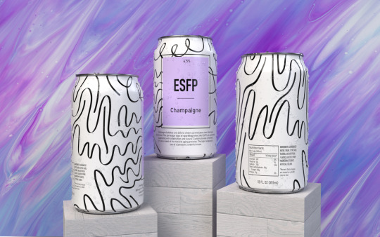
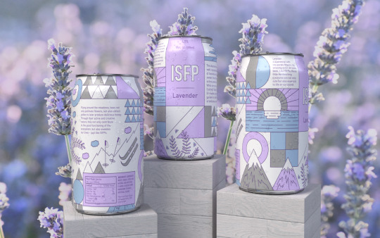
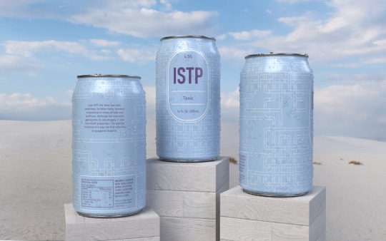

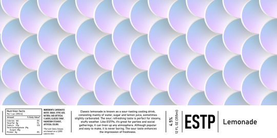

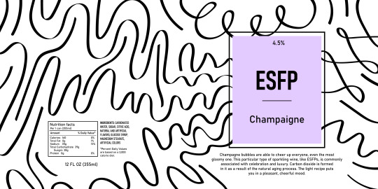

SP types can design
SP types are creative and go-getting, focused on the world of the senses. With ruthless and courageous ESTPs it is impossible to get bored, reticent and composed ISTPs can keep a cool head even in stressful situations, creative ISFPs always go their own way and bold ESFPs become the soul of every company they find themselves in. As a rule, they are characterized by great awareness of their own body and appearance, unobtrusive personal charm and freedom, which is why they have extensive interests related to physical activity and a great sense of aesthetics. They are no strangers to the desire to explore the world and the need for adrenaline.
Pastel colors – lavender purples, pale blues and bright roses in cool tones seem to perfectly reflect their crisp, bringing a lot of liveliness character. Sour as lemonade, bitter as tonic, crisp as lavender, spicy as champagne with sparkling bubbles of SP's stimulate to action. Wood painted with white paint, bunches of lavender, a breath of fresh air – sea breeze or a clear winter morning, shallow waters and white sand, iridescent pink clouds during sunrise reflecting in the sea, snow sparkling in the pink sunrise like glitter – it all reminds me of SP types.
Element: wind
#jstawowy#mbti#design#psychology#personality#graphic#myers briggs#graphic design#art#istp#estp#isfp aesthetic#isfp#esfp#mbti personality types#can design#etiquette
16 notes
·
View notes
Text
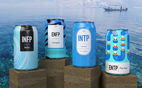
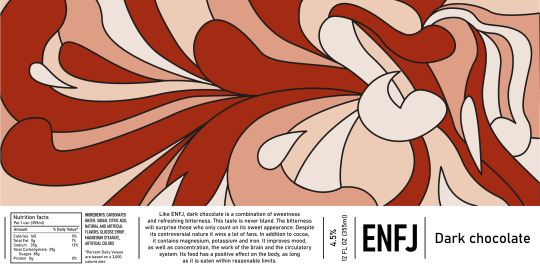
Can design
Limited edition beverage can design. The cans have been designed so that each of them best reflects the aura of one of the sixteen personality types according to the MBTI theory. A given drink's taste also corresponds to the general impression that a particular personality type evokes.
Personality types have been divided into four groups. The selection criterion was the extroverted cognitive function (dominant or auxiliary) – this is what these types mainly use in contact with the outside world, which makes them seem to be somewhat similar to each other. In this way, the following groups were created: SP – Se (extraverted sensing), FJ – Fe (extraverted feeling), TJ – Te (extraverted thinking), Ne – (extraverted intuition).
The flagship color of the SP types is lavender, the FJ types are beige, the TJ types are light green and the NP types are blue. All together they form the entire visible spectrum with a pastel shade, which is intended to indicate that all personality types are equal and equally needed in society. The absence of any of them will upset the balance.


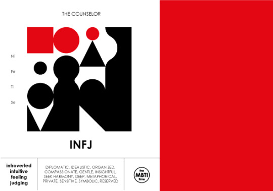
FJ types
FJ types are warm, emotional and focused on the well-being of other people. Widely liked ESFJs are extremely generous and caring, quiet ISFJs impress with the constancy of their feelings, distinguished INFJs dazzle with mystery, elegant ENFJs can boast of great eloquence. They are perfect for professions that require contact with people or charity activities.
The beige-brown-copper aesthetic seems to be a good representation of the warmth emanating from these personalities. Creamy, vanilla, coffee with milk, rusty, red, caramel, biscuit, cherry or chocolate tones are warm and safe. Clay pots, hot sand, fields of wheat blown by the warm wind under a sky covered with storm clouds, the feel of warm rain on the skin, tree bark covered with rusty lichen, rocky ground, dried palm leaves and woven baskets, cozy towns in hot countries with narrow streets and whitewashed walls of houses – all this reminds me of these types.
Element: fire
#jstawowy#design#mbti#personality#art#graphic#can design#product design#advertising#flavor#psychology#graphic design#branding#marketing#myers briggs#esfj#infj#enfj#isfj#computer graphic
10 notes
·
View notes
Text


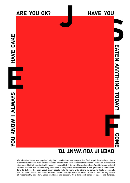
MBTI posters (NJ), 05.2023
A series of 16 typographic posters is a reflection on how our perception of a message depends on the way it is expressed and how the perception of things is influenced by their surroundings.
As Marshall McLuhan said: "The medium is a message." Although we often don't realize it, a letter can arouse various emotions in us, just like personality types. In both cases, it's also important what company they are in. Each poster, just like each personality, has its own unique aura. A subdued, calm ISTJ poster will stand out from the dynamic ESTP, ESFP and ESTJ posters. ESTP, ESFP and ESTJ arranged next to each other, will blend into each other, but contrasted with for example ESFJ, INFP or INTJ they all form a harmonious whole.
It's fascinating how all personality types are complementary to each other. There is no better or worse, prettier or uglier. Each of them is unique in its own way and needed to balance the others. Society is like a large organism in which maintained homeostasis determines health. Each type has different skills and talents, which enrich the organism. In this organism diversity is an advantage, because it allows us to see the problems from different perspectives and thus solve them efficently.
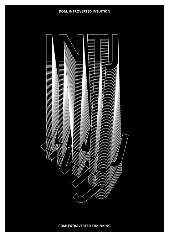
ENTJ
Large, angular letters are expressive and intrusive, although contrary to appearances, they don't show their entire nature at first (the inscription is not easy to read, you have to guess). The composition is dynamic but organized. White is a cunning color – depending on the culture in which it occurs, it’s either a symbol of purity or mourning. ENTJ is specific and determined. It doesn't seem to have any doubts, and even if he does, its Te makes up its mind quickly and cuts off any hesitation.
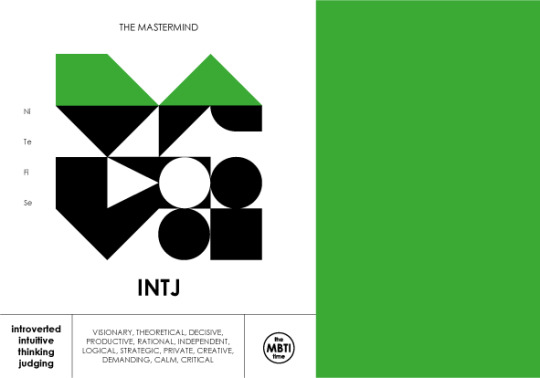
INTJ
The mountain of superimposed letters symbolizes the multi-level personality of the INTJ and its depth. The top is aesthetic and easy to read, but in fact it's only a small part of the whole. The further you go, the more unobvious and surprising the personality is. At the deepest levels, paradoxically, sometimes even the INTJ itself doesn't know what's going on. Sometimes it gets lost in its own thoughts.
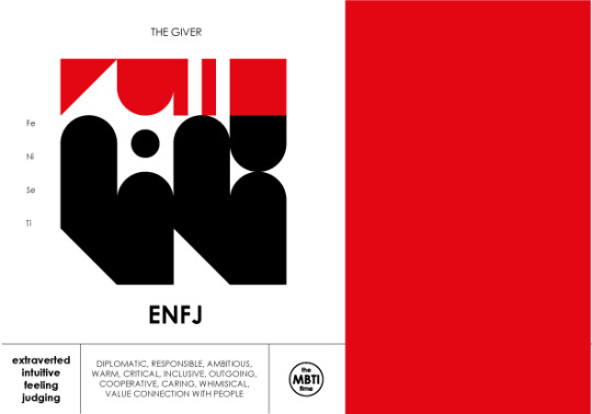
ENFJ
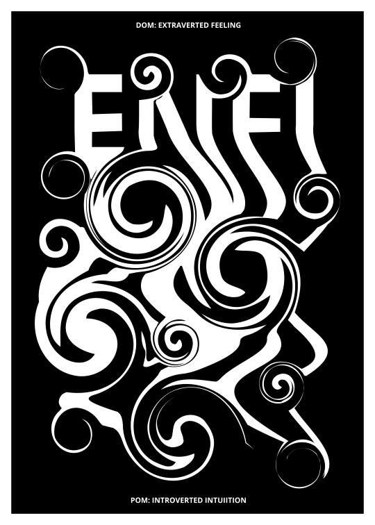
White, as in the case of ENTJ, is a symbol of cunning (perhaps even manipulation at times?). The inscription is large, easy to read. On the one hand whirls symbolize emotions and feelings, which – by their very nature – are unpredictable and fluid, on the other hand, that focused on receiving and processing emotions of other people ENFJ sometimes paradoxically gets lost in its own emotions.
INFJ
The INFJ poster is the most sophisticated of this group (NJ). The lines behind the letters are the finest, indicating the delicacy, eloquence and elegance of this type of personality. There are also rounded spaces – whirls – but they're softer than ENFJ's. Like INTJ, the letters seem to have layers indicating a similarity of these types in terms of depth – here they fade into the black background. Sometimes INFJ gets lost in its own emotions and logic.
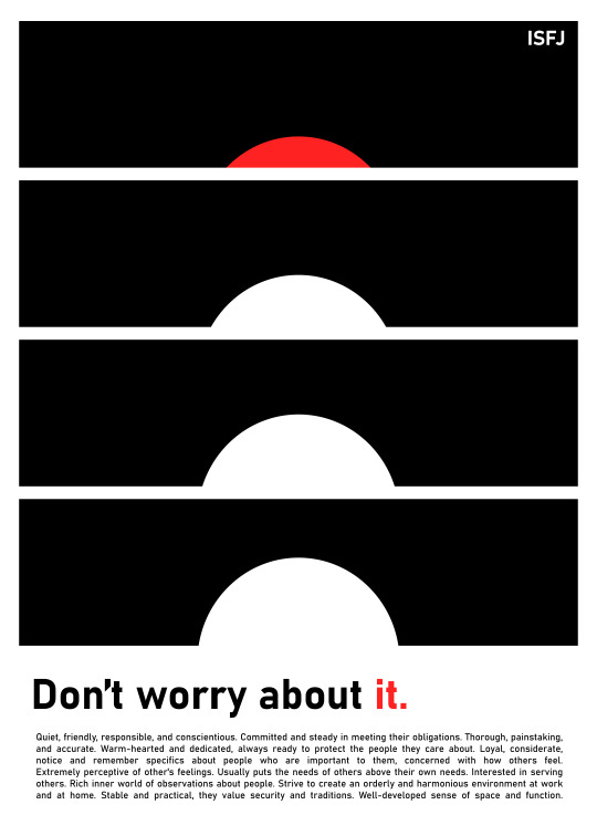
ISFJ
The ISFJ poster font is fancy and rounded, indicating the emotion-centric nature of this personality. They resemble handwriting, nice calligraphy, which refers to the Si function. The deeper you go into the text, the more letters blur. This illustrates that ISFJs may appear calm, level-headed, and kind at first glance, but internally, like everyone else, they have their dark side and difficulties - like INFJs, they often struggle with their own emotions, feelings of rejection and jealousy.��
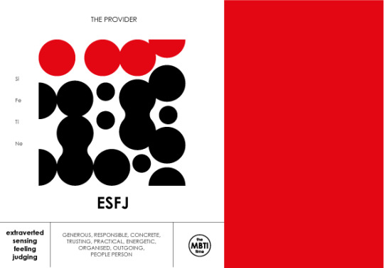
ESFJ
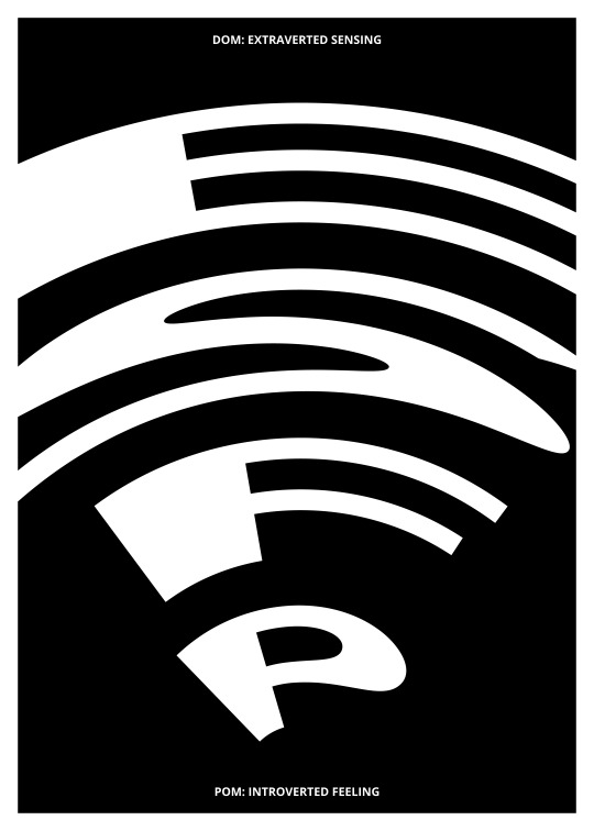
Despite the extroverted nature of the ESFJ, it was portrayed using very sparing, even minimalist means. This is the type focused on relationships with other people. He is generous towards others and loud, but at the same time he has a great sense of aesthetics and a tendency to harmonize the emotions of the group. The ESFJ tries to match other people’s moods, supporting them even at the cost of their own emotions, which is reflected in the deformation of letters that are not easy to read on the first try.
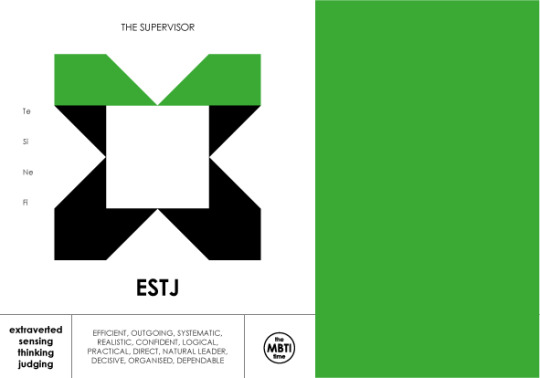
ESTJ
The ESTJ poster is noisy and clear, the letters are easy to read, indicating the type’s straightforwardness. It’s dynamic and slightly deformed at the same time. The deformation is a reminiscent of an electric arc, which is both dangerous in its power and fascinating. This illustrates, on the one hand, the strange, warped conclusions that ESTJs sometimes come to (which, through Te, are put into action instead of being reconsidered), and on the other hand, that despite being perceived as determined and harsh, the ESTJ is also fascinating and harismatic.
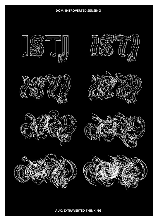
ISTJ
The ISTJ poster shows the stages, it’s a record of a process. It points out that an ISTJ appears orderly and organized, but it also has hidden emotions and insecurities. It doesn’t show them to other people. Also, over time, an ISTJ gains a life experience that it never forgets. It writes them down in its head in detail, like a technical drawing, trying to draw conclusions from it, but despite that it sometimes has unresolved traumas.
#mbti#jstawowy#joanna stawowy#poster#posters#plakat#mbti poster#entj#intj#art#sztuka#graphic#black and white#personality#psychology#graphic design#design#istj#isfj#esfj#enfj#estj#typography#typografia
11 notes
·
View notes
Photo
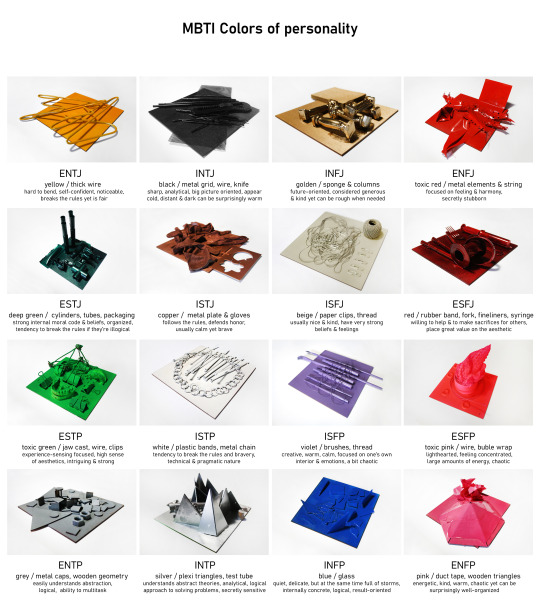
Colors of personality, 03.2023
A series of 16 spray-painted paintings on a 20 x 20 cm board, each of them contains different artifacts symbolizing a given type of personality according to MBTI theory. Although we rarely think about it and take it for granted as part of the scenery of our lives, colors aren't neutral at all. They have a number of cultural meanings, the symbolism of colors was used in painting to express hidden messages, and most importantly, the colors we surround ourselves with affect our mood. Usually, we don't care why some colors feel peacefull, while others feel annoying. Subconsciously, we lean towards certain of them, not being able to say what lays behind our choices. The same applies to personality – in everyday life, hardly anyone reflects on why people behave in a certain way. We don't care why some of us are more alike than others. We often don't understand why we like some people and others annoy us. We're used to attribute the negative features to those, who seems irritating to us, not understanding that usually our assessment is purely subjective and results from a mismatch in terms of the way we consume energy, collect information about the world, make decisions or organize environment. Knowing how our mind works can help us choose our surroundings more consciously, as well as build understanding and empathy towards the world around us. The work can be presented in its entirety, but also in parts, consisting of several objects.
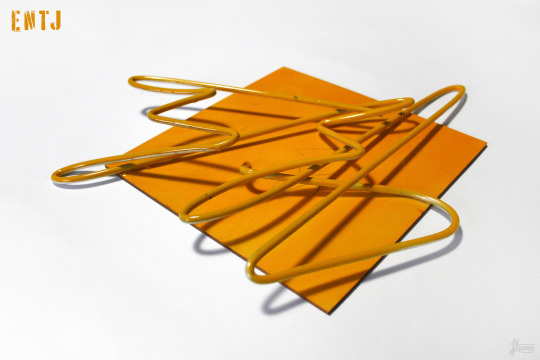
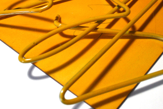
ENTJ (Te Ni Se Fi)
The ultra-minimalist composition composed only of wire symbolizes the strong, combative personality of ENTJ, equipped with strong convictions. The wire used in the artwork is the thickest of the metal elements of the series, impossible to bend with bare hands, just like ENTJs seem to be impossible to bend only with the help of other people's mental or physical strength – sophisticated shapes were given to it with a bender. The lack of breaks in the continuity of the wire, its holistic character indicates the specific character of ENTJs, who usually go through life witha a clearly marked out by themselves path, regardless of other people's assessments. Chaotic bends symbolize difficulties in expressing one's own emotions and, sometimes, also understanding other people's emotions, rationalizing feelings. Due to the fact that yellow is usually well noticeable, it's perfect to draw the attention of anyone nearby (a warning color both in nature and in urban space – warning road signs, reflective vests). It's the color of self-confident, brave people, the color that stimulates the brain and improves memory. On the other hand, it's also identified with mental disorders and madness, as well as jealousy. Yellow color is usually associated positively, but its excess in the environment can cause discomfort in some people.
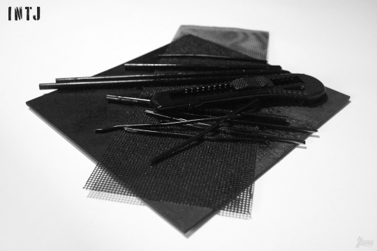

INTJ (Ni Te Fi Se)
The minimalist composition consists of only two diagonal directions - the grid lying at the very bottom indicates one of them, pieces of wire and knife the other. Despite this rather radical simplification, the pieces of wire are not arranged with exaggerated precision, they lie as if they were scattered rather than arranged, which indicates a concentration of this type of personality on principles, not details - despite their highly organized nature (J), INTJs like see the world from a broader perspective, sometimes they deliberately ignore details to follow a larger, fixed path (Ni). The metal mesh is a reference to the organized mental structure of this type of personality, the creation of a systematized network of connections between data collected from the environment (Ni), a passion for arranging things and creating minimalist, but aesthetically coherent compositions (Te). The plastic knife symbolizes the precision of the cut and the sharpness of the thoughts and words of INTJs, who are known for their sarcastic, sharp tongue. In combination with the wire cut into pieces, the knife shows an analytical, willing to cut/break down problems into smaller pieces in order to see the situation from all sides and propose an objective, holistic solution (Ni-Te). The combination of a knife and pieces of wire can also bring to mind the INTJ's often inconspicuous appearance and their stubbornness – could such an inconspicuous tool as a plastic knife be able to cut a metal wire with the right strength and motivation? Black and white have opposite cultural meanings – although both are perceived as elegant, they are also associated with the symbolism of death (in Western culture black is the funeral color, in Eastern culture it is white). Black can be warm or cold depending on the environment in which it is found, just as INTJs, who usually appear cold, distant and dark, become warm and caring to a small group of people who are really important to them.

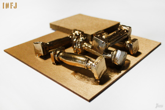
INFJ (Ni Fe Ti Se)
A minimalist artwork, composed of two types of elements (J) – an abrasive sponge and five antique columns, each of a different order (Doric, Corinthian, Ionic, Tuscan, Composite). The columns symbolize respect for history, traditions and human rituals (Fe) – despite their future-oriented (N) and introverted nature (I), INFJs often perform most of the minor everyday rituals established by the culture in which they are brought up, fitting in with the group to which they belong (Fe). Additional value is added by the fact that the columns are handmade, from clay – on the one hand, it is a reference to the INFJ’s respect for human work, on the other hand, it symbolizes the effort they put into the commitments they undertake, regardless of whether they concern their career or relationships with other people. At the same time, the abrasive sponge indicates a secretly hardy and rough character of this type – INFJs are considered generous and kind, but they are not weak and do not bend to every request or coercion; they can be rough when needed. The sponge also symbolizes the logic behind the INFJ’s behavior, their tendency to coolly analyze the facts (Ti), despite making decisions mainly based on feeling (Fe). Gold is synonymous with nobility and wealth, and in the case of INFJ also generosity to others (Fe). It’s also the color of royalty, associated with power and wealth. It can be associated with hedonism (Se).


ENFJ (Fe Ni Se Ti)
The dynamic composition, composed of metal elements connected with a string into elements that are incomprehensible, but having a certain code, is intended to illustrate the complicated process of ENFJ’s reasoning (Fe Ni). Sharp edges refer to the sharpness of thinking, but also to hidden stubbornness. Circles cut in metal, similarly spaced apart, refer to the need to control the environment and create it according to one’s own will, in a way that would be good for the group (Fe Se). It also indicates precision (Ti). Red is the color of strong emotions, whether love or anger, or hate, which refers to focusing on feelings and making decisions based on them (Fe). It’s also the color of blood, which is intended to symbolize the surprising stubbornness and toughness of the usually perceived as nice and soft ENFJ.

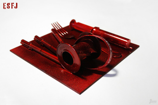
ESFJ (Fe Si Ne Ti)
The presence of a fork symbolizes generosity. A syringe and a bandage for dressings, identified with the health service, mean a willingness to help and a willingness to make sacrifices for others, on the rubber band stuck around it is written “it’s nice to help”. The fineliners refer to the surprisingly frequent artistic abilities of ESFJs, who usually place great value on the aesthetic qualities of things and have good taste. Red is the color of blood, passion and strong emotions, in the case of ESFJ it is a warm, metallic red, which is intended to emphasize the nature of this type ready to sacrifice for others at the expense of yourself. Blood may be a reference to one of the four personality types according to Hippocrates, the sanguine that seems to be most common among cheerful, extroverted ESFJs. Also metallic red is a warm color, opposite to ESTJ’s green.
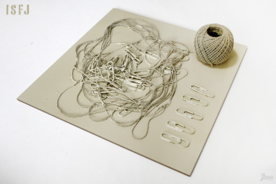
ISFJ (Si Fe Ti Ne)
The thread appears in two forms: in the center of the composition it’s chaotic and unraveled, in its corner the thread is arranged, rolled into a skein, which refers to the emotional, feeling-focused nature of ISFJ and acting according to what one feels (F/Fe). Paper clips thrown into the threadlike space symbolize clumps of metal that are hard to swallow for those who consider the ISFJ being week – because Fe is a function called by Jung rational (meaning that it not only perceives reality, but also evaluates it, submits it to judgment) usually nice and kind ISFJs can get their way and have very strong, unbreakable beliefs about a given topic, which they aren’t usually associated with. The paper clips arranged in one line in the corner of the composition symbolize order and a tendency to like routine, ease of finding oneself in situations and places that are hierarchical. Light beige is pleasing to the eye. It’s also a great base for other color accents, due to its delicacy and neutrality, it fits most colors.


ISTJ (Si Te Fi Ne)
The sparing composition, composed only of a metal plate and a few gloves, indicates a tendency to simplify and catalog information, to create clear divisions that don't take into account intermediate situations (Te). The gloves intertwined in a chaotic pose refer to the distance in interpersonal contacts and difficulties in opening up to other people (Fi), while following the usual etiquette, such as shaking hands or using polite expressions (Si) – the glove separates the hand from the hand of another person, it's also a symbol of elegance and many situations related to history/culture. In the early Middle Ages, gloves became part of the coronation and liturgical attire of kings and bishops, began to be considered a symbol of dignity and power. Throwing the glove is provoking someone to react, fight, compete, polemic – ISTJs who value peace (I) rarely enter into open confrontations, but they are never afraid of them, and when someone offends their internal value system (Fi) they're able to challenge him to a duel, defending their honor (or someone important to them) and knightly dignity. A metal plaque with cut-out symbols of the largest religious systems and atheism indicates the great respect that ISTJs have for tradition, and at the same time the difficulty of breaking away from them and the frequent reluctance to change the existing paradigms (Si). At the same time, copper, as a metal characterized by high plasticity and the only metal that is covered with verdigris (patina) over time, symbolizes that the seemingly unchanging, fierce in its views ISTJ also sometimes changes over time, especially if he sees logical explanations for change and novelty (Te).

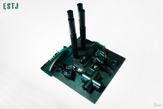
ESTJ (Te Si Ne Fi)
Most of the elements of the composition are well organized, the whole space is filled, the composition seems to be static except for the element extending beyond the edge, which (as well as the crushed, quite chaotic in that organized composition tubes of glue) symbolizes the ESTJ’s tendency to break the rules, if ESTJ believes they are illogical and stupid. Tall, cylindrical elements refer to the multi-level nature of ESTJs, usually paradoxically portrayed as shallow and bossy – lying in fourth place Fi makes ESTJ people with a strong internal moral code and beliefs, who will do anything to fulfill their duties. Also despite a strong Te and leadership tendencies they’re also strongly connected with people whom they respect, their loved ones and willing to sacrifice a lot for them. Deep green is a natural, eye-friendly color that provides peace and a sense of comfort – the gigantic organizational skills of ESTJs provide their loved ones with a sense of security, being well taken care of, they are also salutary in the workspace. When they’re too high, ESTJ can stress people around them, but when they’re optimal, ESTJs bring to the space they find themselves in invigorating and necessary order.
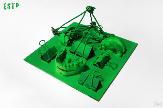
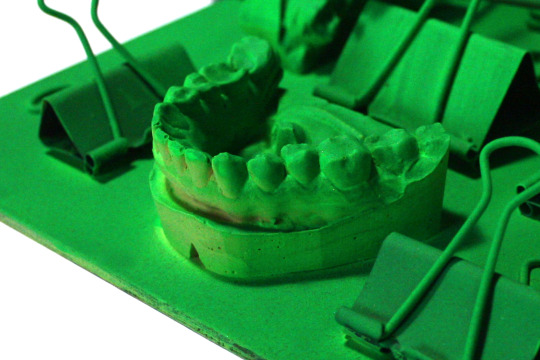
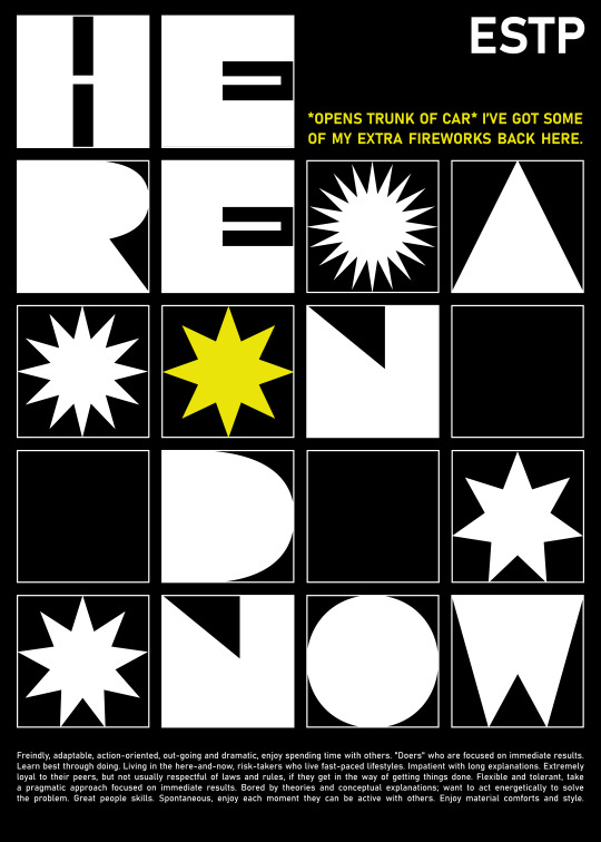
ESTP (Se Ti Fe Ni)
The artwork is composed of depicting, realistic elements (S). The jaw cast pieces symbolize the five human senses, thus referring to the highly experience-focused nature of ESTP (Se). The detail of the casts indicates the ability to notice changes in reality that are elusive for other personality types – ESTP will easily notice subtle changes in the expression of the interlocutor's face or a changes in the interior design. Seemingly trivial office clips (because they are sometimes used by students of the art department to hold large sheets of paper to boards, and in their original purpose they are used, among others, to organize office work by fastening segregated documents together) symbolize a high sense of aesthetics which, although not usually associated with ESTP, often accompanies this type of personality. The arranged structure (T/Ti) is disturbed by an abstract metal element resembling a section of a network of connections, some incomprehensible structure (N/Ni). Bright green has an paradoxical meaning – in nature, bright colors serve to deter potential predators, inform about the venomousness of the individual equipped with them, while green itself is perceived as a soothing color, associated with life-giving vegetation. The shade of fluorescent green seems to not exist in nature, to be artificial and unnatural – at the same time it is intriguing and emanates with strength. Despite its apparent unnaturalness, green of this type occurs in nature in the form of, for example, uranium compounds or bioluminescence (which gives ESTP in this approach only additional, interesting meanings).

ISTP (Ti Se Ni Fe)
The minimalist composition symbolizes the sparing nature of ISTPs, for whom actions are usually more important than talking about emotions. The circular arrangement of the chain is interrupted by straight lines of plastic bands, indicating a tendency to break the rules and bravery (or sometimes recklesness). The chain and plastic bands refer to the ease of analyzing and solving problems of a technical and pragmatic nature. The materials they are made of refer to hardness and logic. White is the color of purity in Western culture, but in the East it is also a funeral color, which is intended to symbolize the dualistic nature of the ISTP.

ISFP (Fi Se Ni Te)
Chisels and brushes refer to creative, non-standard solutions that generate ISFP (Ni Te). Their arrangement symbolizes a good aesthetic sense and attention to the appearance of things (Se). A soft tangle of threads thrown chaotically on top deliberately disturbs the arrangement, introducing features that escape control. In this way, he refers to the nature of ISFP focused on one’s own interior and emotions (Fi). Violet stimulates the imagination and creativity. It is also the color of the monarchy, the most difficult to obtain by natural methods, and therefore the most expensive. Light purple is often used in beauty products because of the calmness and sense of harmony it brings.
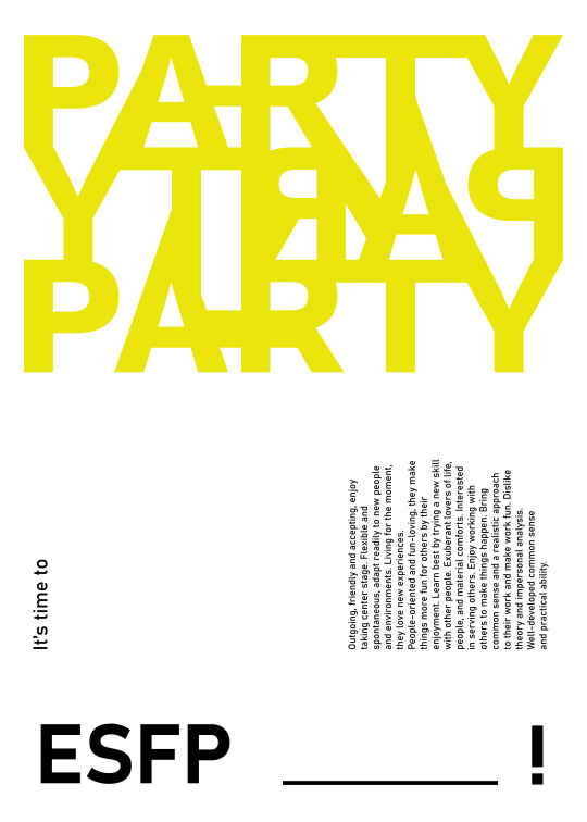
ESFP (Se Fi Te Ni)
The central arrangement of elements refers to the recognizable character of ESFP that brings a lot of movement to any environment. Chaotically arranged, small, round elements around the dominant suggest a tendency to disorganization (P). Bubble wrap is a symbol of fun and lightheartedness. A metal rod bent into a circle refers to the ability to logically analyze problems and solve them in a concrete way, which, although not identified with ESFP, lie dormant inside them (Te). Unnatural, bright, neon pink symbolizes the large amounts of energy. The choice of a warm color (opposite to ESTP) indicates concentration on emotions and feelings, and making decisions based on them (Fi).


ENFP (Ne Fi Te Si)
The asymmetric, diagonal, border-crossing composition symbolizes originality, originality, sympathy for novelty (N/Ne). Chaotically folded duct tape is a symbol of lack of organization, doing things at the last minute, which sometimes happens to ENFPs (P). At the same time, this element doesn’t dominate the composition, because despite the chaotic nature, ENFPs are conscientious people, who fulfill their duties very well. A large, triangular building composed of wooden elements, the dominant feature, is a reference to generating a large number of abstract ideas (Ne). Pink is an energetic and warm color, which is identified with love, trust and hope (F/Fi).
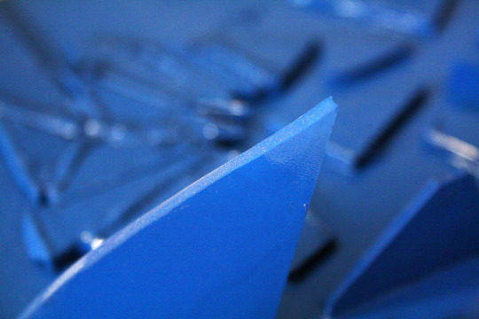
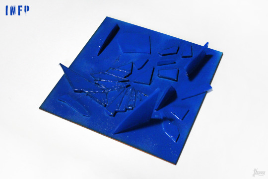
INFP (Fi Ne Si Te)
The composition, made of glass and partly demolished, indicates the quiet, but at the same time full of storms and storms nature of the INFP (I). The glass is delicate, it is easy to break, which symbolizes sensitivity to the world and other people (F/Fi). At the same time, broken pieces can be used to build something beautiful, which in turn refers to creativity and the ease of generating abstract ideas (N/Ne). Broken glass forms sharp edges that are sometimes easy to cut, as does the internally concrete, logical, result-oriented mind of the INFP (Y/Th). Blue is the color of peace and sadness. It is soothing and natural, pleasant to the eye (blue sea, ocean, sky), and staying in it reduces stress.
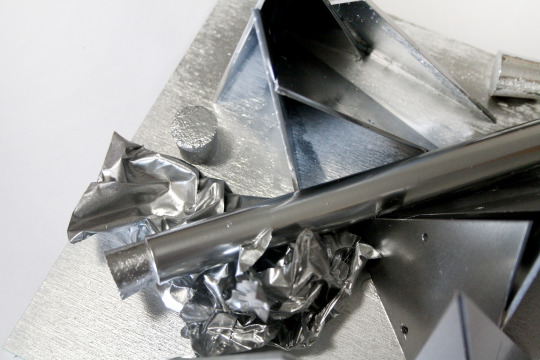
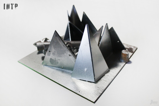
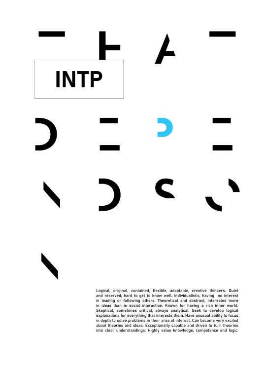
INTP (Ti Ne Si Fe)
Structures built of seemingly disorganized, triangular shapes symbolize sympathy and ease of understanding abstract concepts and theories. The test tube in the center of the composition is a symbol of an analytical, logical approach to solving problems (Ti), as is the silver color, which is associated with metal and also with coolness. The silver foil appeals to the intrinsically soft, secretly sensitive nature of the INTP.

ENTP (Ne Ti Fe Si)
Geometric figures indicate the nature that likes and easily understands abstraction (N). The chaotic composition is intended to emphasise the dispersal and the ability to multitask (Ne), but the beginnings of a building can be found in it, which alludes to the ease of starting projects and combining seemingly unconnectable elements into structures (Ti). Metal caps symbolize a logical, mentally focused personality, not willing to talk about emotions unless it is their analysis (Ne Ti). Gray is a neutral color, it symbolizes the need for balance and calm without manifesting feelings outside. It’s sometimes the color of hidden emotions, improves communication and means opening to substantive, emotionless discussion.
#jstawowy#joanna stawowy#object#entj#intj#istj#estp#intp#infj#mbti#psychology#psychologia#art#sztuka#painting#malarstwo#personality#osobowość#myers briggs#colors#kolory#colours
18 notes
·
View notes
Photo

Ilustracje medyczne, 01.2023
#jstawowy#joanna stawowy#illustration#medical#medicine#medical illustration#ilustracja#art#sztuka#graphic#grafika#graphic art#human muscles#arm muscles#anatomy#human anatomy#digital#digital art#anatomy art#anatomia
13 notes
·
View notes
Photo
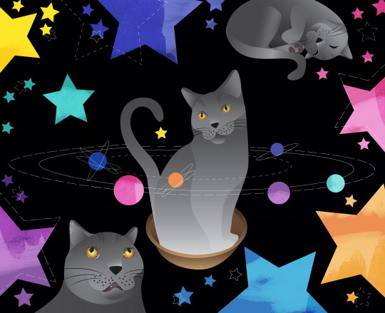
A space cat in a bowl-spaceship
#jstawowy#joanna stawowy#illustration#digital illustration#cat#cat illustration#animal#animals#cats#stars#star#art#sztuka#graphic#digital graphic
1 note
·
View note
Photo
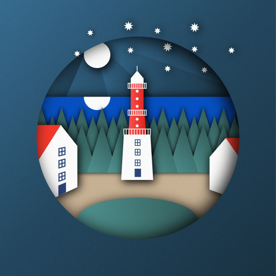
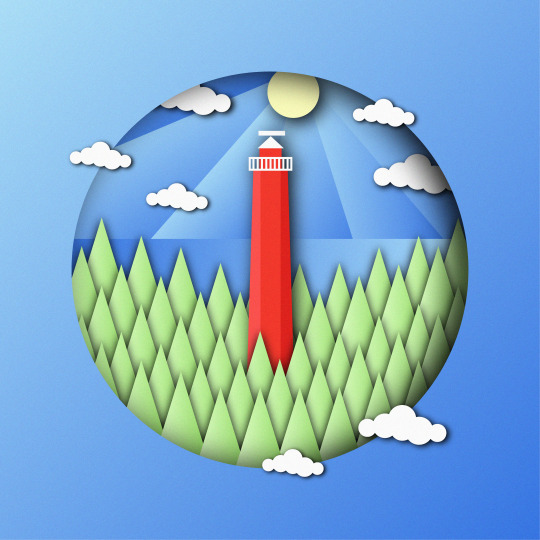


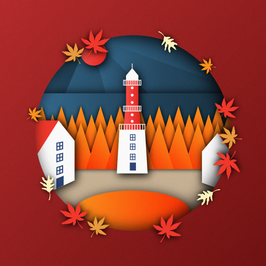


Rozewie & Hel Lighthouses Papercut Illustrations, 12.2022
#jstawowy#joanna stawowy#illustration#digital illustration#papercut#papercut illustration#paper cut#wycinanka#adobe#adobe illustrator#lighthouse#autumn#spring#winter#summer
2 notes
·
View notes
Photo


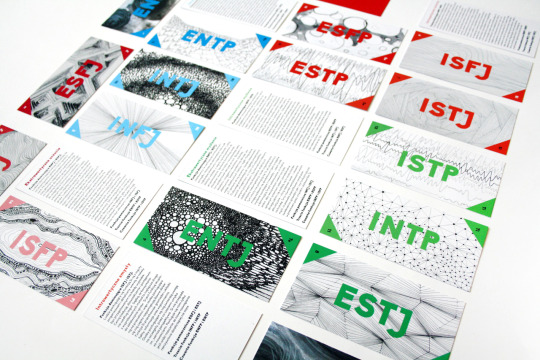

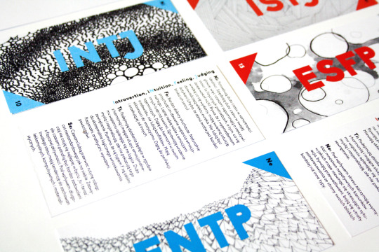

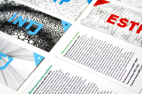
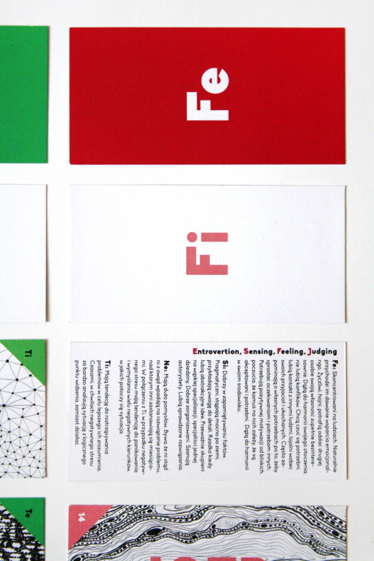
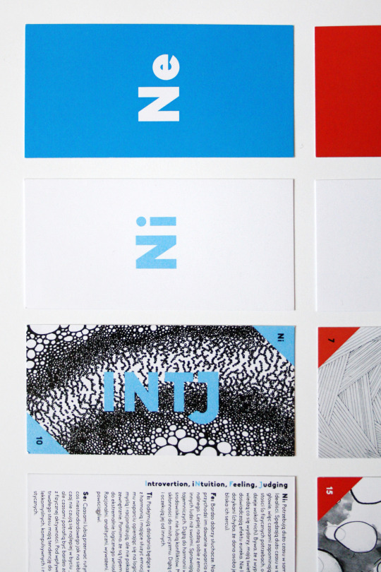
Fiszki MBTI
#jstawowy#joanna stawowy#design#graphic#graphic design#fiszki#flash cards#flashcards#mbti#myers briggs#intj#entj#art#sztuka#infj#intp#entp#psychology#personality#personalities#psychologia
5 notes
·
View notes
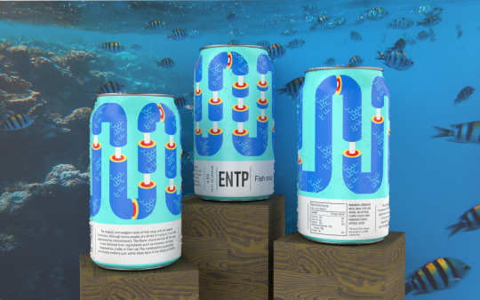
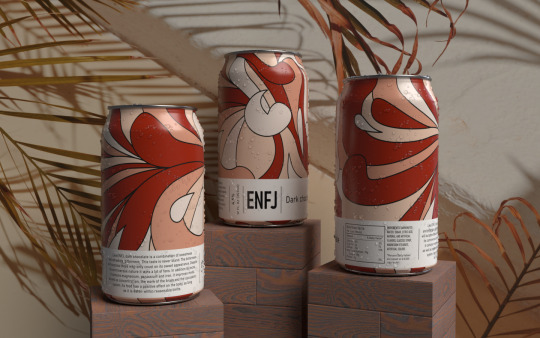
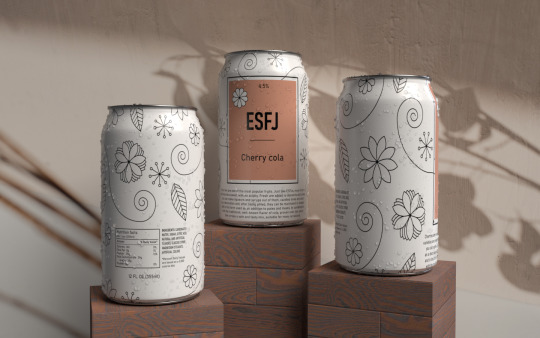
Photo


Puszki MBTI (Przenikanie), 09.2022
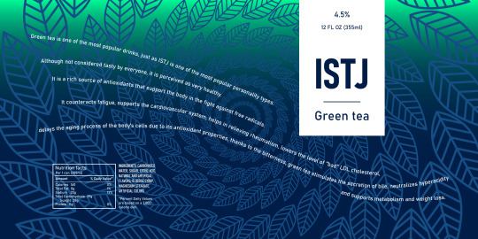
Etykiety typów P
#jstawowy#joanna stawowy#personality#design#dizajn#art design#graphic#grafika#graphic design#computer graphic#code#art code#artist#enfp#mbti#psychologia#personalities#isfp#myers briggs#jung
3 notes
·
View notes
Photo


Puszki MBTI (Przenikanie), 09.2022
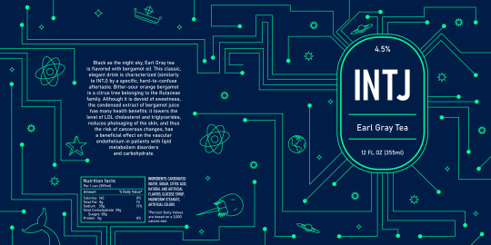
Etykiety typów J
#jstawowy#joanna stawowy#design#personality#personalities#personality type#infj#intj#entj#mbti#red#green#color#shapes#art#geometrical#geometrical art#psychology#psychologia#osobowość#jung theory
5 notes
·
View notes
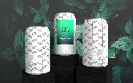
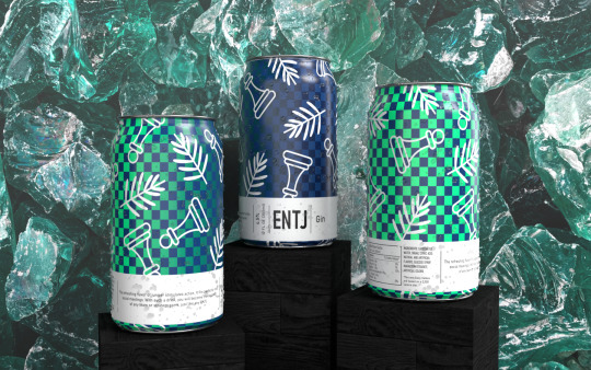
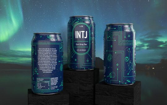
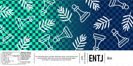
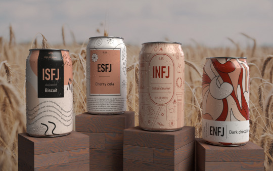
Photo


Puszki MBTI (Przenikanie), 09.2022
Seria puszek prezentująca 16 typów osobowości wg. MBTI. Każda puszka posiada grafikę i kod literowy reprezentujący daną osobowość. Na puszkach naniesiona została również hierarchia funkcji poznawczych oraz słowa-klucze opisujące osobowości.
#jstawowy#joanna stawowy#design#can design#dizajn#mbti#myers briggs#psychology#psychologia#personality#personality types#personalities#personality type#personality psychology#psyche#code#art#sztuka
3 notes
·
View notes
Photo
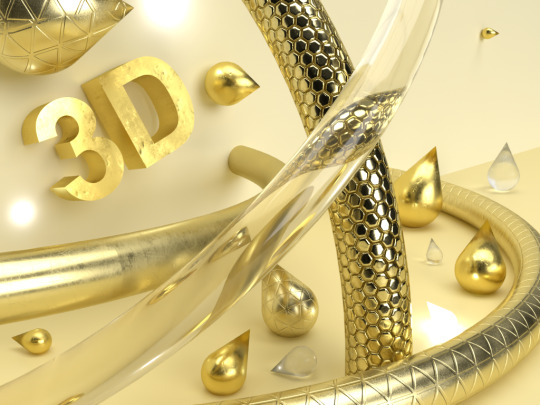
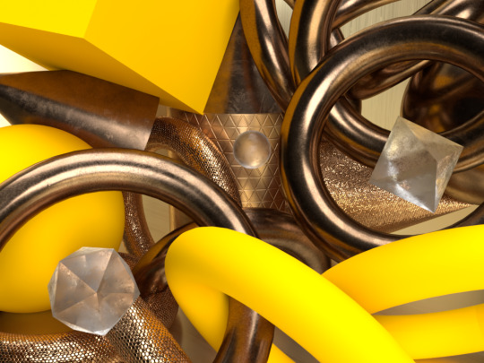
Artificial Composistions
#jstawowy#joanna stawowy#3D#design#dizajn#composition#digital#digital compositions#adobe dimension#adobe#gold#pink#blue#art#sztuka#3D art#3D compositions#crystal
0 notes
Photo

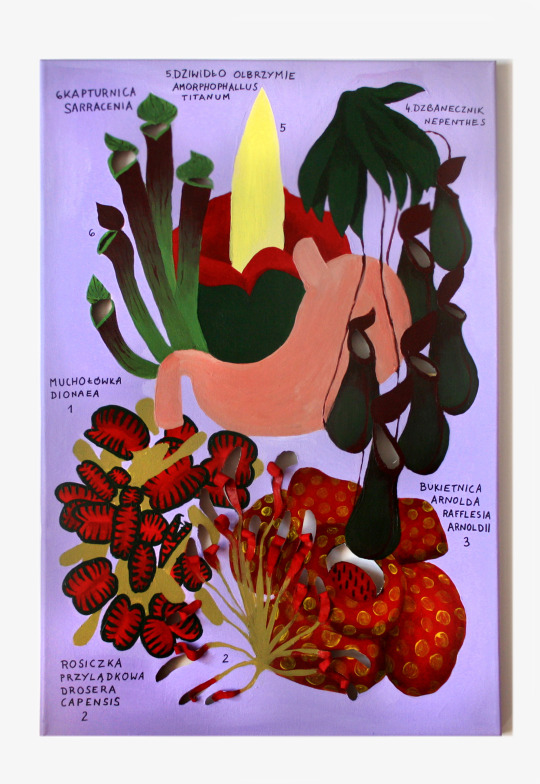
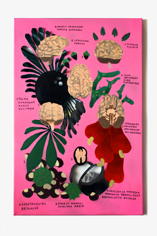

Analogie, 08.2022
Tryptyk bazuje na luźno ujętych podobieństwach między organami w ciele człowieka a narządami roślin/grzybów o podobnej funkcji. Wątroba, ze względu na swoją funkcję filtrującą toksyny, została przedstawiona w otoczeniu grzybów, które są reducentami tj. "oczyszczają" ekosystem z martwej tkanki organicznej, żołądek przedstawiony jest w otoczeniu kwiatów mięsożernych ze względu na obecność soków trawiennych, mózg zaś w otoczeniu orzechów, które nie tylko przypominają jego budowę (orzechy włoskie), ale również ich spożywanie odgrywa kluczową rolę w utrzymaniu zdrowia tego organu.
Nieco naiwny sposób przedstawienia i kolorystyka, a także zrobione markerem podpisy elementów widocznych na obrazach mają za zadanie nawiązywać do dziecięcej/nastoletniej, "szkolnej" stylistyki. Uczniowie szkół wykonują wiele projektów z zakresu sztuk plastycznych (np. w postaci plakatów czy rysunków) na zajęcia niezwiązane ze sztuką np. geografię czy biologię. Co ciekawe, to w zeszytach z tej drugiej zazwyczaj powstaje najwięcej dzieł - tak jakby nauka o naturze i ludzkim ciele w oderwaniu od obrazu była zupełnie nieefektywna. Również podręczniki do tej dyscypliny wyposaża się w wiele interesujących, kolorowych grafik, które przedstawiają procesy biologiczne, anatomię organizmów żywych itd. Bez wzrokowej weryfikacji powyższych zagadnień niezmiernie trudnym byłoby skonstruowanie w umyśle ich wyobrażenia. Ta prawidłowość wykorzystywana jest notabene nie tylko w szkole, ale również np. w nauce medycyny, poprzez korzystanie z bogato ilustrowanych atlasów anatomicznych.
Owo naturalne, wynikające z potrzeb ludzkiego poznania, połączenie sztuki i nauki zostaje jednak zignorowane i niedoceniane w systemie edukacji, który nie tylko nie poświęca czasu teorii sztuki, ale i oddziela ją od nauki grubą kreską sprawiając, że wielu z nas przez całe życie "prawdziwa" sztuka kojarzy się jedynie z obrazami wystawianymi w galeriach sztuki i muzeach. Wszyscy korzystamy z ilustracji, które pomagają nam wyobrazić sobie dane elementy, niekoniecznie jednak traktujemy je jako sztukę sensum stricto, podczas gdy tak naprawdę nauka i sztuka nie tylko płynnie się ze sobą spajają, ale i są obecne wokół nas prawie na każdym kroku. Podziały są umowne, czego dowodzi m.in. dzisiejszy dyskurs o powrocie do traktowania powyższych dyscyplin jako całości a metody badawcze oparte na praktyce (practice-based research) znajdują swoje miejsce na uniwersytetach np. w Szkołach Doktorskich jako równe standardowym metodom naukowym takim jak np. dedukcja, obserwacja, dane statystyczne itd. Seria "Analogie" ma na celu podkreślać potrzebę istnienia wzajemnych relacji pomiędzy nauką a sztuką.
#jstawowy#painting#paintings#medicine#malarstwo#biologia#biology#bio#fungi#grzyby#mashroom#orzechy#nature#natura#school#szkoła#przyroda#art#sztuka#science#nauka
2 notes
·
View notes