
k00259108
Abbie Long
Drawing soft & sapphic art
58 posts
Don't wanna be here? Send us removal request.
Last Seen Blogs

lanicolihe
Untitled
thereykjavikexperience
rach on
yanimayuo
YaniMayuo
lanicolihe
Untitled

virtualkittynacho
Untitled
Text
Project Statement
29/04/2021
My last project was all based around the song Good Old Fashioned Lover Boy by Queen.
For this project I decided to focus on my feelings towards the song and how I always thought about my girlfriend while listening to it, since there’s so little lesbian representation in music as a whole, sometimes I find myself looking for it in unlikely places.
My goal was to get my inspiration across in a way that was obviously sapphic and to represent this kind of relationship dynamic in a way that was romantic and sweet - a far cry from the typical, fetishised view of lesbian relationships in mainstream media.
I really hope I got my initial point across, having my girlfriend and sexuality as inspiration was a really nice experience regardless of the outcome and I do think it helped me grow as an artist.
7 notes
·
View notes
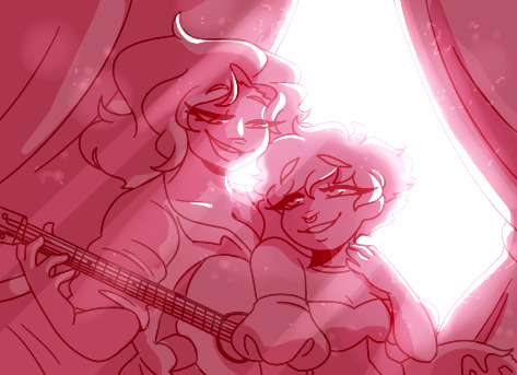
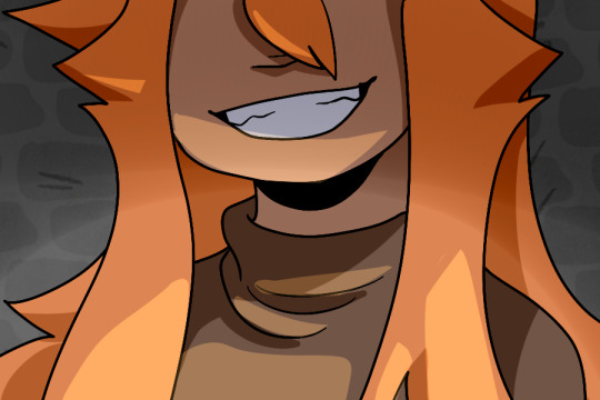
Photo
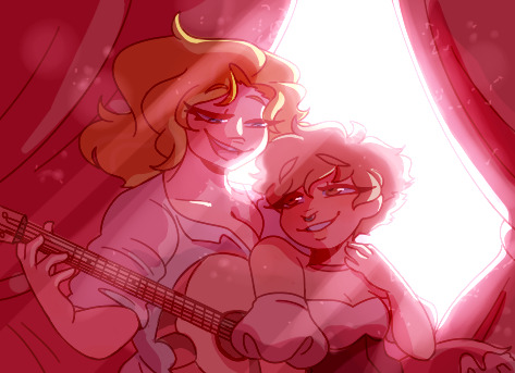
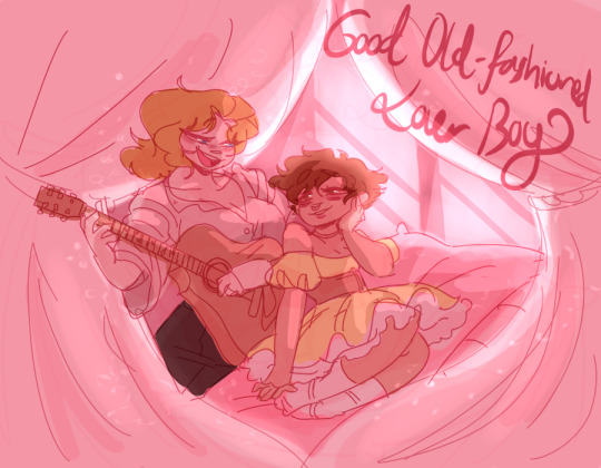
Good Old Fashioned Lover Boy 💕
Aaand here’s the completed piece! I went ahead and added the colours underneath the shadows, you can see the piece without any of the lighting affects below - I’m honestly really happy with this piece, and I’m glad I listened to my professor’s advice
6 notes
·
View notes
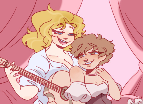
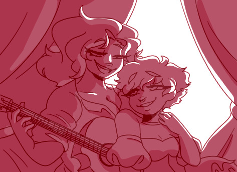
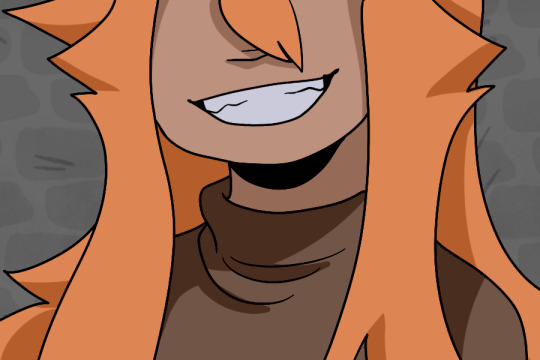
Photo
Good Old Fashioned Lover Boy 💕
Continuing on with the piece I added more to the light source including beams of light and dust particles, this backwards process was really fun! But I think I’m going to add the original colours of the characters underneath, the monochrome look is nice but I think having more variety in the colours would make the piece more visually appealing
2 notes
·
View notes
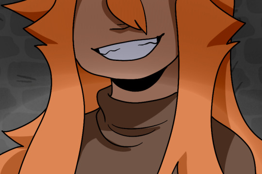
Photo
Good Old Fashioned Lover Boy 💕
Following Paul Gardiner’s advice I decided to work from the darkest to the light to try and really deepen the shadows and contrast of the piece. This advice really worked for me! Although I want to keep pushing it to show more light coming through the window.
I still have a lot to learn in terms of colouring and shading and setting a scene, I’m hoping further on in the animation course to work on these skills and better my art
3 notes
·
View notes
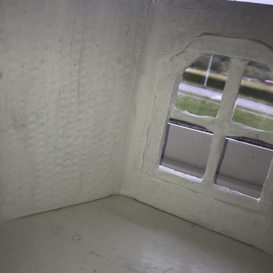
Text
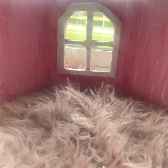
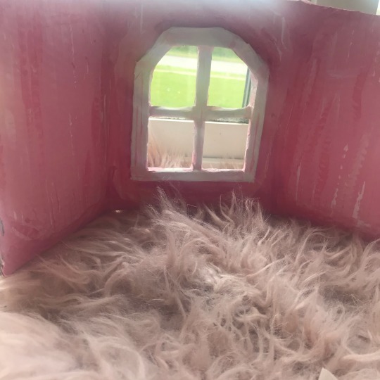
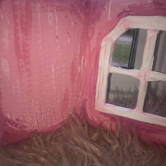
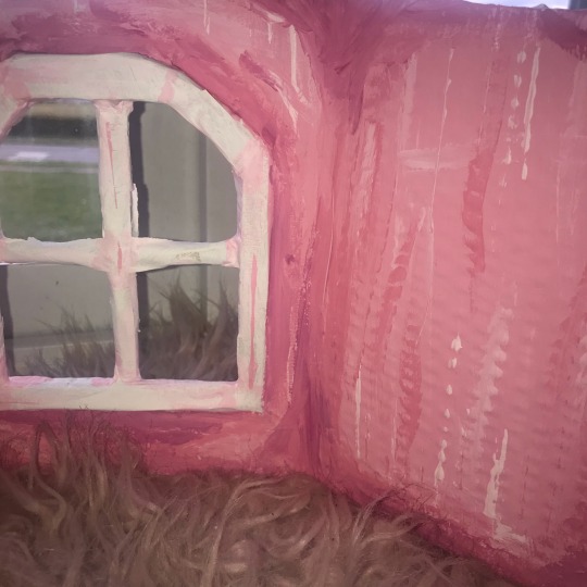
Diorama - complete
I decided to paint the walls pink and deepen the shadows in a kind of stylistic way with darker shades, it’s really a simple scene, just a room with a large window - I do wish I could’ve made something more elaborate, I would’ve loved to include the large cushions and curtains but working at home with no craft stores open means my resources available are sort of limited. I’m still okay with what I made, the overall scene in my original drawing is quite simple regardless so I do think it was adequately executed
3 notes
·
View notes
Photo
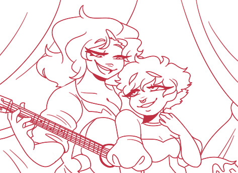
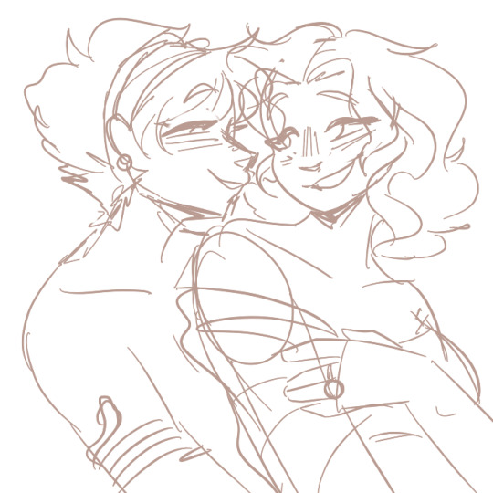
Pose Revision
I did a quick edit of my previous drawing by putting the figures closer together and decided to clean up the drawing and I’m going to work on the lighting and different colour palettes.
2 notes
·
View notes
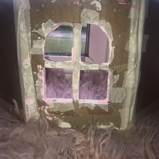
Text


Progress on my Diorama
I started with a cardboard base which I slowly thickened up and smoothed with masking tape and painted white, the scene itself is really simple so I’m hoping to make it mire exciting with a fresh paint job and fabric curtains - I’m excited to have a different light source behind the open window to change up the vibe a bit
1 note
·
View note
Text

Character Sketch
I did a quick traditional sketch of one of the characters singing a line from the song Good Old Fashioned Lover Boy 🧡
I’ve been really loving the image of the rotary phone, I think I definitely want to include that going further
3 notes
·
View notes
Text
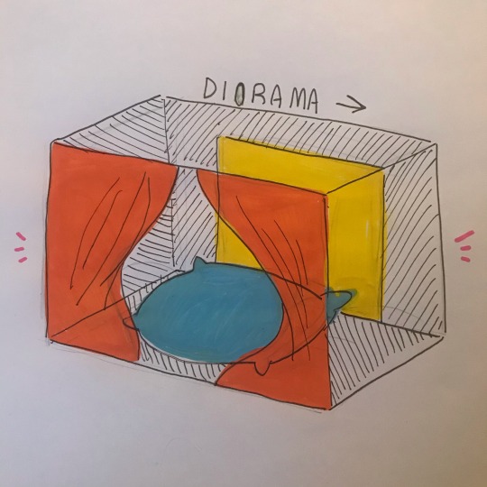
Diorama of the main scene
Paul had recommended to me that I think about the main scene of my project in a more 3D space - so I did a quick mock up, separating each element with a different colour.
I really love having the main light source behind the characters, I’m going to do another mock up of the scene tomorrow
2 notes
·
View notes
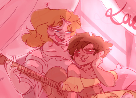
Photo
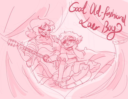
Sketch and Colour Mock-Up
I’m doing a piece inspired by Good Old-Fashioned Lover Boy incorporating some of the ideas from my mind map (serenading, guitars, softness etc.) and I’m really loving it so far! I just want to keep the atmosphere really sweet and calm
9 notes
·
View notes
Photo


Research - Sapphic Paintings no.1
"Dark and Fair" by Tadeusz Styka (ca. 1908)
"According to the prevailing typology of hair colour, a true lesbian was either a brunette or a redhead (red being the epitome of artificiality), and thus golden hair was left to the passive, willing victim. Marthe Barnède, nicknamed Madame Sappho, is 'a stunning brunette, with hair the colour of deep shadow,' while Colette, her young and frail lover, is described as 'a pretty girl with lily-white skin and light blonde hair that crowned her pale ivory forehead with a riotous golden halo.'"
I chose this painting for it’s obvious lesbian subject matter but also because of the ladies having dark and fair hair (Just like me and my girlfriend!)
Seeing the typology of a ‘true lesbian’ having either brown hair or being a redhead made my smile, so I decided to do a sort of re-imagining of the painting in my own style featuring my girlfriend and I! I tried a more lineless style which was difficult but very fun
8 notes
·
View notes
Photo

Good Old-Fashioned Lover Boy - Mind Map
For this part of the semester I chose to be inspired by Queen’s song Gold Old-Fashioned Lover Boy! It really reminds me of my girlfriend and I want to make some really soft and sapphic art inspired by this song - I just jotted down some quick ideas and elements I want to include with my inspired art
I want this to be light-hearted and as lovey dovey as this song makes me feel!
9 notes
·
View notes
Text
Project Statement 25/02/2021
My chosen electives were
Animation
Painting
And sculpture
Since the moment we chose our electives I knew animation was the one I wanted to go into, which is reflected in my tumblr. I know how competitive the course can be, which is why I dedicated almost all of my time to that course.
I was also somewhat frustrated with the sculpture elective, being stuck inside with no art/craft shops open meant I had no access to material that could be used to sculpt with (not the fault of the teachers, but frustrating all the same) so that’s why I didn’t really interact with it at all.
For movement I chose to focus on fire, mainly the contrast between chaos and control. And since I’ve been focused on the animation elective I chose to represent this idea through a personified character (Aika). Although I didn’t have enough time to finish my animation I had so much fun with it, digital art is really my bread and butter - I can only hope I did enough to get selected for the course.
Thanks for coming along with me through this journey, even through the slumps of lack of motivation (I suppose everyone is in the same boat)
3 notes
·
View notes
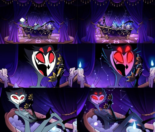
Photo
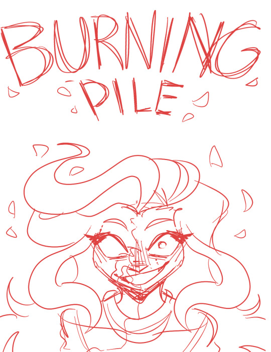


Burning Pile - Animation Poster
Here’s my poster for my short animation from sketch to the finished version. I was asked to include some examples of posters that inspired me. I was mostly influenced by the intense back-lit lighting and bright colour scheme in each poster
I really enjoyed this! It’s cool to act like I’m creating an animated movie or show
10 notes
·
View notes
Text
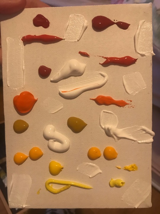

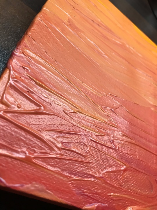

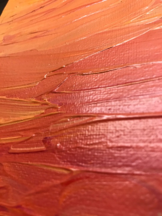
Abstract Painting
I decided to try my hand in abstract painting and tried to represent fire through the red yellow and orange paint, I really like how thick the texture is.
4 notes
·
View notes
Photo
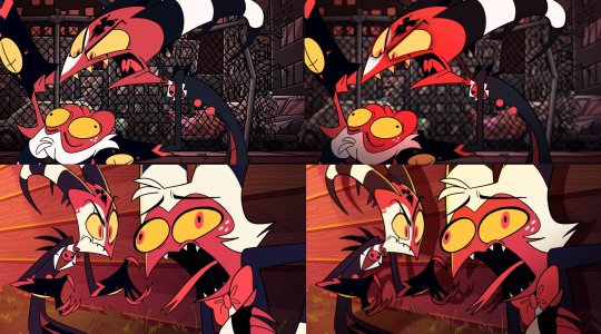
Research/Inspiration - Helluva Boss
This is just an example of how pushing the contrast between light and dark can really make a scene come alive. On the left side the frames are without the glow or shadow effects and on the right is the finished frames. Seeing them side by side is a great way of really seeing the impact good lighting can make to the atmosphere of a scene.
(https://twitter.com/servalsketch/status/1322659613058228224 original)
Helluva Boss produced by Vivienne "VivziePop" Medrano
6 notes
·
View notes
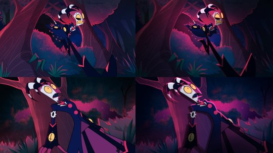
Photo


Animation Frame Process
This is how I do the lighting for each frame in my animation, I thought this would be interesting just to see how I create an atmosphere through layering. It’s time consuming but I think nice lighting can make a drawing interesting
7 notes
·
View notes