k00259794
Hannah O Sullivan
Lsad 1st year art and designstory project | GDC
61 posts
Don't wanna be here? Send us removal request.
Last Seen Blogs
saner-guan
幻想乡

h-opekoo
mizzi

liliregale-main
LiliRegale

arlakos
I love the concept, not the execution.

sweetcroissantpersonacowboy
Untitled

Text
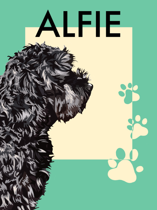
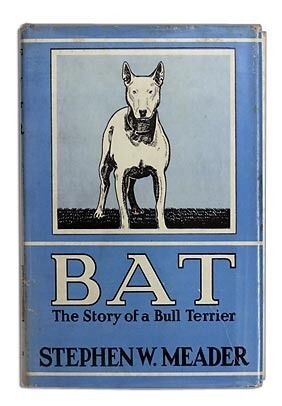
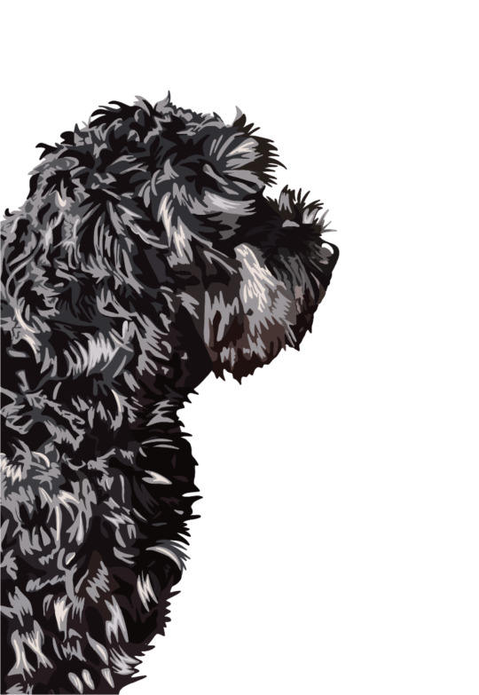
Finished book cover

It took me forever to decide which cover to pick so I incorporated some of my favorite parts of each background into one and this is what I came up with.
4 notes
·
View notes
Text
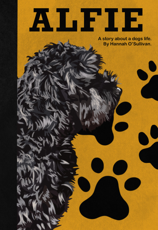
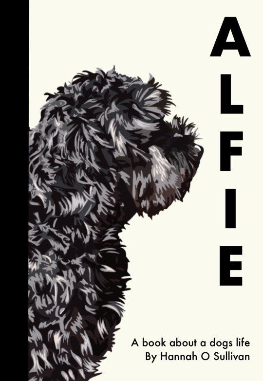
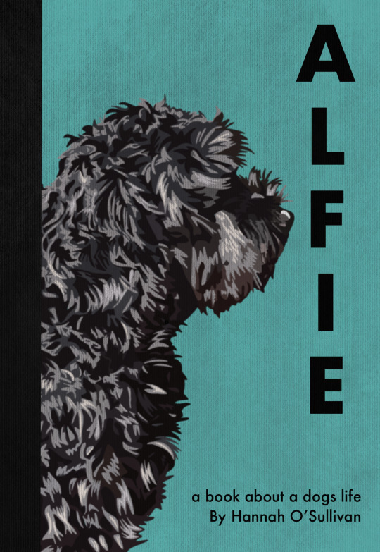
Final ideas for the book cover


4 notes
·
View notes
Text
Research for the book cover


I want to incorporate the textures of old hard back books into the book cover, it will be interesting to incorporate this with the modern style of my digital drawing of Alfie
5 notes
·
View notes
Text
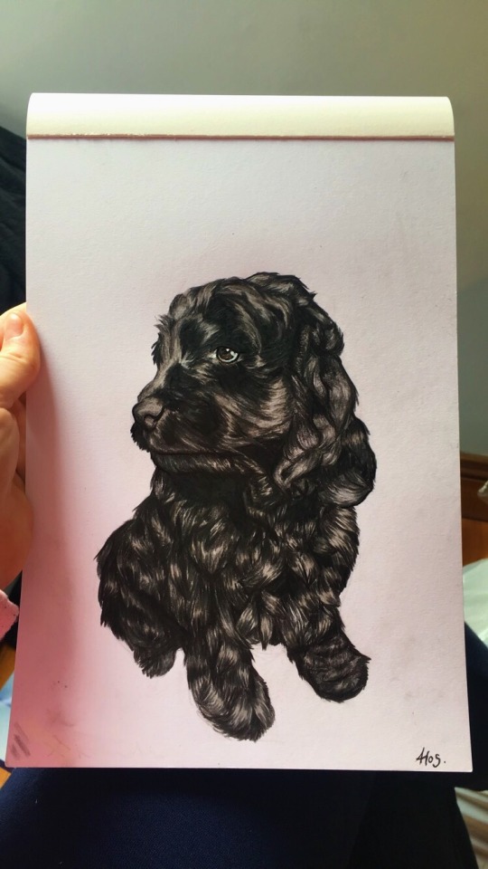
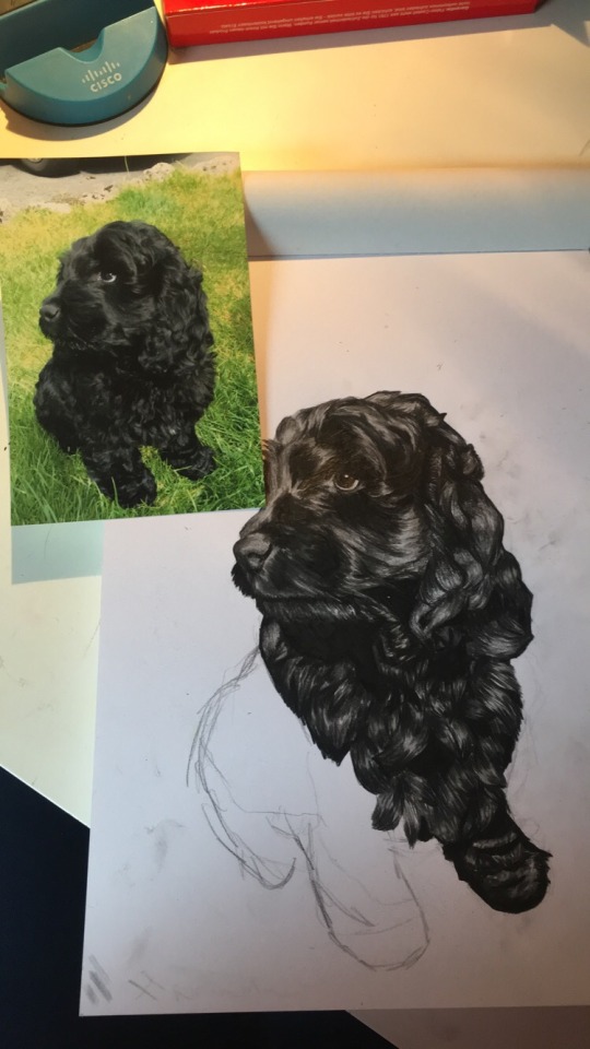
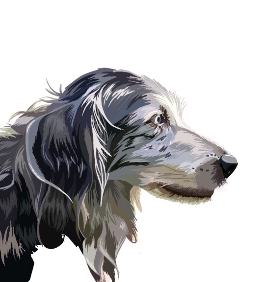
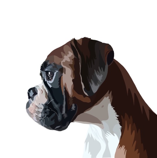
I drew different dogs on procreate based off photos of dogs belonging to my friends and family. I wanted to try out different styles of drawing them as well as different breeds of dog to see which was more fitting for the book cover

11 notes
·
View notes
Text
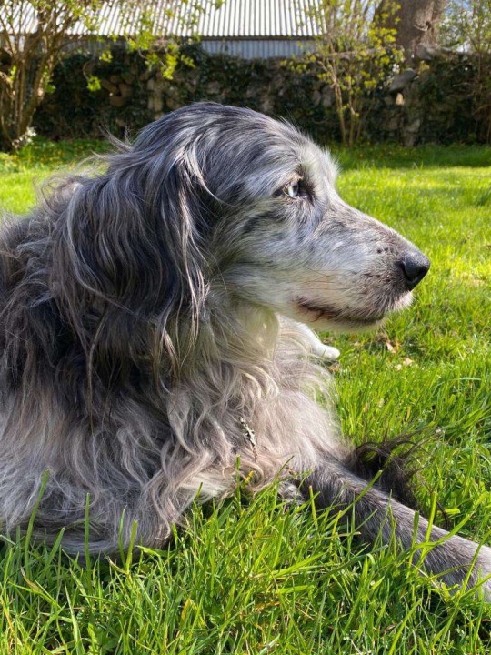
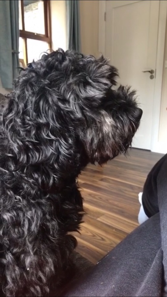
Progress of the book cover for the graphic design brief, I drew my dog Alfie on procreate based off a photo I took of him.
5 notes
·
View notes
Text
Malika favre
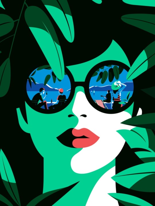

Malika Favre is a French illustrator and graphic artist based in London. Her style of works could be characterized by pure minimalism within Pop art and Op art, where it sometimes described as 'Pop Art meets Op Art'. She combines simple illustrations with geometric patterns and has developed a unique style of illustration by using positive and negative space and colours, elegant layouts, especially of the female body and the curves.
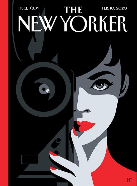
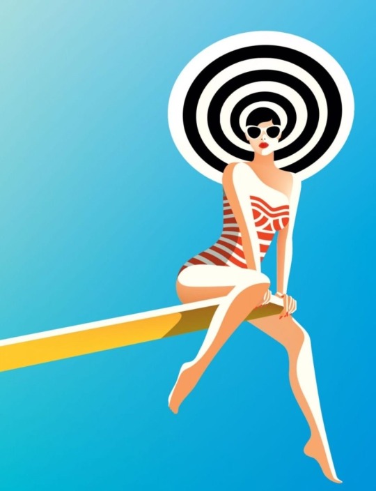
Favre is an independent illustrator and has worked on a variety of projects spanning editorial, advertising and publishing. Her unique graphics style, mixing Pop and Op art, is featured by companies such as Sephora, Le Bon Marché, Penguin Books, and newspapers such as Vogue, The New York Times, The New Yorker,[11] The Sunday Times, and Vanity Fair, etc.
3 notes
·
View notes
Text
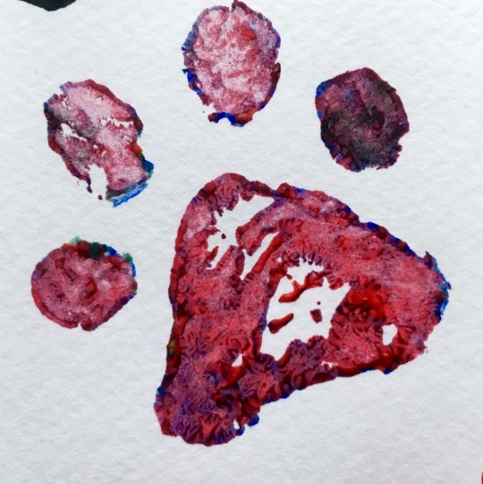
Potatoe prints
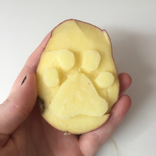
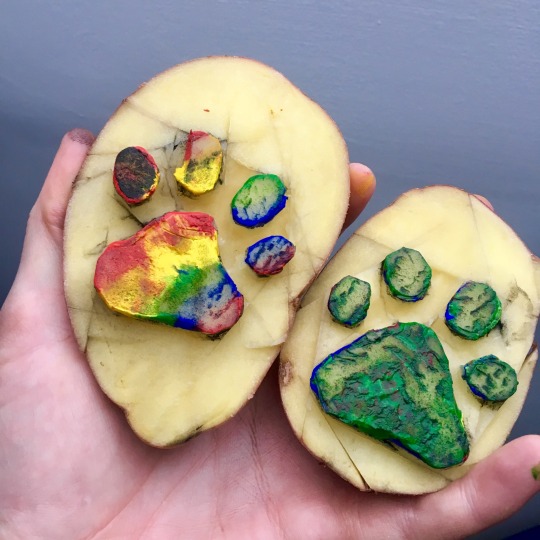
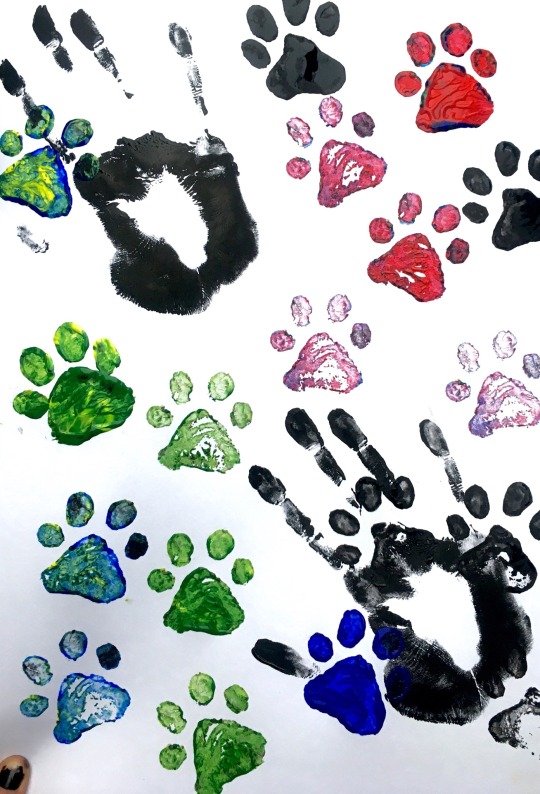

I attempted recreating the texture of a paw print using potatoes and different amounts of paint, I also experimented with hand prints to see the contrasting sizes and textures it produced. I liked playing around with colour and cutting into the stamp to create even more of an interesting look.


10 notes
·
View notes
Text
Typography ideas

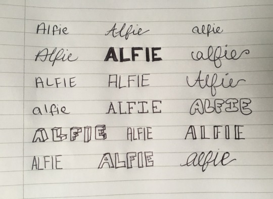
I started exploring different fonts in relation to the title of the book cover both digitally (on procreate) and physically by using various types of handwriting
5 notes
·
View notes
Text
Kate Moross

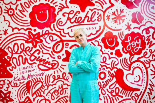
Kate Moross is an English graphic designer, artist, illustrator and art director based in London. In 2012, Kate founded Studio Moross, a London-based multidisciplinary design company as an expansion upon their own work and a way to collaborate with other creatives. Her designs follow a certain pattern such as three sided shapes, illegible typography and she is fond of freeform lettering.
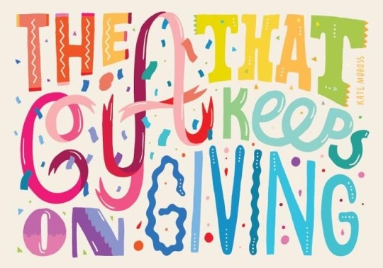
Kate Moross is a versatile and multi-talented graphic designer who worked across a range of illustrative art and designing including motion graphics, photography and moving image. Since graduation she has worked prolifically and created bold artwork for some of the leading clients. Her designing skills can be witnessed in the ads for ESPN, Paul Smith, Mini Cooper, Fabergé, Addidas and Nike.
4 notes
·
View notes
Text
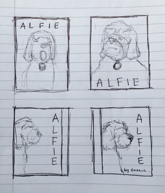
Digital thumbnails for the book cover

2 notes
·
View notes
Text
The initial thumbnails drawn for a book cover based on my dog Alfie and his life
3 notes
·
View notes
Text
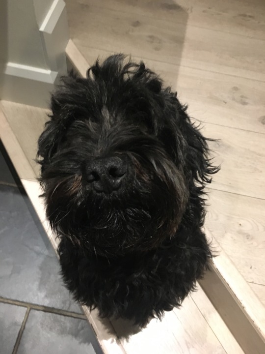
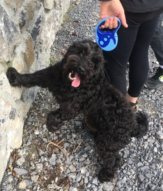
Photo studies taken of Alfie during day to day life.


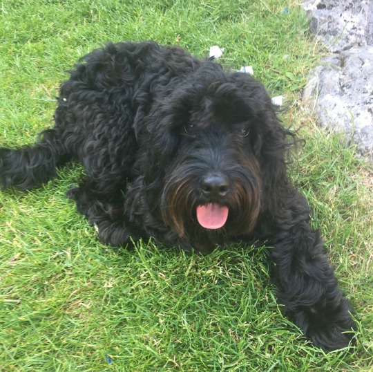
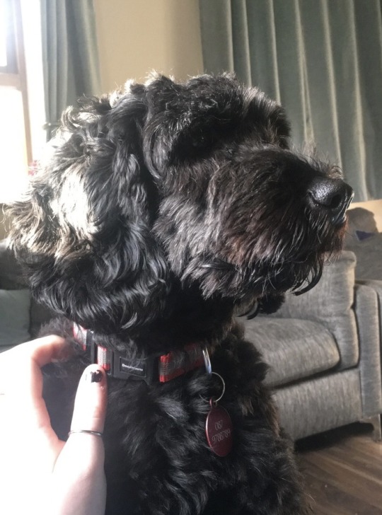
2 notes
·
View notes
Text
Painting workshop with eoin 12/04/21: still life

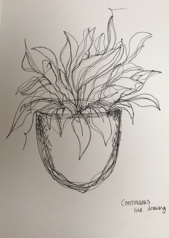
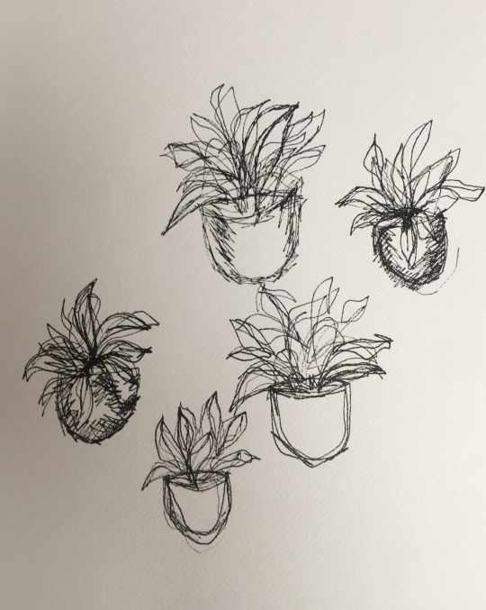
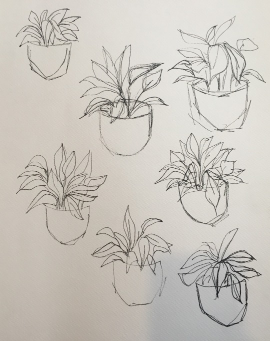
1. 12 minute still life
2. Continuous life drawing
3. 2 minute blind drawings
4. 30 second drawings
I chose a potted plant as my object for still life in this workshop as I wanted to try experimenting with colors, painting is not my strong suit but I really enjoyed playing around none the less.
9 notes
·
View notes
Text
Painting workshop with Eoin 12/04/21: life drawing
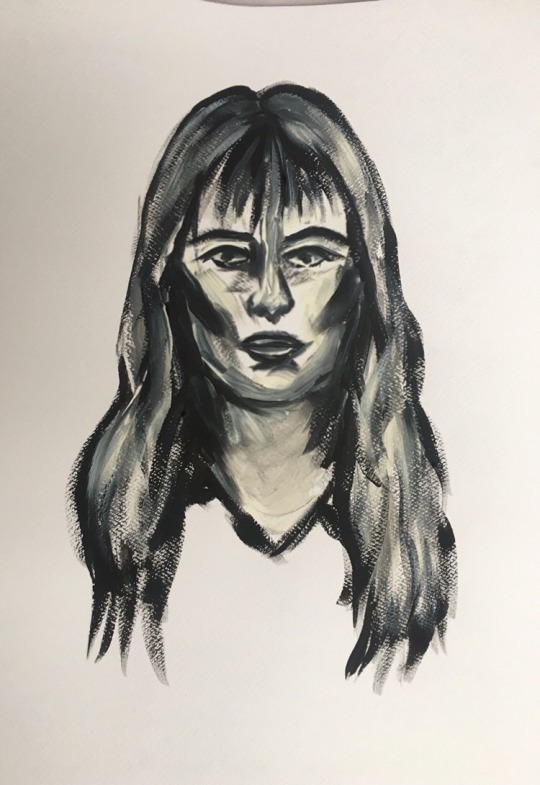
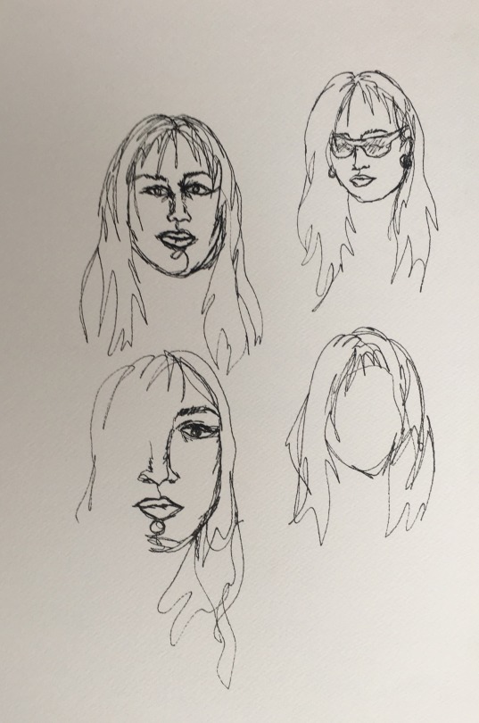


1. 12 minute portrait
2. Continuous line drawings
3. 2 minute portraits
4. 30 second portraits
I really enjoyed this workshop as it helped to loosen up after the Easter break, even though the portraits didn’t turn out great it was still a lot of fun to get to experiment with different styles and ways of portraying myself
12 notes
·
View notes