k00261194
Emma Pyke
B-Ed LSAD Yr 1Exploring movement in terms of emigration and refuge, through the disciplines of painting, printmaking and graphic design. Digital Sketchbook.
65 posts
Don't wanna be here? Send us removal request.
Last Seen Blogs
shadow-rey21
Stoofffff
shygirlworld1
Shy Girl
byambernaomi
BY AmberNaomi

neyyork
Sans titre
vbal3
Yoongi's Kookies
Text
Project Statement
After receiving this semester’s brief, I was delighted to see that the theme was movement, for which I initially began to brainstorm and research the different forms. After some time of debating which concept would suit my three electives (printmaking, painting and graphic design), I decided on emigration and refuge.
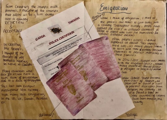
I began by researching into the different forms of emigration and migration, for which I focused on the process of emigration, thinking about the Irish famine and my brother will soon be emigrating to Canada. I thought about what these people would have left behind and how much I would miss my brother. I photographed the process such as filling out the emigration papers, beginning to think about acceptance or denial into a country.
This led me to think of being unable to enter a place, for which I thought of the migration crisis Europe faced in 2014/15, as I felt it needed to be addressed more in society. I researched the struggles these people faced, from leaving their homeland, to the treacherous journeys they would face via their mode of transport, living conditions and leaving what they’ve known behind them. I used boats, trucks, and lifejackets as reference to their journey.
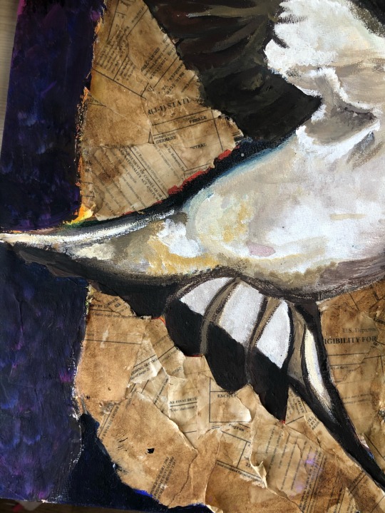
In contrast to this, I wanted to represent the regugee’s/ migrants’ freedom for which I used the symbol of the swallow for representation, as they migrate to the south of Africa twice a year in search of better lives/ food, with a long harsh journey.
I researched into different artists to gain inspiration when engaging with each elective, creating different ideas, works, learning about colour and processes by following different workshops along the way.
5 notes
·
View notes
Text


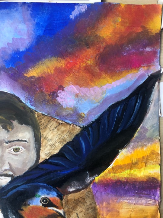
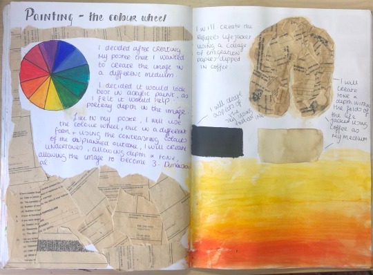
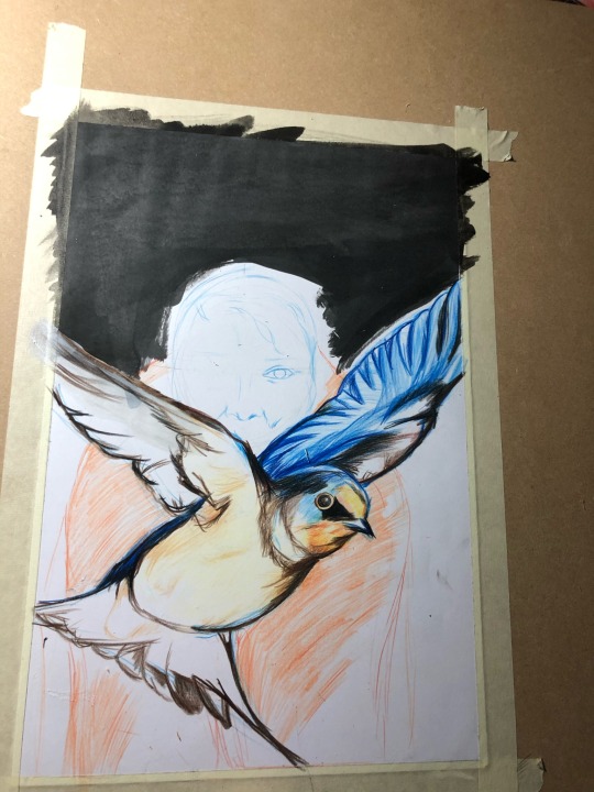
Painting development
I continued my painting, building up more layers with gouache to create tone and dimension. I decided to create a more colourful sunset in the background to represent the better times ahead of the migrant and their journey.
I am quite happy with how the process went, as I learned so much more about colour theory than I had previously known from this task.
If I had more time, I would’ve liked to have added more final detail.
4 notes
·
View notes
Text
Ideas development
https://youtu.be/cuo_zhf-QjQ
youtube
2 notes
·
View notes
Text
Research Development
https://youtu.be/oYLf2LJ7JUA
youtube
2 notes
·
View notes
Text
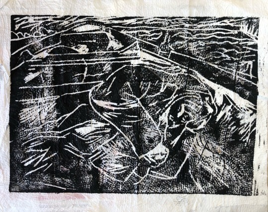
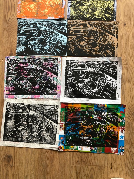
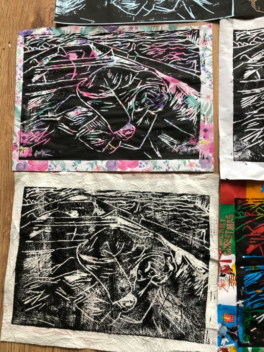
Print Close ups

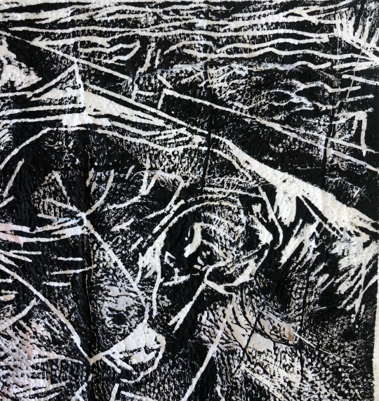
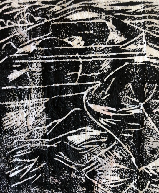


Here are some close ups of the prints. I thought the textures of these were quite interesting.
4 notes
·
View notes
Text
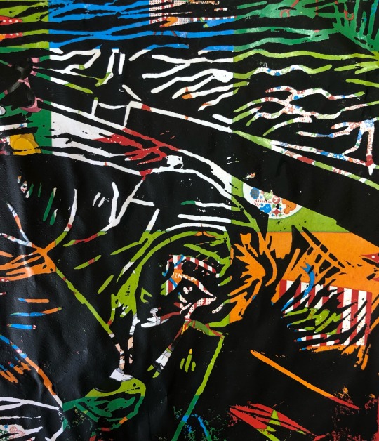
Print dump


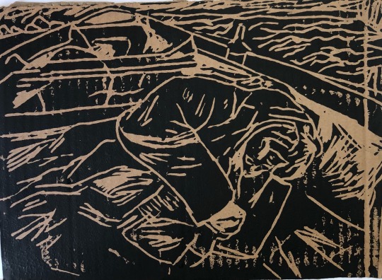
Here are some of my favourite prints on random paper I found from around the house.
4 notes
·
View notes
Text
Research Development and Artist Research


https://youtu.be/DVZGyTdk_BY
3 notes
·
View notes
Text
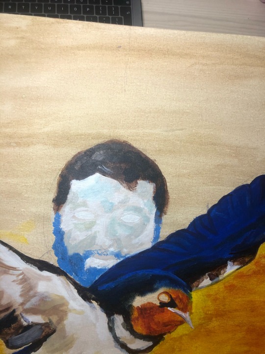
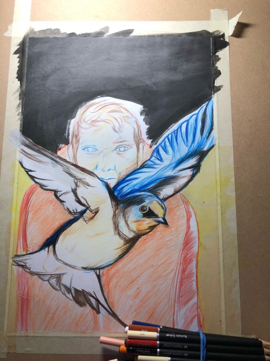
Painting and Collage Progress
I am continuing the process in building up layers in my painting to create 3 Dimension and tone.
I decided to build up the background using a medley of colours, doing my best to blend them into a sky.

I gained some inspiration from the sky on a walk near my home.
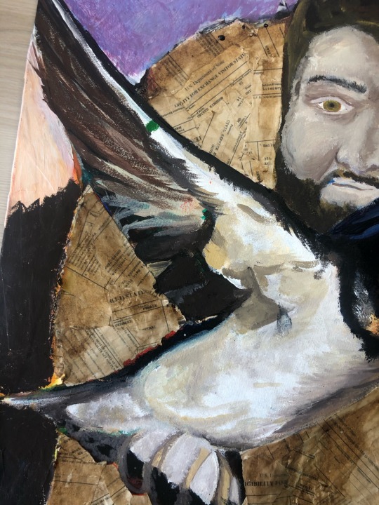
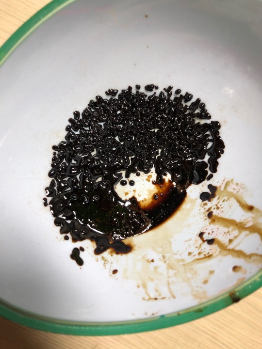
I also decided to darken up the life jacket made from emigration papers, by adding less water and more coffee to the blend in order to make the jacket more life like.
Here is some previous work I did in my sketchbook on emigration papers, for which I made a collage using some photos I took.

I hope to put in the finishing touches soon.
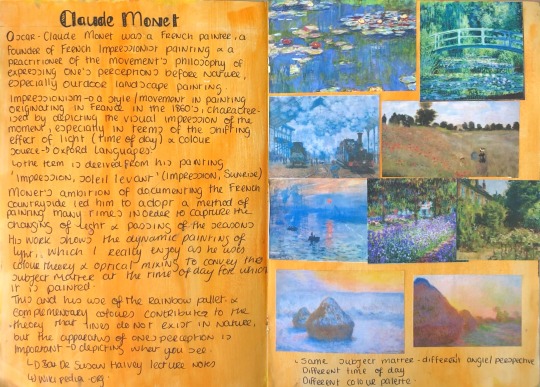
I was inspired by Claude Monet, as his use of complementary colour in his work he creates an aesthetically pleasing painting with tone and 3 dimension. His use of Impressionism is another great factor of his paintings that I enjoy, as it captures the image within the moment.
5 notes
·
View notes
Text
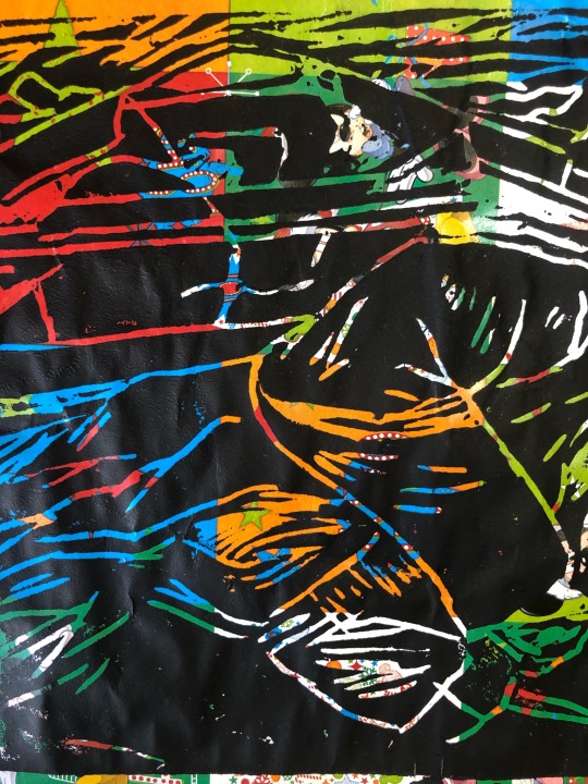
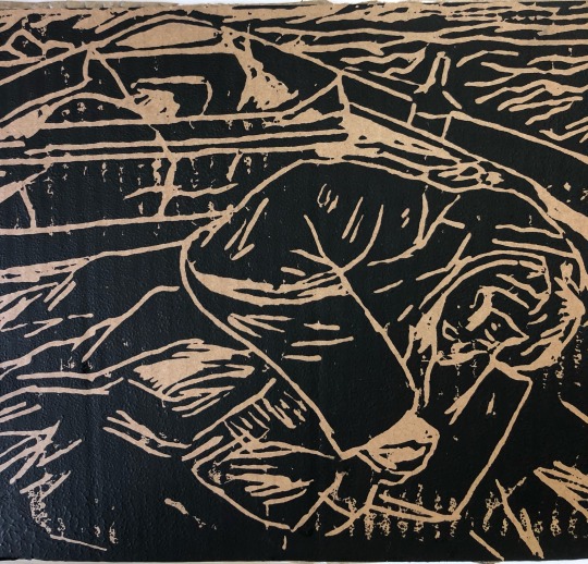
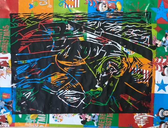
Printmaking part 2~ the results
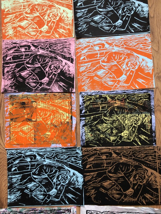


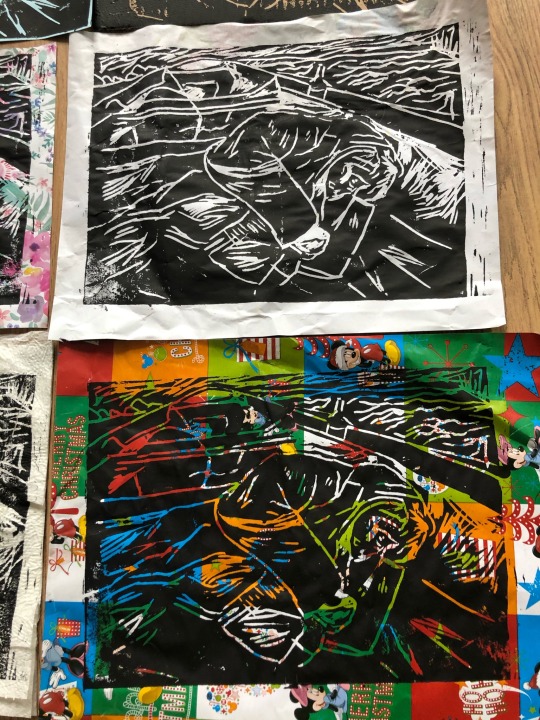

I was quite happy with how my prints had turned out, as I had difficulty printing them.
My favourite ones were the ones on cardboard, wrapping, and homemade paper as I felt the textures and colours looked well with the design.
The colours in these prints reminded me of the work of pop artists Andy Warhol and Roy Lichtenstein, due to their use of vibrant colour and techniques.
I really enjoyed this experience and hope to get to focus more on creating depth in the image with more cutting tools and inks when I get back into the printing studio.
7 notes
·
View notes
Text
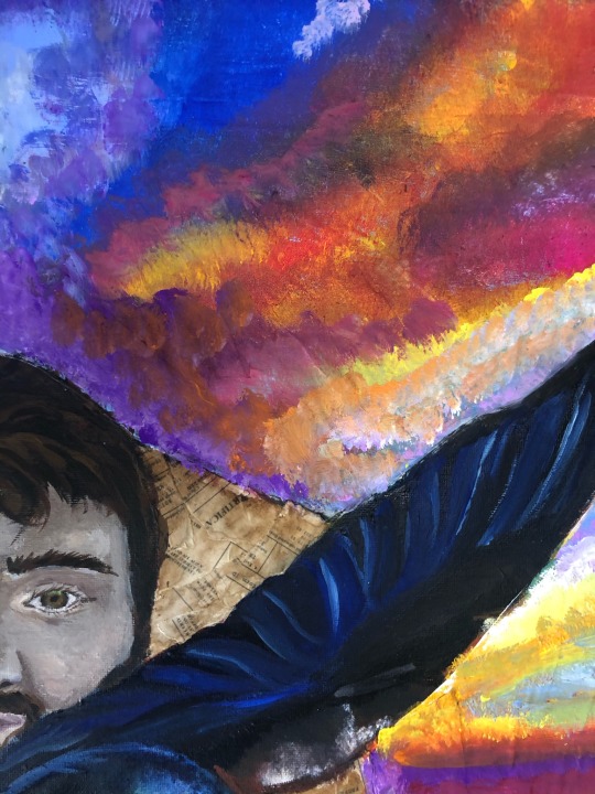
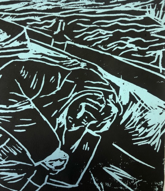
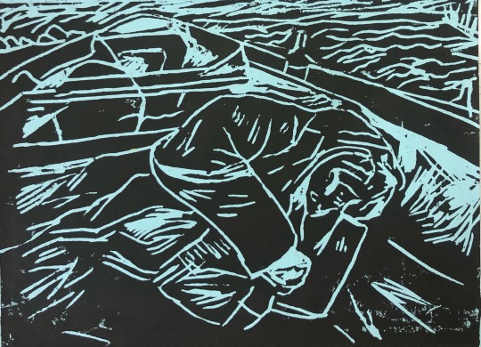
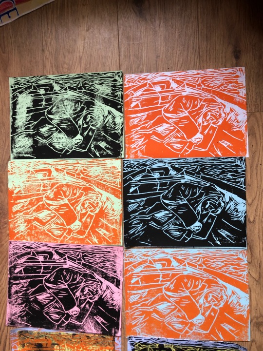
Printmaking
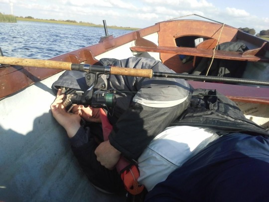
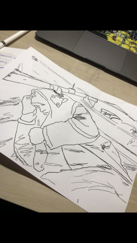

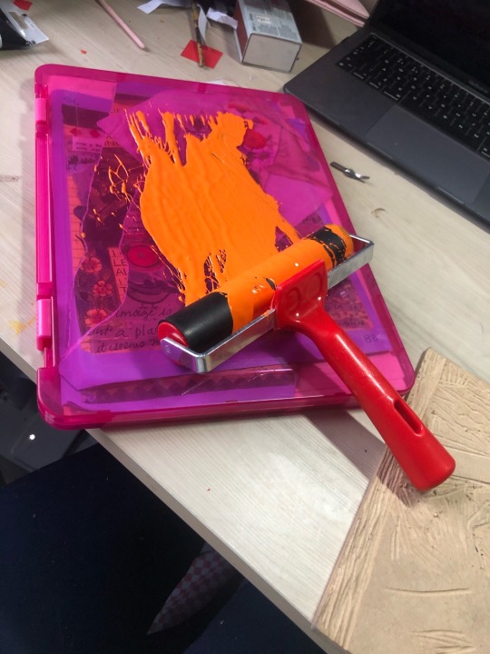


For my project on movement I have been focusing a lot on refugees and the migrant crisis. As a result, I researched the different ways of crossing the sea to a new land in search of a better life, fleeing war etc.
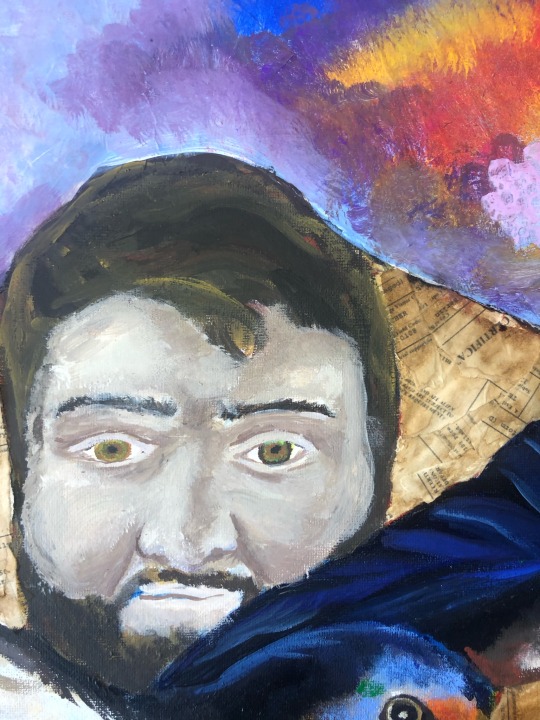
I decided to photograph my brother out on the boat. I pictured him alseep, as these migrants often have no where else to sleep on their journey but the harsh conditions of their transport.
I wanted to create a woodcut of this, using different sized cutting tools to create depth and tone in the print, cutting out the parts for which I wanted to be white.
I found this difficult as the texture of the clothing was quite hard to cut and as I only had orange and black ink, so it was hard to convey the different aspects of the picture such as the sea and the trees. I had to adapt in rolling out the ink method, as my local art shop was closed and I only had one roller, so used a kitchen rolling pin to roll out the paper.
I used different coloured paper to print on attempting to convey the different depth and aspects of the image. When I rang out of paper, I used different wrapping paper, cardboard and paper I had made in a painting workshop.
8 notes
·
View notes
Text
Painting and Collage


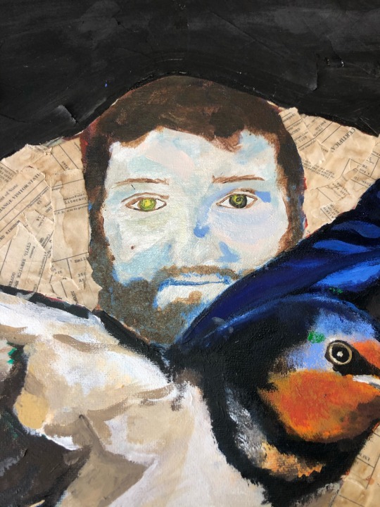
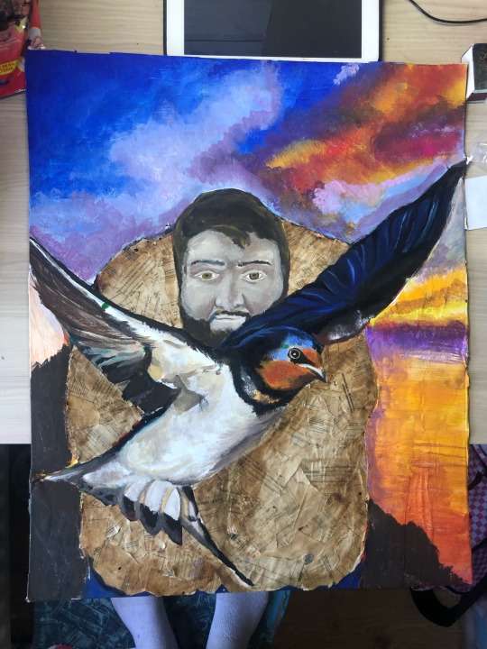
As part of my painting elective, I decided to use different aspects of my poster from graphic design to create a painting representing emigration and refuge.
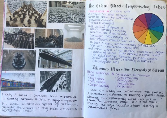
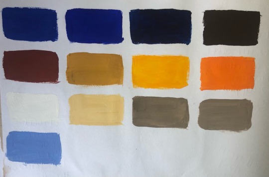
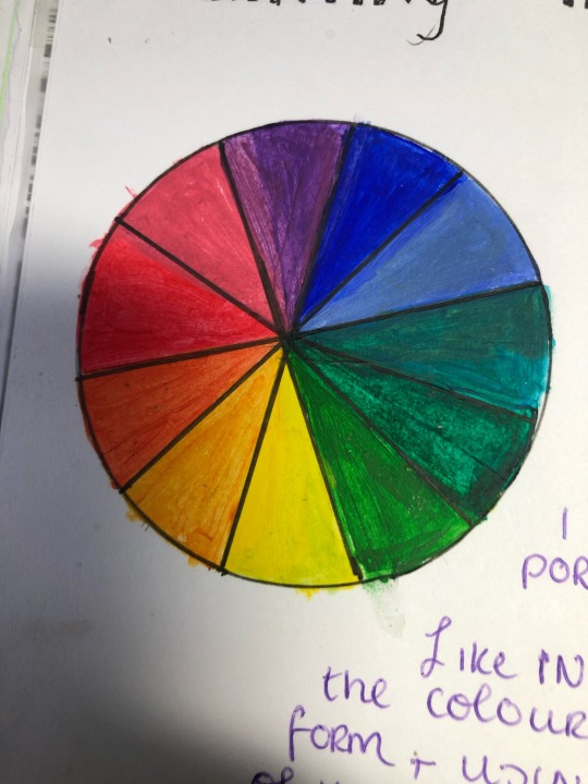
I used coffee to stain the background to create a base for the painting. With reference from colour theorist Johannes Itten, I am creating shadows and hues from the colour wheel, using the complementary colours as a mixing guide for my paints.
I started using acrylic paint as my medium, but decided to try out gouache for the first time. I really enjoyed this process, as I found mixing the gouache with water made the paint more blendable.
I then decided to create the life jacket using a collage of coffee stained emigration papers, using the coffee as a technique to create tones and shadows.I used this with reference to lecturer Eoin McCormacks creating paint workshop.
I had originally painted the background pink and orange, but I felt it didn’t suit the painting. I hope to create a sunset representing the bright future ahead of the refugee, the swallow being a symbol of freedom.
https://monoskop.org/images/4/46/Itten_Johannes_The_Elements_of_Color.pdf
https://www.getty.edu/research/exhibitions_events/exhibitions/bauhaus/new_artist/form_color/color/#:~:text=Itten%20identified%20seven%20fundamental%20categories,meridians%E2%80%9D%20radiating%20from%20their%20circumference.
6 notes
·
View notes
Text
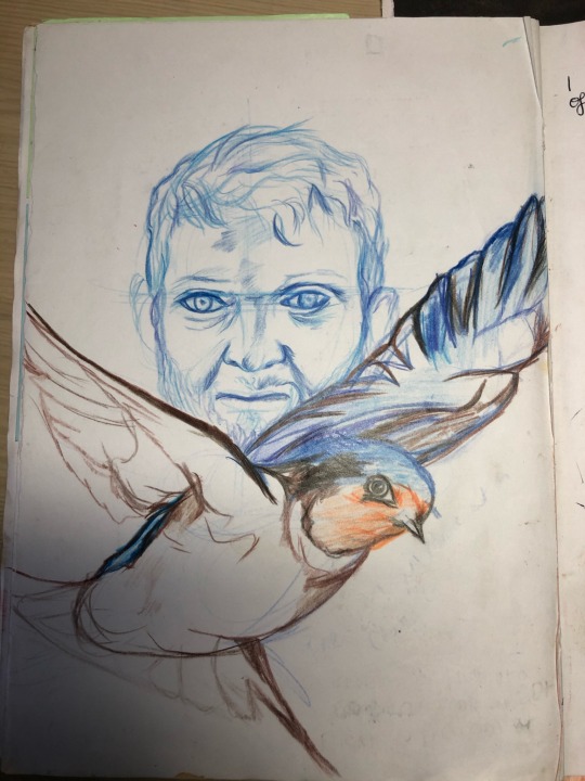
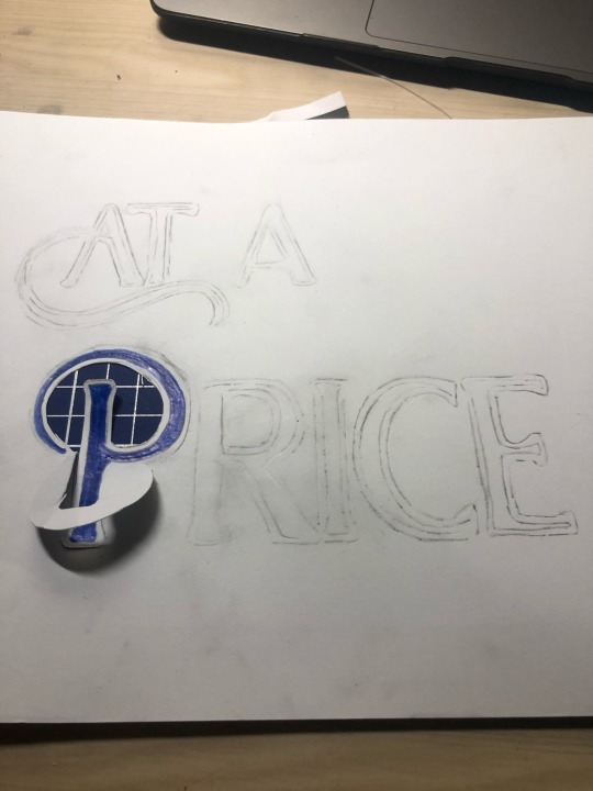
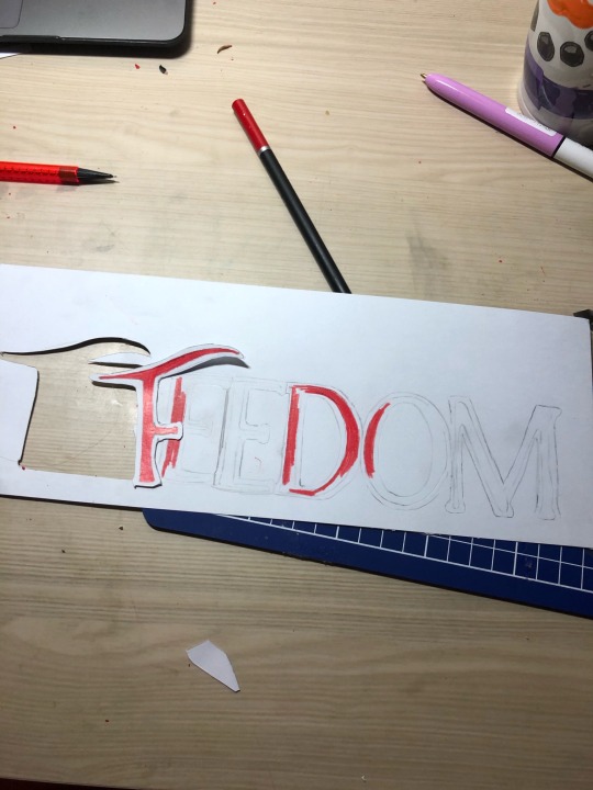
Poster part 2
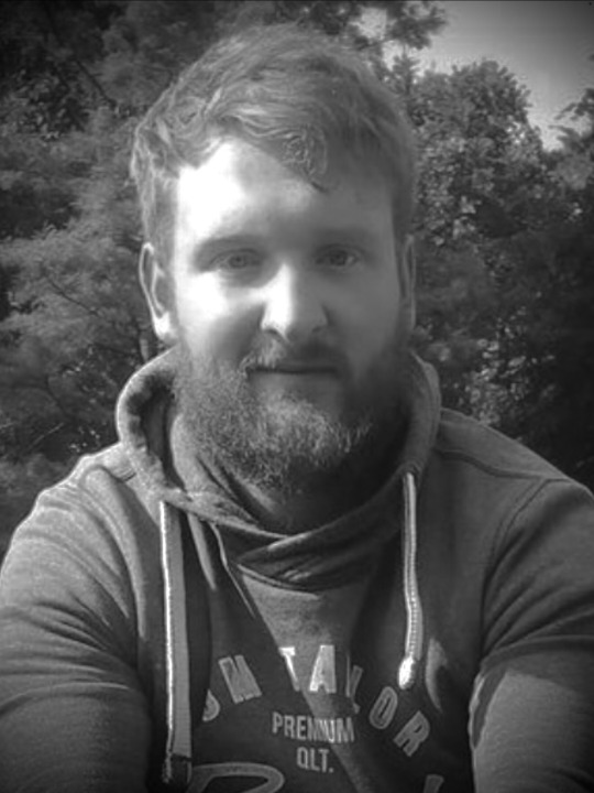

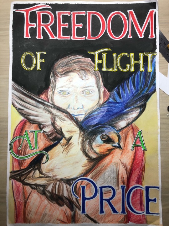
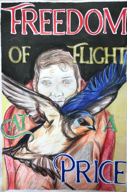
For my poster, I wanted to portray an aspect of migration and refuge, a sense of freedom but yet loss of what they are leaving behind at the same time e.g their homeland, friends, family etc.
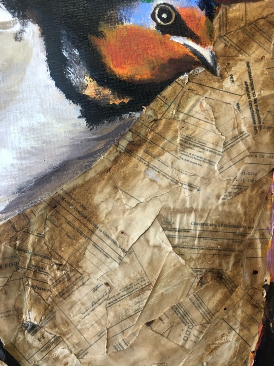
I decided to photograph my brother, portraying him as a migrant with a life jacket. I used the image of the swallow as a symbol of freedom, as they migrate from Ireland twice a year to the south of Africa in search of better lives. As they are not in Ireland at the moment, I had to source this image of the bird in flight online (swallow photograph taken by Chris Glady). I will use the life jacket to represent the refugee and their journey.
I had the colour wheel as a guide for using complementary colours to create shadows, hues and the overall visual effect of the poster.
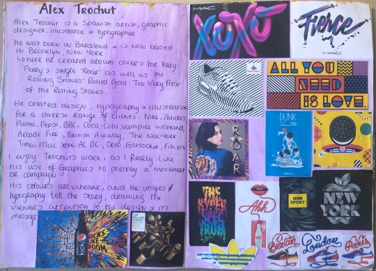
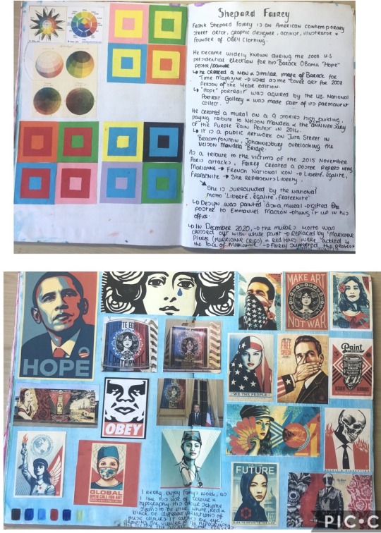
I was inspired by graphic designers Shepard Fairey and Alex Trochut, with their vivid use of colour and typography.
https://www.theguardian.com/environment/2020/nov/10/birdwatch-the-swallow-my-favourite-bird-has-left-to-enjoy-a-second-summer
10 notes
·
View notes
Text
Poster~ Typography

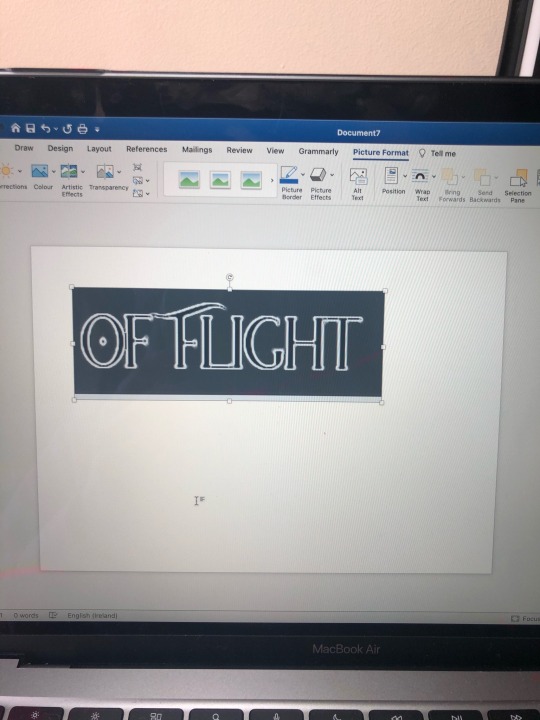
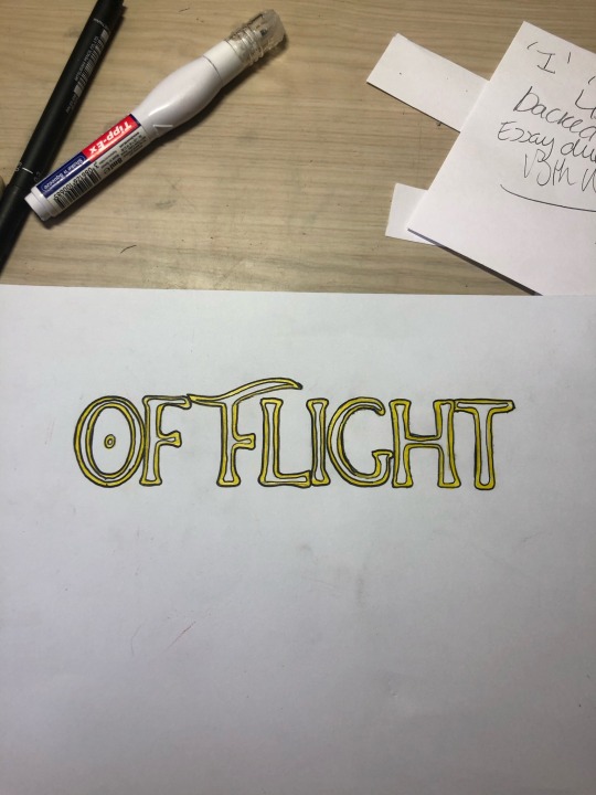
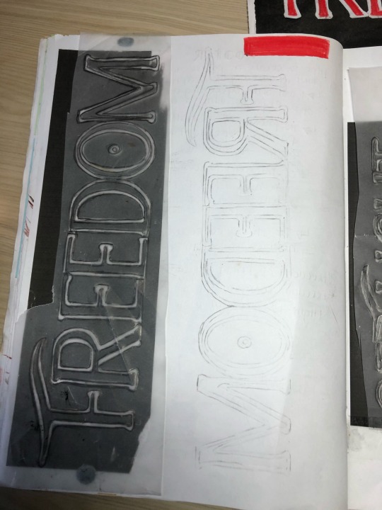

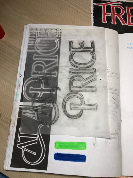
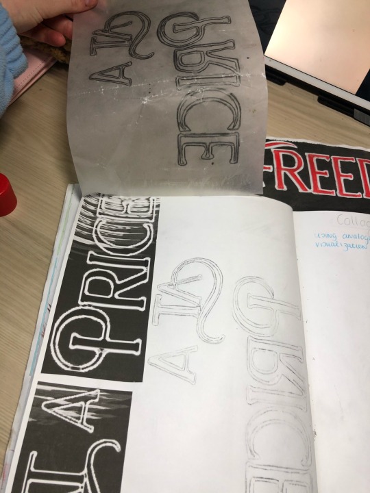
As part of my Graphic Design elective, I attended a typography workshop given by lecturer Lorraine Myers.
From this workshop, I applied what I learned to create a poster. I used the colour wheel to make it more appealing to the eye using the complementary colours.
I researched different fonts using dafont, and manipulated the ‘Hatolie’ as I felt it would best suit my poster.
I really enjoyed this, as I felt it was a great way of learning how advertising works.
7 notes
·
View notes
Text

Creating a gif using print and graphics
I attempted to use what I learned from Photoshop last semester to create a gif of swallows.
From the drawings I had used previously in my swallow print, I created a gif of the swallow flying , referencing my knowledge of birds murmuration to create a gif/ pattern. I did this by creating layers of the image, moving the birds each time, changing the file to a gif and setting a number of frames per second.
https://youtu.be/V4f_1_r80RY
youtube
9 notes
·
View notes
Text
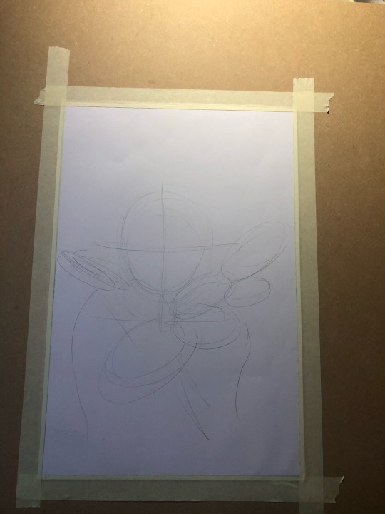
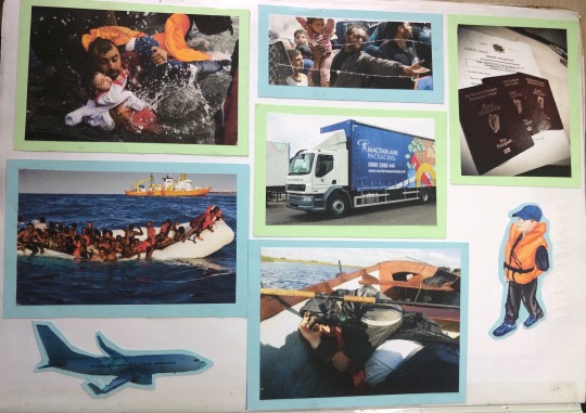
Mood board~ Graphic Design Workshop
Last week I followed a graphic design workshop given by lecturer Sharon LeGear, for which she guided us on making mood boards to visualise our themes and concept.
We were advised use tools from home such as paints, colour, paper, markers, glue, household objects, natural objects etc.
I created these three moodboards of what I visualise my concept of emigration and refuge using reference images from the internet, some of my own photographs and drawings to depict vintage and modern day migration.
I found this workshop very helpful as it helped me lay my ideas out on paper and to visualise my concept.


7 notes
·
View notes
Text
Making coloured paper
In making paper, I decided to add a hint of colour to the PVA glue and water mix using green water colour, creating a green tint to the paper.
3 notes
·
View notes
Text


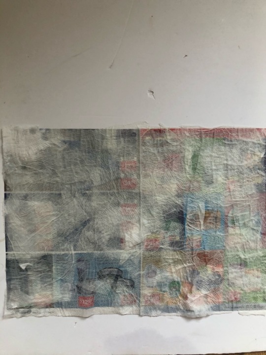

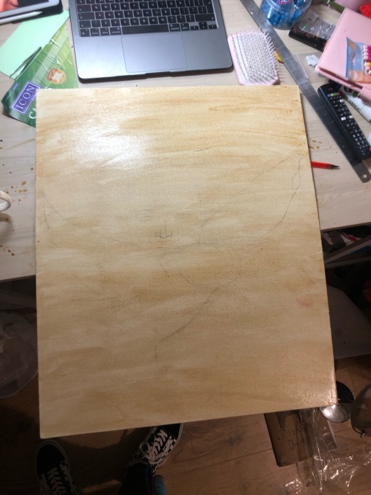
Creating Paper workshop

I followed lecturer Eoin McCormack’s workshop on creating paper as part of the painting elective.
I really enjoyed this workshop, as we got to create paper using recycled newspapers and kitchen roll.
In order to create this, we had to mix water with PVA glue, dabbing the mix with a sponge to the ripped up pieces of kitchen roll, creating different textures, allowing it to stick to the newspaper.
When it dried it would create a nice textured base to paint on.
I had to attempt this twice as I had originally made the PVA mix too watery and hadn’t ripped up the tissue enough.
Overall I found this workshop very beneficial, and think the paper would look really nice in my sketchbook.


9 notes
·
View notes