leeyoojins-works
YOOJINLEE
Originally from South Korea and currently living in LA, I'm a graphic designer with experience working both in-house and on the agency side. I'm an all-rounder that works with just about any media - from print to digital, and even videography.
I've had the opportunity to work with brands and non-profits on multiple projects, ranging from branding to campaigns.
Resume available upon request.
YOO JIN LEE
graphic designer + chicken nugget connoisseur
© 2021 YOO JIN LEE
17 posts
Don't wanna be here? Send us removal request.
Last Seen Blogs

padbutt
Untitled

sanktasansa
She-King in the North

cissaking
Cissa King

sarahlele
Sem título

kimpoor
제목 없음


Photo

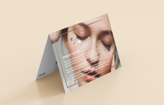
Printed Collateral
Programs used: InDesign, Photoshop
Monthly printed flyer for subscription box.
0 notes
Photo

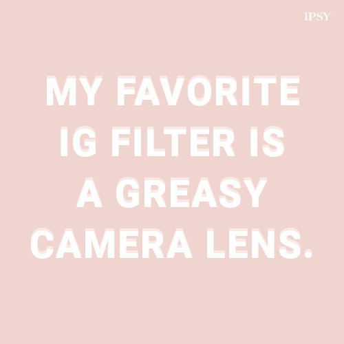
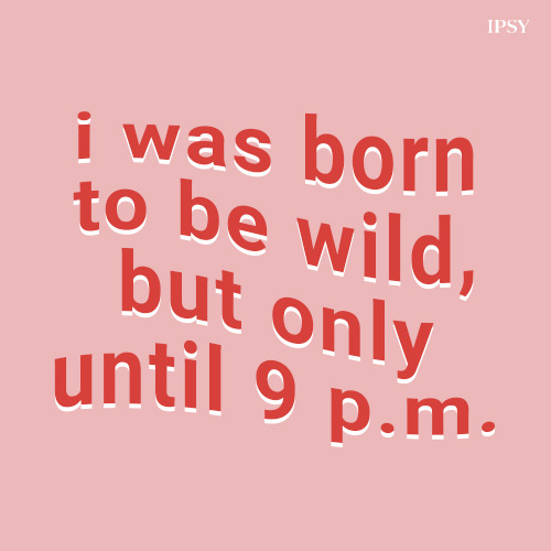

Social Media Posts
Program used: Photoshop
A collection of IG posts.
0 notes
Photo

Website Design
Programs used: Sketch, Photoshop
0 notes
Photo


Social Media Template
Series of templates designed to be used on a non-profit organization’s IG feed.
1 note
·
View note
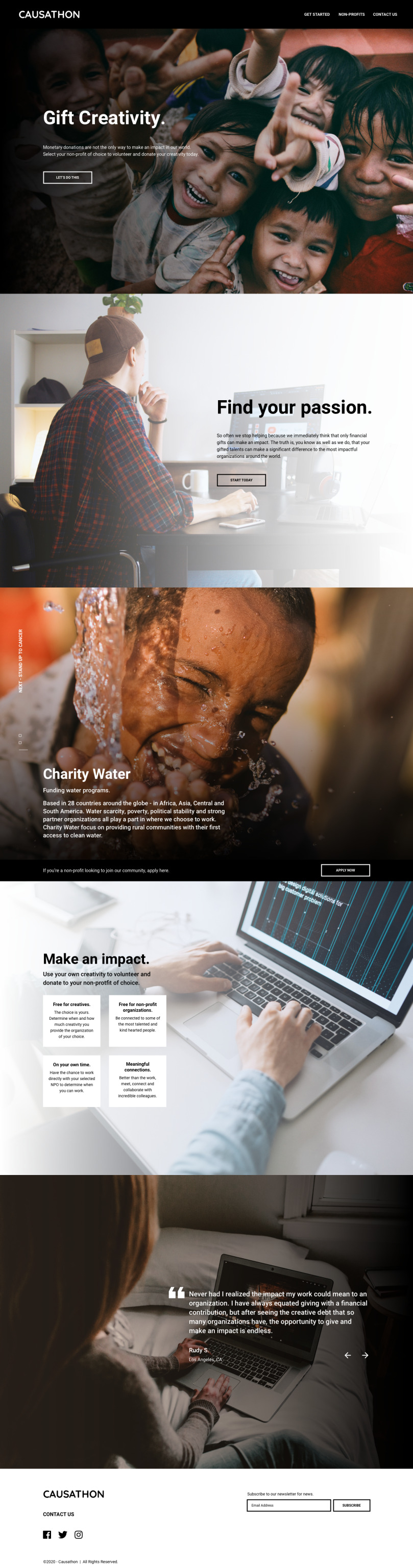
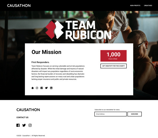
Photo

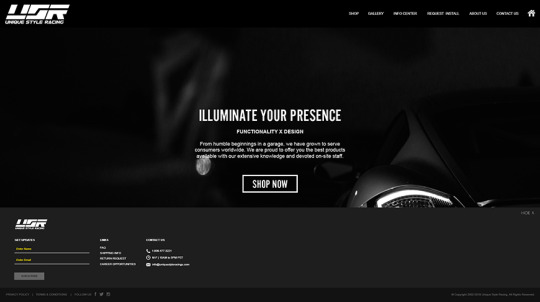


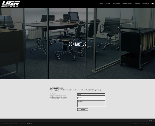


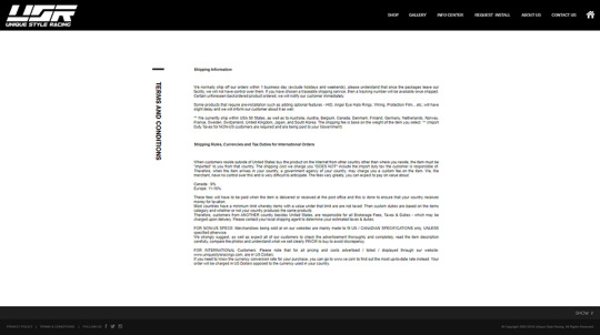
Website Design
Complete redesign of USR’s website to match their new branding.
0 notes
Photo
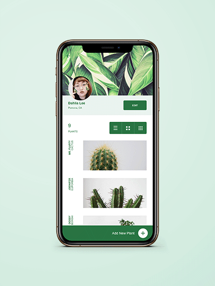

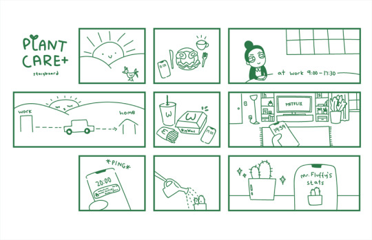
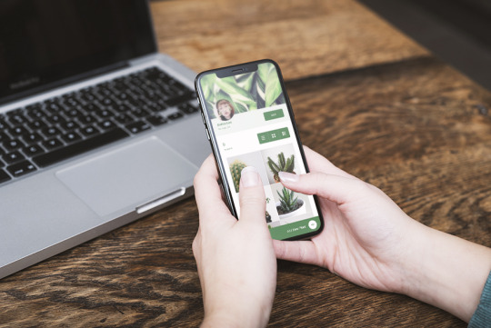
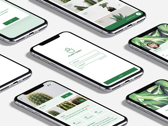
UX/UI Design, Logo Design
Programs used: Sketch, Photoshop, Illustrator
Plant Care + is a new social media tracking app for plant lovers! Designed to keep track of all of the user’s green babies, with watering and sunlight notifications, users can also befriend others on the app for an all around planting experience.
4 notes
·
View notes
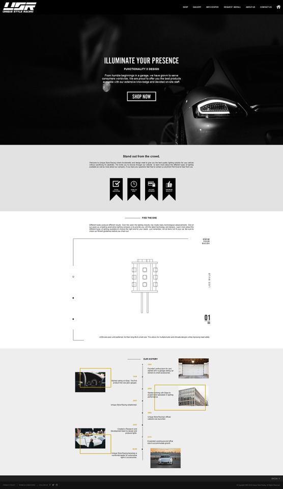
Photo


Landing Pages
Webpage Ad
Webpages done to advertise new products for USR.
0 notes
Photo
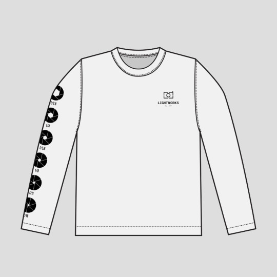


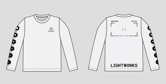
Apparel Design
Club T-shirt design done for Lightworks, a photo club in Santa Ana.
Client asked for a 1 color front, back, and one sleeve design that revolved around a camera.
I designed the different F-Stops of the camera lens on the right arm, as that’s the most common arm a photographer uses to adjust their F-Stop. It was also the most optimal space to showcase each individual lens opening.
The viewfinder is displayed on the back of the shirt to resemble when the photographer looks through the lens of the camera, we see through our eyes.
1 note
·
View note
Photo
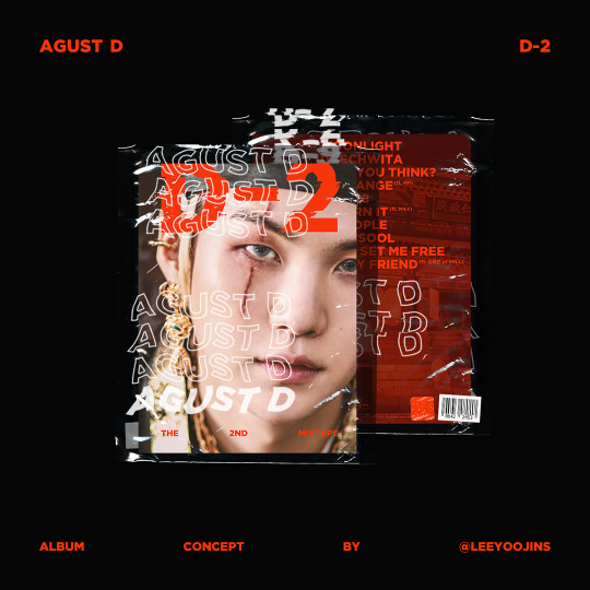

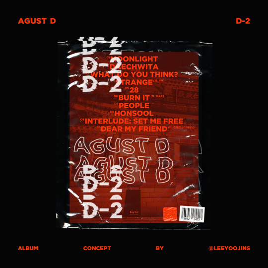
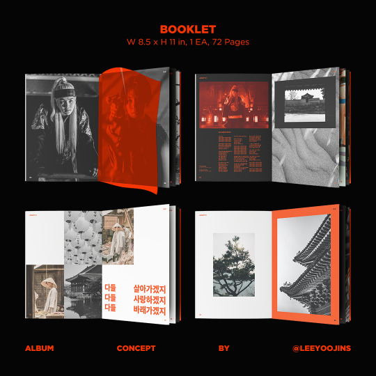
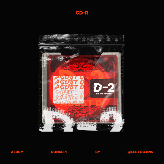
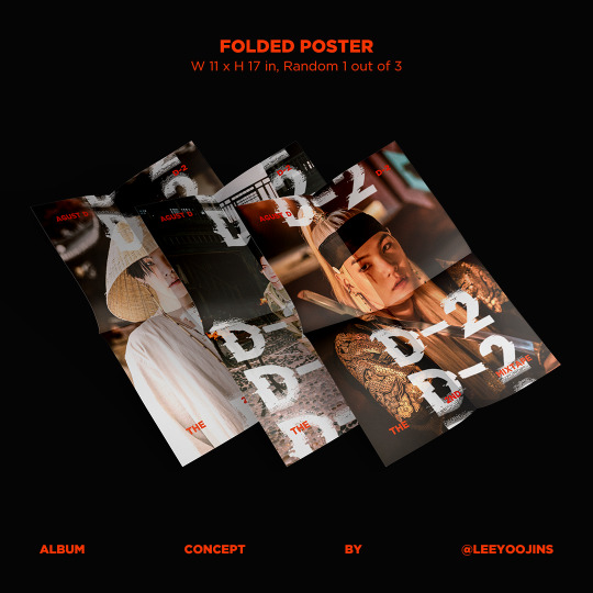


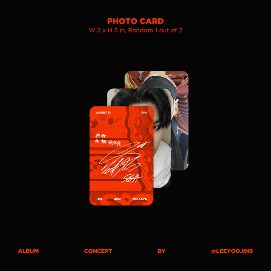
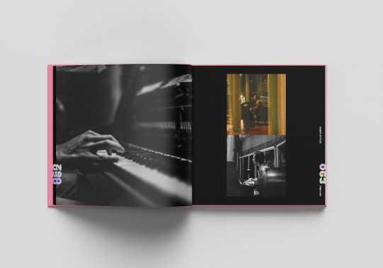
Album Design
Agust D D-2 Album designed to show traditional Korea meets modern day street punk rebel. Put together in a clear plastic bag to play homage to the transparency found in August D’s second mix tape.
Each album would include:
- 1 CD
- 1 Booklet (72 pages)
- 1 Folded Poster (Random 1 out of 3)
- 1 Sticker Pack (Pack of 4 Stickers)
- 1 Postcard (Random 1 out of 2)
- 1 Photocard (Random 1 out of 2)
#agust d#D2#D-2#Agust D D-2#Agust D D2#Agust D D 2#Suga#BTS Suga#Min Yoongi#yoongi#yoongles#Min Suga#BTS#Bangtan#Print#Album Design#Packaging#Packaging Design
23 notes
·
View notes
Photo
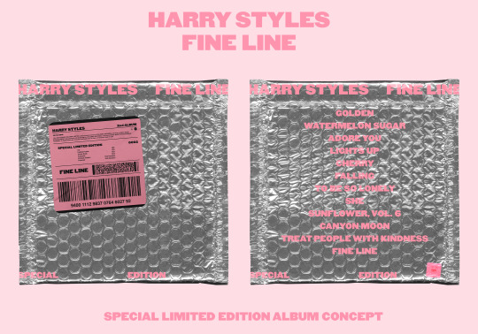


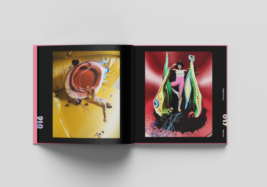
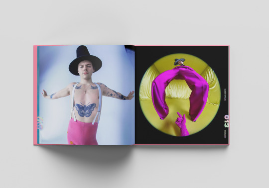

Album Design
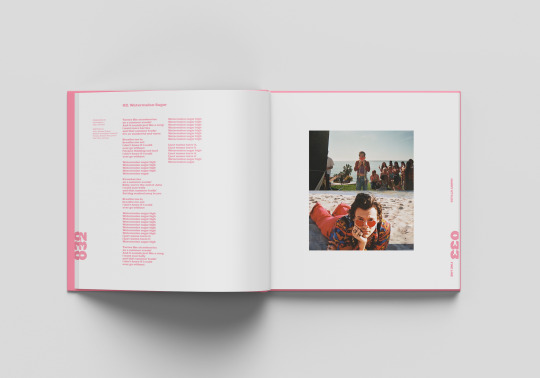
Harry Styles Fine Line Special Limited Edition Album re-imagined.
Each Album includes:
- 1 CD
- 1 Booklet (72 pages)
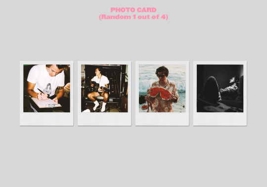
- 1 Photocard (Random 1 out of 4)
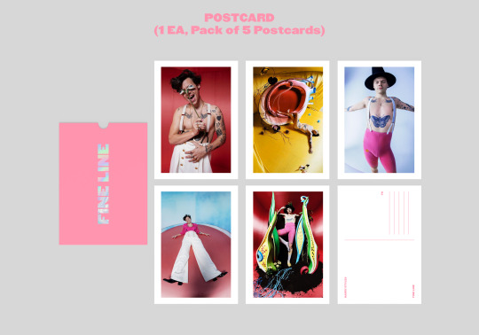
- 1 Postcard Pack (Pack of 5 Postcards)
Harry Styles has some of the funnest visual elements, what would it look like applied to his album packaging as well? The Fine Line album has a rather whimsical vintage carnival flair to it, so why not also incorporate special Polaroids and postcards with the album itself. The concept for this album design was being a care package being sent to the fans. A sort of, “Wish you were here,” vibe.
#One Direction#1D#Harry Styles#Fine Line#Watermelon Sugar#Print#Album Design#Packaging#Packaging Design
94 notes
·
View notes
Photo

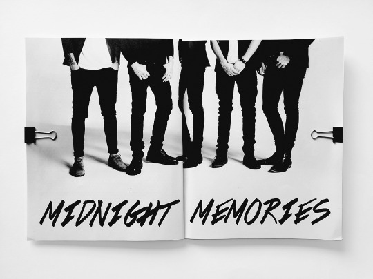


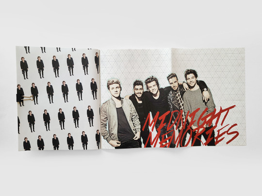
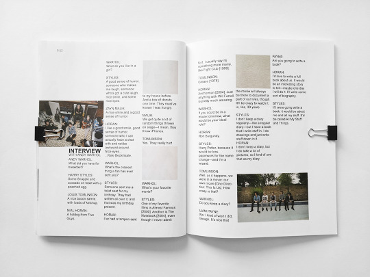
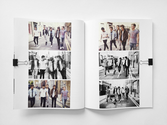
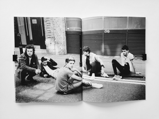


Album Design
One Direction’s Midnight Memories Album re-imagined. What would the album look as if it was packaged like a magazine? What if there were 6 different versions, one for each member and one for the group? This is how I imagined the album to be done.
#One Direction#1D#Harry Styles#Midnight Memories#Liam Payne#Niall Horan#Louis Tomlinson#Zayn Malik#Album Design#Packaging#Packaging Design
15 notes
·
View notes
Photo
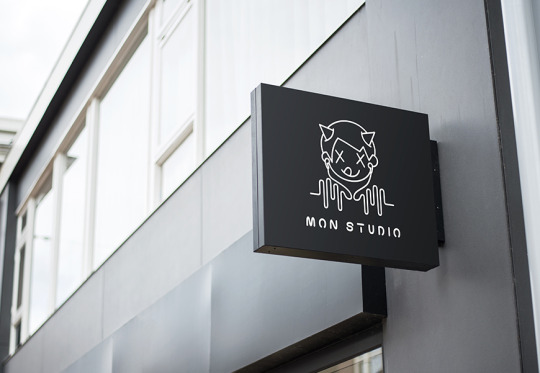


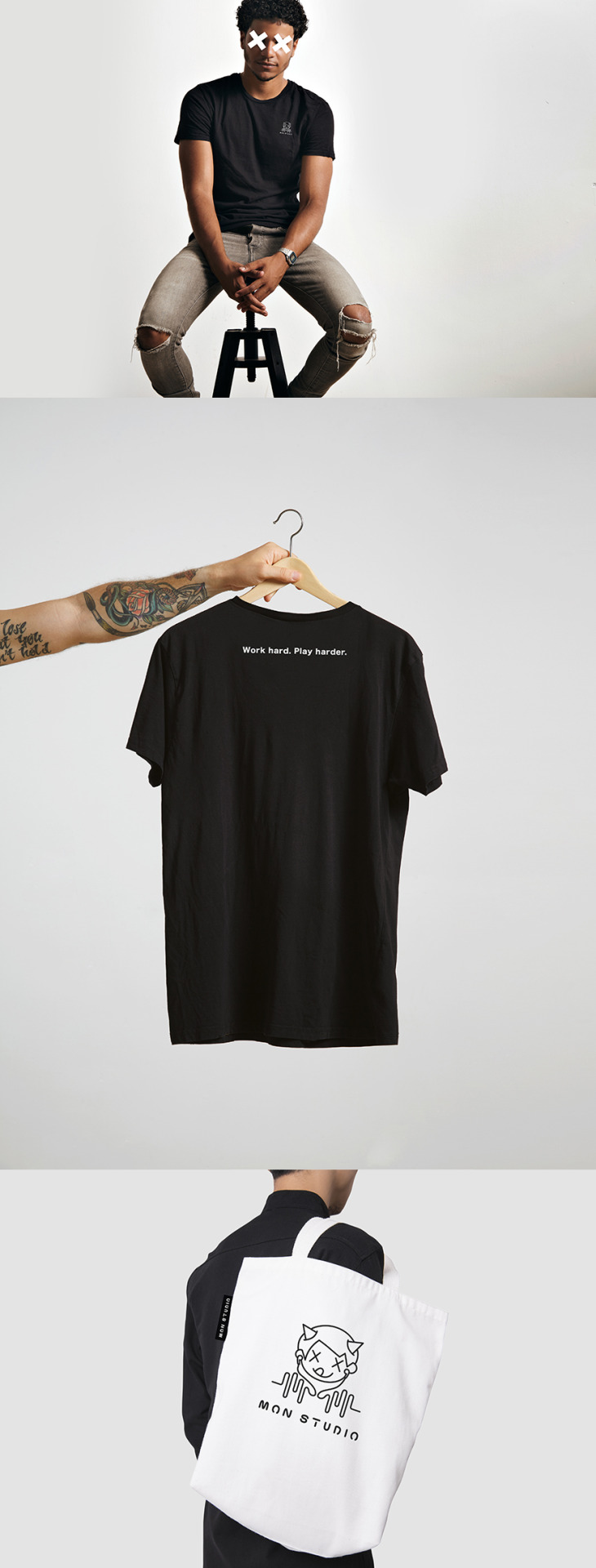
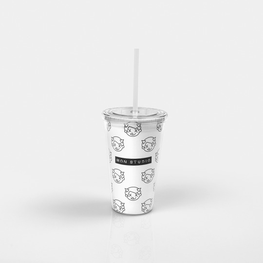
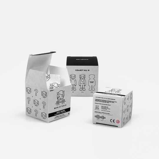
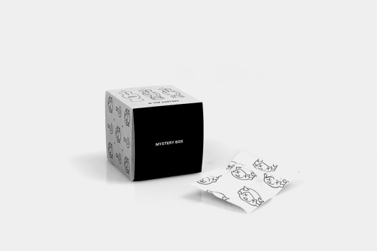

Branding
Mon Studio is a music studio that strives to keep the passion going in music. Less corporate, and more about letting artists create and flex their minds in a way that keeps the soul burning.
Taking inspiration from the founder’s life in the city and love for toys, we created textures which mimicked cold concrete, a customized font that was inspired by neon signs in the city, and a logo full of playfulness.
23 notes
·
View notes
Photo
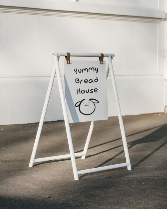


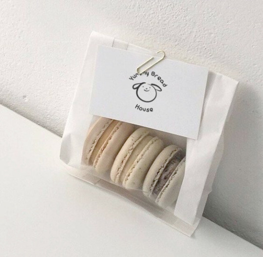
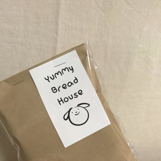

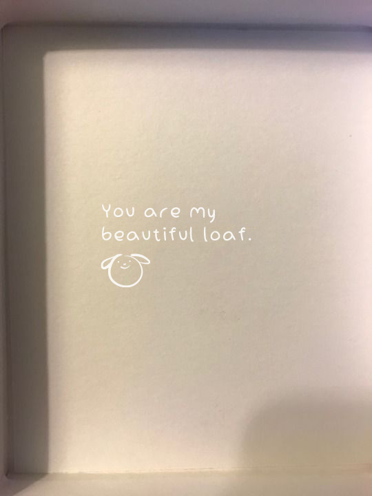

Branding
Yummy Bread House is a small home style bakery located in Koreatown. Specializing in macrons, their goods are baked in small batches to insure quality.
A customized font was created for the logo to carry over the theme of “home made.” The bakery focuses on creating baked goods that feel as if they were made especially for their customers at home instead of being mass produced.
Their receipt doubles as a business card, and at times of purchase, their invoice would be hand written by staff in the back. This adds another level to the brand which separates it from other bakeries that feel automated.
6 notes
·
View notes
Photo
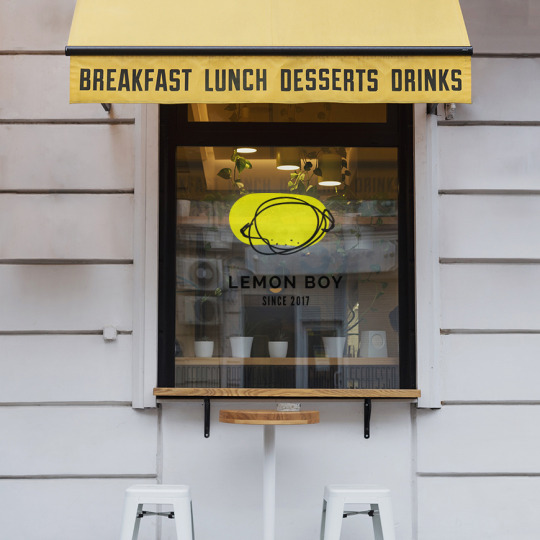
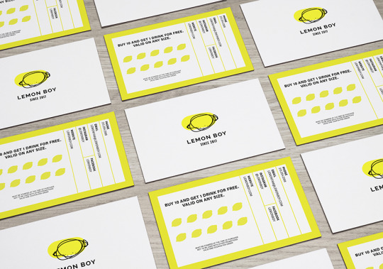

Branding
Lemon Boy is a fresh juice company located in Los Angeles, but their drinks have a little twist. They’re key ingredient? You guessed it, lemons.
Hundreds of thousands of lemons were sacrificed to find the perfect one to fit their logo just right.
1 note
·
View note
Photo


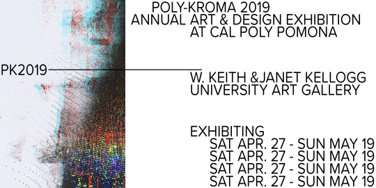
Art Direction
Poly-Kroma is an annual art exhibition held at the W. Keith & Janet Kellog Art Gallery located in California State Polytechnic University, Pomona.
Each year a different theme is chosen to represent the graduating class of the art department. For 2019, the theme was “Break the rules.” With this being the theme, I took it literally and figurative. Designs were broken apart, displayed separately, but when viewed at a distance, created one complete piece. We felt this resonated with the students as no two students are the same, but can still come together.
1 note
·
View note
Photo
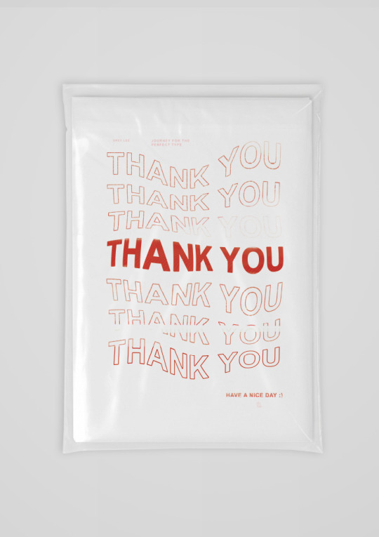
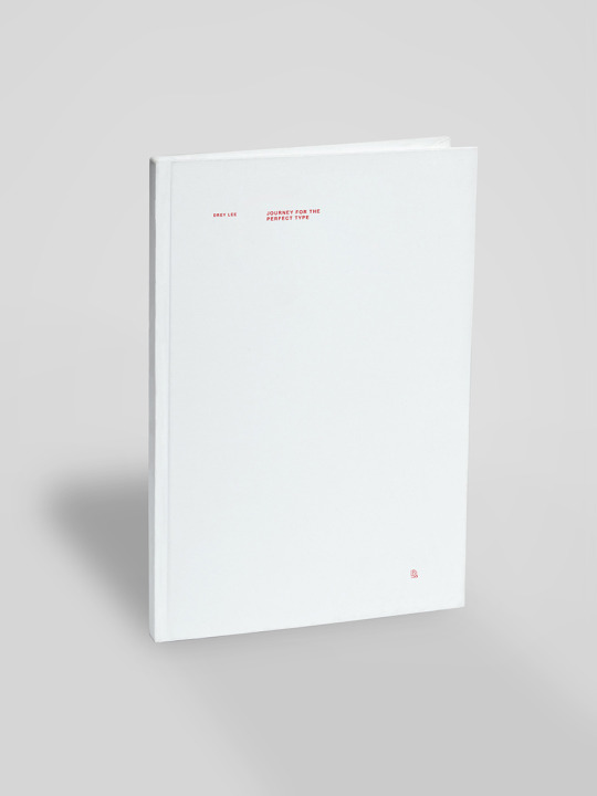
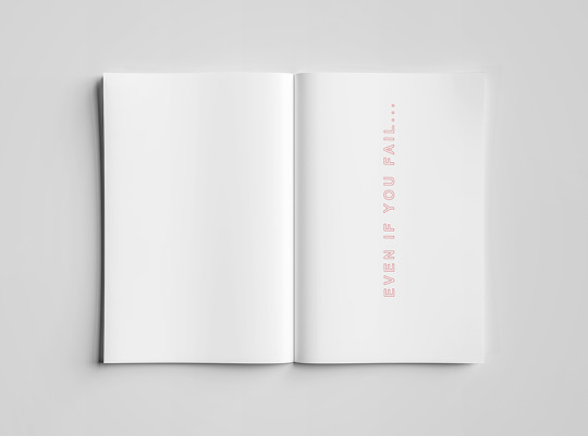
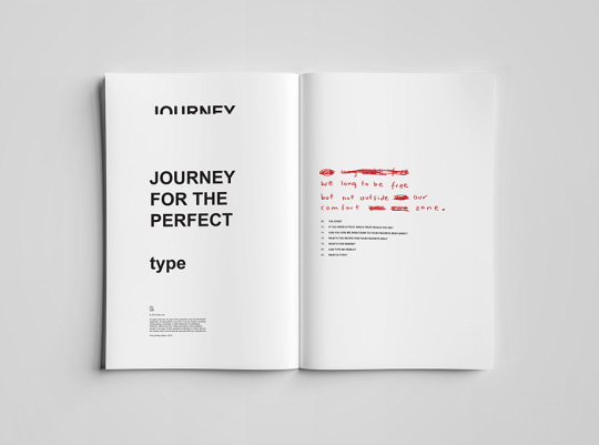
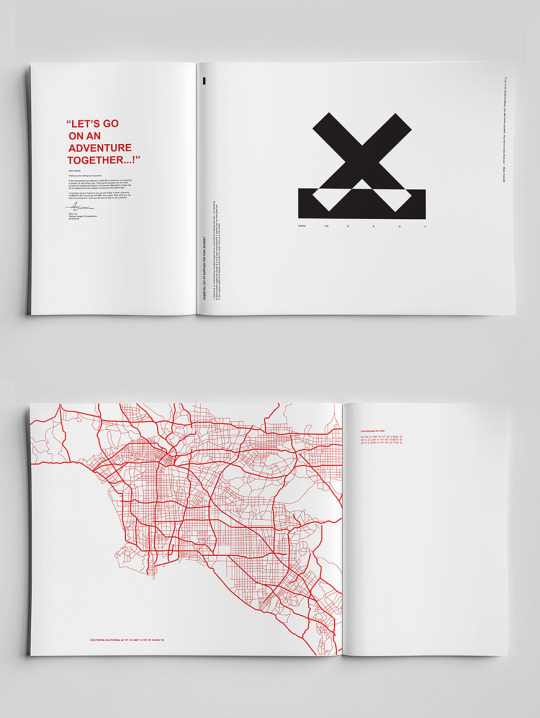
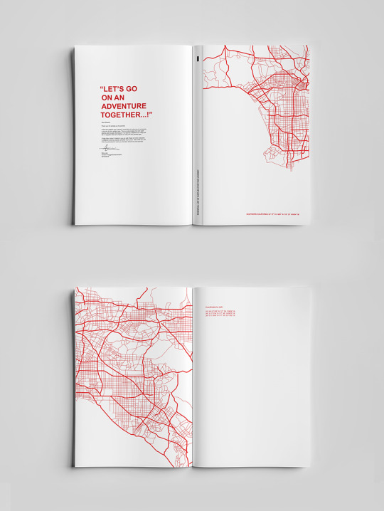
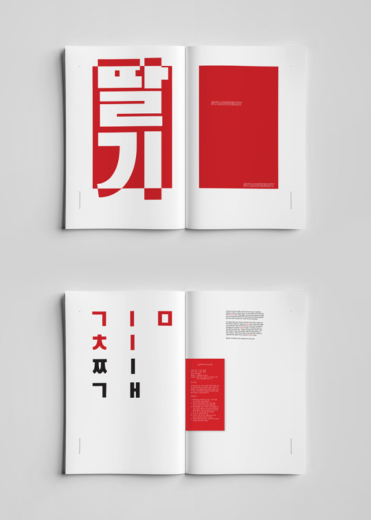

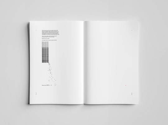

Book: Journey for the Perfect Type
11″x16″
Expressing both English and Korean by typographic means to weave a story about the author’s journey for the perfect type. Drawing inspiration from the ever present take-out boxes and ‘Thank You’ grocery bags which filled the author’s childhood, this book showcases a modern twist to classic Asian-American icons.
11 notes
·
View notes