
lucietope
LUCIE TOPE
Visual Communication (BA Hons)
1131 posts
Don't wanna be here? Send us removal request.
Last Seen Blogs
grubysort
Bez tytułu

footballerarchbishopdetective
The Footballer, the Archbishop, and the Detective
bardkingtomfoolery
Changeling Tomfoolery
gallys-wife
if you ain't scared… you ain't human

mariana8a-otaku
I just love the anime and SCANDAL
Text
Evaluation
Am I happy with the outcome?
Overall, I am very happy with the outcome of my project. I believe that I used my personal knowledge and travel background to address a problem within the travel industry that needed bringing to light. Technology has changed the world in so many ways, and as technological platforms develop they continue to change the world even further. Due to the fact that my parents work in the travel industry I have seen how this has changed the nature of their jobs over the years, and I have noticed that the nature of travel agencies is changing dramatically as the review sites become an increasingly common thing for people to visit. I believe that this is becoming a really bad habit that society is adopting and so I wanted my project to combat this, and to challenge the new idea that complaining is good.
Using experiences my parents have shared with me as inspiration, I believe that my travel brand communicates the idea of true travel, through an alternative, direct and comedic tone of voice. I feel that creating a bespoke typeface to use as the core of the brand identity was appropriate for the purpose of the brand because it has such a bold message to share. I feel that the language and imagery I have chosen conveys this idea that travel isn’t perfect, but this is what makes it worth it. I feel that through my design choices I will shift peoples opinions about complaining on review sites and start to reflect on the impact that this has on a long term scale, upon the travel industry.
What went well in the project?
I feel that the art direction of my project was really successful. This is because I think that I have created a unique brand identity to suit the unique brand message. I believe that through the design choices I have made, I have created a travel brand that is unlike existing travel brands and this was done purposefully. To convey a bold message, I felt that I must ensure that the brand identity supported this and stood out from competitors. The Kukoo typeface is unique to the brand and the imagery I sourced was alternative and playful. I think that using my parents experiences as influences behind the tone of voice really helped bring the project to life, as this time of voice feels more personal - from people who feel this issue the most.
What could be improved?
I think that there are a few elements of my project that could be improved, including the fact that I think I could’ve taken the tone of voice even further, so that the message is more shocking. I think that some of the slogans could’ve benefited from this. I also think that some visual elements of the app could be improved, including the point size of some of the text as it is sometimes quite small. I am unsure about whether I feel that the app needed a brighter colour palette as I fear that in places it is quite bland which doesn’t fit the brand at all, however the purpose of these was to allow the Kukoo typeface and imagery to speak louder than the rest of the design. Overall I am happy with my final outcomes and I believe that I targeted a problem that I feel quite strongly about
2 notes
·
View notes
Text

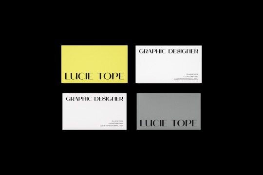
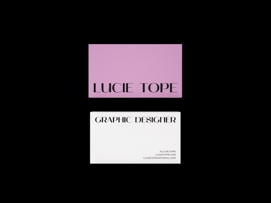
Final Business Cards
I really like the outcome of these cards. As I was experimenting I thought about how I could relate my cards to my work. I personally, feel that my work is quite varied and I am still developing my own style. I usually explore different concepts in my work and I wanted to convey this through my business cards. Each business cards is a different colour to convey the idea that my work is quite varied. The layout is clean and simplistic but still involves colours that I feel drawn to as well as colours that suit my personality. Overall I feel that these business cards represent me as a designer well.
0 notes
Text


Personal Branding Development
My first experiments with personal branding. I don’t really like the outcome of these and they don’t feel very me at all. I really like the way my name looks in this typeface, however, so I think I will use this as my logo.
0 notes
Text


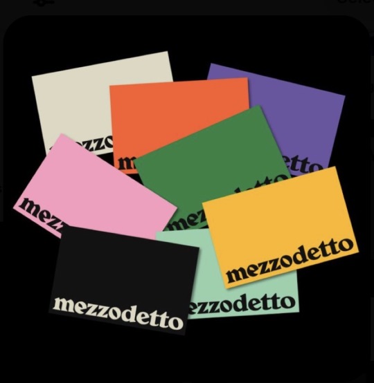


Business Card Inspiration
Really like all of these business card designs. They have given me some ideas for my own. I’m definitely doing to include blue or yellow somewhere.
0 notes
Text
Personal Branding
I thought it would be useful to gather an idea of how I would brand myself, and also how others would brand me. I personally feel drawn to bold typefaces and I like clean, simplistic design with a lot of colour. I am usually drawn to pastel colours but I like working with bright yellow and orange a lot as well.
I asked my family how they would brand me and this is what they said:
- Light blue
- Yellow
- Black and white
0 notes


Photo
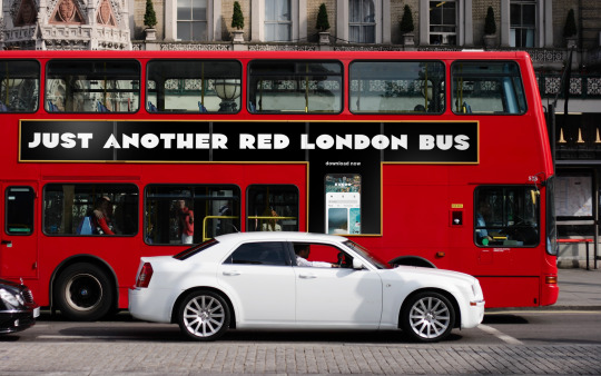
Branding Experiment Again, I was thinking of ways to take the brand further. I think that this is quite a nice idea, to use the Kukoo tone of voice on landmarks etc. I did have other ideas that involved an advert on one of the screens in Times Square New York as well as branding taxis / cabs but unfortunately I cannot find any mockups.
0 notes
Photo


Final Coasters I think that the coasters look much better black. White text on black is a supporting brand identity for Kukoo, when imagery is not needed. I deliberately wanted one side of the coaster to be negative and one side to be positive to show that everyone has different opinions about something, to demonstrate that some things aren’t worth complaining about on reviews sites.
0 notes
Photo
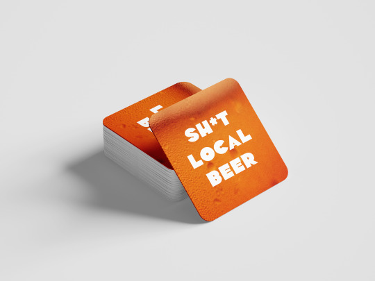
Branding Experiments This is an idea I had about how I could brand Kukoo in other ways. These beer coasters would be available to find in hostels etc (that Kukoo sells) to promote Kukoo, using the same kind of direct language.
0 notes
Photo
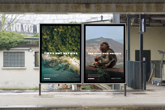
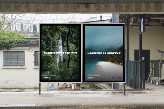

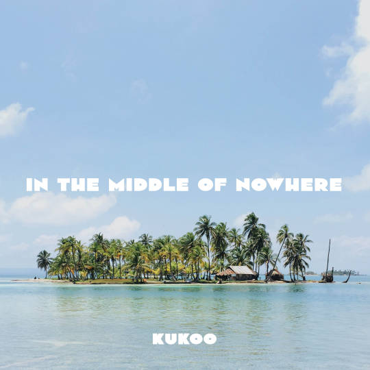
Final Poster Mockups The posters have also mocked up nicely. I think that it shows that they work well together, as a set.
0 notes
Photo

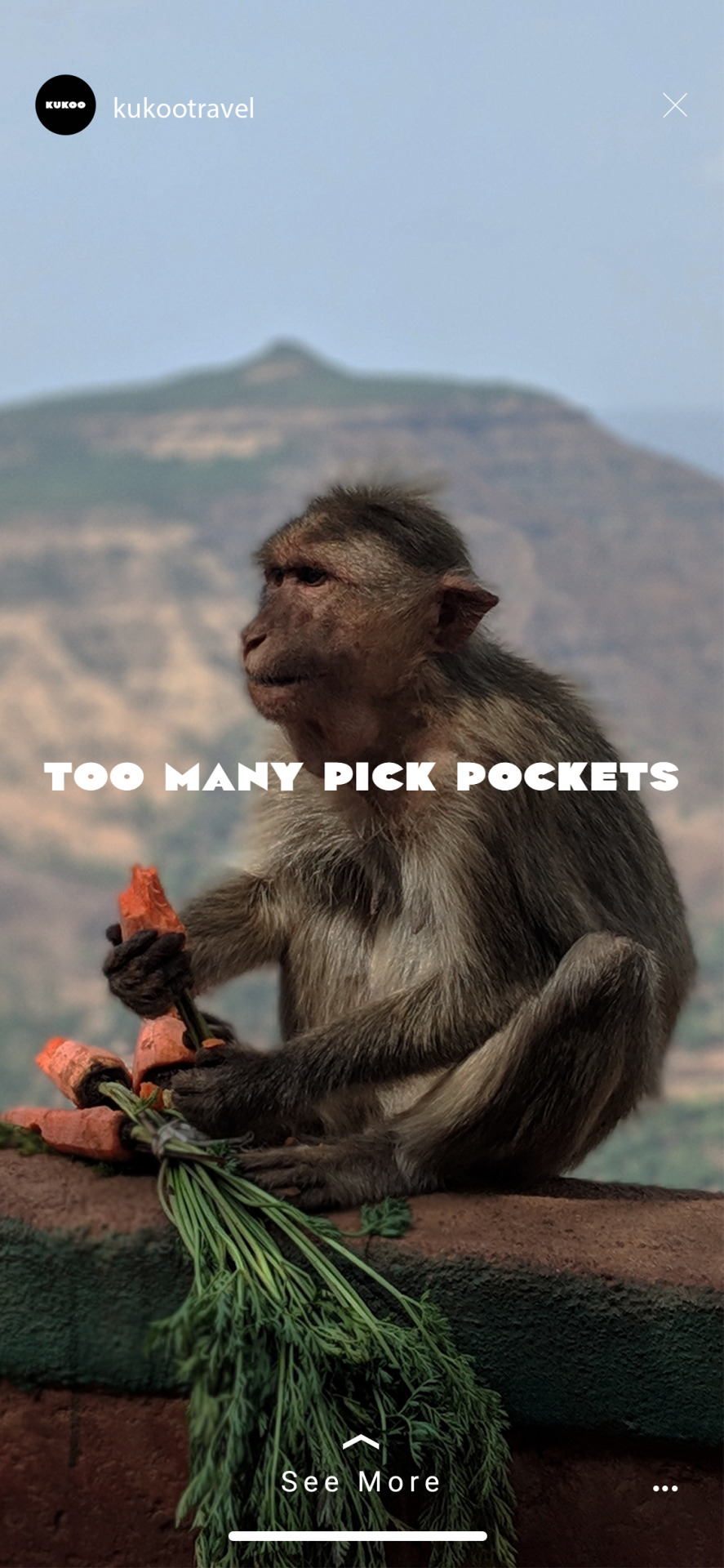
Instagram Stories Mocked Up Again I am happy with how these have mocked up. I think that the imagery creates some curiosity for the viewer, which I like, because the brand is essentially about discovering things for yourself.
0 notes
Photo
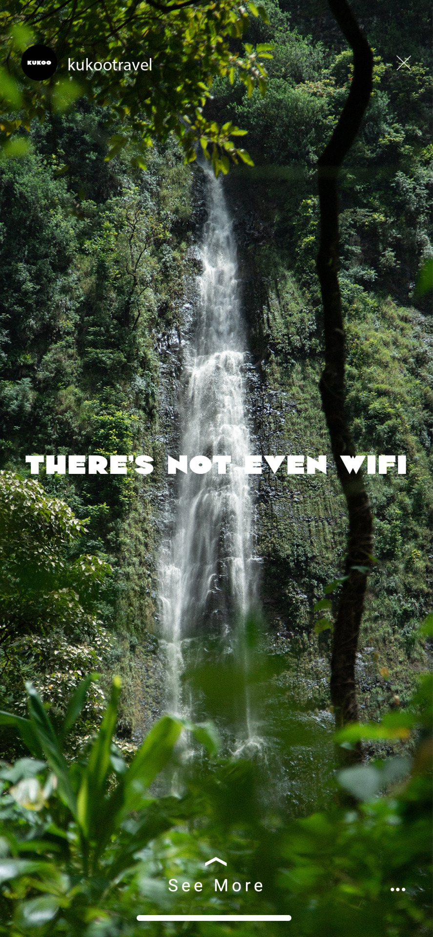
Instagram Stories The Instagram stories have been based off of the design of some of the posters. This is because I think that I don’t want to over complicate the visual identity by using too many different images at the core of the branding.
0 notes
Photo
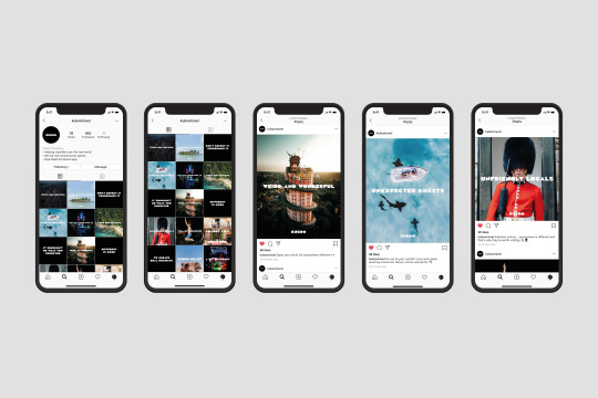
Instagram Profile Mocked Up I’m really happy with how these have mocked up. I think that the Kukoo typeface and imagery is working really well in the brand and I feel that it is exciting and definitely different to existing travel brands.
0 notes
Photo


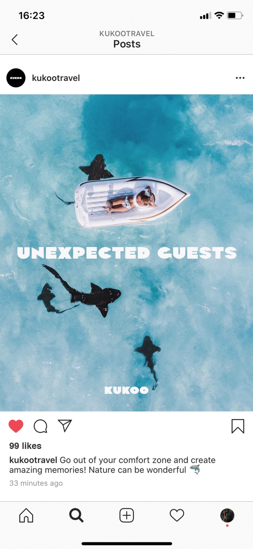
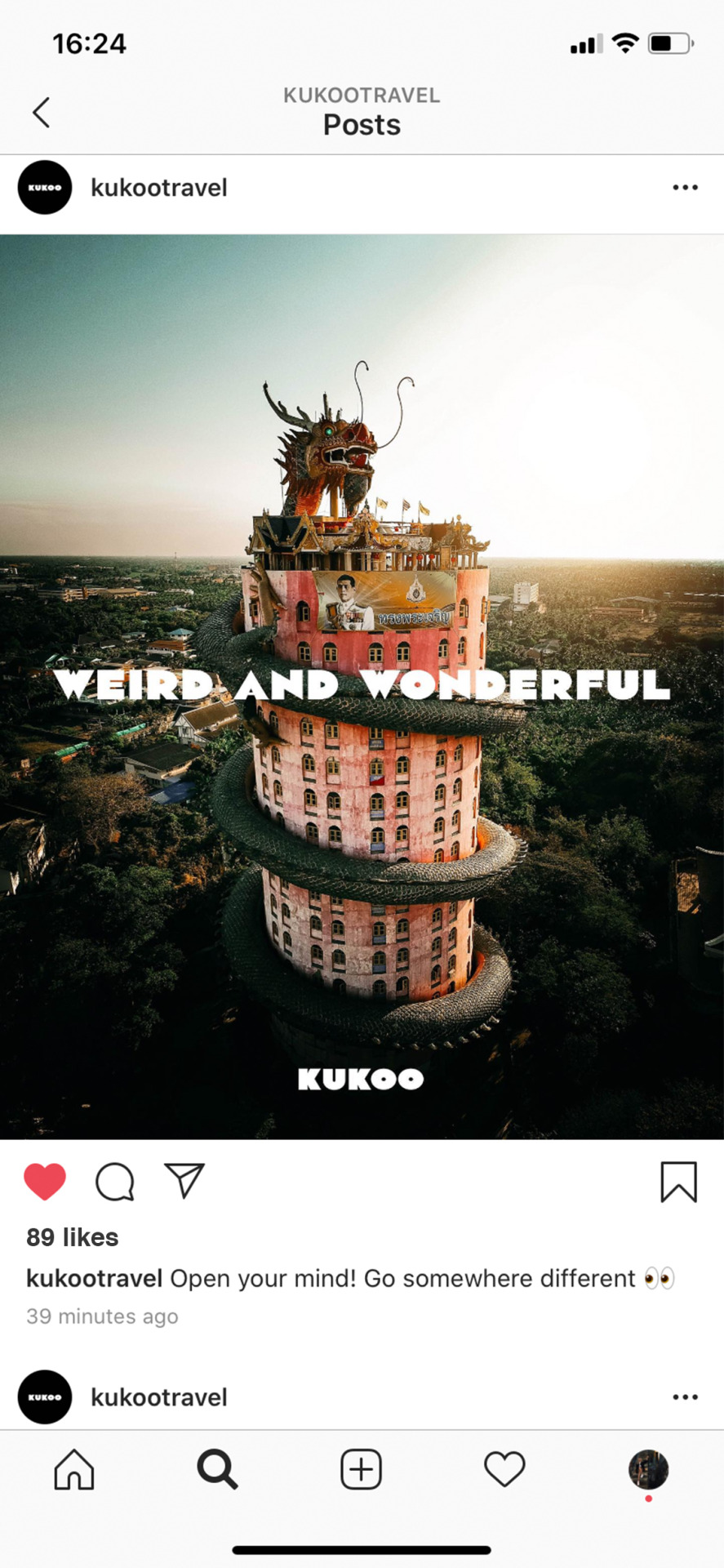
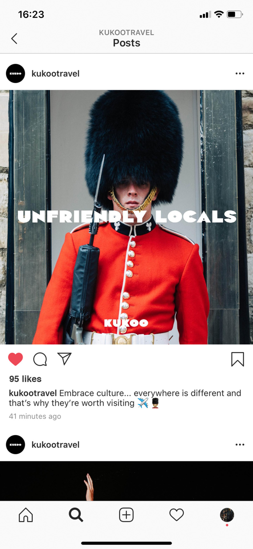
Live Instagram Posts I created an Instagram account rather than mocking up one because I thought it would be more sensible as I am handling a lot of imagery. I have continued the playful tone of voice in the captions and edited in followers / likes.
0 notes
Photo


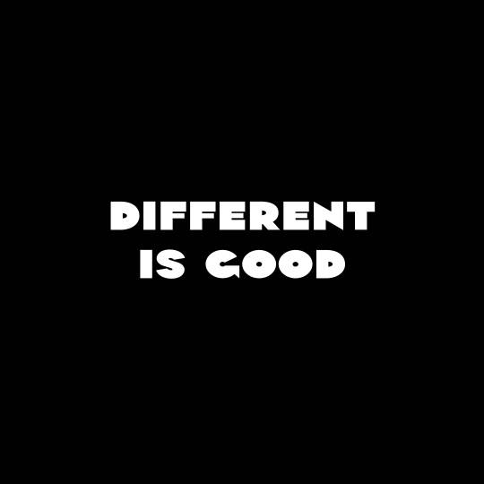
Instagram Square Posts (Supporting Posts) The Kukoo app icon and logo will be white text on black and I wanted to include this design somewhere else in the brand. I think that this will balance the Instagram out a bit. I also think that by taking out the imagery the message is more direct and makes the viewer reflect on what I am trying to communicate more.
0 notes
Photo

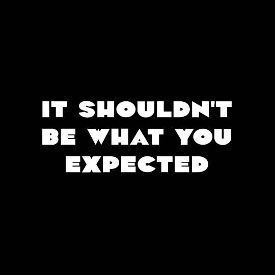
Instagram Square Posts I wanted to make sure that some of the language I used sounded familiar to the viewer. I want people to view Kukoo’s branding and think “I have said that before” because I think that this will help shift people’s perspective of travel and what is actually the most important thing about it - experiencing new things.
0 notes