
mangodelnorte
Raul DTContreras
This is my DTC 336 keeper of the homework
38 posts
Don't wanna be here? Send us removal request.
Last Seen Blogs

aertifloves
Aertif Sapphic

turkishfreak101
franzberg

all3stripes
Untitled
spaceoctopus
Who Even Cares

dixias
dysphoria
Text
232-247
Motion Graphics, this is new to me too. The closest I’ve gotten to it is the timeline tool in Photoshop. Some important things I got from this chapter is to think like a painter, typographer, animator and filmmaker when making these. Again using diagonal compositions to create motion on still images, and looping effects get motion as well. I need to learn about story boards, and to remember to keep it simple for the end product.
248- 260
Rules we should all follow the different rules or we should all mix the rules to create new content. Capturing a still image from an animation really caught my attention. Motion Prompt really creates a nice image full of movement. Abstract Alphabet looks great too, the feeling of getting it to work is probably greater especially after you forget a semicolon on that code.
2 notes
·
View notes
Text
200-213
Patterns have always come from three basic forms. Linear, crisscross and a mixture of both. Also by switching up the angles and size of the patterns we can create motion, something I keep relearning by accident.
214-231
Diagrams, are something I haven't really messed with yet. They can help illuminate and explain complex ideas. Creating networks inside the diagram will connect points, always color coordinate information so its easy accessible to the viewer. These were the notes I took down for myself here.
2 notes
·
View notes
Text
166-185
Working with constrains. Just how I like to try to only use three colors I should try using one shape only in designs. Even just one typography would be good too. I really like the sleek designs shown here by using simplicity and keeping everything looking the same.
186-199
Use grids, I need to let go of my intuition and use logic (the computers help) to make some crispy designs. By using grids it will help us develop a better form, rhythm and content management. Everything will be smoother.
2 notes
·
View notes
Text
140-153
Always layer and always keep an original copy of the work you are using. Layers are our friends we can always customize or delete them without damaging the rest of the work. Copy and pasting main focal points can help us speed up on branding work.
154-165
Transparency and layers are connected, but I think they are connected to texture as well. I use both of them to create most of my textures.
2 notes
·
View notes
Text
116-127 “Framing”
I liked the idea of frames inside frames showed here. It didn’t mess around with the viewer, it takes us straight to the main focus of the photograph. Margins, frame image, and text gives photos a nice touch. I want to start messing around with those ideas.
128-139
How to show hierarchy through design? Variation in scale, value, colors, and spacing can help us achieve this goal. I never thought about how close I should keep information to each other. The incorrect spacing between the table of contents shown really enlighten me here, to me it didn’t look wrong at the first glance.
2 notes
·
View notes
Text
98-107
Using positive and negative space to create a complex meaning into a simplified form. Believe in the six modes, like the Jedi believe in the force. I need to keep the ideas of simplicity, similarity, proximity, closure, continuity, and symmetry in mind always.
108-115
Sketch, sketch, sketch. Always doodle on a pad when brainstorming. White space is a valuable tool, its even considered fancy.
1 note
·
View note
Text
80-89
Color itself is important to create a feeling or set a tone. RGB is seen on screen and CMYK is what we see in prints. I think I am learning what the difference is.
90-97
I always try to keep a max of three colors per design. I am going to start using the mentality of using two colors while keeping black or white as a middle ground.Notes: Near compliments can create harmony, while primaries can create total distance.
1 note
·
View note
Text
60-67
No matter how small or big our logo is it has to be legible, a rule I followed without noticing but it will be in the back of my head now. Especially keeping in mind how the work would look like if printed.
68-79
Using contrast in textures can lure a viewer in. Text itself is a texture. By placing multiple text next to each other I can create different textures, I normally don't use more than 2 fonts for designs so this is new to me.
1 note
·
View note
Text
41-48
By creating one object in multiple points of view, we can express them in various ways creating a multiple different designs. Also using actual numbers to move our lines we can mimic computer perfect lines and symmetry.
49-59
I've haven't really paid attention to how much asymmetrical objects make your eyes move, compared to symmetrical objects. I liked they noted that repetition and change mixed create beauty.
1 note
·
View note
Text
25-32 "Alter Ego"
We can create an alter ego of ourselves. This can help us see from a different perspective and push ourselves from our comfort zone.
33-40 "Points, lines, and planes"
A point creates a dot, more dots create lines, more create shapes and textures. Just like neutrons protons and electrons create different mass and matter
1 note
·
View note
Text
1-12
Graphic design keeps on advancing and we keep on learning. We need to keep experimenting with the unusual language of design.
13-24
"Dozen of Eggs"
By doing multiple iterations they will help us dig deeper into the void of wonder that is our imagination. I really enjoyed the letter blocks. I'm trying these soon, maybe.
1 note
·
View note
Photo
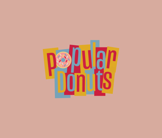

1950′s Branding Project: Popular Donuts in the 50′s
DTC 336
11/19/19
3 notes
·
View notes
Photo
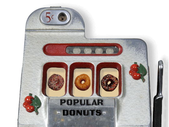
Evan’s Tutorial
DTC 336
11/21/19
1 note
·
View note
Photo
Abby Tutorial Mask
11/19/19
DTC 336
2 notes
·
View notes
Photo
Kyle’s Tutorial Slinky Text
11/14/19
DTC 336
2 notes
·
View notes

Photo

Robert’s Tutorial app logo
DTC 336
11/7/19
2 notes
·
View notes