
mydealingswithwebauthoring
My Dealings With Web Authoring
My hectic life as I try to grapple with all things CSS, HTML and Java
13 posts
Don't wanna be here? Send us removal request.
Last Seen Blogs

mandy-sims
mandy sims

syndrome-stendhal
Stendhal Syndrome

lets-be-plasticfree
The Secret Life of Plastics

victormacneil
Victor MacNeil

switchfukuroi
SWITCH instagram
Text
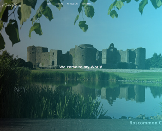
On Reflection...
Here we are nearing the end of Semester 1. Most improtantly, here we are in the midst of one of the busiest times of our lives!! Its probably best revisit this reflective piece once my projects have been submitted, however I would like to include this as part of my blog for WA submission.
So, how has it been?? Possibly the steepest learning curve of my life!! Academically, I have been stretched, technically I have been battered and emotionally I have felt suffocated at times, however, I wouldnt change a thing about the journey so far.
Web Authoring was something I was not looking forward to! Id dabbled in HTML in a past life and I found it particularly difficult. Thankfully, Gemma’s teaching style meant that there was great in-class tutorials, tonnes of resources and the opportunity to contact Gemma with queries.
We started semester 1 with our two-page HTML and CSS site. To me, this seemed like an impossibility. I spent days experimenting with pieces of code linked to some CSS. I referred to my notes backwards and forwards. Then one day, I clicked Refresh and TaDa the website looked perfect. I was petrified to touch it after this point! I just saved it and submitted!! Thankfully my grade was pretty good.

Our next project involved Wordpress. Finally something more visual. I really enjoyed this project. At the same time, the opportunity to use CSS to make edits was hugely beneficial. If I were to do this project again, Id use a more popular template as there might be more helpful resources out there. The template I used was only a couple of weeks old.
Im now in the middle of my final website. Iv made a start - even to start was terrifying!! Why does web design terrify me so much? Obviously I need to get to the bottom of my confidence issues with it! On top of that, I feel that there is so much required knowledge for a 7 page website and currently my brain is still within the basic 2 pager.
Im sure the next week will be a wash with blood, sweat and tears but I have no doubh that with coffee, some good music and the support of my patient family, I will pull it out of the bag!!
0 notes
Text
Typography in Web Design
As a graphic designer, typography is an integral part of my life. I tend to obsess about finding the right font choice for each project I do and get an uneasy feeling with observing a design with less than perfect typography. When I first discovered the art of typography in my undergrad, I wanted to know all the “rules”. Why do I choose this font over another? What size font should I use in this situation... I soon discovered that there are no rules, instead there is a feeling. A piece of graphic design “feels right” or it doesn’t and typography has a huge (if not the most important) influence on how the design feels.
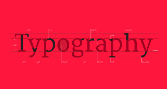
When I read articles about typography in Web Design, it appears a little more cut and dry (as appears to be the case in many aspects of web design). Initially the brand guidelines are drawn up by the graphic designer and this will set the tone for the website. The target audience, colour scheme and general vibe will be established. The web designer can then follow these guidelines either using the fonts recommended or choosing the most similar web safe fonts.
The most obvious distinction between print design and web design is that print is a real, tangible thing with fixed, unchanging information. This means that each piece of paper has a fixed, standard size, and we know what that paper size is in advance. On the other hand, because the screen is an adaptable medium, on-screen material is dynamic and continually changing.
When we develop material for a screen (whether images, accents, or textual components), we are planning for a variety of possibilities (such as varied resolutions, sizes, and devices). In terms of behavior, when we read digitally, we do more scanning and bouncing about. This might be because we're looking for keywords – in order to acquire as much information as possible in as little time as feasible. In terms of speed, Nielsen Norman Group tests have indicated that people read 25% slower when reading from a screen than when reading from paper.
From my research, I have come across a set of basic typography guidelines when creating a website:
Limit the amount of typefaces used on each webpage.
For body text, use a sans serif font.
Initially, stick to standard typefaces.
Text should be appropriately sized.
Don't use all capital letters.
Colors should be used with care and meaning.
Keep your lines between 40 and 80 characters long.
Allow enough space between lines.
Text animations should be avoided.
Remember that readability and legibility come first, but don't forget to make your typeface and messaging consistent with your brand and the personality you want to communicate.
0 notes
Text
Grid-Based Layouts in Web and Graphic Design
As a graphic designer Josef Muller Brockmann’s book “Grid Systems in Graphic Design“ was always a reference I had on my desk. Originally published in 1968, this book is as relevant today as it was during the International Typographic Style (Swiss Style). Web design as a whole has lent itself to clean grid-like structures - avoiding confusion with the message at the forefront..... identical to the movement of the 1950s.

Take a look at some of the most popular websites today that include top-notch design.It's very likely that they employed a grid of some kind. Grids provide stability and structure in a web layout, providing the designer with a logical framework on which to create the site.
A grid is a layout that is divided by vertical and/or horizontal guidelines to include margins, gaps, and columns to offer a framework for arranging material. Grids are commonly used in print design, but they are equally vital in web design. A grid does not have to make a website seem like the layout of a newspaper, but it may surely help in generating a consistent structure to begin the design with.
While a grid is a great place to start, rules are made to be broken! We saw at the latter end of the Swiss Style, Wolfgang Weingart began to rebel against structured design and instigate a new movement called New Wave. Letter spacing, bold stair-stepped rules, diagonal type, combining fonts or weight variations inside words, and type reversed from a sequence of bars were all part of Weingart's 'new wave' work and ideas. His work was very experimental, including experimenting with offset printing methods to create posters that seemed both complex and chaotic, but also humorous and spontaneous, resulting in strange textures and image construction inside his posters.

Similarly in web design, we see a confidence in grid breaking. Web layouts that appear to deviate from their underlying grid can be far more visually appealing than more typical methods.They're also great for calling attention to certain screen items that don't fit within the conventional columns.

The disadvantage of grid-breaking layouts is that they are difficult to master, especially when websites must be responsive. In reality, most ground-breaking designs are anything but. There is still an underlying grid, into which all screen objects fit. It's only that the grid is considerably more intricate, making it less evident. As a result, they are difficult to design. Because of their intrinsic intricacy, they are commonly utilized by design-led businesses such as design agency or fashion brands. They exhibit a level of design complexity that appeals to a certain audience.
For my own website, I may achieve a similar feel by using unstructured images as banners. This tecnique may demonstrate a freedom but while keeping the content in the structured layout.
0 notes
Text
2021 Web Design Trends
While I am still grabbling with the basic fundamentals of web design perhaps more common in 2005, I have been doing some research into what the web design trends for 2021 are. It seems the global pandemic and government lockdowns have had a big impact on how users navigate the web with a strong want for “super realistic” connections.
Virtual reality will explode (not literally!). The screen will outperform our aspirations in the real world by providing engaging, realistic environments that compensate for what we've lost in the real world. Building realistic environments, robust platforms have blurred the lines between real and virtual.

Face Recognition. Now that human contact has shifted further online, we are continually confronted with our own reflections looking back at us, emphasizing the importance of the face. Memojis, avatars and quirky filters present altered versions of ourselves that impact our self-image. Web designers will concentrate on individual identities as they construct experiences that not only cater to, but also include, end users.

Flexible Interfaces: This phenomenon which is getting more common in platforms like Netflix and Spotify, allows users to customise their interface to meet their own personality/mood. Users will be able tweak interfaces to match their varying needs, from enlarging typefaces to choosing a high-contrast palette for better legibility.
Three-dimensional colors: Gradients - with a soft edge to give depth. This effect is achieved by fine shading, which gives the flat icons a rounded appearance. Again, this links back to hyper realism.

Scrolling Transformations: This can vary from complete colour scheme changes to complicated animated transitions to total style changes. Web designers are taking the time to ensure that each scroll is like a new page—or, in some cases, a new website.
Hope and Optimism: If we strive for a stronger, more prosperous world, design will serve as a source of creativity and hope for the future. Optimistic visuals of blue skies, open landscapes, and other natural features would instill optimism and opportunity in our projects. The use of warm, pastel hues or vibrant, colorful colors will help to break up the monotony of our days. There will also be an increase in dreamy mesh gradients.
While all these trends are hugely interesting, part of me fears we will lose our identity if rely on the web at such an extensive level.,Scrolling effects, flexible interfaces etc. are visually great but aspects like facial recognition and AI, are a little less comforting for me. At this stage, it is probably out of my control so I will need to embrace it!!
https://99designs.ie/blog/trends/web-design-trends/#9
https://www.editorx.com/prowebsites/web-design-trends?utm_source=smashing&utm_medium=cpc&utm_campaign=ma_ads_edx-brand-trends-smashing&experiment_id=newsletter
https://www.smashingmagazine.com/2021/01/web-design-trends-report-2021/
0 notes
Text
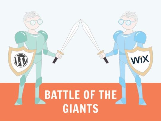
Wordpress vs. WIX
I have been using WIX for the last 7 years. I used WIX to build my own company website which is actually getting slightly outdated. The annual fees are pretty high (but then again it is my shopfront) and I like how easy it is to manage. What bothers me is that the content is lost should I decide to discontinue my plan with WIX. I think wordpress is definitely the way forward with me. I am still not feeling hugely confident with HTML and CSS so I am hoping that Wordpress will be slightly more user friendly for me.
Iv carried out a little research and I have discovered the following:
Ease of use:
WIX is extremely easy to use due to the drag and drop editor within the templates. Its very easy to add elements and move things around. Many beginners would find this feature a blessing as it saves them from dealing with code.
While Wordpress has a whole host of amazing templates, you need some technical knowledge in order to be able to set up the site and add extensions & plug-ins. The Gutenberg editor is great to add blocks of moveable content but its definitely more difficult to us for the novice.
WINNER: WIX
SEO:
WIX offer great options to allow you to expand your search engine optimisation - you can edit the page titles, URL and image alt texts. The Wix SEO Wiz asks you a few simple questions about your site and creates a personalized SEO Plan for you.
Wordpress have a better offering - there are amazing plug-ins available can really enhance to optimize content, meta tags, keyword focus and much more (eg. yoast seo and google analyticator). There isn't a better platform than WordPress when it comes to SEO optimization.
WINNER: WORDPRESS
Blogging:
While WIX will allow you to upload regular content, you are limited with the layout of your posts along with editing capabilities. It has all the basic blogging features you’ll commonly use. For example, categories and tags, photos and videos, archives, etc. Wix blogs have slower commenting and are more difficult to handle than WordPress blogs. Many users end up downloading third-party commenting systems such as Facebook or Disqus, which both require users to register. It also lacks a number of functions, such as the ability to backdate posts, create private posts, and more.
WordPress began as a blogging platform and has since developed into a full-fledged website builder.It now controls approximately 40% of all websites on the internet. It has all of the blogging features you'll need, including a native commenting framework and all of the other advanced features Wix lacks. Wordpress allows you to add tags, categories and RSS. Wordpress also allows for extensive plug-ins to support blogging
WINNER: WORDPRESS
Cost:
Wix offers a basic website builder for free however this plan will have branded ads featured on your website and also you will need to use a custom domain name eg. username.wix.com/sitename. Apart from that, the basic plan does not offer necessary add-ons such as Google Analytics, Favicons, eCommerce, etc. If you prefer to have your own domain name and a site without ads, you need to sign up for one of their plans. These cost between €12-21 with a monthly plan.
Regardless of which plan you select, this price does not include any Wix apps which you may choose to use on your website later.
Wordress is open source, which means that anybody can use it for free. You are just required to have your own domain and web hosting to install it. There are many free themes and plug-ins, it can be tempting to choose the paid option so costs can easily increase.
WINNER: WORDPRESS
CLEAR WINNER: WORDPRESS
Through my research, I have noted the following. If I want an e-commerce site, Wordpress is the way to go. I have experimented with the WIX apps and they tend to work out extremely expensive. From what I gather Wordpress offers WooCommerce which is free and suitable to create an online store. This is something I will experiment with in the next few months.
There are other categories not covered above:
Design Options (Wordpress)
Plug-Ins/Apps (Wordpress)
Data Portability (Wordpress)
https://www.wpbeginner.com/opinion/wix-vs-wordpress-which-one-is-better-pros-and-cons/#designoptions
https://www.arcstone.com/blog/pros-and-cons-of-wordpress-cms
https://youtu.be/z_XaTeO-zMk
0 notes
Photo


These are a few of my favourite things....
In recent times, I have started to compile examples of websites which catch my eye. I came across designmodo.com which is an excellent source of inspiration for web design. Pinterest is also a good source.
As I view my inspirational websites, I find it difficult to find common themes. There is definitely a requirement for simplicity and legibility (isnt that a given??), and I think Im drawn to muted colour palettes. This is interesting because Im not drawn to these colours at all in everyday life. I think one of the above examples feels like it doesnt belong here - THE BRIGHT FUTURE OF CAR SHARING, but yet I love the illustrative style of the background image. I am less convinced about the choice and placement of the typography. Where is the navigation??
What works well in the above examples? large scale photography, simple typography, 2-4 colour palette, a non-invasive nav bar and most of all a clarity about what is the purpose of the site. The branding of each of these sites is convincing and overall the styles are trustworthy and welcoming.
I will continue with this exercise as Im sure it will help when planning future websites of my own.
0 notes
Photo


Responsive Web Design - What is it?
Responsive Web design is a concept where web/app design should adapt to the user's actions and context, taking into account screen size, platform, and orientation. The use of HTML and CSS to automatically resize, hide, shrink, or enlarge a website to make it look good on all devices. When the user switches from a laptop to an iPad to a phone etc., the website should adapt to the new device's resolution, image size, and scripting capabilities.
Becoming flexible: We can now make our designs it more adaptable. Images can be changed automatically, and we have workarounds in place to ensure that formats never break (although they may become squished and illegible in the process).
Adaptive Design vs. Responsive Design
Responsive design differs from adaptive design in that responsive design adapts the rendering of a single page version. Adaptive design, on the other hand, creates several entirely different versions of the same website.
Responsive design - Users can access the same basic file through their browser regardless of platform, but CSS code will monitor the layout and change it depending on screen size.
Adaptive design - there is a script present that checks for the screen size, and then accesses the template designed for that device.
The chart above shows how the use of mobile to access the web has increased. Mobile web traffic has overtaken desktop and now accounts for more than 51% of website traffic.
A media query is a CSS3 feature that allows you to adjust the rendering of content considering various factors such as screen size or resolution.
To use media questions, you must first choose your "responsive breakpoints" or "screen size breakpoints." A breakpoint is the width of the screen at which you can apply new CSS styles using a media query.
The below list is useful when keeping in mind varying screen sizes:
Mobile: 360 x 640
Mobile: 375 x 667
Mobile: 360 x 720
iPhone X: 375 x 812
Pixel 2: 411 x 731
Tablet: 768 x 1024
Laptop: 1366 x 768
High-res laptop or desktop: 1920 x 1080
Sources: https://kinsta.com/blog/responsive-web-design/#responsive-web-design-vs-adaptive-design
https://www.smashingmagazine.com/2011/01/guidelines-for-responsive-web-design/
0 notes
Text
What is Bootstrap?

Bootstrap is an open source platform aimed at making mobile web creation more standardized and simpler. The web app development toolkit was created by former Twitter employees Mark Otto and Jacob Thornton. It is essentially a list of data (CSS and JavaScript). A large number of classes and ready-made components become available for design layout when a Bootstrap web developer connects these files to the page.
Using them, a developer can quickly create modern websites with responsive web design. It saves time from writing lots of CSS code, giving more time to spend on designing webpages.
Some of the advantages of Bootstrap:
Responsive grid
Responsive images (automatically resizes)
Its components (Navigation bars, Dropdowns, Progress bars, Thumbnails)
Its JavaScript (custom JQuery plugins)
External templates
If you do use Bootstrap, keep in mind that it’s designed with mobile users in mind first and foremost. Their media query collection assumes that on very small devices, the default CSS will render, and that any layout for a larger device will be coded in the media query that corresponds to that device's size.
Some of the downsides of Bootstrap:
Templates can be very similar
Files can be huge
May not display on older browsers
Your coding skills might become stale
Despite the downsides, Bootstrap is something I am excited to learn.
0 notes
Text
Women in Tech - 2021

I read an Irish Independant article recently which disussed the prominence of women in lead technology roles in 2021. The article profiled women in high-profile IT jobs, outlining their outlook on the sector. Upon reading the article some aspects became apparent and we are finally seeing the destruction of the so called “glass ceiling”.
Something which is apparent is the necessity to have solid qualifications, often to PHD level. While the STEM subjects are a great starting point, most of the women profiled had studied in their sector to a doctorate level.
Another interesting point is that quite a few of the women had experience in IT, Science and often a Medical field (biomedical or devices). It has prompted me to question whether I tend to put my eggs in one basket by focusing my career on design alone. In school, students are often labelled - the artistic one, the creative one, the clever one, the sporty one etc. Why are we allowing our young people be segregated when clearly crossover is required in many fields?
“Technology is fascinating as it never stands still. In college, I studied anthropology and psychotherapy. I often think it’s the human studies that have helped me most in tech.” Jade O’Connor, VP Product & Marketing, FCR Media
To allow our young girls flourish in the world of technology, we need to remove the sterotypes from a young age. Dorothy Creaven VP, MD & site lead at Rent The Runway European HQ believes that gender diversity in the tech sector starts with “parents encouraging their children to think outside the stereotype box”. Even in 2021, there seems to be a bit to go before girls are catching up with the boys in maths and science. Dr Nora Khaldi, Founder & CEO, Nuritas says “Technology is slowly becoming a more diverse, less male dominated sector.“ We are making progress, but further to go.
A repeat pattern we see among the women profiled is that alot are running two or more companies - going from strength to strength. I guess entrepreneurship is like a bug and once you feel confident in your field, the world is your oyster!
Read the full article here: https://www.independent.ie/business/technology/revealed-irelands-top-30-women-in-tech-in-2021-40243308.html
0 notes
Photo
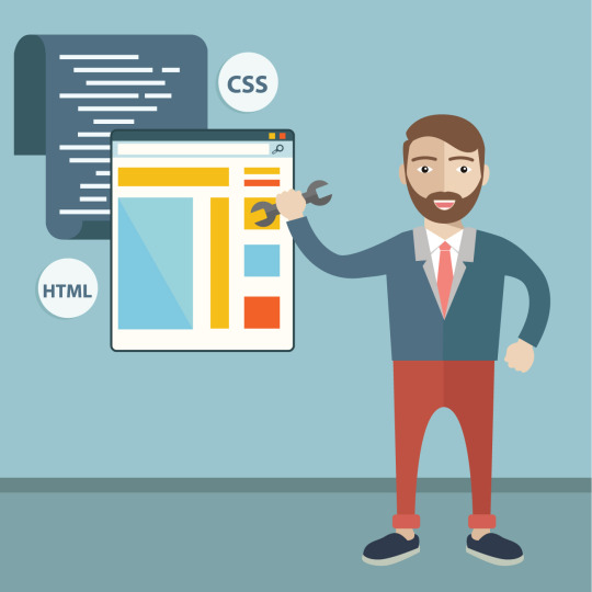
CSS - What’s it all about?
I’m starting to dip my toes into the complex world of CSS. I’m told its a wonderful world but right now, it feels scary, overcomplicated and confusing! Gemma has provided us with a wonderful library of resources - the question is where to start? I find smothering in a sea of tabs, along with youtube tutorials and a half-legible messy notebook. I have discovered that CSS has many benefits (I need to remind myself of these as I pull my hair out!) As a graphic designer, CSS is my friend - it combines the fabulous world of typography with layout and colour. It seems impossible not to love it - I just need to get the hang of it first.
Why External Style Sheets work?
Everything is stored within a single file. Once updated, the changes are reflected on all other pages that reference the stylesheet. This makes it easier to maintain larger websites.
Pages load quicker once the main CSS file has been included. As a result bandwidth goes down.
You can use the same .css file for multiple pages.
Since the CSS code is in a separate document, your HTML files will have a cleaner structure and are smaller in size.
Improved control over formatting. The degree of formatting control in CSS is significantly better than that provided in HTML.
CSS-driven sites are more accessible. By keeping presentation out of the HTML, screen readers and other accessibility tools work better, thereby providing a significantly enriched experience for those reliant on accessibility tools.
So here we go, its time to apply CSS to my own site. I will check back on my next post with an update.
Useful resources:
https://developer.mozilla.org/en-US/docs/Learn/CSS/First_steps/How_CSS_is_structured
Fundamentals of Web Development - Randy Connolly
https://www.smashingmagazine.com/2021/02/things-you-can-do-with-css-today/
#webauthoring
#css
#html
#webdesign
#pullingmyhairout
0 notes
Text
Web Accessibility

What is Accessibility?
“Accessibility is the design of merchandise, devices, or offerings that can be utilized by as many humans as possible. This consists of those with disabilities, which include impaired vision, motor problems, mastering difficulties, or deafness.” (https://seogeky.com)
Thankfully, web design is moving forward to ensure people of all abilities can easily access and use information on the internet at a manageable level.
The EU Web Accessibility Directive (2016) has governed that all public websites and apps meet specific technical accessibility standards.
It requires the following:
accessibility statement for each app and website
a feedback mechanism so users can flag accessibility problems or request information published in a non-accessible content
regular monitoring of public sector websites and apps by Member States, and reporting on the results.
Simple changes that make websites and apps more user-friendly can bring huge improvements for everyone, not only for users with disabilities. Businesses with accessible services can reach a larger, mostly untapped customer base, with resulting economic gain. An estimated 100 million people in the EU have some form of disability, and so represent an important market.
While so much can e done with the aesthetics of the design, the semantic HTML needs to be on point. For example consider which tags you’re using to represent which types of data. The <div> tag doesn’t have any semantic value, the <p> tag does. Its time to think about how we can create a more accessible environment for everyone - this will be something at the forefront of my mind going forward.
https://seogeky.com/make-these-changes-to-meet-web-design-accessibility-standards/
http://nda.ie/Publications/Communications/EU-Web-Accessibility-Directive/EU-Web-Accessibility-Directive.html
https://ec.europa.eu/digital-single-market/en/web-accessibility
0 notes
Photo


How terrifying is HTML
I have to say, I was terrified at the thoughts of learning HTML again. Once upon a time, I undertook an XHTML course for “fun”. I’m still scarred. I found it the most daunting learning curve of my life!! Since then, I have qualified as a graphic designer, third level educator and run my own business.
Come 2021, it was time to face the music again. I joined Gemma’s Web Authoring class with a scepticism beyond belief. I was resounded to the fact that this would be my weakest module. However, I am pleasantly surprised at how satisfying and addictive HTML is. Gemma’s little trick to get you to do 10 minutes per day is effective. 90 minutes later I’m dancing around the room having just placed some information in an unordered list. With my track record 10 minutes per day isn’t feasible but 3 times per week is certainly doable and I’m seeing the rewards. I’m no longer terrified.
Aside from the editing studios, the best tools for me are:
www.freecodecamp.org
www.developer.mozilla.org
www.example.com
www.stackoverflow.com
www.html5.validator.nu
0 notes
Text
Look how far we have come…
I’m a Lecturer, Further Education Tutor, Workshop Facilitator and now I’m a student again. Over the last 12 months, I have been confused, overwhelmed, frightened, and excited about the prospects of online learning – all in equal measures. In a past life I studied a post grad in Third Level Teaching and Learning where “blended learning” was to the forefront… yet nothing prepared me for this!
We have MS Teams, Zoom, Moodle, Webex and the list goes on. Back in March 2020, I was teaching a group of Level 5 learners ranging in age from mid 20s to late 50s. We were plummeted into a valley of distance learning, where EVERYONE had to adjust. Suddenly Teams was to the forefront, with assignments submitted digitally and screencasts became a weekly task. Everyone was dealing with a technological overload –the anxiousness was apparent even through the MS Teams interface. Yet we coped - and here we are into our second academic year and it’s becoming a new normal. Is this going to be the new norm? Being a mum of two, studying online at Griffith is working particularly well – I cannot imagine if I had to travel to Dublin 3x times per week. This technological overload has opened the possibility of a career enhancement, a new interest and a positive future for my family and myself. MS teams has a permanent place on my desktop, I now have a professional Zoom subscription and I can find my way around Moodle like a pro… now isn’t that progress!? Perhaps “the new norm” isn’t so bad!
0 notes