nonamerat
🐀👥
¦ bi ¦ Poland ¦ she/her ¦
o tags
o games list
o podcasts list
> my AO3 (eng/pl)
> art sideblog artarchiveart
| space |
art | birds |
Dublin Core Metadata Core Element Set
49905 posts
Don't wanna be here? Send us removal request.
Last Seen Blogs

ouyul7-blog
- ouyul7.tumblr.com

thegreatgildy
The Great Gildy

pleasedontgethurt
Medicus Cybertronica
mozart-1053
From Kira To Mozart
writingwhatneedswriting
The Darkness Calls
Text
it is once again... binturong appreciation hour
12K notes
·
View notes
Text


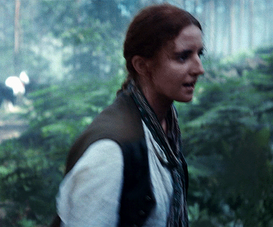

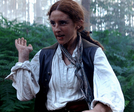
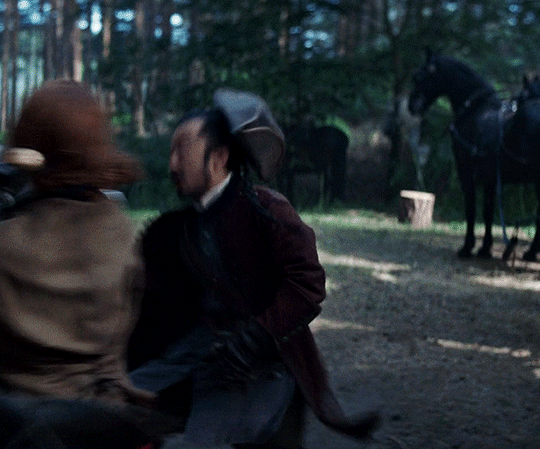

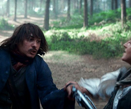
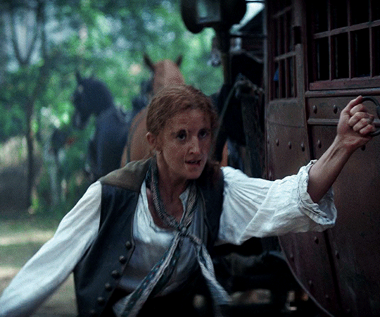
RENEGADE NELL
1.01 | Don't Call Me Nelly
1K notes
·
View notes
Photo

Taras Shevchenko and Ira Aldridge by Heorhiy Melikhov, 1963
Famous Ukrainian poet and artist Taras Shevchenko befriended the African-American Shakespearean actor Ira Aldridge, while the latter was on tour to the Russian Empire in 1858. Shevchenko did his portrait in pastel. It is recounted that the two men got along very well. While posing for the portrait, Aldridge sang African-American songs to Shevchenko and in return, the artist taught him Ukrainian songs.
4K notes
·
View notes
Text

gilliam my friend gilliam arroyo
21 notes
·
View notes
Text
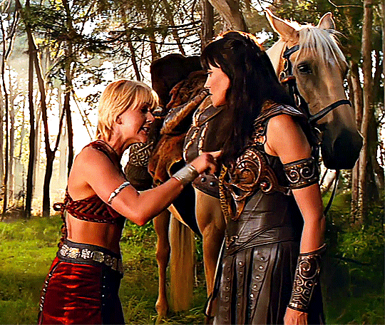
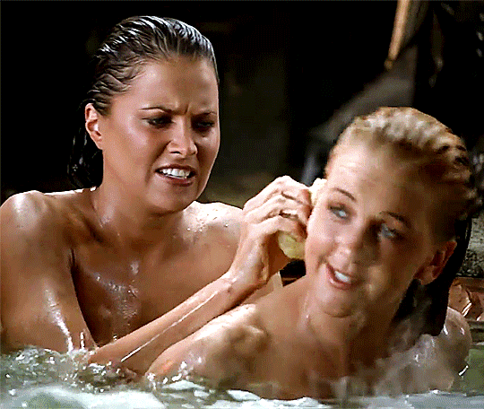
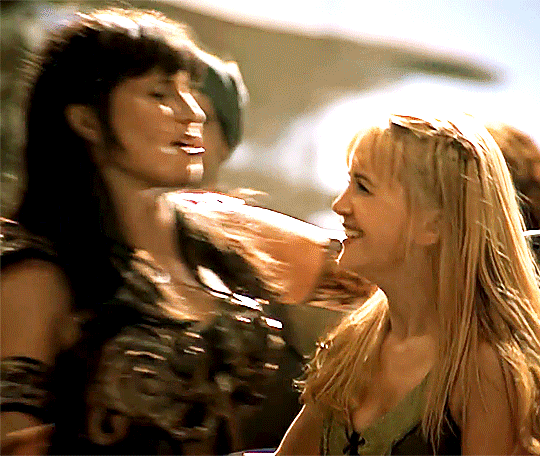
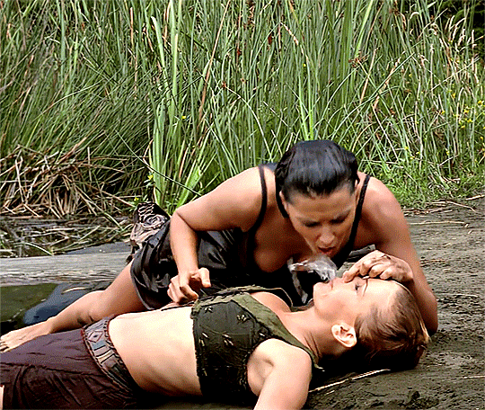
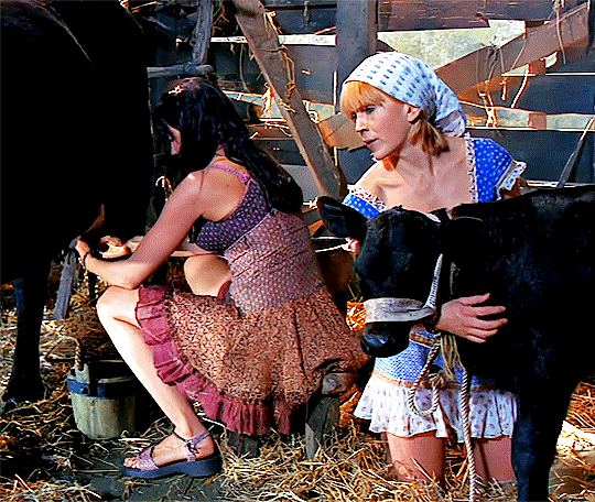
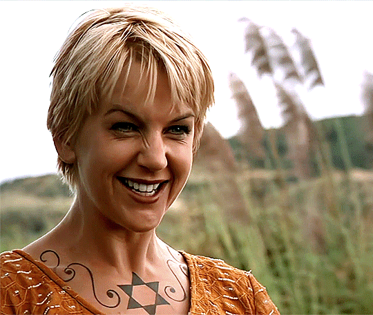
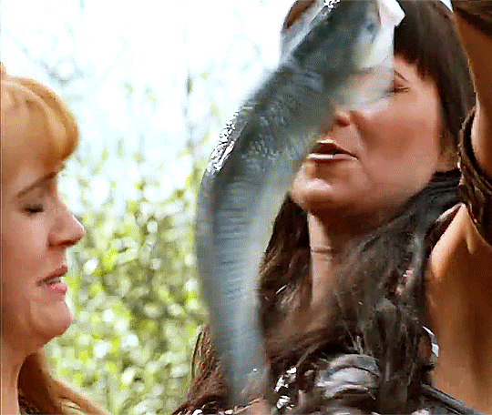

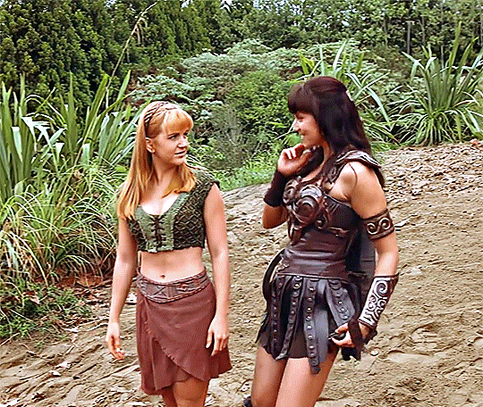
Xena & Gabrielle + being silly together
Requested by ladybokatankryze
6K notes
·
View notes
Text
Remember this joke?

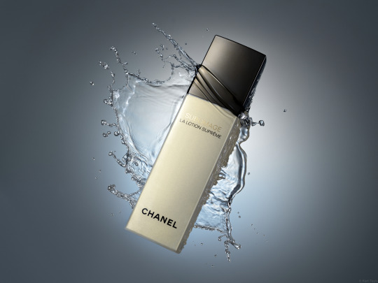
Well, I am going to do something similar only with photography. This is a photo someone took for an Amazon review of their Clinique products.
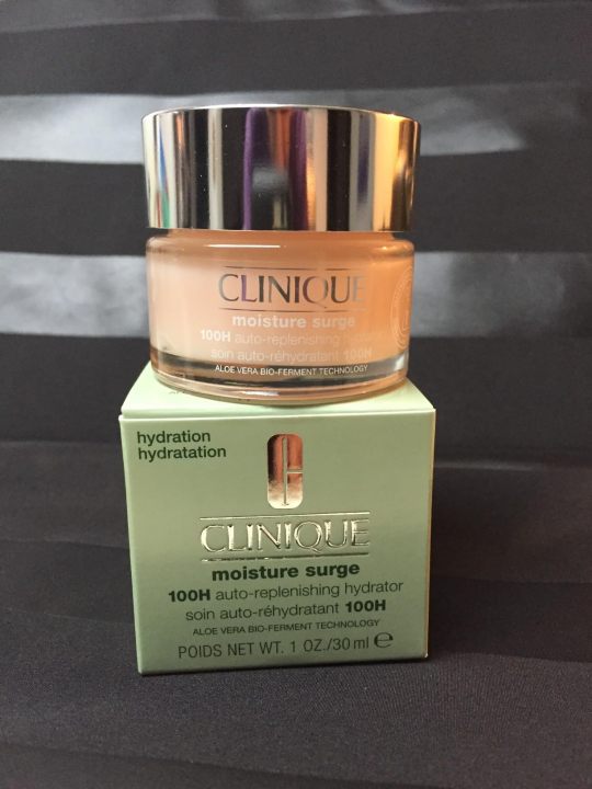
Honestly, it is not a terrible photo. They did some staging. They have an interesting background. All of the labels are legible. It is properly exposed. This would be a perfectly acceptable product photo for an Etsy page.
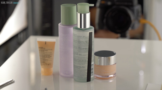
I've been taking these advanced photography courses in preparation for whenever I am able to create a new studio in the house. And my teacher is a photography badass. I just watched a 6 hour class on how to recreate a professional Clinique ad. And at first glance it looks deceptively simple. It's just some skin care products being splashed with a little water.
Which is why I wanted you to see an average person for reference.
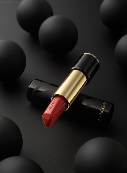
This is what Karl Taylor came up with.

And I don't think I've learned so much about photography in one tutorial before.
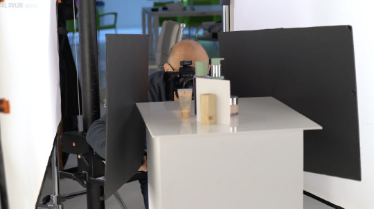
Product photography is just loads and loads of problem solving. You have to light the chrome caps with a gradient. Which requires giant diffusion scrims.

Those big white panels are literally only there for the two chrome caps.
You need a pure white background, but you can't let light spill all over the studio, so you put up giant black light blockers.
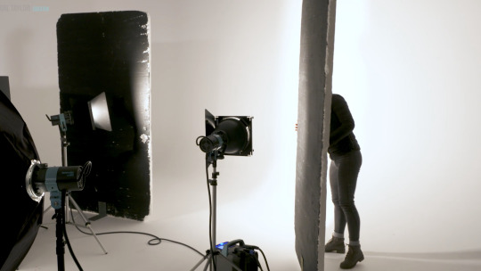
And you have to add another light just for the orange bottle on the right.

Oh, and if you want the bottles to glow, well, you have to hide a silver reflector behind them.

But you still want the edges of the bottles to be darker so they have some contrast. So you add some black tape to the sides.
And in order for the reflective labels to have bold black lettering, you have to reflect black cards into them.
Ack! Karl's beautiful bald head is showing up in the chrome caps! He must put on the naughty blanket.
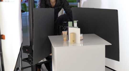
And once you get every aspect of every bottle perfectly lit, you finally get to yeet some water at it all.

I don't love product photography because I have a weird obsession to help greedy corporations make their wares look more beautiful. I love it because it is a complicated and challenging new puzzle every time. Every product is a different shape and requires a different technique to make it look its best.
I don't know if I will be able to live up to Karl's standards.


This is about the level I was at in 2017 before I quit photography.


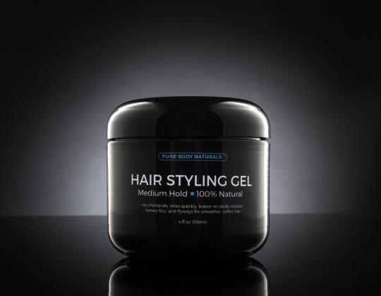
I have so much more knowledge in my brain now. I'm really hoping I can surpass that.
#polaczku jeśli jesteś zainteresowan#to gonciarz w swoim olimpijskim vlogu spotkał się z jedną biegaczką na jej treningu i biegli koło siebie#co doskonale obrazuje olimpijczyk vs prawie normalna osoba
4K notes
·
View notes
Text

I finally got permission to post my Eddie commission by @nwarrior777 ! Such a joy to work with and an excellent artist.
195 notes
·
View notes

Text
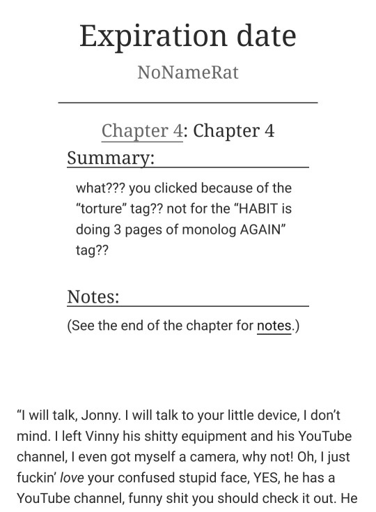
i'm on chapter 4!!!! you totally should check out my ff about HABIT doing monologues and stabbing people, but i also read House of Leaves and i like architecture that also is a character so here we go
hiiiii helloooo, i'm on the chapter 3 of my The Magnus Archives x EverymanHYBRID crossover! i have some blood there, and angst, and a little bit of gore! yes, of course, HABIT kidnaps Jon and have a fun activities with him, i can't imagine another kind of crossover with them. or maybe i can, but it's an idea for another time [read it on AO3]
3 notes
·
View notes