orangezeppelin
OZ's ARTCAVE
*Artist/Metalhead/Barbarian Babe/Anime Shop Clerk *
I'm a professional artist available fo' commission, you can check my About Me link for contact info!
3291 posts
Don't wanna be here? Send us removal request.
Last Seen Blogs
wylldebee
Be Ace. Do Space Crimes.
jphuynh
the story so far

torisvega
moved to nicknellsons

missluckycharms
Love Me, Please?
Text


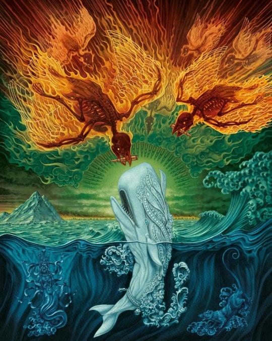

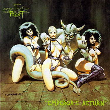
Amazing hand painted art by Marald van Haasteren
279 notes
·
View notes
Text
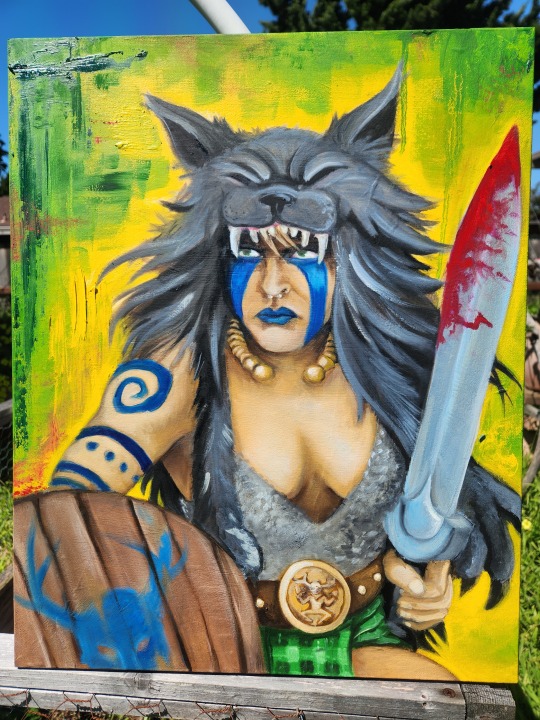
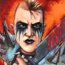
A better photo of my self portrait! Very, very, happy with how this turned out and also feeling much more energized to jump into similar projects this year. This is the mood want to carry though 2024.
0 notes
Text
I have a strategy of announcing certain projects so that it lights a fire under my ass to actually get them done.
....it doesn't always work out😂
23K notes
·
View notes
Text


In hindsight I'm not sure what I was thinking with this design, maybe it will look better when sanded and painted! (I can only hope)
The shop I work in is beginning to add cards to our stock, starting with Pokemon and the One Piece TCG. I told my boss that I was sure I could make something for us (being confident in both my terrible woodworking, and the black hole that is my scrap wood hoard)
Right now my only concern is that the "barrier" pieces are too short and that looking through cards might get tricky, but worst case scenario I can just make a better display in the future.
1 note
·
View note
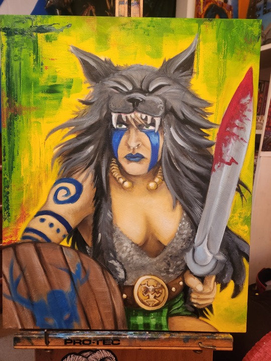
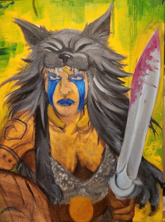
Text
youtube
In this video I show my oil painting process as I take on my largest self-portrait yet!
One thing that I should have mentioned in the video is the actual painting timeframe- Due to work and getting sick last month there were some long stretches where I didn't get any painting done. I do also let oil paintings sit for a few days after a long session so that they're less "soupy". There was probably a full week of between the loose underpainting and the session where I started the wolf pelt.
Once the painting is fully dry I'll get a photo in better lighting, but here is the finished product!
3 notes
·
View notes
Photo

Christopher and Gitte Lee
92 notes
·
View notes
Text

Today is Portfolio Day on Twitter/X/Whateverthefuck! I host my professional portfolio here on Tumblr: https://orangezeppelinportfolio.tumblr.com/
My largest and most easily navigable collection of art is on my DeviantArt: https://www.deviantart.com/orange-zeppelin
I'm just about always available for commissions, mostly traditional art, no AI, no NFTs, no bullshit!
0 notes
Text


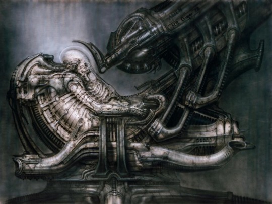
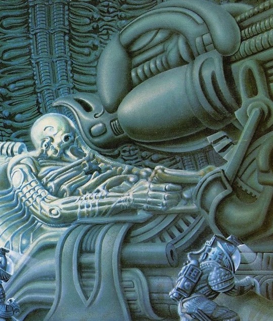
‘Space Jockey’ from Alien (1979) art by Ridley Scott, Moebius (contested), Ron Cobb, H.R. Giger, James Warhola
552 notes
·
View notes
Text


Work in progress on this year's self-portrait! Hoping to be done very soon so I can focus on preperation for two very large, multi-part projects that need to both be done in May.
4 notes
·
View notes
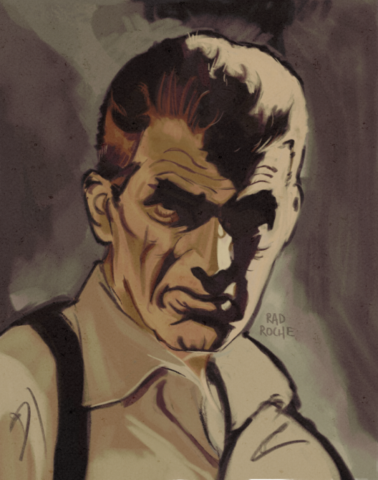
Photo

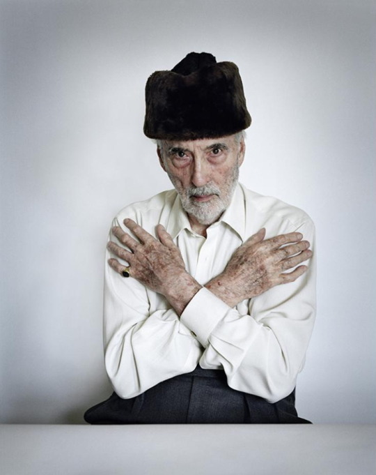
Found this in one of the Christopher Lee International Fanclub journals from the 70s
167 notes
·
View notes
Text

🎶He has a powerful weapon
He charges a million a shot
An assassin that's second to none
The Man with the Golden Gun🎶
35 notes
·
View notes
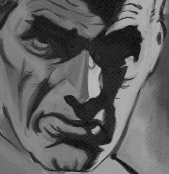
Text

William Stout drew Christopher Lee as The Monster from Hammer's The Curse of Frankenstein (1957).
#The Curse of Frankenstein#Frankenstein's monster#Christopher Lee#Hammer Films#William Stout#other people's art
41 notes
·
View notes
Text
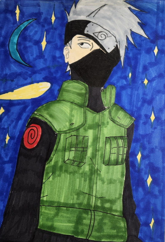

Time to answer that burning question of "Has my art gotten any better since I was 13 years old?" As long as you don't think too hard about some of those buildings in the background, I'd say it has!
If you're curious about my work process or want to hear a funny story about nearly poisoning one of my friends with a comic page, you can see the footage here along with commentary.
youtube
#my art#kakashi#kakashi hatake#naruto#naruto fanart#anime#alcohol markers#artists on youtube#Youtube
36 notes
·
View notes
Text
Part two of my Art Homie's blog post showcasing my comics, this one features and interview and we cover everything from my music taste (chaotic) to my Gaelic skills (questionable).
1 note
·
View note
Text
Pulp Covers And How To Paint Them
With the rise of cheap printing in the early twentieth century, mass-marked paperbacks swept the world, each offering lurid thrills for obscenely low prices. Sex, sadism, and incredible violence for as little as ten cents. An easy purchase to slot in between fifty cigarettes a day and enough bourbon slugs to kill a small garden.
Pulp fiction is where some of the greats of American literature cut their teeth, including the big three, Raymond Chandler, Ross MacDonald and Dashiell Hammett. The contents of these stories, both the dizzyingly good and astoundingly terrible, have been absorbed and digested and remixed and regurgitated in nearly every permutation imaginable, fuelling pop culture some one hundred years on. This isn't an essay on that. Nobody likes to open a tutorial and be greeted with a wall of text. The history is for another time.
But it is about how to paint it.
Don't let the pre-amble intimidate you, it's not as hard as it sounds. You will need:
Painting software with some image editing capabilities. You don't need all the bells and whistles of Photoshop, but I wouldn't recommend something like MSPaint, at least not to start with. I'm using Clip Studio Paint.
A really beat-up paper texture. The grungier, the better.
A lightly-textured brush. Here are the specific brushes I use, 99% of which is the well-named rough brush. Try and avoid anything with any impasto elements.
Go to your colour-picking tool and use the 'select from layer' option. Doing all the painting on a single layer is going to make your life easier.
A complete willingness to make mistakes and, instead of erasing, painting over them. It generates much more colour variation and interest! Keep your finger off the E key.
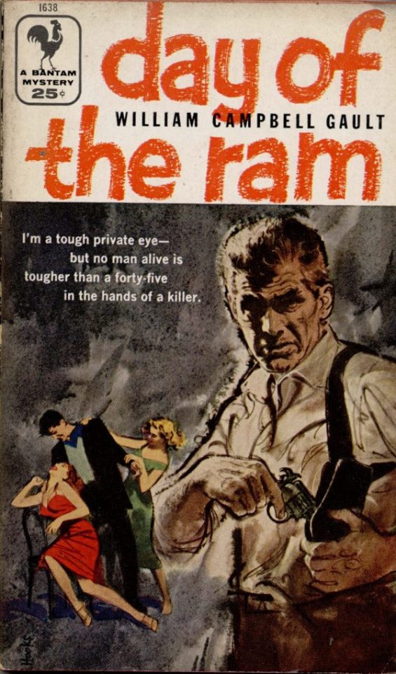
Good reference! That painting is a master copy of Mitchel Hooks' art for Day of the Ram. Find a style you really love and want to learn? Have no clue where to begin? Do direct studies!
Let's not worry about whatever is happening in the background. It's probably fine. Let's get started! Pulp magazine art is a lot more varied than you might first think, so don't agonize over having a style that 'fits' or not. I'm also specifically aiming for something you'd see on the cover after printing, not the initial painting they would use for printing. The stuff I'll show here is a pretty narrow band of it, but here are some general commonalities. This is a painting by Tom Lovell.
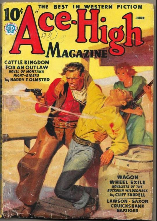
Let's dig into this.

The colours are very bright and saturated, but the actual values, the relative lightness and darkness of them, are actually grouped very simply! You can check this by filling a layer full of black, putting it on top and setting its mode to colour. If the value of a painting looks good, you actually get a lot of leeway with colour. But here's what I think is the most important thing to keep in mind.
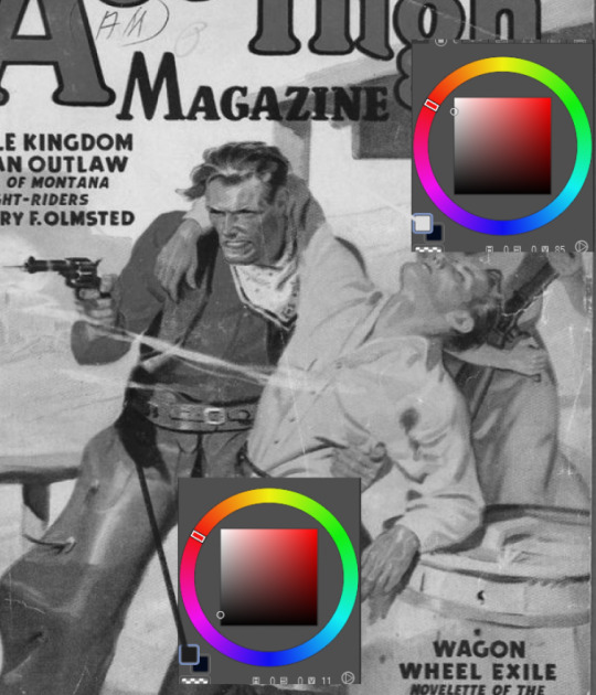
The darks aren't that dark, and the lights aren't all that light! Covers are paintings reproduced on cheap paper. Anything you wouldn't want to happen in the printing process, you lean into. Value wash-outs, lower contrast, colours getting a weird wash to them, really gritty texturing. So let's get painting! Here's my typical setup.
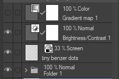
That bottom folder is the painting itself. The screen layer is the grungy paper texture. To get the effect you want, put it down, invert its colour, then set it to screen. That washes out your painting far, far too much, so to compensate, I put a contrast layer up on top. Fiddle around with the settings, but this is where mine ended up sitting.
Note I'm saying this before even starting the painting: you want to do this as early as possible. This is where the 'select from layer' colour picker comes in handy. You can paint without worrying about the screen or contrast layer. Something not looking right? Enable your value check layer and keep painting. When you turn it off, it'll still be in colour. Here's a timelapse so you can see what that looks like.
And when you check the values...
They're pretty simple! This isn't a be all and end all, but I hope it serves as a decent primer. I want thirty dames on my desk by Monday!
157 notes
·
View notes
Text

That mood when you have a lot of projects but instead decide to recreate your middle school Naruto fanart
(Progress video on the way!)
23 notes
·
View notes