Last Seen Blogs

wifeoflilpeep
𖨆♥︎𖨆
hermionegalathynius
Just Another Nerd

stardate-yeehaw
moved to creaturefeature333
chernobog13
My Corner of the Universe

sexlover87sworld
Any Age Girls And Men And LGBTQ Send Pics Here
Text
Simple guide to painting still life in oil paint
In this simple guide I will show in photographs and write about how I create a simple still life of a lemon using oil paint on canvas. I will discuss some of my thoughts and processes.

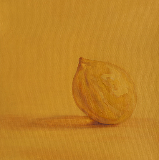
Lemon Yellow, oil on canvas by Paul Hirst
Step 1.
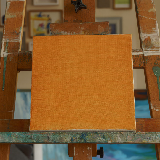
First give your canvas an overall wash in a colour of your choice. I generally use a mix of yellow ochre and alizarin crimson, use a solvent to make this mixture fluid but don’t use too much solvent that it doesn’t carry any pigment. Your aim is to stain the canvas but not have it dripping wet. You can be quite loose with the wash or more neater as I have done on this occasion, I chose to do this because I ultimately want an even coloured background to my painting.
Step 2.

Whilst the wash is still wet and using the the same mix but with less solvent, draw in a sketch of your subject matter. In my case I am painting a Lemon. I roughly paint the shape and darken the areas that have shadow or mid tone. If you are struggling to identify this on your subject there are a few tips to help. Firstly you could close one eye and squint with the other, by doing this is allows your vision to identify the contrast more than you would with two wide open eyes. If this doesn’t work out for you then take a photo of your subject matter with your phone, then edit the picture and there should be an option to change to tonal or even mono if you don’t have the former. Once you have changed the picture to this then it should have turned black and white. Now increase the contrast a little bit to make the blacks and the whites more obvious. This should then give you an idea of your highlights (lights) shadows (darks) and mid tones. You can then sketch in your image onto the canvas with the colour wash.
Step 3.
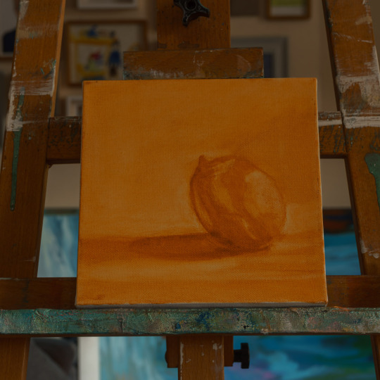
Refine your drawing a little, defining the shadows more and ensuring that the shape of your object is as you would like it. During this drawing stage I would use a no.2 round brush, if you were working on a larger canvas then you may find a larger brush better to use. Using a brush free of paint and dipped in the solvent, brush the areas that you would like to be lighter. In my case it was the background and the highlights on the lemon. When you brush with the solvent have a lint free rag available to mop up the excess and also to lift off larger areas. Be careful not to apply too much solvent and do not rub too hard, the purpose is to gently brush and rub away some of the paint to give a contrasting drawing on your canvas. When using the rag I find it easier to move in a circular motion with very light pressure, this allows the paint to be spread around into the grain of the canvas. You are not aiming to get the canvas back to its original white.
Step 4.
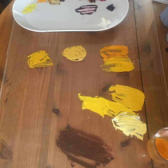
Once you are happy with the drawing it is time to start mixing some paint. For my painting it is mainly a mix of yellows, light, mid and darker tones. Consider what you want in your painting and look at your subject matter, analyse the colours you see, are they warm or cold, bright or dull? You need to consider what colours you will need in order to convey the feel of your subject matter. In my case, a lemon, it’s is an extremely bright colour and I want my painting to be bright but I also want some harmony between the lemon and the background. I want the lemon to stand out but I don’t want it to feel like it is hovering in space. I decide to have a yellow background to anchor the lemon, for this I mix a pale yellow using the yellow that I mixed for the lemon as a base. At this point I added my medium to the paint, I use liquin so I add it to the paint at this stage so I do not have to worry about adding when applying the paint.
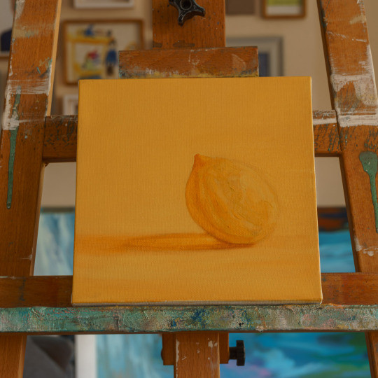
Step 5.

I start applying paint to my canvas, remember if you are using liquin as I am you should not need to use any more solvent. If you are using oil as a medium then you will need to decide your mix of solvent and oil dependant on how many layers you plan to have, you will need to follow the fat over lean principle to avoid cracking at a later date.
I start blocking in some colours onto my canvas, this all depends on what you want your final look to be like. I am aiming for a loose detail work but not looking for a heavy impasto look. I concentrate on putting the lighter yellow in the background and a brighter yellow in the the lemon.
A tip when creating bright areas in your painting, it always works better when you have a darker are next to it to give contrast. If I painted the whole lemon in bright yellow it would look less bright (and less realistic) than if I use bright and toned down colours next to each other. Look at your subject matter carefully and note the colours and tones it contains. Our eyes have a habit of homogenising colours into one overriding colour, do not fall into this trap, look carefully. Again you could photograph your subject matter on your mobile phone and zoom into the picture and look at the variances of colour.
Step 6.

Continuing applying colour, refining and smoothing, shaping your drawing to feel more like a three dimensional object, consider your background, what is its purpose? Is it contrasting your subject or harmonising? Do you want depth or make the subject plane flatter. Consider what colours you want to use to achieve your desired outcome, decide if you want texture or if you want it smooth.
Step 7.
More refining, in my case I needed to define my shadow from the lemon, making it flatter and more realistic. At this point you also need to decide on what your finished look is going to be. Are you going to keep refining until it becomes quite photo realistic or are you going to start using thicker paint and create an impasto look.
My choice is somewhere in the middle, I don’t want to refine too much and focus on fine detail, I want a loose painted feel but do not want a thick impasto finish.
Step 8.
I now take the painting to its final wet refinement, there are a few areas that I need to address such as some edges of the lemon and the shadow which I feel I would be better doing them once the painting has dried a little, so I leave the painting overnight to dry, make a note of my thoughts and clean up my brushes and palette.
The final, finished painting. The next day I refined my edges, background and introduced a complementary subtle purple Into some of the shadow areas and added a few highlights. I am happy with the result, it is what I was aiming for, I wanted a duo tone feeling to the painting, I wanted it bright but not too bright and I wanted it to feel quite calm and subtle.
I hope that you may have found this simple step-by-step guide useful, the aim is not to say “look how you have to paint” painting isn’t like that, there are so many different styles and techniques and the beauty of painting is that you could get 1000 people painting the same thing and they would all interpret it differently.
My hope is that you could see my process and thoughts for this particular painting and start to identify what you would do differently, or the same if you wanted, but to think about what you want out of painting, where do you want to take it, what do you need to learn or change to achieve your outcome.
It is really difficult to make a start sometimes with painting, you need to have a clear picture of what you want to create and then devise a way to achieve that. When starting out as a painter it is challenging to identify the skills and techniques you require or understand what styles you do or don’t want to utilise. There is no substitute for having a go and finding your own way but sometimes it is good to have an insight into how the bike works before you get on and try to peddle.
Let me know any thoughts, questions or feedback, I’d love to hear them!
1 note
·
View note