perfectsilence22
square peg in a round hole
💗 💛 💙 antania. chaotic mess. sideblog: raypakorn. this is mostly just a resource blog.
139 posts
Don't wanna be here? Send us removal request.
Last Seen Blogs

el-efrit
El Efrit

jk-lucent
JK Lucent
lotteteussink
L o t t e T e u s s i n k ART

martine-b
UN JOUR UNE PHOTO

thehouseofwayne
so falls the house of wayne.
Photo
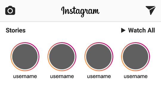
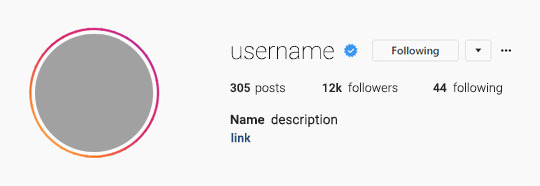


。・ template psd forty six, template pack twenty by templatepsds ゜+.*
-`. info .’-
+ as requested, here are some templates based on IG stories.
+ there are five total psds: one of the home page with accounts with stories, one of a profile w/ story border (image version), one of a profile w/ story border (gif version), one just of a big profile pic w/ the border, and one of the actual stories itself.
+ for the actual stories template, you can have up to 7 stories.
+ for the gif profile template, the gif is already in the frames, you just have the customize the text & add the profile picture.
+ you can make the stories into a gif, or leave as an image.
+ the fonts used is Roboto Thin, Roboto Light, Roboto Regular, and Roboto Medium, all of which you can download here.
+ not for commercial use or anything like that! just for personal use/to have fun.
+ adjust as much as you want to suit your liking.
+ please like or reblog if you download.
+ mssg if you have any questions/difficulties!
-`. dl .’-
+ one (home page stories)
+ two (profile - image ver)
+ three (profile - gif ver)
+ four (icon)
+ five (stories)
3K notes
·
View notes
Text
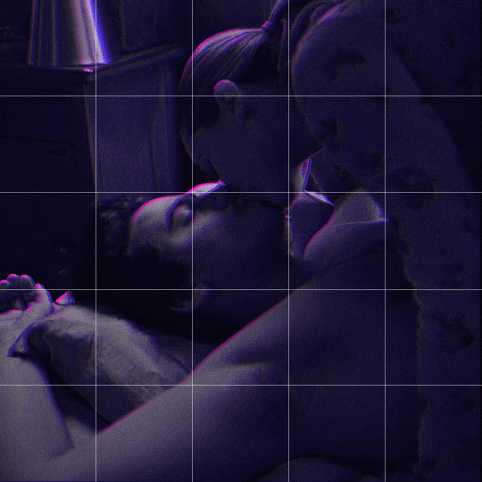
Someone asked me how I created the fade transition in this gifset which I’ll try to explain in the most comprehensive way that I can. If you've never done something like this before, I suggest reading through the full tutorial before attempting it so you know what you'll need to plan for.
To follow, you should have:
basic knowledge of how to make gifs in photoshop
some familiarity with the concept of how keyframes work
patience
Difficulty level: Moderate/advanced
Prep + overview
First and foremost, make the two gifs you'll be using. Both will need to have about the same amount of frames.
For ref the gif in my example is 540x540.
I recommend around 60-70 frames max total for a big gif, which can be pushing it if both are in color, then I would aim for 50-60. My gif has a total of 74 frames which I finessed using lossy and this will be explained in Part 4.
⚠️ IMPORTANT: when overlaying two or more gifs and when using key frames, you MUST set your frame delay to 0.03 fps for each gif, which can be changed to 0.05 fps or anything else that you want after converting the combined canvas back into frames. But both gifs have to be set to 0.03 before you convert them to timeline to avoid duplicated frames that don't match up, resulting in an unpleasantly choppy finish.
Part 1: Getting Started
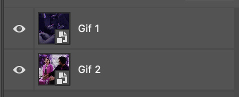
Drag one of your gifs onto the other so they're both on the same canvas.
The gif that your canvas is fading FROM (Gif 1) should be on top of the gif it is fading INTO (Gif 2).
And here's a visual of the order in which your layers should appear by the end of this tutorial, so you know what you're working toward achieving:

Part 2: Creating the grid
Go to: View > Guides > New guide layout
I chose 5 columns and 5 rows to get the result of 25 squares.
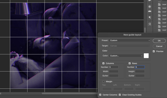
The more rows and columns you choose, the more work you'll have to do, and the faster your squares will have to fade out so keep that in mind. I wouldn't recommend any more than 25 squares for this type of transition.

To save time, duplicate the line you've created 3 more times, or as many times as needed (key shortcut: CMD +J) and move each one to align with the guides both horizontally and vertically. You won't need to recreate the lines on the edges of the canvas, only the ones that will show.
After you complete this step, you will no longer need the guides so you can go back in and clear them.

Follow the same duplicating process for the squares with the rectangle tool using the lines you've created.
Align the squares inside the grid lines. The squares should not overlap the lines but fit precisely inside them.
This might take a few tries for each because although to the eye, the squares look all exactly the same size, you'll notice that if you try to use the same duplicated square for every single one without alterations, many of them will be a few pixels off and you'll have to transform the paths to fit.
To do this go to edit > transform path and hold down the command key with the control key as you move one edge to fill the space.
Once you're done, put all the squares in their separate group, which needs to be sandwiched between Gif 1 and Gif 2.

Right click Gif 1 and choose "create clipping mask" from the drop down to mask it to the squares group. This step is super important.
After this point, I also took the opacity of the line groups down to about 40% so the lines wouldn't be so bold. Doing this revealed some squares that needed fixing so even if you aren't going dim the lines, I recommend clicking off the visibility of the lines for a moment to make sure everything is covered properly.

Part 3A: Prep For Key framing
I wanted my squares to fade out in a random-like fashion and if you want the same effect, you will have to decide which squares you want to fade out first, or reversely, which parts of Gif 2 you want to be revealed first.
In order to see what's going on underneath, I made Gif 1 invisible and turned down the opacity of the squares group.

If you want text underneath to be revealed when the squares fade away, I would add that now, and place the text group above Gif 2, but under the squares group.

Make a mental note that where your text is placed and the order in which it will be revealed is also something you will have to plan for.
With the move tool, click on the first square you want to fade out. Every time you click on a square, it will reveal itself in your layers.
I chose A3 to be the first square to fade and I'm gonna move this one to the very top of all the other square layers.
So if I click on D2 next, that layer would need to be moved under the A3 layer and so on. You'll go back and forth between doing this and adding key frames to each one. As you go along, it's crucial that you put them in order from top to bottom and highly suggested that you rename the layers (numerically for example) which will make it easier to see where you've left off as your dragging the layers into place.

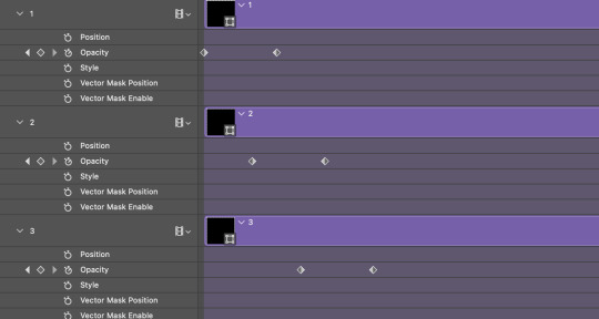
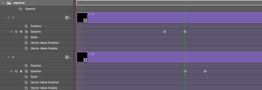
Part 3B: Adding the Keyframes
This is where we enter the gates of hell things become tedious.
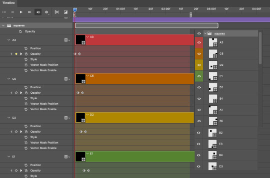
Open up the squares group in the timeline panel so you can see all the clips.
Here is my example of the general pattern that's followed and its corresponding layers of what you want to achieve when you're finished:
So let’s try it!
Expand the control time magnification all the way to the right so you can see every frame per second.

As shown in Part 3A, select your first chosen square.
Where you place the time-indicator on the panel will indicate the placement of the keyframe. Click on the clock next to opacity to place your first keyframe.

Move the time-indicator over 3 frames and place the next key frame.

Things to consider before moving forward:
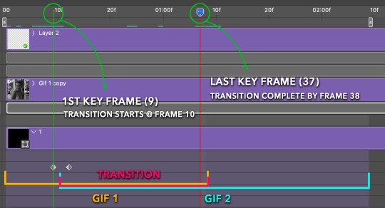
Where you place your very first keyframe will be detrimental. If you're using a lot of squares like I did, you may have to start the transition sooner than preferred.
If you're doing 25 squares, the key frames will have to be more condensed which means more overlapping because more frames are required to finish the transition, verses if you're only using a 9-squared grid. See Part 4 for more detailed examples of this.
The opacity will remain at 100% for every initial key frame, and the second one will be at 0%.
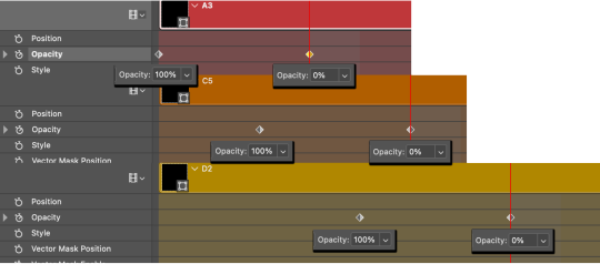
Instead of creating two keyframes like this and changing the opacities for every single clip, you can copy the keyframes and paste them onto the other clips by click-dragging your mouse over both of them and they'll both turn yellow. Then right click one of the keyframes and hit copy.
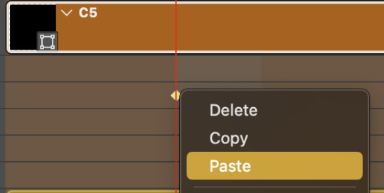
Now drop down to your next clip, move your time-indicator if necessary to the spot where the first keyframe will start and click the clock to create one. Then right click it and hit "paste".

Tip: When you have both keyframes selected, you can also move them side to side by click-dragging one of them while both are highlighted.
Your full repetitive process in steps will go as follows:
click on square of choice on the canvas
drag that square layer to the top under the last renamed
in timeline panel: drop down to next clip, move time-indicator tick to your chosen spot for the next keyframe
create new keyframe
right click new keyframe & paste copied keyframes
repeat until you've done this with every square in the group
Now you can change the opacity of your squares layer group back to 100% and turn on the visibility of Gif 1. Then hit play to see the magic happen.
PART 4: Finished examples
Example 1
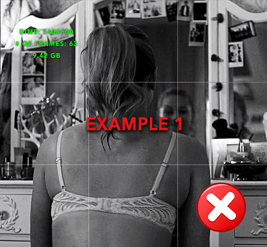
the transition starts too soon
Cause: initial keyframe was placed at frame 0
the squares fade away too quickly
Cause: overlapping keyframes, seen below.
(this may be the ideal way to go with more squares, but for only 9, it's too fast)
Example 2
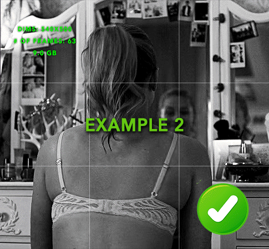
more frame time for first gif
transition wraps up at a good point
Cause: in this instance, the first keyframe was placed 9 frames in, and the keyframes are not overlapping. The sequential pair starts where the last pair ended, creating a slower fade of each square.
Part 5: Final Tips and Saving
You can dl my save action here which will convert everything back into frames, change the frame rate to 0.05 and open the export window so you can see the size of the gif immediately.
If it's over 10gb, one way to finesse this is by use of lossy. By definition, lossy “compresses by removing background data” and therefore quality can be lost when pushed too far. But for most gifs, I have not noticed a deterioration in quality at all when saving with lossy until you start getting into 15-20 or higher, then it will start eating away at your gif so keep it minimal.

If you've done this and your gif is losing a noticeable amount of quality and you still haven’t gotten it below 10gb, you will have no choice but to start deleting frames.
When it comes to transitions like this one, sometimes you can't spare a single frame and if this is the case, you will have to return to the timeline state in your history and condense the key frames to fade out quicker so you can shorten the gif. You should always save a history point before converting so you have a bookmark to go back to in case this happens.
That's pretty much it, free to shoot me an ask on here or on @jugheadjones with any questions.
216 notes
·
View notes
Note
hi laura would you mind sharing the fonts you used in your latest firstprince edit? it’s so gorg 🩵
of course, I am happy to share. please view the fonts on the images below (click to enlarge) and then see downloads under the cut.


Adelia
Amalfi Coast
Bargetta Script
Birch Std
California
Captain Blackjack
Chinese Rocks
Courage Road
Doctor Glitch
Grayson
Lost in Wild
Lovebeat
Preta
Tw Cen MT (this was a default font on my laptop that I use for all basic font work)
164 notes
·
View notes
Text
Coloring Tutorial
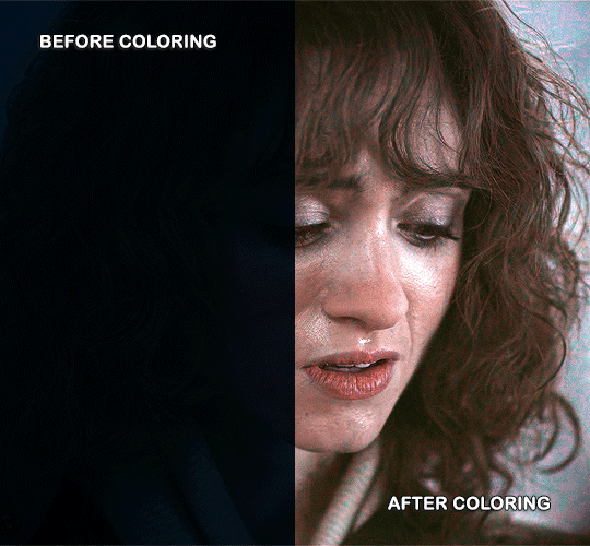
Hello, this tutorial is for the wonderful @djoharrington and those of you wondering how I colored this set. I’m going to be talking about how to color the first gif only to keep this tutorial from getting too long. The other two used the same coloring method with only minor adjustments made to keep them looking similar.
Yes, this scene really is that dark before coloring.
Quick notes on what I’m using:
mpv player for screencapping — not mentioned in tutorial
Photoshop 2021 for editing
I mention mpv player because I’m giffing 4k, and it’s one of the few players I’ve come across that take continuous caps that don’t end up looking washed out. It makes for easier coloring.
Keep reading
859 notes
·
View notes
Note
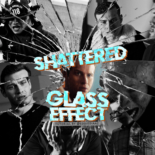
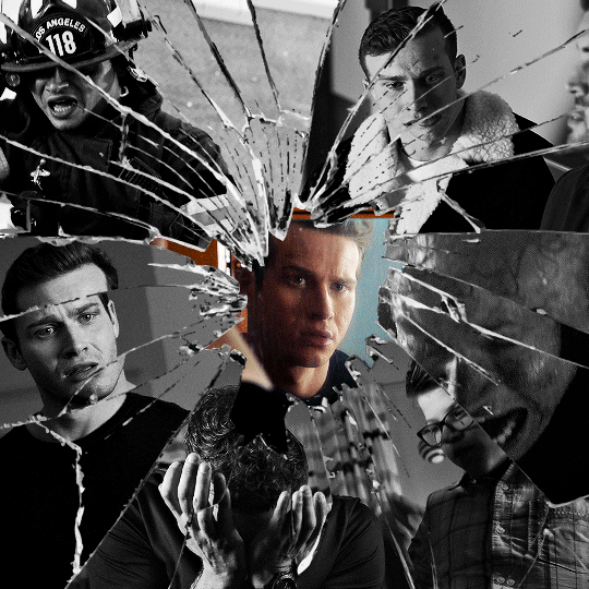
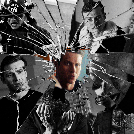
alie! I absolutely adore this mirrorball x buck set that you made last year! (/post/701462848238403584/) (also I can't believe it's been a year, like seriously what is time?) I was wondering how you did the shattered glass effect in the first gif? in particular how you made the black and white gifs appear distorted within the glass if that makes sense? thank you!!!
ahhh thank you so much renee! literally what is time lol, this gifset is still one of my faves that i made. the shattered glass effect is mostly just a lot of layer masks to be honest hahaha. i'm so glad i still have the psd, so here's how i did it under the cut~
(this tutorial assumes you know how to put multiple gifs in the same canvas and are familiar with layer groups and masks)
I. PREPARATION
first things first, create an empty canvas of your desired size. mine was 540x540 px.
then, you need to find a cracked glass texture. if i remember correctly i simply googled something like "broken glass png", "cracked glass png", because i wanted something already transparent.
(a texture that's something like black lines over a white background definitely works too, you'll just have to put that layer's blending mode to darken or multiply.)
here's the png i used (and a download link for best quality):
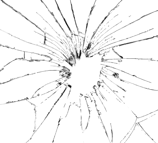
and after positioning it into my canvas.

II. CREATING MAIN SECTIONS FOR GIFS
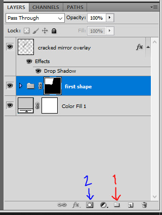
so basically when i did is i sectioned parts of the texture for each gif that i wanted to put. following the texture's lines, i zoomed in and carefuly drew a first shape along the lines with the polygon tool. you can also put a color fill layer behind the cracked glass layer so it's easier to see, like i did.
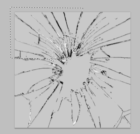
once you have your shape selected, click on the folder icon (1), then on the layer mask icon (2). it should give you a nice masked group to put gifs in hehe
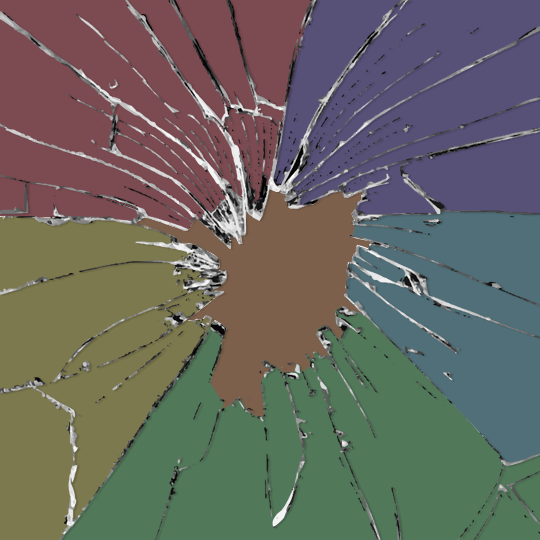
then i repeated the process until i had all of my desired shapes. i've put some color layers so it's easier to see, but here are my 6 main shapes and how my layer groups look like so far:
III. GIFFING TIME
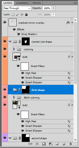
after screencaping and making all 6 gifs required for each section, you need to put all of them in the same canvas. i simply put one smart object gif layer in each group created earlier. then, i resized and rotated each gif to fit its group (by hitting ctrl + T while selecting the gif layer), as you can see with the gif labeled 6x02 in the layers preview. for the coloring, i went simple with black and white for most of them.
once i have all six gifs sharpened, colored, and placed in each shape group, the gif looks like this. the broken glass texture does most of the work to be honest:


obviously the center gif doesn't have any kind of effect, it's just colored as usual, so i'm not gonna go over it. it's just one gif layer in a masked group.
IV. SUBSECTIONS FOR DISRTORTED EFFECT
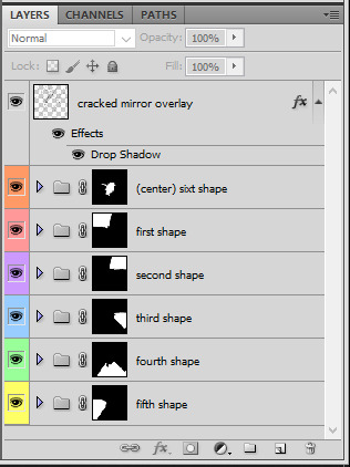
okay so for the distorted effect it's even more layer masks! basically i created more smaller sections within each main shapes already, still following the cracked glass texture's lines with the polygon tool and put them in individual masked groups like i did in the second step. here's how i ended up dividing each main sections:
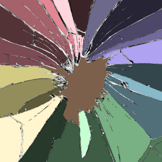
yep, each color here is a different masked group, for example the 2nd and 3rd shape sections:
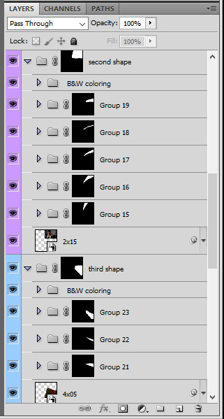
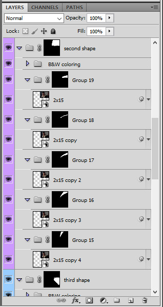
for each main shape section, you want to duplicate your gif layer the same amount of times as you have subsections within that shape. so if the main shape has 5 smaller subsections, i want 5 layers of that same gif. just make sure to not change its duration or position yet, and make sure the coloring layers/group stays on top of the groups in its shape section. then, simply put one gif layer duplicate in each group. example of my layers for the second shape so far:
then just repeat this until all subsections have its own gif layer.
V. DISTORTED EFFECT
this is the best part! and it's really easy. basically you want to slightly move each subsection by a few pixels, so they're in a slightly different position than the ones next to it.
to do so, select one of the gif layers and with the arrows on your keyboard, move it left or right, and even up or down if it looks good. i do this for all duplicated gif layers, making sure it looks like they're all slightly offset. focus on the cracked glass overlay's lines while nudging the gif layers, it's easy to see how the shapes break when you move them. for example here:
this is really just all trial and error, you just need to move each subsection gif layer by a few pixels with the keyboard arrows until it looks good to you.
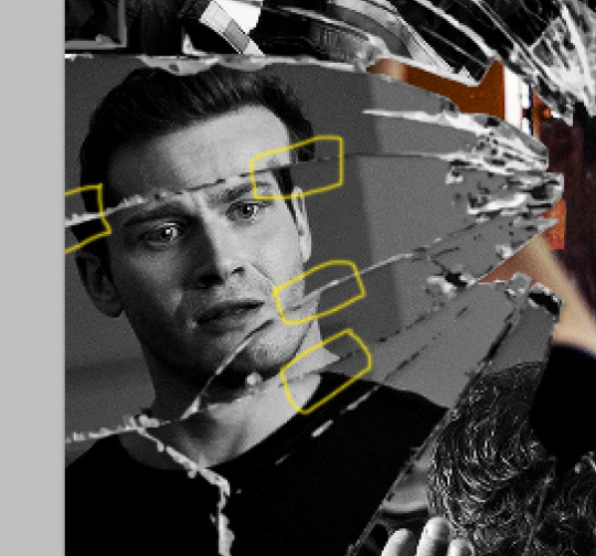
here's my result once i've done this for all (23!!) subsections:
VI. FINAL TOUCHES
i don't think i did much else to this before typography besides adding a bit of contrast overall and a thin drop shadow to the cracked layer texture on top of everything. if you have a transparent png this definitely helps to give a bit more dimension to the effect. so here's the final result:
i hope that was clear enough hehe :D
369 notes
·
View notes
Text
low quality video ➜ “HD” gifs tutorial! (2022 UPDATE!)
back by popular demand. warning, this is a work in progress! so far I have found this is the best way to restore low quality movie videos into somewhat clear and “hd” gifs. I will update if I discover anything different (:
this works on movies/videos in 720p and lower
you must have basic gif making knowledge
I’m using adobe photoshop cc 23.4.1 (2022) for windows
link to previous version of this tutorial
TUTORIAL UNDER THE CUT 🔽
Keep reading
988 notes
·
View notes
Note
hey! your gifsets are absolutely beautiful and i'm always so impressed by them, especially your choice of fonts. so i was wondering if you might wanna share the fonts you've used in your pinned post (your green ray pakorn gifset), because they're so gorgeous!
hey there! thank you so much! 💚💚💚 always happy to share with my fellow font hoarders!
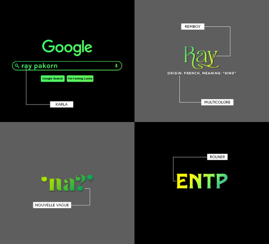
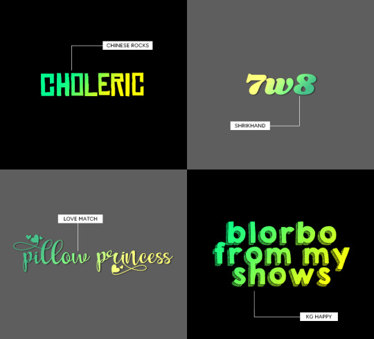
(click for larger image)
links to fonts under the cut!
karla (comes baked in with @cal-kestis' google overlay template! this is the same font used for 'chronic babygirlism')
multicolore (this is the font used for all of the white sans serif typo)
remboy
nouvelle vague
rolner
chinese rocks
shrikhand
love match
kg happy
hope this helps! happy creating!

311 notes
·
View notes
Text

HOW TO: Make an iPhone Layout
+ Downloadable Template
Hi! I've gotten a few messages asking for a tutorial on my iPhone gifsets — but instead of only doing a tutorial (that would probably be triple the length this one already is), I decided to turn my layout into a template with all the bits and bobs! In the "tutorial" under the cut, I'll share everything you'll need, a free template download, and quickly go over how to use this template. :)
Disclaimer: This template uses Video Timeline and this tutorial assumes you have a basic to intermediate understanding of Photoshop.

PHASE 1: THE ASSETS
1.1 – Download fonts. These are the fonts used for all assets I've included in my template:
– SF Pro or SF Pro Display (Regular, Medium, Bold): Either version works, they look nearly identical. You can download directly from https://developer.apple.com/fonts/ or easily find it via Google
– Bebas Neue: Free on Google Fonts, Adobe Fonts, and dafont
– Times New Roman (Bold): Should be a default font in Photoshop

Make sure to download and install any of the fonts you don't already have before opening my template. That way, once you open the template file, all the settings (font size, weight, spacing, color, opacity, etc.) are as intended.
1.2 – Download my template.
Before you use my template, all I ask is that you don't claim or redistribute it as your own and that you give me proper credit in the caption of your post. Making these iPhone gifsets takes me a longgg time and turning this layout into a template took several hours too.
DOWNLOAD TEMPLATE VIA KO-FI ← This template is completely free to download (just enter $0), but if you feel inclined to tip me, I appreciate you! 💖
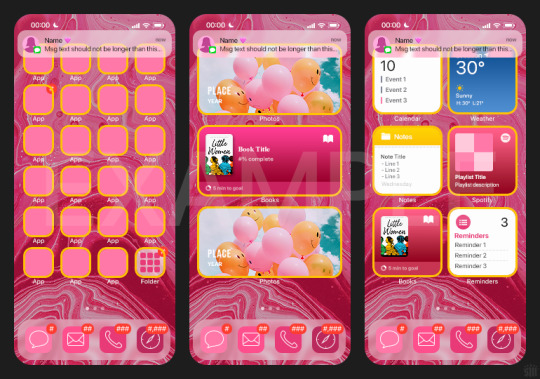
BTW this template also includes some of my frequently used icons!
NOTE: If, for some reason, you open the template and see the pop-up shown below, click "NO" — otherwise, the fonts will be all messed up:
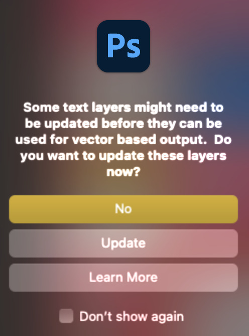
And if you see this triangle with an exclamation point by a text layer, don't double-click it — it'll mess up the font as well:

PHASE 2: THE GIFS
I'm just going to briefly go over gif sizes and my recommendations. Also, keep in mind when grabbing your scenes, you'll want all of these gifs to be the same amount of frames.
2.1 – Background Gif: 540 x 540 px.
I recommend this size so you have a good amount of visibility for the gif behind the iPhone wallpaper. I also recommend making this black and white (or in my case, black and white with a slight blue tint — idk I just like the way it looks) so the wallpaper coloring can stand out.
2.2 – Wallpaper Gif: 230 (w) x 500 (h) px.
Keep in mind the very narrow dimensions of the wallpaper! And also keep in mind that you'll have a bunch of apps and widgets covering the image. I try to use wide shots (or layer my clips into looking like wide shots). Also, keep in mind your color scheme for your set and your character's aesthetic! I tend to focus on one or two colors for the wallpaper.
I usually position the wallpaper to the side with 20px bumpers, so there's lots of space to see the background:
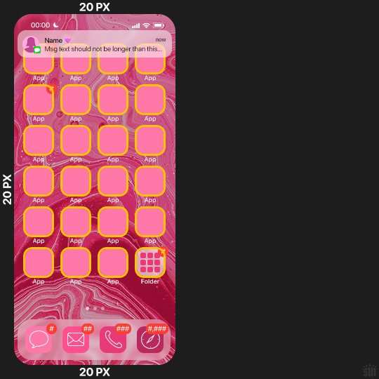
2.3 – Large Photo Widget Gif: 201 (w) x 96 (h) px.
2.4 – Small Photo Widget Gif: 94 x 94 px.
PHASE 3: THE TEMPLATE – "IPHONE" FOLDER
In this section, I'll try to quickly walk you through how to use this template and some bits that may require extra instructions. I'll be going through each folder from top to bottom.
3.1 – Status Bar.
Time, Service, and WiFi are pretty self-explanatory. In the Battery folder, you can use the shape tool to adjust the shape layers labeled "Fill (Adjustable Shape!)" to customize the battery level.
3.2 – Message Notification.
Again, these are pretty self-explanatory. I've already masked the circle for the contact photo, so you can simply import any photo and use the transform tool to shrink it down. The circle is 24x24 px. If you don't want to use a photo, there's another folder called Default Initials.
If your message text can't fit the text box, the message should end with ellipses which is how iOS caps off long texts.
3.3 – Blurred Banner (IMPORTANT)
This folder is easy to miss because there's only one placeholder layer in there. On iPhones, the area behind a banner notification and the dock get blurred (including the wallpaper and any apps).
What to do: Make a duplicate of the apps in Row 1 and/or widgets that intersect the message banner, convert them all into one smart object, apply a Gaussian Blur filter (Radius: 3.0 pixels) on the smart object, and move the smart object into this masked folder!
(There's another masked folder in the Wallpaper folder for the dock which I'll go over in that section.)
3.4 – Apps
Turn off the yellow guide if you don't need it to keep things aligned and turn off layers you don't need by clicking the eye icon. Replace the "App" placeholder text with your app name, change the color or gradient of the square to compliment your color scheme, and add your custom app icon overlay!
If you can't find an app icon you need from the ones I provided, flaticon.com is a great resource. Also, if you can only find the filled version of an icon, check out this tutorial for how to make any text or shape into an outline.
Also, each app folder has 4 notification bubble options (1-4 digits). Again, you can toggle these on and off as you need!
3.5 – Big Widgets
I like using these when my wallpaper has A LOT of negative space to fill. I included the Photos and Books widgets in my template, but there are lots of widgets available on iPhones. You can check some of the other ones I've done here, or if you have an iPhone, simply try adding some widgets to your phone!
There are also widgets bigger than these, but they would take up half of the phone screen which is why I don't use them for these edits.
3.6 – Small Widgets
The only thing I'll say about these — because they're pretty straight forward — is there are a lot more weather themes than I included in my template. Also, if you set your character's phone to evening, the weather widget will show a dark background (sometimes with stars), so keep that in mind.
Speaking of, I've included Light Modes and Dark Modes for, I think, every applicable widget.
3.7 – Page Dots
These barely perceptible dots indicate that your character has more pages of apps than shown in your gifset (so if an anon tries to come at you, you can just say "it's on the next page of apps" /j /lh)
3.8 – Dock
Again, the dock has notification bubble options and I've included the default app designs, custom filled designs, and custom outlined designs for iMessage, Phone, Email, and Safari (there's also a FaceTime alternative if that's how your character rolls). These are usually the apps people keep in their Dock, but this is fully customizable too. So, if your character is, like, super obsessed with Candy Crush or something and needs it in thumb's reach — you can put it in the dock.
3.9 – Wallpaper
This whole folder is masked already to a 230x500 px rounded rectangle.
Inside, you'll find another "Blurred Portion" folder for the area behind the message banner notification and the dock.
What to do: Duplicate your gif layer and place it in this folder, remove any sharpening filters, and apply a Gaussian Blur filter (Radius: 3.0 px). Be sure to add any coloring/adjustment layers ABOVE this folder and your original sharpened gif layer.
PHASE 4: EXPORT
We made it!
I hope this template makes it super easy for you to recreate this layout! If you decide to try it out, feel free to tag me with #usernik.
If you notice anything wonky about the template, kindly let me know so I can fix it! And if you have any questions about how to use this template, please don't hesitate to send me a message! I just ask that you try to be specific in your question so I'm able to answer you the best I can!
752 notes
·
View notes
Text

MAGAZINE PSD
insp ( x )
this is a free psd. please click the source link to be directed to the template.
you will need photoshop to use this.
for personal use only! do not resell or redistribute
you may edit this template as much as you'd like
please do not claim as yours and credit when using this template
please like or reblog if using
if you have any questions, please reach out to me via tumblr asks!
94 notes
·
View notes
Text
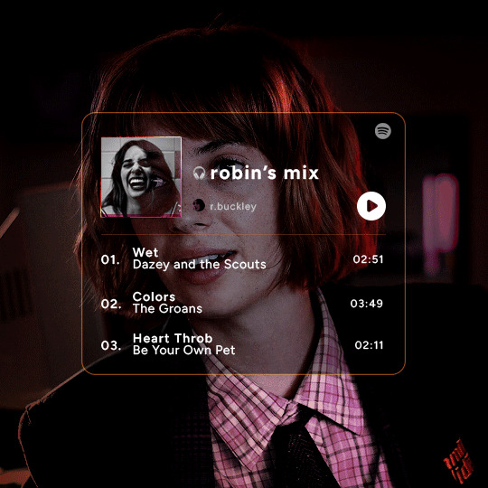
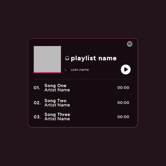
Playlist Template by @uservalerian
this is the template i used to create my robin playlist from this robin set. i've shared this with a few people, but i wanted to make it available for everyone that asked about it/was interested in using this template.
below is some basic info + download link.
the font used here is called figtree
all of the layers are labeled, some with basic info like blend modes
each song has it's own layer group
the headphones emoji is an image, not an emoji font
the playlist cover is 88px
the profile/user photo is 14px
i remade this template, so please let me know if anything is not working or gets confusing :)
all i ask is that you don’t claim as your own & you give proper credit if you end up using this template, as i made it myself.
the link to the template is here.
feel free to tag me in your edits! i would love to see them <3
571 notes
·
View notes
Text
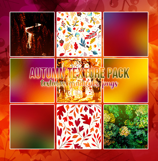
AUTUMN TEXTURE PACK
23 icon textures // 10 header textures
15 icon gradients // 10 autumn pngs
textures in the preview are all from the pack
please do not edit or claim as your own
credit is appreciated, but not required
download // deviant
if you download them please reblog/like!
hope you like them (⊃。•́‿•̀。)⊃
145 notes
·
View notes
Text
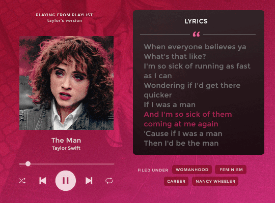

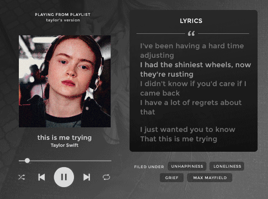
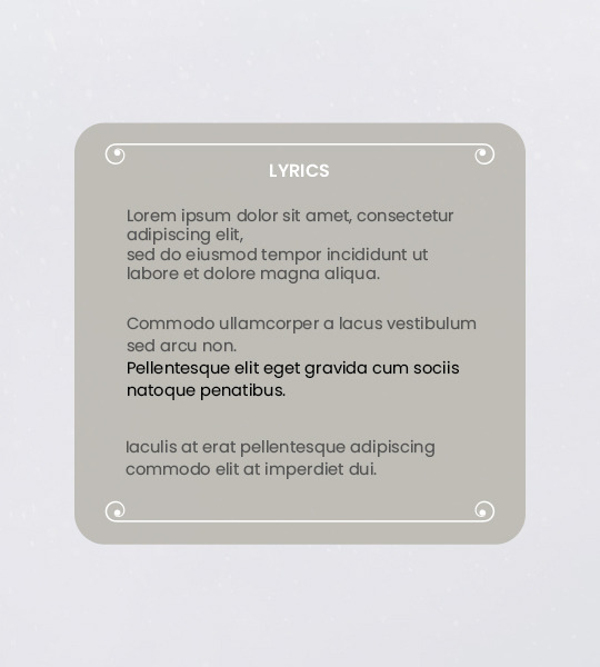
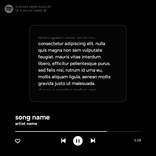
⋆ playing from playlist . . . by petalsource .
. . . a spotify lyrics based character template
hi, guys! this is a character template that mimmicks the spotify interface and features an image/gif, lyrics and additional information. it is ideal to showcase songs that you relate to your characters!
an additional layer with tips for editing this template is included on the file, as well as three different options for background overlay images, six background gradient options, and both the right & left player versions featured above. the only font needed is montserrat.
feel free to edit as you wish, add different background colors and overlays, but kindly do not claim as your own or use it for commercial purposes. feel free to tag me on your creations with this on #petalsource!
💐 click the source link to get it on deviantart or payhip !
1K notes
·
View notes
Text
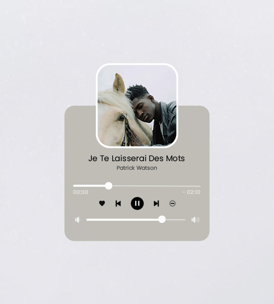
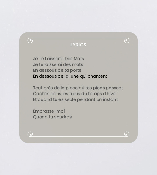
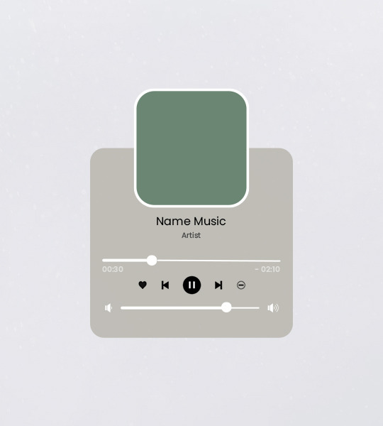
Template #003 by dailyresources
— Music Player Template
Please do not repost / redistribute or claim as your own.
Please, like or reblog if you download.
You may edit as much as you like, it is fully customizable.
This is a free template, for personal and non-commercial use only.
Credit is very much appreciated but not necessary.
Any issues, don’t hesitate to contact me!
Size: 540x600px
Fonts: Poppins.
Enjoy ❤
Download Link: [mediafire]
331 notes
·
View notes
Photo
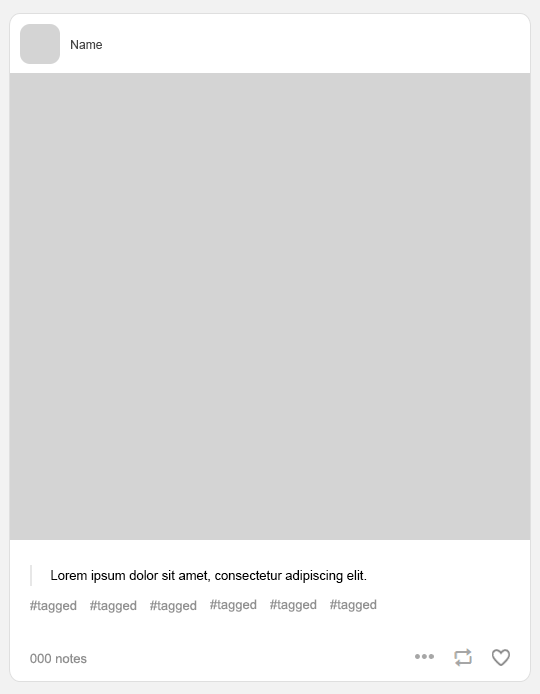
Template pack made by royalscolor. This pack contains a main template, tumblr post template, with 10 moodboard templates. Don’t repost them or upload seperately, and don’t claim as your own, like/reblog if you download. I hope you enjoy! {download}
238 notes
·
View notes
Photo
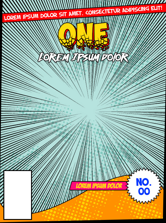
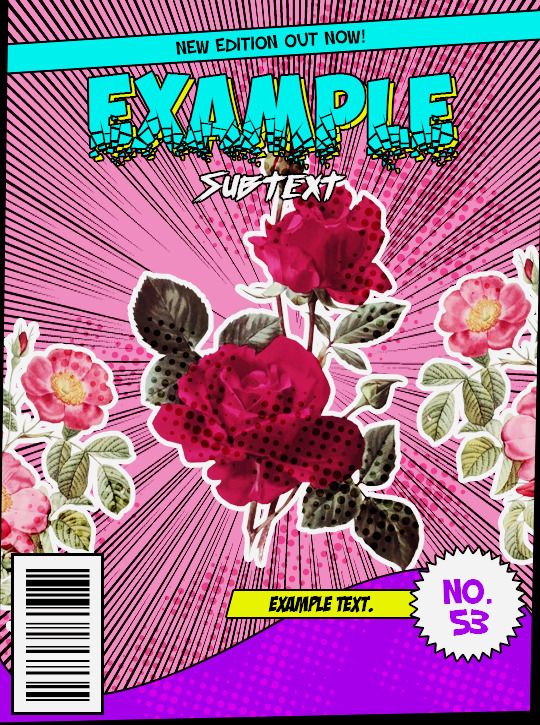
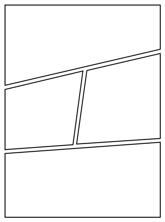
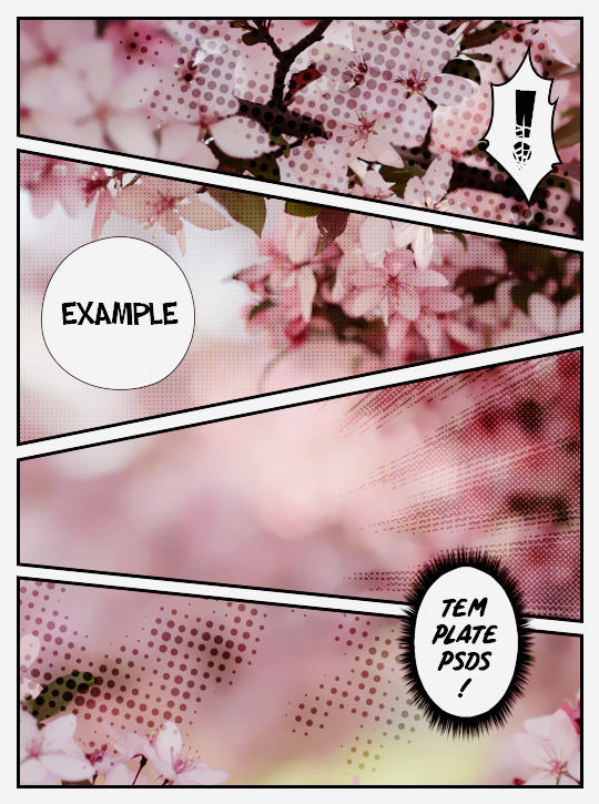
。・ template psd fifty three, template pack twenty four by templatepsds ゜+.*
-`. info .’-
+ as requested, here are a couple templates based off comic book covers and the pages/panels.
+ there are a total of 7 styles of panels and you can choose one from the “panel styles” group.
+ there are also some optional speech bubbles, action bubbles, halftones, and speedlines provided in the page template. you can use those or get ones yourself.
+ it really comes to life once you add pictures, change the colors, add brushes, etc.
+ the fonts used are ‘Obelix Pro Broken’, ‘Badaboom BB’, ‘SF Slapstick Comic’ (Regular, Bold, & Shaded), ‘Comic Panels’, and ‘Outrun Future’. you can find more comic-esque fonts here if you want to change the font to something else.
+ not for commercial use or anything like that! just for personal use/to have fun.
+ adjust as much as you want to suit your liking.
+ please like or reblog if you download.
+ message if you have any questions/difficulties!
+ credits: xUniiqueness, asifalittlezonked, asifalittlezonked, kabocha, and ShinigamiNoAkui.
-`. dl .’-
+ one (cover)
+ two (page)
3K notes
·
View notes
Photo


Template PSD file number seven 07 by Sistaround.
Template made by Selenapastel ━ Size: 540px. More templates here. If you have any problems, send us an ask. We do this for free and sharing our work inspires us to keep going, so please give us a like and/or reblog if you use this psd or plan on using it. Click on the image for better viewing.
Rules:
Like or Reblog this post if you download or plan on doing so.
Don’t redistribute or claim as your own.
Adjust the layers or add new ones if needed.
This file is for your own personal use only.
Download: CloudApp • Mediafire • Dropbox
2K notes
·
View notes
Text

Spotify Template by @seaoftr
Hello! I received a few messages asking me to share the template that i made for my cal kestis playlist set, so I thought it was time to make a post for it!
Below is some basic info + download link.
the font used here is called figtree from google fonts
the layers are all labeled, some with basic info that tells you what to edit/adjust
the play/pause button layer-group uses a layer mask, but the pause button rectangles are included as well in case you run into any issues.
i made this template myself, so all i ask is that you don't claim as your own & you give proper credit if you end up using it!
the link to download the template is here.
feel free to tag me in your edits! i would love to see them <3
1K notes
·
View notes