
portfolioderekli
Portfolio: Peifeng Derek Li
Welcome! Here are some of my works in GIS or Photography related aspect. Currently, I am focusing on visualization with R & Python and beginner iOS development via Swift. -------------------------------------------------------Unless otherwise stated, all pictures are produced by Peifeng Derek Li and all rights are reserved by myself or the collaborators on whose behalf I have worked.
45 posts
Don't wanna be here? Send us removal request.
Last Seen Blogs

grimm-lovers
Trust your instincts -- Grimm Lovers

comodakora21
Untitled

catz-dave
Catz


bradleyedwards12
The Life of Thurston 428
Photo

Image Comparison
Automation in image comparison is precise and efficient. By capturing screen shots in Maps, the code will convert different types of images(jpg, png, bmp, etc.) into RGB with values. By comparing absolute value of images, the differences can be produced automatically.
Quality assurance is also a vital part of cartography. Sometimes new changes that are applied to staging version can become regressions. It is important to make sure changes are not going to break the carto integrity of maps.
This is generated by using Python.
Data credits to Apple’s open map data.
0 notes
Video
Latino Community Fund Asset Map, Part 2:
Creating Interactive 3D Hexagon Heatmap
3d Visualization for service providers in state of Georgia
Created by using Rstudio, Mapdeck from Mapbox GL
0 notes
Photo


Latino Community Fund Asset Map, Part 1:
An example of using ArcGIS Online, Web AppBuilder for Latino Community Fund to create an asset map that includes all of Spanish-spoken Service Providers in GA. My duty includes:
geocoded excel datasheet
created base map
built widgets based on client’s request
customized pop-ups with ArcGIS Arcade Expressions Language
updated ARC’s Arcade Expression SOP
created 3d-visualization, etc.
Data credit to Atlanta Regional Commission.
0 notes
Photo

Yelp Reviews with Geodatabase
Creating geodatabase is just like other relational database, except this databse also includes geospatial information. To summarize, having a geodatabase can minimize the work load of data entry and also combining with locations of retails. This photo describes the schema of restaurants’ reviews/ratings. So that analysts can study locations impact on food retails.
Data of reviews/ratings/customers comments are provided by Yelp.
0 notes
Photo
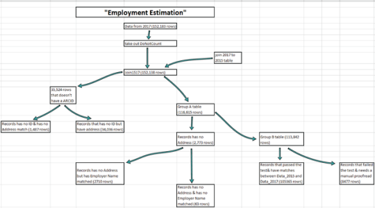
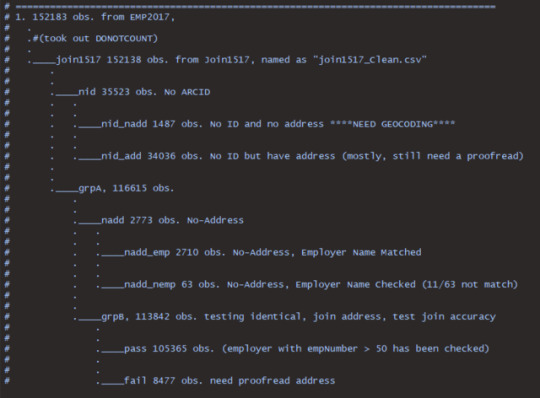
McKinsey Issue Tree & Employment Estimation for Atlanta Metropolitan Area, GA
This project is to match up the employment information from thousands of employer around Great Atlanta areas. Data between 2015 and 2017 sometimes have disconnection (such as retails moved to a new place, number of employee changed, etc.). I was using a issue tree to clarify the logic within the joined table and tried to find the connection so that my collegue and I don’t need to manually geocode every row in the table.
(Performed by R & Excel)
Data credit to Atlanta Regional Commission.
0 notes
Photo
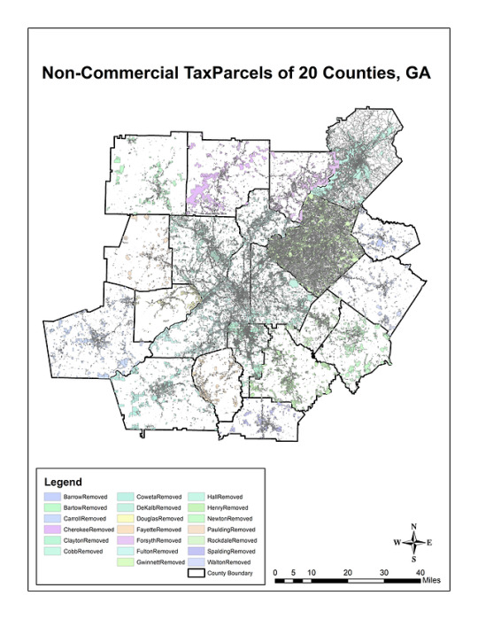
At Atlanta Regional Commission, part of my duty is to troubleshoot Tax Parcels from 20 counties in Atlanta metropolitan area and separate residential from non-residential land use. Eventually, I produced this visualization via ArcMap 10.6. for Atkins North America, Inc.
Data credit to Atlanta Regional Commission
0 notes
Photo
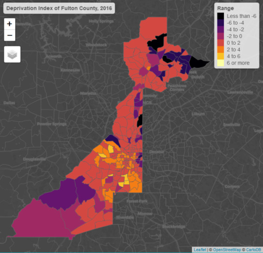


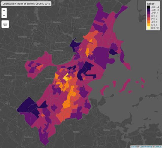
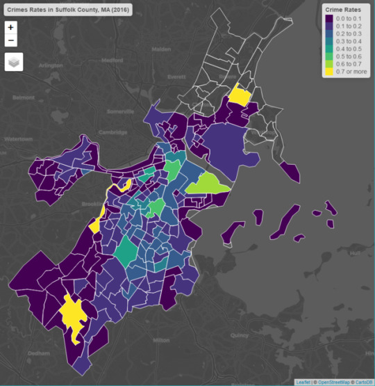

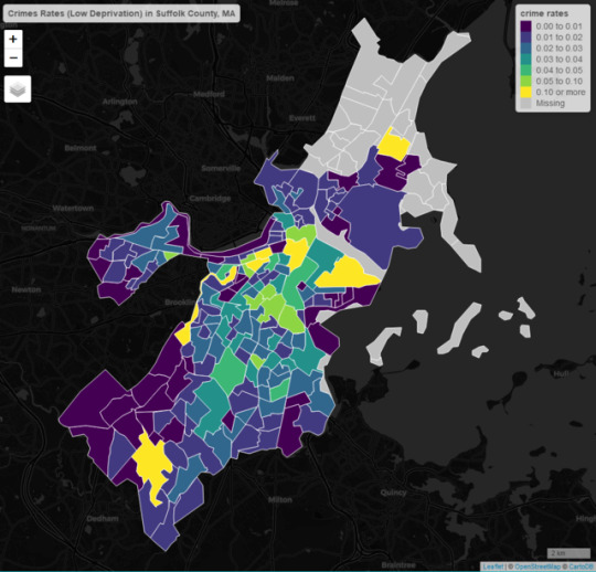
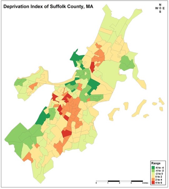
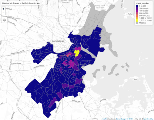
Social Deprivation, Part 3:
Crime Rates in Fulton County, Georgia & Suffolk County, Massachusetts
County Level Comparison, Year 2016
By cropping the deprivation index from state level, I’ve acqured much accurate deprivation index map. After processing crime data and normalizing into crime rates, I am able to compare the correlation between crime rates and deprivation index. Eventually, this correlation will be testified by OLS regression model, and the result is promising.
Analytical Techniques
To exterminate social inequality, Geographic Information Science provides techniques to spatially analyze datasets of
the area, and so creates database with special economic status. This research follows the order from below:
• Collecting variables for creating PCA index
• Proofreading PCA index to make sure it is valid
• Preparing crime data, feature scaling numbers of crimes to crime rates
• Using regression model to testify the validity of correlations
Data credit to:
ACS 5-years Census Tract
Boston Police Department <https://data.boston.gov/dataset/crime-incident-reports-august-2015-to-date-source-new-system>
Atlanta Police Department <http://www.atlantapd.org/about-apd>
Individual Researcher - Alexander Bryant <https://data.world/bryantahb/crime-in-atlanta-2009-2017>
0 notes
Photo
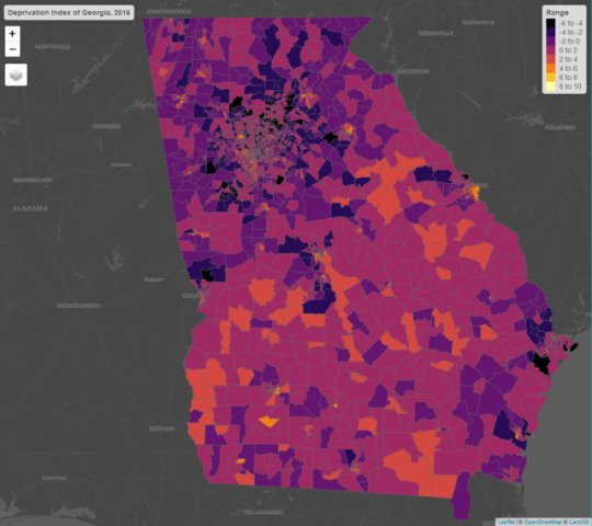

Social Deprivation, Part 2:
Georgia & Massachusetts
State Level Comparison, Year 2016
Part of my capstone project is to create a state level deprivation index.
As we can observe that most of changes happen nearby urban areas. The southern part of Georgia holds majority of high deprivation values.
Data credit to ACS 5-years Census Tract
0 notes
Photo

Social Deprivation, Part 1:
Non-violent vs. Violent Crime Rates in Boston, MA
Year: 2017
Crime rates are devided into two categories based on their type of crimes, in my theory, crimes such as “theft”, ”burglary” are more towards areas with low deprivation index; crimes such as “drug abuse”, ”homicide” are more towards areas with high deprivation index.
(Using R to retrieve data by CKAN API, Census API and visualize via interactive maps)
Data credit to:
Boston Police Department <https://data.boston.gov/dataset/crime-incident-reports-august-2015-to-date-source-new-system>
American FactFinder <https://factfinder.census.gov/faces/nav/jsf/pages/searchresults.xhtml?refresh=t>
0 notes
Photo

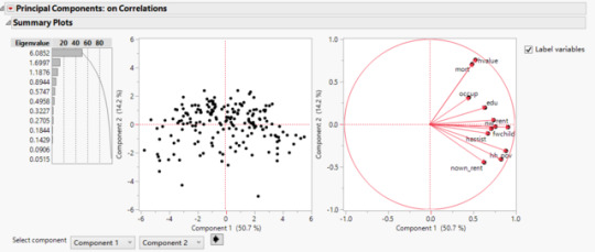
Numbers of Crime Records in Boston, Principal Components Analysis & Cluster Correlations
Using crime records data from Boston Police Department to study the impact from social deprivation index. 12 variables were selected to prepare principal value (from American FactFinder).
This is to prepare for my next step of study: crime rates and social deprivation index.
Data credit to:
Boston Police Department <https://data.boston.gov/dataset/crime-incident-reports-august-2015-to-date-source-new-system>
American FactFinder <https://factfinder.census.gov/faces/nav/jsf/pages/searchresults.xhtml?refresh=t>
0 notes
Photo

Major Ways of Treating Lung Cancer by Tableau
Based on the barchart, “Drug” is considered as a predominant methods. According to heatmap on the right, interventions such as “Biological” and “Procedure” are also playing important roles in clinical trials.
The data are collected via PostgreSQL in R.
Data credits to Access to Aggregate Content of ClinicalTrials.gov (AACT) <https://aact.ctti-clinicaltrials.org/>
0 notes
Photo

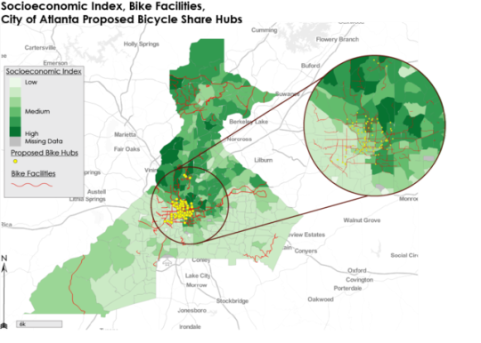


The Relationship Study between Bicycle Facilities and Socioeconomic Status
We (myself, Nick DiSebastian, Wenli Zou) hypothesize that there will be a positive correlation between bike facility presence and ridership as well as a positive correlation between socioeconomic status and ridership.
Data credit to:
Relay Bikeshare <http://relaybikeshare.com/system-data/>
Atlanta Regional Commission <http://opendata.atlantaregional.com/datasets/coaplangis::bicycle-share>
U.S. Census Bureau <https://www.census.gov/>
0 notes
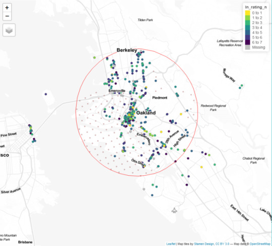
Photo
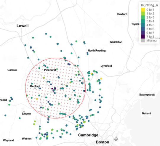
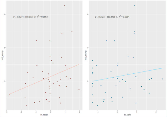
Predicting Potential Cafe Consumption Hotspots w/ Google API and R
(A central business district in Boston, MA)
By scraping data via Google API, I catched cafe retails location lat/lon and put them into R. Then I retrived college graduates that aged from 25 to 34 in 2017 via Census API based on each tract.
(A hidden hypothesis is that I assume college graduates drink more coffee in order to survive from their exams...)
I visualized them via tmap package in R, and eventually test the theory in ggplot package.
Data credit to Google, U.S. Census Bureau.
I scripted and modified the code based on a skeleton code from Dr. Yongsung Lee, Georgia Institute of Technology.
0 notes
Photo
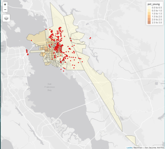

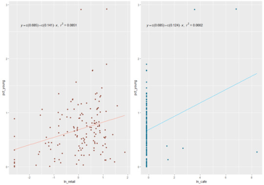
Predicting Potential Cafe Consumption Hotspots w/ Google API and R
(A central business district in San Francisco, CA)
By scraping data via Google API, I catched cafe retails location lat/lon and put them into R. Then I retrived college graduates that aged from 25 to 34 in 2017 via Census API based on each tract.
(A hidden hypothesis is that I assume college graduates drink more coffee in order to survive from their exams...)
I visualized them via tmap package in R, and eventually test the theory in ggplot package.
Data credit to Google, U.S. Census Bureau.
I scripted and modified the code based on a skeleton code from Dr. Yongsung Lee, Georgia Institute of Technology.
0 notes
Photo


Gentrification Study between Atlanta Beltline and Local Economy
Using Rstudio and various packages to generate interactive maps. We were expecting to see the area that are closer to the Beltline should have a lower SES index in 2010 and should now have a higher SES index, which is displayed by the line chart at the bottom.
0 notes
Photo

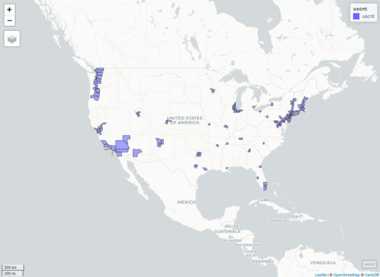

Transit Relationship Analysis in the U.S.
Catching county level data in R to build geoprocessed interactive maps. This is to analyze population volume from each fixed transit station around the U.S.
0 notes
Photo
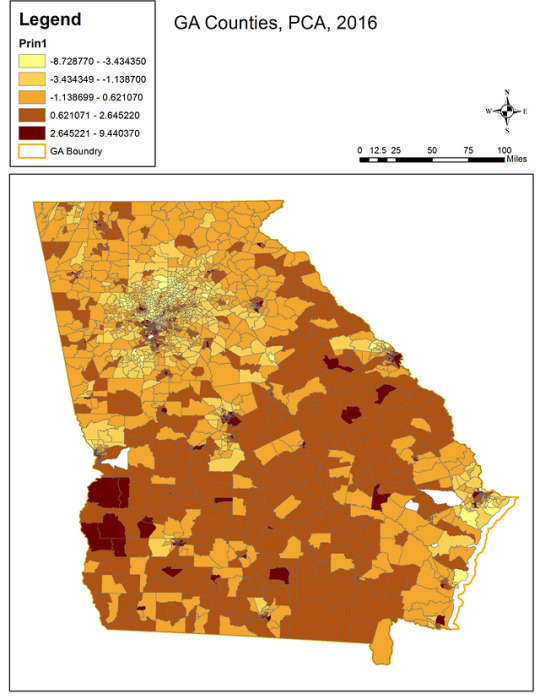

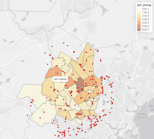
Social Deprivation Index Study with Hierarchical Clustering & Principal Components Analysis
(Via ArcMap 10.2, JMP, R)
The principle values are presenting a negative correlated clustering around Fulton county area, while some area has a positive correlated presenting (discretely). On the boarder of GA area, some county presents a higher principle value.
Generally, the south of GA suffering more from poverty and deprivation. The higher the value from legend, the more serious of poverty and deprivation. On the other hand, the northern part of GA has a relatively lower value from the legend, which means these census tracts has a higher life quality/less deprivation (which make sense, e.g. Buckhead, Fulton, Cobb, etc.).
0 notes