Last Seen Blogs
healthyvisionsketogummiesreviews
Healthy Visions Keto Gummies

thewolfandtgesea
Untitled
arreess
Rhi Rambling about Sims
whitefriartuck
More like a white Friar Tuck
rukiyette
Rukiyette.♡
Photo
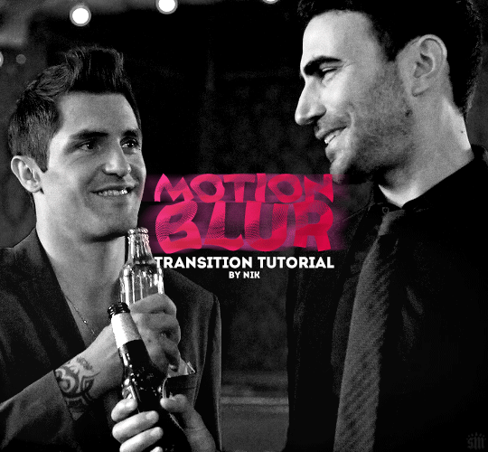
HOW TO: Do a Motion Blur Transition
Using Timeline or Frame Animation
Hi! Someone asked me for a tutorial on the transition effect in the second gif of this set (also featured in this set and the text on this set). So, here it is! This is one of the easiest and least tedious of the gif transition effects in my opinion — and I’m going to go over how to do it both in Timeline and Frame Animation (using the screencap method). Disclaimer: This tutorial assumes you have a basic understanding of gif-making in Photoshop.

Keep reading
759 notes
·
View notes
Text
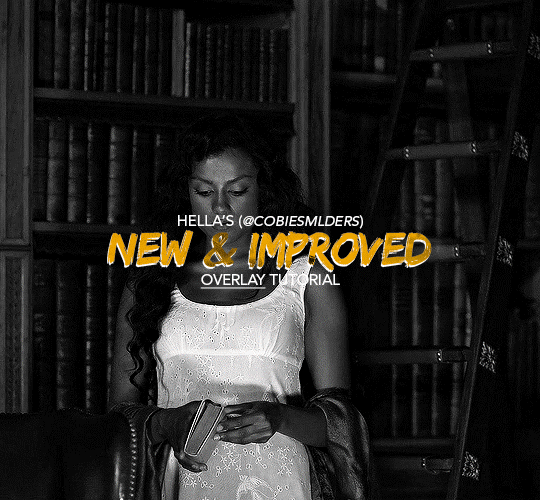
Hello!! A couple years ago I posted this tutorial for making gifs with a moving overlay effect. In the two and a half years since I made that tutorial, I've learned some new tricks for this gif effect but most importantly I've learned how to explain things better.
For that reason, I've created this new and improved tutorial for my overlay gif effect. The basics are the same but it's simpler, I go into more detail, give better explanations, and have more comprehensive instructions.
The easiest way to do this effect with this method is to use smart objects and work in timeline. For this tutorial, I’m assuming you know the basics of giffing like cropping, resizing, colouring, etc. If you need help with this I’d suggest you look at some other tutorials and guides!!
First, we’re going to start off with three things.
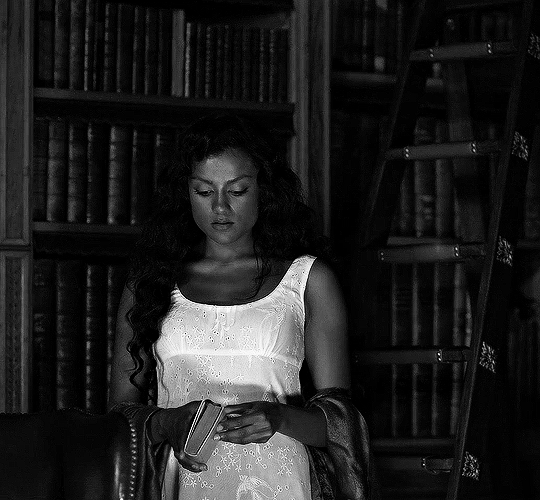
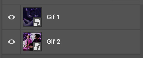
1. A completed gif converted into a smart object that is going to be the base gif. I'm going to call this "gif1". You’ll want this gif to be at least 3 seconds because it needs to last as long as the overlay plus a little bit of extra time in the beginning.
This is the base gif I’ll be using in the example (except I trimmed it so that I could meet the size limit).
2. A second completed gif converted into a smart object that is going to go over the base gif. We’re going to call this "gif2". This gif should be at least 2 seconds but I’ve made it work with shorter. Gif2 needs to be the same dimensions or bigger than gif1.
This is the gif I'll be using in the example (except I trimmed it so that I could meet the size limit).

3. An overlay in video form. These can be found on tumblr and youtube by search for overlay or transition packs. For this example, I'll be using an ink drop overlay I found on youtube.
Step 1: Turning the overlay video into an overlay gif
Most overlays aren’t going to instantly fit the gif effect you’re trying to achieve right away. This is the overlay I got from youtube and as you can see it’s too slow and needs a crop/resize to be usable.

To fix it, I sped the frame rate up, cropped the overlay, and resized the overlay so it fits over my base gif. I also sharpened the overlay (500% amount, 0.3px radius) so that the edges were smooth. This is the new overlay gif and the one I’ll be using for the gif effect.

A tip: I also like to add a brightness/contrast layer to get rid of the grey on the overlay gif. Because we’re working with blending modes to achieve this effect, any parts of the overlay that are grey will be a blended mix of gif1 and gif2. If you think this will look good for your gif effect then don't worry about it!
Another tip: try to get the entire overlay movement to fit into a 2-3 second window. Anything longer than that will likely be cut off when you have to trim your gif to meet the upload size limit and it would suck to only have half of the overlay.
Step 2: Creating the gif effect
Drag a copy of gif2 and a copy of the overlay gif onto the gif1 canvas. I like to use Ctrl+Shift+V so that the layers are pasted in the same position as they were on the previous canvas. MAKE SURE that both overlay layers are in the same position on the canvas. If one of the overlay layers is higher/lower/etc. than the other then the effect won't work properly.
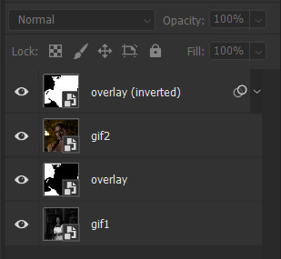
Then, make a second copy of the overlay and invert it (Ctrl+i). These are the layers you should have:

Before you go any further, trim gif2 and both overlay layers so they are all the same length.
Now, we need to rearrange the layers and set blending modes. The top layer should be whichever overlay goes from black to white. This is because when we change the blending modes, the white part of this layer will disappear and look like its being replaced by gif2. In this case, that is the overlay (inverted) layer. Then we want gif2, the other overlay layer, and then gif1.
A tip: this process can be done the other way where the top layer is the overlay that goes from white > black however, you are much more likely to have an error where there is a grey/black line around the overlay effect in your final gif. In order to avoid that, I always use the black > white layer on top.
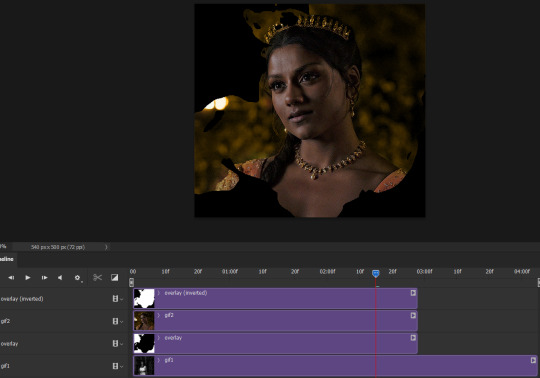
Next, set the top overlay layer to darken. You should only see the black part from the overlay and gif2 should fill in the white part. Here’s how that looks in my example.
Next, select the top overlay layer and gif2 and convert both layers into one smart object. Your layers tab should look like this now.

Now, set the new layer’s blending mode to lighten and the overlay layer’s blending mode to darken. Once you do this, you should be able to see gif1 as well as the overlay gif.
Step 3: Timeline and exporting
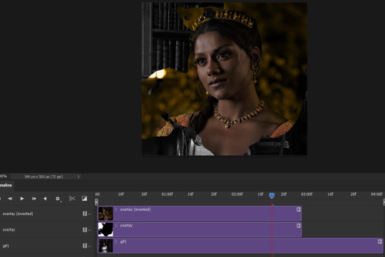
At the moment, gif1 is still significantly longer than the overlay gifs. Since this gif is just over 10 mb (which is pretty small for this effect) I’m going to trim about 1/4 of a second off the end of gif1 and then drag the overlay layers so they all end at the same time.

Now you’re free to export the gif! This is the finished effect for the example gif!

A tip: sometimes, when I convert to from timeline to frames, the gif becomes a little longer and slower. It has to do with different frame rates across the videos and photoshop but I'm not smart enough to understand it. If that happens, just set all the frames with the overlay layers to 0.04 speed instead of 0.05.
And we're finished! I hope that was helpful and made sense. If you have any questions feel free to drop them in my inbox or send me a message!! <3
1K notes
·
View notes
Text
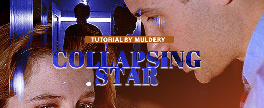
SHATTERED/EXPLODING TEXT tutorial
hiyaa! @krystaljungs asked me for a tutorial on how i made the shattering/exploding animation of the text in this gifset and so i figured i would make it and post it here, like i did with the tutorial for "falling" text.
i must warn you, this one is really tedious and requires a lot of time and patience. honestly maybe there is an easier way to do this but i didn't find any tutorials for when i needed it so i just went off my ps knowledge and did it myself.
note: you will need photoshop with a timeline!
STEP ONE: create your base gif! be mindful of number of frames in your gif. the number of frames doesn’t really matter here, but if your gif is bigger than 10mb and you have to go back to adjust it all again after you have to delete some layers....you might lose the will to live 😂
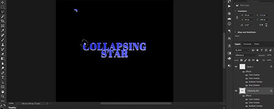
STEP TWO: make your text the way you want it to look. this effect is basically the last step of your gif making process. (i will be using the typography from my set as an example as i already have that psd saved)
this is what my typography looks like now.
STEP THREE: now, you will create a new file (with background) and transfer the text you want to "shatter" in it.

here is when things get tedious.......
tip: zoom in the document, it will be easier for you.
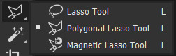
select polygonal lasso tool aka this
STEP FOUR: before you start, you need to rasterize type layer. then you will have to "shatter" every letter into smaller pieces. using polygonal lasso tool, select a smaller part of your first letter.

then you will click on that part with the right click of the mouse and selct layer via cut.
now you need to make sure that your new layer is selected and using the move tool move that part of the letter somewhere away.

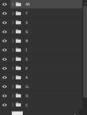
you will have to do this for every part of the letter and every letter. also move every new layer on top of other layers because they will line up better later like that. then create a new folder with every layer of said layers and rename it after the letter you're shattering. see below. (idk why my screenrecord didn't catch me making layers via cut but you should do that after the use of polygonal lasso tool, as stated above)
note: feel free to şelect parts of other letters as you get one letter, for an even better effect.
this is what i have after "shattering" every letter. the lineup doesn't have to be perfect as you will arrange these parts in your main document. (click on images for full view)

STEP FIVE: go back to your main document and make sure the visibility of your text is turned on.

what you will do now is open the shattered text in the new window and transfer letter by letter (letter folders) to your main document. BUT after you transfer every folder, you need to rasterize EVERY layer and convert it to a smart object. i made an action for this part to make it easier. download here.

(okay i really don't know why my screenrecord doesn't show "pop-up" windows but i was moving the C folder from the document where i shattered the text and then used my action on every layer)
after you transfer the folder to your main document and rasterize and convert to smart object, select the folder and use Free Transform to move it so it aligns with the letter from your complete typography. then you will select each layer and align it with the typography. see below. (click on the gif, i made it bigger so you can see better)

i did this one hastily so the recording wouldn't be too long but i'm hoping you can see what i'm doing.
now, do this for every letter.
after that is done, make the original typography layer invisible, and you should have something like this

STEP SIX: another really tedious part BUT it's time to animate the text.
make your timeline space bigger so it's easier for you to work with it. then select the first layer and click on the arrow next to it (in timeline) so Transform is revealed to you.
now, you don't want the animation to start from the very beginning of the gif, but a bit later so the text is readable before it shatters.
for example, i did mine like this, but that is your personal preference.
note: make sure that all animations start at the same time.
tip: do this for all layers in one folder before you transform them, as it will go faster.
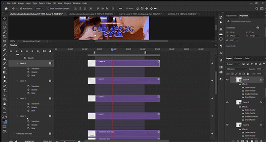
STEP SEVEN: bring the playhead (blue arrow with the red line) to the end of your gif and select one layer in timeline.
now it's time to transform it. use Free Transform (windows shortcut ctrl+T) and drag the part a bit away and rotate it. press enter.

okay ignore the way my text moved upwards, i used the text i used in my edit and i did that animation in the upper part of the gif and i was too lazy to redo the whole animation lmaoo but i hope you can see what i'm doing with the letter C.
do this for every letter. play around with placing and rotation. then save your gif. when you're done, you should have something like this.

again, i was too lazy to redo the whole thing on this new gif so i'm using the one from my gifset i linked in the beginning.
i hope this was understandable and helpful. if you have ANY questions, don't hesitate to shoot me an ask or dm me! i'm always here to help <33
248 notes
·
View notes
Text

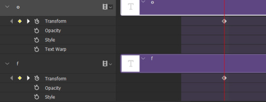
FALLING LETTERS ANIMATION tutorial
hello! @kimmomi asked for a tutorial on how i made the letters "fall" in this gifset and so i figured i would make it and post here! this effect isn't hard to achieve but it might get a little tedious if you have a lot of letters.
note: you will need photoshop with a timeline!
STEP ONE: create your base gif! be mindful of number of frames in your gif. the number of frames doesn't really matter here, altho the longer the gif the better the effect. i'd say try to limit it to 60-70 frames, depending on how big your final gif will be.
STEP TWO: make your text the way you want it to look. this effect is basically the last step of your gif making process. (i will be using the typography from my set as an example as i already have that psd saved)
this is what my typography looks like now.

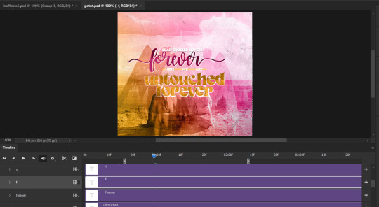
STEP THREE: i would recommend that the word at the bottom be the word that "falls". for me that is forever.
now, you will have to duplicate the "forever" layer and make your non-copy forever invisible.
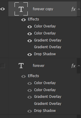
what you will want to do now is delete all the letters but the first one in the duplicated layer. for me that is f. then you just duplicate the f layer and write your second letter instead of it, in my case o. you will have to do this for all letters. also as you do that make sure to move them a bit away from each other.

now, what helps to align those letters where they start off, is making your non-copy layer to be visible again.

after you've aligned your letters, make the non-copy layer invisible again.
STEP FOUR: so now we come to a bit of a tedious part.
what you will do now is move the playhead (blue timeline arrow) a bit further from the beginning of the gif (this allows for the text to stay still a bit before it starts "falling") and click on the first letter.
next step is to click on the little arrow next to your letter and clicking on the stopwatch next to Transform.

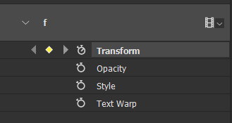
then, you will take the playhead and drag it to the end of the gif where you will start with transforming your letter with Free Transform tool (shortcut ctrl+T on windows). and what you will do is, while in Free Transform mode, drag your letter to the bottom of your gif while also rotating it a bit. when you're happy with your placement of the letter, hit enter. see below gif for how i did it.

you will have to do this for every letter, but make sure to rotate some in the other direction. also make sure that the beginning of the stopwatch mark is the same for every letter.
and that is basically it! after you transform every letter, you can go and save your gif.
this is my final result:

for some extra dramatic look, you can duplicate your initial layer with the whole word on it, drag it above all layers, clear layer style and add a stroke and make sure its FIll is at 0% where you will get the outline text that stays behind.

i hope this was helpful and understandable. if you have any questions, feel free to send me an ask or dm me <33
518 notes
·
View notes
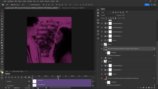
Text
Someone asked me how I created the fade transition in this gifset which I’ll try to explain in the most comprehensive way that I can. If you've never done something like this before, I suggest reading through the full tutorial before attempting it so you know what you'll need to plan for.
To follow, you should have:
basic knowledge of how to make gifs in photoshop
some familiarity with the concept of how keyframes work
patience
Difficulty level: Moderate/advanced
Prep + overview
First and foremost, make the two gifs you'll be using. Both will need to have about the same amount of frames.
For ref the gif in my example is 540x540.
I recommend around 60-70 frames max total for a big gif, which can be pushing it if both are in color, then I would aim for 50-60. My gif has a total of 74 frames which I finessed using lossy and this will be explained in Part 4.
⚠️ IMPORTANT: when overlaying two or more gifs and when using key frames, you MUST set your frame delay to 0.03 fps for each gif, which can be changed to 0.05 fps or anything else that you want after converting the combined canvas back into frames. But both gifs have to be set to 0.03 before you convert them to timeline to avoid duplicated frames that don't match up, resulting in an unpleasantly choppy finish.
Part 1: Getting Started
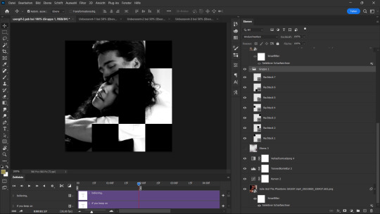
Drag one of your gifs onto the other so they're both on the same canvas.
The gif that your canvas is fading FROM (Gif 1) should be on top of the gif it is fading INTO (Gif 2).
And here's a visual of the order in which your layers should appear by the end of this tutorial, so you know what you're working toward achieving:

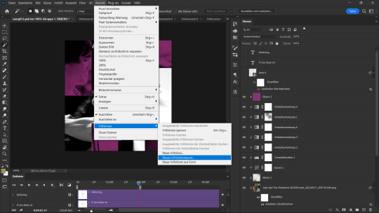
Part 2: Creating the grid
Go to: View > Guides > New guide layout
I chose 5 columns and 5 rows to get the result of 25 squares.
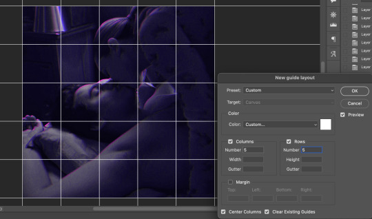
The more rows and columns you choose, the more work you'll have to do, and the faster your squares will have to fade out so keep that in mind. I wouldn't recommend any more than 25 squares for this type of transition.

To save time, duplicate the line you've created 3 more times, or as many times as needed (key shortcut: CMD +J) and move each one to align with the guides both horizontally and vertically. You won't need to recreate the lines on the edges of the canvas, only the ones that will show.
After you complete this step, you will no longer need the guides so you can go back in and clear them.

Follow the same duplicating process for the squares with the rectangle tool using the lines you've created.
Align the squares inside the grid lines. The squares should not overlap the lines but fit precisely inside them.
This might take a few tries for each because although to the eye, the squares look all exactly the same size, you'll notice that if you try to use the same duplicated square for every single one without alterations, many of them will be a few pixels off and you'll have to transform the paths to fit.
To do this go to edit > transform path and hold down the command key with the control key as you move one edge to fill the space.
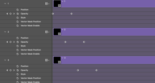
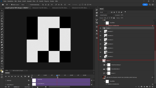
Once you're done, put all the squares in their separate group, which needs to be sandwiched between Gif 1 and Gif 2.

Right click Gif 1 and choose "create clipping mask" from the drop down to mask it to the squares group. This step is super important.
After this point, I also took the opacity of the line groups down to about 40% so the lines wouldn't be so bold. Doing this revealed some squares that needed fixing so even if you aren't going dim the lines, I recommend clicking off the visibility of the lines for a moment to make sure everything is covered properly.

Part 3A: Prep For Key framing
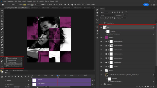
I wanted my squares to fade out in a random-like fashion and if you want the same effect, you will have to decide which squares you want to fade out first, or reversely, which parts of Gif 2 you want to be revealed first.
In order to see what's going on underneath, I made Gif 1 invisible and turned down the opacity of the squares group.

If you want text underneath to be revealed when the squares fade away, I would add that now, and place the text group above Gif 2, but under the squares group.

Make a mental note that where your text is placed and the order in which it will be revealed is also something you will have to plan for.
With the move tool, click on the first square you want to fade out. Every time you click on a square, it will reveal itself in your layers.
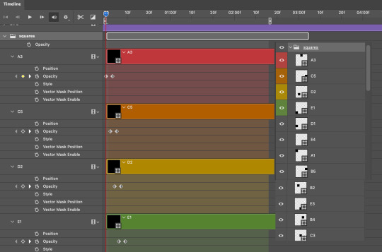
I chose A3 to be the first square to fade and I'm gonna move this one to the very top of all the other square layers.
So if I click on D2 next, that layer would need to be moved under the A3 layer and so on. You'll go back and forth between doing this and adding key frames to each one. As you go along, it's crucial that you put them in order from top to bottom and highly suggested that you rename the layers (numerically for example) which will make it easier to see where you've left off as your dragging the layers into place.

Part 3B: Adding the Keyframes
This is where we enter the gates of hell things become tedious.
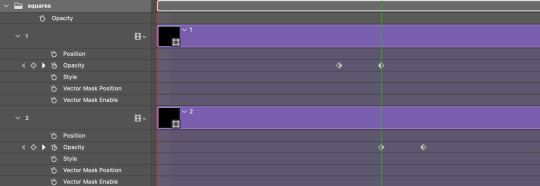
Open up the squares group in the timeline panel so you can see all the clips.
Here is my example of the general pattern that's followed and its corresponding layers of what you want to achieve when you're finished:
So let’s try it!
Expand the control time magnification all the way to the right so you can see every frame per second.

As shown in Part 3A, select your first chosen square.
Where you place the time-indicator on the panel will indicate the placement of the keyframe. Click on the clock next to opacity to place your first keyframe.

Move the time-indicator over 3 frames and place the next key frame.

Things to consider before moving forward:
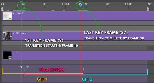
Where you place your very first keyframe will be detrimental. If you're using a lot of squares like I did, you may have to start the transition sooner than preferred.
If you're doing 25 squares, the key frames will have to be more condensed which means more overlapping because more frames are required to finish the transition, verses if you're only using a 9-squared grid. See Part 4 for more detailed examples of this.
The opacity will remain at 100% for every initial key frame, and the second one will be at 0%.
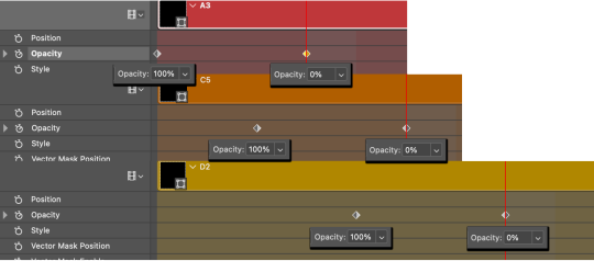
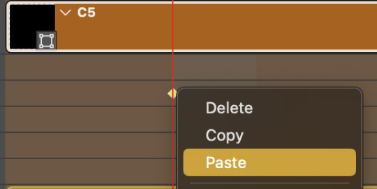
Instead of creating two keyframes like this and changing the opacities for every single clip, you can copy the keyframes and paste them onto the other clips by click-dragging your mouse over both of them and they'll both turn yellow. Then right click one of the keyframes and hit copy.
Now drop down to your next clip, move your time-indicator if necessary to the spot where the first keyframe will start and click the clock to create one. Then right click it and hit "paste".

Tip: When you have both keyframes selected, you can also move them side to side by click-dragging one of them while both are highlighted.
Your full repetitive process in steps will go as follows:
click on square of choice on the canvas
drag that square layer to the top under the last renamed
in timeline panel: drop down to next clip, move time-indicator tick to your chosen spot for the next keyframe
create new keyframe
right click new keyframe & paste copied keyframes
repeat until you've done this with every square in the group
Now you can change the opacity of your squares layer group back to 100% and turn on the visibility of Gif 1. Then hit play to see the magic happen.
PART 4: Finished examples
Example 1
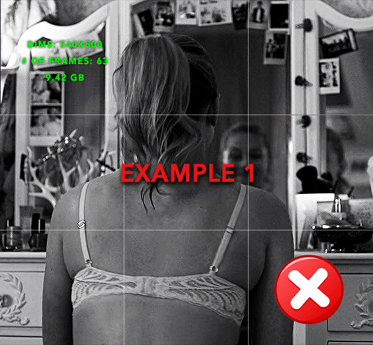
the transition starts too soon
Cause: initial keyframe was placed at frame 0
the squares fade away too quickly
Cause: overlapping keyframes, seen below.
(this may be the ideal way to go with more squares, but for only 9, it's too fast)
Example 2
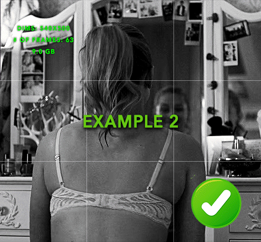
more frame time for first gif
transition wraps up at a good point
Cause: in this instance, the first keyframe was placed 9 frames in, and the keyframes are not overlapping. The sequential pair starts where the last pair ended, creating a slower fade of each square.
Part 5: Final Tips and Saving
You can dl my save action here which will convert everything back into frames, change the frame rate to 0.05 and open the export window so you can see the size of the gif immediately.
If it's over 10gb, one way to finesse this is by use of lossy. By definition, lossy “compresses by removing background data” and therefore quality can be lost when pushed too far. But for most gifs, I have not noticed a deterioration in quality at all when saving with lossy until you start getting into 15-20 or higher, then it will start eating away at your gif so keep it minimal.

If you've done this and your gif is losing a noticeable amount of quality and you still haven’t gotten it below 10gb, you will have no choice but to start deleting frames.
When it comes to transitions like this one, sometimes you can't spare a single frame and if this is the case, you will have to return to the timeline state in your history and condense the key frames to fade out quicker so you can shorten the gif. You should always save a history point before converting so you have a bookmark to go back to in case this happens.
That's pretty much it, free to shoot me an ask on here or on @jugheadjones with any questions.
218 notes
·
View notes
Note
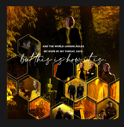
Hi, how did you do the honeycomb layout gifsets?
hey!! so this is likely to not make sense as i am awful at explaining myself, but i will try the best i can.
so, firstly, you need your shape. for the hexagons (used in these sets) i use the polygon tool w/ 6 sides, but you can literally do this with any shape, if you can't get the shape you want on photoshop, or have found a specific shape elsewhere you can use that too (for example this set, i used an hourglass shape from google images, and created the shape in between in photoshop).
my canvas looks like this now...
i've made my canvas the size i think i want it, but as long as you set your width to what it needs to be for tumblr, 540px, you can adjust the height of the layout once you've worked out how you want your layout to look. now the next step is just duplicate and move the shapes around until you've filled your canvas. it can take a little trial and error to get things lined up, but i try make sure the gaps between all the shapes stays at 4px, to match the margin between gifs on tumblr.
so, now i'm left with all the shapes in separate layers, NOW, before you do anything else make sure you've clicked create video timeline.
once you have all your shapes placed out, you're ready to make your gifs. and once you have a gif (i colour them entirely but DON'T resize or sharpen until they're placed in the layout), make sure it's a smart object and either drag from one canvas to the layout canvas, or use the duplicate option. now you literally just clip the gif to the chosen shape layer and resize as needed (there’s a tutorial here by kate that looks at clipping masks/layer masks if you need help with that in more detail!), then sharpen. (i've done it with three random gifs i had psds saved on my laptop to show you as an example)


so this is how it should look with your layers and i saved it as it is too (but i do recommend flattening it all back into layers at the end of this whole process to set the time of your gif properly!) but yeah, you basically just keep going until you've filled your whole gif! really hope this helped i'm bad at this stuff!!!
310 notes
·
View notes
Text
Tutorial for @chris-hargreeves ❤
This is my first tutorial ever, so please please bear with me. Here's how to create this effect:
We'll start by doing the following: the base gif, crop and color it and then little gifs that go in the polygon. I cropped them at 540px even though I knew I was going to use them smaller, because I just wanted to make it able for photoshop to run, but still have a big enough image that I could fiddle with when framing.
Here's how it looks so far:
My layers panel is a mess, so we'll ignore that part for now. We have the base colored gif and stacked on top of it should be the smart objects of the other tiny gifs.
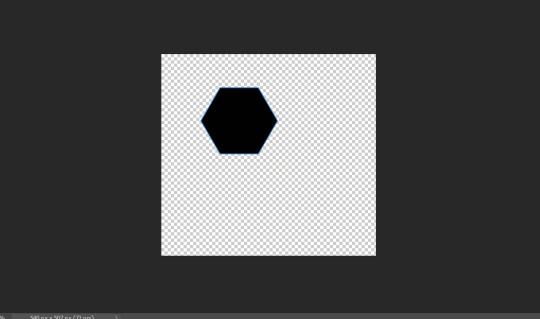
NOW we'll click on the polygon tool and draw your shape.
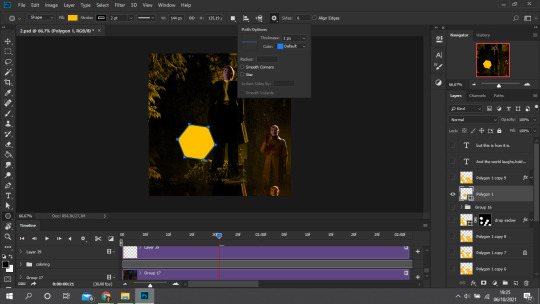
Things to note:
- if you don't have the polygon tool, just right click on the rectangle tool over rotate, in the left toolbar.
- When you click on it, the settings may be to 99 sides and then in configurations "star" may be checked. Change that to 6 sides and uncheck "star".
- Remember to pick a fill! Preferably the color of your gif.
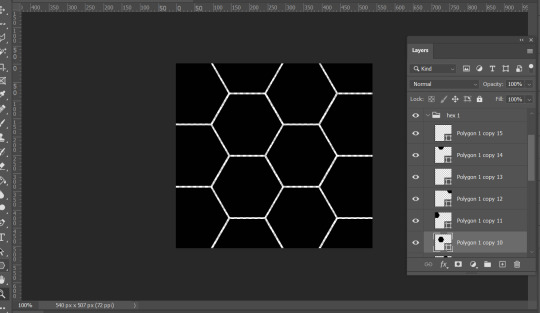
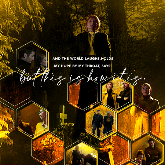
We're going to repeat this process as many times as you want, mine looked like this when I was done:
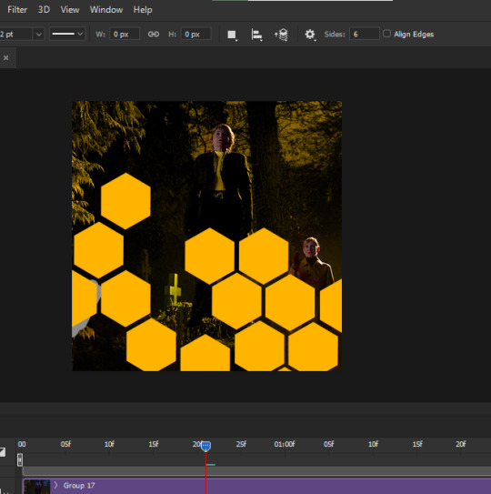
But I'm not giffing a show fortunate enough to have scenes for all the honeycombs. Besides, it would look cluttered. So I selected some of the combs (which polygon will generate 1 layer) and put them in a folder, the others in another folder.
With the ones that AREN'T going to become little gifs, you can rasterize and duplicate. Play with the settings.
I have a layer set on difference, where I changed all the combs to be grey. Another one with the orange set to color. Another one with the orange set to overlay. ANOTHER ONE with a 0% fill but a stroke in light yellow and 1pt.
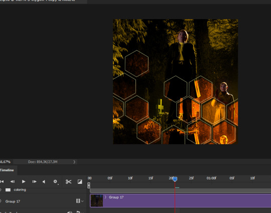
Here's how it's looking. The one with a stroke I moved a little to the left and a little up, so you can see it.
Now the combs that ARE going to be gifs. Set them on normal, 100% fill.
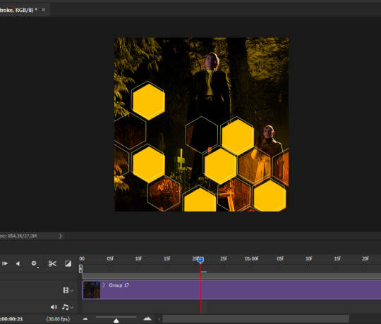
(Duplicate this rasterized layer, turn off visibility, save for later. )
We have shapes! You know what we're going to do now. Turn on the visibility of the little gifs, put on top of this layer, right click and select "Create clipping mask."
Now they're all bound to this shape.
Time to resize, organize, erase parts of your gifs, add more color, etc, etc, etc

One more step:
Remember that duplicated layer of the tiny gifs honey comb? Turn it back on, put it under everything, turn fill down to 0% and then double click. Drop shadow, yellow:

You'll see I also added some glow spots. That's easy to achieve, use a soft brush on a transparent layer on top of everything and brush with a light color, layer set to either "overlay" or "hard light."
Now we add text and it's done!
I know this tutorial was quite choppy, i'm sorry, it's just that my layers are SO MESSY currently bc I don't have the patience to do all the steps pretty like I've explained. Any questions, hit me up!
360 notes
·
View notes
Note
Hello!! First your Tumblr and edits are so gorgeous! Second I was wondering if you were willing to share how you did the second gif of this edit please? Have a great day! (Or night)
https://www.tumblr.com/thereigning-lorelai/713794704750362624/usergif-1-year-celebrationshuffle-challenge?source=share
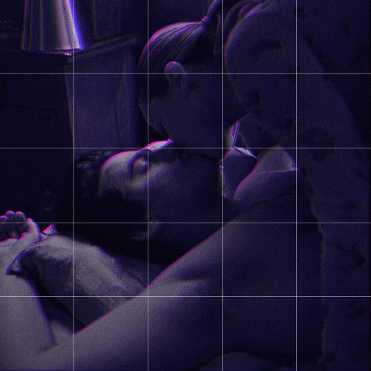
hi nonny, thanks for the nice words! really appreciated. ♥️ so, you're looking for this grid effect:

you're starting off with two gifs. i'd recommend choosing scenes that are not too close up because otherwise they'll overlap too much and you won't be able to delete enough parts to make the most of this effect.
so, here's my base gif that i just did in black and white with some minor purple brush strokes set to screen:

i then chose my second gif and coloured it with a purple gradient map and a purple colour fill set to multiply. the colouring of the gifs is entirely up to you and what you think looks best. so here's my second gif, still without the grid:
this is where the fun part starts - the grid layout. i created that with a new guide layout. this is a super neat tool in photoshop that helps you align shapes or selections on your image. the guide lines basically float over it and help you set up symmetric shapes or layouts. you can define how many columns and rows you want to have and then photoshop creates the guide layout for you. for this gif i chose 4 columns and 4 rows:

with this set up, i started creating the rectangles to make the purple gif visible on top of the black and white one. this is my final layout for my shapes:
you can move around the shapes to your liking and what works best with your gifs. i didn't want to cover too much of my base gif but also tried to make their faces in the top gif all be in the gif as much as possible.
this step is just a lot of moving around your shapes and seeing what looks good tbh.
i then grouped my shapes and clipped my top gif (including all layers for the colouring) to my shapes group:

looking good so far. the only thing missing are the lines for the grid. this is where your guide layout comes in again. i just reopened it and then traced the guide lines with my line tool to create the white grid overlay:
(for editing purposes i turned all of the line layers into a single smart object at the end. this is why you only see one layer for all the lines in this screenshot.)
finally, i used a gaussian blur (0,5 px radius, 100% fill for the filter, 40% fill for the overall layer) on the smart layer to make the lines a little bit smoother and softer looking. this is totally optional and again, up to what looks best to you.
added some text et voilà:
296 notes
·
View notes
Photo
Alright y’all, today is the day that I’ve finally managed to make a tutorial! I’m going to be showing how I created the effect in my lotr and the witcher sets!
For this tutorial you need to know how to make gifs and have a lot of time on your hands!
this is really long and really image heavy oops
Keep reading
1K notes
·
View notes
Text


CRYSTAL CLEAR ✦ A GIF PACK DIRECTORY & PAGE BY FAKEHELPER
Introducing my first ever gif pack directory and page pack !! You asked and now you shall receive. Based on poll results, here is a theme that allows you to use filters to sort through your gifs, using a header navigation style. I know y'all asked for simple, but ya girl just couldn't do it. I did try a simple version and I hope it's to your liking! If you like my work, feel free to leave a tip in the link below!
FEATURES:
Isotope filters and Search
Information section to place faceclaim info and links
Gradient Blob background that you can edit using the linked generator
Solid or blurred trigger warnings that disappear on hover (optional)
No JavaScript version of the gif pack page only
CREDITS:
Font: Google Fonts (Karla)
Icon Font: Phosphor Icons
Tumblr Controls: @cyantists
Gradient Blob: Signal Supply
Gifs: All gifs were made by me | Full Packs: Jeff & Victoria
RULES:
Edit as much as you’d like, but don’t use this as a base
Don’t remove parts of this code and use it in your own
Do not redistribute or repost
Don’t remove my credit in any way
Please like/reblog if using
- ̗̀ PREVIEWS & DOWNLOADS ✦ TIP JAR ̖́-
282 notes
·
View notes
Text
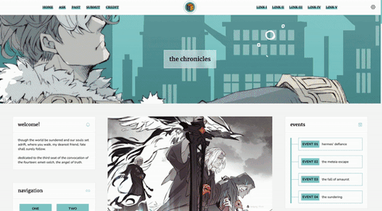
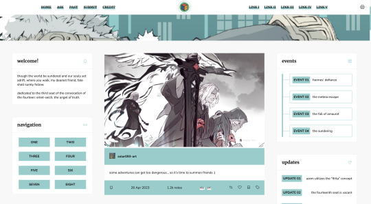
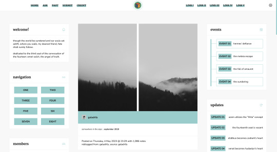
Theme #07: Clio by @pneuma-themes
Where you walk, my dearest friend, fate shall surely follow.
Live Preview (Temporary) / Static Preview: [Index] [Permalink] / Get the code: [pastebin] [github]
This is intended to be a fansite! I am finally happy with how this turned out after a few iterations. This theme features Emet-Selch from Final Fantasy XIV. Be warned going into the live preview as this theme heavily features content that can be found on various points of Shadowbringers and Endwalker, which may or may not be a spoiler!
Features:
Customizable post widths and font sizes. The live preview uses 650px post width and 13px font size. Enter the desired post width on the post width field and the desired font size on the font size field on the Customization page.
One accent color, 7 color options
Option for title alignment (centered/lefthand side/righthand side) to accommodate for the chosen header image.
Option to display or hide the blog title.
Built-in dual sidebar layout. All the boxes on the sidebar (members, events, updates, and site info) and the footer (disclaimer, about, and search box) can be edited from the code directly.
5 custom links at the topbar with additional 8 links on the navigation box.
Customizable photoset gutter. The live preview uses 10px gutter.
A header image. The size of the header (w x h) is the width of your screen x 350px. So if your screen width is 1900px, then the size of your header should be 1900 x 350px.
Notes:
This theme uses @eggdesign's NPF reverse-compatible template. Everything should be working as expected, except for some things noted below.
As we slowly transition into the new editor, posts made by the legacy editor will eventually break. This is particularly evident in a quote post reblogged via the new editor, in which the post will be rendered as a text post with blockquote and cannot be styled similarly to a legacy quote post. This is a Tumblr bug as far as I am concerned and from what other people have told me, so unfortunately there is nothing I can do about it.
I've written a short guide on how to set up this theme here. Everything else is annotated in the code, so do read through them before shooting me an ask!
Credits:
NPF reverse-compatible template: @eggdesign
Header: ユズリコ❂ (yuzuriko_red @ Twitter)
Icon font: Phosphor Icons
Icons (affiliates, members) and toggle tags on click: @alydae
Fonts: Nunito, Merriweather @ Google Fonts
customAudio.js: @annasthms
photoset.css with lightbox: @annasthms and @eggdesign
Search box, minified spotify player: @glenthemes
Toggle-able tumblr controls: @seyche
Shorten note count: @shythemes
Responsive video script: @nouvae
Please like and reblog if you like this theme or are using it!
637 notes
·
View notes
Text

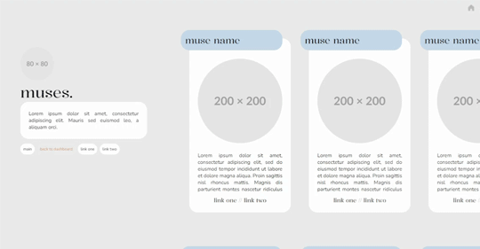
˙ ˖ ✶ ANAHILATION THEME !! 006. take two
100% javascript free
muse picture: 200px by 200px | sidebar icon: 80px by 80px
unlimited muse boxes
two free sidebar links, two free muse links per
feel free to edit however you like for personal use. please do not redistribute, claim as your own, or sell to others.
credit is not necessary, but always appreciated! a like & reblog if you’re using is the cherry on top. and also feel free to mention me, i’d love to see what you come up with!
my askbox is always open for any questions or suggestions on resources.
i make all of my resources for free and always will, but if you’d like to leave a tip my ko-fi is ANAHILATION. enjoy!!
find the preview & download code in the SOURCE LINK.
277 notes
·
View notes
Text

Temperance: About Page #03 by @pneuma-themes
Be still, the dawn is breaking.
Live Preview / Get the code: [Pastebin] [Github]
A simple contained about page. An attempt was made to get out of my slump and back into the groove again before I got busy with real life again.
Features:
A social media links section with icons included
A custom links section. Depending on the width of your screen, you can add more than six links (as seen in the preview).
A short information section above the about body
A sidebar image. The size of the image (w x h) should be 30% of 80% of your screen width and the height should be 300px.
An unlimited space to write your biodata. Can be as long or as short as possible.
Javascript free, so it should be possible to use this page without asking for whitelist from the staff.
This is a page theme, so blog posts will not be displayed. Please install this through the Add new page link instead.
Customizable colors. Colors can be customized from :root section of the CSS.
Credits:
Sidebar image: @xathrid
Font: Rubik @ bunny.net
Icons: Boxicons
The code has been annotated for instructions on changing the icons and adding or removing the sections on the sidebar. Feel free to contact me if you find any difficulties!
Please like and reblog if you like or are using this!
351 notes
·
View notes
Text

Sprung — a responsive, single-column theme
Static previews: - Preview (Left Sidebar) - Preview (Right sidebar)
Download code: GitHub
This is a single-column Tumblr theme with a choice between left or right sidebar, and body font + accent font (Google fonts) of your choosing. Full support of npf posts. Optional dark/light mode toggle and update tab available.
Read features and notes below the cut
Customize colours for dark and light mode
Customizable post margin
Custom title
Custom description
Select font-size
Select Post-width (350-540px)
Select photoset gutter (1-4px)
Select post info displayed as text or icons
Select display tags or hidden behind toggle
Select Tumblr controls displayed or hidden behind toggle
Select update tag hidden, inside sidebar or top left corner
Toggle to center post column
Toggle between sharp or rounded corners on content
Toggle between shark or rounded corners on photo(sets)
Toggle search bar
Navigation: An unlimited display of native Tumblr pages (Learn how they work in my helpdesk here). Custom label for home + ask + archive link.
Sidebar Image icon: Choose between sizes 80x80px/100x100px/120x120px. Choose a shape between shapes square, rounded, circle or blob. Separate icons for light and dark mode! But If you want the same icon, simply upload it twice.
Dark Mode: If you decide to offer dark mode, it detects if the visitor’s operating system is on dark mode, and displays that choice at the first visit - of course with the option to toggle the other mode on/off.
Icon change for update tab: To change the icons, go to https://tabler.io/icons and simply copy the name of the icon like so:

Into the corresponding field:
Notes:
Via/source links are on permalink pages
to hide the archive link, simply delete the text in the field.
Submit-link and ask-link only shows if toggled on in your blog's settings.
Credits
214 notes
·
View notes
Text
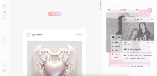

[ Theme #11: TTYL ]
Preview + Install (Theme Garden)
Live Preview + Static Preview + Code (GitHub)
A responsive, all-in-one theme that includes the option to hide the about, navigation, muses, following, and recently liked sections!
Features:
Day and night toggle button that will stay in the selected mode until it is turned off. A dark mode option is available for those who prefer a dark color scheme on their blogs instead of the default light colors. The day and night mode button will also change according to the scheme you are using.
6 sections are included in the theme (blog posts, an about me, navigation links, muses, following, and recently liked posts).
Left or right sidebar. Both layouts are responsive on multiple screens including mobile.
You can also choose icons that you like for various elements of the theme (i.e. the menu links in the sidebar) from Tabler Icons. Please refer to the theme guide linked below for more information.
Like and reblog buttons, a search bar, an updates tab, and a custom "Not Found" page.
A drop-down menu with 3 custom links.
Supports NPF posts and page links.
Options:
Instead of giving you a selection of post sizes to choose from, you can enter your desired post size (i.e. 500px or 40vw). The same applies to the sidebar.
A custom title and/or description. To activate the custom title and description options, just type anything in the text boxes "Custom Title" and "Custom Description."
You have the option to choose whether your accent colors will be a gradient or one color.
There is a selection of border styles and header styles to choose from.
Different sidebar images are optional. However, the first sidebar image that uses your header image as the default will always be visible on your blog. There is no option to hide it like the other sidebar image.
Show or hide tags on the index page.
Notes:
The search bar will be hidden automatically if you have the option to hide your blog from search results enabled.
The following and recently liked sections will only work if you're using the theme on a primary blog. It will not work with side blogs. Please also make sure you have enabled the options to share your following and liked posts in your blog settings.
For an in-depth explanation and tutorial on how to customize the theme to your liking, please refer to the theme guide! Everything you need to know will be addressed there.
Credit:
NPF Audio Player by @glenthemes
Tabler Icons by Paweł Kuna
See full list of credits here.
Please make sure to read the theme guide before sending in any questions about customization, thank you!
1K notes
·
View notes
Text
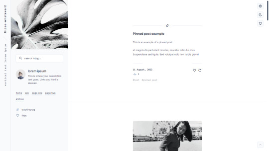
Suburban— a responsive, single-column theme with a full-length sidebar
Static previews:
- Preview (1)
- Preview (2)
Download code: GitHub
This is a single-column Tumblr theme with a full-length left sidebar and two Google fonts of your choosing. Full support of npf posts. Optional dark/light mode toggle and update tab available.
Read features and notes below the cut
Customize colours for dark and light mode
Customizable post margin
Custom vertical text
Custom title
Custom description
Custom statistics (in sidebar)
Select font-size
Select Post-width (350-540px)
Select photoset gutter (1-4px)
Select post info displayed as text or icons
Toggle to hide Tumblr controls behind icon
Toggle between sharp or rounded corners on content
Toggle between sharp or rounded corners on photo(sets)
Toggle optional update tab
Navigation: An unlimited display of native Tumblr pages.. Learn how they work in my helpdesk here. Custom home + ask + archive link labels.
Search bar: The search bar will automatically be hidden if you have the option to discourage searching your blog from search results enabled. Go to your blog’s settings to do so.
Sidebar header image: 290x250px. This header image is also optional. Separate image for light and dark mode, but If you want the same photo, simply upload it twice.
Sidebar Image icon: 50x50px. Choose a shape between shapes square, rounded, circle or blob. Separate icons for light and dark mode! But If you want the same icon, simply upload it twice.
Dark Mode: If you decide to offer dark mode, it detects if the visitor’s operating system is on dark mode, and displays that choice at the first visit - of course with the option to toggle the other mode on/off.
Icon change for update tab and sidebar statistics: To change the icons, go to https://tabler.io/icons and simply copy the name of the icon like so:

Into the corresponding field:

Notes:
Via/source links are on permalink pages
to hide the archive link, simply delete the text in the field.
Submit-link and ask-link only shows if toggled on in your blog's settings.
Credits
631 notes
·
View notes
Text
elio’s colouring tutorial! <3
i've been getting a lot of asks about my colouring process and requests for colouring tutorials, so i finally decided to make one! using a few gifs as examples, i'll show you how i turn backgrounds into a vibrant colour. this tutorial assumes that you already know how to gif; we're jumping right into the colouring!

(disclaimer: just keep in mind that this is what works for me, experimenting is the best way to learn what works for you ahshdgjg anyways, here we go, under the cut!)
four things i keep in mind when i want to make a colourful gif:
scenes should have backgrounds that aren't complicated or full of other objects (especially if they're dark)
scenes should have backgrounds with colours that are easy to manipulate. i.e. a simple blue background will be much easier to change than a background that has a mixture of green, red, and brown.
scenes shouldn't have a lot of movement. scenes with limited movement will save you from a migraine.
avoid dark scenes!!! it's really hard to colour a dark scene, and most of the time, it doesn't turn out looking as vibrant as other scenes.
this alina scene from shadow and bone isn't the best because the lighting is on the darker side, but the relatively solid blue/green background made it doable. that being said, it would have been much less time-consuming if it was brighter.
step one: brightness.
the first thing i always do is click on "brightness/contrast." leave the toggles at 0, but change the blending mode to screen. this generally gives you a decent brightness without overdoing it.
now, if this was a regular gifset, i would move on to "curves." for a vibrant colouring set, i leave that for last. the results turn out much better if your curves layers are on top of your colouring layers; order layer matters!
step 2: hue/saturation.
generally, you won't want to touch this too much because it changes the overall appearance of your gif and can affect things like skin tone. however, you do want to move it subtly either to the left or right depending on what colour you want your final gif to be! think of it this way: the point of hue/saturation is to get your gif (especially your background) to a colour that's easy to manipulate so that your "selective colour" layers work better!
this alina starkov scene has a relatively blue background with mild splotches of green. the blue is easier to manipulate than green since there's more of it, so i'll move the hue/saturation to the right (+8) to make the gif a little bluer.
step 3: colour balance.
colour balance works the same way — use it to change the colour of your gif so that your selective colour layers are stronger.
play around with midtones, shadows, and highlights. don't overuse these, or it'll be a pain to fix other parts of your gif later (i.e. a person's face). again, i made the gif look more blue and less green with this colour balance layer. this is how my gif looks now, with a before and after included so you see what i meant about going from green -> blue:

*i also added two subtle selective colour layers (set on "relative") after the colour balance to make alina's face less grey.
step 4: selective colour
alright, this is where the real colouring comes in!!! selective colour layers are your best friend when you want vibrant colours in your gif. now that we've made the scene take on a bluer tone than green, click on "selective colour." you’ll see two options when you click on it: absolute and relative.
i recommend beginning with absolute, not relative. absolute is stronger than relative, and will therefore give you more vibrant results. you can use relative to "touch up" later.
the key to selective colour layers is to alternate between absolute and relative. think of the absolute layers as a way to set the foundation for a new colour, and the relative layers as a way to subtly fix little things afterwards. the number of selective colour layers will differ per scene and gif. sometimes, i'll have 5 absolute + 10 relative, and other times i'll have 10 absolute + 2 relative.
there's no right answer for how you play around with the toggles in selective colouring, because again, it will differ per scene.
for this gif, the first thing i did was go to the cyans (absolute) and dragged the toggle for "cyan" all the way to the left (-100), magenta (+8), and yellow (+38). this got rid of the cyan tones, but that's alright, because the point of establishing this blue tone is so that the colour of the entire gif is easier to manipulate.
for blues (absolute), i did the following: cyan (-48), magenta (-27), yellow (+100). this gets rid of the blues almost entirely, leaving us with a light grey and neutral tone.
since we now have this neutral tone, i went to neutrals (absolute), and moved the toggles: cyan (-25), magenta (+10), yellow (+100). i also did black (-5) to make the scene a little brighter. now, after all of this, our background is orangey-yellow. the only problem is that it's also affected alina's face, so our gif looks like this:
definitely not the look we want the final gif to have. but this is alright! don't be afraid to make your scene look intense, because your layer mask will help you!
click on your layer mask — the white box next to the selective colour layer. make sure you click on the layer mask of the selective colour layer that's affected the person's face. so, mine would be the "neutrals" selective colour layer. then, grab the brush tool, set the colour to black, and colour over the face/other necessary areas. anywhere you paint black on your gif, the selective colour layer's effect will be erased. if you make a mistake, change your brush tool colour to white and paint the layer back.
my gif looks much better now, and alina's face is no longer orange. but i want the background to look yellow — this is orange. now that we've established a vibrant colour background, it'll be much easier to work with — getting here was the hardest part!
i made another selective colour (absolute) layer. i usually like to have at least two absolute layers before moving on to relative layers.
now that our background is orangey-yellow, we can dive right into the yellows of our selective colour layer. i moved the toggles like so: cyan (-100), magenta (-9), and yellow (+100). this gives me a light yellow colour, but there are still darker splotches in my gifs. this isn't an issue; i just moved black to -40 and fixed most of it.
now that we have a vibrant colour that's similar to the shade we want, it's time for our relative selective colour layers. my gif looks good, but i want it to take on an even more vibrant shade.
make a new selective colour layer and click relative. the changes you make with relative will be subtler than absolute, but because we've established such a vibrant colour already, relative will be perfect! i moved the toggles like so: cyan (-100), magenta (-33), yellow (+16), black (-6). now my gif looks like this:

this gif turned out pretty good without a lot of trouble, but sometimes, i'll have to go ahead and add another absolute layer, then another relative layer, etc. again, like i said earlier: alternate between absolute and relative selective colour layers!!!!
step 5: new layer + brush tool
i could leave this gif as is, but i still think that the darker splotches ruin the overall look. to fix this issue, i made a new layer, used the eydropper tool to find the right colour, and used the brush tool to colour over these areas. again, i usually have multiple layers where i manually colour over certain areas. for this gif, i have 5 layers.
i tend to set the blending mode to soft light because it gives the best results. colour works too, but i find that it tends to make the colours look a bit flatter.
near the top of alina's head are whiter splotches. those bothered me as well, so again, i made a new layer and used the brush tool to cover them. i didn't change the blending mode though. i kept it on normal but lowered the opacity (for this gif, to 63%). this works because there isn't a lot of movement in the gif, so it doesn't look messy. darken will colour in your white spots too, but that doesn't work too well sometimes — in my opinion, keeping it on normal and messing around with the opacity looks most natural.
this is how my gif looks now:
step 6: curves
now that our colouring is done, it's time for curves!
if you click on the curves layer, you'll see that there are three little droppers on the left. i use the first and the third.
click on the first dropper, then click on the darkest point of your gif. then use the third dropper to click on the whitest part of your gif. this will help balance out the brightness and contrast. if your curves are too extreme, lower the opacity.
if your gif doesn't look good with the curves layers, just scrap them. you can fix most of the brightness with a new selective colour layer. for this gif, i used curves and a new selective colour layer to make alina's hair look darker and less blue. this also helped balance out the overall brightness of the gif, as well as her skin tone.
step 7: vibrance
slap on a vibrance layer, but leave the saturation alone. for this gif, i did vibrance +37.
andddd that's it!
this is what my final gif looks like:
*the area around her neck is a bit too pixelated, but it was fine because this gif was originally used in a 268 px gifset, so it wasn't noticeable.
but this is an issue that can happen with vibrant colouring! so, what if the gif turns out too pixelated after a lot of colour manipulation?
this is an easy fix if your gifset doesn't have a lot of movement (and in some cases, even works with some movement!) here's an example.
this gif was given a vibrant purple colour by doing the steps listed above. i've included a before and after so you can see the colouring.
but if you look near the top, it's very pixelated and messy because of how much brightness/colour manipulation has happened. we can fix this by making a new layer, using the eyedropper tool to find a similar shade of purple to the background, then colouring over those pixelated spots.
keep the blending mode on normal but lower the opacity so that it blends seamlessly. for this gif, 48% opacity worked.
my gif now looks like this:

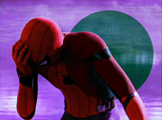
it's not perfect. if you look closely, you can see that some of the purple is painted over spider-man's head at one point since there's a lot of movement happening here. you can sometimes fix this by using the eraser tool with a significantly lowered opacity (i.e. 15-30%). but the main point is, the pixelated areas look much better and less messy, and overall, the gif has a more cohesive look.
AGAIN, the key idea of vibrant colouring:
the key idea of vibrant colouring is, in my opinion, this: manipulate the overall colour of the gif with other layers so you can use selective colour to achieve your vibrant colours.
one method that i sometimes use (but didn't for the previous examples) is to take your gif, do all of the steps, but focus especially on new layers + brush tool to help you colour your gif. here's what i mean.
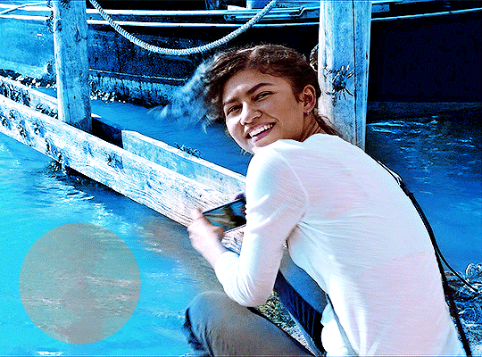
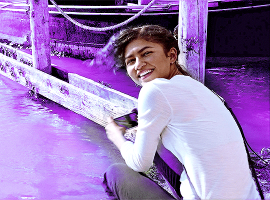
this admittedly awkwardly coloured gif of MJ was originally blue. this vibrant blue was achieved by making a new layer and manually colouring in the background after doing all the other steps. it was blue before, but it certainly wasn't this vibrant without the multiple manually-coloured layers. you can see what i mean in the before and after:
since we have this vibrant blue colouring, adding a selective layer on top of this will give us fantastic results. since your gif is blue, go to cyans and blues on a selective colour layer.
with the help of three selective colour layers that alternate between absolute and relative, my final gif looks like this:
if i hadn't used new layer + brush tool to manually colour this gif's background, it wouldn't have ended up so vibrant — or if it had, it would've taken me much longer.
so, again: focus on manipulating the entire background so you can take full advantage of selective colour layers!!! with practice, it gets easier.
that's it from me! i hope this overly long tutorial was helpful! give it a like or reblog if you found it helpful, and feel free to reach out to me if something's unclear!!! happy giffing <3
771 notes
·
View notes