
Last Seen Blogs
kotozakii
##LULU ; 🥝 !
hrrycore
✧:・praise the earth・:✧
atraccion-fatal-blog
.:Picture Perfect:.

dahianajzpi
dahianajzpi

thatweirdgirlslife
That Weird Girl's Life
Text
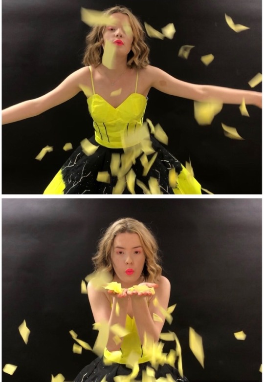
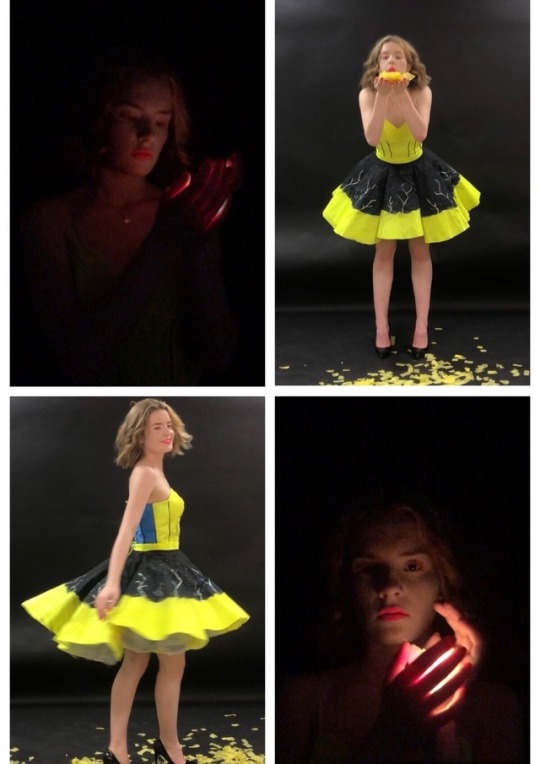

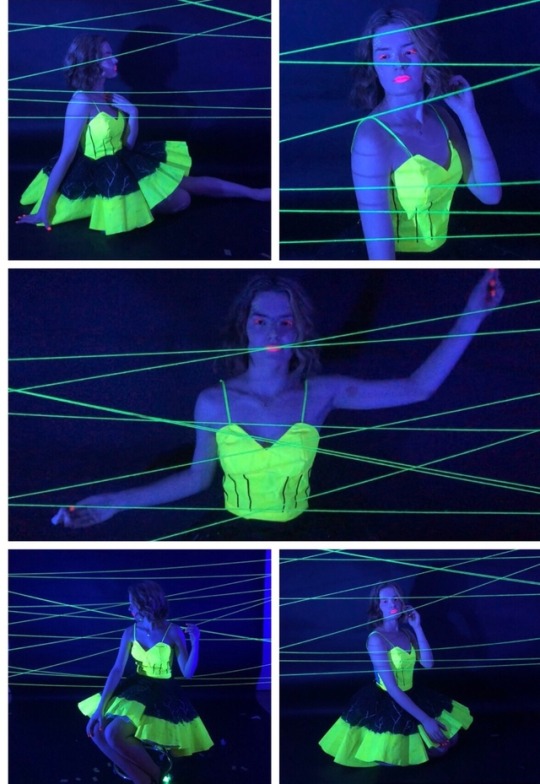


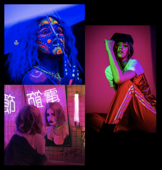
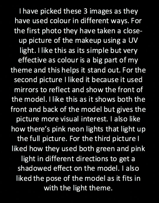
These are some of the photos I took of my garment. When taking the photos I used props such as confetti and balloons as my customer (the carnival of light) does balloon drops and confetti drops so I thought it would apeel to my customer more if I showed part of the carnival in my photos. I also showed the dress under UV light and in normal light to show what it would look like in both. For my model I added neon UV makeup so that the makeup also flowed with the dress to get my light theme across. I reflected my them through the makeup by adding yellow dots on the inner corner of the eye, the nose and the side of the face to represent the fireflies. I then added neon pink lips and eyeliner and orange lashes to tie the look together. I also added neon Orange UV nail vanish to match the makeup.
0 notes
Text
undefined
youtube
When picking my music for my commercial, I struggled to find royalty free upbeat music that will catch an audiences attention. So instead I picked out pieces from royalty free music I did like and I pieced them together to make my own music. When looking for the music I wanted to have an electric sound feel to it and I also wanted it to be dark, dramatic but also carnival like. I listed to the carnival of light trailer and realised the music was very fast and upbeat so to fit in with my customer I found fast upbeat carnival music for the 3rd part of my commercial. I blended in all the music to one another so it sounded like one music track. I kept the beginning dramatic with a big build up to catch the audiences attention.
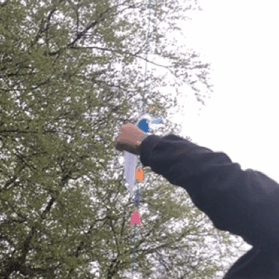
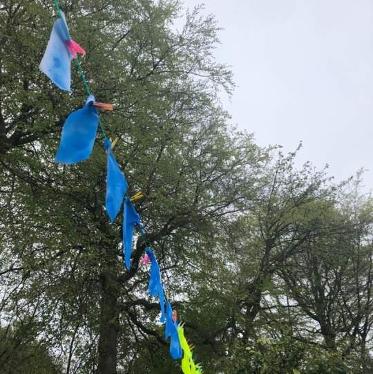
I started the video with my logo and the collection name however, I changed the bigginging of my video from the story board. I did this because I wanted the video to make it clear and show what inspired my design. I kept the video dramatic and kept it to a fast paste. When videoing my commercial I used confetti and light up balloons because my customer (the carnival of light) does balloon drops and confetti drops so I thought it would help link the video to my customer by using the same objects. I also used UV glow in the dark wool to give a Lasered effect. I spit the video up to show the dress under UV light but also under normal light, I also showed the detail on the dress In both lights. I added images at the end of the Commercial to give a still image of the dress and I ended the video with the collection name and the date it is supposed to come out.
0 notes
Text
Story board

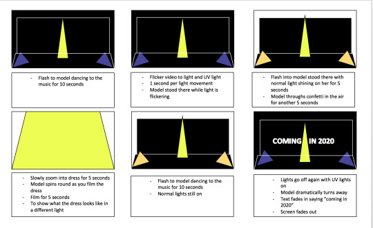
I have done my story board digital, i did this to try and make it more professional and easier to understand. i have shown my logo at the beginning and i have shown both the dress in UV light and in normal light throughout the video. i have also added the collection name at the beginning and the the date its due out at the end. i tried to do close ups of the dress to show detail in the design and to also i’ve more visual interest as the dress is shown in different views.
0 notes
Text


This is my finished garment. When creating my garment I added more netting to create a fuller luck. I also had more eyelits for the corset then on my original design.
0 notes
Text
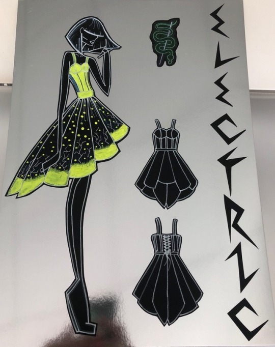
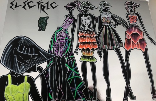

These are my final 3 design boards I have included the collection name and logo at the the Top. I have then done placed 4 full sided illustrations along the side with one large one to add varying in hight and give it more depth. I have then picked the design that I am making and I have enlarged it and added spec drawings on the side. I have chosen this design as it shows a lot of natural light which is what I wanted to show more off, it also reflects my theme really well. My customer will like it as it reflects the carnival of light and it has a lot of movement in the garment, it also has straps so it will be good for body dips that happen at the carnival. For my illustrations I drew and added colour to them on black paper I did this as it makes the illustrations stand out and it gives the illustration of them glowing in the dark.
0 notes
Text


I have done 3 design board ideas for the first one I have put silver strips ontop of black paper and then I have put my illustrations and logo ontop, I don’t like this design as the black makes the illustratuon blend into the background. The the next design I didn’t the same technique but on white paper I liked this as it makes the illustrations strand out however I think the background is too busy and it will overpower my designs. For my final board I just had a plain silver background I like this as it makes my illustrations stand out.
0 notes
Text
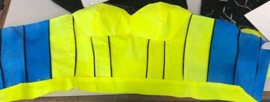
Today I have put together my corset with piping inbetween. I had no problem putting the piping in however when it came to putting the bust in I came across a few problems. When putting the bust in, the fabric was really stiff which didn’t allow any room for movement to manipulate it in the shape it needed to be in. this corsed the fabric to become brittle where sewn , so it started to rip. Also when turning my facings inside out the fabric ripped so I had to add in an extra seam to get rid of the tear. However once done the corset was sturdy and didn’t need any interfaceing as the fabric was stiff.
0 notes
Text


I have spray painted my corset pieces I did this similar to the skirt by cutting out the pieces bigger incase of shrinking when painting. I then spray painted my corset pieces in my chosen neon uv colours and re cut them out to match the pattern pieces. The spray paint left the fabric stiff so there was no need for interfacing.
0 notes
Text
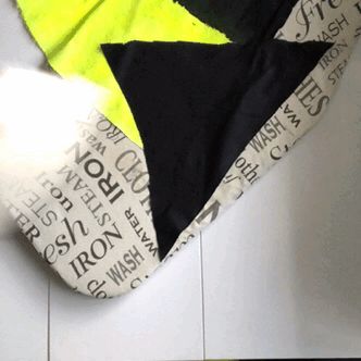

Once the paint had dried I then ironed and cut out the skirt pieces the exact size of the pattern pieces making sure I followed the pattern instructions. When cutting the fabric pieces out I noticed that the black part of the skirt shrunk but the bleached yellow part stayed the same size as what I cut it the first time. So when I cut out my pieces I had to make sure they were flattened out as Carefully as possible so that the fabric wasn’t bunched up when cutting out.
0 notes
Text
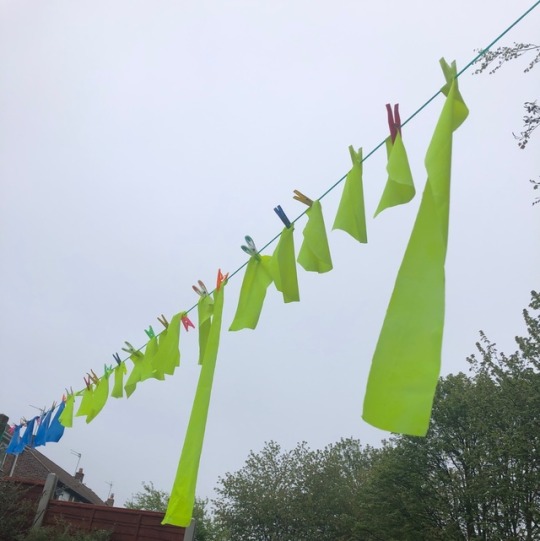
Once I finished bleaching my fabric I started adding the colour onto the bottom of the skirt. For the bottom of the skirt I was going to use neon uv fabric paint however, neon uv fabric paint was hard to find online and in shops in a large amount. So I decided to use neon uv spray paint, this spray paint left the bottom of the fabric stiff which helps the skirt keep its shape without needing interfacing. The spray paint was harder to control however it gave more of a ombrayed affect into the black.
0 notes
Text


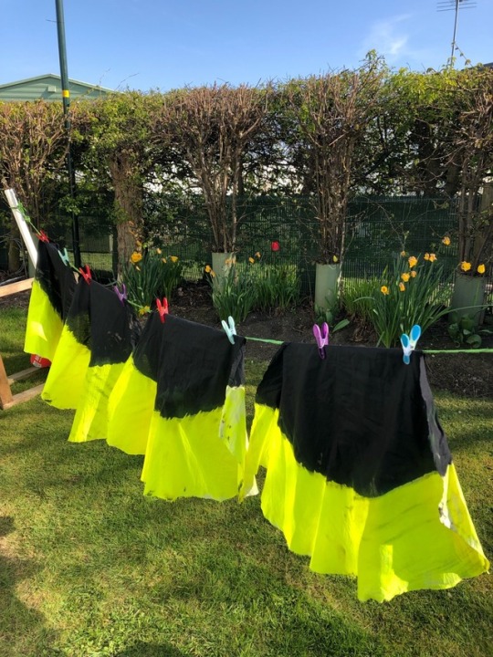
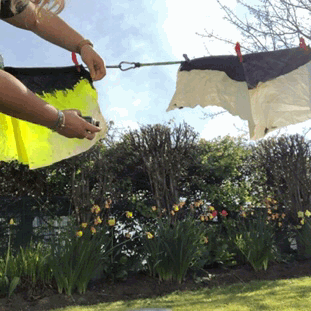
I have started my final dress. First I decided to bleach the skirt so that it’s ready to paint. I first cut out the skirt pieces by following the pattern pieces and lay plan, however I cut the pattern pieces leaving a lot of excess fabric just in case the fabric shrunk when bleaching. I then bleached the skirt by painting on bleach to give the skirt a dipped effect. However I had a few problems when bleaching my skirt, the first bottle of bleach I used wasn’t taking the colour out so I had to used a second bottle of bleach to remove the black colour. I then did a second coat of bleach once I washed them because I did my bleaching on a rough service so it left black lines, so by bleaching it a second time it got rid of the black lines and made the fabric whiter. For each bleaching session I left the bleach on for 1 hour then I washed each of the skirt pieces and hung them up to dry.
0 notes
Photo

Today I have finished my calico dress. I have done half the corset of the dress in piping to see how it would look I also made the piping longer and shorter to see if I wanted the piping in the seam or not. When doing my dress I will make the piping longer so that it fits into the seams. I will also have to make sure my seams are 1cm as where I did the piping I made the seams too small so my garnet was bigger overall. On my dress I also experimented with how I would add shape and volume to the skirt. I first added wire round the edge of the skirt to give it shape however it didn’t give a strong shape and it didn’t give the volume I wanted. I then got another section of the skirt and added netting underneath I liked this and it added a lot of volume and I could add as much or as little as I wanted, so when doing my final design I will use netting under my skirt. I then added ribbon for the straps and I added makings of the techniques I will be doing on the dress.
0 notes
Photo
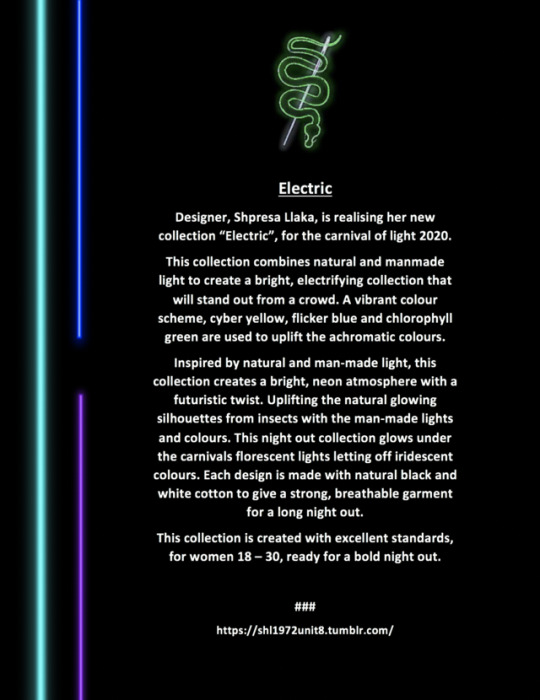
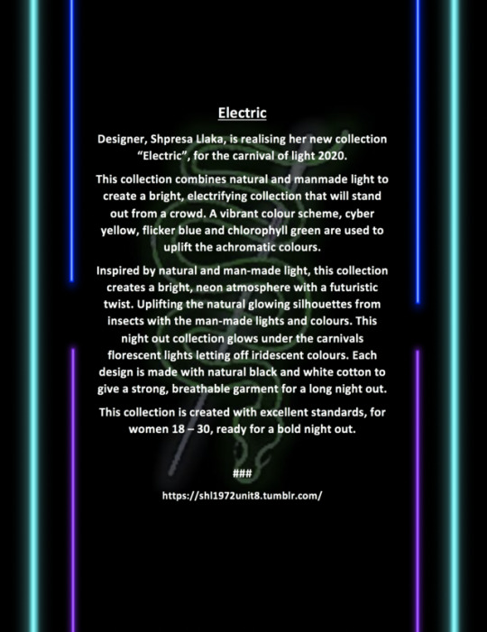
This is my final design for my press release. I chose this design as the colours match my logo and theme really well. I also changed some of the words in my press release so that some of the sentences weren’t Repeated.
0 notes
Photo

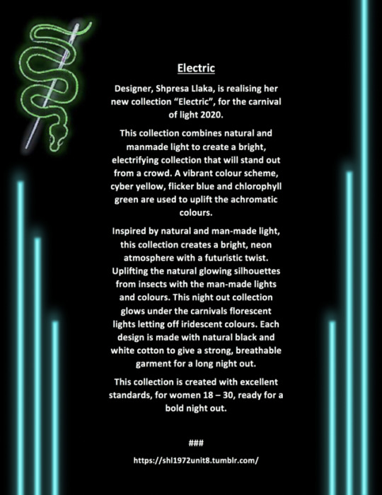

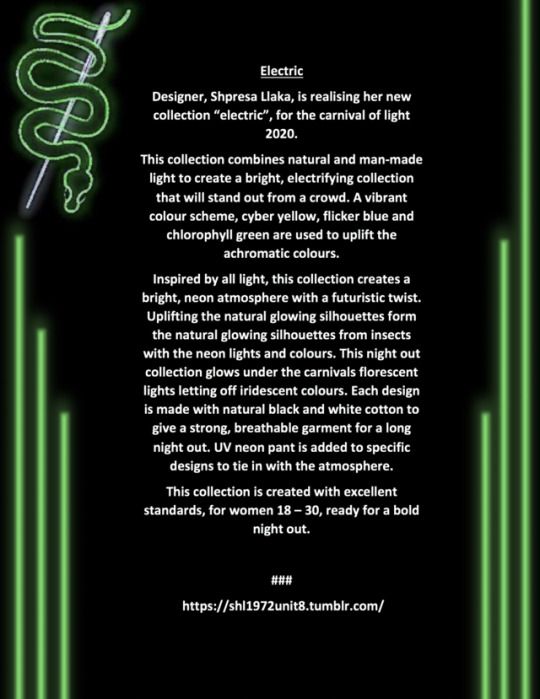
i have created 5 different designs for my press realise.
for my first, second and third design i have used the same colour palette however for the first one i have kept the writing off centre and put the neon lights at one side with the logo above the writing. I like this design however I feel like because it’s off centre it looks like it’s been miss placed. For the second and third one I have put the writing in the centre and the lights at each side but I have changed the placement of the logo. For the second one I have enlarged and fade the logo and I have put in the background, I don’t like this design very much because the logo in the background makes it harder to read. For the third one I put the logo above the writing I like this design as it’s simple but effective.
For the fourth and fifth design I kept the layout the same by putting neon lights at each side and putting an enlarged logo on the left hand side however I changed the light colours. I kept the lights on the fourth design the original colour however I felt like they didn’t belong so on the fifth one I changed the lights to match the snake in the logo. I prefer this design as it looks cohesive with the logo.
0 notes
Text
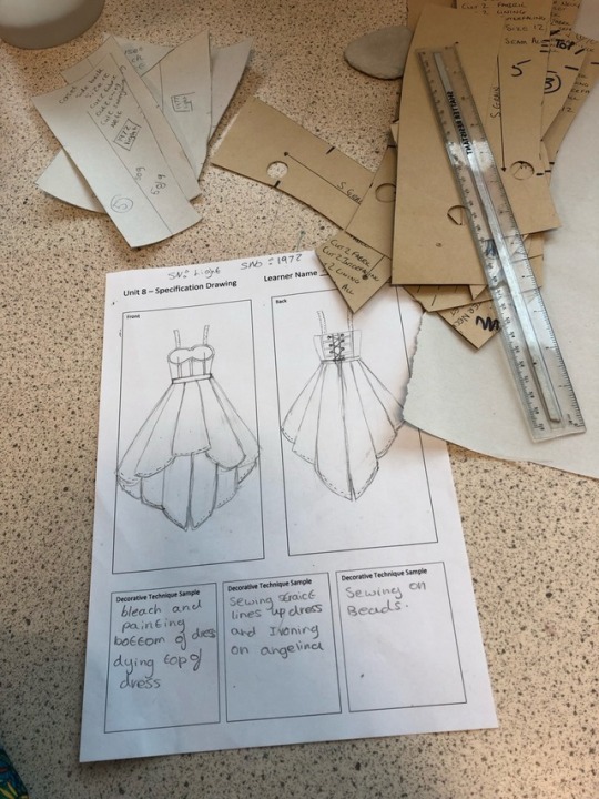

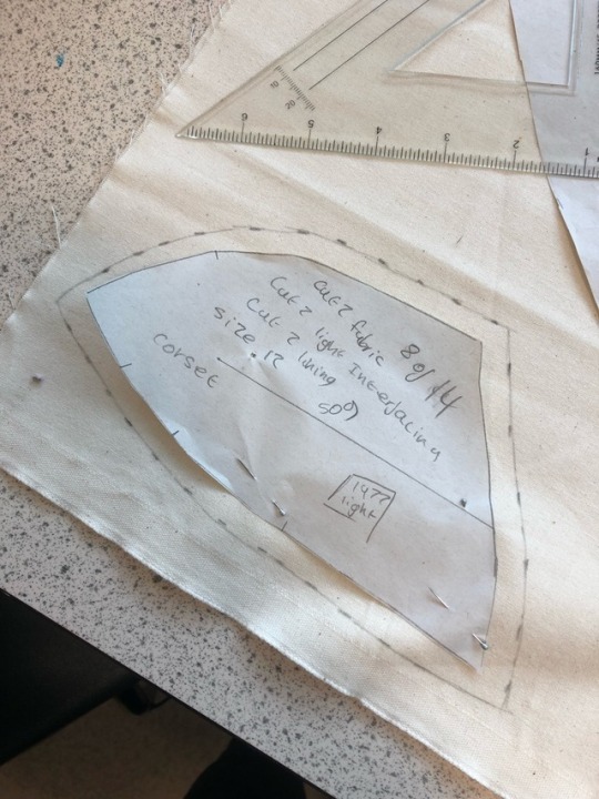


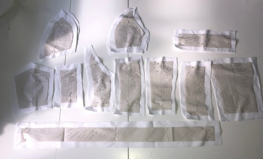
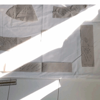
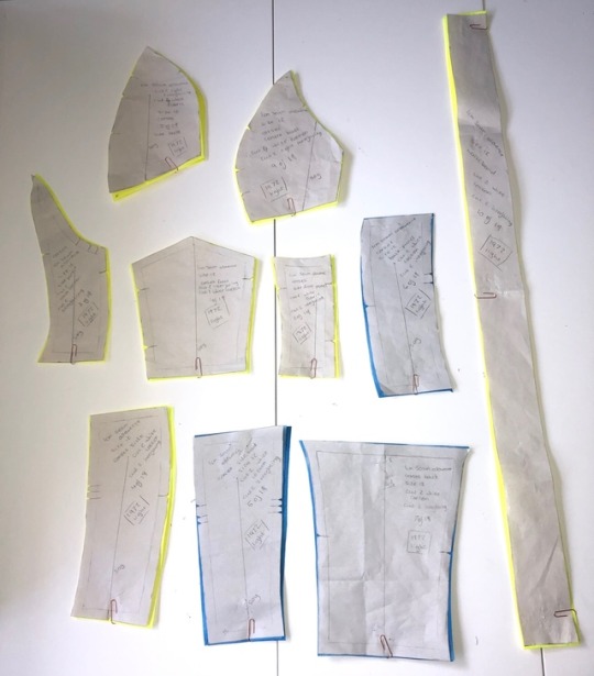
Today i have started creating my own pattern pieces for my chosen design. I started off by creating a spec drawing, I then drafted and cut out the pattern prices I needed. Afterwords I pinned them onto the fabric adding on 1cm Seam allowence all the way around. I then cut the pieces out and started constructing my dress in calico to see how the final product would look and to see if my pattern pieces work.
0 notes
Text


For my theme “light” I have change my logo to fit in with the light theme by making it look like a neon light. I did this by getting my original logo and put a filter on it I then did loads of editing to make it look like it was glowing and to give it an outline. I feel like this logo will fit in more with my customer and theme but it keeps its originality And shape.
0 notes