Last Seen Blogs

thealmightyawesomegay-blog
Untitled

sellhousefaster
Sell House Faster

marlynsonrocha
Sem título

current-adhd-hyperfixations
I Just Reblog Shit

Text
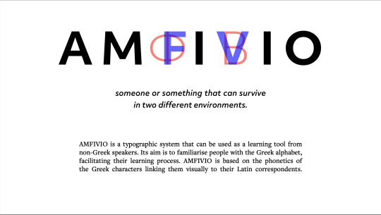
FMP - evaluation
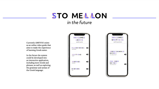
In general I am happy with the body of work I have produced for my final major project and I think that it stands well for my idea. Of course there are things that could have gone better and there is room for improvement. If I could continue this project further I’d make a working typeface out of it, so that it could be applied to more assets easier. I’d also like to explore the potential of it becoming an educational application or website going into further depth about Greek vocabulary, grammar and syntax. I really enjoyed working on my illustrations but I think that their style could be developed more in order to look more consistent with the vibe of the typography. Even though in the end I didn't use the colour filter idea I still see potential in it but it needs further exploration on where and how it can be applied. On the technical side of things on my final video I would like to re record my audio with professional equipment and maybe use another Greek speaker on the parts with the dialogue because it feels a bit monotonous. I would like to also explore the animation idea I experimented with because I feel that it would make the outcome a lot smoother and thus more pleasant to watch. Another thing that I would consider is making a small printed version of the project like booklet, that one can have with them. I could also experiment more with digital line drawing, maybe using an iPad or Wacom tablet. I would definitely like the AMFIVIO project to expand and I see a lot of possibility in it. Another thing that I would like to improve is getting the ideas earlier on when I start a project because I feel that if my idea hadn't changed that drastically I would have had more time to develop the new idea. During this project I definitely realised how important is planning things out before making work, especially when it came to choosing the words and phrases as well as making the final decks and the video. I would love to do a case study of someone who doesn't speak greek using the system and see if it would actually help them learn the basics. I think I would rework the video presentation of the project but overall I am happy with my work for now.
7 notes
·
View notes


Text
FMP - body copy choice
FreightText is the typeface I chose for body copy for my final board of decks for my FMP. I chose this typeface because it has a similar X height to objective so they look consistent together and I also like the contrast that a well balanced serif typeface would give visually. for the translation of the words I used Objektive italics in lower case and FreightText I used it only for longer explanations. I was happy with this visual outcome and they proceeded on designing my board of decks.

0 notes
Text
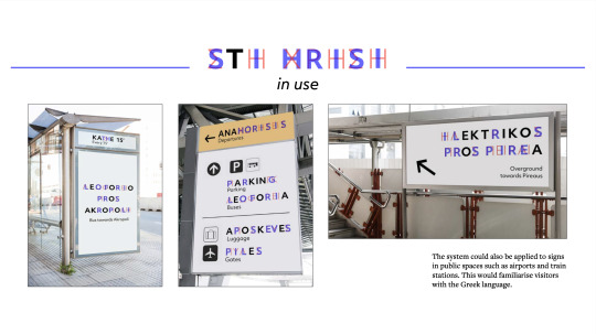
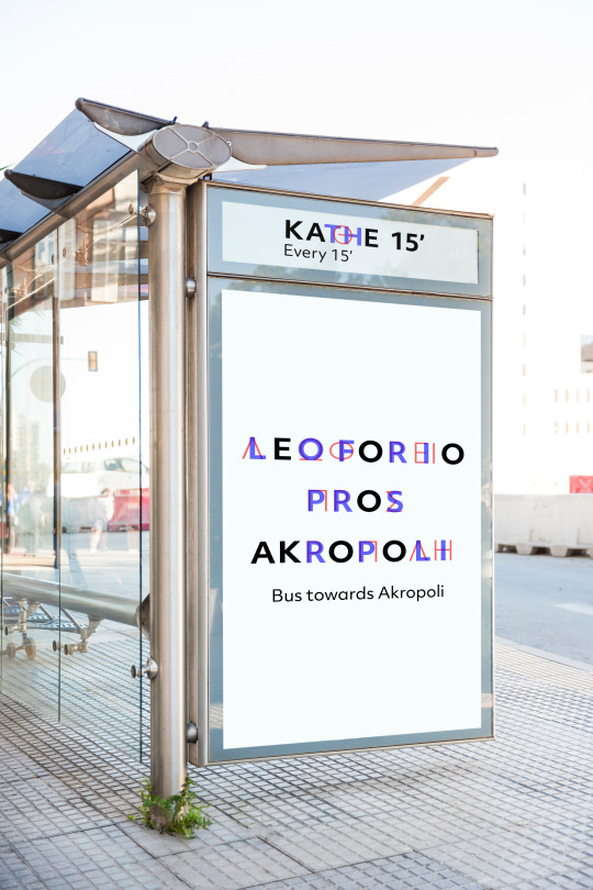
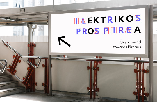
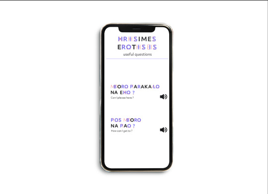
FMP - mockups
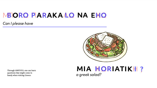
I made some mockups for my project aiming to represent how it could be of actual use other than just a short video guide for learning Greek. I imagine this project to be incorporated in public signage in places such as airports bus stops and train stations. also an extension of this project could be creating an interactive app in the future including more words and phrases so it can engage with a larger audience.
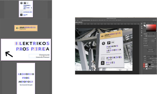
I made my mockups on indesign so that the spacing of the letters would be even and then place them on the files and Photoshop and edited them a bit so that the outcome would be consistent regarding colour and contrast.


0 notes
Text
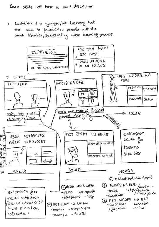
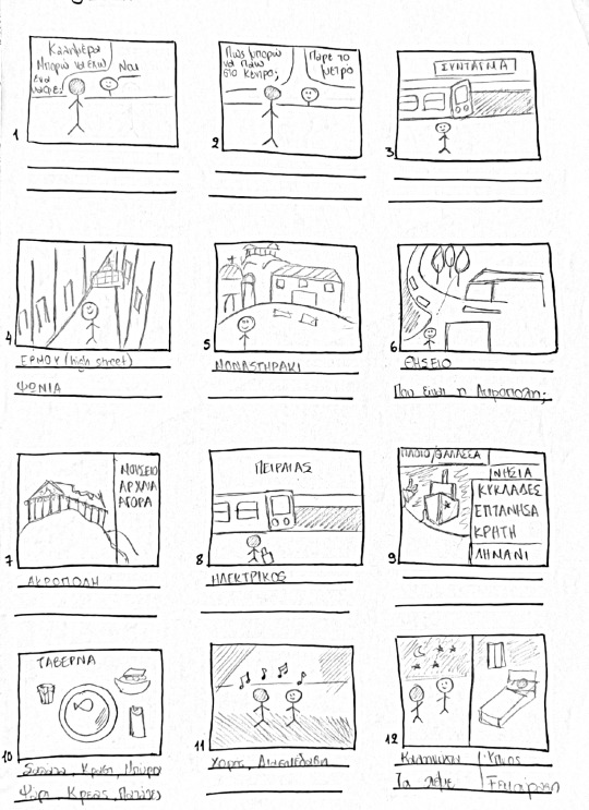
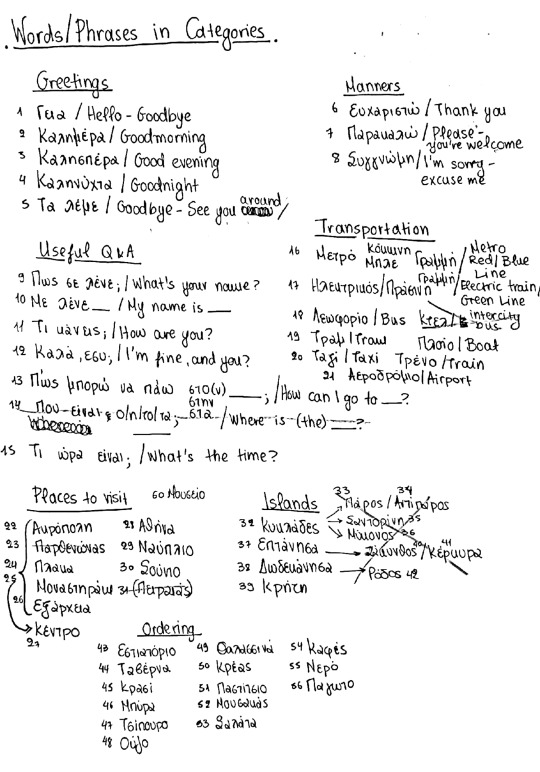
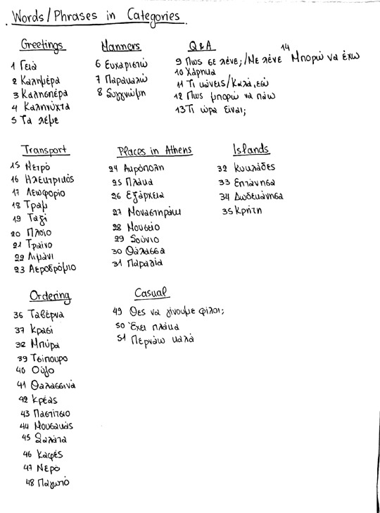
FMP - final mapping out
This is the final mapping out I did for my project before refining my decks and making my final video presentation outcome.
0 notes
Text
FMP - illustrations: test and finals
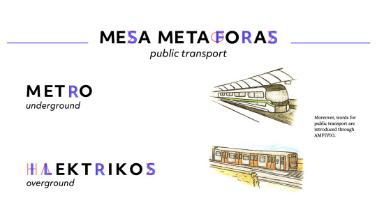
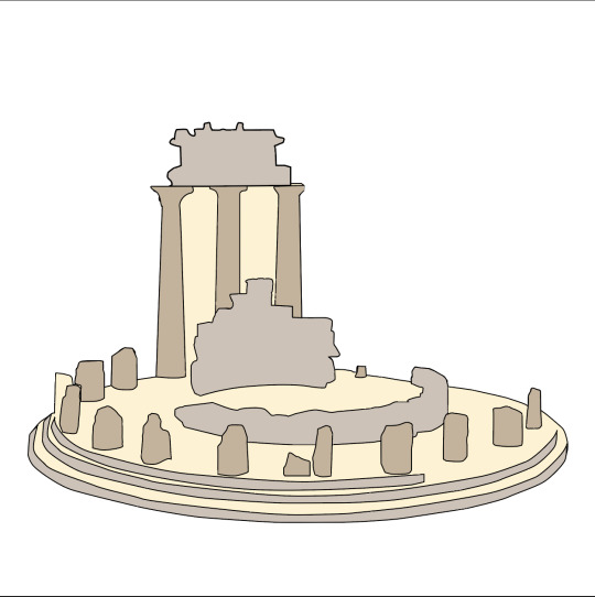
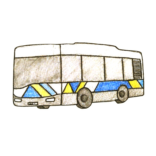
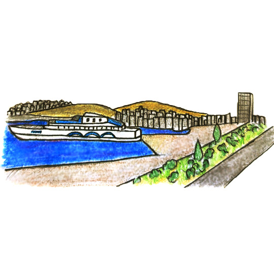
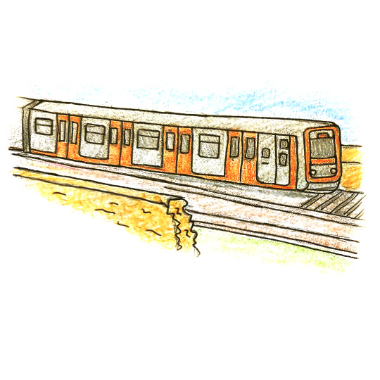
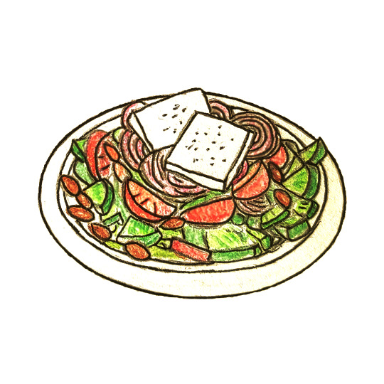
I started making accompanying illustrations for my presentation decks and my presentation video of my project. I did a test on illustrator tracing over an image of Delphi and they came up with this result. even though I like the result and I think that it would match the geometric vibe of the typeface I am using what I don't like about it is that it makes the projects become to dry and that's because the way one learns a language is organic through interaction and communication. I decided to go with a style of hand drawn illustrations that I then edited on Photoshop and I aims for a warmer kind of editing because I wanted them to remind of the sunny atmosphere that Greece is associated with and also give them more fun tone to the presentation of the project.Also I wanted my illustrations to be accurate to what Greece Is like and This is why Represent accurately what one would come across from food and beverages to public transport and places.


0 notes
Video
FMP - deck animation test
a quick test of how the final video presentation could come together. Timing is off I just wanted to see how could animate the assets of the board.
problem: 1. too many layers bc each letter is one text box
2. have to get board from indesign to illustrator with elements on separate layers and then on to after effects - won't have time to do it for many slides
0 notes
Video
FMP - quick animation test
feedback : do we need the filters?, do the letters need to appear one by one?
0 notes
Text
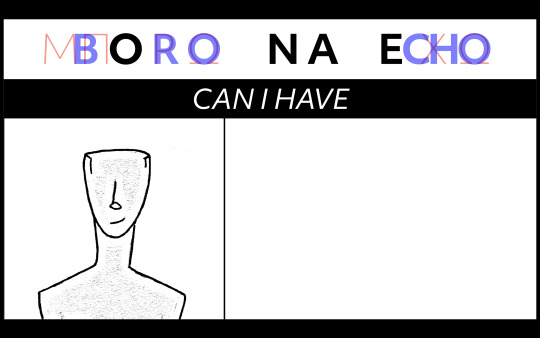
FMP - initial boards
These were my initial boards for this project and how it could be laid out it would include the word and then the character probably an image of what the word is describing and then the blue and red filters would run through.
Note: I was still considering using the filters at this point but when I tried it without I thought that the end result looked better so I decided not to use them in the end and just include them as an experiment through my project.


0 notes
Text
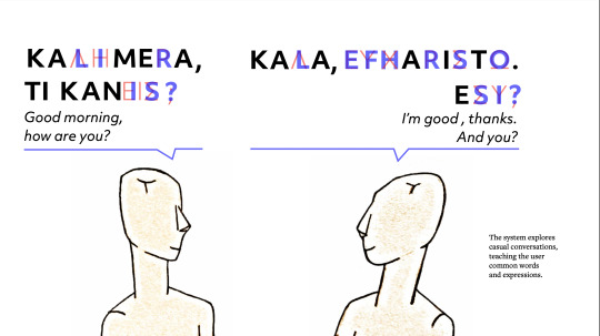
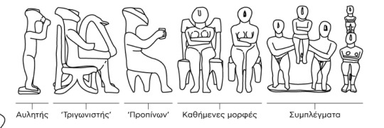
FMP - research & figure illustrations
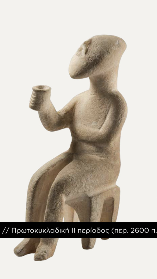
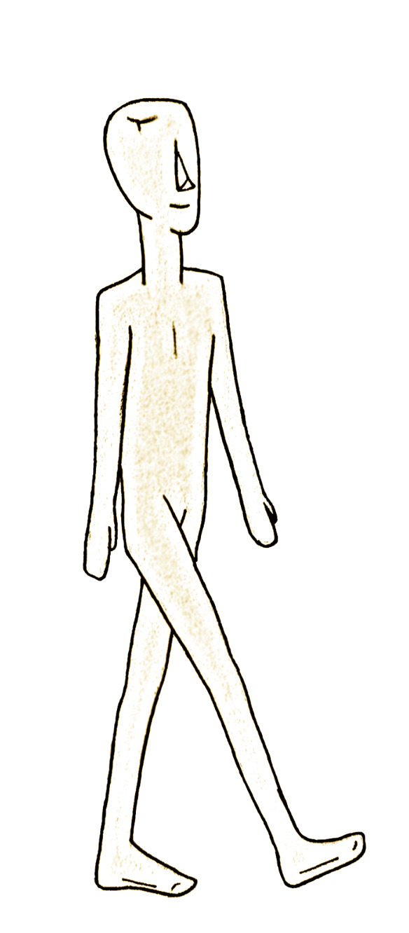
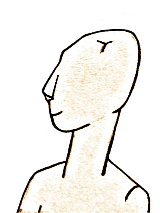
I realized I needed a character in order to portray the different situations that one could face in Greece. I was inspired by cycladic art because they have these very simple yet geometric small statues That could be used as characters to portray Conversations and questions. these are some images from the Museum of cycladic in Athens As well as their website. I made these illustrations and then I edited them in order to get a warmer tone and they like how the texture of the paper turned out because it looks similar to the texture of the actual marble statue. I also like these characters because even though the actual statues have gender in my illustrations I didn't have to incorporate it and so it would make them more relatable to a broader audience. I feel that the simplicity of these drawings fits the nature of the typeface but it also adds an organic and fun touch to the project.


0 notes
Text
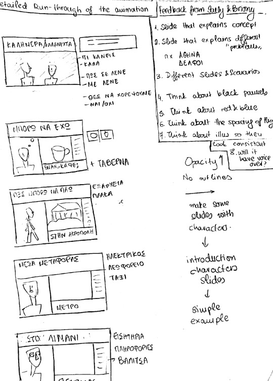
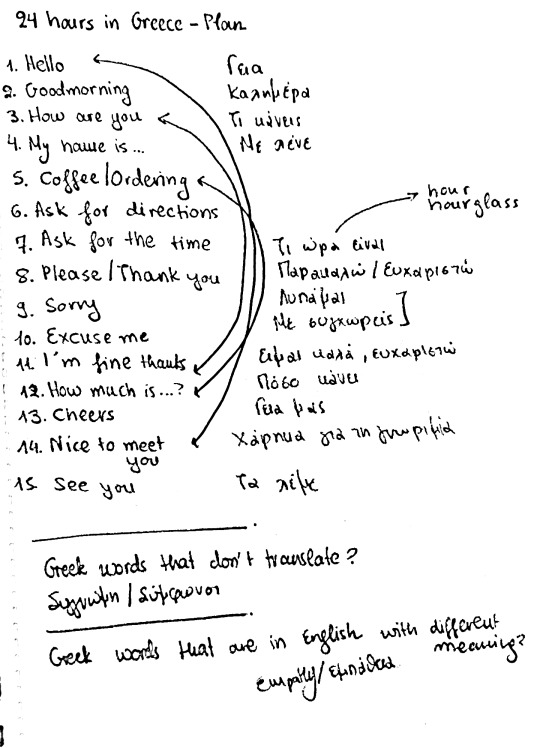
FMP - planning
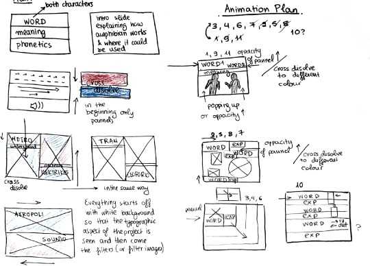
I started making some plans of how I could present this project I was still thinking of incorporating the panels and animating them in a way that the white would come fast and then the red and blue would cross so one could see the combined character and then just the Greek and just the English ones. I then started thinking of different scenarios in order to help me with which words I was going to make. I made a storyboard of just the words and their meanings without incorporating an imagery but I thought that this wouldn't work because it would feel very dry. I then created another storyline of someone spending their day in Athens and as their day goes on they come across different situations that are explained with words written in the system. I tried making this more simple with just images just to get the idea of how the narrative was gonna run.
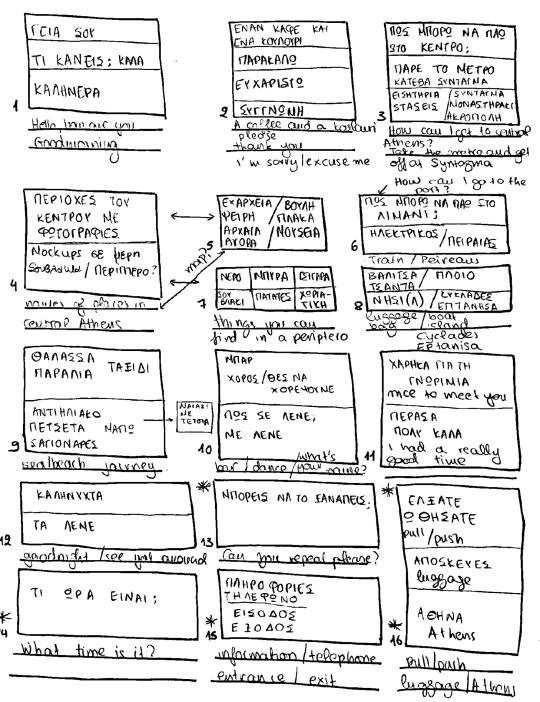
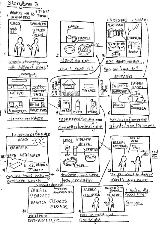
0 notes
Text
FMP - feedback & lists of words
After the feedback I started coming up with a loose narrative and what kind of words I could use to portray my project. if there was such a narrative it would make the words more memorable for the audience because they would be linked to actions or times of the day. I ended up coming up with a lot of words and phrases and I really needed to narrow down my lists because it would be impossible to make all these words. I revised my list again and again and then I realized that they needed a more structured kind of storyline to help me navigate and be precise about which words and phrases I would be using
0 notes
Text
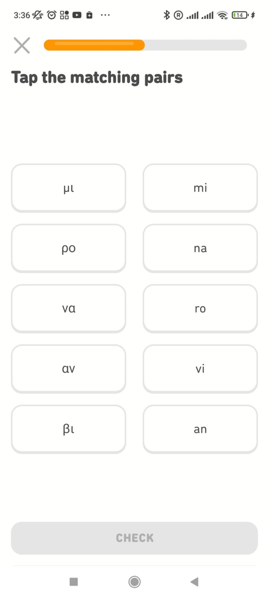
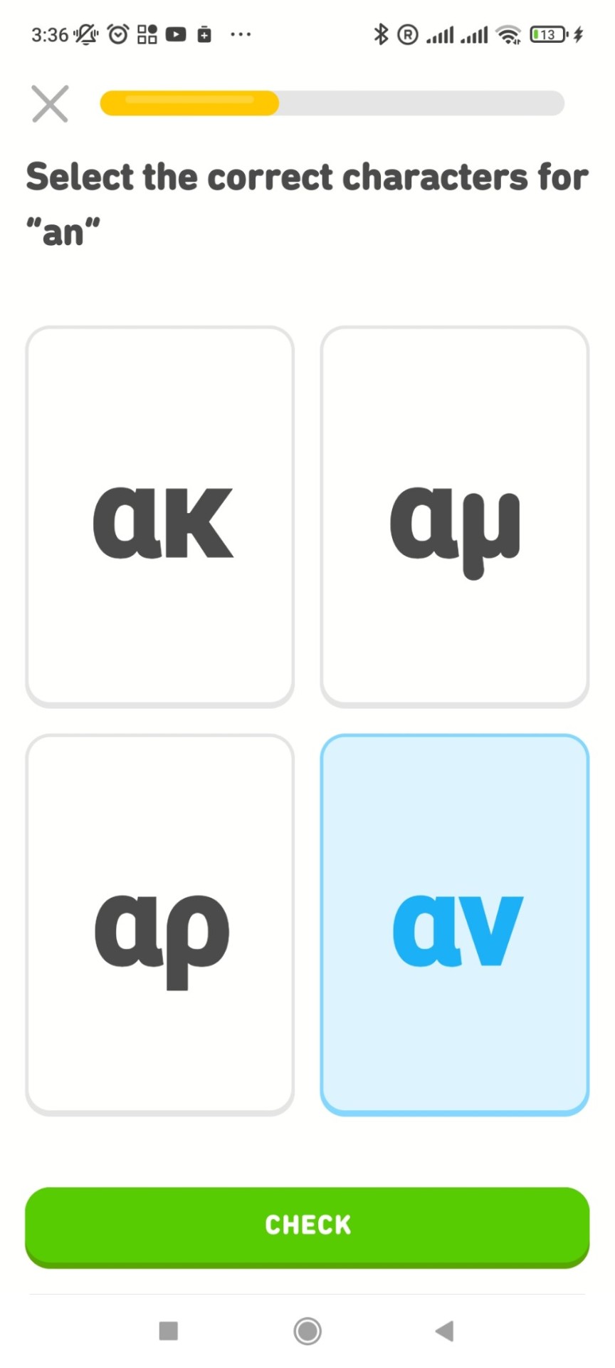
FMP - audience research / duolingo
My project is aimed for people whose language uses the latin script and either english is their first language or speak english and want to start learning greek. For this reason i made an acount on duolingo pretending to be a beginner in learning greek. What i liked in the way of teaching on duolingo is that there is a phonetic approach to the different sounds and there are some initial exercises to get the user accoustimed to the greek alphabet. I think that this was successful as the exercises tend to be repetitive and they ecome harder progressively. What i found a bit odd is that the initial sentences and phrases that one is taught on the app are not sentences that would be used in everyday life, or that they coudl be used at all ( the water is pink) . In my project after Introducing the typographic system that links the characters of both languages together, i aim to focus on common words and phrases as building a foundation for the learner. I want my project to find application in real life and i think that duolingos approach is problematic regarding that. It definitely is an inspiration though for the future if i would want to make my project into an. Interactive learning app or website. Also the character illustrations and the accompanying illustrations in the app are successful and i might need to consider illustration or some for of imagery for introducing and presenting my project.


0 notes
Text
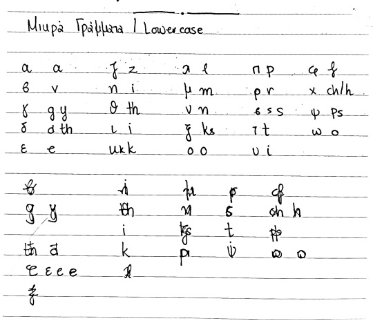
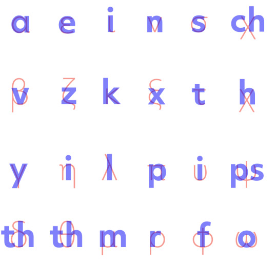
FMP - set of characters & lowercase experiment
I created the first version of the character sets that could be used for my typographic system. I struggled especially with laying out the digraphs because it was hard to online two letters with one and sometimes the result would be off. some characters that needed special attention was F because the Greek one and the English one when they were the same point in size for some reason wouldn't align so the Greek one had to be smaller than the English one. I also tried it with thin and lightweight and I decided to go with the thin one instead of the light one because the light one was way too thin.
Another character that was problematic was the Greek X. grammatically it corresponds to Ch but phonetically it corresponds better to H. I asked people around for that and I made words that included this character and when it was just paired with H the the world would be pronounced in a more correct way than it was when it was paired with Ch so I decided to pair it with h for this project.
I also tried laying out lower case letters and I made the first draft of that but I felt that this would make the project way complicated and that I should only concentrate on one thing now but that would be a good future continuation of that project.
Finally after taking everything into consideration I came up with the final set of characters that I will be using for my project.


0 notes
Text
FMP - feedback 18/4
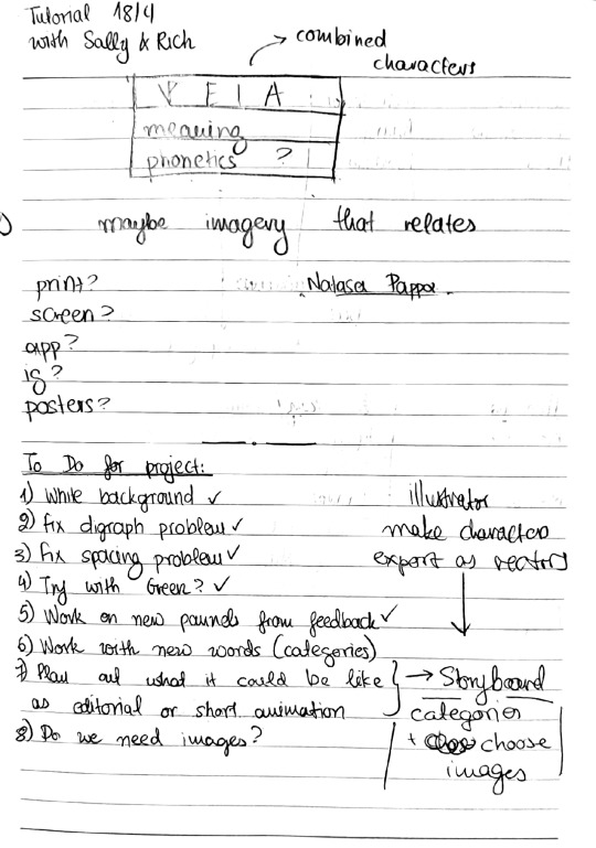

I did a quick experiment with the advice from the feedback. The overlaid characters look nice on a white background and I feel that this element gets lost when I add the coloured filters. I will consider not using them or only using them in some cases.
0 notes