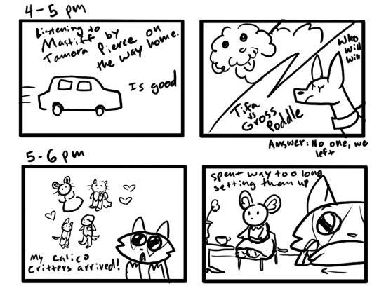
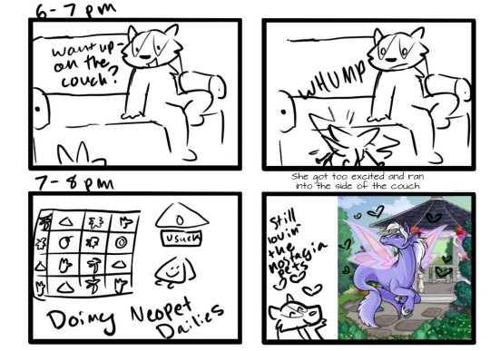
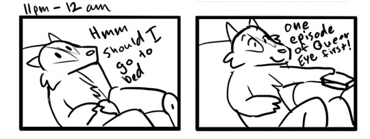
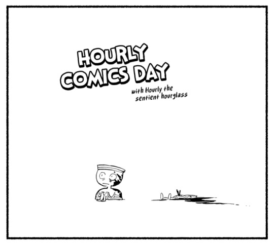
#24 hourly comic
Photo


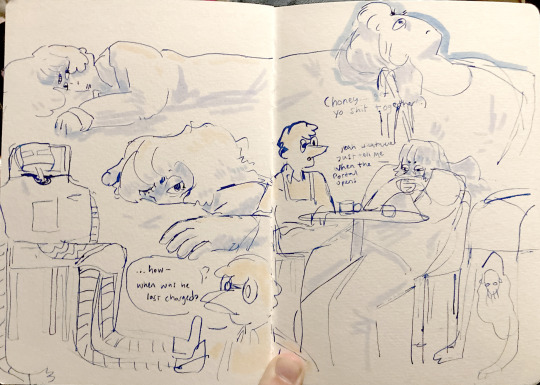
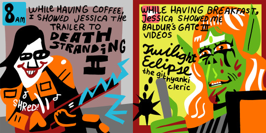
First hourlies in who knows how long.
613 notes
·
View notes
Text

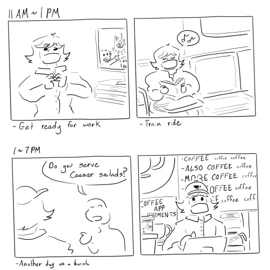
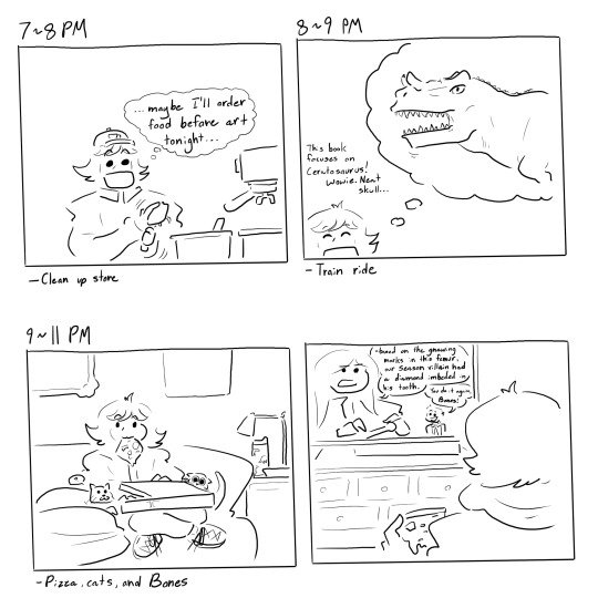
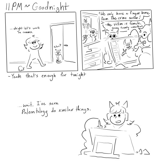
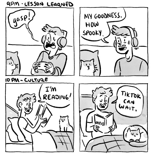
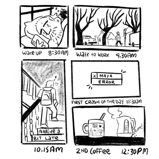
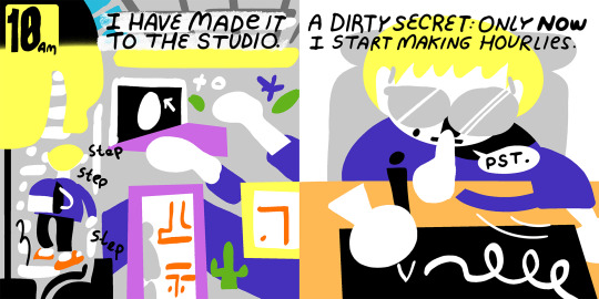
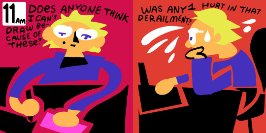
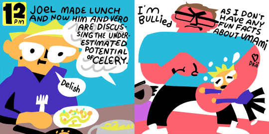
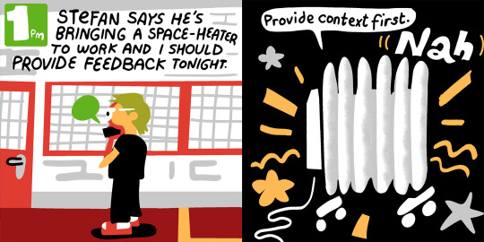
Hourly comics for 2/1/24!
Yes i’m a day late but in my defense i was so busy (see comic)
(no reposts; reblogs appreciated)
#my art#artists on tumblr#original art#digital art#doodles#hourly comics#hourlies#comic#this was so hard actually!#like i can paint for hours straight but comics require a different kind of stamina#college really fixed my mental health by making me busy 24/7#cant be sad if no thoughts head empty#also im older now#and in denial so no im not#oh and#this comic helped me realize how much i love food#(a lot)#sanji would approve i think
98 notes
·
View notes
Text

Hourly Comic Day 2024
7 notes
·
View notes
Text
My cat makes me cry 😭😭😭
3 notes
·
View notes
Text


Realizing now I never posted my hourlies from this year. How crazy is that?
15 notes
·
View notes
Text
It's TIME
4 notes
·
View notes
Text


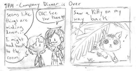

vacation hourlies part 2! part 1 here
0 notes
Text
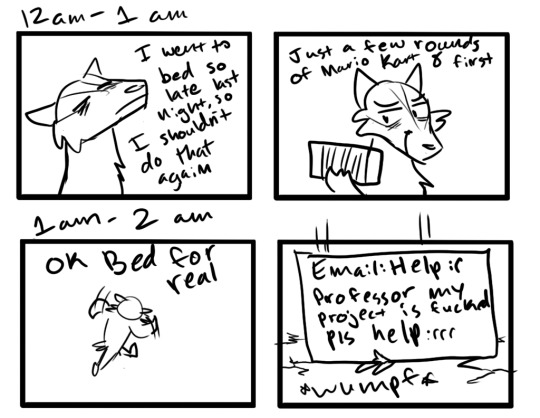
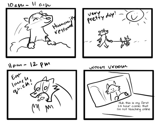
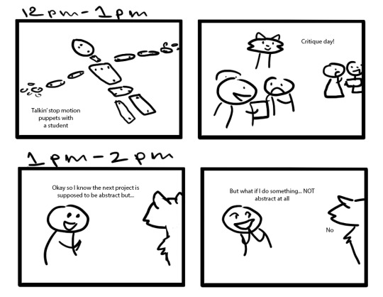


24 hour comic day! I actually got to drive somewhere during this one, the last two were during ice storms lol
0 notes
Text
Why are ther TWO hour comic days i checked ahead i was SURE this wouldnt come up til october
#songs that the hyades shall sing#apparently feb first is HOURLY COMICS and oct 7 is 24 HOUR COMICS#i know you Can do hourlies whenever#but i checked :( my scheduling :(
0 notes
Text


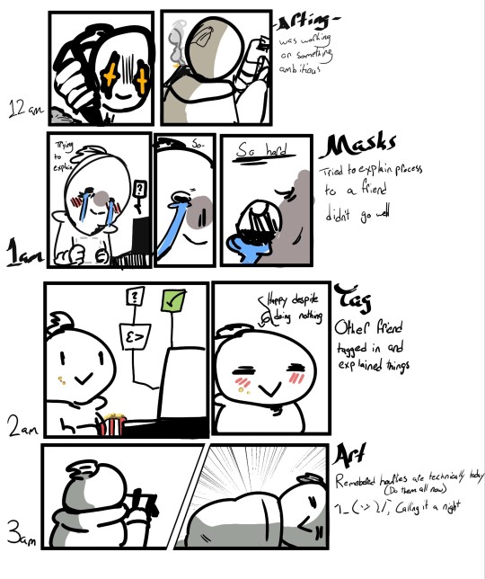
My 24 hour comic summary 🥲
1 note
·
View note
Text
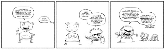

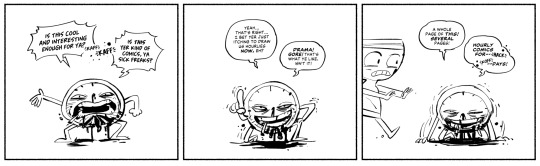


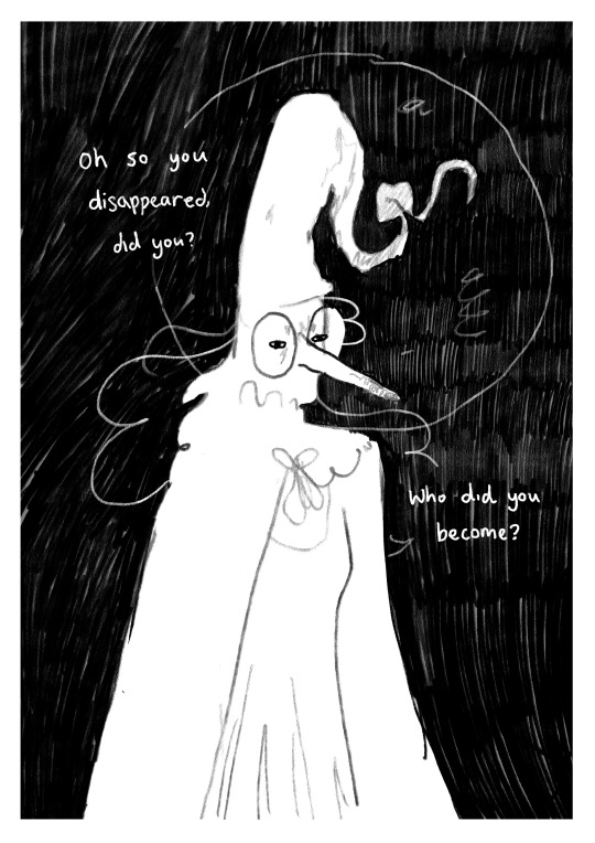
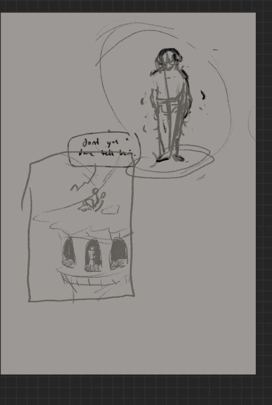
Today's their day, the day of the clocks that are alive for 24 hours, which is 100% what Hourly Comic Day is about, as we have always known.
CW: There is definitely no escalation into bloody stabbings and death. Absolutely not a thing that happens.
733 notes
·
View notes
Text
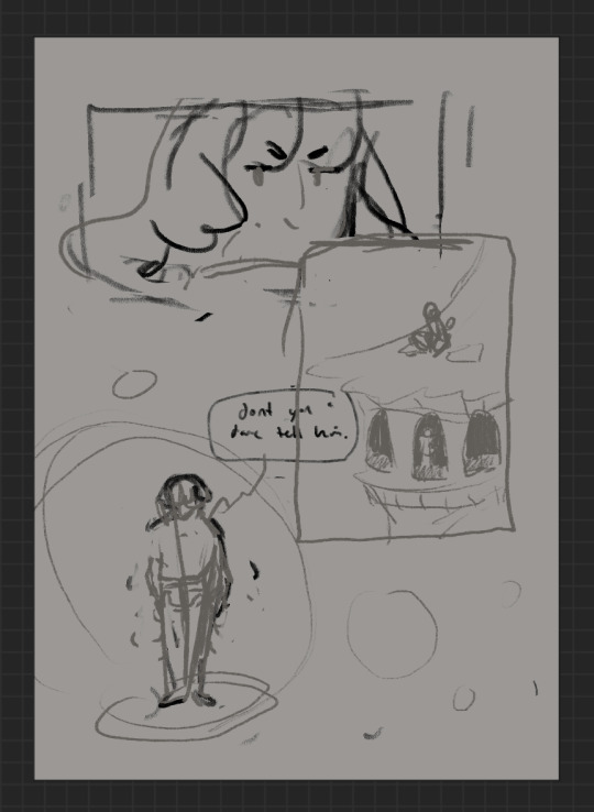
9th feb '24 - [arch] characters, interactions and emotion - making a mini webcomic
Gahhhh Shri this has been an absolutely crazy couple of weeks!!!! Hope you are doing well :)) First of all, WOW! You have a lot of goals, and I’m sure you’ll get them done! I’ve worked a lot on my graphic design during the process of making Winter Wellbeing. If you wanna see a blog post dedicated just to that, I can do so! It would be cool to compare notes on the approaches we take for graphic layouts. If you wanna share your knowledge of camera skills when you build that up that would be awesome 😭😭
It’s been a tough few weeks, art wise. I have been reflecting on my process, motivations to create, the ego and all the baggage that’s lumped into the creative process for me. It turns out there’s a lot. I took some space from my illustration practise (literally for a weekend!) and began to realise how dysfunctional it is. I’ve been writing a lot about that so there may be a larger piece of writing coming about that at some point (no promises!!)
But for now, let's talk about little successes!
I’ve been playing with some characters for a while but I’d hit a bit of a block with the plot. I realised the expectation of having a finished project of high quality soon is unrealistic, and an unhealthy expectation to put on myself. I rarely give myself time to play with concepts for a long time and let the characters, plot and interactions evolve naturally. Maybe this in part came from sticking to the short university module turnaround. I noticed that that short turnaround was causing a lot of block, so I have decided to bench it as a comic for now and focus on using it as a playground - falling in love with the characters, creating stories and drawing them for fun. Maybe years down the line I’ll make them into a comic - we shall see!
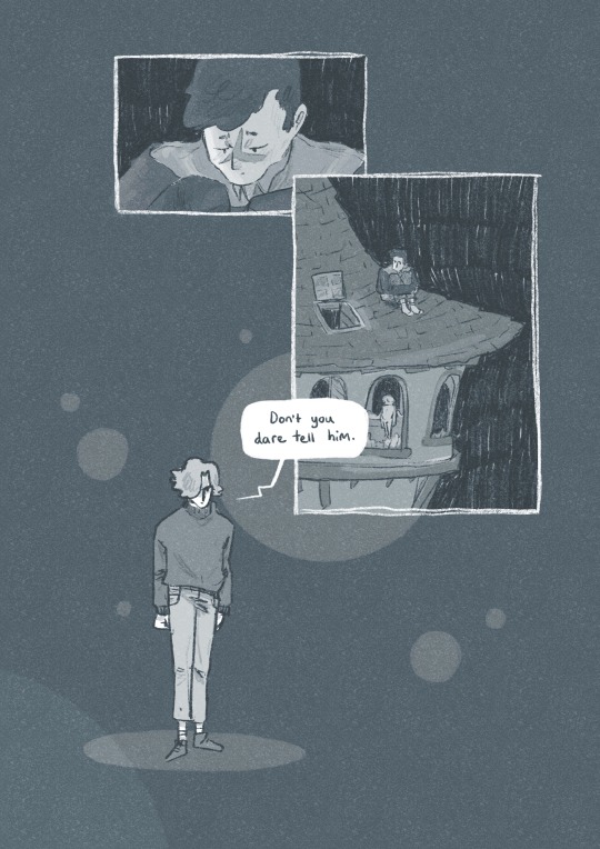
I *tried* to do hourly comics day this year and it didn’t quite work for me. I think I made 3 comics? And then got distracted with a bigger project that ended up taking a week or so to complete. Let’s have a look at it, shall we?
[you can find the full version here]
First of all, it’s based on an unfinished fanfiction I started a couple of months ago, which was mostly bad, but there was one nice scene that I liked and wanted to expand on. I started by having a look at the script I wrote and thumbnailing on the iPad. I’m away from home at the mo and usually would prefer to do most of my artwork traditionally, but because I don’t have access to a scanner, the whole process was digital this time. A lot of the pages got scrapped because the dialogue wasn’t necessary, and I’m not drawing pages that aren’t necessary.

some more development screenshots
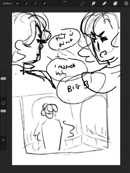

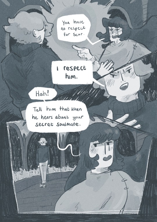
I thought a lot about posing during the process, acting the scenes out in my mind and sometimes physically, really understanding the emotions of the characters, why they’re saying what they’re saying, their tone and how to convey that though their body language and expression (i find grian really annoying normally [affectionate] but I want this grian to step on me).

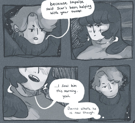
Pearl was hard with this because she’s quite erratic and unpredictable in this series, so I wanted her to switch from raw explodey anger to playful jabs at Grian. I’m hoping this comes across as somewhat insane, rather than tonally off and inconsistent. I did super enjoy drawing her and her explosive nature though, especially in comparison to Grian’s coldness.


I played with levels and monotone colour too - I’m not working with multiple colours much at the moment so I’m able to focus on things like values composition, characters and backgrounds. My skills limit the kind of stories I can tell currently, so I’m working to improve those foundations. Maybe when I’m back in the riso studio I can play with colours a little more.
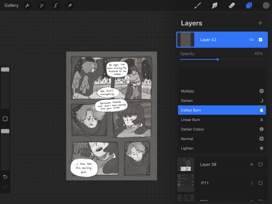
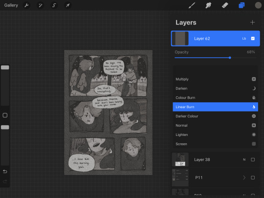
Colours - despite the simple pallete it gets a bit nerdy here.I stuck to specific flat percentages for most of it - Pearl’s hair and Grians jumper are 60%, Grian’s hair and Pearl’s cloak are 20%. Then I added a 14% layer for shadows, using a ahrd blend eraser tool for highlights, making the images quite dark. I fill a layer with texture from Forystr’s riso brush for procreate, and turn it into a 40% opacity colour dodge layer. This gives it some much needed texture and makes the lighting feel low and nighttimecore. It also pushes the values to look really nice - I tend to be too scared to push them by myself.
I tried a few different colour layers to get a *vibe* but settled on a low percentage riso blue in a colour layer. All layers besides the riso blue are in a riso black, colour picked from a riso colour pallete.
I learnt these tools - using percentages to get good values - from working with risograph. I really recommend having a look at these techniques and doing some monotone work. It's really improved by character designs, page layouts and compositions.


That's all from me today, though I have had MANY other thoughts over the past two weeks about creating, but perhaps we'll dive into them another time. If you (or anyone else) has any questions, hit me up with a reblog or an ask and I will get right to it.
Lovely to hear from you! Hope your art is going great too :))
Arch :)
#archillustrates#arch is learning#project development#art#art process#art resource#process#artists on tumblr#illustration#comic#picture book#small art blog#art blog#illustration blog#female artists on tumblr#queer artists on tumblr#illustrator#book illustrator#female illustrator#queer illustrator#comic artist#comic art#female artists on instagram#artists on instagram#procreate#digital artwork#digital artist#artist blog#artist on tumblr#web comics
24 notes
·
View notes
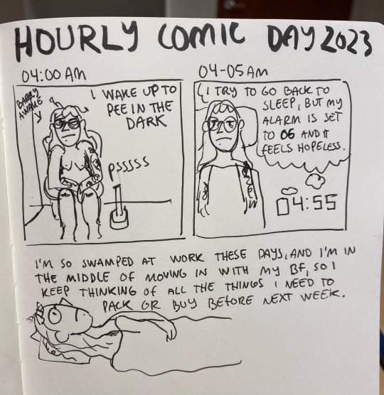
Photo


GOOD MORNING HOURLY COMIC DAY , GOODNIGHT HOURLY COMIC DAY!
instagram | twitter | tapas
#Hourly Comic#24 hour comic#hourly comic day 2023#hourlies#hourlycomicday2023#comic#webcomic#slice of life#trans#transgender#queer
57 notes
·
View notes
Text


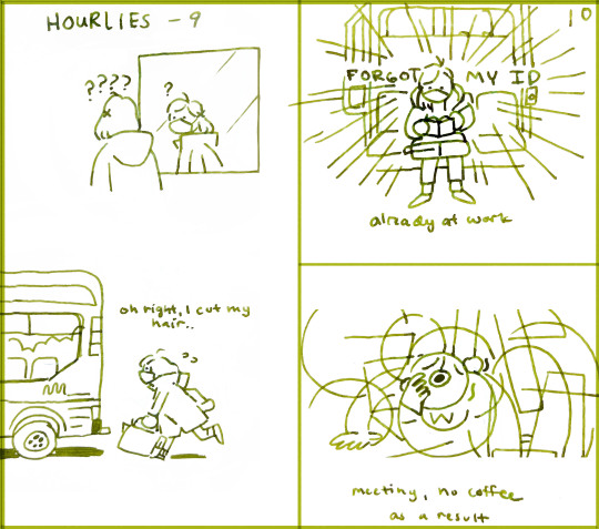
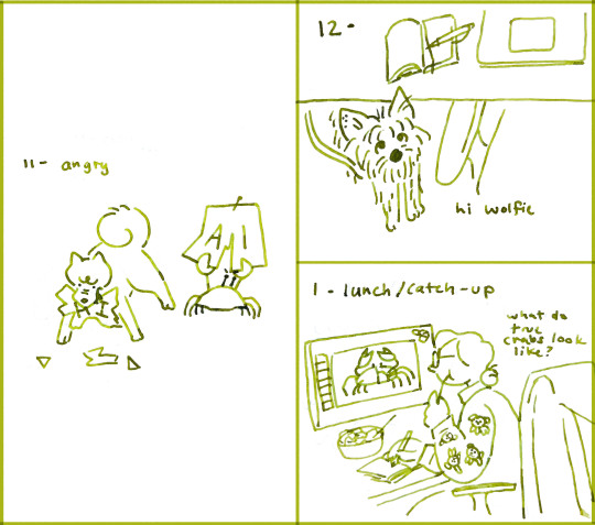
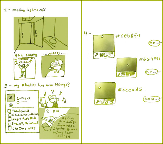
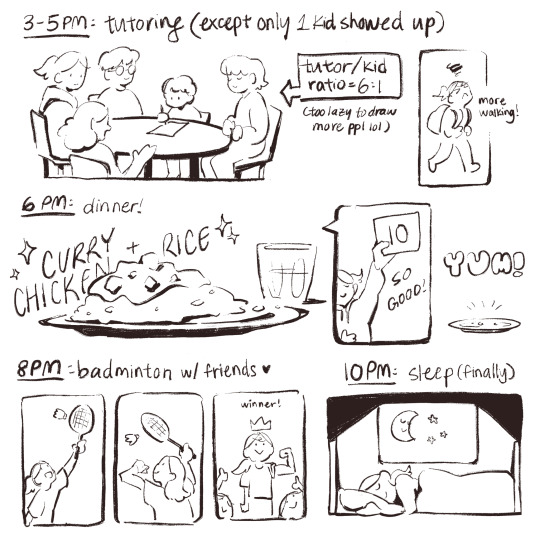
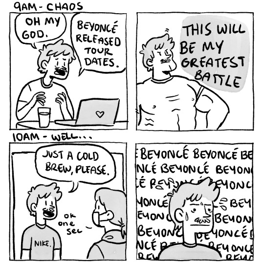
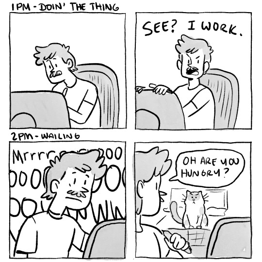
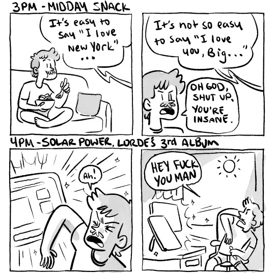
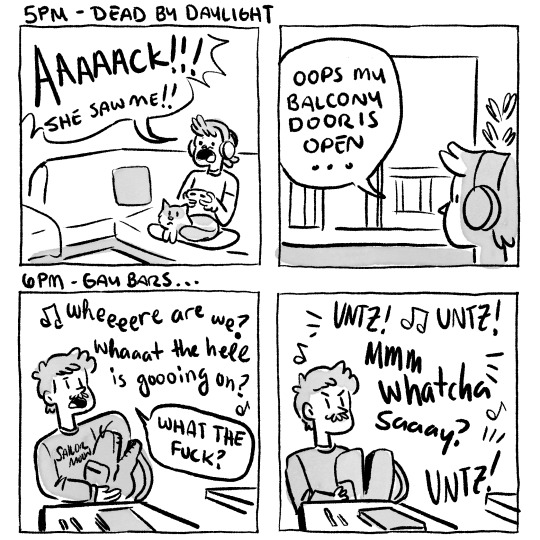
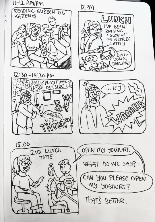
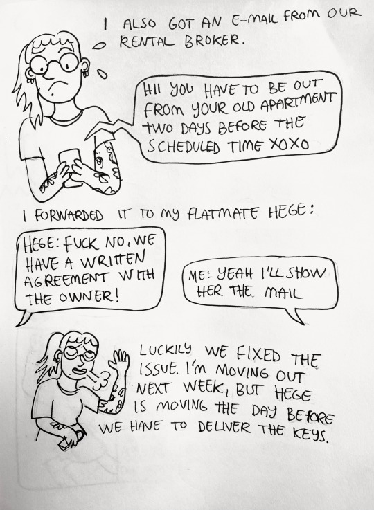
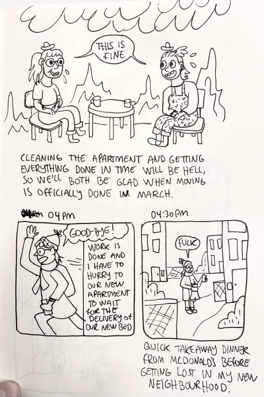
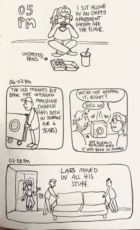
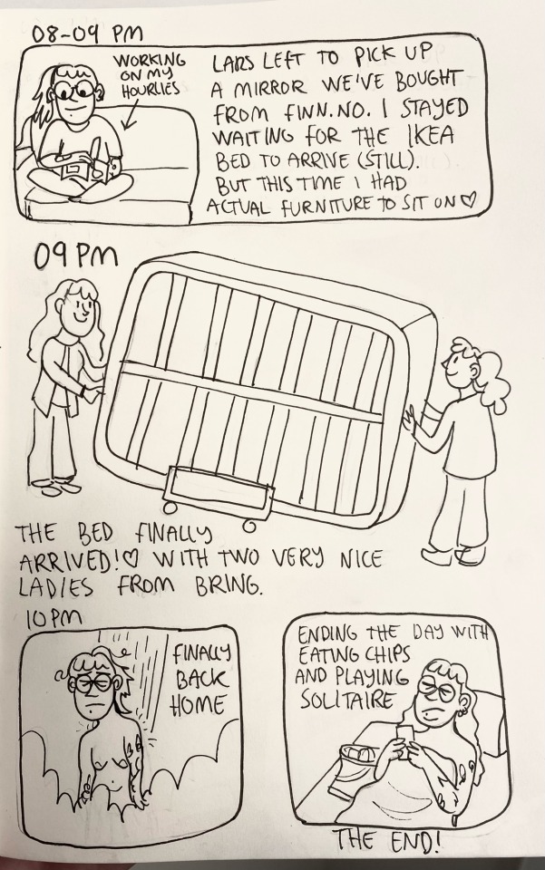
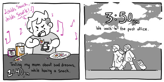
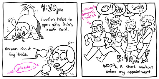
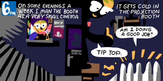
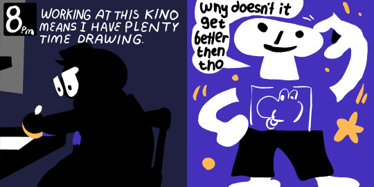
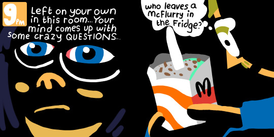
My hourly comic for 2024. Posted originally on the 1/02/24.
Hadn't done one before so this year seemed like as good a time as any to start.
23 notes
·
View notes
Text

Check out the streams this weekend!! Donate!!
2 notes
·
View notes
Text


Hourly comic day 24
16 notes
·
View notes
Last Seen Blogs

soothz
Soothz

garbagedumptruck
Untitled

hilioon
HI LIOON صحة وجمال

lglifesgarcia
Digital Journal of Luis G
inkedberries
sunrise, parabellum